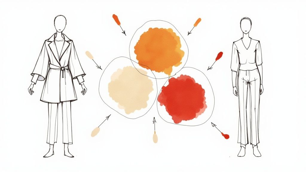
Embrace the Vibrancy of Spring
Whether you are adding vibrant colors to your wardrobe or reimagining your living space, bringing in fresh spring colors can transform the energy and mood around you. From delicate pastels in Victorian fashion to the bold geometric patterns of the 1960s, spring colors have long been a part of our design heritage. As the days grow longer and nature blooms anew, our eyes naturally gravitate toward brighter, uplifting shades that mirror the seasonal change.
The key to using spring colors effectively lies in finding the right balance - capturing that fresh, lively spring energy while creating versatile looks that work for different styles and settings. A thoughtfully chosen spring palette can enhance everything from your daily outfits to your home décor. In this guide, we'll explore 8 essential spring colors that will help you make the most of the season's natural vibrancy.
Whether you want to refresh your wardrobe, try new makeup looks, or simply boost your confidence through personal style, these color recommendations will help you harness spring's natural energy. We'll show you practical ways to incorporate these shades into your life while staying true to your unique aesthetic preferences. Get ready to discover how the right colors can help you fully embrace the spirit of the season.
1. Lemon Yellow
Lemon yellow brings fresh energy and vibrancy to any palette. This bright shade features subtle green undertones that make it distinct from traditional yellows, giving it remarkable light reflection properties that create warmth without overwhelming the senses.
This color has gained significant recognition in recent years. Major fashion influencers like Carolina Herrera and interior designer Jonathan Adler have championed its use. The shade appeared prominently in Versace's Spring/Summer 2023 collection, while Kate Spade frequently incorporates it into accessories. In home design, lemon yellow has become essential to modern Scandinavian style, adding vibrant accents to neutral spaces.
One of lemon yellow's greatest strengths is its ability to instantly lift spirits. The brightness naturally promotes feelings of optimism and joy, making it perfect for refreshing your style or living space. It works exceptionally well with other spring colors and commands attention through its high visibility.
However, this bold shade requires thoughtful application. While impactful in small amounts, too much lemon yellow can become visually overwhelming. Consider workplace dress codes carefully, as the brightness may not suit all professional settings. Success comes from finding the right balance.
Here are practical ways to incorporate lemon yellow effectively:
- Use it as an accent color rather than the dominant shade
- Pair with white or navy for sophistication
- Take advantage of natural light to showcase its brilliance
- Highlight specific elements strategically
For more guidance on finding your ideal color combinations, see: Color Analysis: Your Perfect Palette Guide.
For quick style updates, try adding a lemon yellow tie, scarf or throw pillow. Beauty enthusiasts can experiment with yellow eyeshadow or nail polish for a fresh seasonal look. The key is using this cheerful color deliberately to create maximum positive impact while avoiding visual overload.
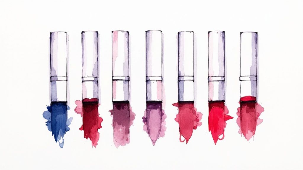
2. Cherry Blossom Pink
Cherry blossom pink captures the essence of spring with its fresh and uplifting quality. This soft yet luminous shade combines gentle warmth with seasonal brightness, featuring a medium saturation level and subtle coral undertones. The color's natural connection to blooming flowers creates an instant feeling of optimism and calm.
This shade holds deep cultural meaning, especially in East Asian traditions. From Japan's famous sakura festivals to the cherry blossoms lining Washington D.C.'s Tidal Basin, these pink blooms symbolize new beginnings and renewal. Major fashion houses like Dior regularly showcase this color in their spring collections, cementing its status as a seasonal classic.
One key strength of cherry blossom pink is how well it works for different people. The shade flatters many skin tones and hair colors, making it an excellent choice for various uses. You'll find it brightening up everything from spring dresses to accent walls, adding a fresh and romantic touch wherever it appears. For those wanting a quick style upgrade, even small touches of this pink can create a polished, approachable look.
Like all colors, cherry blossom pink comes with some practical considerations. Some may find it too feminine for their taste preferences. The color can also fade when exposed to strong sunlight, so choosing quality materials becomes important. When selecting cherry blossom pink items, look for fabrics and materials known for good color retention.
Here are practical ways to use cherry blossom pink effectively:
- Mix with sage green: Create balance by pairing with earthy sage green tones
- Use in morning rooms: The color shines in spaces with soft, natural light
- Choose floral designs: Embrace nature-inspired patterns that highlight the color's organic beauty
- Add metallic details: Gold or silver accents bring sophistication to the soft pink shade
Want to learn more about choosing colors that work for you? Check out our guide on Eye and Hair Color Importance in Personal Color Analysis. Understanding your natural coloring helps you wear cherry blossom pink with confidence. Whether you're updating your wardrobe or refreshing your space, this versatile spring shade offers something for everyone.
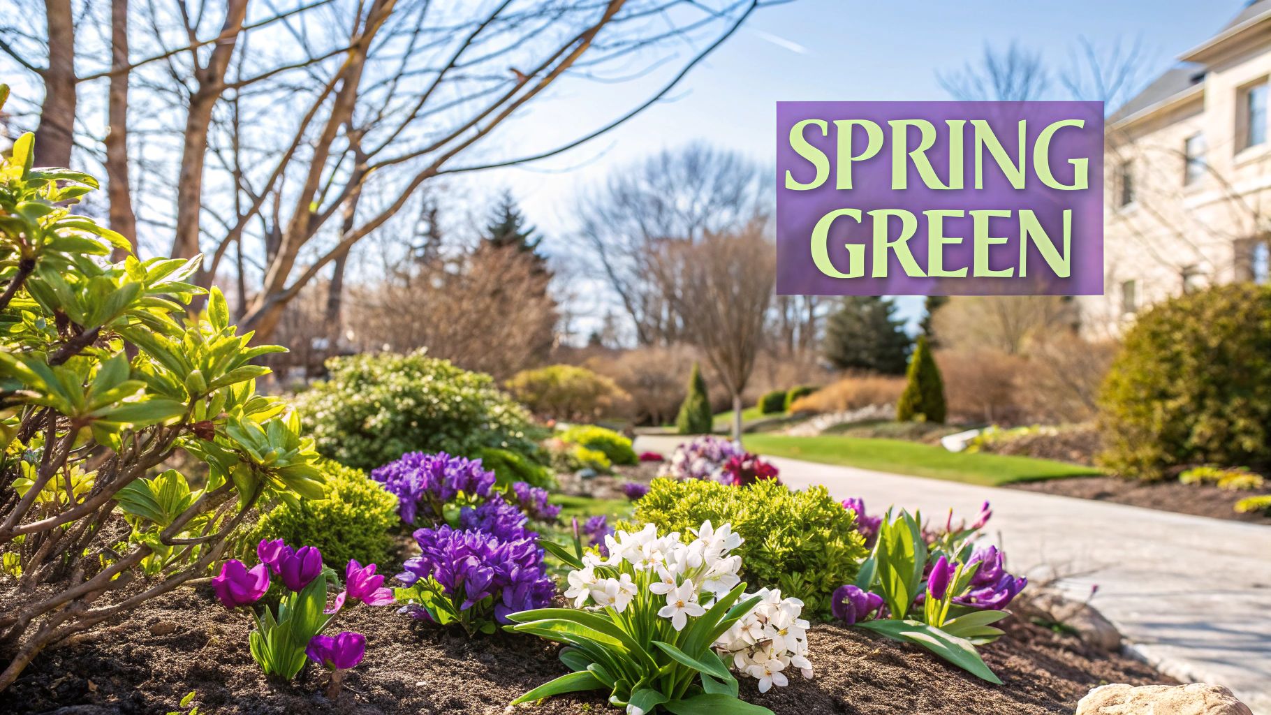
3. Spring Green
Spring Green is a perfect example of natural vitality and growth. This bright, vivid hue blends yellow and green tones to create a color that instantly reminds us of fresh spring leaves and new plant growth. Its high level of brightness makes it a true bright spring shade.
The distinguishing characteristic of Spring Green is its yellow-green foundation, setting it apart from cooler green variations. This yellow undertone gives it an energetic, lively quality that draws attention naturally without being overwhelming. Picture those first blades of grass emerging in springtime or tender new leaves unfurling - Spring Green captures that exact fresh feeling.
The rise of eco-conscious design has made Spring Green increasingly popular. You'll find it used prominently in botanical artwork, sustainable brand identities, and wellness spaces. Many environmentally-focused clothing brands incorporate it into their visual identity to highlight their sustainability values. Wellness centers often use Spring Green in their interiors to create spaces that feel both calming and invigorating.
Pros:
- Represents natural growth and renewal
- Creates positive, energetic spaces
- Works well in nature-inspired designs
- Promotes feelings of peace and optimism
Cons:
- Can feel too intense in large amounts
- May not work well year-round
- Can clash with warm oranges and reds
Practical Tips for Implementation:
- As an Accent: Add small pops of Spring Green through accessories like scarves or pillows to brighten neutral spaces
- Neutral Pairings: Combine with whites and creams to let the vibrant green shine
- Natural Settings: Use in plant-filled spaces to enhance the organic feel
- Lighting Matters: Place in well-lit areas where the brightness can be fully appreciated
You might be interested in: Comprehensive Guide Understanding Skin Undertone to learn how Spring Green complements different complexions and creates balanced looks. Understanding your skin's undertones helps determine which colors work best for you.
For men's styling, Spring Green makes an excellent warm-weather accent color. Try a linen shirt in this shade or add it through accessories like ties, pocket squares or socks for subtle flair. Even small touches of this bright green can boost confidence while maintaining a connection to nature - key elements of a strong personal style. For makeup and beauty enthusiasts, experimenting with Spring Green eyeshadows or nail colors offers a fun way to incorporate this seasonal energy.
4. Coral Blue
Coral blue is a refreshing blend of cool and warm tones that perfectly captures the spirit of spring. This captivating shade combines the serenity of ocean waters with subtle warm undertones, making it both energetic and soothing. The medium-high saturation and optimal brightness give this color a distinctive presence that sets it apart from traditional blues.
Fashion designers have embraced coral blue, particularly for resort wear and coastal-inspired collections. You'll find this shade gracing everything from airy linen shirts to elegant summer dresses. In interior design, coral blue has become a go-to choice for creating serene spaces. It's especially effective in bathrooms and coastal-themed rooms, where it can transform an ordinary shower into a spa-like retreat or add a fresh accent to living spaces.
The growing popularity of coral blue reflects our increasing appreciation for Mediterranean aesthetics and natural elements in design. Leading brands like Tommy Hilfiger and Lilly Pulitzer have showcased this shade in their collections, while coastal living magazines regularly feature it in their interior design spreads.
Key Characteristics:
- Medium-high saturation delivers vibrancy without overwhelming
- Warm undertones balance the cool blue base
- Optimal brightness captures springtime light
- Marine-inspired qualities create a sense of escape
Advantages:
- Creates an airy, fresh atmosphere
- Works well across multiple design applications
- Suitable for indoor and outdoor spaces
- Has broad demographic appeal
Limitations:
- May appear cold under certain lighting
- Requires proper lighting to show true qualities
- Not flattering for all skin types
Design Tips:
- Mix with coral or peach for balanced color combinations
- Use in water-themed spaces to enhance natural connections
- Layer different shades to create visual depth
- Incorporate into patterns for modern appeal
For those looking to add coral blue to their wardrobe, start small with accessories like ties or scarves paired with neutral outfits. Fashion enthusiasts can explore different textures and patterns in this shade. Even minimal touches, such as coral blue nail polish or eyeshadow, can bring springtime freshness to your look. Understanding how to work with this adaptable color opens up countless possibilities for both fashion and design applications.
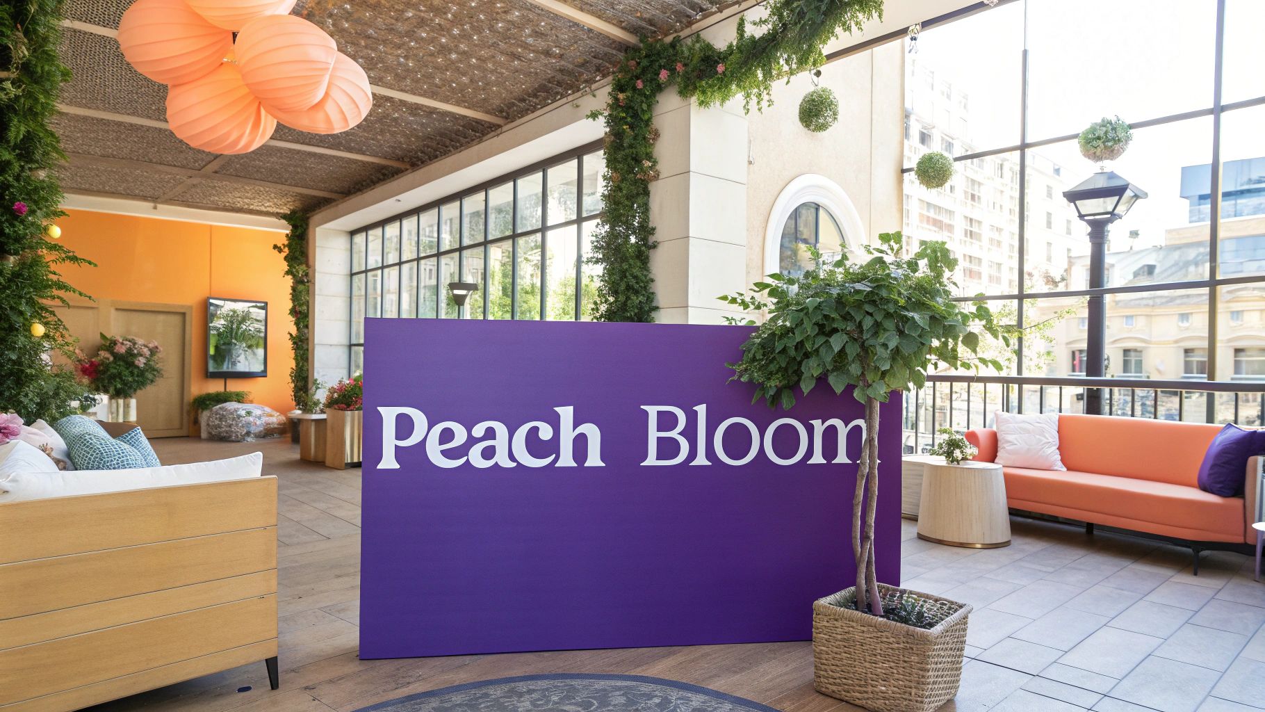
5. Peach Bloom
Peach Bloom brings fresh energy and warmth to the spring color palette. This glowing peachy shade expertly combines pink and orange tones while maintaining spring's natural vibrancy. Its soft radiance and warm undertones make it a universally flattering choice across diverse skin tones.
This captivating hue offers unique qualities that make it highly adaptable. The inherent warmth creates inviting spaces, while the gentle luminosity adds subtle elegance. One of its key strengths is enhancing natural skin tones, making it particularly valuable in beauty and cosmetic applications. It also blends seamlessly with other spring colors for versatile palette combinations.
Pros:
- Universally flattering: The warm undertones complement many skin tones
- Creates welcoming spaces: Naturally evokes comfort and positivity
- Highly adaptable: Works well in fashion, beauty, and interior design
- Excellent transitional shade: Bridges brighter and softer spring colors
Cons:
- Can feel outdated: Requires modern styling to avoid looking too traditional
- Shows wear easily: Consider durability for high-touch items
- Lighting sensitive: Needs proper illumination to show true color depth
Real-World Applications:
- Beauty Products: Often featured in spring makeup collections for blush, lipstick and eyeshadow palettes from major brands, highlighting its skin-enhancing qualities
- Wedding Design: Popular in spring ceremonies, pairing beautifully with ivory and champagne or vibrant corals and greens
- Fashion: Makes regular appearances in spring/summer collections through flowing dresses, tailored pieces and accessories
Growth in Popularity:
The beauty industry first highlighted Peach Bloom's skin-enhancing benefits. Wedding designers then adopted it for its romantic appeal. Social media platforms played a key role in showcasing its versatility across lifestyle categories through visual inspiration.
Implementation Tips:
- Maximize natural light: Daylight brings out the warm undertones
- Balance with neutrals: Pair with white, beige or gray for sophistication
- Use in gradients: Creates beautiful color transitions and depth
- Try accent walls: Makes an effective focal point to add warmth
Understanding these characteristics helps incorporate Peach Bloom effectively into designs and personal style while capturing spring's fresh spirit.
6. Iris Purple
Iris purple combines the vibrancy of spring with a sophisticated color profile. This bright, floral shade perfectly balances blue and red undertones to create a clear, energetic hue that mirrors its namesake flower. The natural floral connection gives it an organic, seasonal quality that resonates with spring's fresh spirit.
This shade carries meaningful historical weight - it has long represented royalty and luxury throughout the ages. This rich heritage adds depth and interest to its modern applications.
Key Characteristics:
- Well-balanced undertones: The mix of blue and red creates an engaging, multi-dimensional color
- Bright clarity: Provides eye-catching vibrancy perfect for focal points
- Natural inspiration: Connects directly to springtime blooms
- Classic significance: Links to traditions of luxury and nobility
Advantages:
- Makes a strong impression: Commands attention and elevates designs
- Fresh seasonal choice: Offers a bolder option beyond typical spring pastels
- Creative versatility: Works well across fashion, art, and design
- Rich meaning: Brings cultural and historical depth
Challenges:
- Color coordination: Requires careful pairing with other shades
- Space considerations: Can dominate smaller areas if not used strategically
- Balance needed: Bold nature needs thoughtful integration
Real Applications:
Top fashion houses regularly feature iris purple in their collections through statement pieces like dresses and accessories. Artists incorporate the shade into contemporary works to create striking visual impact. Interior designers use it effectively through accent pieces, artwork, and occasional bold wall colors. The shade appears in luxury product packaging, runway fashion, and gallery exhibitions to dramatic effect.
Usage Guidelines:
- Strategic placement: Use as an accent to create intentional focal points
- Complementary colors: Balance with whites, beiges, light grays or soft pinks
- Careful portioning: Apply sparingly in smaller spaces
- Artistic elements: Explore in painting, design and creative projects
Iris purple gives professionals an easy way to add personality to their style choices. A simple accessory like a tie or scarf in this shade can enhance a neutral outfit significantly. For those interested in beauty and cosmetics, iris purple offers exciting possibilities in eye makeup, lip colors and nail polish. The key is understanding how to use the color's natural drama while maintaining balance. With proper application, iris purple can help create memorable and polished looks across many contexts.
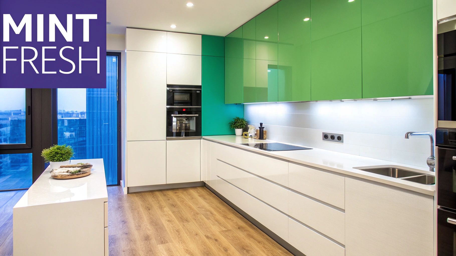
7. Mint Fresh
Mint fresh combines cool green with blue undertones to create a crisp, clean look that fits perfectly in the bright spring color palette. This modern shade moves beyond traditional spring pastels to create a fresh, contemporary aesthetic. The color's clear, cool quality makes it ideal for designs aiming to convey innovation.
The tech industry helped establish mint fresh as a popular choice. It appears frequently in startup branding, app interfaces, and modern websites. From there, the color made its way into interior design - particularly kitchens and bathrooms where it creates an airy, clean feel. Contemporary fashion has also embraced mint fresh through accessories like scarves, jewelry, and handbags that add sophisticated flair.
Key Characteristics:
- Cool Blue Undertones: Gives mint fresh its distinctively crisp, icy quality compared to warmer greens
- Clear, Vibrant Tone: Creates visual impact, especially in digital applications
- Contemporary Feel: Aligns perfectly with modern design aesthetics
- Refreshing Quality: Evokes a sense of cleanliness and revitalization
Advantages:
- Creates an energizing, fresh atmosphere
- Conveys a current, on-trend image
- Performs well across digital platforms and branding
- Adapts easily to different design contexts
Challenges:
- Can feel cold or clinical if overused
- May lack warmth in certain settings
- Needs careful balancing with warmer elements
Application Examples:
- Tech Branding: Many tech companies use mint fresh to communicate innovation
- Modern Kitchens: Mint fresh cabinetry and tiles create contemporary appeal
- Fashion Accessories: Adds a fresh accent to outfits
Usage Tips:
- Modern Spaces: Works best in clean, minimalist environments
- Metallic Accents: Pair with warm metals like gold or copper to add warmth
- Minimalist Design: Complements simple, uncluttered aesthetics
- Digital Design: High clarity makes it effective for interfaces and websites
For both professionals and style enthusiasts, mint fresh offers an easy way to incorporate modern freshness into wardrobes and spaces. Small touches like a mint tie, statement jewelry piece, or home accent can make a contemporary impact. Makeup lovers can experiment with mint eyeshadow or nail polish for an unexpected pop of color. Understanding how to best use mint fresh allows you to confidently integrate this current color into your personal style.
The section about Daffodil Orange converted into a human-written, informative style:
8. Daffodil Orange
Daffodil Orange captures the essence of spring with its warm, golden-infused orange tone. This vibrant shade goes beyond being just another seasonal color trend - it embodies the optimistic spirit and natural renewal that spring represents. Its depth and richness make it adaptable for various uses, from clothing to home design.
What sets this orange apart is its unique golden undertones that add sophistication and complexity. When used thoughtfully, it can energize a space or outfit while maintaining visual appeal. The name itself connects directly to springtime daffodils, creating an instant association with fresh blooms and natural beauty.
Key Benefits and Limitations:
Benefits:
- Adds instant energy to any space or outfit through its natural vibrancy
- Strong seasonal connection that immediately evokes spring feelings
- Excellent accent color for highlighting important design elements
- Works across multiple applications from fashion to interior design
Limitations:
- Can be too dominant when used in large amounts
- May feel too bold for conservative settings
- Needs careful color coordination to avoid clashing with other shades
Practical Applications:
- Fashion Design: Commonly featured in spring/summer collections through accessories, statement pieces, and accent details
- Interior Spaces: Used to bring natural energy indoors through decorative elements like pillows, throws, and artwork
- Artistic Expression: Often chosen by artists to convey joy and creativity in their work
Implementation Tips:
- Use strategically as an accent through smaller items and design details
- Balance with neutral colors like white, cream, or navy for a polished look
- Incorporate into patterns to add visual interest without overwhelming
- Highlight key features by using it selectively on focal points
Growing Popularity:
This shade gained momentum as designers and brands recognized its ability to uplift and energize spaces and wardrobes. Its frequent appearance in fashion shows and home decor publications has established it as an essential spring color choice.
For men looking to refresh their style, Daffodil Orange offers simple yet impactful options. A pocket square, tie, or pair of socks in this shade can add personality without going overboard. The color works equally well in beauty applications, where it can bring warmth and vitality to makeup looks through blush, eyeshadow, or lip color choices.
8-Point Bright Spring Color Comparison
| Color | Implementation Complexity (🔄) | Resource Requirements (⚡) | Expected Outcomes (📊) | Ideal Use Cases (💡) | Key Advantages (⭐) |
|---|---|---|---|---|---|
| Lemon Yellow | Requires careful color balancing; can be overwhelming if overused | Best in natural lighting; high saturation demands precise use | Instant mood lift and vibrant energy | Accent in fashion & interior design; seasonal highlights | Highly visible, attention-grabbing, and bright |
| Cherry Blossom Pink | Simple to implement with minor fabric/lighting considerations | Moderate; benefits from balanced lighting for longevity | Creates a romantic, fresh, and soft atmosphere | Ideal for feminine designs, spring festivals, and subtle decor | Universally flattering and versatile |
| Spring Green | Moderately complex; intensity must be carefully managed | Excels in well-lit, eco-friendly spaces; season-specific setup | Conveys energetic growth and natural renewal | Perfect for botanical themes, wellness, and eco designs | Strong symbolic impact and energetic appeal |
| Coral Blue | Requires specific lighting; balancing warmth and cool is key | Adaptable with proper lighting controls; moderate resource use | Achieves a refreshing balance with cool aquatic energy | Suited for coastal, indoor-outdoor, and resort aesthetics | Versatile with an appealing marine-inspired vibe |
| Peach Bloom | Moderately challenging; sensitive to lighting and styling | Works best with natural light and pairing with neutrals | Produces a warm, welcoming, and smooth atmosphere | Great for cosmetic packaging, weddings, and transitional palettes | Flattering on most skin tones; versatile and soft |
| Iris Purple | Higher complexity; requires careful color coordination and matching | Needs well-planned design interventions for balance | Provides a creative, visually striking, and unique statement | Best for luxury branding, high-end fashion, and art installations | Distinctive seasonal statement with historical allure |
| Mint Fresh | Simple and modern; low risk if balanced correctly | Optimized for digital and minimalist settings; clean execution | Imparts a crisp, refreshing, and modern feel | Ideal for tech startups, minimalist interiors, and digital interfaces | Trendy, versatile, and modern with a clean appeal |
| Daffodil Orange | Moderately complex; intensity and brightness need balancing | Demands careful use of natural lighting and complementary colors | Delivers energetic, optimistic, attention-grabbing impact | Excellent for spring fashion, vibrant art, and garden-inspired themes | High energy impact with strong seasonal connection |
Styling Your Bright Spring Color Palette
The bright spring color palette features eight vibrant hues - Lemon Yellow, Cherry Blossom Pink, Spring Green, Coral Blue, Peach Bloom, Iris Purple, Mint Fresh, and Daffodil Orange. Each color brings unique energy and life to your style choices. When working with these colors, the focus should be on embracing their natural vibrancy while maintaining visual harmony. To create balanced looks, pair these bright tones with classic neutrals like crisp white, light beige, or soft gray. This approach lets the colors shine without becoming overwhelming.
Start small when incorporating these colors into your wardrobe and style. Begin with simple swaps - try a bright spring scarf or tie in place of a neutral one. Play with color combinations to find what suits you best. Pairing Spring Green with Peach Bloom creates a fresh, balanced look, while Cherry Blossom Pink with Coral Blue offers playful contrast. For makeup, consider subtle pops of color like Coral Blue eyeliner or Peach Bloom blush to brighten your features.
Building your style with a new color palette takes time and experimentation. Notice how different colors affect your mood and confidence - this feedback helps guide your choices. The colors that make you feel energized and radiant are likely your best matches. Simple fabrics like linen and silk can complement these bright spring tones beautifully. Focus on finding combinations that feel authentic to your personal style.
Key Takeaways:
- Balance is Essential: Pair bright spring colors with neutrals for a harmonious look
- Experimentation is Key: Try different color combinations to find what suits you
- Consider the Mood: Use color combinations to project a specific energy or feeling
- Personalize Your Approach: Adapt the palette to your existing style and preferences
Ready to discover your most flattering colors? AI Color Analysis offers personalized color recommendations based on your unique features. Simply upload a photo to receive a detailed PDF report with custom color guidance for clothing, makeup and more. Get expert color insights tailored just for you, all from home. Start exploring your perfect palette today with AI Color Analysis!