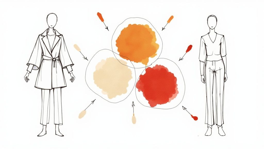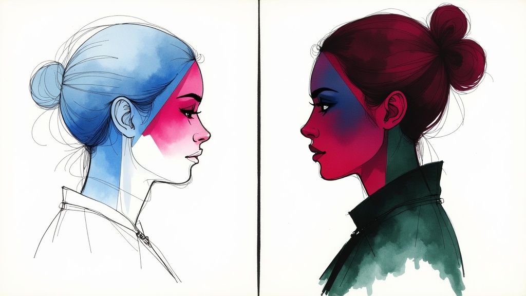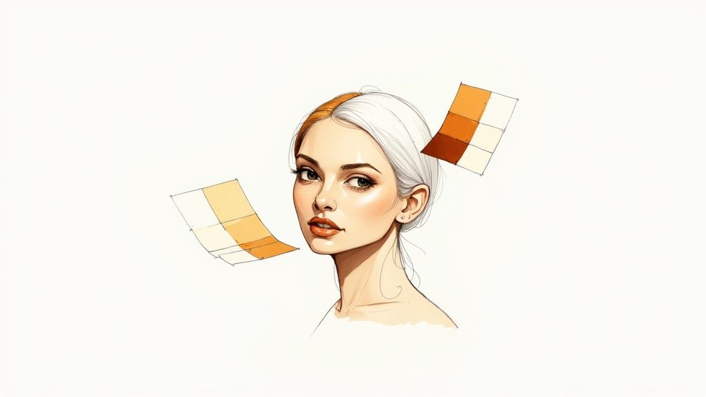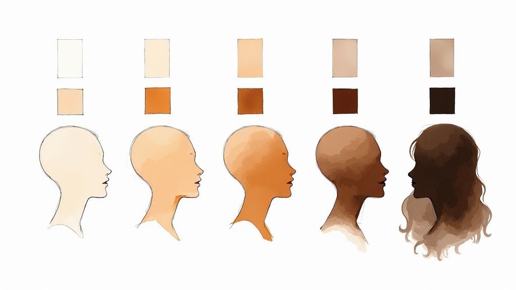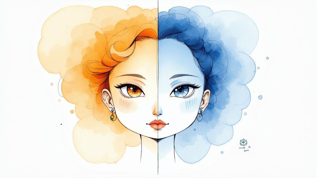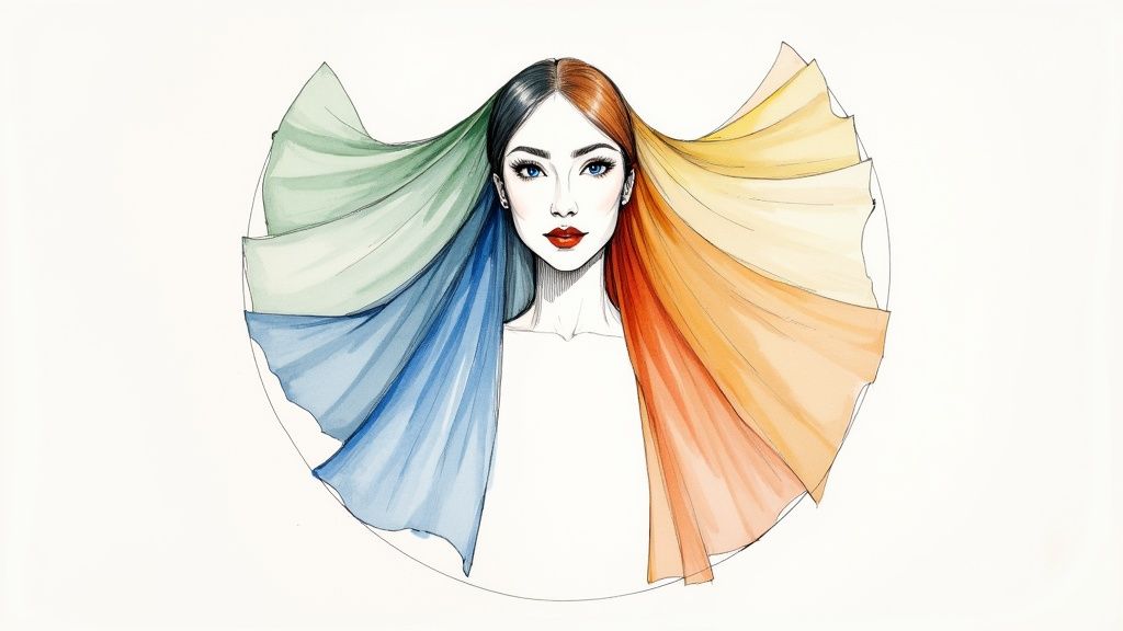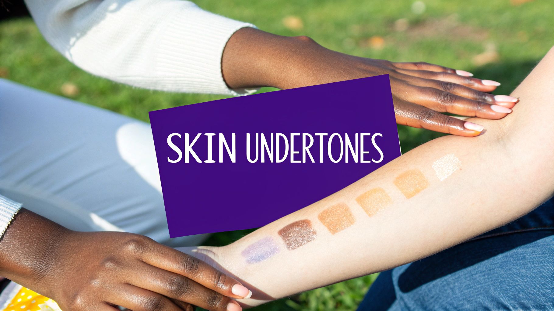
\u003C/figure>\u003C/p>\n\u003Cp>Selecting the perfect eyeshadow begins with understanding your \u003Cstrong>skin tone\u003C/strong>. This is the underlying color of your complexion, and it significantly impacts how colors appear on you. Think of your skin tone as the canvas for your makeup.\u003C/p>\n\u003Cp>Knowing your skin tone helps you choose eyeshadow colors that enhance your natural features. This allows you to confidently select shades that complement you, instead of feeling overwhelmed by the vast array of choices.\u003C/p>\n\u003Ch3>Understanding Undertones: Warm, Cool, And Neutral\u003C/h3>\n\u003Cp>Skin tones are generally classified into three undertones: \u003Cstrong>warm\u003C/strong>, \u003Cstrong>cool\u003C/strong>, and \u003Cstrong>neutral\u003C/strong>. Warm undertones have a golden or yellow base. Cool undertones have a pink or blue base. Neutral undertones are a blend of both, sometimes leaning slightly warm or cool. For a deeper dive into undertones, check out this \u003Ca href=\"https://aicoloranalysis.com/blog/comprehensive-guide-understanding-skin-undertone\">comprehensive guide to understanding skin undertone\u003C/a>.\u003C/p>\n\u003Ch3>Simple Methods To Determine Your Undertone\u003C/h3>\n\u003Cp>Several simple methods can help you determine your undertone. The \u003Cstrong>vein test\u003C/strong> is a popular choice. Examine the veins on your inner wrist. Blue or purple veins likely indicate cool undertones. Green veins suggest warm undertones. If your veins appear bluish-green, or you have difficulty determining the color, you likely have neutral undertones.\u003C/p>\n\u003Cp>Another effective method is the \u003Cstrong>jewelry test\u003C/strong>. Consider whether gold or silver jewelry complements your complexion better. Gold typically looks best on warm tones, while silver flatters cool tones. If both look equally good, you may have neutral undertones. How your skin reacts to sun exposure can also be a clue. Warm undertones tend to tan easily, while cool undertones are prone to burning.\u003C/p>\n\u003Ch3>Choosing Eyeshadow Based On Your Undertone\u003C/h3>\n\u003Cp>Once you know your undertone, selecting eyeshadow becomes much simpler. \u003Cstrong>Warm undertones\u003C/strong> generally look best in earthy shades like golds, bronzes, and warm browns. A terracotta or burnt orange, for example, can create a beautiful look.\u003C/p>\n\u003Cp>\u003Cstrong>Cool undertones\u003C/strong> are often enhanced by jewel tones such as blues, purples, and cool pinks. A silvery lavender or an icy blue could be excellent options. \u003Cstrong>Neutral undertones\u003C/strong> offer the most versatility, as they can typically wear both warm and cool shades.\u003C/p>\n\u003Cp>Interestingly, eyeshadow choices are often influenced by global trends. As of 2019, nude eyeshadow held the top spot globally, representing \u003Cstrong>12%\u003C/strong> of all eyeshadow searches. This underscores the versatility of neutral shades, which complement a wide range of skin tones and eye colors. You can find more detailed statistics \u003Ca href=\"https://www.newbeauty.com/worlds-most-popular-makeup/\">here\u003C/a>.\u003C/p>\n\u003Cp>By understanding your skin's undertone, you can curate an eyeshadow collection that harmonizes with your natural coloring, allowing you to create a variety of stunning eye looks.\u003C/p>\n\u003Ch2>Making Your Eyes Pop: The Color Theory Breakthrough\u003C/h2>\n\u003Cp>\u003Cfigure class=\"wp-block-image size-large\">\u003Cimg src=\"https://api.outrank.so/storage/v1/object/public/article-images/9761ece7-aeaa-49de-bf81-a0d579a8f9ff/ai-image-d35a6dae-a55d-4a69-8766-1d95fd18a6b8.jpg\" alt=\"Color Theory for Eyeshadow\" />\u003C/figure>\u003C/p>\n\u003Cp>Understanding your skin's undertone is crucial for choosing the right eyeshadow. But the real magic lies in understanding \u003Cstrong>color theory\u003C/strong>. This is how makeup artists create stunning looks, and you can too.\u003C/p>\n\u003Cp>This knowledge will empower you to choose eyeshadows that truly complement your natural eye color.\u003C/p>\n\u003Ch3>The Power of Complementary Colors\u003C/h3>\n\u003Cp>The \u003Cstrong>color wheel\u003C/strong> is the key. \u003Cstrong>Complementary colors\u003C/strong>, located opposite each other on the wheel, create contrast and intensify each other. This principle is the secret to making your eyes stand out.\u003C/p>\n\u003Cp>For instance, blue eyes become even brighter when paired with the warm tones of copper, bronze, or gold. It's the same effect as a copper penny against a blue sky.\u003C/p>\n\u003Cp>Green eyes, on the other hand, are enhanced by shades of purple and plum. These contrasting hues amplify the green, creating a captivating look.\u003C/p>\n\u003Ch3>Choosing Eyeshadow Based on Eye Color\u003C/h3>\n\u003Cp>Selecting eyeshadow based on eye color involves understanding these complementary relationships. Let's explore some examples:\u003C/p>\n\u003Cul>\n\u003Cli>\u003Cstrong>Blue Eyes:\u003C/strong> Copper, bronze, peach, and coral offer striking contrast.\u003C/li>\n\u003Cli>\u003Cstrong>Green Eyes:\u003C/strong> Purples, reddish browns, and even pinks work beautifully, but avoid greens that are too similar to your own eye color.\u003C/li>\n\u003Cli>\u003Cstrong>Brown Eyes:\u003C/strong> Brown eyes are versatile and work well with most colors. However, greens, golds, and blues add depth and make them pop.\u003C/li>\n\u003Cli>\u003Cstrong>Hazel Eyes:\u003C/strong> The mix of colors in hazel eyes allows for both warm and cool tones. Greens, golds, and purples are especially flattering.\u003C/li>\n\u003C/ul>\n\u003Cp>To help visualize the best color combinations, take a look at the table below:\u003C/p>\n\u003Cp>Introducing a handy guide to help you choose the most flattering eyeshadow shades for your eye color. The following table provides a comprehensive overview of enhancing colors and those to avoid, along with celebrity examples for inspiration.\u003C/p>\n\u003Ch2>Best Eyeshadow Colors by Eye Color\u003C/h2>\n\u003Ctable>\n\u003Cthead>\n\u003Ctr>\n\u003Cth>Eye Color\u003C/th>\n\u003Cth>Enhancing Colors\u003C/th>\n\u003Cth>Colors to Avoid\u003C/th>\n\u003Cth>Celebrity Examples\u003C/th>\n\u003C/tr>\n\u003C/thead>\n\u003Ctbody>\u003Ctr>\n\u003Ctd>Blue\u003C/td>\n\u003Ctd>Gold, Copper, Bronze, Peach, Coral\u003C/td>\n\u003Ctd>Bright blues, cool-toned silvers\u003C/td>\n\u003Ctd>Blake Lively, Taylor Swift\u003C/td>\n\u003C/tr>\n\u003Ctr>\n\u003Ctd>Green\u003C/td>\n\u003Ctd>Purple, Plum, Reddish Brown, Pink\u003C/td>\n\u003Ctd>Greens that closely match your eye color\u003C/td>\n\u003Ctd>Emma Stone, Rihanna\u003C/td>\n\u003C/tr>\n\u003Ctr>\n\u003Ctd>Brown\u003C/td>\n\u003Ctd>Gold, Green, Blue, Purple\u003C/td>\n\u003Ctd>Very light pastels\u003C/td>\n\u003Ctd>Beyoncé, Jennifer Lopez\u003C/td>\n\u003C/tr>\n\u003Ctr>\n\u003Ctd>Hazel\u003C/td>\n\u003Ctd>Gold, Green, Purple, Brown\u003C/td>\n\u003Ctd>Cool-toned grays\u003C/td>\n\u003Ctd>Olivia Wilde, Jessica Biel\u003C/td>\n\u003C/tr>\n\u003C/tbody>\u003C/table>\n\u003Cp>This table makes it easy to identify colors that create the most impact for your specific eye color.\u003C/p>\n\u003Ch3>Beyond the Basics: Creating Dimension\u003C/h3>\n\u003Cp>Choosing the right color is only the beginning. Creating \u003Cstrong>depth and dimension\u003C/strong> is equally important. This involves using various shades, both light and dark, within your chosen color family.\u003C/p>\n\u003Cp>Think of a painting with only one flat color – it lacks interest. Makeup is similar. Use a lighter shade on the inner corner and a darker shade on the outer corner for a gradient effect. This adds intrigue and draws attention to your eyes.\u003C/p>\n\u003Ch2>Navigating Trends While Building Timeless Eyeshadow Collections\u003C/h2>\n\u003Cp>\u003Cfigure class=\"wp-block-image size-large\">\u003Cimg src=\"https://api.outrank.so/storage/v1/object/public/article-images/9761ece7-aeaa-49de-bf81-a0d579a8f9ff/ai-image-74e3df26-46a0-4f72-aeb1-65f8722be6ef.jpg\" alt=\"Navigating Trends\" />\u003C/figure>\u003C/p>\n\u003Cp>The eyeshadow landscape is constantly changing, with new trends appearing every season. Building a functional eyeshadow collection requires balancing these fleeting trends with timeless shades. This involves choosing colors that not only reflect current styles but also enhance your features and remain stylish over time. How can you achieve this balance?\u003C/p>\n\u003Ch3>Identifying Passing Fads Vs. Lasting Trends\u003C/h3>\n\u003Cp>Understanding makeup history provides valuable context for navigating current trends. Historically, eyeshadow trends have been shaped by cultural and fashion movements. The bold makeup of the 1980s, for instance, is experiencing a revival. Trends like "new wave makeup" are gaining popularity, as seen in rising related search terms. Learn more about \u003Ca href=\"https://www.harpersbazaar.com/beauty/makeup/a63194697/2025-makeup-trends/\">makeup history and current trends\u003C/a>. This cyclical nature suggests that while enjoying current styles is fun, prioritizing classic colors creates a strong foundation.\u003C/p>\n\u003Ch3>Building a Versatile Core Collection\u003C/h3>\n\u003Cp>Begin with a core collection of \u003Cstrong>neutral eyeshadows\u003C/strong>. These shades, including \u003Cstrong>browns, beiges, grays, and blacks\u003C/strong>, are essential for any makeup collection. They are universally flattering and versatile enough for various looks, from natural daytime makeup to more dramatic evening styles. This core collection lets you experiment with trendier colors without constantly chasing fads.\u003C/p>\n\u003Ch3>Strategically Incorporating Trendy Shades\u003C/h3>\n\u003Cp>Once you have a solid neutral base, strategically add trendy shades. Rather than investing heavily in bold, unusual colors that may quickly lose their appeal, consider buying smaller, less expensive options. Single eyeshadows or smaller palettes offer an affordable way to try trending colors without overspending.\u003C/p>\n\u003Ch3>Evaluating Trends for Your Personal Style\u003C/h3>\n\u003Cp>Before adding any new eyeshadow, ask yourself some key questions. Does this color complement my eye color and skin tone? Can I see myself wearing this color in multiple ways, or is it limited to a specific look? This helps determine if a trendy shade truly enhances your personal style or is just a passing impulse.\u003C/p>\n\u003Ch3>The Power of Adaptation\u003C/h3>\n\u003Cp>True versatility comes from adapting your eyeshadow choices to different situations. A trendy color might be perfect for a night out, but less suitable for a professional environment. Learn to adjust your application techniques and color intensity to achieve different effects with the same shades. This approach maximizes the value of every color, whether a timeless neutral or a trendy pop of color. By carefully considering your eyeshadow choices, you can build a collection that remains relevant and flattering for years to come.\u003C/p>\n\u003Ch2>The Finish Line: Mastering Texture and Dimension\u003C/h2>\n\u003Cp>\u003Cfigure class=\"wp-block-image size-large\">\u003Cimg src=\"https://api.outrank.so/storage/v1/object/public/article-images/9761ece7-aeaa-49de-bf81-a0d579a8f9ff/ai-image-8d287413-c517-4e8f-aef2-6303edd8c2cd.jpg\" alt=\"Eyeshadow Textures\" />\u003C/figure>\u003C/p>\n\u003Cp>We've covered choosing eyeshadow colors based on your skin tone and eye color, and how to incorporate current trends into a timeless makeup collection. Now, let's explore the essential role of \u003Cstrong>texture and finish\u003C/strong> in creating stunning eye looks. Understanding the different finishes and their strategic placement can dramatically elevate your eyeshadow game.\u003C/p>\n\u003Ch3>Exploring the Spectrum of Finishes\u003C/h3>\n\u003Cp>Eyeshadow finishes range from completely matte to intensely sparkly. Each finish provides a unique visual effect:\u003C/p>\n\u003Cul>\n\u003Cli>\u003Cp>\u003Cstrong>Matte:\u003C/strong> Matte eyeshadows offer no shine. They are perfect for creating a base, defining the crease, and adding depth subtly.\u003C/p>\n\u003C/li>\n\u003Cli>\u003Cp>\u003Cstrong>Satin:\u003C/strong> Satin eyeshadows have a gentle sheen for a soft, radiant glow. They’re an excellent choice for a natural look with a touch of luminosity.\u003C/p>\n\u003C/li>\n\u003Cli>\u003Cp>\u003Cstrong>Shimmer:\u003C/strong> Shimmer eyeshadows contain fine reflective particles that add sparkle and dimension without being overly glittery.\u003C/p>\n\u003C/li>\n\u003Cli>\u003Cp>\u003Cstrong>Metallic:\u003C/strong> Metallic eyeshadows have a high-shine, almost foil-like finish, perfect for a bold and reflective look.\u003C/p>\n\u003C/li>\n\u003Cli>\u003Cp>\u003Cstrong>Glitter:\u003C/strong> Glitter eyeshadows pack the most sparkle with larger reflective particles. While stunning, they can sometimes be prone to fallout.\u003C/p>\n\u003C/li>\n\u003C/ul>\n\u003Ch3>Strategic Placement for Each Finish\u003C/h3>\n\u003Cp>Different eyeshadow finishes serve distinct purposes in a complete eye look. Using a matte shade in the crease, for example, adds depth and definition. A shimmer shade on the lid brightens and draws attention to the eyes. Applying a metallic shade to the inner corner can instantly brighten and open the eye area.\u003C/p>\n\u003Cp>Consider your eye shape when deciding on placement. Hooded eyes, for instance, often benefit from matte shades in the crease to create the illusion of more lid space. Deep-set eyes, however, can be enhanced with shimmer or metallic shades on the lid to bring them forward.\u003C/p>\n\u003Ch3>Age-Inclusive Considerations\u003C/h3>\n\u003Cp>Makeup application is a personal journey, but some finishes can be particularly flattering on mature skin. Highly shimmery or glittery finishes can sometimes accentuate fine lines and wrinkles. This doesn't mean avoiding shimmer entirely, but perhaps opting for a satin or a subtle shimmer. Concentrating shimmer on the inner corner or center of the lid can create a youthful glow without emphasizing texture.\u003C/p>\n\u003Ch3>Troubleshooting Common Finish Issues\u003C/h3>\n\u003Cp>Certain finishes can present application challenges. Shimmer eyeshadows might crease, while glitter can lead to fallout. To prevent creasing, apply a good eyeshadow primer. For glitter fallout, try spritzing your brush with setting spray before applying the glitter, or use a glitter glue. These techniques will keep your eyeshadow looking flawless and lasting all day, no matter the finish. By understanding and mastering the interplay of textures and finishes, you can take your eye makeup skills to the next level. You'll be creating looks that are both visually stunning and technically impressive.\u003C/p>\n\u003Ch2>Building Your Personal Eyeshadow Wardrobe\u003C/h2>\n\u003Ciframe width=\"100%\" style=\"aspect-ratio: 16 / 9;\" src=\"https://www.youtube.com/embed/r1VMQ8KY5Io\" frameborder=\"0\" allow=\"autoplay; encrypted-media\" allowfullscreen>\u003C/iframe>\n\n\u003Cp>Building a comprehensive eyeshadow collection isn't about owning every palette on the market. It's about creating a \u003Cstrong>personalized selection\u003C/strong> of colors and finishes that enhance your features and suit your style. This curated approach not only saves money but also simplifies your makeup routine.\u003C/p>\n\u003Ch3>Curating Your Core Colors\u003C/h3>\n\u003Cp>Begin by identifying your \u003Cstrong>core shades\u003C/strong>. These versatile neutrals will serve as the foundation of every eye look. Consider matte browns, creams, and a rich, deep shade for adding definition. These core colors are essential for everyday makeup and can easily be enhanced for more dramatic evening looks. Investing in high-quality formulas for these frequently used shades is a wise decision.\u003C/p>\n\u003Ch3>Expanding Your Range Strategically\u003C/h3>\n\u003Cp>After establishing your core collection, strategically expand your range with colors that complement your eye color and skin tone. Instead of purchasing large palettes filled with shades you may rarely use, consider individual eyeshadows or smaller, curated palettes. This allows you to experiment with new colors and gradually expand your collection without the expense of a large palette.\u003C/p>\n\u003Ch3>Assessing Palette Value\u003C/h3>\n\u003Cp>When considering new palettes, carefully evaluate whether the colors genuinely add something new to your existing collection. Many palettes feature similar shades, resulting in unnecessary duplicates. A well-curated eyeshadow wardrobe prioritizes versatility and minimizes redundancy. For further guidance on building a personalized palette, check out this helpful guide: \u003Ca href=\"https://aicoloranalysis.com/blog/color-analysis-perfect-palette-guide\">building the perfect palette\u003C/a>.\u003C/p>\n\u003Ch3>Matching Your Lifestyle and Preferences\u003C/h3>\n\u003Cp>Your eyeshadow collection should reflect your personal style and lifestyle. If you typically prefer natural makeup looks, focus on matte and satin finishes. For those who enjoy bolder eye makeup, invest in metallics and shimmers. Aligning your collection with your preferred style ensures you'll use every eyeshadow and avoid impulse purchases. The eye makeup market, which includes eyeshadows, is a significant industry. As of 2023, the market was valued at \u003Cstrong>USD 18.2 billion\u003C/strong> and is projected to grow at a CAGR of \u003Cstrong>5.7%\u003C/strong> from 2024 to 2030. The eyeshadow segment alone is expected to see growth of \u003Cstrong>6.2%\u003C/strong>. Learn more about the eye makeup market \u003Ca href=\"https://www.grandviewresearch.com/industry-analysis/eye-makeup-market\">here\u003C/a>.\u003C/p>\n\u003Ch3>Evaluating Your Collection's Completeness\u003C/h3>\n\u003Cp>How can you tell if your eyeshadow wardrobe is complete? One key indicator is the ability to create a variety of looks without feeling like you're missing essential shades. Another sign is a decreased temptation to buy new releases because you already own similar colors. Remember, building a personalized eyeshadow wardrobe is a journey, not a destination. Enjoy experimenting and discovering the colors and finishes that best enhance your eyes. For further guidance, consider these helpful tips on \u003Ca href=\"https://aicoloranalysis.com\">How to master eyeshadow application\u003C/a>.\u003C/p>\n\u003Cp>To help you choose the right colors for different occasions, consult the table below:\u003C/p>\n\u003Cp>Understanding what eyeshadow colors work best for different events can simplify your makeup routine. The table below offers suggestions for various occasions and settings.\u003C/p>\n\u003Cp>Essential Eyeshadow Colors for Different Occasions\u003C/p>\n\u003Ctable>\n\u003Cthead>\n\u003Ctr>\n\u003Cth>Occasion\u003C/th>\n\u003Cth>Recommended Colors\u003C/th>\n\u003Cth>Finish Type\u003C/th>\n\u003Cth>Application Technique\u003C/th>\n\u003C/tr>\n\u003C/thead>\n\u003Ctbody>\u003Ctr>\n\u003Ctd>Everyday/Work\u003C/td>\n\u003Ctd>Neutral browns, taupe, cream\u003C/td>\n\u003Ctd>Matte/Satin\u003C/td>\n\u003Ctd>Soft blending in the crease and outer corner\u003C/td>\n\u003C/tr>\n\u003Ctr>\n\u003Ctd>Formal Event\u003C/td>\n\u003Ctd>Golds, bronzes, deep plums\u003C/td>\n\u003Ctd>Shimmer/Metallic\u003C/td>\n\u003Ctd>Smudged liner, highlighted inner corner\u003C/td>\n\u003C/tr>\n\u003Ctr>\n\u003Ctd>Night Out\u003C/td>\n\u003Ctd>Smoky grays, blacks, jewel tones\u003C/td>\n\u003Ctd>Shimmer/Matte\u003C/td>\n\u003Ctd>Cut crease, defined outer V\u003C/td>\n\u003C/tr>\n\u003Ctr>\n\u003Ctd>Casual Outing\u003C/td>\n\u003Ctd>Peach, coral, rose gold\u003C/td>\n\u003Ctd>Satin/Shimmer\u003C/td>\n\u003Ctd>Light wash of color all over the lid\u003C/td>\n\u003C/tr>\n\u003C/tbody>\u003C/table>\n\u003Cp>This table provides a starting point for building your eyeshadow wardrobe. Feel free to experiment and adapt these suggestions to your personal preferences and style.\u003C/p>\n\u003Ch2>Context-Aware Eyeshadow: Adapting Your Look\u003C/h2>\n\u003Cp>Choosing eyeshadow colors that flatter your features is essential. However, truly mastering eyeshadow application involves adapting your look to various situations. Consider the \u003Cstrong>context\u003C/strong>, whether it’s a professional environment, a night out, or a special occasion. Each setting requires a unique approach to color selection and application.\u003C/p>\n\u003Ch3>Transitioning Your Makeup from Day to Night\u003C/h3>\n\u003Cp>Seamlessly transitioning your makeup look from day to night is a valuable skill. Begin with a neutral, office-appropriate look using matte eyeshadows in shades of brown, taupe, or soft peach. These create a polished, professional appearance. For instance, a soft brown in the crease paired with a subtle shimmer on the eyelid works perfectly for the office.\u003C/p>\n\u003Cp>To elevate this look for an evening event, deepen the crease with a darker brown or add a pop of shimmer or metallic eyeshadow to the center of the lid. This simple enhancement transforms your look without requiring a complete overhaul, a fantastic time-saver for busy individuals.\u003C/p>\n\u003Ch3>The Role of Lighting in Eyeshadow Application\u003C/h3>\n\u003Cp>Lighting significantly impacts how eyeshadow colors appear. Natural daylight reveals true colors, while artificial light can alter their perception. Fluorescent lights, for example, can wash out colors, while warm incandescent lights intensify them.\u003C/p>\n\u003Cp>For significant events like weddings or photoshoots, opt for eyeshadows that photograph well. Matte shades are generally reliable, as shimmer and glitter can sometimes appear excessively reflective in photos. For further insights into the interplay of eye, hair, and skin tone, consider this resource: \u003Ca href=\"https://aicoloranalysis.com/blog/eye-hair-color-importance-personal-color-analysis\">How important are your eye and hair color for personal color analysis?\u003C/a>\u003C/p>\n\u003Cp>For everyday wear, however, feel free to experiment with different finishes. Shimmer and glitter can add beautiful dimension to your eyes, even if they don't always capture perfectly in photographs.\u003C/p>\n\u003Ch3>Developing Your Signature Eyeshadow Looks\u003C/h3>\n\u003Cp>Instead of reinventing your look every time, develop a few signature looks for different occasions. Having a go-to professional look, a casual weekend look, and a glamorous evening look streamlines your makeup routine. This also allows for personalization, ensuring your makeup reflects your individual style.\u003C/p>\n\u003Ch3>Mastering Color Intensity and Application Techniques\u003C/h3>\n\u003Cp>The same eyeshadow palette can be used for various occasions by adjusting the color intensity and application technique. For a casual daytime look, apply colors lightly, focusing on blending. For a more dramatic effect, use a denser brush and apply with greater intensity, building the pigment as desired. Experimenting with different brushes and techniques allows for a variety of looks.\u003C/p>\n\u003Cp>By understanding how color perception changes in different lighting and creating a few signature looks, you can confidently choose eyeshadow colors and finishes suitable for any occasion. This mastery saves time and ensures you always look your best, regardless of the context.\u003C/p>\n\u003Cp>Ready to discover your perfect color palette? \u003Cstrong>AI Color Analysis\u003C/strong> offers a simple way to find the colors that best complement your unique features. Upload your photo and receive a personalized PDF report detailing your ideal colors, style recommendations, and more. Visit \u003Ca href=\"https://aicoloranalysis.com\">AI Color Analysis\u003C/a> today and transform your look!\u003C/p>\n","2025-08-04T20:24:51.982Z",{"id":18,"slug":19,"lang":8,"metaTitle":20,"title":20,"description":21,"keywords":22,"author":12,"date":23,"image":24,"content":25,"createdAt":26},"8bc4d99e-7c34-4fd6-ad30-b0fbcaaacba2","winter-color-palette-makeup","Winter Color Palette Makeup: Stunning Seasonal Looks","Discover our winter color palette makeup for 2025. From icy metallics to jewel tones, elevate your seasonal style today.",[],"2025-08-30T07:50:01.054Z","https://api.outrank.so/storage/v1/object/public/article-images/9761ece7-aeaa-49de-bf81-a0d579a8f9ff/featured-image-01f7d2d0-fb6b-41b0-82e5-4f2c0008efdc.jpg","\u003Ch3>Embracing the Chill: Perfecting Your Winter Makeup Look\u003C/h3>\n\u003Cp>As the weather cools and the leaves change, it's time to update our makeup routines along with our wardrobes. Just like swapping summer dresses for cozy sweaters, our makeup palettes should reflect the shift to winter's softer light and cooler tones. Choosing the right winter palette is crucial for a look that complements the season.\u003C/p>\n\u003Cp>This means moving from bright summer shades to richer textures and deeper hues. Winter makeup trends offer a wide range of options, from classic Hollywood glamour with deep reds and velvety textures to modern icy shimmers and frosty metallics. The evolution of winter makeup draws inspiration from both nature and the ever-changing fashion world.\u003C/p>\n\u003Ch3>What Makes a Winter Palette Effective?\u003C/h3>\n\u003Cp>A truly effective winter makeup palette balances seasonal inspiration with enhancing your unique features. Imagine rich pigments that evoke the warmth of a fireplace alongside subtle shimmer reminiscent of freshly fallen snow. The ideal palette adds depth and dimension, brightening your complexion against gray skies and even creating a healthy, natural flush. Winter makeup trends, from the smoky eyes of the 1920s to the bold berry lips of recent years, highlight a focus on enhancing natural beauty during the colder months.\u003C/p>\n\u003Ch3>Finding Your Perfect Winter Palette\u003C/h3>\n\u003Cp>This guide unveils a curated selection of winter color palettes for diverse tastes and skin tones. Whether you're a makeup artist, a busy professional, or simply someone looking to refresh their look, you'll discover the secrets to mastering winter makeup and embracing the season with style.\u003C/p>\n\u003Ch3>Classic Winter Neutrals\u003C/h3>\n\u003Cp>\u003Cfigure class=\"wp-block-image size-large\">\u003Cimg src=\"https://api.outrank.so/storage/v1/object/public/article-images/9761ece7-aeaa-49de-bf81-a0d579a8f9ff/listicle-items/fd9169e1-ed59-4c6f-b7ca-0a57e6fd9402.jpg\" alt=\"Classic Winter Neutrals\" />\u003C/figure>\u003C/p>\n\u003Cp>Classic Winter Neutrals are a staple for any winter makeup collection. These cool-toned hues create effortlessly chic looks, perfectly complementing winter complexions with blue or pink undertones. The palette focuses on building depth and dimension with contrasting shades of grey, taupe, and deep brown.\u003C/p>\n\u003Cp>The cool undertones enhance features without overpowering them, avoiding warmth and relying on blue-based neutrals for sculpting and definition. This allows for a range of looks, from subtle daytime definition to dramatic evening glamour.\u003C/p>\n\u003Cp>This palette's versatility makes it suitable for both day and night. Imagine sleek, smoky eyes for a night out, or softly defined lids for a polished daytime look. The contrast between light and dark shades allows for strategic placement and blending to achieve any desired intensity.\u003C/p>\n\u003Cp>Makeup artists like \u003Ca href=\"https://www.charlottetilbury.com/us/\">Charlotte Tilbury\u003C/a>, \u003Ca href=\"https://www.bobbibrowncosmetics.com/\">Bobbi Brown\u003C/a>, and \u003Ca href=\"https://www.patmcgrath.com/\">Pat McGrath\u003C/a> have championed cool-toned neutrals, showcasing their versatility in high-fashion. Their work demonstrates how these shades enhance natural features, creating various sophisticated makeup styles. For a deeper understanding of how cool tones interact with undertones, check out this \u003Ca href=\"https://aicoloranalysis.com/blog/color-analysis-perfect-palette-guide\">guide on color analysis and finding your perfect palette\u003C/a>.\u003C/p>\n\u003Cp>Excellent examples of palettes that embody this concept include the Charlotte Tilbury The Rock Chick Luxury Palette, the \u003Ca href=\"https://www.maccosmetics.com/\">MAC\u003C/a> Pro Palette Cool Neutrals, and the Chanel Les 4 Ombres in 334 Modern Glamour. These palettes offer a curated selection of cool-toned greys, taupes, and browns in matte and satin finishes, perfect for achieving the classic winter neutral look.\u003C/p>\n\u003Cp>While flattering on cool winter skin tones, this palette may appear flat on warmer complexions. Achieving a seamless, blended look might require practice. It also offers less versatility for those who prefer vibrant, colorful eye makeup.\u003C/p>\n\u003Ch3>Tips for Implementation\u003C/h3>\n\u003Cul>\n\u003Cli>\u003Cstrong>Layering and Depth:\u003C/strong> Apply lighter shades to the lid as a base and deeper tones in the crease for dimension.\u003C/li>\n\u003Cli>\u003Cstrong>Complementary Lip Colors:\u003C/strong> Pair your neutral eye look with a cool-toned berry or red lip for a classic winter statement.\u003C/li>\n\u003Cli>\u003Cstrong>Brightening the Eyes:\u003C/strong> Add a touch of white or silver shimmer to the inner corner to instantly brighten the eyes.\u003C/li>\n\u003Cli>\u003Cstrong>Gradual Intensity:\u003C/strong> Apply lightly and gradually build intensity to avoid harsh lines and create a smooth finish.\u003C/li>\n\u003C/ul>\n\u003Cp>Mastering Classic Winter Neutrals allows you to create a polished and sophisticated look, perfectly complementing the season's cool tones.\u003C/p>\n\u003Ch2>Icy Metallics\u003C/h2>\n\u003Cp>\u003Cfigure class=\"wp-block-image size-large\">\u003Cimg src=\"https://api.outrank.so/storage/v1/object/public/article-images/9761ece7-aeaa-49de-bf81-a0d579a8f9ff/listicle-items/c8e6bbd8-447c-4460-b837-2e438b806888.jpg\" alt=\"Icy Metallics\" />\u003C/figure>\u003C/p>\n\u003Cp>Icy metallics have become a winter makeup essential. Their captivating frosty allure perfectly complements the season's aesthetic. This palette, featuring reflective shades of silver, platinum, gunmetal, and icy blue, evokes the glistening beauty of winter landscapes.\u003C/p>\n\u003Cp>The cool-toned base colors, infused with shimmer, create a captivating play of light. This effect is especially striking under winter's softer light.\u003C/p>\n\u003Ch3>The Rise of Icy Metallics\u003C/h3>\n\u003Cp>This trend's popularity is thanks to makeup artists and brands like \u003Ca href=\"https://www.patmcgrath.com/\">Pat McGrath Labs\u003C/a>, \u003Ca href=\"https://www.natashadenona.com/\">Natasha Denona\u003C/a>, \u003Ca href=\"https://lisaeldridge.com/\">Lisa Eldridge\u003C/a>, and \u003Ca href=\"https://fentybeauty.com/\">Fenty Beauty\u003C/a>. They showcased the impact of metallics in creating high-impact looks. These artists demonstrated how icy metallics can achieve a subtle glow or a dramatic statement. Palettes like the Pat McGrath Mothership I: Subliminal Palette and the Natasha Denona Biba Palette exemplify this trend, offering curated metallic pigments. Dior's Backstage Eye Palette in Cool Neutrals is a more accessible option.\u003C/p>\n\u003Ch3>Benefits and Challenges\u003C/h3>\n\u003Cp>The high-shine metallic finishes offer stunning dimensional effects. These are perfect for holiday parties and special events. They reflect light beautifully, making eyes appear brighter. They're particularly flattering on those with "deep winter" and "cool winter" color seasons. This palette adds depth and dimension, making it versatile for both daytime and evening looks.\u003C/p>\n\u003Cp>However, icy metallics can present challenges. They can emphasize texture on mature eyelids. The finely milled shimmer particles can lead to fallout during application. Using a glitter glue or sticky base is recommended. Metallics may require special application techniques, such as a dampened brush. While stunning, highly reflective metallics may not be suitable for all workplaces.\u003C/p>\n\u003Ch3>Tips for Mastering Icy Metallics\u003C/h3>\n\u003Cul>\n\u003Cli>\u003Cp>\u003Cstrong>Maximize Impact:\u003C/strong> Use a damp brush to intensify pigment and shine.\u003C/p>\n\u003C/li>\n\u003Cli>\u003Cp>\u003Cstrong>Minimize Fallout:\u003C/strong> Apply a glitter glue or eyeshadow primer to prevent fallout.\u003C/p>\n\u003C/li>\n\u003Cli>\u003Cp>\u003Cstrong>Balanced Dimension:\u003C/strong> Pair metallics with matte transition shades in the crease.\u003C/p>\n\u003C/li>\n\u003Cli>\u003Cp>\u003Cstrong>Subtle Application:\u003C/strong> For a softer look, apply metallics to the lid's center or inner corner.\u003C/p>\n\u003C/li>\n\u003C/ul>\n\u003Cp>By understanding the application of icy metallics, you can create stunning winter makeup looks. These can range from subtly shimmering to dramatically dazzling.\u003C/p>\n\u003Ch3>Berry and Plum Winter Drama\u003C/h3>\n\u003Cp>\u003Cfigure class=\"wp-block-image size-large\">\u003Cimg src=\"https://api.outrank.so/storage/v1/object/public/article-images/9761ece7-aeaa-49de-bf81-a0d579a8f9ff/listicle-items/d7bc0a47-fa2a-46ba-92df-ffd125e67e67.jpg\" alt=\"Berry and Plum Winter Drama\" />\u003C/figure>\u003C/p>\n\u003Cp>The "Berry and Plum Winter Drama" palette perfectly captures the rich, sophisticated colors of winter. This luxurious palette, built around deep berry, plum, and burgundy shades, evokes the season's intensity while adding warmth to complexions that can look pale in colder months. It carefully maintains the cool undertones characteristic of winter color harmony, creating a flattering and cohesive appearance.\u003C/p>\n\u003Cp>This palette's versatility is key. The rich burgundy, plum, wine, and berry colors, available in matte, satin, and shimmer finishes, provide a wide range of options. Deep pigmentation allows for buildable intensity, so you can achieve both subtle daytime makeup and dramatic evening looks. The cool-to-neutral undertones complement winter skin, revitalizing paler complexions. The depth of these shades is particularly striking with blue, green, and hazel eyes, enhancing their natural sparkle.\u003C/p>\n\u003Ch3>Inspiration and Accessibility\u003C/h3>\n\u003Cp>Makeup artists like \u003Ca href=\"https://www.charlottetilbury.com/us\">Charlotte Tilbury\u003C/a>, \u003Ca href=\"https://www.patmcgrath.com/\">Pat McGrath\u003C/a>, \u003Ca href=\"https://lisaeldridge.com/\">Lisa Eldridge\u003C/a>, and \u003Ca href=\"https://www.danessamyricksbeauty.com/\">Danessa Myricks\u003C/a> have championed this color story, showcasing its power on runways and in magazines. They've demonstrated how these shades can create anything from a soft wash of color to a bold, high-fashion look. Palettes like the \u003Ca href=\"https://www.anastasiabeverlyhills.com/modern-renaissance-palette/ABH01-18170.html\">Anastasia Beverly Hills Modern Renaissance Palette\u003C/a>, \u003Ca href=\"https://hudabeauty.com/us/en_US/makeup/eyeshadow-palettes/mauve-obsessions-eyeshadow-palette-H00000139.html\">Huda Beauty Mauve Obsessions Palette\u003C/a>, Urban Decay Naked Cherry Palette, and Patrick Ta Major Dimension Rose Palette have solidified the trend, offering high-quality options for anyone wanting to try it.\u003C/p>\n\u003Ch3>Challenges and Application Tips\u003C/h3>\n\u003Cp>While undeniably beautiful, this palette does require skill. Deeper shades can be challenging to blend, needing patience and practice. The intensity of the colors might be too strong for some daytime situations, and care is needed around the eyes, as these shades can emphasize redness if not applied precisely.\u003C/p>\n\u003Cp>\u003Cstrong>Tips for Mastering the Berry and Plum Winter Drama:\u003C/strong>\u003C/p>\n\u003Cul>\n\u003Cli>\u003Cstrong>Start Light:\u003C/strong> Begin with lighter berry shades in the crease and gradually build intensity with deeper plums and burgundies.\u003C/li>\n\u003Cli>\u003Cstrong>Balance the Look:\u003C/strong> Use a neutral or champagne shade in the inner corner to brighten the eye and balance the rich berry and plum tones.\u003C/li>\n\u003Cli>\u003Cstrong>Monochromatic Magic:\u003C/strong> Coordinate your eye makeup with similar blush and lip colors for a sophisticated monochromatic effect.\u003C/li>\n\u003Cli>\u003Cstrong>Precision is Key:\u003C/strong> Use a small, precise brush for the deeper shades to control placement and avoid fallout.\u003C/li>\n\u003Cli>\u003Cstrong>Blend, Blend, Blend:\u003C/strong> Soften any harsh lines with a clean blending brush, creating a seamless color gradient.\u003C/li>\n\u003C/ul>\n\u003Cp>By following these tips and understanding this palette, you can create stunning winter looks that enhance your natural beauty and reflect the season's magic.\u003C/p>\n\u003Ch3>Deep Jewel Tones\u003C/h3>\n\u003Cp>\u003Cfigure class=\"wp-block-image size-large\">\u003Cimg src=\"https://api.outrank.so/storage/v1/object/public/article-images/9761ece7-aeaa-49de-bf81-a0d579a8f9ff/listicle-items/54cb04b9-dca2-4bec-b62b-7c65d768f4ed.jpg\" alt=\"Deep Jewel Tones\" />\u003C/figure>\u003C/p>\n\u003Cp>This winter, elevate your makeup with the luxurious depth of \u003Cstrong>jewel tones\u003C/strong>. Think rich emerald greens, sapphire blues, amethyst purples, and ruby reds. This palette, inspired by precious gemstones, offers a captivating intensity perfect for the season. It's a sophisticated alternative to traditional muted winter shades.\u003C/p>\n\u003Cp>These richly pigmented colors add drama and intrigue to any look. Jewel tones offer a vibrant contrast to the often-drab winter landscape. They provide a refreshing update to classic winter makeup.\u003C/p>\n\u003Cp>Jewel tones are particularly flattering for winter complexions which often have cool or neutral undertones. For more information on how these colors interact with different skin tones, check out \u003Ca href=\"https://aicoloranalysis.com/blog/comprehensive-guide-understanding-skin-undertone\">Our guide on understanding skin undertone\u003C/a>. These hues enhance the natural color of your eyes, making them appear brighter and more captivating. This versatile palette works beautifully with both matte and metallic finishes, adding depth and complexity to your eye makeup.\u003C/p>\n\u003Ch3>Jewel-Toned Inspiration\u003C/h3>\n\u003Cp>From colorful and vibrant to smoldering and smoky, jewel tones create a variety of looks. Popular palettes like the \u003Ca href=\"https://www.patmcgrath.com/\">Pat McGrath\u003C/a> Mothership III: Subversive, \u003Ca href=\"https://www.natashadenona.com/\">Natasha Denona\u003C/a> Metropolis, Juvia's Place The Festival, and \u003Ca href=\"https://colourpop.com/\">ColourPop\u003C/a> It's A Mood are excellent examples of curated jewel-toned collections. Makeup artists and influencers like \u003Ca href=\"https://www.danessamyricksbeauty.com/\">Danessa Myricks\u003C/a> and \u003Ca href=\"https://www.instagram.com/juliannamaz/\">Julia Mazzucato\u003C/a> showcase the transformative power of this trend.\u003C/p>\n\u003Cp>While stunning, using deep jewel tones requires practice and confidence. Blending multiple intense shades can be challenging. The boldness of the look may not be suitable for all occasions. High-quality formulations are also essential for achieving true color payoff.\u003C/p>\n\u003Ch3>Tips for Using Jewel Tones\u003C/h3>\n\u003Cp>Here are some tips for successfully incorporating jewel tones into your winter makeup routine:\u003C/p>\n\u003Cul>\n\u003Cli>\u003Cp>\u003Cstrong>Start Small:\u003C/strong> Apply a single jewel tone to your eyelid for a wearable yet impactful look.\u003C/p>\n\u003C/li>\n\u003Cli>\u003Cp>\u003Cstrong>Define and Anchor:\u003C/strong> Pair jewel tones with black eyeliner for definition. This helps to ground the vibrant colors.\u003C/p>\n\u003C/li>\n\u003Cli>\u003Cp>\u003Cstrong>Subtle Pop:\u003C/strong> Use jewel tones as eyeliner for a hint of color. This is a great way to experiment with the trend.\u003C/p>\n\u003C/li>\n\u003Cli>\u003Cp>\u003Cstrong>Balance is Key:\u003C/strong> Blend with neutral transition shades in the crease for a seamless gradient.\u003C/p>\n\u003C/li>\n\u003Cli>\u003Cp>\u003Cstrong>Less is More:\u003C/strong> Keep the rest of your makeup neutral to let your eyes take center stage. A neutral lip and cheek create balance.\u003C/p>\n\u003C/li>\n\u003C/ul>\n\u003Cp>By following these tips, you can create truly memorable winter makeup looks. Jewel tones add a touch of luxury and drama to your seasonal style.\u003C/p>\n\u003Ch3>Snow Queen Iridescence\u003C/h3>\n\u003Cp>Capture the ethereal magic of winter with an \u003Cstrong>iridescent color palette\u003C/strong>. This trend focuses on creating dimensional, light-reflective looks inspired by snow crystals, the aurora borealis, and the unique luminosity of winter light. Imagine shimmering, otherworldly finishes that shift and change depending on the angle and the lighting. This palette relies heavily on \u003Cstrong>duochrome\u003C/strong>, \u003Cstrong>multichrome\u003C/strong>, and translucent pearl finishes to achieve its captivating effect.\u003C/p>\n\u003Ciframe width=\"100%\" style=\"aspect-ratio: 16 / 9;\" src=\"https://www.youtube.com/embed/NiJjF9UbKps\" frameborder=\"0\" allow=\"autoplay; encrypted-media\" allowfullscreen>\u003C/iframe>\n\n\u003Cp>Snow Queen Iridescence earns its place on this list because it offers a unique approach to winter makeup. It goes beyond traditional shimmer and glitter, creating a more refined, almost ethereal glow. This look is perfect for adding a touch of magic to holiday makeup or creating an eye-catching statement for any winter occasion. The interplay of light and color adds depth and dimension, making this palette desirable for anyone looking to elevate their winter makeup.\u003C/p>\n\u003Cp>The core of this palette lies in its special pigments. Duochrome and multichrome pigments shift between two or more colors depending on the angle of light. This creates a mesmerizing, dynamic effect. Translucent bases infused with colored reflects allow for sheer-to-buildable coverage, giving you control over the intensity of the iridescence. Cool-toned iridescent pearl finishes add to the wintery feel.\u003C/p>\n\u003Cp>Brands like Clionadh Cosmetics with their Stained Glass Collection, JD Glow's Galaxy Shadows, \u003Ca href=\"https://www.danessamyricksbeauty.com/\">Danessa Myricks Beauty\u003C/a>'s Twin Flames, and Terra Moons Cosmetics' Iridescent Chameleons showcase this trend. These examples highlight the diversity and range within iridescent makeup, from subtle shifts to dramatic color transformations.\u003C/p>\n\u003Cp>The growing popularity of this trend can be attributed to makeup artists like Danessa Myricks and Clionadh Cosmetics, along with \u003Ca href=\"https://www.patmcgrath.com/\">Pat McGrath Labs\u003C/a>' iconic special shades, who have popularized the use of multichromes and duochromes. Independent makeup artists on social media platforms have also played a key role, demonstrating the versatility and visual impact of these unique pigments through tutorials and captivating looks.\u003C/p>\n\u003Ch3>Pros\u003C/h3>\n\u003Cul>\n\u003Cli>Creates magical, ethereal eye looks ideal for winter.\u003C/li>\n\u003Cli>Dynamic color shifts depending on lighting and angle.\u003C/li>\n\u003Cli>Offers sophisticated shimmer without using chunky glitter.\u003C/li>\n\u003Cli>Works beautifully for holiday and special occasion makeup.\u003C/li>\n\u003C/ul>\n\u003Ch3>Cons\u003C/h3>\n\u003Cul>\n\u003Cli>The effect can be subtle depending on the lighting.\u003C/li>\n\u003Cli>May require specific bases or techniques for the best results.\u003C/li>\n\u003Cli>Can sometimes emphasize texture on mature eyelids.\u003C/li>\n\u003Cli>Can be more expensive due to the complex pigment technology.\u003C/li>\n\u003C/ul>\n\u003Ch3>Tips for Application\u003C/h3>\n\u003Cul>\n\u003Cli>\u003Cstrong>Maximize Shift:\u003C/strong> Apply over a sticky base or a glitter primer to enhance the color shift and prevent fallout.\u003C/li>\n\u003Cli>\u003Cstrong>Transformative Layering:\u003C/strong> Layer over black or colored bases to dramatically change the look of the iridescent pigments.\u003C/li>\n\u003Cli>\u003Cstrong>Intensify Color:\u003C/strong> For the strongest color payoff, gently pat the pigment onto the eyelid with your fingertip instead of using a brush.\u003C/li>\n\u003Cli>\u003Cstrong>Subtle Accents:\u003C/strong> For a more understated look, use the iridescent shades as an inner corner highlight or a center lid accent.\u003C/li>\n\u003Cli>\u003Cstrong>Capture the Magic:\u003C/strong> Take photos of your look from different angles to fully capture the spectrum of the shifting colors.\u003C/li>\n\u003C/ul>\n\u003Cp>By understanding the properties of iridescent makeup and using these application tips, you can create captivating winter looks that capture the magic and luminosity of the season.\u003C/p>\n\u003Ch3>Smoky Winter Glamour: A Timeless Trend\u003C/h3>\n\u003Cp>Smoky Winter Glamour stands out as the quintessential dramatic eye look for the winter season. This palette, built around deep blacks, charcoals, gunmetals, and navy blues, embodies winter’s dark elegance and offers amazing versatility. It's a fantastic choice for holiday parties, festive gatherings, or any occasion calling for a touch of drama.\u003C/p>\n\u003Cp>The key to a successful smoky eye is understanding the gradient of shades and finishes. Rich blacks and charcoals create the base, while navy blues and gunmetals add depth and dimension. The combination of matte, satin, and subtle shimmer finishes creates a multifaceted look that catches the light, especially in the evening. This palette is particularly flattering for all eye colors, from deep browns to icy blues. You might be interested in learning more about how these cool-toned shades interact with your coloring: \u003Ca href=\"https://aicoloranalysis.com/blog/eye-hair-color-importance-personal-color-analysis\">The Importance of Eye and Hair Color in Personal Color Analysis\u003C/a>.\u003C/p>\n\u003Cp>This trend, popularized by brands like \u003Ca href=\"https://www.tomford.com/beauty/\">Tom Ford Beauty\u003C/a> and \u003Ca href=\"https://www.charlottetilbury.com/\">Charlotte Tilbury\u003C/a>, and used by makeup artists like Hung Vanngo and Mario Dedivanovic, has become a mainstay in holiday fashion campaigns. Palettes like the Tom Ford Eye Color Quad in Noir, Charlotte Tilbury Luxury Palette in The Rock Chick, Chanel Les 4 Ombres in 334 Modern Glamour, and \u003Ca href=\"https://www.dior.com/\">Dior\u003C/a> 5 Couleurs Couture in 079 Black Bow showcase the versatility of this winter staple. While the smoky eye is timelessly elegant, achieving the perfect look requires practice.\u003C/p>\n\u003Ch3>Pros and Cons of the Smoky Eye\u003C/h3>\n\u003Cp>Here's a breakdown of the advantages and disadvantages:\u003C/p>\n\u003Ctable>\n\u003Cthead>\n\u003Ctr>\n\u003Cth>Pros\u003C/th>\n\u003Cth>Cons\u003C/th>\n\u003C/tr>\n\u003C/thead>\n\u003Ctbody>\u003Ctr>\n\u003Ctd>Creates elegant looks for formal events\u003C/td>\n\u003Ctd>Can appear harsh if not blended well\u003C/td>\n\u003C/tr>\n\u003Ctr>\n\u003Ctd>Flattering for all eye colors\u003C/td>\n\u003Ctd>Requires skill for proper execution\u003C/td>\n\u003C/tr>\n\u003Ctr>\n\u003Ctd>Offers versatile levels of drama\u003C/td>\n\u003Ctd>Prone to fallout with deeper shades\u003C/td>\n\u003C/tr>\n\u003Ctr>\n\u003Ctd>Photographs beautifully\u003C/td>\n\u003Ctd>May require specific brushes for application\u003C/td>\n\u003C/tr>\n\u003C/tbody>\u003C/table>\n\u003Ch3>Tips for Mastering the Smoky Eye Look\u003C/h3>\n\u003Cul>\n\u003Cli>\u003Cp>\u003Cstrong>Build Intensity Gradually:\u003C/strong> Start with lighter shades and gradually deepen the crease and outer corner.\u003C/p>\n\u003C/li>\n\u003Cli>\u003Cp>\u003Cstrong>Blend, Blend, Blend:\u003C/strong> Use a clean blending brush to ensure seamless transitions between colors.\u003C/p>\n\u003C/li>\n\u003Cli>\u003Cp>\u003Cstrong>Prevent Fallout:\u003C/strong> Apply eye makeup before foundation for easy cleanup.\u003C/p>\n\u003C/li>\n\u003Cli>\u003Cp>\u003Cstrong>Balance Your Look:\u003C/strong> Pair smoky eyes with a neutral lip color.\u003C/p>\n\u003C/li>\n\u003Cli>\u003Cp>\u003Cstrong>Define the Lower Lash Line:\u003C/strong> Smudge a darker shade along the lower lash line for a dramatic effect.\u003C/p>\n\u003C/li>\n\u003C/ul>\n\u003Ch3>Frosted Pastels: A Refreshing Winter Makeup Trend\u003C/h3>\n\u003Cp>Forget the usual dark winter colors. \u003Cstrong>Frosted pastels\u003C/strong> offer a unique approach to winter makeup, creating a cool, ethereal look. This palette features icy shades of \u003Cstrong>lavender, mint, pale blue, and silvery pink\u003C/strong>. These cool-toned pastels, often with frosted or satin finishes and pearlescent properties, provide a crisp aesthetic that complements the winter season with a touch of modern whimsy.\u003C/p>\n\u003Cp>Frosted pastels create striking, editorial-inspired looks, a refreshing change from traditional dark winter palettes. They are especially flattering on fair and light complexions, adding an otherworldly glow. Their buildable pigmentation allows for a range of effects, from subtle washes of color to intense, avant-garde statements. Imagine ethereal fairies or ice queens—the possibilities are vast.\u003C/p>\n\u003Cp>This trend gained popularity thanks to makeup artists like \u003Ca href=\"https://www.instagram.com/valgarland/\">Val Garland\u003C/a> and \u003Ca href=\"https://www.instagram.com/isamayaffrench/\">Isamaya Ffrench\u003C/a>, who showcased these icy hues on runways and in magazines. The influence of K-beauty and J-beauty, with their focus on soft, luminous skin and delicate colors, further solidified frosted pastels in the mainstream. Social media platforms like \u003Ca href=\"https://www.tiktok.com/\">TikTok\u003C/a> and \u003Ca href=\"https://www.instagram.com/\">Instagram\u003C/a> have also played a role, with makeup artists creating viral looks using these shades. Palettes like the Makeup by Mario Master Metallics Eyeshadow Palette, Colourpop's Elsa Palette, the \u003Ca href=\"https://hudabeauty.com/us/en_US/makeup/eyeshadow-palettes/mercury-retrograde-palette-H00000051.html\">Huda Beauty Mercury Retrograde Palette\u003C/a>, and the Anastasia Beverly Hills Norvina Pro Pigment Palette Vol. 4 offer a variety of frosted pastel shades.\u003C/p>\n\u003Ch3>Pros of Frosted Pastels\u003C/h3>\n\u003Cul>\n\u003Cli>Unique, editorial-inspired winter looks\u003C/li>\n\u003Cli>A fresh alternative to traditional dark palettes\u003C/li>\n\u003Cli>Flattering on fair and light complexions\u003C/li>\n\u003Cli>Ethereal, avant-garde effects\u003C/li>\n\u003C/ul>\n\u003Ch3>Cons of Frosted Pastels\u003C/h3>\n\u003Cul>\n\u003Cli>Can appear chalky if not applied correctly\u003C/li>\n\u003Cli>May not be as vibrant on deeper skin tones without a base\u003C/li>\n\u003Cli>Requires specific techniques for best results\u003C/li>\n\u003Cli>Limited versatility for everyday professional settings\u003C/li>\n\u003C/ul>\n\u003Ch3>Tips for Mastering Frosted Pastels\u003C/h3>\n\u003Cul>\n\u003Cli>\u003Cp>\u003Cstrong>Prime and Base:\u003C/strong> Use a white cream base or eyeshadow primer to enhance vibrancy and prevent chalkiness. This is especially helpful for deeper skin tones.\u003C/p>\n\u003C/li>\n\u003Cli>\u003Cp>\u003Cstrong>Dampen Your Brush:\u003C/strong> A dampened brush intensifies pigment payoff and creates a smoother application. This helps the pigments adhere to the eyelid.\u003C/p>\n\u003C/li>\n\u003Cli>\u003Cp>\u003Cstrong>Graphic Liner:\u003C/strong> Combine frosted pastels with graphic liner for a modern, editorial look. This adds definition and balances the soft pastels.\u003C/p>\n\u003C/li>\n\u003Cli>\u003Cp>\u003Cstrong>Layering for Dimension:\u003C/strong> Layer different shades to create a dimensional, watercolor effect. This adds depth and complexity.\u003C/p>\n\u003C/li>\n\u003Cli>\u003Cp>\u003Cstrong>Defined Lashes and Brows:\u003C/strong> Balance the ethereal look with defined lashes and brows to add structure. This anchors the overall look.\u003C/p>\n\u003C/li>\n\u003C/ul>\n\u003Cp>Frosted pastels offer a unique and refreshing twist on winter makeup. Though they may require a little extra effort in application, the ethereal and captivating results make them a worthwhile addition to your winter makeup collection. They offer a playful and enchanting alternative to traditional trends, allowing for creative expression.\u003C/p>\n\u003Ch2>7 Winter Color Palette Makeup Comparison\u003C/h2>\n\u003Ctable>\n\u003Cthead>\n\u003Ctr>\n\u003Cth>Makeup Look\u003C/th>\n\u003Cth>🔄 Complexity\u003C/th>\n\u003Cth>⚡ Resources\u003C/th>\n\u003Cth>📊 Outcomes\u003C/th>\n\u003Cth>💡 Ideal Use\u003C/th>\n\u003Cth>⭐ Advantages\u003C/th>\n\u003C/tr>\n\u003C/thead>\n\u003Ctbody>\u003Ctr>\n\u003Ctd>Classic Winter Neutrals\u003C/td>\n\u003Ctd>Moderate; blending skill required\u003C/td>\n\u003Ctd>Basic yet precise matte and satin products\u003C/td>\n\u003Ctd>Sculpted, sophisticated eye definition\u003C/td>\n\u003Ctd>Day-to-evening versatile events\u003C/td>\n\u003Ctd>Timeless, flattering for cool skin tones\u003C/td>\n\u003C/tr>\n\u003Ctr>\n\u003Ctd>Icy Metallics\u003C/td>\n\u003Ctd>Advanced; careful application to avoid fallout\u003C/td>\n\u003Ctd>High-quality metallic formulas with primers/glitter glue\u003C/td>\n\u003Ctd>Radiant, reflective, and light-enhancing effects\u003C/td>\n\u003Ctd>Holiday parties, photoshoots, special events\u003C/td>\n\u003Ctd>Stunning shimmer with eye-brightening dimension\u003C/td>\n\u003C/tr>\n\u003Ctr>\n\u003Ctd>Berry and Plum Winter Drama\u003C/td>\n\u003Ctd>Moderate-to-high; mastering deep pigments\u003C/td>\n\u003Ctd>Diverse finishes (matte, satin, shimmer)\u003C/td>\n\u003Ctd>Striking, dramatic look with buildable intensity\u003C/td>\n\u003Ctd>Special events and dramatic makeup looks\u003C/td>\n\u003Ctd>Rich, luxurious tones that enhance eye color\u003C/td>\n\u003C/tr>\n\u003Ctr>\n\u003Ctd>Deep Jewel Tones\u003C/td>\n\u003Ctd>Bold and challenging; requires proficiency\u003C/td>\n\u003Ctd>Premium formulations ensuring vivid pigment payoff\u003C/td>\n\u003Ctd>Memorable, high-impact, vivid eye accents\u003C/td>\n\u003Ctd>Evening events, holiday parties, creative expression\u003C/td>\n\u003Ctd>Luxurious and vibrant, bringing out eye definition\u003C/td>\n\u003C/tr>\n\u003Ctr>\n\u003Ctd>Snow Queen Iridescence\u003C/td>\n\u003Ctd>High; specialized techniques for shifting hues\u003C/td>\n\u003Ctd>Sticky bases and layered, shifting pigments\u003C/td>\n\u003Ctd>Ethereal, multidimensional, light-shifting appearance\u003C/td>\n\u003Ctd>Holiday events, photoshoots, creative looks\u003C/td>\n\u003Ctd>Magical iridescence with dynamic, color-shifting effects\u003C/td>\n\u003C/tr>\n\u003Ctr>\n\u003Ctd>Smoky Winter Glamour\u003C/td>\n\u003Ctd>High; precise blending is essential\u003C/td>\n\u003Ctd>Targeted tools like precision brushes for smooth gradients\u003C/td>\n\u003Ctd>Timeless smoky elegance with dimensional depth\u003C/td>\n\u003Ctd>Formal events, evening wear, red-carpet looks\u003C/td>\n\u003Ctd>Versatile, elegant look flattering all eye colors\u003C/td>\n\u003C/tr>\n\u003Ctr>\n\u003Ctd>Frosted Pastels\u003C/td>\n\u003Ctd>Moderate; precision needed for pastel vibrancy\u003C/td>\n\u003Ctd>Innovative, semi-sheer formulas and special techniques\u003C/td>\n\u003Ctd>Unique, editorial-inspired, ethereal frosted finish\u003C/td>\n\u003Ctd>Creative expression, editorial shoots, festivals\u003C/td>\n\u003Ctd>Fresh, modern twist on winter palette with crisp, cool vibes\u003C/td>\n\u003C/tr>\n\u003C/tbody>\u003C/table>\n\u003Ch3>Finding Your Ideal Winter Look\u003C/h3>\n\u003Cp>This winter, explore the power of color. From the subtle beauty of Classic Winter Neutrals to the rich allure of Deep Jewel Tones, and the enchanting shimmer of Snow Queen Iridescence, we've covered seven unique color palettes to complement your natural features throughout the colder months. Whether you prefer the drama of Berry and Plum Winter Drama, the modern feel of Icy Metallics, the timeless appeal of Smoky Winter Glamour, or the soft romance of Frosted Pastels, you're sure to find a perfect winter style.\u003C/p>\n\u003Cp>The secret to mastering these looks lies in understanding your \u003Cstrong>undertones\u003C/strong> and choosing shades that enhance your complexion. Play around with different textures and finishes—matte, shimmer, metallic—to add depth and dimension. Don't be afraid to tailor these palettes to your individual style.\u003C/p>\n\u003Ch3>Personalizing Your Winter Colors\u003C/h3>\n\u003Cp>Consider adding a surprising pop of color, experimenting with the intensity of your blush, or trying different eyeliner styles. The possibilities are endless! As styles evolve, we're seeing a greater emphasis on personalized \u003Cstrong>color analysis\u003C/strong>. Techniques like \u003Cstrong>color draping\u003C/strong>, once exclusive to professional stylists, are becoming more widely accessible through new technologies.\u003C/p>\n\u003Cp>This focus on individualization means you're choosing colors that genuinely flatter your unique features, not just following fleeting trends. We anticipate future advancements will bring even more advanced tools for personalized color recommendations, factoring in elements like hair color, eye color, and even individual style preferences.\u003C/p>\n\u003Ch3>Key Takeaways for a Stunning Winter Look\u003C/h3>\n\u003Cul>\n\u003Cli>\u003Cstrong>Know Your Undertone:\u003C/strong> This is essential for selecting shades that truly flatter you.\u003C/li>\n\u003Cli>\u003Cstrong>Explore Different Textures and Finishes:\u003C/strong> Add depth and complexity to your look with mattes, shimmers, and metallics.\u003C/li>\n\u003Cli>\u003Cstrong>Make it Your Own:\u003C/strong> Adapt the palettes to your personal style by modifying colors and intensities.\u003C/li>\n\u003Cli>\u003Cstrong>Stay Current:\u003C/strong> Keep an eye on the latest color palettes and makeup application methods.\u003C/li>\n\u003Cli>\u003Cstrong>Consider Personalized Color Analysis:\u003C/strong> Uncover the colors that best showcase your natural beauty.\u003C/li>\n\u003C/ul>\n\u003Cp>Ready to discover your most flattering winter looks? \u003Cstrong>AI Color Analysis\u003C/strong> offers an accessible way to determine your perfect color palette, ensuring you always look your best. Upload your photo and receive a detailed, personalized PDF report outlining your skin undertone, \u003Cstrong>color season\u003C/strong>, and customized style recommendations for makeup, clothing, and more. Elevate your winter style and feel more confident with colors designed specifically for you. Visit \u003Ca href=\"https://aicoloranalysis.com\">AI Color Analysis\u003C/a> today!\u003C/p>\n","2025-08-04T20:24:52.081Z",{"id":28,"slug":29,"lang":8,"metaTitle":30,"title":30,"description":31,"keywords":32,"author":12,"date":33,"image":34,"content":35,"createdAt":36},"4ed4f499-6af2-4134-9f20-78343a04bbc5","best-colors-for-fair-skin","Best Colors for Fair Skin: Top Picks for Radiance","Discover the best colors for fair skin that brighten your glow. Explore jewel tones and pastels for a chic, eye-catching look.",[],"2025-08-29T07:50:07.515Z","https://api.outrank.so/storage/v1/object/public/article-images/9761ece7-aeaa-49de-bf81-a0d579a8f9ff/featured-image-785a2b01-1c27-4397-b9f7-611f4c4a829b.jpg","\u003Ch3>Unlocking Your Color Palette\u003C/h3>\n\u003Cp>Have you ever noticed how some colors make your fair skin glow, while others wash you out? The key to looking your best lies in understanding which colors truly complement your complexion. Choosing the right hues can significantly enhance your natural radiance, making you appear healthier and more vibrant. This isn't a new concept; color theory has influenced art and design for centuries.\u003C/p>\n\u003Cp>Artists and designers have long recognized the impact of \u003Cstrong>color harmony\u003C/strong>. Applying these same principles to your personal style can make a real difference. What makes a color flattering? It's about achieving \u003Cstrong>contrast and balance\u003C/strong>. The most flattering colors for fair skin create a subtle contrast, highlighting your features without overwhelming your complexion.\u003C/p>\n\u003Cp>Some colors complement your undertones, bringing out the warmth or coolness of your skin. This guide explores the \u003Cstrong>top 10\u003C/strong> most flattering colors for fair skin. We’ll delve into the science behind these choices and offer practical tips for incorporating them into your wardrobe. Whether you're a busy professional, a fashion enthusiast, or simply seeking a confidence boost, understanding your ideal color palette is invaluable.\u003C/p>\n\u003Cp>Get ready to discover the shades that will illuminate your fair skin and elevate your style!\u003C/p>\n\u003Ch2>Navy Blue\u003C/h2>\n\u003Cp>\u003Cimg src=\"https://api.outrank.so/storage/v1/object/public/article-images/9761ece7-aeaa-49de-bf81-a0d579a8f9ff/listicle-items/bc180822-e2d1-40a1-ba3c-6b01f212a34d.jpg\" alt=\"Navy Blue\">\u003C/p>\n\u003Cp>Navy blue stands out as a top color choice for fair skin. Its deep, rich tone creates a beautiful contrast, making lighter complexions appear brighter and more radiant. Unlike black, which can sometimes overwhelm fair skin, navy offers a softer, more flattering effect.\u003C/p>\n\u003Cp>This makes it a versatile and stylish option for a wide range of looks.\u003C/p>\n\u003Ch3>Why Navy Blue Works\u003C/h3>\n\u003Cp>The effectiveness of navy blue lies in its depth and richness. It forms a striking backdrop that allows the natural glow of fair skin to shine. The contrast helps define facial features and adds a touch of vibrancy. This makes it a universally flattering option, especially for those aiming for a polished and confident appearance.\u003C/p>\n\u003Ch3>Features and Benefits\u003C/h3>\n\u003Cul>\n\u003Cli>\u003Cstrong>Rich, Deep Blue Hue:\u003C/strong> Offers a sophisticated and luxurious aesthetic.\u003C/li>\n\u003Cli>\u003Cstrong>Timeless and Classic:\u003C/strong> A color that transcends trends and remains stylish.\u003C/li>\n\u003Cli>\u003Cstrong>Versatile Across Seasons:\u003C/strong> Suitable for both lightweight summer fabrics and heavier winter garments.\u003C/li>\n\u003Cli>\u003Cstrong>Adaptable to Various Styles:\u003C/strong> Works well with everything from casual t-shirts to formal attire.\u003C/li>\n\u003Cli>\u003Cstrong>Flattering Contrast:\u003C/strong> Enhances fair skin, creating a brighter appearance.\u003C/li>\n\u003Cli>\u003Cstrong>Suitable for Pale Complexions:\u003C/strong> Adds depth and dimension without washing out lighter skin tones.\u003C/li>\n\u003Cli>\u003Cstrong>Softer Than Black:\u003C/strong> Provides a more approachable alternative to stark black.\u003C/li>\n\u003C/ul>\n\u003Ch3>Pros and Cons\u003C/h3>\n\u003Cul>\n\u003Cli>\u003Cstrong>Pros:\u003C/strong> Creates a flattering contrast, brightens fair skin, doesn't wash out pale complexions, and offers a gentler alternative to black.\u003C/li>\n\u003Cli>\u003Cstrong>Cons:\u003C/strong> May appear too formal or conservative in some settings and might be too dark for very fair skin under bright sunlight.\u003C/li>\n\u003C/ul>\n\u003Ch3>Styling Tips and Examples\u003C/h3>\n\u003Cp>Consider the Duchess of Cambridge, Kate Middleton, and her frequent use of navy. From navy blazers paired with white shirts and tailored trousers to elegant navy dresses, she demonstrates the color's versatility. \u003Ca href=\"https://www.jcrew.com/\">J.Crew\u003C/a> and Ralph Lauren have also helped cement navy's place as a wardrobe staple.\u003C/p>\n\u003Cp>For a casual outfit, pair a navy top with jeans and white sneakers. Elevate the look with a navy blazer and loafers. For more formal occasions, a navy suit or dress is a classic choice.\u003C/p>\n\u003Cul>\n\u003Cli>\u003Cstrong>Add Warmth:\u003C/strong> Combine navy with gold or rose gold accessories for an elegant touch.\u003C/li>\n\u003Cli>\u003Cstrong>Evening Looks:\u003C/strong> Choose navy with a subtle sheen for added glamour.\u003C/li>\n\u003Cli>\u003Cstrong>Cool Undertones:\u003C/strong> For cool-toned fair skin, navy with purple undertones can be particularly flattering.\u003C/li>\n\u003C/ul>\n\u003Ch3>History and Popularity\u003C/h3>\n\u003Cp>Navy blue's association with authority and sophistication stems from its use in naval uniforms. Its versatility and flattering qualities have ensured its enduring presence in mainstream fashion. Today, it continues to be a popular choice, valued for its timeless appeal. From high fashion runways to everyday outfits, navy blue remains a go-to color for a chic and sophisticated look.\u003C/p>\n\u003Cp>By understanding how navy blue complements fair skin and using these styling tips, you can leverage this color's power to enhance your personal style.\u003C/p>\n\u003Ch3>Emerald Green: A Jewel Tone for Fair Skin\u003C/h3>\n\u003Cp>Emerald green, a medium-deep green with blue undertones, is a fantastic color for fair skin. This rich, vibrant shade creates a stunning contrast against lighter complexions, enhancing their natural glow. Its blue-green undertones are especially flattering for cool-toned fair skin.\u003C/p>\n\u003Ciframe width=\"100%\" style=\"aspect-ratio: 16 / 9;\" src=\"https://www.youtube.com/embed/57VfzOJq6SU\" frameborder=\"0\" allow=\"autoplay; encrypted-media\" allowfullscreen>\u003C/iframe>\n\n\u003Cp>Emerald green's vibrancy makes it incredibly versatile. It can be dressed up or down and works well across all seasons. Consider a luxurious emerald green silk blouse with tailored trousers for the office, or a striking emerald cocktail dress for an evening out. Even a simple accessory, like a scarf or necklace, can elevate a neutral outfit. This saturated hue brings out rosy undertones in fair skin and makes blue and green eyes pop.\u003C/p>\n\u003Ch3>Emerald Green on the Red Carpet and Runway\u003C/h3>\n\u003Cp>Emerald green’s popularity has been boosted by numerous celebrity appearances. Emma Stone, known for her fair complexion, has often chosen emerald green for red carpet events. Angelina Jolie’s memorable emerald green Atelier Versace gown at the \u003Cstrong>2011 Golden Globes\u003C/strong> solidified the color's association with elegance and glamour. More recently, The Duchess of Cambridge and high-fashion brands like Gucci have embraced emerald green, keeping it in the spotlight.\u003C/p>\n\u003Ch3>Choosing the Right Shade of Emerald Green\u003C/h3>\n\u003Cp>While emerald green offers many styling advantages, it's important to choose the right shade. Excessively bright shades can be overwhelming, especially for fair skin with reddish undertones. A deeper or more muted emerald might be a better choice in this case. \u003Ca href=\"https://aicoloranalysis.com/blog/color-analysis-perfect-palette-guide\">Color Analysis: The Perfect Palette Guide\u003C/a> can help you understand your undertones and select the perfect shade.\u003C/p>\n\u003Ch3>Styling Tips for Emerald Green\u003C/h3>\n\u003Cp>To maximize the impact of emerald green, choose true emerald shades over yellow-toned greens, which can look washed out against fair skin. Silver jewelry complements the cool undertones of both the color and cool-toned complexions beautifully. For a subtle yet effective touch, try emerald green eyeliner.\u003C/p>\n\u003Ch3>Pros and Cons of Emerald Green\u003C/h3>\n\u003Cp>\u003Cstrong>Pros:\u003C/strong>\u003C/p>\n\u003Cul>\n\u003Cli>Enhances natural rosy tones in fair skin\u003C/li>\n\u003Cli>Creates a striking contrast\u003C/li>\n\u003Cli>Makes blue and green eyes stand out\u003C/li>\n\u003Cli>Adds sophistication\u003C/li>\n\u003Cli>Versatile for any season\u003C/li>\n\u003C/ul>\n\u003Cp>\u003Cstrong>Cons:\u003C/strong>\u003C/p>\n\u003Cul>\n\u003Cli>Overly bright shades can be overwhelming\u003C/li>\n\u003Cli>May clash with reddish undertones\u003C/li>\n\u003C/ul>\n\u003Cp>Choosing the right jewelry for your skin tone offers further advice on accessorizing. Emerald green is a simple yet effective way to elevate your style, making it one of the best colors for fair skin.\u003C/p>\n\u003Ch3>Burgundy: A Rich Color For Fair Skin\u003C/h3>\n\u003Cp>\u003Cimg src=\"https://api.outrank.so/storage/v1/object/public/article-images/9761ece7-aeaa-49de-bf81-a0d579a8f9ff/listicle-items/50830153-98ff-440c-8c1d-7211c0ce6070.jpg\" alt=\"Burgundy\">\u003C/p>\n\u003Cp>Burgundy earns its place among the best colors for fair skin. It offers a sophisticated warmth without overwhelming lighter complexions. This deep, reddish-purple provides the perfect balance of intensity and elegance. It enhances natural undertones and adds depth to your overall appearance. Consider it a more refined and adaptable alternative to true red, offering similar advantages without the risk of looking washed out.\u003C/p>\n\u003Cp>Burgundy's richness stems from its complex blend of deep wine-red and subtle purple-red undertones. This complexity allows it to complement both warm and cool undertones in fair skin. For warm undertones, burgundy amplifies the natural golden hues. For cooler undertones, it provides a beautiful contrast that brightens the complexion.\u003C/p>\n\u003Cp>Burgundy's versatility makes it suitable for both casual and formal attire, especially during fall and winter. The options are endless, from cozy burgundy sweaters and cardigans paired with neutral trousers for a relaxed weekend look to a sleek burgundy dress for an evening event. Even incorporating burgundy accessories, such as a scarf or handbag, can elevate a neutral outfit.\u003C/p>\n\u003Ch3>Pros and Cons of Burgundy\u003C/h3>\n\u003Cp>\u003Cstrong>Pros:\u003C/strong>\u003C/p>\n\u003Cul>\n\u003Cli>Creates flattering contrast with fair skin\u003C/li>\n\u003Cli>Less harsh than true red\u003C/li>\n\u003Cli>Adds warmth without overwhelming\u003C/li>\n\u003Cli>Works for both warm and cool undertones\u003C/li>\n\u003C/ul>\n\u003Cp>\u003Cstrong>Cons:\u003C/strong>\u003C/p>\n\u003Cul>\n\u003Cli>Can sometimes make \u003Cem>very\u003C/em> fair skin look paler (use it strategically as an accent in this case)\u003C/li>\n\u003Cli>May be too intense for daytime casual wear (consider lighter fabrics and pairings)\u003C/li>\n\u003C/ul>\n\u003Ch3>Practical Tips For Using Burgundy\u003C/h3>\n\u003Cul>\n\u003Cli>\u003Cp>\u003Cstrong>Balance with Neutrals:\u003C/strong> Pairing burgundy with neutral tones like cream, beige, or gray creates a sophisticated and balanced look. This allows the richness of the burgundy to stand out.\u003C/p>\n\u003C/li>\n\u003Cli>\u003Cp>\u003Cstrong>Accentuate, Don't Overwhelm:\u003C/strong> For very fair skin, use burgundy as an accent color. A burgundy handbag, scarf, or lipstick adds a pop of color without washing you out.\u003C/p>\n\u003C/li>\n\u003Cli>\u003Cp>\u003Cstrong>Enhance with Gold:\u003C/strong> Gold accessories beautifully complement the warm undertones of burgundy, adding a touch of luxury and elegance.\u003C/p>\n\u003C/li>\n\u003C/ul>\n\u003Ch3>Burgundy's Rise in Fashion\u003C/h3>\n\u003Cp>Burgundy has a long history, but several factors contribute to its current popularity. Fashion icons like \u003Ca href=\"https://www.taylorswift.com/\">Taylor Swift\u003C/a> and Emma Watson have embraced the color, showcasing its versatility. High-fashion houses like \u003Ca href=\"https://www.valentino.com/en-us\">Valentino\u003C/a>, with its signature Valentino Red, and Chanel, with its classic burgundy lipsticks, have solidified its position as a timeless and elegant color.\u003C/p>\n\u003Cp>Burgundy’s rise also reflects a broader trend toward richer, more complex colors in fashion and beauty. It offers depth and sophistication that resonates with individuals expressing their personal style. By understanding this versatile color, you can create stunning looks that enhance your natural beauty.\u003C/p>\n\u003Ch3>Blush Pink: A Delicate Hue for Fair Skin\u003C/h3>\n\u003Cp>Blush pink, a soft pink with warm undertones, is an exceptional color for fair skin. Its gentle hue complements lighter complexions, creating a harmonious and brightening effect without being overpowering. This makes it one of the best colors for fair skin, offering a blend of femininity and sophistication for various occasions and styles.\u003C/p>\n\u003Cp>This light pink shade, with its delicate character, creates a fresh, youthful appearance. It's particularly flattering for fair skin with cool undertones, adding warmth without clashing. The subtle warm undertones prevent a stark contrast, resulting in a natural, healthy glow.\u003C/p>\n\u003Ch3>Pros and Cons of Blush Pink\u003C/h3>\n\u003Cp>\u003Cstrong>Pros:\u003C/strong>\u003C/p>\n\u003Cul>\n\u003Cli>Enhances the natural flush of fair skin\u003C/li>\n\u003Cli>Creates a soft, romantic look\u003C/li>\n\u003Cli>Suitable for both casual and formal occasions\u003C/li>\n\u003Cli>Flattering for cool undertones\u003C/li>\n\u003C/ul>\n\u003Cp>\u003Cstrong>Cons:\u003C/strong>\u003C/p>\n\u003Cul>\n\u003Cli>Can blend too much with very pink-toned skin\u003C/li>\n\u003Cli>May appear washed out in harsh lighting\u003C/li>\n\u003C/ul>\n\u003Ch3>Blush Pink's Rise in Fashion\u003C/h3>\n\u003Cp>Blush pink's popularity is partly due to Pantone's 2016 Color of the Year, Rose Quartz, which brought this soft hue into the mainstream. Celebrities like Emma Roberts and Gwyneth Paltrow have embraced blush pink, showcasing its versatility and elegance. The color is also a mainstay in \u003Ca href=\"https://www.dior.com/\">Dior\u003C/a>'s aesthetic, solidifying its association with refined style.\u003C/p>\n\u003Ch3>Real-World Examples of Blush Pink\u003C/h3>\n\u003Cul>\n\u003Cli>\u003Cstrong>Blush pink blouses and sweaters:\u003C/strong> A subtle way to incorporate the color daily.\u003C/li>\n\u003Cli>\u003Cstrong>Pink-toned nude lipsticks:\u003C/strong> Enhance natural lip color with warmth and sophistication.\u003C/li>\n\u003Cli>\u003Cstrong>Soft pink formal dresses:\u003C/strong> Create a romantic and ethereal look for special occasions.\u003C/li>\n\u003C/ul>\n\u003Ch3>Practical Tips for Wearing Blush Pink\u003C/h3>\n\u003Cul>\n\u003Cli>\u003Cstrong>Pair with darker accessories:\u003C/strong> A black belt, navy blazer, or dark grey scarf adds definition.\u003C/li>\n\u003Cli>\u003Cstrong>Choose warmer blush pinks for pale skin:\u003C/strong> This prevents a washed-out look.\u003C/li>\n\u003Cli>\u003Cstrong>Combine with gray or navy for sophistication:\u003C/strong> Creates a balanced and polished ensemble.\u003C/li>\n\u003C/ul>\n\u003Ch3>Understanding Skin Undertones\u003C/h3>\n\u003Cp>Understanding your skin's undertones is crucial for choosing the right blush pink. \u003Ca href=\"https://aicoloranalysis.com/blog/comprehensive-guide-understanding-skin-undertone\">Learn more about skin undertones\u003C/a> to determine if cool, warm, or neutral undertones dominate your complexion. This will help you select the most flattering shade.\u003C/p>\n\u003Ch3>Blush Pink for Everyday Style and Confidence\u003C/h3>\n\u003Cp>For busy professionals, a blush pink blouse with navy trousers or a skirt offers an effortlessly chic look. For those seeking to boost confidence, incorporating blush pink into their wardrobe can subtly enhance natural beauty and project sophistication. Blush pink offers a touch of romance and elegance that transcends trends, making it a timeless addition to any wardrobe.\u003C/p>\n\u003Ch3>Reigning in Royal Purple\u003C/h3>\n\u003Cp>\u003Cimg src=\"https://api.outrank.so/storage/v1/object/public/article-images/9761ece7-aeaa-49de-bf81-a0d579a8f9ff/listicle-items/214276d9-c692-4ec1-b12e-4cd2c53d4a94.jpg\" alt=\"Royal Purple\">\u003C/p>\n\u003Cp>Royal purple commands attention. This rich, deep shade with its inherent blue undertones makes a stunning statement against fair skin, brightening the complexion and adding a touch of regal elegance. Its depth and jewel-toned nature make it versatile for various occasions.\u003C/p>\n\u003Cp>This color's richness stems from its deep blue-violet base. Unlike lighter or red-toned purples, royal purple creates a vibrant backdrop against lighter skin tones, enhancing its luminosity. This shade carries a sense of luxury, thanks to its historical association with royalty and power.\u003C/p>\n\u003Ch3>Pros of Royal Purple\u003C/h3>\n\u003Cul>\n\u003Cli>\u003Cstrong>Stunning Contrast:\u003C/strong> Royal purple creates a striking contrast against fair skin, making it appear more radiant.\u003C/li>\n\u003Cli>\u003Cstrong>Eye-Catching:\u003C/strong> It enhances the brilliance of green or hazel eyes.\u003C/li>\n\u003Cli>\u003Cstrong>Adds Depth:\u003C/strong> This shade adds richness and depth to fair complexions, preventing a washed-out appearance.\u003C/li>\n\u003Cli>\u003Cstrong>Versatile:\u003C/strong> Royal purple works beautifully for both casual and formal occasions. Think a silk blouse with jeans or an elegant evening gown.\u003C/li>\n\u003C/ul>\n\u003Ch3>Cons of Royal Purple\u003C/h3>\n\u003Cul>\n\u003Cli>\u003Cstrong>Overpowering:\u003C/strong> Too much royal purple can overwhelm an outfit.\u003C/li>\n\u003Cli>\u003Cstrong>Clashing Undertones:\u003C/strong> The blue undertones might clash with reddish undertones in some fair skin types.\u003C/li>\n\u003C/ul>\n\u003Ch3>Royal Purple Examples\u003C/h3>\n\u003Cul>\n\u003Cli>A flowing purple evening gown for a gala.\u003C/li>\n\u003Cli>A rich purple silk blouse paired with neutral slacks for the office.\u003C/li>\n\u003Cli>Purple accessories, such as a scarf, handbag, or jewelry, add a pop of color to neutral outfits.\u003C/li>\n\u003C/ul>\n\u003Ch3>Tips for Using Royal Purple\u003C/h3>\n\u003Cul>\n\u003Cli>\u003Cstrong>Choose Wisely:\u003C/strong> Select blue-based, rather than red-based, purples to maximize the flattering contrast against fair skin.\u003C/li>\n\u003Cli>\u003Cstrong>Balance is Key:\u003C/strong> Pair royal purple with neutrals like gray, cream, or black to create a polished, balanced look.\u003C/li>\n\u003Cli>\u003Cstrong>Start Small:\u003C/strong> If you’re unsure about wearing a lot of purple, begin with accessories or smaller garments.\u003C/li>\n\u003C/ul>\n\u003Ch3>The History of Royal Purple\u003C/h3>\n\u003Cp>Royal purple boasts a rich history as a color of luxury and power. Centuries ago, the dye needed to produce this vibrant hue was expensive, making it accessible only to the elite. This historical exclusivity contributes to its regal aura.\u003C/p>\n\u003Cp>Modern icons, like Elizabeth Taylor, embraced purple, strengthening its association with glamour. Queen Elizabeth II also frequently wears the color, reinforcing its royal connection. More recently, Lupita Nyong’o’s red carpet appearances in various purple shades showcase its versatility and flattering nature. \u003Ca href=\"https://www.pantone.com/\">Pantone’s\u003C/a> selection of Ultra Violet as the 2018 Color of the Year further solidified purple’s enduring appeal and modern relevance. From ancient royalty to modern celebrities, royal purple remains a color of elegance and sophistication.\u003C/p>\n\u003Ch3>Teal: A Flattering Hue for Fair Skin\u003C/h3>\n\u003Cp>Teal, a captivating color ranging from medium to deep blue-green, is exceptionally flattering for fair skin. This balanced \u003Cstrong>jewel tone\u003C/strong>, nestled between blue and green, enhances complexions with both warm and cool undertones. Its versatility transcends seasons and integrates seamlessly into various clothing and accessories.\u003C/p>\n\u003Cp>Teal's strength lies in its balanced contrast against fair skin. While pure blues can sometimes wash out paler complexions, and greens might clash with certain undertones, teal offers a harmonious middle ground. This vibrancy creates a sophisticated look without appearing too stark or overpowering. Teal also intensifies blue and green eyes.\u003C/p>\n\u003Ch3>Features and Benefits of Teal\u003C/h3>\n\u003Cul>\n\u003Cli>\u003Cstrong>Medium-deep blue-green shade:\u003C/strong> Offers balanced contrast.\u003C/li>\n\u003Cli>\u003Cstrong>Balanced jewel tone:\u003C/strong> Provides a sophisticated appearance.\u003C/li>\n\u003Cli>\u003Cstrong>Seasonless versatility:\u003C/strong> Works well in winter and summer wardrobes.\u003C/li>\n\u003Cli>\u003Cstrong>Versatile application:\u003C/strong> Suitable for clothing, accessories, and makeup.\u003C/li>\n\u003C/ul>\n\u003Ch3>Pros of Wearing Teal\u003C/h3>\n\u003Cul>\n\u003Cli>Flatters both warm and cool fair skin tones.\u003C/li>\n\u003Cli>Creates a vibrant yet sophisticated look.\u003C/li>\n\u003Cli>Makes blue and green eyes stand out.\u003C/li>\n\u003Cli>Offers a refreshing alternative to traditional blues or greens.\u003C/li>\n\u003C/ul>\n\u003Ch3>Cons of Wearing Teal\u003C/h3>\n\u003Cul>\n\u003Cli>Can be challenging to color-match.\u003C/li>\n\u003Cli>May feel too intense for minimalist aesthetics.\u003C/li>\n\u003C/ul>\n\u003Ch3>Real-World Examples and Styling Tips for Teal\u003C/h3>\n\u003Cp>A teal silk blouse paired with crisp white trousers creates a polished office look. Alternatively, a chunky teal knit sweater with beige chinos offers a relaxed weekend vibe. Teal statement earrings or a necklace can instantly elevate a simple outfit. Even a touch of teal eyeliner can beautifully accentuate fair complexions.\u003C/p>\n\u003Cul>\n\u003Cli>\u003Cstrong>For warm-toned fair skin:\u003C/strong> Combine teal with copper accessories.\u003C/li>\n\u003Cli>\u003Cstrong>For cool-toned fair skin:\u003C/strong> Silver or gunmetal jewelry pairs well with teal.\u003C/li>\n\u003Cli>\u003Cstrong>Summer styling:\u003C/strong> Opt for lighter teals in flowing fabrics like linen or cotton.\u003C/li>\n\u003Cli>\u003Cstrong>Winter styling:\u003C/strong> Deeper teals in wool or velvet create a luxurious feel.\u003C/li>\n\u003C/ul>\n\u003Ch3>Teal's Popularity and Influence\u003C/h3>\n\u003Cp>Teal has become a staple for numerous style icons, cementing its place as a sophisticated and flattering color. Celebrities like Emma Stone, Cate Blanchett, and Karen Elson have embraced this captivating hue. Designers like \u003Ca href=\"https://www.eliesaab.com/\">Elie Saab\u003C/a> have showcased teal's elegance in their gowns, further enhancing its popularity.\u003C/p>\n\u003Cp>By understanding teal's nuances and how to incorporate it effectively, you can enhance your personal style and project confidence. Whether a statement piece or a subtle accent, teal is a unique and flattering choice for fair skin.\u003C/p>\n\u003Ch3>Coral: A Flattering Color for Fair Skin\u003C/h3>\n\u003Cp>Coral, a warm pinkish-orange hue, is a fantastic color for fair skin. It illuminates pale complexions, adding a healthy, radiant glow for a naturally flushed, youthful appearance. Its vibrancy is energetic but not overpowering, making it a highly versatile choice.\u003C/p>\n\u003Cp>Coral's warm undertones work beautifully with fair skin, particularly those with warm or golden undertones. It brings warmth and liveliness to the face, counteracting any washed-out look. The color ranges in intensity, from delicate pastel corals for very fair skin to bolder shades for light-medium complexions. This versatility offers a spectrum of options for different individuals and occasions.\u003C/p>\n\u003Ch3>Coral in Clothing and Makeup\u003C/h3>\n\u003Cp>One of coral's strengths is its versatility in both clothing and makeup. A coral sundress or top is a stunning choice for spring and summer. A coral lipstick or blush adds warmth and vitality to any makeup look. Even coral accessories, such as a scarf or jewelry, can pop against a neutral outfit. For a fresh, nautical-inspired look, pair coral with white or navy. If you’re wearing a coral top, balance it with neutral bottoms like white, beige, or navy trousers or skirts.\u003C/p>\n\u003Ch3>Considerations for Coral\u003C/h3>\n\u003Cp>While generally flattering for warm-toned fair skin, coral can sometimes clash with cool-toned fair skin, especially those with pink undertones. It might emphasize redness, creating a less harmonious look. Additionally, coral is often considered a spring/summer color, potentially limiting its wearability throughout the year. Understanding your vein color can help determine your skin's undertones and whether coral is a good choice for you. You might be interested in: \u003Ca href=\"https://aicoloranalysis.com/blog/vein-color-significance-health-beauty-implications\">Vein Color Significance: Understanding the Health and Beauty Implications\u003C/a>.\u003C/p>\n\u003Ch3>Coral in Fashion\u003C/h3>\n\u003Cp>Coral's popularity surged in \u003Cstrong>2019\u003C/strong> when "Living Coral" was named \u003Ca href=\"https://www.pantone.com/\">Pantone\u003C/a> Color of the Year, solidifying its place as a trendy yet timeless shade. Celebrities like Reese Witherspoon and Emma Roberts, known for their fair skin, have often embraced coral. Fashion brands like \u003Ca href=\"https://www.jcrew.com/\">J.Crew\u003C/a>, with their bright color palette, have also popularized coral in their collections.\u003C/p>\n\u003Ch3>Tips for Wearing Coral\u003C/h3>\n\u003Cp>Here are some tips for incorporating coral:\u003C/p>\n\u003Cul>\n\u003Cli>\u003Cstrong>For very fair skin:\u003C/strong> Choose softer, pastel corals.\u003C/li>\n\u003Cli>\u003Cstrong>For light-medium skin:\u003C/strong> Brighter, more saturated corals work well.\u003C/li>\n\u003Cli>\u003Cstrong>Pair with neutrals:\u003C/strong> White, navy, beige, and gray complement coral beautifully.\u003C/li>\n\u003Cli>\u003Cstrong>Balance vibrant tops:\u003C/strong> Wear neutral bottoms with a coral top.\u003C/li>\n\u003C/ul>\n\u003Cp>By understanding this vibrant color, you can enhance your natural beauty and create stunning looks.\u003C/p>\n\u003Ch3>Forest Green: A Flattering Shade for Fair Skin\u003C/h3>\n\u003Cp>Forest green, a deep, rich green with subtle blue undertones, stands out for its ability to create elegant contrast against fair skin. Unlike darker shades that can sometimes overwhelm lighter complexions, forest green adds depth and warmth without being harsh. It offers a sophisticated, nature-inspired alternative to black. Its versatility across seasons and diverse range of applications makes it a valuable addition to any wardrobe.\u003C/p>\n\u003Cp>The richness of this shade is its key strength. The deep, earthy tone provides a grounding element, while the subtle cool undertones prevent it from appearing too heavy. This balance makes forest green particularly flattering for fair skin. It enhances the natural clarity of lighter complexions, creating a harmonious contrast. This contrast draws attention to the wearer's features. Those with green or hazel eyes will find this color especially complementary, as it brings out the natural warmth and depth of their eye color.\u003C/p>\n\u003Cp>Consider the elegant simplicity of Kate Middleton in a forest green coat, or the understated chic of Rooney Mara in a dark green gown. The color's popularity is also evident in its use by heritage brands like \u003Ca href=\"https://www.ralphlauren.com/\">Ralph Lauren\u003C/a> and \u003Ca href=\"https://us.burberry.com/\">Burberry\u003C/a>, cementing its status as a timeless classic. These examples highlight the color's versatility, suitable for both formal occasions and everyday wear.\u003C/p>\n\u003Ch3>Features and Benefits of Forest Green\u003C/h3>\n\u003Cul>\n\u003Cli>\u003Cstrong>Deep, rich green shade:\u003C/strong> Creates a sophisticated and grounding effect.\u003C/li>\n\u003Cli>\u003Cstrong>Subtle cool undertones:\u003C/strong> Prevents the color from overwhelming fair skin.\u003C/li>\n\u003Cli>\u003Cstrong>Earthy yet sophisticated:\u003C/strong> Balances natural warmth with refined elegance.\u003C/li>\n\u003Cli>\u003Cstrong>Year-round versatility:\u003C/strong> Adaptable for different seasons with strategic pairings.\u003C/li>\n\u003C/ul>\n\u003Ch3>Pros of Wearing Forest Green\u003C/h3>\n\u003Cul>\n\u003Cli>Creates a flattering contrast with fair skin.\u003C/li>\n\u003Cli>Offers depth while being less harsh than black.\u003C/li>\n\u003Cli>Enhances the natural clarity of fair complexions.\u003C/li>\n\u003Cli>Particularly flattering for green or hazel eyes.\u003C/li>\n\u003C/ul>\n\u003Ch3>Cons of Wearing Forest Green\u003C/h3>\n\u003Cul>\n\u003Cli>Can sometimes make very fair skin appear paler (easily addressed with the right makeup and accessories).\u003C/li>\n\u003Cli>May be too dark for some summer settings (consider brighter forest green hues in warmer months).\u003C/li>\n\u003C/ul>\n\u003Ch3>Practical Tips for Implementing Forest Green Into Your Wardrobe\u003C/h3>\n\u003Cul>\n\u003Cli>\u003Cstrong>Neutral Pairings:\u003C/strong> Combine forest green with cream or beige instead of stark white for a softer look. Stark white can sometimes create too much contrast, making the green appear darker.\u003C/li>\n\u003Cli>\u003Cstrong>Accessorize with Gold:\u003C/strong> Gold accessories can lighten and warm up forest green outfits. The metallic sheen adds a touch of luxury and prevents the overall look from feeling too heavy.\u003C/li>\n\u003Cli>\u003Cstrong>Seasonal Adjustments:\u003C/strong> Opt for slightly brighter forest greens for spring and summer to align with the lighter feel of warmer months. Deeper shades are perfect for fall and winter.\u003C/li>\n\u003Cli>\u003Cstrong>Wardrobe Staples:\u003C/strong> Invest in forest green wardrobe staples such as sweaters, cardigans, tailored pants, or skirts. These pieces can be mixed and matched to create various outfits.\u003C/li>\n\u003Cli>\u003Cstrong>Accessorize with Forest Green:\u003C/strong> Incorporate forest green accessories, like scarves, bags, or jewelry, into your existing wardrobe. This can add a pop of color and sophistication to light neutral outfits.\u003C/li>\n\u003C/ul>\n\u003Cp>By understanding the nuances of forest green and using these tips, you can confidently incorporate this rich and versatile color into your wardrobe and enhance your personal style.\u003C/p>\n\u003Ch3>Cobalt Blue\u003C/h3>\n\u003Cp>\u003Cimg src=\"https://api.outrank.so/storage/v1/object/public/article-images/9761ece7-aeaa-49de-bf81-a0d579a8f9ff/listicle-items/aeaa49a7-2da8-4853-b7f4-1a2846143d1b.jpg\" alt=\"Cobalt Blue\">\u003C/p>\n\u003Cp>Cobalt blue stands out as a top color for fair skin due to its ability to create a striking contrast. This vivid, medium-deep blue, accented by subtle purple undertones, brightens the complexion for a more radiant appearance. It adds a bold and confident touch, making it an excellent choice for those with fair skin.\u003C/p>\n\u003Cp>This intense shade makes a real statement. While suitable year-round, cobalt blue particularly shines in the summer months. It offers a vibrant alternative to navy, providing more energy while remaining flattering to fair skin tones. The purple undertones complement the cool undertones often present in fair complexions.\u003C/p>\n\u003Ch3>Pros of Cobalt Blue\u003C/h3>\n\u003Cul>\n\u003Cli>\u003Cstrong>Dramatic Contrast:\u003C/strong> Creates a dramatic contrast against fair skin, making it appear brighter.\u003C/li>\n\u003Cli>\u003Cstrong>Enhanced Clarity:\u003C/strong> The vibrancy of cobalt blue helps fair skin appear clearer and more luminous.\u003C/li>\n\u003Cli>\u003Cstrong>Eye-Catching:\u003C/strong> This shade truly makes blue and green eyes pop.\u003C/li>\n\u003Cli>\u003Cstrong>Vibrant yet Flattering:\u003C/strong> Cobalt blue offers the vibrancy of lighter blues while maintaining the flattering qualities of deeper shades like navy.\u003C/li>\n\u003C/ul>\n\u003Ch3>Cons of Cobalt Blue\u003C/h3>\n\u003Cul>\n\u003Cli>\u003Cstrong>Overpowering:\u003C/strong> In large amounts, cobalt blue can be overwhelming. Balancing it with neutral tones is recommended.\u003C/li>\n\u003Cli>\u003Cstrong>Boldness:\u003C/strong> It might be too bold for very conservative settings.\u003C/li>\n\u003C/ul>\n\u003Ch3>Real-World Examples and Styling Tips\u003C/h3>\n\u003Cp>Cobalt blue's versatility makes it adaptable for various styles and occasions.\u003C/p>\n\u003Cul>\n\u003Cli>\u003Cstrong>Dresses and Tops:\u003C/strong> A cobalt blue dress or top can be a statement piece, especially for evening events. Pair it with simple, neutral accessories.\u003C/li>\n\u003Cli>\u003Cstrong>Accessories:\u003C/strong> If you're hesitant about a full cobalt blue look, start with accessories. A cobalt blue scarf, handbag, or pair of shoes can add a pop of color.\u003C/li>\n\u003Cli>\u003Cstrong>Makeup:\u003C/strong> Cobalt blue eyeliner can be surprisingly flattering on fair complexions, creating a dramatic eye look.\u003C/li>\n\u003C/ul>\n\u003Ch3>Popularity and Inspiration\u003C/h3>\n\u003Cp>Cobalt blue's popularity surged after several high-profile appearances. Kate Middleton's iconic sapphire engagement dress brought the color into the spotlight. Celebrities like Blake Lively and Lupita Nyong'o have also showcased its flattering qualities. Even in the art world, Yves Klein's signature International Klein Blue further cemented cobalt blue as a shade of power and vibrancy.\u003C/p>\n\u003Ch3>Practical Tips for Using Cobalt Blue\u003C/h3>\n\u003Cul>\n\u003Cli>\u003Cstrong>Balance is Key:\u003C/strong> Pair cobalt blue with neutrals like white, beige, gray, or black for a sophisticated look.\u003C/li>\n\u003Cli>\u003Cstrong>Start Small:\u003C/strong> If you're unsure, begin with smaller accessories and gradually introduce larger cobalt blue pieces.\u003C/li>\n\u003Cli>\u003Cstrong>Jewelry Pairing:\u003C/strong> Silver jewelry complements cool-toned fair skin and pairs beautifully with cobalt blue.\u003C/li>\n\u003C/ul>\n\u003Cp>By understanding how to use cobalt blue's vibrant and flattering qualities, you can confidently incorporate this dynamic color into your wardrobe.\u003C/p>\n\u003Ch3>Ruby Red: A Timeless Hue for Fair Skin\u003C/h3>\n\u003Cp>Ruby red, a deep, blue-based red, is a quintessential color for fair skin. Its rich, jewel-toned hue creates a striking contrast, enhancing the natural clarity of fair complexions. This makes it a powerful choice for those looking to make a statement. This timeless classic exudes sophistication and confidence, instantly elevating any look.\u003C/p>\n\u003Cp>The magic of ruby red lies in its blue undertones. These cool tones counteract any redness in fair skin, promoting a more even and balanced appearance. The contrast against a lighter complexion also makes teeth appear whiter, adding to its overall flattering effect. This universally flattering color works beautifully across all fair skin undertones, from cool to warm.\u003C/p>\n\u003Ch3>Features and Benefits of Ruby Red\u003C/h3>\n\u003Cul>\n\u003Cli>\u003Cstrong>Deep, Blue-Based Red Shade:\u003C/strong> The blue undertones are key to its flattering effect on fair skin.\u003C/li>\n\u003Cli>\u003Cstrong>True Jewel Tone:\u003C/strong> Its richness and depth add a touch of luxury and sophistication.\u003C/li>\n\u003Cli>\u003Cstrong>Classic, Timeless Color:\u003C/strong> Ruby red never goes out of style, making it a worthwhile addition to any wardrobe.\u003C/li>\n\u003Cli>\u003Cstrong>Associated with Confidence and Sophistication:\u003C/strong> Wearing ruby red can boost your self-assuredness.\u003C/li>\n\u003C/ul>\n\u003Ch3>Pros of Wearing Ruby Red\u003C/h3>\n\u003Cul>\n\u003Cli>Creates a striking contrast that enhances fair skin\u003C/li>\n\u003Cli>Makes teeth appear whiter\u003C/li>\n\u003Cli>Universally flattering for all fair skin undertones\u003C/li>\n\u003Cli>Instantly adds polish and confidence to any look\u003C/li>\n\u003C/ul>\n\u003Ch3>Cons of Wearing Ruby Red\u003C/h3>\n\u003Cul>\n\u003Cli>Can be overpowering if worn in large amounts\u003C/li>\n\u003Cli>May make \u003Cem>extremely\u003C/em> fair skin look paler (though less so than orange-based reds)\u003C/li>\n\u003C/ul>\n\u003Ch3>Real-World Examples of Ruby Red\u003C/h3>\n\u003Cp>Think of Taylor Swift's signature red lip – a classic example of how ruby red can become a defining feature. Emma Stone also frequently incorporates ruby red into her red carpet looks, demonstrating its versatility. The iconic image of Marilyn Monroe in a red dress further solidifies ruby red's status as a timeless and alluring color. Even \u003Ca href=\"https://eu.christianlouboutin.com/\">Christian Louboutin’s\u003C/a> iconic red soles are a testament to the power of this shade.\u003C/p>\n\u003Ch3>The Enduring Popularity of Ruby Red\u003C/h3>\n\u003Cp>Ruby red has been associated with power, passion, and status for centuries. From royal robes to Hollywood glamour, it has consistently held a prominent position in fashion and culture. Its continued popularity stems from its ability to transform an outfit and imbue the wearer with an aura of confidence.\u003C/p>\n\u003Ch3>Practical Tips for Incorporating Ruby Red\u003C/h3>\n\u003Cul>\n\u003Cli>\u003Cstrong>For Very Fair Skin:\u003C/strong> Opt for blue-based reds rather than orange-reds, which can clash with cool undertones.\u003C/li>\n\u003Cli>\u003Cstrong>Balance with Neutral Colors:\u003C/strong> Pair ruby red with neutral colors like black, white, beige, or navy to avoid an overwhelming look. This allows the ruby red to be the focal point.\u003C/li>\n\u003Cli>\u003Cstrong>Start with Accessories:\u003C/strong> If you're hesitant about a full ruby red garment, start with accessories like a scarf, handbag, or shoes. A ruby red lipstick is another excellent starting point.\u003C/li>\n\u003C/ul>\n\u003Cp>By understanding the power of ruby red and incorporating these tips, you can confidently use this vibrant hue to enhance your personal style and project timeless elegance.\u003C/p>\n\u003Ch2>10-Color Comparison for Fair Skin\u003C/h2>\n\u003Ctable>\n\u003Cthead>\n\u003Ctr>\n\u003Cth>Color\u003C/th>\n\u003Cth>🔄 Implementation Complexity\u003C/th>\n\u003Cth>⚡ Resource Requirements\u003C/th>\n\u003Cth>📊 Expected Outcomes\u003C/th>\n\u003Cth>💡 Ideal Use Cases\u003C/th>\n\u003Cth>⭐ Key Advantages\u003C/th>\n\u003C/tr>\n\u003C/thead>\n\u003Ctbody>\u003Ctr>\n\u003Ctd>Navy Blue\u003C/td>\n\u003Ctd>Low\u003C/td>\n\u003Ctd>Standard pairing\u003C/td>\n\u003Ctd>Brightens fair skin with striking contrast\u003C/td>\n\u003Ctd>Versatile for casual and formal outfits\u003C/td>\n\u003Ctd>Timeless and flattering contrast\u003C/td>\n\u003C/tr>\n\u003Ctr>\n\u003Ctd>Emerald Green\u003C/td>\n\u003Ctd>Moderate\u003C/td>\n\u003Ctd>Requires complementary accessories\u003C/td>\n\u003Ctd>Enhances natural glow with sophisticated contrast\u003C/td>\n\u003Ctd>Elegant evening wear and refined ensembles\u003C/td>\n\u003Ctd>Vibrant jewel tone that makes eyes pop\u003C/td>\n\u003C/tr>\n\u003Ctr>\n\u003Ctd>Burgundy\u003C/td>\n\u003Ctd>Moderate\u003C/td>\n\u003Ctd>Minimal extra styling\u003C/td>\n\u003Ctd>Provides warm, flattering contrast\u003C/td>\n\u003Ctd>Fall/winter occasions and formal/casual settings\u003C/td>\n\u003Ctd>Deep allure with versatile warmth\u003C/td>\n\u003C/tr>\n\u003Ctr>\n\u003Ctd>Blush Pink\u003C/td>\n\u003Ctd>Low\u003C/td>\n\u003Ctd>Minimal styling effort\u003C/td>\n\u003Ctd>Delivers a soft, naturally flushed and romantic look\u003C/td>\n\u003Ctd>Daytime events as well as light formal occasions\u003C/td>\n\u003Ctd>Delicate hue that enhances natural rosiness\u003C/td>\n\u003C/tr>\n\u003Ctr>\n\u003Ctd>Royal Purple\u003C/td>\n\u003Ctd>High\u003C/td>\n\u003Ctd>Needs careful balancing with neutrals\u003C/td>\n\u003Ctd>Creates dramatic, rich contrast while brightening fair skin\u003C/td>\n\u003Ctd>Statement evening looks and regal formal events\u003C/td>\n\u003Ctd>Luxurious, regal tone with vibrant intensity\u003C/td>\n\u003C/tr>\n\u003Ctr>\n\u003Ctd>Teal\u003C/td>\n\u003Ctd>Moderate\u003C/td>\n\u003Ctd>Moderate pairing efforts required\u003C/td>\n\u003Ctd>Offers a balanced, vibrant look for varied undertones\u003C/td>\n\u003Ctd>Versatile styling for both casual and formal scenarios\u003C/td>\n\u003Ctd>Unique blend of blue-green that flatters both tones\u003C/td>\n\u003C/tr>\n\u003Ctr>\n\u003Ctd>Coral\u003C/td>\n\u003Ctd>Low\u003C/td>\n\u003Ctd>Minimal, season-specific styling\u003C/td>\n\u003Ctd>Adds a radiant, youthful glow with lively warmth\u003C/td>\n\u003Ctd>Perfect for spring/summer casual and festive wear\u003C/td>\n\u003Ctd>Fresh, energetic, and inviting\u003C/td>\n\u003C/tr>\n\u003Ctr>\n\u003Ctd>Forest Green\u003C/td>\n\u003Ctd>Moderate\u003C/td>\n\u003Ctd>Simple pairing with neutrals\u003C/td>\n\u003Ctd>Provides subtle, elegant contrast with natural depth\u003C/td>\n\u003Ctd>Ideal for formal and fall/winter styling\u003C/td>\n\u003Ctd>Sophisticated alternative to black\u003C/td>\n\u003C/tr>\n\u003Ctr>\n\u003Ctd>Cobalt Blue\u003C/td>\n\u003Ctd>High\u003C/td>\n\u003Ctd>Requires bold, careful coordination\u003C/td>\n\u003Ctd>Produces dramatic, electric contrast that defines features\u003C/td>\n\u003Ctd>Bold statement pieces and summer events\u003C/td>\n\u003Ctd>Vivid and modern with high-impact brightness\u003C/td>\n\u003C/tr>\n\u003Ctr>\n\u003Ctd>Ruby Red\u003C/td>\n\u003Ctd>Moderate\u003C/td>\n\u003Ctd>Standard styling for bold accents\u003C/td>\n\u003Ctd>Offers a classic, striking contrast enhancing overall clarity\u003C/td>\n\u003Ctd>Iconic, formal looks and power statement outfits\u003C/td>\n\u003Ctd>Timeless, confidence-boosting, and universally flattering\u003C/td>\n\u003C/tr>\n\u003C/tbody>\u003C/table>\n\u003Ch3>Styling Your Fair Skin With Confidence\u003C/h3>\n\u003Cp>Finding the perfect colors to complement fair skin can make a real difference in your overall appearance. This guide explores a range of flattering shades, from deep jewel tones to soft, muted hues, helping you create a wardrobe and makeup palette that truly enhances your complexion.\u003C/p>\n\u003Cp>We'll delve into ten colors that particularly suit fair skin, including rich shades like \u003Cstrong>navy blue, emerald green, ruby red\u003C/strong>, and \u003Cstrong>blush pink\u003C/strong>. We'll also explore the impact of jewel tones like \u003Cstrong>burgundy\u003C/strong> and \u003Cstrong>royal purple\u003C/strong>, vibrant shades like \u003Cstrong>teal\u003C/strong> and \u003Cstrong>cobalt blue\u003C/strong>, and softer options like \u003Cstrong>coral\u003C/strong> and \u003Cstrong>forest green\u003C/strong>. Keep in mind, these are just suggestions, and your personal preferences always come first.\u003C/p>\n\u003Ch3>Understanding Color Interactions\u003C/h3>\n\u003Cp>The key is to understand how colors interact with your fair skin. \u003Cstrong>Deeper, richer colors\u003C/strong> create a striking contrast, making a bold statement. \u003Cstrong>Softer, muted shades\u003C/strong>, on the other hand, offer a more harmonious and understated look.\u003C/p>\n\u003Ch3>Experimentation Is Key\u003C/h3>\n\u003Cp>Experiment with different shades within each color family. For example, if burgundy feels too intense, try a softer raspberry or mauve. If cobalt blue isn't quite right, explore lighter sky blue or a deeper navy. This allows you to fine-tune your choices and discover the nuances that work best for you.\u003C/p>\n\u003Ch3>Listening to Your Inner Stylist\u003C/h3>\n\u003Cp>Pay attention to how different colors make you feel. Some shades may make you feel energized and vibrant, while others might leave you feeling washed out. Use a mirror to assess how different colors affect your appearance and choose the ones that make you feel confident and radiant.\u003C/p>\n\u003Ch3>Staying Current With Trends\u003C/h3>\n\u003Cp>While certain colors consistently flatter fair skin, staying updated with current trends can provide inspiration for incorporating those colors into your wardrobe and makeup. Trends can influence the way colors are used in clothing styles, makeup applications, and accessories.\u003C/p>\n\u003Cp>Looking ahead, personalized color analysis is gaining momentum. Technologies are being developed to identify the most flattering shades for each individual, offering a more tailored approach to style.\u003C/p>\n\u003Ch3>AI-Powered Color Analysis\u003C/h3>\n\u003Cp>Want a more scientific approach to finding your perfect colors? \u003Cstrong>AI Color Analysis\u003C/strong> offers a personalized online service using advanced AI technology. Simply upload your photo and receive a comprehensive PDF report detailing your skin undertone, ideal color palettes, and personalized style advice. \u003Ca href=\"https://aicoloranalysis.com\">Get your personalized color analysis today!\u003C/a> This innovative service provides a personalized, efficient, and affordable way to discover your most flattering colors and boost your confidence.\u003C/p>\n","2025-08-04T20:21:16.747Z",{"id":38,"slug":39,"lang":8,"metaTitle":40,"title":40,"description":41,"keywords":42,"author":12,"date":43,"image":44,"content":45,"createdAt":46},"1b9f68b5-a0a2-444d-9de8-56e8cd1a6245","hair-color-skin-tone-matcher","Top Hair Color Skin Tone Matcher Tools","Discover the best hair color skin tone matcher apps and quizzes to find your perfect match. Try them out today!",[],"2025-08-28T07:51:10.344Z","https://api.outrank.so/storage/v1/object/public/article-images/9761ece7-aeaa-49de-bf81-a0d579a8f9ff/featured-image-db4c3e7f-69e7-4182-93d5-f2cbe28597ef.jpg","\u003Ch2>Unlock Your Most Flattering Hair Color\u003C/h2>\n\u003Cp>Choosing the right hair color can dramatically enhance your appearance. It's not simply about following trends; it's about highlighting your natural beauty and projecting confidence. For decades, stylists have understood the important relationship between hair color and skin tone, applying color theory principles to create harmonious looks. \u003C/p>\n\u003Cp>The most effective approach focuses on \u003Cstrong>harmony\u003C/strong>. The ideal hair color complements your undertones, brightens your complexion, and creates a cohesive overall look. Think of classic Hollywood icons like Marilyn Monroe's platinum blonde or Elizabeth Taylor's raven black—their hair color became integral to their image, showcasing the power of this styling principle.\u003C/p>\n\u003Ch3>Finding Your Perfect Shade in 2023\u003C/h3>\n\u003Cp>In today's world, finding your perfect shade is easier than ever thanks to \u003Cstrong>hair color skin tone matchers\u003C/strong>. These online tools combine technology and expert color knowledge to simplify the process. Whether you’re a busy professional wanting a quick update, a beauty enthusiast trying new trends, or simply seeking more confidence, these resources offer valuable guidance.\u003C/p>\n\u003Cul>\n\u003Cli>\u003Cstrong>Benefit 1:\u003C/strong> Streamlined color selection\u003C/li>\n\u003Cli>\u003Cstrong>Benefit 2:\u003C/strong> Personalized recommendations\u003C/li>\n\u003Cli>\u003Cstrong>Benefit 3:\u003C/strong> Expert advice at your fingertips\u003C/li>\n\u003C/ul>\n\u003Cp>This article explores the world of hair color skin tone matchers, examining how they can help you discover your ideal shade. Get ready to unlock the secret to a truly flattering hair color experience.\u003C/p>\n\u003Ch2>AI Color Analysis\u003C/h2>\n\u003Cp>Tired of struggling with wardrobe choices and makeup that doesn't quite look right? AI Color Analysis offers a modern solution for finding your most flattering colors using the power of artificial intelligence. This online service analyzes \u003Cstrong>over 100 facial features\u003C/strong> from a single photo to determine your \u003Cstrong>skin undertone\u003C/strong>, \u003Cstrong>color season\u003C/strong> (Spring, Summer, Autumn, Winter), and ideal color palettes for clothing, makeup, and even hair color.\u003C/p>\n\u003Cp>\u003Cimg src=\"https://api.outrank.so/storage/v1/object/public/article-images/9761ece7-aeaa-49de-bf81-a0d579a8f9ff/screenshots/5759892d-9803-4ac6-a782-ed2265a5302a.jpg\" alt=\"AI Color Analysis\">\u003C/p>\n\u003Cp>This tool stands out for its speed, convenience, and affordability. In just \u003Cstrong>one minute\u003C/strong>, you receive a comprehensive personalized PDF report filled with actionable style advice. Busy professionals can say goodbye to agonizing over outfits or wasting money on makeup that doesn't work.\u003C/p>\n\u003Cp>Fashion enthusiasts and men looking to improve their style will appreciate the detailed guidance on building a cohesive and flattering wardrobe. Even those simply wanting to feel more confident in their appearance can benefit from understanding which colors enhance their natural features.\u003C/p>\n\u003Ch3>How It Works\u003C/h3>\n\u003Cp>The process is simple: upload a clear, makeup-free photo, and let the AI do the work. The technology analyzes your facial features to identify your unique coloring. The resulting report then provides tailored recommendations, helping you choose everything from the perfect lipstick to the most flattering shirt.\u003C/p>\n\u003Ch3>Key Features and Benefits\u003C/h3>\n\u003Cul>\n\u003Cli>\u003Cstrong>Instant Results:\u003C/strong> Get your personalized color analysis in just one minute.\u003C/li>\n\u003Cli>\u003Cstrong>Comprehensive Report:\u003C/strong> Your PDF report includes clothing, makeup, and hairstyle recommendations.\u003C/li>\n\u003Cli>\u003Cstrong>24/7 Accessibility:\u003C/strong> Use the service anytime, anywhere, from your device.\u003C/li>\n\u003Cli>\u003Cstrong>Guaranteed Privacy:\u003C/strong> Your photo is deleted after processing, ensuring confidentiality.\u003C/li>\n\u003Cli>\u003Cstrong>Cost-Effective:\u003C/strong> Starting at just \u003Cstrong>$14\u003C/strong> with a one-time payment, it’s much more affordable than traditional in-person color consultations.\u003C/li>\n\u003C/ul>\n\u003Ch3>Pros and Cons\u003C/h3>\n\u003Cp>Here's a quick breakdown of the advantages and disadvantages:\u003C/p>\n\u003Ctable>\n\u003Cthead>\n\u003Ctr>\n\u003Cth>Pros\u003C/th>\n\u003Cth>Cons\u003C/th>\n\u003C/tr>\n\u003C/thead>\n\u003Ctbody>\u003Ctr>\n\u003Ctd>Instant, detailed analysis in one minute using AI technology.\u003C/td>\n\u003Ctd>Requires a clear, makeup-free photo for best accuracy.\u003C/td>\n\u003C/tr>\n\u003Ctr>\n\u003Ctd>Personalized PDF report with makeup, fashion, and hairstyle advice.\u003C/td>\n\u003Ctd>May not offer the nuance of a live stylist for a bespoke look.\u003C/td>\n\u003C/tr>\n\u003Ctr>\n\u003Ctd>Accessible 24/7 with guaranteed privacy.\u003C/td>\n\u003Ctd>\u003C/td>\n\u003C/tr>\n\u003C/tbody>\u003C/table>\n\u003Ch3>Pricing and Technical Requirements\u003C/h3>\n\u003Cp>A one-time payment starts at \u003Cstrong>$14\u003C/strong>. You’ll need a device with internet access and a clear, makeup-free photo.\u003C/p>\n\u003Ch3>Implementation Tip\u003C/h3>\n\u003Cp>For the most accurate results, take your photo in natural light against a plain background. Avoid wearing makeup and accessories.\u003C/p>\n\u003Cp>You might also be interested in: \u003Ca href=\"https://aicoloranalysis.com/blog/comprehensive-guide-understanding-skin-undertone\">A Comprehensive Guide to Understanding Skin Undertone\u003C/a>. This resource offers valuable information on skin undertones and how they influence color choices.\u003C/p>\n\u003Cp>Learn more and discover your color potential at \u003Ca href=\"https://aicoloranalysis.com\">AI Color Analysis\u003C/a>.\u003C/p>\n\u003Ch3>Finding the Perfect Shade with the Madison Reed Color Quiz\u003C/h3>\n\u003Cp>Finding the right hair color can be daunting. With so many shades and undertones, it’s easy to feel lost. The Madison Reed Color Quiz simplifies the process with a comprehensive online tool designed to guide you toward colors that truly flatter. This quiz stands out because of its in-depth analysis, going beyond basic skin tone assessment to consider your eye color and current hair color for truly personalized recommendations. It's a valuable tool for anyone looking for a reliable way to update their look, from fashion enthusiasts and beauty lovers to busy professionals.\u003C/p>\n\u003Cp>The quiz itself is interactive and easy to use. It guides you through a series of questions about your skin's undertones (warm, cool, or neutral), your eye color, and your current hair color (if any). A sophisticated algorithm analyzes your answers to suggest specific shades from the Madison Reed product line designed to complement your unique features.\u003C/p>\n\u003Ch3>Visualizing Your New Look\u003C/h3>\n\u003Cp>A key feature is the photo-realistic color preview, allowing you to visualize how the recommended shades might look on you before you commit. It even takes it a step further by offering specific product recommendations, seamlessly connecting color selection and purchase. This streamlined approach is especially helpful for busy individuals looking for efficient styling solutions.\u003C/p>\n\u003Cp>Beyond simple recommendations, the Madison Reed Color Quiz offers educational resources on color theory and skin tone compatibility. For a deeper understanding of your personal color profile, you might find this resource helpful: \u003Ca href=\"https://aicoloranalysis.com/blog/color-analysis-perfect-palette-guide\">Color Analysis: The Perfect Palette Guide\u003C/a>. This added information empowers you to make informed choices and feel confident in your decisions about your personal appearance.\u003C/p>\n\u003Ch3>Features and Benefits of the Madison Reed Color Quiz\u003C/h3>\n\u003Cul>\n\u003Cli>Interactive quiz with skin tone analysis\u003C/li>\n\u003Cli>Personalized hair color recommendations based on skin undertones and eye color\u003C/li>\n\u003Cli>Photo-realistic color preview\u003C/li>\n\u003Cli>Specific product recommendations\u003C/li>\n\u003Cli>Educational content on color theory and skin tone compatibility\u003C/li>\n\u003C/ul>\n\u003Ch3>Pros and Cons\u003C/h3>\n\u003Ctable>\n\u003Cthead>\n\u003Ctr>\n\u003Cth>Pros\u003C/th>\n\u003Cth>Cons\u003C/th>\n\u003C/tr>\n\u003C/thead>\n\u003Ctbody>\u003Ctr>\n\u003Ctd>Detailed analysis considering many factors\u003C/td>\n\u003Ctd>Recommendations limited to Madison Reed products\u003C/td>\n\u003C/tr>\n\u003Ctr>\n\u003Ctd>Specific product recommendations\u003C/td>\n\u003Ctd>Can take a bit longer than simpler tools\u003C/td>\n\u003C/tr>\n\u003Ctr>\n\u003Ctd>User-friendly interface\u003C/td>\n\u003Ctd>Cannot replicate in-person consultations\u003C/td>\n\u003C/tr>\n\u003Ctr>\n\u003Ctd>Free to use\u003C/td>\n\u003Ctd>\u003C/td>\n\u003C/tr>\n\u003C/tbody>\u003C/table>\n\u003Ch3>Quiz Details\u003C/h3>\n\u003Cul>\n\u003Cli>\u003Cstrong>Website:\u003C/strong> \u003Ca href=\"https://www.madison-reed.com/quiz\">https://www.madison-reed.com/quiz\u003C/a>\u003C/li>\n\u003Cli>\u003Cstrong>Pricing:\u003C/strong> Free\u003C/li>\n\u003Cli>\u003Cstrong>Technical Requirements:\u003C/strong> Internet access and a web browser\u003C/li>\n\u003C/ul>\n\u003Ch3>Finding the Right Color for You\u003C/h3>\n\u003Cp>While the Madison Reed Color Quiz is a great resource, it's important to remember that the recommendations are limited to their product line. If you want to explore other brands, other tools might be a better fit. However, for those looking for a personalized and convenient way to find a flattering hair color within the Madison Reed range, this quiz offers a valuable and informative experience. It empowers you to experiment with new shades and feel confident expressing your personal style, making it a worthwhile tool for anyone interested in enhancing their appearance.\u003C/p>\n\u003Ch3>Garnier Virtual Try-On\u003C/h3>\n\u003Cp>Garnier's Virtual Try-On tool provides a convenient, risk-free way to experiment with various hair colors. Using \u003Cstrong>Augmented Reality (AR)\u003C/strong> technology, the tool shows you how different shades will look in real-time, right through your device's camera. This is particularly useful for busy individuals and those looking for quick styling options, eliminating salon visits or potentially messy DIY dye jobs. For fashion enthusiasts, men interested in personal styling, and beauty and makeup lovers, this tool opens a world of possibilities for exploring looks and gaining confidence.\u003C/p>\n\u003Ch3>How It Works\u003C/h3>\n\u003Cp>The Virtual Try-On tool analyzes your skin tone through your camera and overlays a preview of different hair colors onto your live image. This allows you to instantly see how shades complement your complexion, helping you choose the right one. Beyond AR, Garnier offers a shade finder questionnaire for users who prefer a more guided approach to color selection. This is ideal for those who might feel overwhelmed by the many choices or are unsure where to begin.\u003C/p>\n\u003Ch3>Features and Benefits\u003C/h3>\n\u003Cul>\n\u003Cli>\u003Cstrong>Real-Time AR Visualization:\u003C/strong> Instantly see how different hair colors look on you.\u003C/li>\n\u003Cli>\u003Cstrong>Skin Tone Analysis:\u003C/strong> The tool analyzes your skin tone to suggest fitting shades.\u003C/li>\n\u003Cli>\u003Cstrong>Wide Range of Color Options:\u003C/strong> Explore numerous colors across Garnier brands.\u003C/li>\n\u003Cli>\u003Cstrong>Live Camera Feed Integration:\u003C/strong> The tool works directly with your camera; no photo uploads needed.\u003C/li>\n\u003Cli>\u003Cstrong>Shade Finder Questionnaire:\u003C/strong> Additional guidance for choosing the perfect color.\u003C/li>\n\u003Cli>\u003Cstrong>No Commitment Required:\u003C/strong> Experiment freely without purchasing.\u003C/li>\n\u003Cli>\u003Cstrong>Mobile-Friendly:\u003C/strong> Works seamlessly on mobile devices without a separate app.\u003C/li>\n\u003C/ul>\n\u003Ch3>Pros\u003C/h3>\n\u003Cul>\n\u003Cli>\u003Cstrong>Immediate Visual Feedback:\u003C/strong> See how colors interact with your skin tone in real-time.\u003C/li>\n\u003Cli>\u003Cstrong>Risk-Free Experimentation:\u003C/strong> Try before you buy, with no commitment.\u003C/li>\n\u003Cli>\u003Cstrong>Accessibility:\u003C/strong> Easily accessible on mobile devices.\u003C/li>\n\u003Cli>\u003Cstrong>Variety:\u003C/strong> A wide selection of shades and color families to choose from.\u003C/li>\n\u003C/ul>\n\u003Ch3>Cons\u003C/h3>\n\u003Cul>\n\u003Cli>\u003Cstrong>Lighting Sensitivity:\u003C/strong> Lighting conditions can affect the visualization's accuracy.\u003C/li>\n\u003Cli>\u003Cstrong>Subtle Undertone Capture:\u003C/strong> May not perfectly capture undertones in very fair or deep complexions.\u003C/li>\n\u003Cli>\u003Cstrong>Real-World Discrepancies:\u003C/strong> Dyed results may slightly differ from the preview.\u003C/li>\n\u003C/ul>\n\u003Ch3>Why It's On Our List\u003C/h3>\n\u003Cp>The Garnier Virtual Try-On tool combines convenience, accessibility, and a wide selection. Its AR technology provides a realistic preview of different hair colors, making it valuable for anyone considering a change. It earns its spot on our list by offering a user-friendly and risk-free way to explore hair color options.\u003C/p>\n\u003Cp>\u003Cstrong>Website:\u003C/strong> Garnier Virtual Try-On\u003C/p>\n\u003Ch3>L'Oréal Hair Color Genius: A Personalized Approach to Hair Color\u003C/h3>\n\u003Cp>Finding the perfect hair color can be daunting. L'Oréal's Hair Color Genius app aims to simplify this process. This AI-powered mobile application uses advanced facial recognition to analyze your skin tone, current hair color, and facial features to recommend suitable shades. It's a helpful tool for anyone looking to explore new hair colors without the commitment of a salon visit.\u003C/p>\n\u003Cp>This app is especially useful for fashion enthusiasts, beauty lovers, and busy professionals seeking a quick and easy way to find a new look. Even men interested in changing their hair color can benefit from the personalized recommendations and virtual try-on feature.\u003C/p>\n\u003Ch3>Precise Skin Tone Analysis\u003C/h3>\n\u003Cp>The app's key strength is its detailed \u003Cstrong>AI skin tone analysis\u003C/strong>. It goes beyond basic categorization (light, medium, or dark) and identifies your \u003Cstrong>undertones\u003C/strong> (warm, cool, or neutral). Understanding undertones is critical for choosing flattering hair colors.\u003C/p>\n\u003Cp>Based on this analysis, the app offers personalized recommendations. It narrows down the vast range of hair color options to shades that complement your unique complexion. This tailored approach distinguishes it from generic online quizzes or color charts.\u003C/p>\n\u003Ch3>Virtual Try-On and Product Integration\u003C/h3>\n\u003Cp>One of the most appealing features is the \u003Cstrong>virtual try-on\u003C/strong> technology. Using realistic rendering, you can see how different shades will look in real-time. This "try-before-you-buy" feature lets you experiment confidently.\u003C/p>\n\u003Cp>The app also lets you save and compare multiple colors side-by-side, simplifying the decision-making process. For added practicality, the app integrates with L'Oréal's product line, providing precise product matches for your selected shades. This streamlines purchasing, ensuring you get the exact virtual color.\u003C/p>\n\u003Ch3>Pros and Cons of the App\u003C/h3>\n\u003Cp>Here’s a quick overview of the advantages and disadvantages:\u003C/p>\n\u003Cp>\u003Cstrong>Pros:\u003C/strong>\u003C/p>\n\u003Cul>\n\u003Cli>Advanced AI technology for accurate skin tone matching\u003C/li>\n\u003Cli>Side-by-side color comparison\u003C/li>\n\u003Cli>Mobile app for convenient consultations\u003C/li>\n\u003Cli>Expert color selection tips\u003C/li>\n\u003Cli>Direct product matching to L'Oréal's hair color range\u003C/li>\n\u003C/ul>\n\u003Cp>\u003Cstrong>Cons:\u003C/strong>\u003C/p>\n\u003Cul>\n\u003Cli>Requires app download and account creation\u003C/li>\n\u003Cli>Focuses primarily on L'Oréal products\u003C/li>\n\u003Cli>May consume significant battery power when using AR features\u003C/li>\n\u003C/ul>\n\u003Ch3>Tips for Optimal Use\u003C/h3>\n\u003Cp>For the most accurate results, use the app in natural, well-lit conditions. Make sure your face is clearly visible and free from obstructions.\u003C/p>\n\u003Ch3>Conclusion: A Valuable Tool for Hair Color Transformations\u003C/h3>\n\u003Cp>L'Oréal Hair Color Genius provides a convenient, personalized, and technologically advanced method for selecting hair color. Whether you're a beauty expert or simply want a change, this app offers helpful guidance. While it primarily features L'Oréal products, its technology and virtual try-on experience make it a useful tool for anyone considering a new hair color.\u003C/p>\n\u003Ch3>Clairol MyShade: Finding Your Perfect Hair Color\u003C/h3>\n\u003Cp>Finding the perfect hair color can feel overwhelming. Clairol's MyShade App aims to simplify the process, offering a personalized approach to hair color selection. This app stands out by providing a convenient, tech-driven solution for anyone looking to find a flattering hair color.\u003C/p>\n\u003Cp>MyShade uses your device's camera to analyze your skin tone and current hair color. By identifying your undertones – warm, cool, or neutral – the app intelligently suggests Clairol shades designed to complement your natural coloring. This focus on undertones provides a more accurate and personalized result than simpler color-matching tools.\u003C/p>\n\u003Ch3>Features and Benefits\u003C/h3>\n\u003Cul>\n\u003Cli>\u003Cstrong>Detailed Skin Tone Analysis:\u003C/strong> The app pinpoints your specific undertones for more refined color recommendations.\u003C/li>\n\u003Cli>\u003Cstrong>Custom Shade Recommendations:\u003C/strong> Based on your skin tone, current hair color, and desired result, the app suggests tailored shades from the Clairol product line.\u003C/li>\n\u003Cli>\u003Cstrong>Virtual Try-On:\u003C/strong> Virtually try on different shades in real-time to see how they look against your skin tone. This feature allows risk-free experimentation with different looks.\u003C/li>\n\u003Cli>\u003Cstrong>Personalized Formula Creation (where applicable):\u003C/strong> For certain Clairol products, the app helps create a personalized formula for optimal color results.\u003C/li>\n\u003Cli>\u003Cstrong>Step-by-Step Application Guidance:\u003C/strong> The app provides detailed instructions on how to apply the product correctly for best results.\u003C/li>\n\u003C/ul>\n\u003Ch3>Pros and Cons of the MyShade App\u003C/h3>\n\u003Cp>\u003Cstrong>Pros:\u003C/strong>\u003C/p>\n\u003Cul>\n\u003Cli>\u003Cstrong>Focus on Skin Tone Undertones:\u003C/strong> Leads to more accurate and flattering color matches.\u003C/li>\n\u003Cli>\u003Cstrong>Detailed Application Guidance:\u003C/strong> Helps users achieve salon-quality results at home.\u003C/li>\n\u003Cli>\u003Cstrong>Saving Favorites:\u003C/strong> Easily revisit and compare preferred shades.\u003C/li>\n\u003Cli>\u003Cstrong>Regular Updates:\u003C/strong> Stays current with the latest Clairol products.\u003C/li>\n\u003C/ul>\n\u003Cp>\u003Cstrong>Cons:\u003C/strong>\u003C/p>\n\u003Cul>\n\u003Cli>\u003Cstrong>Limited to Clairol Products:\u003C/strong> May not be suitable for users who prefer other brands.\u003C/li>\n\u003Cli>\u003Cstrong>Requires Good Lighting:\u003C/strong> Inaccurate lighting can affect color matching.\u003C/li>\n\u003Cli>\u003Cstrong>Device Compatibility:\u003C/strong> May not work optimally on all devices.\u003C/li>\n\u003C/ul>\n\u003Ch3>Pricing and Technical Requirements\u003C/h3>\n\u003Cp>The Clairol MyShade App is free on both \u003Ca href=\"https://www.apple.com/ios/\">iOS\u003C/a> and \u003Ca href=\"https://www.android.com/\">Android\u003C/a> devices. Specific technical requirements may vary.\u003C/p>\n\u003Ch3>Tips for Using the MyShade App\u003C/h3>\n\u003Cul>\n\u003Cli>\u003Cstrong>Lighting is Key:\u003C/strong> Use natural light for the most accurate skin tone analysis.\u003C/li>\n\u003Cli>\u003Cstrong>Follow the Prompts:\u003C/strong> Carefully capture a clear image of your hair and face.\u003C/li>\n\u003Cli>\u003Cstrong>Experiment with Virtual Try-On:\u003C/strong> Compare different shades before making a decision.\u003C/li>\n\u003C/ul>\n\u003Ch3>Comparing MyShade to Other Tools\u003C/h3>\n\u003Cp>While other hair color apps exist, MyShade's focus on scientific skin tone analysis and personalized Clairol recommendations makes it a valuable tool for users interested in Clairol products.\u003C/p>\n\u003Cp>Clairol MyShade App\u003C/p>\n\u003Cp>Whether you're looking for a quick styling solution, want to experiment with new looks, or are seeking to build confidence in your appearance, the Clairol MyShade app offers a convenient platform for discovering your perfect hair color.\u003C/p>\n\u003Ch3>Wella Color Discovery: Salon-Quality Hair Color at Your Fingertips\u003C/h3>\n\u003Cp>The Wella Professional Color Discovery App helps you find the perfect hair color, right from your smartphone. Whether you're a professional stylist or experimenting at home, this app provides \u003Cstrong>personalized recommendations\u003C/strong> using advanced color theory and consultations. It's a valuable tool for anyone looking to refresh their look or maintain a polished style.\u003C/p>\n\u003Cp>What sets this app apart is its \u003Cstrong>professional-grade approach to color matching\u003C/strong>. Instead of simply matching to your skin tone, the app analyzes your \u003Cstrong>skin's undertones\u003C/strong>. This creates a more natural and flattering result by ensuring the suggested colors harmonize with your complexion, avoiding clashes that can occur with less precise methods.\u003C/p>\n\u003Ch3>How the Wella Color Discovery App Works\u003C/h3>\n\u003Cp>The app uses your phone's camera to analyze your skin tone and undertones. Sophisticated \u003Cstrong>color theory algorithms\u003C/strong> then suggest hair colors that will complement your unique coloring. The app also guides you through a consultation, asking about your current hair condition, color history, and desired look. This ensures the recommendations are not only aesthetically pleasing but also \u003Cstrong>achievable and maintainable\u003C/strong> for your hair's specific needs. A \u003Cstrong>virtual try-on feature\u003C/strong> allows you to experiment with different shades before committing to a color change, providing a valuable tool for the hesitant or adventurous.\u003C/p>\n\u003Ch3>Key Features and Benefits of the App\u003C/h3>\n\u003Cul>\n\u003Cli>\u003Cstrong>Professional Skin Tone and Undertone Analysis:\u003C/strong> Ensures accurate and flattering color recommendations.\u003C/li>\n\u003Cli>\u003Cstrong>Advanced Color Theory Algorithms:\u003C/strong> Employs the same principles used by professional colorists.\u003C/li>\n\u003Cli>\u003Cstrong>Personalized Consultations:\u003C/strong> Tailors recommendations to your hair's specific needs and your desired outcome.\u003C/li>\n\u003Cli>\u003Cstrong>Virtual Try-On:\u003C/strong> Experiment with different shades virtually.\u003C/li>\n\u003Cli>\u003Cstrong>Salon Locator:\u003C/strong> Connects you with local Wella salons and professionals.\u003C/li>\n\u003C/ul>\n\u003Ch3>Pros and Cons of Using the App\u003C/h3>\n\u003Cp>\u003Cstrong>Pros:\u003C/strong>\u003C/p>\n\u003Cul>\n\u003Cli>Professional-level color analysis\u003C/li>\n\u003Cli>More comprehensive than basic color matching tools\u003C/li>\n\u003Cli>Considers hair health in recommendations\u003C/li>\n\u003Cli>Provides options for both at-home and professional use\u003C/li>\n\u003C/ul>\n\u003Cp>\u003Cstrong>Cons:\u003C/strong>\u003C/p>\n\u003Cul>\n\u003Cli>The interface might be initially challenging for beginners\u003C/li>\n\u003Cli>Primarily focuses on Wella product recommendations\u003C/li>\n\u003Cli>Some features may require sharing personal information\u003C/li>\n\u003C/ul>\n\u003Ch3>Pricing and Technical Requirements\u003C/h3>\n\u003Cp>The app is \u003Cstrong>free to download and use\u003C/strong>. Information on technical requirements (iOS/Android compatibility) is available on the app store listing.\u003C/p>\n\u003Ch3>Comparison with Other Hair Color Apps\u003C/h3>\n\u003Cp>While many apps offer basic color matching, the Wella Professional Color Discovery App stands out due to its \u003Cstrong>professional-grade analysis, personalized consultations, and integration with salon professionals.\u003C/strong> This makes it a much more robust solution than simpler alternatives.\u003C/p>\n\u003Ch3>Tips for Using the App\u003C/h3>\n\u003Cul>\n\u003Cli>Use the app in a well-lit area for accurate skin tone analysis.\u003C/li>\n\u003Cli>Answer the consultation questions thoroughly and honestly.\u003C/li>\n\u003Cli>Experiment with the virtual try-on feature to explore various shades.\u003C/li>\n\u003C/ul>\n\u003Cp>The Wella Professional Color Discovery App empowers you to make informed decisions about your hair color, giving you the confidence to achieve your desired look.\u003C/p>\n\u003Ch2>Modiface Hair Color Studio: A Realistic Look at Virtual Hair Color\u003C/h2>\n\u003Cp>Modiface Hair Color Studio is a leading hair color and skin tone matching tool. Unlike basic color overlay apps, Modiface uses advanced technology to realistically simulate how different hair colors will look with your complexion. This makes it a valuable tool for anyone wanting to experiment with new hair colors without the commitment, from casual users to beauty professionals.\u003C/p>\n\u003Cp>What sets Modiface apart is its detailed \u003Cstrong>skin tone analysis\u003C/strong>. It considers not only your general skin tone, but also undertones, ethnicity, and even \u003Cstrong>seasonal color theory\u003C/strong> (Spring, Summer, Autumn, Winter). This ensures personalized color recommendations tailored to your features for flattering and harmonious results. For those interested in diving deeper into the relationship between hair and eye color with personal color analysis, check out this helpful resource: \u003Ca href=\"https://aicoloranalysis.com/blog/eye-hair-color-importance-personal-color-analysis\">Eye and Hair Color Importance in Personal Color Analysis\u003C/a>.\u003C/p>\n\u003Cp>Modiface's \u003Cstrong>real-time 3D hair color simulation\u003C/strong> with realistic lighting effects allows you to see the transformation as if looking in a mirror. You can virtually "try on" different shades and styles, giving you the confidence to make a change or stay with your current look. The platform offers recommendations from various product lines, not limiting you to a single brand. It even includes educational content explaining why certain colors complement specific skin tones, empowering you to make informed choices.\u003C/p>\n\u003Ch3>Key Features of Modiface\u003C/h3>\n\u003Cul>\n\u003Cli>\u003Cstrong>High-definition skin tone and undertone detection\u003C/strong>\u003C/li>\n\u003Cli>\u003Cstrong>Real-time 3D hair color simulation with realistic lighting effects\u003C/strong>\u003C/li>\n\u003Cli>\u003Cstrong>Ethnicity-specific color recommendations\u003C/strong>\u003C/li>\n\u003Cli>\u003Cstrong>Color analysis based on seasonal color theory (Spring, Summer, Autumn, Winter)\u003C/strong>\u003C/li>\n\u003Cli>\u003Cstrong>Brand-agnostic recommendations\u003C/strong>\u003C/li>\n\u003C/ul>\n\u003Ch3>Pros and Cons of Using Modiface\u003C/h3>\n\u003Ctable>\n\u003Cthead>\n\u003Ctr>\n\u003Cth>Feature\u003C/th>\n\u003Cth>Pro\u003C/th>\n\u003Cth>Con\u003C/th>\n\u003C/tr>\n\u003C/thead>\n\u003Ctbody>\u003Ctr>\n\u003Ctd>Technology\u003C/td>\n\u003Ctd>Most advanced visualization engine available\u003C/td>\n\u003Ctd>More resource-intensive than simpler tools\u003C/td>\n\u003C/tr>\n\u003Ctr>\n\u003Ctd>Analysis\u003C/td>\n\u003Ctd>Considers multiple factors in skin tone analysis\u003C/td>\n\u003Ctd>Premium features may require a subscription (check the Modiface website)\u003C/td>\n\u003C/tr>\n\u003Ctr>\n\u003Ctd>Recommendations\u003C/td>\n\u003Ctd>Not limited to a single brand's product line\u003C/td>\n\u003Ctd>Steeper learning curve than basic apps\u003C/td>\n\u003C/tr>\n\u003Ctr>\n\u003Ctd>Education\u003C/td>\n\u003Ctd>Includes educational content on color and skin tone matching\u003C/td>\n\u003Ctd>\u003C/td>\n\u003C/tr>\n\u003C/tbody>\u003C/table>\n\u003Cp>While Modiface may have a slightly steeper learning curve than simpler apps, the realistic results and personalized recommendations are worth the time investment. You can explore the platform’s features on their website: Modiface Hair Products. For busy individuals seeking efficient solutions, the time spent learning the platform can save you from costly and time-consuming hair color mistakes in the long run. For fashion enthusiasts and anyone wanting to explore their personal style, Modiface provides a powerful tool for self-expression.\u003C/p>\n\u003Ch2>Top 7 Hair Color & Skin Tone Matcher Tools Comparison\u003C/h2>\n\u003Ctable>\n\u003Cthead>\n\u003Ctr>\n\u003Cth>Service\u003C/th>\n\u003Cth>Core Features\u003C/th>\n\u003Cth>User Experience\u003C/th>\n\u003Cth>Value Proposition\u003C/th>\n\u003Cth>Unique Selling Points\u003C/th>\n\u003C/tr>\n\u003C/thead>\n\u003Ctbody>\u003Ctr>\n\u003Ctd>🏆 \u003Cstrong>AI Color Analysis\u003C/strong>\u003C/td>\n\u003Ctd>AI PDF report; 100+ facial feature analysis\u003C/td>\n\u003Ctd>Instant results ★★★★★; 24/7 access; high privacy\u003C/td>\n\u003Ctd>💰 Low cost ($14); fast & secure analysis\u003C/td>\n\u003Ctd>✨ Personalized advice on makeup, clothing, & hairstyles\u003C/td>\n\u003C/tr>\n\u003Ctr>\n\u003Ctd>Madison Reed Color Quiz\u003C/td>\n\u003Ctd>Quiz-based skin, eye & hair analysis; photo-realistic preview\u003C/td>\n\u003Ctd>Interactive ★★★★; user-friendly; educational\u003C/td>\n\u003Ctd>💰 Free to use; integrated product suggestions\u003C/td>\n\u003Ctd>✨ Detailed multi-factor analysis; specific product picks\u003C/td>\n\u003C/tr>\n\u003Ctr>\n\u003Ctd>Garnier Virtual Try-On\u003C/td>\n\u003Ctd>AR real-time simulation; live camera feed\u003C/td>\n\u003Ctd>Immediate preview ★★★★; mobile-friendly\u003C/td>\n\u003Ctd>💰 Free trial experience\u003C/td>\n\u003Ctd>✨ No photo upload; broad range of shades\u003C/td>\n\u003C/tr>\n\u003Ctr>\n\u003Ctd>L'Oréal Hair Color Genius\u003C/td>\n\u003Ctd>AI-based skin tone & hair analysis; virtual try-on\u003C/td>\n\u003Ctd>High-quality ★★★★★; mobile app convenience\u003C/td>\n\u003Ctd>💰 Enhances product matching; expert styling tips\u003C/td>\n\u003Ctd>✨ Side-by-side shade comparison; tailored to L'Oréal products\u003C/td>\n\u003C/tr>\n\u003Ctr>\n\u003Ctd>Clairol MyShade App\u003C/td>\n\u003Ctd>Skin tone analysis; virtual try-on; custom shade recommendations\u003C/td>\n\u003Ctd>Easy to navigate ★★★★; guided step-by-step approach\u003C/td>\n\u003Ctd>💰 Designed for Clairol users\u003C/td>\n\u003Ctd>✨ Focus on application techniques; option to save favorites\u003C/td>\n\u003C/tr>\n\u003Ctr>\n\u003Ctd>Wella Professional Color Discovery\u003C/td>\n\u003Ctd>Professional-grade skin & hair analysis; salon locator\u003C/td>\n\u003Ctd>Comprehensive ★★★★; includes consultation features\u003C/td>\n\u003Ctd>💰 Offers both at-home & professional options\u003C/td>\n\u003Ctd>✨ Salon-quality color theory; advanced consultation aspects\u003C/td>\n\u003C/tr>\n\u003Ctr>\n\u003Ctd>Modiface Hair Color Studio\u003C/td>\n\u003Ctd>HD skin tone detection; 3D AR simulation; ethnicity-specific\u003C/td>\n\u003Ctd>Advanced visualization ★★★★★; immersive interface\u003C/td>\n\u003Ctd>💰 Premium features (subscription option available)\u003C/td>\n\u003Ctd>✨ Brand-agnostic; educational insights on seasonal color theory\u003C/td>\n\u003C/tr>\n\u003C/tbody>\u003C/table>\n\u003Ch3>Finding the Perfect Hair Color Match: A Guide to Online Tools\u003C/h3>\n\u003Cp>Choosing a new hair color can be exciting, but also daunting. Luckily, a variety of online tools can help you find the perfect shade for your skin tone. These tools range from quick quizzes to advanced AI-powered analyses, offering something for everyone.\u003C/p>\n\u003Cp>Picking the right tool depends on your individual needs and preferences. Simple online quizzes, like those offered by \u003Ca href=\"https://www.madison-reed.com/\">Madison Reed\u003C/a> and \u003Ca href=\"https://www.garnierusa.com/\">Garnier\u003C/a>, are excellent for quick inspiration and a general idea of which colors might suit you.\u003C/p>\n\u003Cp>For a more interactive experience, augmented reality (AR) tools offer the opportunity to virtually "try on" different hair colors. L'Oréal's app and \u003Ca href=\"https://modiface.com/\">Modiface\u003C/a> provide this immersive experience, allowing you to visualize different shades before making a commitment. If you're looking for professional-level guidance, explore apps from established brands like \u003Ca href=\"https://www.clairol.com/\">Clairol\u003C/a> and \u003Ca href=\"https://www.wella.com/\">Wella\u003C/a>.\u003C/p>\n\u003Ch3>Choosing the Right Tool For Your Needs\u003C/h3>\n\u003Cp>Consider the level of detail you're looking for when selecting a tool. Quick quizzes are perfect for a fast overview, while more advanced options, like AI-powered analysis, delve deeper into personalized recommendations based on your unique features. Most tools are easy to use, typically requiring you to answer a few questions or upload a selfie.\u003C/p>\n\u003Ch3>Budget and Resource Considerations\u003C/h3>\n\u003Cp>Budget is another important factor. Many apps and online tools are free to use, while some offer premium features for a fee. Before you begin, ensure you have a stable internet connection. Some tools may also require a webcam or the ability to upload a clear photo. It's also wise to check device compatibility, as some apps may be limited to specific operating systems.\u003C/p>\n\u003Ch3>The Key to a Flattering Hair Color\u003C/h3>\n\u003Cp>The most important factor in finding a flattering hair color is understanding your skin's undertones. The right hair color should complement these undertones, enhancing your overall look. Whether you're aiming for a subtle change or a bold transformation, the right tool can help you achieve your desired results.\u003C/p>\n\u003Ch3>Unlock Your Style Potential with AI\u003C/h3>\n\u003Cp>\u003Cstrong>\u003Ca href=\"https://aicoloranalysis.com\">AI Color Analysis\u003C/a> offers an innovative, AI-driven approach to personalized color matching. Receive a comprehensive, custom PDF report analyzing your skin tone, ideal color palettes, and personalized style advice, all from the convenience of your home.\u003C/strong> \u003Cstrong>This provides a cost-effective alternative to traditional consultations, empowering you to explore and discover your perfect hair color.\u003C/strong>\u003C/p>\n","2025-08-04T20:21:17.411Z",{"id":48,"slug":49,"lang":8,"metaTitle":50,"title":50,"description":51,"keywords":52,"author":12,"date":53,"image":54,"content":55,"createdAt":56},"70878a4f-2553-466e-a528-b794e8cd96be","hair-color-analysis","Expert Hair Color Analysis for a Flawless Look","Elevate your style with personalized hair color analysis. Discover a science-backed method to unveil your most flattering hue.",[],"2025-08-27T07:58:55.571Z","https://api.outrank.so/storage/v1/object/public/article-images/9761ece7-aeaa-49de-bf81-a0d579a8f9ff/featured-image-5da54fe3-ca38-4402-b695-aa00ee8fc56b.jpg","\u003Ch2>The Science and Art of Hair Color Analysis\u003C/h2>\n\u003Cp>\u003Cimg src=\"https://api.outrank.so/storage/v1/object/public/article-images/9761ece7-aeaa-49de-bf81-a0d579a8f9ff/ai-image-0322c4ff-641c-493b-8df3-e018477f1eef.jpg\" alt=\"Image description\">\u003C/p>\n\u003Cp>Selecting the right hair color can transform your appearance completely. On the flip side, a color that doesn't work with your natural features can detract from your overall look. Professional colorists use hair color analysis to identify the most flattering shades for each person they work with. This personalized approach looks beyond passing trends to consider how different factors work together to create a result that truly enhances your natural beauty.\u003C/p>\n\u003Ch3>Key Elements of Hair Color Analysis\u003C/h3>\n\u003Cp>Today's professional color analysis has evolved far beyond the basic seasonal color charts many people are familiar with. Modern colorists evaluate several key factors:\u003C/p>\n\u003Cul>\n\u003Cli>\u003Cstrong>Skin Undertone:\u003C/strong> This refers to the subtle color that lies beneath your skin's surface. Determining whether you have warm, cool, or neutral undertones is essential for selecting complementary hair colors. People with warm undertones often look best in golden or honey shades, while those with cooler undertones typically shine in ash or platinum tones.\u003C/li>\n\u003Cli>\u003Cstrong>Eye Color:\u003C/strong> The color of your eyes plays a crucial role in creating a balanced, striking appearance. Colorists consider not only the primary color of your eyes but also their intensity, depth, and any variations or flecks within the iris that might be enhanced by certain hair colors.\u003C/li>\n\u003Cli>\u003Cstrong>Natural Hair Pigmentation:\u003C/strong> Your natural hair color provides the foundation for any color treatment. Professional colorists assess your natural level and tone to determine how much lightening or color deposit is needed for your desired result, ensuring the final color looks natural and grows out gracefully.\u003C/li>\n\u003C/ul>\n\u003Cp>Hair coloring has been popular across many cultures throughout history. From ancient civilizations using plant-based dyes to today's \u003Cstrong>multi-billion dollar industry\u003C/strong>, hair color has remained an important form of self-expression and identity. For more detailed information about the prevalence of hair coloring, check out these hair color statistics. This rich history shows how humans have consistently sought to express themselves through hair color.\u003C/p>\n\u003Ch3>Moving Beyond Outdated Rules\u003C/h3>\n\u003Cp>While traditional color analysis systems offer helpful starting points, many professional colorists now work beyond rigid categorization. This shift acknowledges human diversity and celebrates individual uniqueness rather than forcing everyone into predefined categories.\u003C/p>\n\u003Cp>The focus has moved toward creating genuinely personalized color recommendations that account for the subtle variations in each person's features. This modern approach ensures that the final color not only flatters your natural coloring but also reflects your personal style and preferences. By considering the whole person rather than just isolated characteristics, today's color analysis delivers more satisfying and authentic results.\u003C/p>\n\u003Ch2>Color Chemistry: Why Some Shades Just Work Better\u003C/h2>\n\u003Cp>\u003Cimg src=\"https://api.outrank.so/storage/v1/object/public/article-images/9761ece7-aeaa-49de-bf81-a0d579a8f9ff/ai-image-15344790-7405-48f4-b08c-e3545166478c.jpg\" alt=\"Image description\">\u003C/p>\n\u003Cp>Hair color analysis goes beyond personal preference to explore why certain shades naturally complement our features while others seem to clash. When you understand the science behind color interaction, you can achieve results that truly enhance your natural beauty rather than just changing your look.\u003C/p>\n\u003Ch3>The Role of Melanin and Artificial Colorants\u003C/h3>\n\u003Cp>At the core of hair color analysis is \u003Cstrong>melanin\u003C/strong>, the natural pigment responsible for your hair color. Different types of melanin interact uniquely with hair dyes and colorants. For example, if your hair contains mostly \u003Cstrong>eumelanin\u003C/strong> (the brown/black pigment), your results with a particular dye will differ significantly from someone with predominantly \u003Cstrong>pheomelanin\u003C/strong> (red/yellow pigment).\u003C/p>\n\u003Cp>This explains why the same box of hair color can look stunning on your friend but completely different on you. The chemical reaction between your natural melanin and the artificial pigments creates a unique result based on how your hair absorbs and reflects light.\u003C/p>\n\u003Ch3>Color Temperature and Contrast Levels\u003C/h3>\n\u003Cp>\u003Cstrong>Color temperature\u003C/strong> plays a crucial role in finding your perfect shade. Just like skin, hair colors fall into warm, cool, or neutral categories. When your hair color temperature aligns with your skin's undertone, the result looks naturally harmonious rather than jarring.\u003C/p>\n\u003Cp>Contrast levels also matter significantly. High contrast between your hair, skin, and eyes creates a bold, dramatic appearance, while lower contrast offers a softer, more natural look. Think of selecting hair color like choosing the right frame for a beautiful painting – the right choice enhances, while the wrong one distracts.\u003C/p>\n\u003Ch3>Facial Proximity Effects\u003C/h3>\n\u003Cp>Colors closest to your face influence your overall appearance more than those further away. This is why hair color has such a powerful impact on how others perceive you. Professional color analysis considers this proximity effect carefully, ensuring the chosen shade enhances your features rather than competing with them.\u003C/p>\n\u003Cp>This attention to detail distinguishes expert color analysis from simply picking a color you like. You might be interested in: \u003Ca href=\"https://aicoloranalysis.com/blog/color-analysis-perfect-palette-guide\">How to master your perfect color palette\u003C/a>.\u003C/p>\n\u003Ch3>Creating Natural-Looking Dimension\u003C/h3>\n\u003Cp>Skilled colorists use principles of color temperature, contrast, and proximity to create multi-dimensional looks. Rather than applying flat, single-process color, they strategically place highlights and lowlights to add depth and movement that mimics natural hair variations.\u003C/p>\n\u003Cp>This approach creates more vibrant, authentic-looking results that enhance your overall appearance. The goal isn't just changing your hair color but finding a shade that makes you look your best while still feeling like yourself.\u003C/p>\n\u003Cp>Here's a handy reference to help you identify your natural characteristics and find your most flattering hair colors:\u003C/p>\n\u003Ch2>Skin Undertone and Hair Color Compatibility\u003C/h2>\n\u003Cp>This table will help you identify your skin undertone and match it with the most flattering hair color families that enhance your natural features.\u003C/p>\n\u003Ctable>\n\u003Cthead>\n\u003Ctr>\n\u003Cth>Skin Undertone\u003C/th>\n\u003Cth>Characteristics\u003C/th>\n\u003Cth>Best Hair Colors\u003C/th>\n\u003Cth>Colors to Avoid\u003C/th>\n\u003C/tr>\n\u003C/thead>\n\u003Ctbody>\u003Ctr>\n\u003Ctd>Warm\u003C/td>\n\u003Ctd>Golden/yellow tone, veins appear green, gold jewelry looks better\u003C/td>\n\u003Ctd>Honey blonde, copper, auburn, chestnut brown, golden brown\u003C/td>\n\u003Ctd>Ash blonde, platinum, blue-black, cool burgundy\u003C/td>\n\u003C/tr>\n\u003Ctr>\n\u003Ctd>Cool\u003C/td>\n\u003Ctd>Pink/bluish tone, veins appear blue, silver jewelry looks better\u003C/td>\n\u003Ctd>Ash blonde, espresso, cool brown, platinum, burgundy\u003C/td>\n\u003Ctd>Golden blonde, copper, orange-red, warm brown\u003C/td>\n\u003C/tr>\n\u003Ctr>\n\u003Ctd>Neutral\u003C/td>\n\u003Ctd>Mix of warm and cool, veins appear both blue and green, both gold and silver jewelry look good\u003C/td>\n\u003Ctd>Most colors work but best with balanced tones - wheat blonde, walnut brown, maple brown\u003C/td>\n\u003Ctd>Very extreme colors (either too warm or too cool)\u003C/td>\n\u003C/tr>\n\u003Ctr>\n\u003Ctd>Olive\u003C/td>\n\u003Ctd>Greenish/gray tone, tans easily, veins appear faint\u003C/td>\n\u003Ctd>Chocolate brown, mocha, deep auburn, rich caramel\u003C/td>\n\u003Ctd>Very light blondes, orange tones, harsh black\u003C/td>\n\u003C/tr>\n\u003C/tbody>\u003C/table>\n\u003Cp>Your natural coloring provides the perfect starting point for finding hair colors that will truly enhance your appearance rather than just changing it. By matching your hair color to your skin's undertone, you'll achieve that elusive "perfect fit" that looks natural and flattering.\u003C/p>\n\u003Ch2>Breaking Down Color Analysis Systems That Actually Work\u003C/h2>\n\u003Cp>Ever wonder which hair color analysis method is truly worthwhile? With so many options available today, it can be challenging to determine which systems provide reliable guidance. Let's explore the strengths and limitations of various modern color assessment approaches, from classic seasonal frameworks to the latest digital technologies.\u003C/p>\n\u003Ch3>Traditional Seasonal Color Analysis\u003C/h3>\n\u003Cp>The \u003Cstrong>seasonal system\u003C/strong> groups people into four color palettes – Spring, Summer, Autumn, and Winter – based on the relationship between skin undertone, eye color, and natural hair color. This framework suggests that individuals within each season share similar coloring traits and look best in specific color ranges. For example, Summers typically have cool undertones and shine in softer, muted shades, while Autumns with warm undertones excel in rich, earthier tones.\u003C/p>\n\u003Cp>This approach, however, comes with notable drawbacks. It can be overly simplistic and fails to account for the incredible diversity in human coloring. Someone with olive skin and dark hair, for instance, might not fit neatly into any single category. Additionally, the traditional seasonal system often reflects Eurocentric beauty standards, potentially excluding or misclassifying people from diverse ethnic backgrounds.\u003C/p>\n\u003Ch3>Modern Adaptations for Diverse Skin Tones\u003C/h3>\n\u003Cp>Today's leading color analysts recognize these limitations and are actively refining their approaches to be more inclusive. Many now use expanded seasonal palettes or personalized systems that transcend basic categories. This shift moves away from rigid rules toward creating custom color palettes that celebrate individual uniqueness. Some systems now include sub-categories like "Deep Winter" or "Light Spring," allowing for greater precision and nuance.\u003C/p>\n\u003Cp>Modern colorists understand that hair color analysis can't be one-size-fits-all. The natural distribution of blonde hair varies dramatically across regions – with \u003Cstrong>58%\u003C/strong> of Finns being blonde compared to only \u003Cstrong>8%\u003C/strong> of Italians. These statistics highlight why genetic and regional factors matter in hair color analysis. Find more detailed information \u003Ca href=\"https://sufficientlywise.org/2017/11/05/statistics-and-hair-color/\">here\u003C/a>. This individualized approach ensures recommended colors truly complement a person's features, regardless of their ethnic background.\u003C/p>\n\u003Ch3>Digital Color Matching Technology\u003C/h3>\n\u003Cp>Technology is reshaping hair color analysis in significant ways. \u003Cstrong>Digital color matching tools\u003C/strong> use sophisticated algorithms to analyze images and recommend suitable hair colors. These tools often evaluate a broader range of factors than traditional methods, including facial shape and even clothing preferences.\u003C/p>\n\u003Ch3>Comparing Hair Color Analysis Systems\u003C/h3>\n\u003Cp>Let's examine how different hair color analysis methodologies stack up against each other in terms of features, ideal users, and limitations:\u003C/p>\n\u003Ctable>\n\u003Cthead>\n\u003Ctr>\n\u003Cth>Analysis System\u003C/th>\n\u003Cth>Key Features\u003C/th>\n\u003Cth>Best For\u003C/th>\n\u003Cth>Limitations\u003C/th>\n\u003C/tr>\n\u003C/thead>\n\u003Ctbody>\u003Ctr>\n\u003Ctd>Seasonal Analysis\u003C/td>\n\u003Ctd>Categorizes individuals into four seasons based on undertone, eye color, and hair color\u003C/td>\n\u003Ctd>Individuals who fit neatly into a specific season\u003C/td>\n\u003Ctd>Overly simplistic, doesn't account for diversity, can be Eurocentric\u003C/td>\n\u003C/tr>\n\u003Ctr>\n\u003Ctd>Expanded Seasonal Analysis\u003C/td>\n\u003Ctd>Incorporates sub-categories within each season for more nuance\u003C/td>\n\u003Ctd>Individuals seeking more precise color recommendations\u003C/td>\n\u003Ctd>Still relies on seasonal categorizations, may not be fully inclusive\u003C/td>\n\u003C/tr>\n\u003Ctr>\n\u003Ctd>Personalized Systems\u003C/td>\n\u003Ctd>Creates custom color palettes based on individual features\u003C/td>\n\u003Ctd>Individuals with complex coloring or those seeking highly personalized advice\u003C/td>\n\u003Ctd>Requires expertise from a skilled color analyst, can be more expensive than standardized methods\u003C/td>\n\u003C/tr>\n\u003Ctr>\n\u003Ctd>Digital Color Matching\u003C/td>\n\u003Ctd>Uses algorithms to analyze images and recommend colors\u003C/td>\n\u003Ctd>Individuals seeking a quick and convenient analysis\u003C/td>\n\u003Ctd>Accuracy can vary depending on the quality of the image and the sophistication of the algorithm\u003C/td>\n\u003C/tr>\n\u003C/tbody>\u003C/table>\n\u003Cp>While digital tools offer convenience and efficiency, they also have drawbacks. The quality of analysis can be affected by factors like lighting and image resolution. Digital systems may miss subtle nuances that a trained human eye can detect. However, as technology improves, these digital approaches will likely become increasingly sophisticated and accurate.\u003C/p>\n\u003Cp>In the end, the most effective hair color analysis system is one that prioritizes your unique needs and preferences. Whether you choose a traditional seasonal approach, a personalized consultation, or a digital tool, what matters most is finding a method that resonates with you and helps you make confident color choices that enhance your natural beauty.\u003C/p>\n\u003Ch2>DIY Hair Color Analysis: A Professional's Step-by-Step Guide\u003C/h2>\n\u003Cp>\u003Cimg src=\"https://api.outrank.so/storage/v1/object/public/article-images/9761ece7-aeaa-49de-bf81-a0d579a8f9ff/ai-image-caa31932-0c3f-4590-a111-d56d1f4c01fa.jpg\" alt=\"Image description\">\u003C/p>\n\u003Cp>Curious about analyzing your hair color at home just like the pros? This guide breaks down the exact techniques hair color specialists use, giving you the knowledge to evaluate your natural coloring and make smarter choices about your hair. With these insights, you can experiment with different shades and avoid expensive salon mistakes.\u003C/p>\n\u003Ch3>Determining Your Skin Undertone\u003C/h3>\n\u003Cp>The foundation of any solid hair color analysis starts with identifying your \u003Cstrong>skin undertone\u003C/strong>. This subtle hue beneath your surface skin color determines which hair colors will naturally complement your complexion. You might find it helpful to read more about this topic in our \u003Ca href=\"https://aicoloranalysis.com/blog/comprehensive-guide-understanding-skin-undertone\">comprehensive guide to understanding skin undertone\u003C/a>. Here are several reliable methods to determine your undertone:\u003C/p>\n\u003Cul>\n\u003Cli>\u003Cstrong>The Vein Test:\u003C/strong> Look at the veins on your inner wrist in natural light. Blue or purple veins typically indicate a cool undertone, while green-appearing veins suggest a warm undertone. See both colors? You likely have a neutral undertone.\u003C/li>\n\u003Cli>\u003Cstrong>The Jewelry Test:\u003C/strong> Notice which metal flatters your skin more – gold or silver? Gold typically enhances warm undertones, while silver complements cool ones. If both metals look equally good, you probably have a neutral undertone.\u003C/li>\n\u003Cli>\u003Cstrong>The White Paper Test:\u003C/strong> Hold a plain white paper next to your face in natural light. If your skin appears yellowish or golden against the white, that signals a warm undertone. If your skin looks pinkish or bluish, you have a cool undertone.\u003C/li>\n\u003C/ul>\n\u003Ch3>Evaluating Contrast and Existing Color\u003C/h3>\n\u003Cp>After identifying your undertone, assess your \u003Cstrong>contrast level\u003C/strong>. This refers to the visual difference between your hair, skin, and eye colors. People with high contrast typically have light skin with dark hair (or vice versa), while low contrast individuals have similar depth levels across their features.\u003C/p>\n\u003Cp>Also examine your current hair color. How far is it from your natural shade? Understanding this helps you predict how easily you can achieve certain colors and how well they'll integrate with your overall appearance.\u003C/p>\n\u003Ch3>Testing Potential Colors\u003C/h3>\n\u003Cp>Before committing to a permanent change, try these temporary methods to experiment:\u003C/p>\n\u003Cul>\n\u003Cli>\u003Cstrong>Hair Color Apps:\u003C/strong> Several digital tools let you virtually try different hair colors. While not perfect representations, they provide a helpful preview of how various shades might look.\u003C/li>\n\u003Cli>\u003Cstrong>Temporary Hair Color:\u003C/strong> Products like color sprays, chalks, and wash-out tints let you test a color briefly without commitment. This gives you a chance to see how a shade looks in different lighting conditions and with your wardrobe.\u003C/li>\n\u003Cli>\u003Cstrong>Clip-In Hair Extensions:\u003C/strong> These offer a more realistic preview of a new color. They're especially useful when considering a dramatic color change that might be difficult to visualize.\u003C/li>\n\u003C/ul>\n\u003Ch3>Common Hair Color Analysis Mistakes\u003C/h3>\n\u003Cp>Avoid these frequent pitfalls that often lead to disappointing results:\u003C/p>\n\u003Cul>\n\u003Cli>\u003Cstrong>Relying solely on online images:\u003C/strong> Hair color appears differently depending on lighting, photo editing, and individual hair characteristics. Your results will likely differ from what you see in social media posts.\u003C/li>\n\u003Cli>\u003Cstrong>Ignoring your undertone:\u003C/strong> Selecting a color simply because you like it without considering how it works with your skin tone can create an unflattering, disharmonious look.\u003C/li>\n\u003Cli>\u003Cstrong>Overlooking maintenance requirements:\u003C/strong> Significant color changes often demand consistent upkeep. Be honest about how much time and money you're willing to invest in maintaining your new look.\u003C/li>\n\u003C/ul>\n\u003Cp>While this DIY approach provides an excellent starting point, consider consulting a professional colorist for complex transformations. Their expertise is particularly valuable if you have specific goals like covering gray hair or achieving vibrant, unusual shades. Professional colorists also bring specialized knowledge about working with different hair types and textures.\u003C/p>\n\u003Ch2>Beyond Basics: Analyzing Unique and Rare Hair Colors\u003C/h2>\n\u003Cp>\u003Cimg src=\"https://api.outrank.so/storage/v1/object/public/article-images/9761ece7-aeaa-49de-bf81-a0d579a8f9ff/ai-image-9ce35da7-82ea-4072-be1a-bebea497986f.jpg\" alt=\"Image description\">\u003C/p>\n\u003Cp>People with naturally distinctive hair colors like red or platinum blonde often face special challenges when considering color enhancements. The standard rules of hair color analysis sometimes need adjustment for these less common shades. Let's explore how to approach color analysis for those with rare hair colors or those planning bold color transformations.\u003C/p>\n\u003Ch3>Navigating Color Analysis for Rare Hair Colors\u003C/h3>\n\u003Cp>Red hair demands careful consideration when choosing color enhancements. It's the rarest natural hair color globally, found in only \u003Cstrong>2%\u003C/strong> of the world's population. Scotland has the highest concentration of redheads, with about \u003Cstrong>13%\u003C/strong> of Scots having this distinctive shade due to specific genetic factors. You can learn more about \u003Ca href=\"https://worldpopulationreview.com/country-rankings/hair-color-by-country\">the global distribution of red hair\u003C/a> and its prevalence across different regions.\u003C/p>\n\u003Cp>For redheads, preserving the richness of their natural color is often the primary goal. When enhancing red hair, selecting complementary shades becomes essential. Copper tones or subtle auburn highlights can add dimension while maintaining the hair's distinctive red character.\u003C/p>\n\u003Cp>Those with naturally platinum blonde hair face different challenges. Since lightening dark hair to platinum can damage hair structure, maintaining hair health is crucial. Choosing the right toners and color refreshers helps maintain desired undertones and prevents unwanted yellowing or brassiness.\u003C/p>\n\u003Ch3>Embracing Bold Transformations\u003C/h3>\n\u003Cp>Major color changes require a thorough understanding of hair color principles. For example, someone with dark hair wanting to go blue or purple needs to understand how their underlying pigment will interact with the new shade.\u003C/p>\n\u003Cp>This often requires pre-lightening the hair to create a blank canvas, a process that needs expertise to minimize damage. Selecting the right intensity and tone of the desired color is also essential for achieving the intended result.\u003C/p>\n\u003Ch3>Cultural and Personal Influences\u003C/h3>\n\u003Cp>Hair color carries both cultural and personal significance beyond mere aesthetics. Different societies view hair colors in distinct ways, which can influence individual choices. Some cultures associate red hair with fiery personalities, while others connect blonde hair with youthfulness. These cultural perceptions often shape how people approach their hair color decisions.\u003C/p>\n\u003Cp>Personal preferences and self-expression also play major roles in hair color choices. Hair color serves as a powerful tool for expressing individuality and making personal statements. While color analysis provides valuable guidance, your own style preferences and how you want to present yourself should ultimately guide your decisions. The most successful hair color analysis balances technical principles with personal desires.\u003C/p>\n\u003Ch2>Translating Analysis Into Salon Success: Colorist Communication\u003C/h2>\n\u003Cp>Even the most comprehensive hair color analysis won't deliver results if you can't effectively communicate your vision to your colorist. This section helps bridge the gap between understanding your ideal colors and actually achieving them in the salon chair. Let's explore how to speak the language of color, use visual references effectively, and build a productive relationship with your stylist.\u003C/p>\n\u003Ch3>Speaking Your Colorist's Language\u003C/h3>\n\u003Cp>Successful communication starts with understanding the terminology professionals use. Terms like \u003Cstrong>tone\u003C/strong>, \u003Cstrong>level\u003C/strong>, and \u003Cstrong>saturation\u003C/strong> aren't just technical jargon—they're essential concepts in hair color. \u003Cstrong>Tone\u003C/strong> describes the warmth or coolness of a color (golden blonde versus ash blonde). \u003Cstrong>Level\u003C/strong> indicates the lightness or darkness (from 1, black, to 10, lightest blonde). \u003Cstrong>Saturation\u003C/strong> refers to the intensity of the color, from subtle pastel to vibrant. Learning these fundamental terms helps you articulate your desired result with precision.\u003C/p>\n\u003Ch3>The Power of Visuals: Using Reference Images\u003C/h3>\n\u003Cp>Photos truly are worth a thousand words when discussing hair color. Bringing reference images to your appointment gives your colorist a concrete visual of your goal. Be realistic, though. That stunning Instagram photo might look different on you due to your hair texture, natural color, and other factors. Select multiple images that showcase different aspects of your desired color—the tone, dimension, and overall effect. For more insight, check out our guide on \u003Ca href=\"https://aicoloranalysis.com/blog/eye-hair-color-importance-personal-color-analysis\">the importance of eye and hair color in personal color analysis\u003C/a>.\u003C/p>\n\u003Ch3>Building a Collaborative Relationship\u003C/h3>\n\u003Cp>Creating beautiful hair color requires partnership. Share your complete hair history with your colorist, including previous color treatments, chemical processes, and any sensitivities you may have. Being honest about your lifestyle, budget, and maintenance commitment helps your stylist develop a realistic color strategy. Interestingly, external factors can impact hair analysis too. For example, hair nicotine levels can reveal exposure to tobacco smoke, as explained in this hair analysis research. This highlights why transparent communication about all potential factors affecting your hair is crucial.\u003C/p>\n\u003Ch3>Adapting Your Color Over Time\u003C/h3>\n\u003Cp>Our hair changes throughout our lives, just like our skin. Aging, sun exposure, and hormonal shifts can alter our natural coloring. A good colorist will help you adapt your hair color as these changes occur, ensuring it continues to flatter your features and complement your style. This might mean adjusting the tone, level, or incorporating new techniques to address changes in texture or gray coverage.\u003C/p>\n\u003Cp>Ready to discover your most flattering colors? \u003Ca href=\"https://aicoloranalysis.com\">AI Color Analysis\u003C/a> uses advanced technology to analyze over 100 facial features, providing a detailed report of your ideal color palettes for hair, makeup, and clothing. Find the colors that truly enhance your natural beauty, boost your confidence, and express your unique style.\u003C/p>\n","2025-08-04T20:21:17.513Z",{"id":58,"slug":59,"lang":8,"metaTitle":60,"title":60,"description":61,"keywords":62,"author":12,"date":63,"image":64,"content":65,"createdAt":66},"458f87e2-08b0-40d6-ad0b-75aa8a9e9c32","seasonal-color-analysis-chart","Unlock Beauty: Seasonal Color Analysis Chart Guide","Discover your perfect palette with our seasonal color analysis chart. Explore expert color tips from classic to digital for a transformative look.",[],"2025-08-26T07:57:48.164Z","https://api.outrank.so/storage/v1/object/public/article-images/9761ece7-aeaa-49de-bf81-a0d579a8f9ff/featured-image-c46e2cd7-6208-4a65-8dc7-8a527c064f3c.jpg","\u003Ch2>Unlock Your Color Potential\u003C/h2>\n\u003Cp>When choosing clothes, have you noticed how certain colors make you feel radiant while others seem to dull your features? Or maybe you've seen a friend looking stunning in a color that just doesn't work for you? The key lies in understanding how colors interact with your natural features. When you know which shades complement your complexion, hair, and eyes, you can make style choices that help you look and feel your best. This deep understanding of personal coloring has reshaped how we think about fashion and personal style.\u003C/p>\n\u003Cp>The study of color analysis has evolved significantly over time. From \u003Cstrong>Johannes Itten's foundational color theories\u003C/strong> to \u003Cstrong>Suzanne Caygill's seasonal color system\u003C/strong>, experts have developed methods to help people identify their most flattering colors. The most useful approaches focus on identifying your natural undertones and creating practical color palettes you can actually use. Rather than rigid rules, good color analysis gives you a flexible framework for making confident choices - whether you're building a wardrobe, choosing makeup, or simply understanding what makes you look your best.\u003C/p>\n\u003Cp>In this guide, we'll explore eight different seasonal color analysis systems that each offer unique insights and methods. By the end, you'll be able to find an approach that resonates with your needs and helps you express your personal style with confidence and authenticity. Let's discover how understanding your best colors can transform your relationship with fashion and self-expression.\u003C/p>\n\u003Ch2>1. Traditional Four-Season Color Wheel\u003C/h2>\n\u003Cp>The Traditional Four-Season Color Wheel serves as the foundation of seasonal color analysis. This system puts people into \u003Cstrong>four main categories - Spring, Summer, Autumn, and Winter\u003C/strong> - based on how certain colors work with their natural coloring, focusing mainly on skin tone, hair color, and eye color. \u003Cimg src=\"https://api.outrank.so/storage/v1/object/public/article-images/9761ece7-aeaa-49de-bf81-a0d579a8f9ff/listicle-items/737a1bc2-c9e5-411c-9fe6-e9fabc040977.jpg\" alt=\"Traditional Four-Season Color Wheel\">\u003C/p>\n\u003Cp>This approach became widely known in the 1980s after the release of \u003Ca href=\"https://carolejacksoncolors.com/\">Carole Jackson's\u003C/a> book \u003Cem>Color Me Beautiful\u003C/em>, along with work by Bernice Kentner and Suzanne Caygill. The system made personal color analysis accessible by creating clear associations: Springs look best in warm, bright colors; Summers shine in cool, soft tones; Autumns glow in warm, rich earth tones; and Winters stand out in cool, vivid colors.\u003C/p>\n\u003Cp>One of the system's main strengths is how easy it is to understand. For people new to color analysis or those wanting quick style guidance, the Four-Season method provides clear, practical direction. The categories are straightforward and the rules are simple to follow and remember.\u003C/p>\n\u003Cp>Consider how it works in practice: A "True Spring" might have golden blonde hair, peachy skin, and light blue eyes - they'll look amazing in coral, sunny yellow, and periwinkle blue. In contrast, a "True Winter" with dark hair, cool skin, and bright blue eyes will look striking in icy blue, bright pink, and emerald green. Knowing your season helps you choose clothes that make you look healthy and vibrant.\u003C/p>\n\u003Cp>The system does have some drawbacks. Its simplicity means it can't account for neutral undertones, and the limited categories don't capture all the subtle differences in people's coloring. Someone with olive skin, for example, might not fit neatly into any season. For more details about these nuances, check out: \u003Ca href=\"https://aicoloranalysis.com/blog/eye-hair-color-importance-personal-color-analysis\">Eye and Hair Color Importance in Personal Color Analysis\u003C/a>.\u003C/p>\n\u003Cp>\u003Cstrong>Pros:\u003C/strong>\u003C/p>\n\u003Cul>\n\u003Cli>Easy to understand and remember\u003C/li>\n\u003Cli>Good starting point for beginners\u003C/li>\n\u003Cli>Well-established and widely recognized\u003C/li>\n\u003Cli>Simple categorization process\u003C/li>\n\u003C/ul>\n\u003Cp>\u003Cstrong>Cons:\u003C/strong>\u003C/p>\n\u003Cul>\n\u003Cli>May be too simplistic for some people\u003C/li>\n\u003Cli>Doesn't account for neutral undertones\u003C/li>\n\u003Cli>Limited subcategories\u003C/li>\n\u003Cli>Can miss subtle variations\u003C/li>\n\u003C/ul>\n\u003Cp>\u003Cstrong>Tips for Implementing the Four-Season System:\u003C/strong>\u003C/p>\n\u003Cul>\n\u003Cli>\u003Cstrong>Start with determining warm vs. cool undertones:\u003C/strong> Look at the veins on your inner wrist. Blue or purple veins typically indicate cool undertones, while green veins suggest warm undertones.\u003C/li>\n\u003Cli>\u003Cstrong>Consider both skin and hair color:\u003C/strong> Your overall coloring plays a role in determining your season.\u003C/li>\n\u003Cli>\u003Cstrong>Use natural daylight for assessment:\u003C/strong> Artificial lighting can distort colors and make accurate assessment difficult.\u003C/li>\n\u003Cli>\u003Cstrong>Compare results across multiple seasons:\u003C/strong> Observe how different colors look on you in various lighting conditions.\u003C/li>\n\u003C/ul>\n\u003Cp>While it has limitations, the Traditional Four-Season Color Wheel remains essential for understanding color harmony and personal coloring. It provides solid basics for those interested in exploring more detailed systems later. Read also: [Advanced Color Analysis Systems] (This link is placeholder, replace with the actual link if available) to learn about systems that expand on these fundamental concepts.\u003C/p>\n\u003Ch2>2. 12-Season Color Analysis Chart\u003C/h2>\n\u003Cp>The 12-season color analysis chart provides a detailed framework for understanding personal coloring. While the classic four-season system groups people into Spring, Summer, Autumn, and Winter, the 12-season method adds Light, True, and Deep variations within each season. This creates a more complete picture based on both skin undertones and the depth of natural coloring.\u003C/p>\n\u003Cp>\u003Cimg src=\"https://api.outrank.so/storage/v1/object/public/article-images/9761ece7-aeaa-49de-bf81-a0d579a8f9ff/listicle-items/44eb36d1-e71a-400f-9386-6d418afee3f6.jpg\" alt=\"12-Season Color Analysis Chart\">\u003C/p>\n\u003Cp>The system recognizes important distinctions within each season. For example, a Winter type can be a crisp and bright "True Winter," a rich and deep "Deep Winter," or a lighter "Light Winter." Each category has specific color recommendations - Light Winters look best in icy pastels and cool greys, Deep Winters shine in jewel tones and charcoal, while True Winters excel in clear, vivid colors.\u003C/p>\n\u003Cp>Color experts like Mary Spillane and Christine Scaman helped develop this more refined approach through \u003Ca href=\"https://12blueprints.com/\">12 Blueprints\u003C/a>, acknowledging that human coloring has many subtle variations that the four-season model couldn't fully capture.\u003C/p>\n\u003Cp>\u003Cstrong>Features and Benefits:\u003C/strong>\u003C/p>\n\u003Cul>\n\u003Cli>\u003Cstrong>12 distinct categories:\u003C/strong> Much more specific than the 4-season approach\u003C/li>\n\u003Cli>\u003Cstrong>Complete color assessment:\u003C/strong> Evaluates both undertones and color intensity\u003C/li>\n\u003Cli>\u003Cstrong>Custom recommendations:\u003C/strong> Provides exact color matches for clothes and makeup\u003C/li>\n\u003Cli>\u003Cstrong>Detailed guidance:\u003C/strong> Enables precise personal style choices\u003C/li>\n\u003C/ul>\n\u003Cp>\u003Cstrong>Pros:\u003C/strong>\u003C/p>\n\u003Cul>\n\u003Cli>\u003Cstrong>Greater accuracy:\u003C/strong> Captures fine differences in coloring\u003C/li>\n\u003Cli>\u003Cstrong>Wider applicability:\u003C/strong> Works for more skin tones and types\u003C/li>\n\u003Cli>\u003Cstrong>Makeup matching:\u003C/strong> Helps select the right cosmetic shades\u003C/li>\n\u003Cli>\u003Cstrong>Clear direction:\u003C/strong> Gives specific style guidance\u003C/li>\n\u003C/ul>\n\u003Cp>\u003Cstrong>Cons:\u003C/strong>\u003C/p>\n\u003Cul>\n\u003Cli>\u003Cstrong>Learning curve:\u003C/strong> Takes time to understand fully\u003C/li>\n\u003Cli>\u003Cstrong>Expert analysis needed:\u003C/strong> Hard to assess yourself\u003C/li>\n\u003Cli>\u003Cstrong>Information overload:\u003C/strong> Can feel complex at first\u003C/li>\n\u003Cli>\u003Cstrong>Higher costs:\u003C/strong> Premium color tools required\u003C/li>\n\u003C/ul>\n\u003Cp>\u003Cstrong>Practical Tips for Implementation:\u003C/strong>\u003C/p>\n\u003Cul>\n\u003Cli>\u003Cstrong>Get professionally draped:\u003C/strong> Have an expert analyze your coloring using fabric samples\u003C/li>\n\u003Cli>\u003Cstrong>Check contrast levels:\u003C/strong> Note the difference between your hair, skin and eyes - high contrast suggests Winter/Spring, low contrast points to Summer/Autumn\u003C/li>\n\u003Cli>\u003Cstrong>Examine multiple factors:\u003C/strong> Consider both your undertone and the intensity of your features\u003C/li>\n\u003Cli>\u003Cstrong>Keep photo records:\u003C/strong> Take pictures with different color samples to compare effects\u003C/li>\n\u003C/ul>\n\u003Cp>The 12-season color analysis chart stands out for bringing precision to personal color analysis. Though it requires more study than simpler methods, it gives exact, personalized results for anyone wanting to use color effectively in their wardrobe and appearance. It's especially valuable for those serious about developing their personal style with confidence and skill.\u003C/p>\n\u003Ch2>3. 16-Season Color Analysis System\u003C/h2>\n\u003Cp>The 16-season color analysis system provides highly specific personal color recommendations. This upgraded version of the classic 12-season system adds \u003Cstrong>four new categories\u003C/strong> to account for \u003Cstrong>neutral undertones\u003C/strong>, making it the most detailed color analysis approach available today.\u003C/p>\n\u003Cp>The key innovation is recognizing that not everyone fits neatly into warm or cool categories. Some people have neutral undertones that affect which colors work best for them. For example, someone previously classified as a "Soft Summer" might actually be a "True Summer" in the 16-season system due to their neutral undertone. This distinction helps identify the most flattering color palette with greater accuracy.\u003C/p>\n\u003Cp>\u003Cstrong>Features of the 16-Season System:\u003C/strong>\u003C/p>\n\u003Cul>\n\u003Cli>\u003Cstrong>16 distinct categories\u003C/strong> for precise personal color matching\u003C/li>\n\u003Cli>\u003Cstrong>Neutral undertone analysis\u003C/strong> for those between warm and cool\u003C/li>\n\u003Cli>\u003Cstrong>Detailed color palettes\u003C/strong> for clothing, makeup and accessories \u003C/li>\n\u003Cli>\u003Cstrong>Contrast evaluation\u003C/strong> between hair, skin and eye colors\u003C/li>\n\u003C/ul>\n\u003Cp>\u003Cstrong>Pros:\u003C/strong>\u003C/p>\n\u003Cul>\n\u003Cli>\u003Cstrong>Most accurate categorization\u003C/strong> for personalized recommendations\u003C/li>\n\u003Cli>\u003Cstrong>Recognizes neutral undertones\u003C/strong> often missed by other systems\u003C/li>\n\u003Cli>\u003Cstrong>Highly customized palettes\u003C/strong> that truly complement individuals\u003C/li>\n\u003Cli>\u003Cstrong>Complete color guidance\u003C/strong> with extensive supporting resources\u003C/li>\n\u003C/ul>\n\u003Cp>\u003Cstrong>Cons:\u003C/strong>\u003C/p>\n\u003Cul>\n\u003Cli>\u003Cstrong>Complex analysis process\u003C/strong> requiring professional expertise\u003C/li>\n\u003Cli>\u003Cstrong>Specialist training needed\u003C/strong> for accurate assessments\u003C/li>\n\u003Cli>\u003Cstrong>Nuanced distinctions\u003C/strong> that may overwhelm beginners\u003C/li>\n\u003Cli>\u003Cstrong>Limited expert availability\u003C/strong> in many geographic areas\u003C/li>\n\u003C/ul>\n\u003Cp>\u003Cstrong>Tips for Using the 16-Season System:\u003C/strong>\u003C/p>\n\u003Cul>\n\u003Cli>\u003Cstrong>Consult certified analysts\u003C/strong> for proper category placement\u003C/li>\n\u003Cli>\u003Cstrong>Get professional draping\u003C/strong> to see color effects on your complexion\u003C/li>\n\u003Cli>\u003Cstrong>Evaluate multiple features\u003C/strong> including hair, skin, eyes and contrast\u003C/li>\n\u003Cli>\u003Cstrong>Keep color reference swatches\u003C/strong> for shopping and outfit planning\u003C/li>\n\u003C/ul>\n\u003Cp>The 16-season approach was developed by \u003Cstrong>Sci/ART\u003C/strong> with contributions from experts like \u003Cstrong>Kathryn Kalisz\u003C/strong> and \u003Cstrong>House of Colour\u003C/strong>. These pioneers saw the need for a more nuanced system. Many people who struggled with the 12-season system found their perfect match with 16 seasons. For example, someone whose designated season colors felt "not quite right" might discover their neutral undertone and receive a revised palette that works perfectly.\u003C/p>\n\u003Cp>This system earns its place through exceptional precision and attention to individual coloring details. While finding qualified analysts can be challenging, the benefits of a truly personalized color palette make it worthwhile for those serious about optimizing their appearance. For fashion enthusiasts, stylists, and anyone wanting to look their best through strategic color choices, the 16-season system provides valuable guidance based on proven color theory principles.\u003C/p>\n\u003Cp>\u003Ccode>Do Not wrap in markdown\u003C/code>\u003C/p>\n\u003Ch2>4. Flow Seasonal Analysis Chart\u003C/h2>\n\u003Cp>The traditional 12-season color analysis system works well for many people, but it can feel too limiting for others. The Flow Seasonal Analysis Chart offers a fresh perspective by recognizing that personal coloring often exists on a spectrum. This approach acknowledges that many people have characteristics of multiple seasons and may naturally "flow" between two or three neighboring seasonal categories.\u003C/p>\n\u003Cp>\u003Cimg src=\"https://api.outrank.so/storage/v1/object/public/article-images/9761ece7-aeaa-49de-bf81-a0d579a8f9ff/listicle-items/5704f5ef-41d8-4b81-950a-5656f59136bc.jpg\" alt=\"Flow Seasonal Analysis Chart\">\u003C/p>\n\u003Cp>This system stands out because it solves a common problem with traditional methods - feeling restricted to one strict category. It works especially well for people with mixed features, like someone who has warm skin but cool eyes, by offering more flexibility in color choices.\u003C/p>\n\u003Cp>\u003Cstrong>Key Features of the Flow System:\u003C/strong>\u003C/p>\n\u003Cul>\n\u003Cli>\u003Cstrong>Flexible Boundaries:\u003C/strong> The system recognizes gradual shifts between seasons rather than strict dividing lines\u003C/li>\n\u003Cli>\u003Cstrong>Natural Blending:\u003C/strong> Allows mixing colors from neighboring seasonal palettes \u003C/li>\n\u003Cli>\u003Cstrong>Personal Color Mix:\u003C/strong> Creates custom palettes based on individual coloring\u003C/li>\n\u003Cli>\u003Cstrong>Smooth Transitions:\u003C/strong> Focuses on gentle color progressions for a more natural look\u003C/li>\n\u003C/ul>\n\u003Cp>\u003Cstrong>Pros:\u003C/strong>\u003C/p>\n\u003Cul>\n\u003Cli>\u003Cstrong>Matches Reality:\u003C/strong> Better reflects how human coloring naturally varies\u003C/li>\n\u003Cli>\u003Cstrong>Highly Personal:\u003C/strong> Takes individual features into account\u003C/li>\n\u003Cli>\u003Cstrong>More Freedom:\u003C/strong> Offers broader color options\u003C/li>\n\u003Cli>\u003Cstrong>Mixed Features:\u003C/strong> Perfect for those who don't fit one season\u003C/li>\n\u003C/ul>\n\u003Cp>\u003Cstrong>Cons:\u003C/strong>\u003C/p>\n\u003Cul>\n\u003Cli>\u003Cstrong>Less Clear-Cut:\u003C/strong> Can feel less structured than traditional systems\u003C/li>\n\u003Cli>\u003Cstrong>More Complex:\u003C/strong> Requires careful testing to create palettes\u003C/li>\n\u003Cli>\u003Cstrong>Judgment Required:\u003C/strong> Relies heavily on expert interpretation\u003C/li>\n\u003Cli>\u003Cstrong>Needs Expertise:\u003C/strong> Best results come from experienced analysts\u003C/li>\n\u003C/ul>\n\u003Cp>\u003Cstrong>Real-World Example:\u003C/strong> Consider someone with both Spring and Autumn characteristics - warm undertones like Autumn but Spring's brightness. The Flow system lets them combine rich earth tones and bright Spring colors into one harmonious palette that truly works for their unique coloring.\u003C/p>\n\u003Cp>\u003Cstrong>Background and Growth:\u003C/strong> The Flow Seasonal Analysis Chart emerged as color analysts and consultants saw the need for more flexibility. It gained popularity among people who felt caught between seasons in traditional analysis, spreading through professional color communities.\u003C/p>\n\u003Cp>\u003Cstrong>Tips for Using the Flow System:\u003C/strong>\u003C/p>\n\u003Cul>\n\u003Cli>\u003Cstrong>Find Your Main Seasons:\u003C/strong> Determine which 2-3 seasons most closely match your coloring\u003C/li>\n\u003Cli>\u003Cstrong>Test Colors:\u003C/strong> Try shades from neighboring seasons to see what works\u003C/li>\n\u003Cli>\u003Cstrong>Track Results:\u003C/strong> Keep notes on which colors look best\u003C/li>\n\u003Cli>\u003Cstrong>Stay Open:\u003C/strong> Be willing to adjust your palette based on what you learn\u003C/li>\n\u003C/ul>\n\u003Cp>The Flow Seasonal Analysis Chart creates a more inclusive approach to personal color analysis. While it may require more nuanced guidance and testing, it offers a rewarding path to finding your perfect colors and enhancing your natural beauty.\u003C/p>\n\u003Ch2>5. Tonal Color Analysis Chart\u003C/h2>\n\u003Cp>The Tonal Color Analysis Chart provides a straightforward way to understand personal color harmony. Moving beyond traditional seasonal categories, this method focuses on three key aspects of color: depth (light vs. deep), clarity (clear vs. soft), and temperature (warm vs. cool). This creates a simple yet effective system based on six tonal directions.\u003C/p>\n\u003Cp>Rather than fitting you into a preset seasonal category, tonal analysis helps you identify your unique color traits. You'll discover whether bright or muted colors suit you best, if rich or light shades enhance your features, and whether warm or cool tones complement your natural coloring. This personalized approach leads to a color palette that truly works for you.\u003C/p>\n\u003Cp>Consider these real-world examples: Someone with "Light and Cool" characteristics glows in pastel pinks and icy blues, while a "Deep and Warm" person looks best in rich browns and deep greens. A "Soft and Warm" individual might find their perfect match in muted peaches and dusty rose tones. The system creates room for many distinct palettes while keeping the framework simple.\u003C/p>\n\u003Cp>Many makeup artists, fashion experts, and color consultants now prefer tonal analysis for its practical approach. The system's focus on individual traits makes it especially useful for people who want clear, effective style guidance. It's particularly helpful for makeup choices, as your tonal direction points you toward the most flattering foundation, blush, and eyeshadow shades.\u003C/p>\n\u003Cp>\u003Cstrong>Pros:\u003C/strong>\u003C/p>\n\u003Cul>\n\u003Cli>\u003Cstrong>Simple to Understand:\u003C/strong> The concepts are clearer than sometimes confusing seasonal categories\u003C/li>\n\u003Cli>\u003Cstrong>More Flexible:\u003C/strong> Offers broader options than strict seasonal palettes\u003C/li>\n\u003Cli>\u003Cstrong>Quick to Learn:\u003C/strong> The six tonal directions are easy to identify\u003C/li>\n\u003Cli>\u003Cstrong>Makeup-Friendly:\u003C/strong> Makes choosing cosmetics more straightforward\u003C/li>\n\u003C/ul>\n\u003Cp>\u003Cstrong>Cons:\u003C/strong>\u003C/p>\n\u003Cul>\n\u003Cli>\u003Cstrong>Less Detailed:\u003C/strong> May not capture the fine distinctions found in seasonal analysis\u003C/li>\n\u003Cli>\u003Cstrong>Newer System:\u003C/strong> Has less established research compared to traditional methods\u003C/li>\n\u003Cli>\u003Cstrong>Fewer Tools:\u003C/strong> Not as many resources available as seasonal analysis\u003C/li>\n\u003Cli>\u003Cstrong>Basic Framework:\u003C/strong> The simpler approach might miss some personal color nuances\u003C/li>\n\u003C/ul>\n\u003Cp>\u003Cstrong>Tips for Using Tonal Analysis:\u003C/strong>\u003C/p>\n\u003Cul>\n\u003Cli>\u003Cstrong>Identify Main Features:\u003C/strong> Look for your strongest tonal directions\u003C/li>\n\u003Cli>\u003Cstrong>Test with Fabric:\u003C/strong> Hold different colored fabrics near your face to see which enhance your complexion\u003C/li>\n\u003Cli>\u003Cstrong>Create Balance:\u003C/strong> Build a palette that works together\u003C/li>\n\u003Cli>\u003Cstrong>Try Different Makeup:\u003C/strong> Test makeup colors that match your tonal direction\u003C/li>\n\u003C/ul>\n\u003Cp>For more information about personal coloring, check out our \u003Ca href=\"https://aicoloranalysis.com/blog/comprehensive-guide-understanding-skin-undertone\">Comprehensive Guide Understanding Skin Undertone\u003C/a>. Understanding your skin's undertones helps create more accurate color choices, even within the tonal system.\u003C/p>\n\u003Cp>The Tonal Color Analysis Chart stands out for its clear, practical approach to personal color. It helps people understand their coloring and build confident style choices, regardless of their color theory knowledge. Whether you're interested in fashion, men's styling, or improving your appearance, tonal analysis offers an effective way to find your best colors. Read more about related topics in [Choosing the Right Colors for Your Skin Tone].\u003C/p>\n\u003Ch2>6. Digital Color Analysis Chart\u003C/h2>\n\u003Cp>Digital color analysis represents an exciting advance in personal style consulting. This method uses advanced software to analyze digital images of your skin, hair, and eyes to determine your most flattering colors. The technology precisely measures your dominant undertones and identifies specific hues that will enhance your natural features.\u003C/p>\n\u003Ciframe width=\"100%\" style=\"aspect-ratio: 16 / 9;\" src=\"https://www.youtube.com/embed/szzhGONo4BQ\" frameborder=\"0\" allow=\"autoplay; encrypted-media\" allowfullscreen>\u003C/iframe>\n\n\u003Cp>While traditional color draping can be subjective, digital analysis emerged as a more data-driven approach. Companies like \u003Ca href=\"https://www.kettlewellcolours.co.uk/\">Kettlewell Colours\u003C/a> and \u003Ca href=\"https://www.sciartglobal.com/\">Sci\\Art Global\u003C/a> have made this technology widely available. Many image consultants now offer digital color analysis as part of their services.\u003C/p>\n\u003Cp>The system uses specialized tools to measure color values in photographs and compare them against databases of skin tones. For example, the software analyzes RGB (Red, Green, Blue) values to determine undertones. The results are presented as personalized digital color palettes with dozens of harmonious shades suited to your coloring.\u003C/p>\n\u003Cp>\u003Cstrong>Pros:\u003C/strong>\u003C/p>\n\u003Cul>\n\u003Cli>\u003Cstrong>Precise Measurements:\u003C/strong> Takes the guesswork out of color analysis\u003C/li>\n\u003Cli>\u003Cstrong>Consistent Results:\u003C/strong> Provides reliable recommendations regardless of lighting or other variables \u003C/li>\n\u003Cli>\u003Cstrong>Quick Process:\u003C/strong> Complete analysis often takes just minutes\u003C/li>\n\u003Cli>\u003Cstrong>Digital Format:\u003C/strong> Easy to reference and share color recommendations\u003C/li>\n\u003C/ul>\n\u003Cp>\u003Cstrong>Cons:\u003C/strong>\u003C/p>\n\u003Cul>\n\u003Cli>\u003Cstrong>Equipment Dependent:\u003C/strong> Results rely on camera and lighting quality\u003C/li>\n\u003Cli>\u003Cstrong>May Miss Details:\u003C/strong> Cannot always detect subtle tone variations\u003C/li>\n\u003Cli>\u003Cstrong>Learning Curve:\u003C/strong> Requires training to use tools effectively\u003C/li>\n\u003Cli>\u003Cstrong>Less Personal:\u003C/strong> Lacks human touch of traditional consulting\u003C/li>\n\u003C/ul>\n\u003Cp>\u003Cstrong>Tips for Best Results:\u003C/strong>\u003C/p>\n\u003Cul>\n\u003Cli>\u003Cstrong>Use Quality Equipment:\u003C/strong> Invest in cameras that capture accurate colors\u003C/li>\n\u003Cli>\u003Cstrong>Control Lighting:\u003C/strong> Work in natural, diffused daylight \u003C/li>\n\u003Cli>\u003Cstrong>Regular Calibration:\u003C/strong> Keep systems updated and properly calibrated\u003C/li>\n\u003Cli>\u003Cstrong>Expert Input:\u003C/strong> Consider combining with traditional consultant analysis\u003C/li>\n\u003C/ul>\n\u003Cp>Digital color analysis stands out for providing an efficient, technology-driven approach to personal color recommendations. The method appeals to those seeking quick, reliable results backed by objective data. While mastering the technical aspects takes time, the precise color guidance can dramatically improve your style choices and boost confidence through strategic use of color.\u003C/p>\n\u003Ch2>7. Combined Systems Chart\u003C/h2>\n\u003Cp>The Combined Systems Chart represents the most detailed and accurate approach to personal color analysis. It brings together multiple color analysis methods including seasonal, tonal, and digital analysis to create highly personalized color recommendations. This integrated approach catches subtle variations that basic systems often miss, leading to more precise results.\u003C/p>\n\u003Cp>\u003Cstrong>How it Works:\u003C/strong>\u003C/p>\n\u003Cp>The system analyzes multiple color dimensions rather than using just one method. It starts with basic seasonal analysis (Spring, Summer, Autumn, Winter), then examines tonal qualities (Light, Deep, Soft, Clear, Warm, Cool), and may include digital tools that measure skin undertones scientifically. This multi-layered process creates an exact color profile matching each person's unique characteristics.\u003C/p>\n\u003Cp>\u003Cstrong>Real-World Example:\u003C/strong>\u003C/p>\n\u003Cp>Consider someone initially typed as a "Summer" season. Further combined analysis might show they are specifically a "Soft Summer" with cool, muted undertones. Digital analysis could then determine their best contrast and color intensity levels. This detailed information creates a precisely tailored palette with the right cool summer colors, focusing on soft, muted shades at optimal contrast levels. Single-system analysis cannot achieve this level of precision.\u003C/p>\n\u003Cp>\u003Cstrong>Development and Growth:\u003C/strong>\u003C/p>\n\u003Cp>The Combined Systems Chart emerged as color analysis moved beyond basic seasonal categories. Professional color consultants and high-end styling services began using this detailed approach to better serve clients. As digital color analysis tools became available, they added another layer of precise, objective data to the process.\u003C/p>\n\u003Cp>\u003Cstrong>Key Features:\u003C/strong>\u003C/p>\n\u003Cul>\n\u003Cli>\u003Cstrong>Multi-system integration:\u003C/strong> Uses strengths from multiple color systems\u003C/li>\n\u003Cli>\u003Cstrong>Complete analysis:\u003C/strong> Examines all aspects of personal coloring\u003C/li>\n\u003Cli>\u003Cstrong>Adaptable process:\u003C/strong> Adjusts to individual needs\u003C/li>\n\u003Cli>\u003Cstrong>Specific guidance:\u003C/strong> Creates highly personalized color recommendations\u003C/li>\n\u003C/ul>\n\u003Cp>\u003Cstrong>Pros & Cons:\u003C/strong>\u003C/p>\n\u003Ctable>\n\u003Cthead>\n\u003Ctr>\n\u003Cth>Pros\u003C/th>\n\u003Cth>Cons\u003C/th>\n\u003C/tr>\n\u003C/thead>\n\u003Ctbody>\u003Ctr>\n\u003Ctd>Most detailed analysis\u003C/td>\n\u003Ctd>Complex to understand\u003C/td>\n\u003C/tr>\n\u003Ctr>\n\u003Ctd>Considers all factors\u003C/td>\n\u003Ctd>Takes longer\u003C/td>\n\u003C/tr>\n\u003Ctr>\n\u003Ctd>Highly personalized\u003C/td>\n\u003Ctd>Higher cost\u003C/td>\n\u003C/tr>\n\u003Ctr>\n\u003Ctd>Combines best methods\u003C/td>\n\u003Ctd>Requires expert knowledge\u003C/td>\n\u003C/tr>\n\u003C/tbody>\u003C/table>\n\u003Cp>\u003Cstrong>Tips for Using This System:\u003C/strong>\u003C/p>\n\u003Cul>\n\u003Cli>\u003Cstrong>Begin with basics:\u003C/strong> Start with a simple seasonal analysis\u003C/li>\n\u003Cli>\u003Cstrong>Add more analysis:\u003C/strong> Include tonal and digital analysis gradually\u003C/li>\n\u003Cli>\u003Cstrong>Keep records:\u003C/strong> Document your color analysis results\u003C/li>\n\u003Cli>\u003Cstrong>Check periodically:\u003C/strong> Review as your coloring changes over time\u003C/li>\n\u003C/ul>\n\u003Cp>\u003Cstrong>Value of This Method:\u003C/strong>\u003C/p>\n\u003Cp>While more involved than simpler approaches, the Combined Systems Chart delivers exceptional accuracy and personalization. It works best for those wanting the most precise color recommendations and willing to invest time and resources in detailed analysis. This method helps create a perfectly coordinated wardrobe and makeup selection that brings out natural beauty and creates a polished look.\u003C/p>\n\u003Ch2>8. Simplified Color Analysis Chart\u003C/h2>\n\u003Cp>A Simplified Color Analysis Chart provides a quick and effective way to understand personal color harmony, perfect for busy professionals and fashion enthusiasts who want practical style solutions. This basic approach focuses on core elements of traditional color analysis, making it easier to understand and apply.\u003C/p>\n\u003Cp>The system uses four main categories - Light, Deep, Warm, and Cool - instead of the more detailed 12 or 16 seasons found in complex systems. This straightforward approach gives clear color guidance without getting lost in subtle distinctions like "True Winter" versus "Dark Winter."\u003C/p>\n\u003Cp>\u003Cstrong>Features of a Simplified System:\u003C/strong>\u003C/p>\n\u003Cul>\n\u003Cli>\u003Cstrong>Basic Categories:\u003C/strong> Four clear groups (Light, Deep, Warm, Cool)\u003C/li>\n\u003Cli>\u003Cstrong>Core Color Guidance:\u003C/strong> Essential palettes for each type\u003C/li>\n\u003Cli>\u003Cstrong>Simple Testing:\u003C/strong> Basic draping with common items like scarves\u003C/li>\n\u003Cli>\u003Cstrong>Daily Application:\u003C/strong> Focus on everyday wardrobe choices\u003C/li>\n\u003C/ul>\n\u003Cp>\u003Cstrong>Pros:\u003C/strong>\u003C/p>\n\u003Cul>\n\u003Cli>\u003Cstrong>Simple to Learn:\u003C/strong> Great for beginners\u003C/li>\n\u003Cli>\u003Cstrong>Fast Results:\u003C/strong> See improvements quickly\u003C/li>\n\u003Cli>\u003Cstrong>Budget-Friendly:\u003C/strong> Many free resources available\u003C/li>\n\u003Cli>\u003Cstrong>DIY-Friendly:\u003C/strong> Can be done at home\u003C/li>\n\u003C/ul>\n\u003Cp>\u003Cstrong>Cons:\u003C/strong>\u003C/p>\n\u003Cul>\n\u003Cli>\u003Cstrong>Less Detail:\u003C/strong> May not capture all color nuances\u003C/li>\n\u003Cli>\u003Cstrong>Broader Groups:\u003C/strong> Some complexions need more specific guidance\u003C/li>\n\u003Cli>\u003Cstrong>Fewer Options:\u003C/strong> More limited color choices\u003C/li>\n\u003Cli>\u003Cstrong>General Rules:\u003C/strong> Not highly personalized\u003C/li>\n\u003C/ul>\n\u003Cp>\u003Cstrong>Tips for Implementation:\u003C/strong>\u003C/p>\n\u003Cul>\n\u003Cli>\u003Cstrong>Start Simple:\u003C/strong> Begin with basic pieces like tops and jackets\u003C/li>\n\u003Cli>\u003Cstrong>Test at Home:\u003C/strong> Use fabric samples near your face to see what works\u003C/li>\n\u003Cli>\u003Cstrong>Build Basics:\u003C/strong> Create a foundation of core colors first\u003C/li>\n\u003Cli>\u003Cstrong>Add Slowly:\u003C/strong> Expand your palette as you learn more\u003C/li>\n\u003C/ul>\n\u003Cp>This approach gained popularity through style guides and online resources, making color analysis more accessible. You might be interested in: \u003Ca href=\"https://aicoloranalysis.com/blog/color-analysis-perfect-palette-guide\">Color Analysis Perfect Palette Guide\u003C/a> for more insights on finding your best colors.\u003C/p>\n\u003Cp>\u003Cstrong>Real Example:\u003C/strong> Consider a professional looking to update his work wardrobe. Using the simplified chart, he identifies as "Deep" and focuses on rich colors like navy, burgundy, and forest green for suits and ties - instantly improving his professional appearance.\u003C/p>\n\u003Cp>While not as detailed as professional analysis, this simplified approach offers a solid starting point for understanding how colors enhance your look. It's an excellent first step for those new to personal color analysis. For those wanting more depth, exploring expanded systems can come later after mastering these basics.\u003C/p>\n\u003Cp>Read also: [The Benefits of Color Analysis in Everyday Life] (This is a placeholder; replace with a relevant link if available).\u003C/p>\n\u003Ch2>8-Point Seasonal Palette Comparison\u003C/h2>\n\u003Ctable>\n\u003Cthead>\n\u003Ctr>\n\u003Cth>System Name\u003C/th>\n\u003Cth>Complexity 🔄\u003C/th>\n\u003Cth>Resources ⚡\u003C/th>\n\u003Cth>Outcomes 📊\u003C/th>\n\u003Cth>Advantages ⭐\u003C/th>\n\u003Cth>Tips 💡\u003C/th>\n\u003C/tr>\n\u003C/thead>\n\u003Ctbody>\u003Ctr>\n\u003Ctd>Traditional Four-Season Color Wheel\u003C/td>\n\u003Ctd>Low complexity: Simple categorization process\u003C/td>\n\u003Ctd>Basic tools: No advanced equipment needed\u003C/td>\n\u003Ctd>Foundational guidance suitable for general use\u003C/td>\n\u003Ctd>Easy to understand and widely recognized\u003C/td>\n\u003Ctd>Determine warm vs cool undertones; compare multiple seasons\u003C/td>\n\u003C/tr>\n\u003Ctr>\n\u003Ctd>12-Season Color Analysis Chart\u003C/td>\n\u003Ctd>Moderate complexity: More nuanced process requiring draping techniques\u003C/td>\n\u003Ctd>Requires professional input and detailed tests\u003C/td>\n\u003Ctd>More accurate and comprehensive color recommendations\u003C/td>\n\u003Ctd>Provides nuanced and specific makeup & color guidance\u003C/td>\n\u003Ctd>Use draping; analyze contrast and document with photos\u003C/td>\n\u003C/tr>\n\u003Ctr>\n\u003Ctd>16-Season Color Analysis System\u003C/td>\n\u003Ctd>High complexity: Extensive criteria including neutral undertones\u003C/td>\n\u003Ctd>Demands expert training and precise tools\u003C/td>\n\u003Ctd>Highly personalized and precise color matching\u003C/td>\n\u003Ctd>Offers the most precise categorization with inclusive details\u003C/td>\n\u003Ctd>Work with certified analysts; use multiple precise color samples\u003C/td>\n\u003C/tr>\n\u003Ctr>\n\u003Ctd>Flow Seasonal Analysis Chart\u003C/td>\n\u003Ctd>Moderate complexity: Flexible and subjective categorization\u003C/td>\n\u003Ctd>Needs experienced analyst expertise\u003C/td>\n\u003Ctd>Natural, adaptable recommendations for mixed features\u003C/td>\n\u003Ctd>Provides a flexible, natural approach suited for unique characteristics\u003C/td>\n\u003Ctd>Balance dominant and secondary seasons; experiment with blends\u003C/td>\n\u003C/tr>\n\u003Ctr>\n\u003Ctd>Tonal Color Analysis Chart\u003C/td>\n\u003Ctd>Low complexity: Streamlined and intuitive process\u003C/td>\n\u003Ctd>Minimal resources: Basic draping and visual tests\u003C/td>\n\u003Ctd>Simple, clear guidance focused on tonal qualities\u003C/td>\n\u003Ctd>Intuitive, ideal for self-analysis and makeup application\u003C/td>\n\u003Ctd>Emphasize dominant characteristics; test with makeup colors\u003C/td>\n\u003C/tr>\n\u003Ctr>\n\u003Ctd>Digital Color Analysis Chart\u003C/td>\n\u003Ctd>Moderate complexity: Technical and software-based assessment\u003C/td>\n\u003Ctd>Requires quality digital equipment and calibration\u003C/td>\n\u003Ctd>Objective, quick assessments with consistent results\u003C/td>\n\u003Ctd>Offers rapid, data-driven color matching\u003C/td>\n\u003Ctd>Use professional equipment; ensure proper lighting and calibration\u003C/td>\n\u003C/tr>\n\u003Ctr>\n\u003Ctd>Combined Systems Chart\u003C/td>\n\u003Ctd>Very high complexity: Integrates multiple analysis systems\u003C/td>\n\u003Ctd>Demands extensive expertise, time, and multiple tools\u003C/td>\n\u003Ctd>Delivers comprehensive and holistic color recommendations\u003C/td>\n\u003Ctd>Highly customizable; the most thorough analysis available\u003C/td>\n\u003Ctd>Start with basic analysis then layer additional systems\u003C/td>\n\u003C/tr>\n\u003Ctr>\n\u003Ctd>Simplified Color Analysis Chart\u003C/td>\n\u003Ctd>Low complexity: Streamlined for quick assessments\u003C/td>\n\u003Ctd>Minimal, cost-effective resources available\u003C/td>\n\u003Ctd>Fast, practical results suitable for everyday use\u003C/td>\n\u003Ctd>Easy to learn and implement with essential guidance\u003C/td>\n\u003Ctd>Focus on basics and add detail gradually with simple draping\u003C/td>\n\u003C/tr>\n\u003C/tbody>\u003C/table>\n\u003Ch2>Embrace Your True Colors\u003C/h2>\n\u003Cp>Color analysis systems - from the classic four-season approach to modern 12 or 16 season variations - help you make smarter choices about your wardrobe, makeup and personal style. These frameworks show how colors work with your natural features, but they're meant to guide rather than restrict. The key is finding shades that boost your confidence and make you feel your best.\u003C/p>\n\u003Cp>Start by looking at your core characteristics - do you have warm or cool undertones? High or low contrast features? Once you identify these basics, explore colors within your seasonal palette. Some shades will resonate more than others, so don't be afraid to experiment within your color family to find what works best for you.\u003C/p>\n\u003Cp>Modern color analysis is evolving with new digital tools that make personalized recommendations more accessible than ever. These technologies account for individual variations and cultural influences in ways traditional systems couldn't. The result is increasingly precise and customized color guidance available to more people.\u003C/p>\n\u003Cp>\u003Cstrong>Key takeaways:\u003C/strong>\u003C/p>\n\u003Cul>\n\u003Cli>Knowing your color season can noticeably improve how you look and feel\u003C/li>\n\u003Cli>Different color systems offer varying levels of detail to match your needs\u003C/li>\n\u003Cli>Testing colors and adapting recommendations helps you get the most benefit\u003C/li>\n\u003Cli>Digital analysis tools make professional color guidance more accessible\u003C/li>\n\u003C/ul>\n\u003Cp>Looking to discover your most flattering colors? \u003Cstrong>\u003Ca href=\"https://aicoloranalysis.com\">AI Color Analysis\u003C/a>\u003C/strong> uses advanced technology to analyze your unique features and provide personalized recommendations. Simply upload a photo to receive a detailed PDF report with your ideal color palettes and style guidance - all from home. Find the colors that work best for you and build a wardrobe you'll love, while saving time and money compared to traditional color consultations.\u003C/p>\n","2025-08-04T20:21:17.616Z",{"id":68,"slug":69,"lang":8,"metaTitle":70,"title":70,"description":71,"keywords":72,"author":12,"date":73,"image":74,"content":75,"createdAt":76},"de0c5d81-6f69-4a5a-9421-752b5c09094e","find-your-color-palette","Find Your Color Palette: Master Captivating Designs","Unlock the secret to find your color palette. Get expert tips to create stunning designs that captivate and convert.",[],"2025-08-25T08:01:30.485Z","https://api.outrank.so/storage/v1/object/public/article-images/9761ece7-aeaa-49de-bf81-a0d579a8f9ff/featured-image-354e9eed-d1d9-4f8c-9239-4db05ec903ea.jpg","\u003Ch2>The Psychology Behind Winning Color Palettes\u003C/h2>\n\u003Cp>\u003Cimg src=\"https://api.outrank.so/storage/v1/object/public/article-images/9761ece7-aeaa-49de-bf81-a0d579a8f9ff/ai-image-aa632d1e-6008-4d2e-b4dd-960403394498.jpg\" alt=\"The Psychology Behind Winning Color Palettes\">\u003C/p>\n\u003Cp>Colors shape how we feel and think, creating deep emotional connections and influencing our decisions. When choosing colors for your brand, website, or artwork, understanding this psychological impact is key. For instance, \u003Cstrong>blue\u003C/strong> creates feelings of reliability and peace, making it effective for business settings. \u003Cstrong>Red\u003C/strong> stirs up energy and passion, which is why it features prominently in marketing. These effects show how colors subtly guide our emotional responses.\u003C/p>\n\u003Cp>The meaning of colors varies significantly across cultures. Take \u003Cstrong>white\u003C/strong> as an example - Western societies see it as representing purity, while some Eastern cultures associate it with mourning and loss. These differences highlight why it's essential to consider your audience when selecting colors. Understanding their cultural background helps ensure your color choices send the right message.\u003C/p>\n\u003Ch3>Historical Trends and Societal Influences\u003C/h3>\n\u003Cp>Looking at color trends through history offers valuable insights for modern palette selection. The \u003Cstrong>1950s\u003C/strong> embraced soft pastels - gentle pinks, blues, and greens that reflected post-war optimism and domestic comfort. By contrast, the \u003Cstrong>1980s\u003C/strong> burst with intense hues like bright cyan, red, and yellow, mirroring the decade's bold fashion and tech advancement. Learn more about color's evolution in design \u003Ca href=\"https://juiceboxinteractive.com/blog/color/\">here\u003C/a>.\u003C/p>\n\u003Cp>By studying these historical patterns, we can better understand what makes certain colors resonate at different times. This knowledge helps create color combinations that connect meaningfully with specific audiences while avoiding dated or inappropriate choices.\u003C/p>\n\u003Ch3>Applying Color Psychology to Your Projects\u003C/h3>\n\u003Cp>Creating effective color palettes requires a clear plan. Start by identifying the \u003Cstrong>mood and message\u003C/strong> you want to convey. Research how different colors affect people and choose ones that match your goals. For a health food brand's website, \u003Cstrong>greens and browns\u003C/strong> might work best to suggest nature and wellness. A tech startup might prefer \u003Cstrong>blues and purples\u003C/strong> to communicate forward-thinking ideas.\u003C/p>\n\u003Cp>Always test your color choices with your target audience. Get their feedback and adjust based on their responses. This testing process helps ensure your colors achieve their intended effect. By combining scientific understanding with practical feedback, you can develop color schemes that truly speak to your audience and effectively deliver your message.\u003C/p>\n\u003Ch2>Mastering Color Analysis in Visual Media\u003C/h2>\n\u003Ciframe width=\"100%\" style=\"aspect-ratio: 16 / 9;\" src=\"https://www.youtube.com/embed/yYwEnLYT55c\" frameborder=\"0\" allow=\"autoplay; encrypted-media\" allowfullscreen>\u003C/iframe>\n\n\u003Cp>Professional creators across graphic design, film, and data visualization use color analysis techniques to connect with their audiences. By carefully selecting color combinations, they can guide viewer emotions and perceptions in powerful ways.\u003C/p>\n\u003Ch3>Deconstructing Successful Color Schemes\u003C/h3>\n\u003Cp>Looking at successful color schemes provides excellent insights for developing your own palette. Nature documentaries often use calming blues and greens to create a tranquil atmosphere that matches their subject matter. Action movies, on the other hand, frequently incorporate energetic reds and oranges to heighten excitement and drama.\u003C/p>\n\u003Cp>These choices aren't random - they come from understanding how colors shape the viewer's experience. By studying these patterns, you can identify effective color relationships to use in your work. Learn more about finding your perfect palette in this \u003Ca href=\"https://aicoloranalysis.com/blog/color-analysis-perfect-palette-guide\">color analysis guide\u003C/a>.\u003C/p>\n\u003Ch3>The Science of Color in Film and Data\u003C/h3>\n\u003Cp>Color research extends beyond design into film and data visualization. For example, researcher Gillian Maurer at the University of Missouri is conducting a fascinating study analyzing color palettes in award-winning films. Her project examines RGB values across \u003Cstrong>50 movies\u003C/strong> - approximately \u003Cstrong>13.4 trillion pixels\u003C/strong> total. The goal is to determine whether people prefer artistically chosen or mathematically generated color schemes. Read more about this research \u003Ca href=\"https://showme.missouri.edu/2021/coloring-outside-the-lines-research-to-quantify-color-palettes-of-award-winning-films/\">in this University of Missouri article\u003C/a>.\u003C/p>\n\u003Ch3>Practical Techniques for Color Analysis\u003C/h3>\n\u003Cp>Here are key methods you can use to analyze color in visual media:\u003C/p>\n\u003Cul>\n\u003Cli>\u003Cstrong>Isolate Key Colors:\u003C/strong> Find the main colors used in an image or design. Notice whether they are warm or cool tones and how they work together\u003C/li>\n\u003Cli>\u003Cstrong>Consider Context:\u003C/strong> Think about the content's purpose - is it meant to calm, excite or inform? How do the colors support that goal?\u003C/li>\n\u003Cli>\u003Cstrong>Analyze Contrast:\u003C/strong> Look at how color contrasts create emphasis or harmony in the piece\u003C/li>\n\u003Cli>\u003Cstrong>Explore Color Harmony:\u003C/strong> Test classic color harmony principles like complementary, analogous and triadic combinations\u003C/li>\n\u003C/ul>\n\u003Cp>By practicing these techniques, you'll better understand what makes color palettes successful and be able to create \u003Cstrong>more effective color strategies\u003C/strong> in your own work. This analytical approach will give you more confidence in selecting colors that achieve your visual goals.\u003C/p>\n\u003Ch2>Creating Data-Driven Color Strategies\u003C/h2>\n\u003Cp>\u003Cimg src=\"https://api.outrank.so/storage/v1/object/public/article-images/9761ece7-aeaa-49de-bf81-a0d579a8f9ff/ai-image-aa24bfe9-dbdd-431b-b55b-650db081fedb.jpg\" alt=\"Creating Data-Driven Color Strategies\">\u003C/p>\n\u003Cp>Smart color selection is becoming increasingly data-driven. By studying how colors perform in real-world scenarios, we can build color palettes that deliver better results. Major companies now carefully track and analyze their color choices to boost brand recognition and improve user engagement.\u003C/p>\n\u003Cp>Let's look at how different color combinations work best for various design purposes:\u003C/p>\n\u003Ctable>\n\u003Cthead>\n\u003Ctr>\n\u003Cth>Application Type\u003C/th>\n\u003Cth>Recommended Colors\u003C/th>\n\u003Cth>Key Considerations\u003C/th>\n\u003C/tr>\n\u003C/thead>\n\u003Ctbody>\u003Ctr>\n\u003Ctd>Data Visualization\u003C/td>\n\u003Ctd>5-7 colors\u003C/td>\n\u003Ctd>Clarity, differentiation, cognitive load\u003C/td>\n\u003C/tr>\n\u003Ctr>\n\u003Ctd>Brand Identity\u003C/td>\n\u003Ctd>3-4 primary colors\u003C/td>\n\u003Ctd>Recognition, consistency, versatility\u003C/td>\n\u003C/tr>\n\u003Ctr>\n\u003Ctd>Website Design\u003C/td>\n\u003Ctd>2-3 core colors + accents\u003C/td>\n\u003Ctd>Accessibility, usability, contrast\u003C/td>\n\u003C/tr>\n\u003Ctr>\n\u003Ctd>Print Materials\u003C/td>\n\u003Ctd>2-4 colors\u003C/td>\n\u003Ctd>Print reproduction, cost, legibility\u003C/td>\n\u003C/tr>\n\u003C/tbody>\u003C/table>\n\u003Ch3>Leveraging Performance Data for Color Optimization\u003C/h3>\n\u003Cp>Companies are getting smarter about testing color performance. \u003Cstrong>A/B testing different color schemes\u003C/strong> helps identify which combinations drive better results like higher click-through and conversion rates. Eye-tracking studies provide insights into how viewers interact with colors, helping create more engaging designs.\u003C/p>\n\u003Cp>This approach moves color selection beyond pure aesthetics into a strategic choice backed by real data. When color decisions align with business goals and user needs, the results speak for themselves through improved metrics and better user engagement.\u003C/p>\n\u003Ch3>Building Palettes for Comprehension and Appeal\u003C/h3>\n\u003Cp>Color plays a vital role in making complex information easier to grasp. The right palette highlights key data points while avoiding visual overload. For data visualization specifically, experts recommend using \u003Cstrong>5-7 distinct colors\u003C/strong> to balance clarity with cognitive load. Popular tools like Excel and Google Sheets follow this principle with their default chart colors.\u003C/p>\n\u003Cp>Good color palettes must serve both form and function. While visual appeal matters, the main goal is helping viewers understand the information quickly and clearly. This requires careful attention to how different audiences perceive and process color combinations.\u003C/p>\n\u003Ch3>Creating Balanced Color Schemes Across Platforms\u003C/h3>\n\u003Cp>A strong color system maintains consistency across all touchpoints - from websites to print materials to social media. This requires a flexible palette with primary colors, secondary colors, and accent shades that work together while adapting to different mediums.\u003C/p>\n\u003Cp>Accessibility should be a top priority when designing color schemes. Since color blindness affects many users, palettes need to work for everyone. Testing tools can identify potential issues early in the design process. The result is color schemes that look great and work well for all users, reinforcing brand identity across every platform.\u003C/p>\n\u003Ch2>Designing Inclusive Color Experiences\u003C/h2>\n\u003Cp>Creating effective color palettes requires considering accessibility and usability for all users. Good design ensures colors work well together while remaining accessible to people with different visual abilities.\u003C/p>\n\u003Ch3>Understanding Color Vision Deficiency\u003C/h3>\n\u003Cp>\u003Cstrong>Color vision deficiency (CVD)\u003C/strong> affects a significant portion of the population. When designing with color, we must account for these vision differences to avoid creating barriers. For example, using red and green coding alone can be problematic since red-green CVD is the most common type.\u003C/p>\n\u003Ch3>Techniques for Inclusive Color Palettes\u003C/h3>\n\u003Cp>Building inclusive color palettes involves multiple strategies. First, pay attention to \u003Cstrong>contrast\u003C/strong> - ensuring sufficient difference between foreground and background colors improves readability for everyone, including those with low vision or using different screen settings.\u003C/p>\n\u003Cp>Consider using \u003Cstrong>patterns and textures\u003C/strong> alongside color to convey information. Adding visual elements like stripes or dots helps distinguish between data points even when color perception is limited.\u003C/p>\n\u003Cp>Include a \u003Cstrong>wider range of hues\u003C/strong> in your palette to maintain clear contrast between colors, even if some hues appear similar to users with CVD.\u003C/p>\n\u003Ch3>Testing and Validation\u003C/h3>\n\u003Cp>Testing color choices for accessibility is essential. Online tools help preview how designs appear to people with different types of CVD, allowing adjustments before finalizing. For scientific figures and data visualization, accessibility is particularly important since \u003Cstrong>1 in 12 men and 1 in 200 women\u003C/strong> have some form of color vision deficiency. Using complementary colors like blue and orange improves clarity while maintaining visual appeal. Adjusting \u003Cstrong>hue, saturation, and lightness\u003C/strong> creates effective palettes that highlight key information clearly. Learn more about scientific color palettes here.\u003C/p>\n\u003Ch3>Tools and Workflows for Accessibility\u003C/h3>\n\u003Cp>Many resources can help create accessible color schemes. Read our guide on \u003Ca href=\"https://aicoloranalysis.com/blog/comprehensive-guide-understanding-skin-undertone\">understanding skin undertone\u003C/a> for insights on personalized color selection. Many design tools include accessibility checkers, while specialized online tools analyze color contrast. For more details, see \u003Ca href=\"https://aicoloranalysis.com/blog/comprehensive-guide-understanding-skin-undertone\">How to Master Understanding Skin Undertone\u003C/a>. By making accessibility central to color selection, you can create designs that work well for everyone and build truly inclusive experiences.\u003C/p>\n\u003Ch2>Essential Tools for Perfect Color Selection\u003C/h2>\n\u003Cp>\u003Cimg src=\"https://api.outrank.so/storage/v1/object/public/article-images/9761ece7-aeaa-49de-bf81-a0d579a8f9ff/ai-image-49e187c1-b8a2-4dc9-beb7-b2b86cc5df69.jpg\" alt=\"Essential Tools for Perfect Color Selection\">\u003C/p>\n\u003Cp>Choosing the right colors for your designs doesn't have to be overwhelming. Today, several practical tools make color selection straightforward and precise. Let's explore the main tools available to help you build beautiful, cohesive color palettes.\u003C/p>\n\u003Ch3>Color Palette Generators\u003C/h3>\n\u003Cp>\u003Cstrong>Color palette generators\u003C/strong> make it easy to build color schemes from a single starting color or image. These tools produce color combinations based on classic principles like \u003Cstrong>complementary\u003C/strong>, \u003Cstrong>analogous\u003C/strong>, and \u003Cstrong>triadic\u003C/strong> relationships. You can adjust and fine-tune the generated palettes to match your vision perfectly. Both new designers and experienced pros rely on these tools for quick inspiration and solid starting points.\u003C/p>\n\u003Ch3>Color Wheel Websites and Apps\u003C/h3>\n\u003Cp>The \u003Cstrong>color wheel\u003C/strong> remains essential for understanding how colors work together. Modern digital color wheels take this classic tool into the interactive age. You can explore color relationships hands-on while learning important concepts like hue, saturation, and value. Many tools let you save your favorite palettes and share them with others.\u003C/p>\n\u003Ch3>Image Color Pickers\u003C/h3>\n\u003Cp>When you find inspiration in a photo or artwork, \u003Cstrong>image color pickers\u003C/strong> (or \u003Cstrong>color extractors\u003C/strong>) help you capture those exact colors. Simply upload your inspiration image, and these tools identify the key colors present. This makes it simple to translate real-world color inspiration into usable design palettes.\u003C/p>\n\u003Ch3>Advanced Design Software\u003C/h3>\n\u003Cp>Professional tools like Adobe Photoshop, Illustrator, and InDesign offer detailed color controls for expert users. These programs include features like color libraries, swatches, and gradient tools that help you build and manage complex color schemes. While these tools require more learning time, they provide the precision needed for professional work.\u003C/p>\n\u003Ch3>Choosing the Right Tool for Your Needs\u003C/h3>\n\u003Cp>Pick your color tools based on your skill level and project requirements:\u003C/p>\n\u003Cul>\n\u003Cli>\u003Cstrong>For beginners\u003C/strong>: Start with color palette generators and color wheel websites\u003C/li>\n\u003Cli>\u003Cstrong>For inspiration\u003C/strong>: Use image color pickers to capture colors from photos\u003C/li>\n\u003Cli>\u003Cstrong>For professionals\u003C/strong>: Invest in advanced design software for maximum control\u003C/li>\n\u003C/ul>\n\u003Cp>Below is a comparison of popular color selection tools and their key features:\u003C/p>\n\u003Ctable>\n\u003Cthead>\n\u003Ctr>\n\u003Cth>Tool Type\u003C/th>\n\u003Cth>Best For\u003C/th>\n\u003Cth>Features\u003C/th>\n\u003Cth>Price\u003C/th>\n\u003C/tr>\n\u003C/thead>\n\u003Ctbody>\u003Ctr>\n\u003Ctd>Palette Generators\u003C/td>\n\u003Ctd>Quick inspiration\u003C/td>\n\u003Ctd>Auto-generation, harmony options\u003C/td>\n\u003Ctd>Free - $10/mo\u003C/td>\n\u003C/tr>\n\u003Ctr>\n\u003Ctd>Color Wheels\u003C/td>\n\u003Ctd>Learning color theory\u003C/td>\n\u003Ctd>Interactive tools, educational resources\u003C/td>\n\u003Ctd>Usually free\u003C/td>\n\u003C/tr>\n\u003Ctr>\n\u003Ctd>Image Color Pickers\u003C/td>\n\u003Ctd>Finding colors in images\u003C/td>\n\u003Ctd>Color extraction, palette creation\u003C/td>\n\u003Ctd>Free - $5/mo\u003C/td>\n\u003C/tr>\n\u003Ctr>\n\u003Ctd>Design Software\u003C/td>\n\u003Ctd>Professional work\u003C/td>\n\u003Ctd>Complete color management\u003C/td>\n\u003Ctd>$20-50/mo\u003C/td>\n\u003C/tr>\n\u003C/tbody>\u003C/table>\n\u003Cp>The key to mastering color selection is experimenting with different tools until you find what works best for you. Learn more about color in our guide to \u003Ca href=\"https://aicoloranalysis.com/blog/eye-hair-color-importance-personal-color-analysis\">the importance of eye and hair color in personal color analysis\u003C/a>. With practice and the right tools, you'll develop an eye for creating stunning color combinations.\u003C/p>\n\u003Ch2>Bringing Your Color Vision to Life\u003C/h2>\n\u003Cp>\u003Cimg src=\"https://api.outrank.so/storage/v1/object/public/article-images/9761ece7-aeaa-49de-bf81-a0d579a8f9ff/ai-image-92184dc1-f26b-40aa-96f5-8b9d9c2f5f63.jpg\" alt=\"Bringing Your Color Vision to Life\">\u003C/p>\n\u003Cp>Selecting colors is just the first step. The real challenge lies in applying your chosen palette effectively across different mediums while maintaining visual consistency. Success requires careful planning, clear documentation, and openness to refining your approach based on real-world results.\u003C/p>\n\u003Ch3>From Concept to Consistent Application\u003C/h3>\n\u003Cp>Think of your color palette like building blocks - you need a solid foundation that supports every element working together smoothly. Your colors should seamlessly connect across all platforms, from websites to marketing materials to physical spaces, creating a unified brand identity that people instantly recognize.\u003C/p>\n\u003Cp>Consider how companies effectively use color combinations - like using \u003Cstrong>deep blue\u003C/strong> for headlines and calls-to-action, \u003Cstrong>light blue\u003C/strong> for backgrounds, and \u003Cstrong>bright orange\u003C/strong> for emphasis. When applied consistently, these color choices help strengthen brand recognition.\u003C/p>\n\u003Ch3>Documenting and Sharing Your Color Scheme\u003C/h3>\n\u003Cp>To maintain consistency, especially when working with teams, clear documentation is essential. Create a \u003Cstrong>style guide\u003C/strong> that specifies exact color codes in HEX, RGB, and CMYK formats. This acts as a reference guide ensuring everyone uses the correct colors across projects.\u003C/p>\n\u003Cp>Digital color management tools make it easy to store and share palettes with collaborators. Many tools can also generate accessible versions of your colors to support users with color vision differences.\u003C/p>\n\u003Ch3>Managing Feedback and Iterative Refinement\u003C/h3>\n\u003Cp>Even well-planned color schemes often need adjustment after implementation. Getting input from stakeholders and target audiences through A/B testing and surveys helps validate color choices. \u003C/p>\n\u003Cp>Remember that while feedback is important, it's subjective. Balance individual opinions with your overall design goals and brand identity. Sometimes you'll need to weigh different perspectives against established design principles.\u003C/p>\n\u003Ch3>Real-World Case Studies and Problem-Solving\u003C/h3>\n\u003Cp>Designers often face practical challenges implementing color palettes. For example, colors that look perfect on desktop screens may appear washed out on mobile devices. Print materials may not match digital versions due to differences in color reproduction.\u003C/p>\n\u003Cp>Learning from these real examples helps you prepare for common issues. Solutions include thorough testing across devices and working closely with print vendors to ensure color accuracy.\u003C/p>\n\u003Cp>Ready to find your perfect color palette? \u003Ca href=\"https://aicoloranalysis.com\">Discover Your Colors Now!\u003C/a>\u003C/p>\n","2025-08-04T20:21:17.718Z",{"id":78,"slug":79,"lang":8,"metaTitle":80,"title":80,"description":81,"keywords":82,"author":12,"date":83,"image":84,"content":85,"createdAt":86},"e85bb5af-9bde-42e4-aa86-6abecff016af","seasonal-color-palette","Seasonal Color Palette: Elevate Your Designs","Explore our curated seasonal color palette featuring vibrant hues from spring to winter. Refresh your designs with perfect color combinations!",[],"2025-08-24T08:02:19.038Z","https://api.outrank.so/storage/v1/object/public/article-images/9761ece7-aeaa-49de-bf81-a0d579a8f9ff/featured-image-d7784a8e-2713-42cd-b0d0-1eeebab8f411.jpg","\u003Ch2>Unlocking the Power of Seasonal Colors\u003C/h2>\n\u003Cp>Understanding how colors work together with the changing seasons is a fascinating part of personal style. Just as nature shifts its palette throughout the year, we intuitively connect with different colors during spring, summer, fall and winter. This natural color cycle has shaped fashion, design, and personal styling for generations.\u003C/p>\n\u003Cp>The science behind seasonal color theory emerged in the early 1900s, when experts began systematically analyzing how skin tones and personal coloring relate to nature's palette. The key lies in understanding three main aspects of color: \u003Cstrong>temperature\u003C/strong> (warm or cool undertones), \u003Cstrong>value\u003C/strong> (light to dark), and \u003Cstrong>intensity\u003C/strong> (bright to muted). These elements work together to create the distinct palettes we associate with each season.\u003C/p>\n\u003Cp>This guide will help you discover which seasonal color palette brings out your best features and enhances your personal style. We'll explore the unique characteristics of spring, summer, autumn and winter colors, providing practical tips for incorporating them into your wardrobe and daily life. Whether you're looking to build a more cohesive closet, enhance your makeup choices, or simply express yourself more authentically through color, understanding seasonal palettes gives you powerful tools to create harmony between your natural coloring and the hues you choose to wear.\u003C/p>\n\u003Ch2>1. Spring Color Palette\u003C/h2>\n\u003Cp>Spring brings fresh life and energy, reflected in its characteristic color scheme. The palette features warm, clear, and bright colors that echo nature's awakening - from delicate flower petals to tender green leaves and crystal blue skies. It's perfect for adding vitality and warmth to design projects and living spaces.\u003C/p>\n\u003Cp>\u003Cimg src=\"https://api.outrank.so/storage/v1/object/public/article-images/9761ece7-aeaa-49de-bf81-a0d579a8f9ff/listicle-items/02b0880b-8a53-4dc7-ae5a-b0f3ba5a6c60.jpg\" alt=\"Spring Color Palette\">\u003C/p>\n\u003Cp>The Spring palette combines light pastel tones with pops of more saturated color. Its warm undertones create an inviting, cheerful mood. The colors maintain a crisp, clean quality that feels fresh and pure, with moderate contrast levels that create visual interest without becoming overwhelming.\u003C/p>\n\u003Cp>This palette works exceptionally well in retail and hospitality environments where a welcoming atmosphere is essential. Its adaptability makes it a go-to choice for graphic design, branding, and interior design projects. The naturally complementary color combinations make it accessible even for those just learning about color theory.\u003C/p>\n\u003Cp>The growing appeal of Spring colors connects deeply to fashion cycles and our natural response to seasonal changes. As winter ends, people naturally gravitate toward lighter, brighter hues that signal new beginnings. Leading brands like \u003Ca href=\"https://www.katespade.com\">Kate Spade\u003C/a> often showcase these vibrant seasonal tones in their collections. Major cultural events like cherry blossom festivals also embrace Spring's signature colors to create joyful experiences. \u003Ca href=\"https://www.pantone.com\">Pantone's\u003C/a> seasonal color forecasts help guide these trends.\u003C/p>\n\u003Cp>\u003Cstrong>Pros:\u003C/strong>\u003C/p>\n\u003Cul>\n\u003Cli>Creates energetic, uplifting spaces\u003C/li>\n\u003Cli>Works well in retail and hospitality settings\u003C/li>\n\u003Cli>Versatile for both interior and graphic design\u003C/li>\n\u003Cli>Naturally harmonious combinations\u003C/li>\n\u003C/ul>\n\u003Cp>\u003Cstrong>Cons:\u003C/strong>\u003C/p>\n\u003Cul>\n\u003Cli>Can appear too casual for formal settings\u003C/li>\n\u003Cli>May feel out of place during autumn/winter\u003C/li>\n\u003Cli>Colors need careful balancing to avoid overwhelming spaces\u003C/li>\n\u003C/ul>\n\u003Cp>\u003Cstrong>Tips for Implementation:\u003C/strong>\u003C/p>\n\u003Cul>\n\u003Cli>\u003Cstrong>Balance:\u003C/strong> Add neutral tones like beige, cream, or light gray to create sophistication and visual rest\u003C/li>\n\u003Cli>\u003Cstrong>Tints:\u003C/strong> Use lighter versions for large areas and save saturated hues for accents\u003C/li>\n\u003Cli>\u003Cstrong>Texture:\u003C/strong> Include natural materials like linen, cotton, or wood to complement the organic palette\u003C/li>\n\u003Cli>\u003Cstrong>Light:\u003C/strong> Consider natural lighting - brighter spaces can handle more intense colors while darker rooms need softer tints\u003C/li>\n\u003C/ul>\n\u003Cp>The Spring color palette stands out for its ability to create positive, engaging environments. When thoughtfully applied using these guidelines, it can enhance any design project with its fresh, timeless appeal.\u003C/p>\n\u003Ch2>2. Summer Color Palette\u003C/h2>\n\u003Cp>\u003Cimg src=\"https://api.outrank.so/storage/v1/object/public/article-images/9761ece7-aeaa-49de-bf81-a0d579a8f9ff/listicle-items/b6961433-c285-4b50-8a2e-b3068ae1c929.jpg\" alt=\"Summer Color Palette\">\u003C/p>\n\u003Cp>The summer color palette features gentle, cool-toned hues that draw inspiration from peaceful coastal scenes and muted summer landscapes. Unlike spring's bright colors, summer shades have a subtle quality that creates a sense of calm. This makes them a lasting favorite for interior design, fashion, and brand identity.\u003C/p>\n\u003Cp>Key characteristics include cool undertones and soft, romantic qualities with maritime influences. Picture weathered beach house blues and greens, sun-faded sand beiges, and driftwood grays working together to create an enduring visual experience.\u003C/p>\n\u003Cp>The growing preference for simple design and peaceful spaces has made the summer palette increasingly popular. Its adaptability lets it work equally well in casual or formal settings, making it perfect for those wanting effortless style.\u003C/p>\n\u003Cp>\u003Cstrong>Benefits of Using the Summer Color Palette:\u003C/strong>\u003C/p>\n\u003Cul>\n\u003Cli>\u003Cstrong>Creates peaceful environments:\u003C/strong> These colors naturally promote relaxation in both fashion and interior spaces\u003C/li>\n\u003Cli>\u003Cstrong>Perfect for coastal design:\u003C/strong> The nautical influences make it ideal for beach homes and vacation properties\u003C/li>\n\u003Cli>\u003Cstrong>Stands the test of time:\u003C/strong> These classic colors maintain their appeal over many years\u003C/li>\n\u003Cli>\u003Cstrong>Suitable for work settings:\u003C/strong> The refined tones project professionalism across various environments\u003C/li>\n\u003C/ul>\n\u003Cp>\u003Cstrong>Key Challenges to Consider:\u003C/strong>\u003C/p>\n\u003Cul>\n\u003Cli>\u003Cstrong>May appear faint in dim lighting:\u003C/strong> The gentle nature of these colors needs proper illumination\u003C/li>\n\u003Cli>\u003Cstrong>Not suited for high-energy designs:\u003C/strong> The understated palette may feel too subtle for bold concepts\u003C/li>\n\u003Cli>\u003Cstrong>Reduced contrast options:\u003C/strong> Working with similar muted tones can make creating visual interest harder\u003C/li>\n\u003C/ul>\n\u003Cp>\u003Cstrong>Tips for Using the Summer Palette:\u003C/strong>\u003C/p>\n\u003Cul>\n\u003Cli>\u003Cstrong>Build depth with similar shades:\u003C/strong> Combine various blues and grays to create rich visual texture\u003C/li>\n\u003Cli>\u003Cstrong>Add white accents:\u003C/strong> Clean white provides clear contrast and brightens the overall look\u003C/li>\n\u003Cli>\u003Cstrong>Choose natural materials:\u003C/strong> Elements like linen, cotton, and wood enhance the organic feel\u003C/li>\n\u003Cli>\u003Cstrong>Test colors in different light:\u003C/strong> Check how paint and fabric colors look throughout the day\u003C/li>\n\u003C/ul>\n\u003Cp>\u003Cstrong>Real Examples:\u003C/strong>\u003C/p>\n\u003Cul>\n\u003Cli>\u003Cstrong>Classic Hamptons homes:\u003C/strong> These beach houses showcase the elegance of summer colors\u003C/li>\n\u003Cli>\u003Cstrong>Ralph Lauren seasonal lines:\u003C/strong> Their summer collections display refined casual style with light fabrics and soft tones\u003C/li>\n\u003Cli>\u003Cstrong>Seaside resort design:\u003C/strong> Many coastal properties use these calming colors to create relaxing guest experiences\u003C/li>\n\u003C/ul>\n\u003Cp>The summer color palette offers a reliable choice whether you're updating your clothes, redesigning your home, or developing your brand identity. By following these guidelines and understanding its characteristics, you can use these colors to create stylish and peaceful designs.\u003C/p>\n\u003Ch2>3. Autumn Color Palette\u003C/h2>\n\u003Cp>The Autumn color palette brings together the rich hues found in fall foliage and harvest scenes. \u003Cimg src=\"https://api.outrank.so/storage/v1/object/public/article-images/9761ece7-aeaa-49de-bf81-a0d579a8f9ff/listicle-items/1a1a9eae-1709-453c-aa81-d236cf74e048.jpg\" alt=\"Autumn Color Palette\"> This collection features deep earth tones like \u003Cstrong>burnt orange, rust red, deep gold, and olive green\u003C/strong>, often highlighted by golden undertones. These colors create a sense of warmth and sophistication that works well across fashion, interior design, and marketing.\u003C/p>\n\u003Cp>People connect with this palette because it reflects the natural world and seasonal changes. The warm, inviting qualities of these colors provide comfort and familiarity. While rooted in classic design, the Autumn palette fits perfectly into modern contexts, especially with the rise of cozy design trends focused on creating welcoming spaces.\u003C/p>\n\u003Cp>\u003Cstrong>Features and Benefits:\u003C/strong>\u003C/p>\n\u003Cul>\n\u003Cli>\u003Cstrong>Rich depth:\u003C/strong> These saturated colors add visual interest and dimension\u003C/li>\n\u003Cli>\u003Cstrong>Natural foundation:\u003C/strong> Earth-based hues provide stability and ground designs\u003C/li>\n\u003Cli>\u003Cstrong>Bold impact:\u003C/strong> Strong, vibrant tones make memorable statements\u003C/li>\n\u003Cli>\u003Cstrong>Built-in harmony:\u003C/strong> Colors work together naturally for cohesive looks\u003C/li>\n\u003C/ul>\n\u003Cp>\u003Cstrong>Pros:\u003C/strong>\u003C/p>\n\u003Cul>\n\u003Cli>\u003Cstrong>Creates welcoming environments:\u003C/strong> Perfect for cozy, inviting spaces\u003C/li>\n\u003Cli>\u003Cstrong>Long-lasting style:\u003C/strong> Maintains appeal beyond passing trends\u003C/li>\n\u003Cli>\u003Cstrong>Natural material complement:\u003C/strong> Enhances wood, leather and textiles\u003C/li>\n\u003Cli>\u003Cstrong>Design versatility:\u003C/strong> Works in both traditional and modern applications\u003C/li>\n\u003C/ul>\n\u003Cp>\u003Cstrong>Cons:\u003C/strong>\u003C/p>\n\u003Cul>\n\u003Cli>\u003Cstrong>Can overwhelm small spaces:\u003C/strong> Deep colors may make rooms feel smaller\u003C/li>\n\u003Cli>\u003Cstrong>Needs thoughtful balance:\u003C/strong> Risk of dated look without proper execution\u003C/li>\n\u003Cli>\u003Cstrong>Lighting dependent:\u003C/strong> Requires good illumination to show true richness\u003C/li>\n\u003C/ul>\n\u003Cp>\u003Cstrong>Real-World Examples and Implementation Tips:\u003C/strong>\u003C/p>\n\u003Cul>\n\u003Cli>\u003Cstrong>Fashion:\u003C/strong> Mix rust sweaters with olive pants and burnt orange accessories. Balance deep colors using cream or beige. For menswear, incorporate autumn tones in jackets and knitwear.\u003C/li>\n\u003Cli>\u003Cstrong>Interior Design:\u003C/strong> Take inspiration from Pottery Barn's seasonal collections - warm orange throws, deep green pillows, and dark wood furniture create inviting spaces.\u003C/li>\n\u003Cli>\u003Cstrong>Marketing:\u003C/strong> Seasonal campaigns often use this palette to communicate warmth and abundance.\u003C/li>\n\u003C/ul>\n\u003Cp>\u003Cstrong>Tips for Success:\u003C/strong>\u003C/p>\n\u003Cul>\n\u003Cli>\u003Cstrong>Add light neutrals:\u003C/strong> Balance deep colors with cream, beige or light gray\u003C/li>\n\u003Cli>\u003Cstrong>Include metallic touches:\u003C/strong> Gold, copper and bronze add refined accents\u003C/li>\n\u003Cli>\u003Cstrong>Mix textures:\u003C/strong> Combine knits, velvet and suede for visual depth\u003C/li>\n\u003Cli>\u003Cstrong>Consider lighting:\u003C/strong> Adjust color intensity based on natural light levels\u003C/li>\n\u003C/ul>\n\u003Cp>The Autumn palette stands out for its ability to create beautiful, inviting designs across different applications. With careful implementation, these colors can craft spaces and styles that feel both timeless and fresh.\u003C/p>\n\u003Ch2>4. Winter Color Palette\u003C/h2>\n\u003Cp>\u003Cimg src=\"https://api.outrank.so/storage/v1/object/public/article-images/9761ece7-aeaa-49de-bf81-a0d579a8f9ff/listicle-items/6ecb506f-30d1-48b7-83ac-bc33098f1672.jpg\" alt=\"Winter Color Palette\">\u003C/p>\n\u003Cp>The Winter color palette captures the essence of the season with its rich depth and dramatic contrasts. Drawing inspiration from snowy landscapes and festive traditions, it combines \u003Cstrong>deep jewel tones\u003C/strong> like emerald, sapphire, ruby, and amethyst with crisp whites, icy silvers, and charcoal grays to create striking visual effects.\u003C/p>\n\u003Cp>\u003Cstrong>Key Characteristics:\u003C/strong>\u003C/p>\n\u003Cp>The Winter palette stands out through its distinctive features:\u003C/p>\n\u003Cul>\n\u003Cli>\u003Cstrong>Bold Contrasts:\u003C/strong> The mix of deep and light tones creates eye-catching visual interest\u003C/li>\n\u003Cli>\u003Cstrong>Rich Jewel Tones:\u003C/strong> Deep, saturated colors form the foundation of this palette\u003C/li>\n\u003Cli>\u003Cstrong>Cool Undertones:\u003C/strong> An overall cool temperature unifies the color scheme\u003C/li>\n\u003C/ul>\n\u003Cp>\u003Cstrong>Advantages:\u003C/strong>\u003C/p>\n\u003Cul>\n\u003Cli>Makes a bold visual statement\u003C/li>\n\u003Cli>Creates an elegant atmosphere\u003C/li>\n\u003Cli>Works well for formal settings\u003C/li>\n\u003C/ul>\n\u003Cp>\u003Cstrong>Limitations:\u003C/strong>\u003C/p>\n\u003Cul>\n\u003Cli>May feel heavy in compact spaces\u003C/li>\n\u003Cli>Needs careful color distribution\u003C/li>\n\u003Cli>Less suited for casual environments\u003C/li>\n\u003C/ul>\n\u003Cp>\u003Cstrong>Real Applications:\u003C/strong>\u003C/p>\n\u003Cp>The Winter palette shines in both commercial and residential spaces. High-end hotels often showcase this palette during holiday seasons with deep reds and greens accented by metallic touches. Fashion designers embrace these rich tones in their winter collections through luxurious fabrics. Nordic interiors masterfully blend deep blues and grays with bright whites for a modern yet cozy feel.\u003C/p>\n\u003Cp>\u003Cstrong>Implementation Tips:\u003C/strong>\u003C/p>\n\u003Cul>\n\u003Cli>\u003Cstrong>Strategic Color Placement:\u003C/strong> Use deep tones as focal points rather than dominant colors\u003C/li>\n\u003Cli>\u003Cstrong>Add Metallic Elements:\u003C/strong> Incorporate gold, silver, or pewter accents to enhance sophistication\u003C/li>\n\u003Cli>\u003Cstrong>Balance with White:\u003C/strong> Include crisp white to lighten the overall effect\u003C/li>\n\u003Cli>\u003Cstrong>Mix Textures:\u003C/strong> Combine materials like velvet, wool, and silk to add visual depth\u003C/li>\n\u003C/ul>\n\u003Cp>The Winter color palette offers timeless appeal for those seeking to create sophisticated spaces or elevated looks. By following these guidelines and carefully balancing colors, you can create stunning designs that capture winter's dramatic beauty.\u003C/p>\n\u003Ch2>5. Transitional Color Palettes\u003C/h2>\n\u003Cp>A transitional color palette is an elegant solution that smoothly connects different seasons through thoughtful color combinations. These versatile palettes blend hues from both the outgoing and incoming seasons to create designs that stay fresh and relevant for longer periods. This approach is ideal for those who want to maximize their color choices while being mindful of costs.\u003C/p>\n\u003Cp>The foundation of a successful transitional palette combines balanced undertones with moderate contrast levels. This setup allows you to easily incorporate different accessories and accents to shift the overall mood between seasons. For example, when moving from spring to summer, you might pair warm neutral bases like beige with soft spring greens and blues, plus touches of vibrant summer corals and yellows.\u003C/p>\n\u003Cp>Many retail spaces and modern offices effectively use transitional palettes in their designs. Department stores are masters at this technique, smoothly moving from autumn's rich jewel tones to winter's metallic accents through carefully chosen neutral bridges. The fashion industry, particularly resort wear collections, also excels at creating pieces that work beautifully from late spring through early fall.\u003C/p>\n\u003Cp>Leading home and lifestyle brands like \u003Ca href=\"https://www.marthastewart.com\">Martha Stewart Living\u003C/a>, West Elm, and \u003Ca href=\"https://www.hgtv.com\">HGTV\u003C/a> have helped popularize this approach by showing how simple updates to accessories, fabrics, and accent colors can refresh a space without requiring major changes.\u003C/p>\n\u003Cp>\u003Cstrong>Pros:\u003C/strong>\u003C/p>\n\u003Cul>\n\u003Cli>\u003Cstrong>Extended seasonal relevance:\u003C/strong> Your wardrobe and décor stay current longer\u003C/li>\n\u003Cli>\u003Cstrong>Practical for commercial spaces:\u003C/strong> Makes sense for business environments\u003C/li>\n\u003Cli>\u003Cstrong>Cost-effective:\u003C/strong> Fewer updates needed\u003C/li>\n\u003Cli>\u003Cstrong>Adaptable to different contexts:\u003C/strong> Works across various settings\u003C/li>\n\u003C/ul>\n\u003Cp>\u003Cstrong>Cons:\u003C/strong>\u003C/p>\n\u003Cul>\n\u003Cli>\u003Cstrong>May lack strong seasonal identity:\u003C/strong> Can feel less season-specific\u003C/li>\n\u003Cli>\u003Cstrong>Can appear indecisive:\u003C/strong> Needs careful planning to avoid confusion\u003C/li>\n\u003Cli>\u003Cstrong>Requires careful color selection:\u003C/strong> Balancing seasonal elements takes skill\u003C/li>\n\u003C/ul>\n\u003Cp>\u003Cstrong>Tips for Implementing Transitional Palettes:\u003C/strong>\u003C/p>\n\u003Cul>\n\u003Cli>\u003Cstrong>Focus on neutral base colors:\u003C/strong> Use neutrals as your foundation\u003C/li>\n\u003Cli>\u003Cstrong>Use accessories for seasonal shifts:\u003C/strong> Update with pillows, throws, scarves\u003C/li>\n\u003Cli>\u003Cstrong>Incorporate versatile patterns:\u003C/strong> Choose patterns that bridge color families\u003C/li>\n\u003Cli>\u003Cstrong>Consider lighting changes:\u003C/strong> Account for seasonal light variations\u003C/li>\n\u003C/ul>\n\u003Cp>You might be interested in: \u003Ca href=\"https://aicoloranalysis.com/blog/color-analysis-perfect-palette-guide\">Color Analysis: The Perfect Palette Guide\u003C/a> to learn more about finding flattering transitional palettes for your style. This guide is particularly helpful for fashion enthusiasts, men exploring personal style, and professionals seeking efficient styling solutions. Understanding your best colors builds confidence in your appearance, which beauty and makeup enthusiasts will find valuable.\u003C/p>\n\u003Cp>Transitional color palettes earn their place on this list by offering a practical and attractive solution for lasting style. By mastering color blending and seasonal transitions, you can create versatile looks that stand the test of time. Read also: [How to build confidence with your image] (insert link if available, otherwise remove this line).\u003C/p>\n\u003Ch2>6. Natural Color Harmony\u003C/h2>\n\u003Cp>Nature offers some of the most beautiful and balanced color combinations. By studying and adapting colors directly from our environment, we can create seasonally-inspired palettes that connect deeply with viewers. This design method focuses on capturing authentic color relationships found in nature's landscapes and settings.\u003C/p>\n\u003Cp>When you look closely at nature's seasonal displays, you'll find perfect color pairings - from the \u003Cstrong>rich oranges and browns of fall foliage\u003C/strong> to the \u003Cstrong>fresh greens and yellows of spring meadows\u003C/strong> to the \u003Cstrong>crisp blues and whites of winter scenes\u003C/strong>. These combinations work so well because they've evolved naturally over time. For both fashion enthusiasts and busy professionals, these timeless nature-inspired palettes offer reliable styling options that won't quickly go out of style.\u003C/p>\n\u003Cp>Organizations like \u003Ca href=\"https://www.nationalgeographic.com\">National Geographic\u003C/a> and \u003Ca href=\"https://www.nature.org\">The Nature Conservancy\u003C/a> have helped showcase these natural color harmonies through their stunning photography and artwork. Their work highlighting nature's incredible diversity has inspired designers across industries - from interior design to branding - to embrace organic color palettes.\u003C/p>\n\u003Cp>You can see natural color harmony at work in many settings. For example, botanical gardens often use earthy greens and browns to blend buildings with their surroundings. Eco-resorts frequently incorporate the blues and greens of ocean and forest into their branding. In men's fashion, earth tones create a sophisticated yet rugged look, while flower-inspired colors add refined touches to outfits.\u003C/p>\n\u003Cp>\u003Cstrong>Practical Tips for Implementing Natural Color Harmony:\u003C/strong>\u003C/p>\n\u003Cul>\n\u003Cli>\u003Cstrong>Study local landscapes:\u003C/strong> Observe the colors in your immediate environment as seasons change\u003C/li>\n\u003Cli>\u003Cstrong>Document seasonal changes:\u003C/strong> Photograph or sketch the evolving colors around you\u003C/li>\n\u003Cli>\u003Cstrong>Use photography for reference:\u003C/strong> Photos help identify specific colors for your palette\u003C/li>\n\u003Cli>\u003Cstrong>Consider regional variations:\u003C/strong> Color palettes differ based on location and climate\u003C/li>\n\u003C/ul>\n\u003Cp>\u003Cstrong>Pros:\u003C/strong>\u003C/p>\n\u003Cul>\n\u003Cli>Natural color combinations that work well together\u003C/li>\n\u003Cli>Classic appeal that lasts\u003C/li>\n\u003Cli>Easy seasonal updates\u003C/li>\n\u003Cli>Strong environmental connection\u003C/li>\n\u003C/ul>\n\u003Cp>\u003Cstrong>Cons:\u003C/strong>\u003C/p>\n\u003Cul>\n\u003Cli>Requires seasonal palette updates\u003C/li>\n\u003Cli>Can be hard to match colors exactly\u003C/li>\n\u003Cli>Weather affects inspiration\u003C/li>\n\u003C/ul>\n\u003Cp>While natural palettes are effective, capturing nature's subtle color nuances takes practice. Understanding your personal coloring helps you choose flattering natural palettes. Read more: \u003Ca href=\"https://aicoloranalysis.com/blog/comprehensive-guide-understanding-skin-undertone\">Comprehensive Guide to Understanding Skin Undertone\u003C/a>. This knowledge builds confidence in your style choices.\u003C/p>\n\u003Cp>Natural Color Harmony earns its place here by offering a tested approach to creating visually appealing palettes grounded in the natural world. It provides a path to enduring style for anyone wanting to feel more confident in their appearance. You might be interested in: [How to Use Color Psychology in Your Wardrobe].\u003C/p>\n\u003Ch2>7. Cultural Color Seasons\u003C/h2>\n\u003Cp>Color in design goes far beyond simply matching spring greens or fall oranges. \u003Cstrong>Cultural Color Seasons\u003C/strong> explores how different societies and traditions influence seasonal color choices. This fascinating approach looks at how history and regional customs shape our color preferences and cultural identity through generations.\u003C/p>\n\u003Cp>When we incorporate culturally significant colors, we create deeper connections with specific audiences. For instance, Chinese New Year features bright reds and golds that represent wealth and good fortune. Indian weddings showcase deep jewel tones reflecting tradition and auspiciousness. Japanese festivals display distinct seasonal palettes - from soft cherry blossom pinks in spring to rich forest greens in summer.\u003C/p>\n\u003Cp>Key aspects of Cultural Color Seasons include:\u003C/p>\n\u003Cul>\n\u003Cli>\u003Cstrong>Cultural Symbolism:\u003C/strong> Each color carries specific cultural meanings and significance\u003C/li>\n\u003Cli>\u003Cstrong>Traditional Meanings:\u003C/strong> Understanding historical color associations within cultures\u003C/li>\n\u003Cli>\u003Cstrong>Regional Differences:\u003C/strong> Color interpretations can vary across different areas\u003C/li>\n\u003Cli>\u003Cstrong>Historical Context:\u003C/strong> Studying traditional art and artifacts reveals color meanings\u003C/li>\n\u003C/ul>\n\u003Cp>Benefits of using Cultural Color Seasons:\u003C/p>\n\u003Cul>\n\u003Cli>\u003Cstrong>Meaningful Design:\u003C/strong> Colors gain extra depth through cultural context\u003C/li>\n\u003Cli>\u003Cstrong>Fresh Perspectives:\u003C/strong> New ways to approach seasonal color schemes\u003C/li>\n\u003Cli>\u003Cstrong>Personal Connection:\u003C/strong> Colors resonate with those sharing cultural backgrounds\u003C/li>\n\u003Cli>\u003Cstrong>Cultural Celebration:\u003C/strong> Respectfully honors traditions and heritage\u003C/li>\n\u003C/ul>\n\u003Cp>Important considerations:\u003C/p>\n\u003Cul>\n\u003Cli>\u003Cstrong>Cultural Variations:\u003C/strong> Colors may have different meanings across cultures\u003C/li>\n\u003Cli>\u003Cstrong>Global Design:\u003C/strong> International audiences need careful color consideration\u003C/li>\n\u003Cli>\u003Cstrong>Deep Understanding:\u003C/strong> Proper research prevents cultural misrepresentation\u003C/li>\n\u003C/ul>\n\u003Cp>\u003Cstrong>Tips for Using Cultural Color Seasons:\u003C/strong>\u003C/p>\n\u003Cul>\n\u003Cli>\u003Cstrong>Study Color Meanings:\u003C/strong> Research the cultural significance behind colors\u003C/li>\n\u003Cli>\u003Cstrong>Follow Traditions:\u003C/strong> Use established color combinations correctly\u003C/li>\n\u003Cli>\u003Cstrong>Learn Local Customs:\u003C/strong> Pay attention to regional color preferences\u003C/li>\n\u003Cli>\u003Cstrong>Include Patterns:\u003C/strong> Add traditional patterns to enhance cultural themes\u003C/li>\n\u003C/ul>\n\u003Cp>Cultural Color Seasons gained recognition through traditional artists, cultural organizations, and heritage-focused brands working to preserve cultural practices. This approach deserves attention because it adds meaning beyond pure aesthetics, helping fashion enthusiasts and professionals create more thoughtful color choices. It gives anyone interested in personal style a deeper appreciation for color's cultural importance. You might be interested in: \u003Ca href=\"https://aicoloranalysis.com/blog/eye-hair-color-importance-personal-color-analysis\">Eye and Hair Color Importance in Personal Color Analysis\u003C/a>. Read also: [How to Choose Colors That Complement Your Skin Tone]. This mindful approach to color helps us better understand and appreciate different cultural perspectives through design.\u003C/p>\n\u003Ch2>8. Commercial Seasonal Color Trends\u003C/h2>\n\u003Cp>Color trends play an important role in defining modern style choices. Understanding seasonal color trends helps you make informed wardrobe decisions that align with current fashion directions. Leading color forecasting organizations carefully research and predict which shades will shape upcoming seasons across fashion, home decor, and consumer products.\u003C/p>\n\u003Cp>Major industry players like \u003Ca href=\"https://www.pantone.com\">Pantone\u003C/a>, \u003Ca href=\"https://colormarketing.org\">Color Marketing Group\u003C/a>, and \u003Ca href=\"https://www.wgsn.com\">WGSN\u003C/a> invest extensive resources into identifying color trends months before each season. Their forecasts guide everything from clothing design to visual merchandising. For example, Pantone's Fashion Color Trend Report, released before major fashion weeks, influences colors used in apparel, accessories, beauty products, and home goods. You can see these predicted palettes come to life in retail displays from mass market to luxury brands.\u003C/p>\n\u003Cp>Color forecasting emerged in the mid-20th century alongside the rise of mass production and consumer culture. The introduction of the \u003Cstrong>Pantone Matching System\u003C/strong> in the 1960s brought standardization to color communication across industries. Today, trend forecasts are readily available through online publications, industry reports, and social media platforms.\u003C/p>\n\u003Cp>\u003Cstrong>Key Benefits:\u003C/strong>\u003C/p>\n\u003Cul>\n\u003Cli>\u003Cstrong>Current color combinations\u003C/strong> that reflect contemporary aesthetics\u003C/li>\n\u003Cli>\u003Cstrong>Research-backed selections\u003C/strong> based on market analysis and consumer preferences \u003C/li>\n\u003Cli>\u003Cstrong>Regular seasonal updates\u003C/strong> to keep your wardrobe fresh\u003C/li>\n\u003Cli>\u003Cstrong>Expert forecasting\u003C/strong> from color industry professionals\u003C/li>\n\u003Cli>\u003Cstrong>Wide product availability\u003C/strong> in trending shades\u003C/li>\n\u003C/ul>\n\u003Cp>\u003Cstrong>Advantages and Limitations:\u003C/strong>\u003C/p>\n\u003Cp>\u003Cstrong>Advantages:\u003C/strong>\u003C/p>\n\u003Cul>\n\u003Cli>Reflects current style directions\u003C/li>\n\u003Cli>Market-validated color choices\u003C/li>\n\u003Cli>Professional trend analysis\u003C/li>\n\u003Cli>Easy to find products\u003C/li>\n\u003C/ul>\n\u003Cp>\u003Cstrong>Limitations:\u003C/strong>\u003C/p>\n\u003Cul>\n\u003Cli>Colors can feel outdated quickly \u003C/li>\n\u003Cli>May seem mainstream\u003C/li>\n\u003Cli>Less individual expression\u003C/li>\n\u003C/ul>\n\u003Cp>\u003Cstrong>Implementation Tips:\u003C/strong>\u003C/p>\n\u003Cul>\n\u003Cli>\u003Cstrong>Follow key forecasts\u003C/strong> from leading color organizations\u003C/li>\n\u003Cli>\u003Cstrong>Plan ahead\u003C/strong> for upcoming seasonal palettes\u003C/li>\n\u003Cli>\u003Cstrong>Consider your preferences\u003C/strong> alongside trends\u003C/li>\n\u003Cli>\u003Cstrong>Mix trendy and classic\u003C/strong> colors for balance\u003C/li>\n\u003C/ul>\n\u003Cp>Understanding commercial color trends helps you build a wardrobe that feels current while staying true to your personal style. While trends provide useful guidance, the key is finding the right balance between embracing new directions and maintaining your authentic look. Thoughtfully incorporating trending colors can refresh your style while keeping it grounded in what works best for you.\u003C/p>\n\u003Ch2>8-Point Seasonal Palette Comparison\u003C/h2>\n\u003Ctable>\n\u003Cthead>\n\u003Ctr>\n\u003Cth>Palette\u003C/th>\n\u003Cth>🔄 Implementation Complexity\u003C/th>\n\u003Cth>⚡ Resource Requirements\u003C/th>\n\u003Cth>📊 Expected Outcomes\u003C/th>\n\u003Cth>Ideal Use Cases\u003C/th>\n\u003Cth>⭐ Key Advantages\u003C/th>\n\u003C/tr>\n\u003C/thead>\n\u003Ctbody>\u003Ctr>\n\u003Ctd>Spring Color Palette\u003C/td>\n\u003Ctd>Medium – requires careful balancing of bright accents\u003C/td>\n\u003Ctd>Medium – balanced materials and lighting essential\u003C/td>\n\u003Ctd>Energetic & uplifting ambience\u003C/td>\n\u003Ctd>Retail, hospitality, graphic & interior design\u003C/td>\n\u003Ctd>Naturally harmonious and versatile\u003C/td>\n\u003C/tr>\n\u003Ctr>\n\u003Ctd>Summer Color Palette\u003C/td>\n\u003Ctd>Low – softer tone blending simplifies application\u003C/td>\n\u003Ctd>Low to Medium – minimal adjustments needed\u003C/td>\n\u003Ctd>Calming & sophisticated atmosphere\u003C/td>\n\u003Ctd>Coastal resorts, professional spaces, residential\u003C/td>\n\u003Ctd>Serene and timeless appeal\u003C/td>\n\u003C/tr>\n\u003Ctr>\n\u003Ctd>Autumn Color Palette\u003C/td>\n\u003Ctd>Medium – careful blending of deeper, earthy hues\u003C/td>\n\u003Ctd>Medium – moderate investment in complementary elements needed\u003C/td>\n\u003Ctd>Warm, inviting, and timeless spaces\u003C/td>\n\u003Ctd>Traditional interiors, seasonal marketing, home decor\u003C/td>\n\u003Ctd>Rich, naturally cohesive color harmony\u003C/td>\n\u003C/tr>\n\u003Ctr>\n\u003Ctd>Winter Color Palette\u003C/td>\n\u003Ctd>High – precision needed for high-contrast, dramatic combinations\u003C/td>\n\u003Ctd>High – premium materials and lighting required\u003C/td>\n\u003Ctd>Sophisticated with bold, dramatic impact\u003C/td>\n\u003Ctd>Formal events, luxury settings, evening gatherings\u003C/td>\n\u003Ctd>Striking visual impact and drama\u003C/td>\n\u003C/tr>\n\u003Ctr>\n\u003Ctd>Transitional Color Palettes\u003C/td>\n\u003Ctd>Medium – flexibility required to bridge seasonal differences\u003C/td>\n\u003Ctd>Low – cost-effective with adaptable neutral bases\u003C/td>\n\u003Ctd>Balanced and versatile design outcomes\u003C/td>\n\u003Ctd>Commercial spaces, offices, adaptable interiors\u003C/td>\n\u003Ctd>Extended seasonal relevance and adaptability\u003C/td>\n\u003C/tr>\n\u003Ctr>\n\u003Ctd>Natural Color Harmony\u003C/td>\n\u003Ctd>Medium – moderate effort to replicate organic, environment-inspired tones\u003C/td>\n\u003Ctd>Medium – periodic updates may be needed to capture natural variations\u003C/td>\n\u003Ctd>Authentic, timeless, and harmonious ambiance\u003C/td>\n\u003Ctd>Eco-friendly designs, nature-inspired interiors, public spaces\u003C/td>\n\u003Ctd>Inherent organic harmony and authenticity\u003C/td>\n\u003C/tr>\n\u003Ctr>\n\u003Ctd>Cultural Color Seasons\u003C/td>\n\u003Ctd>High – demands cultural research and sensitive color selection\u003C/td>\n\u003Ctd>Medium – balanced integration of traditional elements\u003C/td>\n\u003Ctd>Emotionally resonant and culturally rich designs\u003C/td>\n\u003Ctd>Cultural events, heritage branding, thematic design projects\u003C/td>\n\u003Ctd>Rich cultural significance and unique symbolism\u003C/td>\n\u003C/tr>\n\u003Ctr>\n\u003Ctd>Commercial Seasonal Color Trends\u003C/td>\n\u003Ctd>Low to Medium – trend adoption with relatively straightforward updates\u003C/td>\n\u003Ctd>High – relies on up-to-date market research and materials\u003C/td>\n\u003Ctd>Current and market-aligned visual impact\u003C/td>\n\u003Ctd>Retail, fashion, visual merchandising, corporate branding\u003C/td>\n\u003Ctd>Market-tested relevance and professional insight\u003C/td>\n\u003C/tr>\n\u003C/tbody>\u003C/table>\n\u003Ch2>Designing with Seasonal Color Palettes: A Final Word\u003C/h2>\n\u003Cp>Every season brings a unique set of colors that can inspire design choices and personal style. Throughout our exploration of seasonal color theory, we've covered the distinct palettes of spring, summer, autumn, and winter, along with the subtle shifts that happen between seasons. These color combinations work together with our natural features while reflecting cultural meaning and natural beauty. As you develop your color intuition, remember that observation and experimentation are key to finding what works best for you. Recent developments show more people moving beyond strict seasonal rules to embrace personalized approaches to color.\u003C/p>\n\u003Cp>\u003Cstrong>Key Takeaways:\u003C/strong>\u003C/p>\n\u003Cul>\n\u003Cli>\u003Cstrong>Learn the seasonal basics:\u003C/strong> Each season has signature colors and characteristics that can guide your choices\u003C/li>\n\u003Cli>\u003Cstrong>Use transitional colors wisely:\u003C/strong> Colors that bridge seasons add flexibility to your palette\u003C/li>\n\u003Cli>\u003Cstrong>Make it personal:\u003C/strong> While seasonal guidelines help, your individual coloring should drive color choices\u003C/li>\n\u003Cli>\u003Cstrong>Keep learning:\u003C/strong> Color trends and applications continue to evolve - stay open to new ideas\u003C/li>\n\u003C/ul>\n\u003Cp>Want to better understand which colors highlight your best features? \u003Cstrong>AI Color Analysis\u003C/strong> can help you discover your perfect palette. By analyzing a photo of you, the system creates a detailed report covering your skin undertone, seasonal color type, and specific recommendations for clothes, makeup and more. Take the guesswork out of color choices and feel confident that you're showcasing your natural beauty. Find your ideal colors today with \u003Ca href=\"https://aicoloranalysis.com\">AI Color Analysis\u003C/a>!\u003C/p>\n","2025-08-04T20:21:17.819Z",{"id":88,"slug":89,"lang":8,"metaTitle":90,"title":90,"description":91,"keywords":92,"author":12,"date":93,"image":94,"content":95,"createdAt":96},"4c532786-c80a-46c9-ac1a-fbec0807c9c8","bright-spring-color-palette","8 Colors in a Bright Spring Color Palette","Refresh your look with this bright spring color palette! Explore 8 vibrant colors and learn how to use them in fashion, design, and more.",[],"2025-08-23T08:05:46.538Z","https://api.outrank.so/storage/v1/object/public/article-images/9761ece7-aeaa-49de-bf81-a0d579a8f9ff/featured-image-3ea43ca7-9d91-462d-911c-aee2e9d29f7b.jpg","\u003Ch2>Embrace the Vibrancy of Spring\u003C/h2>\n\u003Cp>Whether you are adding vibrant colors to your wardrobe or reimagining your living space, bringing in fresh spring colors can transform the energy and mood around you. From delicate pastels in Victorian fashion to the bold geometric patterns of the 1960s, spring colors have long been a part of our design heritage. As the days grow longer and nature blooms anew, our eyes naturally gravitate toward brighter, uplifting shades that mirror the seasonal change.\u003C/p>\n\u003Cp>The key to using spring colors effectively lies in finding the right balance - capturing that fresh, lively spring energy while creating versatile looks that work for different styles and settings. A thoughtfully chosen spring palette can enhance everything from your daily outfits to your home décor. In this guide, we'll explore \u003Cstrong>8 essential spring colors\u003C/strong> that will help you make the most of the season's natural vibrancy.\u003C/p>\n\u003Cp>Whether you want to refresh your wardrobe, try new makeup looks, or simply boost your confidence through personal style, these color recommendations will help you harness spring's natural energy. We'll show you practical ways to incorporate these shades into your life while staying true to your unique aesthetic preferences. Get ready to discover how the right colors can help you fully embrace the spirit of the season.\u003C/p>\n\u003Ch2>1. Lemon Yellow\u003C/h2>\n\u003Cp>Lemon yellow brings fresh energy and vibrancy to any palette. This bright shade features subtle green undertones that make it distinct from traditional yellows, giving it remarkable light reflection properties that create warmth without overwhelming the senses.\u003C/p>\n\u003Ciframe width=\"100%\" style=\"aspect-ratio: 16 / 9;\" src=\"https://www.youtube.com/embed/H95TxBP1CCM\" frameborder=\"0\" allow=\"autoplay; encrypted-media\" allowfullscreen>\u003C/iframe>\n\n\u003Cp>This color has gained significant recognition in recent years. \u003Cstrong>Major fashion influencers\u003C/strong> like \u003Ca href=\"https://www.carolinaherrera.com\">Carolina Herrera\u003C/a> and interior designer \u003Ca href=\"https://jonathanadler.com\">Jonathan Adler\u003C/a> have championed its use. The shade appeared prominently in \u003Cstrong>Versace's Spring/Summer 2023 collection\u003C/strong>, while \u003Ca href=\"https://www.katespade.com\">Kate Spade\u003C/a> frequently incorporates it into accessories. In home design, lemon yellow has become essential to modern Scandinavian style, adding vibrant accents to neutral spaces.\u003C/p>\n\u003Cp>One of lemon yellow's greatest strengths is its ability to instantly lift spirits. The brightness naturally promotes feelings of optimism and joy, making it perfect for refreshing your style or living space. It works exceptionally well with other spring colors and commands attention through its high visibility.\u003C/p>\n\u003Cp>However, this bold shade requires thoughtful application. While impactful in small amounts, too much lemon yellow can become visually overwhelming. Consider workplace dress codes carefully, as the brightness may not suit all professional settings. Success comes from finding the right balance.\u003C/p>\n\u003Cp>Here are practical ways to incorporate lemon yellow effectively:\u003C/p>\n\u003Cul>\n\u003Cli>Use it as an accent color rather than the dominant shade\u003C/li>\n\u003Cli>Pair with white or navy for sophistication\u003C/li>\n\u003Cli>Take advantage of natural light to showcase its brilliance \u003C/li>\n\u003Cli>Highlight specific elements strategically\u003C/li>\n\u003C/ul>\n\u003Cp>For more guidance on finding your ideal color combinations, see: \u003Ca href=\"https://aicoloranalysis.com/blog/color-analysis-perfect-palette-guide\">Color Analysis: Your Perfect Palette Guide\u003C/a>.\u003C/p>\n\u003Cp>For quick style updates, try adding a lemon yellow tie, scarf or throw pillow. \u003Cstrong>Beauty enthusiasts\u003C/strong> can experiment with yellow eyeshadow or nail polish for a fresh seasonal look. The key is using this cheerful color deliberately to create maximum positive impact while avoiding visual overload.\u003C/p>\n\u003Ch2>2. Cherry Blossom Pink\u003C/h2>\n\u003Cp>\u003Cimg src=\"https://api.outrank.so/storage/v1/object/public/article-images/9761ece7-aeaa-49de-bf81-a0d579a8f9ff/listicle-items/fd9cbe81-c3eb-46ca-8ab1-dceb2c27d8e9.jpg\" alt=\"Cherry Blossom Pink\">\u003C/p>\n\u003Cp>Cherry blossom pink captures the essence of spring with its fresh and uplifting quality. This soft yet luminous shade combines gentle warmth with seasonal brightness, featuring a medium saturation level and subtle coral undertones. The color's natural connection to blooming flowers creates an instant feeling of optimism and calm.\u003C/p>\n\u003Cp>This shade holds deep cultural meaning, especially in East Asian traditions. From Japan's famous sakura festivals to the cherry blossoms lining Washington D.C.'s Tidal Basin, these pink blooms symbolize new beginnings and renewal. \u003Cstrong>Major fashion houses like Dior\u003C/strong> regularly showcase this color in their spring collections, cementing its status as a seasonal classic.\u003C/p>\n\u003Cp>One key strength of cherry blossom pink is how well it works for different people. The shade flatters many skin tones and hair colors, making it an excellent choice for various uses. You'll find it brightening up everything from spring dresses to accent walls, adding a fresh and romantic touch wherever it appears. For those wanting a quick style upgrade, even small touches of this pink can create a polished, approachable look.\u003C/p>\n\u003Cp>Like all colors, cherry blossom pink comes with some practical considerations. Some may find it too feminine for their taste preferences. The color can also fade when exposed to strong sunlight, so choosing quality materials becomes important. When selecting cherry blossom pink items, look for fabrics and materials known for good color retention.\u003C/p>\n\u003Cp>Here are practical ways to use cherry blossom pink effectively:\u003C/p>\n\u003Cul>\n\u003Cli>\u003Cstrong>Mix with sage green:\u003C/strong> Create balance by pairing with earthy sage green tones\u003C/li>\n\u003Cli>\u003Cstrong>Use in morning rooms:\u003C/strong> The color shines in spaces with soft, natural light\u003C/li>\n\u003Cli>\u003Cstrong>Choose floral designs:\u003C/strong> Embrace nature-inspired patterns that highlight the color's organic beauty\u003C/li>\n\u003Cli>\u003Cstrong>Add metallic details:\u003C/strong> Gold or silver accents bring sophistication to the soft pink shade\u003C/li>\n\u003C/ul>\n\u003Cp>Want to learn more about choosing colors that work for you? Check out our guide on \u003Ca href=\"https://aicoloranalysis.com/blog/eye-hair-color-importance-personal-color-analysis\">Eye and Hair Color Importance in Personal Color Analysis\u003C/a>. Understanding your natural coloring helps you wear cherry blossom pink with confidence. Whether you're updating your wardrobe or refreshing your space, this versatile spring shade offers something for everyone.\u003C/p>\n\u003Ch2>3. Spring Green\u003C/h2>\n\u003Cp>Spring Green is a perfect example of natural vitality and growth. This bright, vivid hue blends yellow and green tones to create a color that instantly reminds us of fresh spring leaves and new plant growth. Its high level of brightness makes it a true bright spring shade.\u003C/p>\n\u003Cp>The distinguishing characteristic of Spring Green is its yellow-green foundation, setting it apart from cooler green variations. This yellow undertone gives it an energetic, lively quality that draws attention naturally without being overwhelming. Picture those first blades of grass emerging in springtime or tender new leaves unfurling - Spring Green captures that exact fresh feeling.\u003C/p>\n\u003Cp>The rise of eco-conscious design has made Spring Green increasingly popular. You'll find it used prominently in botanical artwork, sustainable brand identities, and wellness spaces. Many environmentally-focused clothing brands incorporate it into their visual identity to highlight their sustainability values. Wellness centers often use Spring Green in their interiors to create spaces that feel both calming and invigorating.\u003C/p>\n\u003Cp>\u003Cstrong>Pros:\u003C/strong>\u003C/p>\n\u003Cul>\n\u003Cli>Represents natural growth and renewal\u003C/li>\n\u003Cli>Creates positive, energetic spaces\u003C/li>\n\u003Cli>Works well in nature-inspired designs \u003C/li>\n\u003Cli>Promotes feelings of peace and optimism\u003C/li>\n\u003C/ul>\n\u003Cp>\u003Cstrong>Cons:\u003C/strong>\u003C/p>\n\u003Cul>\n\u003Cli>Can feel too intense in large amounts\u003C/li>\n\u003Cli>May not work well year-round\u003C/li>\n\u003Cli>Can clash with warm oranges and reds\u003C/li>\n\u003C/ul>\n\u003Cp>\u003Cstrong>Practical Tips for Implementation:\u003C/strong>\u003C/p>\n\u003Cul>\n\u003Cli>\u003Cstrong>As an Accent:\u003C/strong> Add small pops of Spring Green through accessories like scarves or pillows to brighten neutral spaces\u003C/li>\n\u003Cli>\u003Cstrong>Neutral Pairings:\u003C/strong> Combine with whites and creams to let the vibrant green shine\u003C/li>\n\u003Cli>\u003Cstrong>Natural Settings:\u003C/strong> Use in plant-filled spaces to enhance the organic feel\u003C/li>\n\u003Cli>\u003Cstrong>Lighting Matters:\u003C/strong> Place in well-lit areas where the brightness can be fully appreciated\u003C/li>\n\u003C/ul>\n\u003Cp>You might be interested in: \u003Ca href=\"https://aicoloranalysis.com/blog/comprehensive-guide-understanding-skin-undertone\">Comprehensive Guide Understanding Skin Undertone\u003C/a> to learn how Spring Green complements different complexions and creates balanced looks. Understanding your skin's undertones helps determine which colors work best for you.\u003C/p>\n\u003Cp>For men's styling, Spring Green makes an excellent warm-weather accent color. Try a linen shirt in this shade or add it through accessories like ties, pocket squares or socks for subtle flair. Even small touches of this bright green can boost confidence while maintaining a connection to nature - key elements of a strong personal style. For makeup and beauty enthusiasts, experimenting with Spring Green eyeshadows or nail colors offers a fun way to incorporate this seasonal energy.\u003C/p>\n\u003Ch2>4. Coral Blue\u003C/h2>\n\u003Cp>\u003Cimg src=\"https://api.outrank.so/storage/v1/object/public/article-images/9761ece7-aeaa-49de-bf81-a0d579a8f9ff/listicle-items/af5d4c8a-8c91-417d-a7d5-d5dba895db5d.jpg\" alt=\"Coral Blue\">\u003C/p>\n\u003Cp>Coral blue is a refreshing blend of cool and warm tones that perfectly captures the spirit of spring. This captivating shade combines the serenity of ocean waters with subtle warm undertones, making it both energetic and soothing. The \u003Cstrong>medium-high saturation\u003C/strong> and \u003Cstrong>optimal brightness\u003C/strong> give this color a distinctive presence that sets it apart from traditional blues.\u003C/p>\n\u003Cp>Fashion designers have embraced coral blue, particularly for resort wear and coastal-inspired collections. You'll find this shade gracing everything from airy linen shirts to elegant summer dresses. In interior design, coral blue has become a go-to choice for creating serene spaces. It's especially effective in bathrooms and coastal-themed rooms, where it can transform an ordinary shower into a spa-like retreat or add a fresh accent to living spaces.\u003C/p>\n\u003Cp>The growing popularity of coral blue reflects our increasing appreciation for Mediterranean aesthetics and natural elements in design. Leading brands like Tommy Hilfiger and \u003Ca href=\"https://www.lillypulitzer.com/\">Lilly Pulitzer\u003C/a> have showcased this shade in their collections, while coastal living magazines regularly feature it in their interior design spreads.\u003C/p>\n\u003Cp>\u003Cstrong>Key Characteristics:\u003C/strong>\u003C/p>\n\u003Cul>\n\u003Cli>\u003Cstrong>Medium-high saturation\u003C/strong> delivers vibrancy without overwhelming\u003C/li>\n\u003Cli>\u003Cstrong>Warm undertones\u003C/strong> balance the cool blue base\u003C/li>\n\u003Cli>\u003Cstrong>Optimal brightness\u003C/strong> captures springtime light\u003C/li>\n\u003Cli>\u003Cstrong>Marine-inspired qualities\u003C/strong> create a sense of escape\u003C/li>\n\u003C/ul>\n\u003Cp>\u003Cstrong>Advantages:\u003C/strong>\u003C/p>\n\u003Cul>\n\u003Cli>Creates an airy, fresh atmosphere\u003C/li>\n\u003Cli>Works well across multiple design applications\u003C/li>\n\u003Cli>Suitable for indoor and outdoor spaces\u003C/li>\n\u003Cli>Has broad demographic appeal\u003C/li>\n\u003C/ul>\n\u003Cp>\u003Cstrong>Limitations:\u003C/strong>\u003C/p>\n\u003Cul>\n\u003Cli>May appear cold under certain lighting\u003C/li>\n\u003Cli>Requires proper lighting to show true qualities\u003C/li>\n\u003Cli>Not flattering for all skin types\u003C/li>\n\u003C/ul>\n\u003Cp>\u003Cstrong>Design Tips:\u003C/strong>\u003C/p>\n\u003Cul>\n\u003Cli>\u003Cstrong>Mix with coral or peach\u003C/strong> for balanced color combinations\u003C/li>\n\u003Cli>\u003Cstrong>Use in water-themed spaces\u003C/strong> to enhance natural connections\u003C/li>\n\u003Cli>\u003Cstrong>Layer different shades\u003C/strong> to create visual depth\u003C/li>\n\u003Cli>\u003Cstrong>Incorporate into patterns\u003C/strong> for modern appeal\u003C/li>\n\u003C/ul>\n\u003Cp>For those looking to add coral blue to their wardrobe, start small with accessories like ties or scarves paired with neutral outfits. Fashion enthusiasts can explore different textures and patterns in this shade. Even minimal touches, such as coral blue nail polish or eyeshadow, can bring springtime freshness to your look. Understanding how to work with this adaptable color opens up countless possibilities for both fashion and design applications.\u003C/p>\n\u003Ch2>5. Peach Bloom\u003C/h2>\n\u003Cp>Peach Bloom brings fresh energy and warmth to the spring color palette. This glowing peachy shade expertly combines pink and orange tones while maintaining spring's natural vibrancy. Its soft radiance and warm undertones make it a universally flattering choice across diverse skin tones.\u003C/p>\n\u003Cp>This captivating hue offers unique qualities that make it highly adaptable. The inherent warmth creates inviting spaces, while the gentle luminosity adds subtle elegance. \u003Cstrong>One of its key strengths is enhancing natural skin tones\u003C/strong>, making it particularly valuable in beauty and cosmetic applications. It also blends seamlessly with other spring colors for versatile palette combinations.\u003C/p>\n\u003Cp>\u003Cstrong>Pros:\u003C/strong>\u003C/p>\n\u003Cul>\n\u003Cli>\u003Cstrong>Universally flattering:\u003C/strong> The warm undertones complement many skin tones\u003C/li>\n\u003Cli>\u003Cstrong>Creates welcoming spaces:\u003C/strong> Naturally evokes comfort and positivity \u003C/li>\n\u003Cli>\u003Cstrong>Highly adaptable:\u003C/strong> Works well in fashion, beauty, and interior design\u003C/li>\n\u003Cli>\u003Cstrong>Excellent transitional shade:\u003C/strong> Bridges brighter and softer spring colors\u003C/li>\n\u003C/ul>\n\u003Cp>\u003Cstrong>Cons:\u003C/strong> \u003C/p>\n\u003Cul>\n\u003Cli>\u003Cstrong>Can feel outdated:\u003C/strong> Requires modern styling to avoid looking too traditional\u003C/li>\n\u003Cli>\u003Cstrong>Shows wear easily:\u003C/strong> Consider durability for high-touch items\u003C/li>\n\u003Cli>\u003Cstrong>Lighting sensitive:\u003C/strong> Needs proper illumination to show true color depth\u003C/li>\n\u003C/ul>\n\u003Cp>\u003Cstrong>Real-World Applications:\u003C/strong>\u003C/p>\n\u003Cul>\n\u003Cli>\u003Cstrong>Beauty Products:\u003C/strong> Often featured in spring makeup collections for blush, lipstick and eyeshadow palettes from major brands, highlighting its skin-enhancing qualities\u003C/li>\n\u003Cli>\u003Cstrong>Wedding Design:\u003C/strong> Popular in spring ceremonies, pairing beautifully with ivory and champagne or vibrant corals and greens\u003C/li>\n\u003Cli>\u003Cstrong>Fashion:\u003C/strong> Makes regular appearances in spring/summer collections through flowing dresses, tailored pieces and accessories\u003C/li>\n\u003C/ul>\n\u003Cp>\u003Cstrong>Growth in Popularity:\u003C/strong>\u003C/p>\n\u003Cp>The beauty industry first highlighted Peach Bloom's skin-enhancing benefits. Wedding designers then adopted it for its romantic appeal. \u003Cstrong>Social media platforms played a key role\u003C/strong> in showcasing its versatility across lifestyle categories through visual inspiration.\u003C/p>\n\u003Cp>\u003Cstrong>Implementation Tips:\u003C/strong>\u003C/p>\n\u003Cul>\n\u003Cli>\u003Cstrong>Maximize natural light:\u003C/strong> Daylight brings out the warm undertones\u003C/li>\n\u003Cli>\u003Cstrong>Balance with neutrals:\u003C/strong> Pair with white, beige or gray for sophistication\u003C/li>\n\u003Cli>\u003Cstrong>Use in gradients:\u003C/strong> Creates beautiful color transitions and depth\u003C/li>\n\u003Cli>\u003Cstrong>Try accent walls:\u003C/strong> Makes an effective focal point to add warmth\u003C/li>\n\u003C/ul>\n\u003Cp>Understanding these characteristics helps incorporate Peach Bloom effectively into designs and personal style while capturing spring's fresh spirit.\u003C/p>\n\u003Ch2>6. Iris Purple\u003C/h2>\n\u003Cp>\u003Cimg src=\"https://api.outrank.so/storage/v1/object/public/article-images/9761ece7-aeaa-49de-bf81-a0d579a8f9ff/listicle-items/4f90563c-de32-4f6d-a8c8-58f38b456b04.jpg\" alt=\"Iris Purple\">\u003C/p>\n\u003Cp>Iris purple combines the vibrancy of spring with a sophisticated color profile. This bright, floral shade perfectly balances blue and red undertones to create a clear, energetic hue that mirrors its namesake flower. The natural floral connection gives it an organic, seasonal quality that resonates with spring's fresh spirit.\u003C/p>\n\u003Cp>This shade carries meaningful historical weight - it has long represented royalty and luxury throughout the ages. This rich heritage adds depth and interest to its modern applications.\u003C/p>\n\u003Cp>\u003Cstrong>Key Characteristics:\u003C/strong>\u003C/p>\n\u003Cul>\n\u003Cli>\u003Cstrong>Well-balanced undertones:\u003C/strong> The mix of blue and red creates an engaging, multi-dimensional color\u003C/li>\n\u003Cli>\u003Cstrong>Bright clarity:\u003C/strong> Provides eye-catching vibrancy perfect for focal points\u003C/li>\n\u003Cli>\u003Cstrong>Natural inspiration:\u003C/strong> Connects directly to springtime blooms\u003C/li>\n\u003Cli>\u003Cstrong>Classic significance:\u003C/strong> Links to traditions of luxury and nobility\u003C/li>\n\u003C/ul>\n\u003Cp>\u003Cstrong>Advantages:\u003C/strong>\u003C/p>\n\u003Cul>\n\u003Cli>\u003Cstrong>Makes a strong impression:\u003C/strong> Commands attention and elevates designs\u003C/li>\n\u003Cli>\u003Cstrong>Fresh seasonal choice:\u003C/strong> Offers a bolder option beyond typical spring pastels\u003C/li>\n\u003Cli>\u003Cstrong>Creative versatility:\u003C/strong> Works well across fashion, art, and design\u003C/li>\n\u003Cli>\u003Cstrong>Rich meaning:\u003C/strong> Brings cultural and historical depth\u003C/li>\n\u003C/ul>\n\u003Cp>\u003Cstrong>Challenges:\u003C/strong>\u003C/p>\n\u003Cul>\n\u003Cli>\u003Cstrong>Color coordination:\u003C/strong> Requires careful pairing with other shades\u003C/li>\n\u003Cli>\u003Cstrong>Space considerations:\u003C/strong> Can dominate smaller areas if not used strategically \u003C/li>\n\u003Cli>\u003Cstrong>Balance needed:\u003C/strong> Bold nature needs thoughtful integration\u003C/li>\n\u003C/ul>\n\u003Cp>\u003Cstrong>Real Applications:\u003C/strong>\u003C/p>\n\u003Cp>Top fashion houses regularly feature iris purple in their collections through statement pieces like dresses and accessories. Artists incorporate the shade into contemporary works to create striking visual impact. Interior designers use it effectively through accent pieces, artwork, and occasional bold wall colors. The shade appears in luxury product packaging, runway fashion, and gallery exhibitions to dramatic effect.\u003C/p>\n\u003Cp>\u003Cstrong>Usage Guidelines:\u003C/strong>\u003C/p>\n\u003Cul>\n\u003Cli>\u003Cstrong>Strategic placement:\u003C/strong> Use as an accent to create intentional focal points\u003C/li>\n\u003Cli>\u003Cstrong>Complementary colors:\u003C/strong> Balance with whites, beiges, light grays or soft pinks\u003C/li>\n\u003Cli>\u003Cstrong>Careful portioning:\u003C/strong> Apply sparingly in smaller spaces\u003C/li>\n\u003Cli>\u003Cstrong>Artistic elements:\u003C/strong> Explore in painting, design and creative projects\u003C/li>\n\u003C/ul>\n\u003Cp>Iris purple gives professionals an easy way to add personality to their style choices. A simple accessory like a tie or scarf in this shade can enhance a neutral outfit significantly. For those interested in beauty and cosmetics, iris purple offers exciting possibilities in eye makeup, lip colors and nail polish. The key is understanding how to use the color's natural drama while maintaining balance. With proper application, iris purple can help create memorable and polished looks across many contexts.\u003C/p>\n\u003Ch2>7. Mint Fresh\u003C/h2>\n\u003Cp>Mint fresh combines cool green with blue undertones to create a crisp, clean look that fits perfectly in the bright spring color palette. This modern shade moves beyond traditional spring pastels to create a fresh, contemporary aesthetic. The color's clear, cool quality makes it ideal for designs aiming to convey innovation.\u003C/p>\n\u003Cp>The tech industry helped establish mint fresh as a popular choice. It appears frequently in startup branding, app interfaces, and modern websites. From there, the color made its way into interior design - particularly kitchens and bathrooms where it creates an airy, clean feel. Contemporary fashion has also embraced mint fresh through accessories like scarves, jewelry, and handbags that add sophisticated flair.\u003C/p>\n\u003Cp>\u003Cstrong>Key Characteristics:\u003C/strong>\u003C/p>\n\u003Cul>\n\u003Cli>\u003Cstrong>Cool Blue Undertones:\u003C/strong> Gives mint fresh its distinctively crisp, icy quality compared to warmer greens\u003C/li>\n\u003Cli>\u003Cstrong>Clear, Vibrant Tone:\u003C/strong> Creates visual impact, especially in digital applications \u003C/li>\n\u003Cli>\u003Cstrong>Contemporary Feel:\u003C/strong> Aligns perfectly with modern design aesthetics\u003C/li>\n\u003Cli>\u003Cstrong>Refreshing Quality:\u003C/strong> Evokes a sense of cleanliness and revitalization\u003C/li>\n\u003C/ul>\n\u003Cp>\u003Cstrong>Advantages:\u003C/strong>\u003C/p>\n\u003Cul>\n\u003Cli>Creates an energizing, fresh atmosphere\u003C/li>\n\u003Cli>Conveys a current, on-trend image\u003C/li>\n\u003Cli>Performs well across digital platforms and branding\u003C/li>\n\u003Cli>Adapts easily to different design contexts\u003C/li>\n\u003C/ul>\n\u003Cp>\u003Cstrong>Challenges:\u003C/strong> \u003C/p>\n\u003Cul>\n\u003Cli>Can feel cold or clinical if overused\u003C/li>\n\u003Cli>May lack warmth in certain settings\u003C/li>\n\u003Cli>Needs careful balancing with warmer elements\u003C/li>\n\u003C/ul>\n\u003Cp>\u003Cstrong>Application Examples:\u003C/strong>\u003C/p>\n\u003Cul>\n\u003Cli>\u003Cstrong>Tech Branding:\u003C/strong> Many tech companies use mint fresh to communicate innovation\u003C/li>\n\u003Cli>\u003Cstrong>Modern Kitchens:\u003C/strong> Mint fresh cabinetry and tiles create contemporary appeal\u003C/li>\n\u003Cli>\u003Cstrong>Fashion Accessories:\u003C/strong> Adds a fresh accent to outfits\u003C/li>\n\u003C/ul>\n\u003Cp>\u003Cstrong>Usage Tips:\u003C/strong>\u003C/p>\n\u003Cul>\n\u003Cli>\u003Cstrong>Modern Spaces:\u003C/strong> Works best in clean, minimalist environments\u003C/li>\n\u003Cli>\u003Cstrong>Metallic Accents:\u003C/strong> Pair with warm metals like gold or copper to add warmth\u003C/li>\n\u003Cli>\u003Cstrong>Minimalist Design:\u003C/strong> Complements simple, uncluttered aesthetics \u003C/li>\n\u003Cli>\u003Cstrong>Digital Design:\u003C/strong> High clarity makes it effective for interfaces and websites\u003C/li>\n\u003C/ul>\n\u003Cp>For both professionals and style enthusiasts, mint fresh offers an easy way to incorporate modern freshness into wardrobes and spaces. Small touches like a mint tie, statement jewelry piece, or home accent can make a contemporary impact. Makeup lovers can experiment with mint eyeshadow or nail polish for an unexpected pop of color. Understanding how to best use mint fresh allows you to confidently integrate this current color into your personal style.\u003C/p>\n\u003Cp>The section about Daffodil Orange converted into a human-written, informative style:\u003C/p>\n\u003Ch2>8. Daffodil Orange\u003C/h2>\n\u003Cp>Daffodil Orange captures the essence of spring with its warm, golden-infused orange tone. This vibrant shade goes beyond being just another seasonal color trend - it embodies the optimistic spirit and natural renewal that spring represents. Its depth and richness make it adaptable for various uses, from clothing to home design.\u003C/p>\n\u003Cp>What sets this orange apart is its unique golden undertones that add sophistication and complexity. When used thoughtfully, it can energize a space or outfit while maintaining visual appeal. The name itself connects directly to springtime daffodils, creating an instant association with fresh blooms and natural beauty.\u003C/p>\n\u003Cp>\u003Cstrong>Key Benefits and Limitations:\u003C/strong>\u003C/p>\n\u003Cp>\u003Cstrong>Benefits:\u003C/strong>\u003C/p>\n\u003Cul>\n\u003Cli>\u003Cstrong>Adds instant energy\u003C/strong> to any space or outfit through its natural vibrancy\u003C/li>\n\u003Cli>\u003Cstrong>Strong seasonal connection\u003C/strong> that immediately evokes spring feelings\u003C/li>\n\u003Cli>\u003Cstrong>Excellent accent color\u003C/strong> for highlighting important design elements\u003C/li>\n\u003Cli>\u003Cstrong>Works across multiple applications\u003C/strong> from fashion to interior design\u003C/li>\n\u003C/ul>\n\u003Cp>\u003Cstrong>Limitations:\u003C/strong>\u003C/p>\n\u003Cul>\n\u003Cli>\u003Cstrong>Can be too dominant\u003C/strong> when used in large amounts\u003C/li>\n\u003Cli>\u003Cstrong>May feel too bold\u003C/strong> for conservative settings\u003C/li>\n\u003Cli>\u003Cstrong>Needs careful color coordination\u003C/strong> to avoid clashing with other shades\u003C/li>\n\u003C/ul>\n\u003Cp>\u003Cstrong>Practical Applications:\u003C/strong>\u003C/p>\n\u003Cul>\n\u003Cli>\u003Cstrong>Fashion Design:\u003C/strong> Commonly featured in spring/summer collections through accessories, statement pieces, and accent details\u003C/li>\n\u003Cli>\u003Cstrong>Interior Spaces:\u003C/strong> Used to bring natural energy indoors through decorative elements like pillows, throws, and artwork\u003C/li>\n\u003Cli>\u003Cstrong>Artistic Expression:\u003C/strong> Often chosen by artists to convey joy and creativity in their work\u003C/li>\n\u003C/ul>\n\u003Cp>\u003Cstrong>Implementation Tips:\u003C/strong>\u003C/p>\n\u003Cul>\n\u003Cli>\u003Cstrong>Use strategically as an accent\u003C/strong> through smaller items and design details\u003C/li>\n\u003Cli>\u003Cstrong>Balance with neutral colors\u003C/strong> like white, cream, or navy for a polished look\u003C/li>\n\u003Cli>\u003Cstrong>Incorporate into patterns\u003C/strong> to add visual interest without overwhelming\u003C/li>\n\u003Cli>\u003Cstrong>Highlight key features\u003C/strong> by using it selectively on focal points\u003C/li>\n\u003C/ul>\n\u003Cp>\u003Cstrong>Growing Popularity:\u003C/strong>\u003C/p>\n\u003Cp>This shade gained momentum as designers and brands recognized its ability to uplift and energize spaces and wardrobes. Its frequent appearance in fashion shows and home decor publications has established it as an essential spring color choice.\u003C/p>\n\u003Cp>For men looking to refresh their style, Daffodil Orange offers simple yet impactful options. A pocket square, tie, or pair of socks in this shade can add personality without going overboard. The color works equally well in beauty applications, where it can bring warmth and vitality to makeup looks through blush, eyeshadow, or lip color choices.\u003C/p>\n\u003Ch2>8-Point Bright Spring Color Comparison\u003C/h2>\n\u003Ctable>\n\u003Cthead>\n\u003Ctr>\n\u003Cth>Color\u003C/th>\n\u003Cth>Implementation Complexity (🔄)\u003C/th>\n\u003Cth>Resource Requirements (⚡)\u003C/th>\n\u003Cth>Expected Outcomes (📊)\u003C/th>\n\u003Cth>Ideal Use Cases (💡)\u003C/th>\n\u003Cth>Key Advantages (⭐)\u003C/th>\n\u003C/tr>\n\u003C/thead>\n\u003Ctbody>\u003Ctr>\n\u003Ctd>Lemon Yellow\u003C/td>\n\u003Ctd>Requires careful color balancing; can be overwhelming if overused\u003C/td>\n\u003Ctd>Best in natural lighting; high saturation demands precise use\u003C/td>\n\u003Ctd>Instant mood lift and vibrant energy\u003C/td>\n\u003Ctd>Accent in fashion & interior design; seasonal highlights\u003C/td>\n\u003Ctd>Highly visible, attention-grabbing, and bright\u003C/td>\n\u003C/tr>\n\u003Ctr>\n\u003Ctd>Cherry Blossom Pink\u003C/td>\n\u003Ctd>Simple to implement with minor fabric/lighting considerations\u003C/td>\n\u003Ctd>Moderate; benefits from balanced lighting for longevity\u003C/td>\n\u003Ctd>Creates a romantic, fresh, and soft atmosphere\u003C/td>\n\u003Ctd>Ideal for feminine designs, spring festivals, and subtle decor\u003C/td>\n\u003Ctd>Universally flattering and versatile\u003C/td>\n\u003C/tr>\n\u003Ctr>\n\u003Ctd>Spring Green\u003C/td>\n\u003Ctd>Moderately complex; intensity must be carefully managed\u003C/td>\n\u003Ctd>Excels in well-lit, eco-friendly spaces; season-specific setup\u003C/td>\n\u003Ctd>Conveys energetic growth and natural renewal\u003C/td>\n\u003Ctd>Perfect for botanical themes, wellness, and eco designs\u003C/td>\n\u003Ctd>Strong symbolic impact and energetic appeal\u003C/td>\n\u003C/tr>\n\u003Ctr>\n\u003Ctd>Coral Blue\u003C/td>\n\u003Ctd>Requires specific lighting; balancing warmth and cool is key\u003C/td>\n\u003Ctd>Adaptable with proper lighting controls; moderate resource use\u003C/td>\n\u003Ctd>Achieves a refreshing balance with cool aquatic energy\u003C/td>\n\u003Ctd>Suited for coastal, indoor-outdoor, and resort aesthetics\u003C/td>\n\u003Ctd>Versatile with an appealing marine-inspired vibe\u003C/td>\n\u003C/tr>\n\u003Ctr>\n\u003Ctd>Peach Bloom\u003C/td>\n\u003Ctd>Moderately challenging; sensitive to lighting and styling\u003C/td>\n\u003Ctd>Works best with natural light and pairing with neutrals\u003C/td>\n\u003Ctd>Produces a warm, welcoming, and smooth atmosphere\u003C/td>\n\u003Ctd>Great for cosmetic packaging, weddings, and transitional palettes\u003C/td>\n\u003Ctd>Flattering on most skin tones; versatile and soft\u003C/td>\n\u003C/tr>\n\u003Ctr>\n\u003Ctd>Iris Purple\u003C/td>\n\u003Ctd>Higher complexity; requires careful color coordination and matching\u003C/td>\n\u003Ctd>Needs well-planned design interventions for balance\u003C/td>\n\u003Ctd>Provides a creative, visually striking, and unique statement\u003C/td>\n\u003Ctd>Best for luxury branding, high-end fashion, and art installations\u003C/td>\n\u003Ctd>Distinctive seasonal statement with historical allure\u003C/td>\n\u003C/tr>\n\u003Ctr>\n\u003Ctd>Mint Fresh\u003C/td>\n\u003Ctd>Simple and modern; low risk if balanced correctly\u003C/td>\n\u003Ctd>Optimized for digital and minimalist settings; clean execution\u003C/td>\n\u003Ctd>Imparts a crisp, refreshing, and modern feel\u003C/td>\n\u003Ctd>Ideal for tech startups, minimalist interiors, and digital interfaces\u003C/td>\n\u003Ctd>Trendy, versatile, and modern with a clean appeal\u003C/td>\n\u003C/tr>\n\u003Ctr>\n\u003Ctd>Daffodil Orange\u003C/td>\n\u003Ctd>Moderately complex; intensity and brightness need balancing\u003C/td>\n\u003Ctd>Demands careful use of natural lighting and complementary colors\u003C/td>\n\u003Ctd>Delivers energetic, optimistic, attention-grabbing impact\u003C/td>\n\u003Ctd>Excellent for spring fashion, vibrant art, and garden-inspired themes\u003C/td>\n\u003Ctd>High energy impact with strong seasonal connection\u003C/td>\n\u003C/tr>\n\u003C/tbody>\u003C/table>\n\u003Ch2>Styling Your Bright Spring Color Palette\u003C/h2>\n\u003Cp>The bright spring color palette features eight vibrant hues - Lemon Yellow, Cherry Blossom Pink, Spring Green, Coral Blue, Peach Bloom, Iris Purple, Mint Fresh, and Daffodil Orange. Each color brings unique energy and life to your style choices. When working with these colors, the focus should be on embracing their natural vibrancy while maintaining visual harmony. To create balanced looks, pair these bright tones with classic neutrals like crisp white, light beige, or soft gray. This approach lets the colors shine without becoming overwhelming.\u003C/p>\n\u003Cp>Start small when incorporating these colors into your wardrobe and style. Begin with simple swaps - try a bright spring scarf or tie in place of a neutral one. Play with color combinations to find what suits you best. Pairing Spring Green with Peach Bloom creates a fresh, balanced look, while Cherry Blossom Pink with Coral Blue offers playful contrast. For makeup, consider subtle pops of color like Coral Blue eyeliner or Peach Bloom blush to brighten your features.\u003C/p>\n\u003Cp>Building your style with a new color palette takes time and experimentation. Notice how different colors affect your mood and confidence - this feedback helps guide your choices. The colors that make you feel energized and radiant are likely your best matches. Simple fabrics like linen and silk can complement these bright spring tones beautifully. Focus on finding combinations that feel authentic to your personal style.\u003C/p>\n\u003Cp>Key Takeaways:\u003C/p>\n\u003Cul>\n\u003Cli>\u003Cstrong>Balance is Essential:\u003C/strong> Pair bright spring colors with neutrals for a harmonious look\u003C/li>\n\u003Cli>\u003Cstrong>Experimentation is Key:\u003C/strong> Try different color combinations to find what suits you\u003C/li>\n\u003Cli>\u003Cstrong>Consider the Mood:\u003C/strong> Use color combinations to project a specific energy or feeling\u003C/li>\n\u003Cli>\u003Cstrong>Personalize Your Approach:\u003C/strong> Adapt the palette to your existing style and preferences\u003C/li>\n\u003C/ul>\n\u003Cp>Ready to discover your most flattering colors? \u003Cstrong>\u003Ca href=\"https://aicoloranalysis.com\">AI Color Analysis\u003C/a>\u003C/strong> offers personalized color recommendations based on your unique features. Simply upload a photo to receive a detailed PDF report with custom color guidance for clothing, makeup and more. Get expert color insights tailored just for you, all from home. Start exploring your perfect palette today with AI Color Analysis!\u003C/p>\n","2025-08-04T20:21:17.921Z",{"id":98,"slug":99,"lang":8,"metaTitle":100,"title":100,"description":101,"keywords":102,"author":12,"date":103,"image":104,"content":105,"createdAt":106},"aa5b892b-983b-4b49-9298-d01621952e8c","deep-autumn-color-palette","Deep Autumn Color Palette: 7 Must-Have Hues","Unlock the magic of the deep autumn color palette with 7 rich hues perfect for elevating your style and decor. Discover now!",[],"2025-08-22T08:09:16.859Z","https://api.outrank.so/storage/v1/object/public/article-images/9761ece7-aeaa-49de-bf81-a0d579a8f9ff/featured-image-150de95c-1d33-4477-87d0-7092765b14c5.jpg","\u003Ch2>Unearthing the Magic of Deep Autumn Colors\u003C/h2>\n\u003Cp>The changing of seasons brings one of nature's most stunning displays - the deep autumn color palette. From rich burgundies to warm ambers, these earthy tones inspire art, fashion, and personal style in uniquely powerful ways. Beyond simply admiring fall foliage, understanding and working with this color family can make a real difference in how you present yourself and feel.\u003C/p>\n\u003Cp>The science behind seasonal color analysis shows that certain shades naturally complement individual features like skin tone, hair, and eye color. \u003Cstrong>Deep autumn colors\u003C/strong> are particularly striking because they build on the basic seasonal color theory while accounting for subtle variations that bring out natural beauty. This careful color matching helps create a polished, put-together look that feels authentic rather than forced.\u003C/p>\n\u003Cp>Whether you're interested in refreshing your wardrobe, updating your makeup routine, or bringing fall-inspired touches into your living space, the deep autumn palette offers endless creative possibilities. In this guide, we'll explore the specific hues that define this color family and share practical ways to incorporate them into your personal style. You'll discover how thoughtfully chosen autumn colors can help you feel more confident while celebrating the innate beauty of the fall season.\u003C/p>\n\u003Ch2>1. Burgundy Red\u003C/h2>\n\u003Cp>\u003Cimg src=\"https://api.outrank.so/storage/v1/object/public/article-images/9761ece7-aeaa-49de-bf81-a0d579a8f9ff/listicle-items/7c97a8c2-aef6-4b6a-80bd-d33f57ed01cd.jpg\" alt=\"Burgundy Red\">\u003C/p>\n\u003Cp>Burgundy red captures the essence of deep autumn with its rich wine-red hue. This striking color mirrors the final stages of fall, reminiscent of aged wine and deep crimson leaves. Its purple undertones and muted warmth make it a foundational shade that adds depth and character to any outfit.\u003C/p>\n\u003Cp>This color shows remarkable adaptability across different style elements. From statement pieces like winter coats to subtle accents like leather wallets, burgundy red makes its mark. A burgundy lipstick can transform an everyday makeup look into something special. Its flexibility makes it equally appealing in both men's and women's fashion.\u003C/p>\n\u003Cp>Major fashion houses including Hermès, Gucci, and Ralph Lauren regularly feature burgundy in their collections. These brands showcase the color in signature pieces like scarves, loafers, and knitwear, demonstrating how burgundy can convey both classic style and modern flair.\u003C/p>\n\u003Cp>\u003Cstrong>Pros:\u003C/strong>\u003C/p>\n\u003Cul>\n\u003Cli>\u003Cstrong>Works across categories:\u003C/strong> Effective in both clothing and accessories\u003C/li>\n\u003Cli>\u003Cstrong>Adds polish:\u003C/strong> Brings refinement to any outfit\u003C/li>\n\u003Cli>\u003Cstrong>Natural complement:\u003C/strong> Works well with forest green, burnt orange, and mustard yellow\u003C/li>\n\u003C/ul>\n\u003Cp>\u003Cstrong>Cons:\u003C/strong>\u003C/p>\n\u003Cul>\n\u003Cli>\u003Cstrong>Can dominate outfits:\u003C/strong> Best used selectively rather than as the main color\u003C/li>\n\u003Cli>\u003Cstrong>Situation-dependent:\u003C/strong> Not always suitable for every occasion\u003C/li>\n\u003C/ul>\n\u003Cp>\u003Cstrong>Practical Tips for Implementation:\u003C/strong>\u003C/p>\n\u003Cul>\n\u003Cli>\u003Cstrong>Mix with neutral tones:\u003C/strong> Combine burgundy with beige, grey, or black for balance. Try pairing a burgundy sweater with grey trousers.\u003C/li>\n\u003Cli>\u003Cstrong>Add gold details:\u003C/strong> Gold jewelry enhances burgundy's rich qualities\u003C/li>\n\u003Cli>\u003Cstrong>Focus on face-framing pieces:\u003C/strong> Burgundy flatters warm and deep skin tones. Consider scarves, turtlenecks, or hats.\u003C/li>\n\u003C/ul>\n\u003Cp>For professionals looking to enhance their style, burgundy offers an easy way to add polish. Simple additions like a burgundy tie or pocket square can make a significant impact. Those new to building their personal style can start small - try burgundy accessories or makeup to build confidence. Whether it's a bold lip color or a cozy scarf, burgundy's depth and warmth can help anyone feel more put-together and self-assured.\u003C/p>\n\u003Ch2>2. Forest Green\u003C/h2>\n\u003Cp>\u003Cimg src=\"https://api.outrank.so/storage/v1/object/public/article-images/9761ece7-aeaa-49de-bf81-a0d579a8f9ff/listicle-items/c02b2cdb-b017-442b-bb80-2d2ff498f173.jpg\" alt=\"Forest Green\">\u003C/p>\n\u003Cp>Forest green, with its deep richness and brown undertones, has earned a special place in the deep autumn color palette. This shade captures the quiet essence of evergreen forests in late autumn, bringing a strong grounding element to both wardrobes and interiors.\u003C/p>\n\u003Cp>Heritage brands like \u003Ca href=\"https://www.hunterboots.com\">Hunter\u003C/a> and \u003Ca href=\"https://www.burberry.com\">Burberry\u003C/a> have long embraced forest green in their classic designs. From the iconic Barbour waxed jacket to luxurious velvet sofas, this color adds sophistication across many applications. Its enduring appeal stems from a perfect balance of refinement and natural charm.\u003C/p>\n\u003Cp>The true strength of forest green lies in its exceptional wearability. This shade works beautifully across different complexions and hair colors, making it a universally flattering choice. While perfectly at home in autumn, it transitions smoothly through winter and spring, providing year-round style potential.\u003C/p>\n\u003Cp>For professional settings, forest green offers smart styling options. A forest green suit paired with a white shirt creates an impression of quiet confidence. For casual looks, try a forest green sweater or field jacket with dark jeans - an effortless combination that always looks polished.\u003C/p>\n\u003Cp>Some practical considerations: forest green can appear darker in low light, so consider this for evening wear. When color matching, warm browns and golds make ideal partners. \u003Cstrong>The color shows best in textured materials\u003C/strong> like wool, tweed, or corduroy, which enhance its natural depth.\u003C/p>\n\u003Cp>You might be interested in: \u003Ca href=\"https://aicoloranalysis.com/blog/vein-color-significance-health-beauty-implications\">Vein Color Significance: Health, Beauty & Implications\u003C/a> - knowing your undertones helps you select the most flattering shade of forest green for your coloring.\u003C/p>\n\u003Cp>\u003Cstrong>Pros:\u003C/strong>\u003C/p>\n\u003Cul>\n\u003Cli>Highly wearable\u003C/li>\n\u003Cli>Works across seasons\u003C/li>\n\u003Cli>Natural and grounding\u003C/li>\n\u003C/ul>\n\u003Cp>\u003Cstrong>Cons:\u003C/strong>\u003C/p>\n\u003Cul>\n\u003Cli>Can look too dark in dim lighting \u003C/li>\n\u003Cli>Needs careful color coordination\u003C/li>\n\u003C/ul>\n\u003Cp>\u003Cstrong>Tips for Implementation:\u003C/strong>\u003C/p>\n\u003Cul>\n\u003Cli>Match with warm browns and golds\u003C/li>\n\u003Cli>Choose textured fabrics like tweed or velvet\u003C/li>\n\u003Cli>Perfect for outerwear pieces\u003C/li>\n\u003C/ul>\n\u003Cp>Forest green brings together natural beauty and refined style in a timeless way. For those who appreciate subtlety and lasting appeal, this color offers both versatility and sophistication as a key player in the deep autumn palette.\u003C/p>\n\u003Ch2>3. Copper Brown\u003C/h2>\n\u003Cp>Copper brown brings warmth and luxury to the autumn color palette. This rich neutral combines deep brown with subtle metallic undertones, creating natural warmth that captures the essence of fall leaves and autumn landscapes.\u003C/p>\n\u003Cp>The color's depth adds sophistication to any outfit while maintaining balance. Picture a copper brown leather jacket layered over a cream cashmere sweater - the combination feels polished yet effortless. Beyond clothing, this versatile shade enhances accessories like handbags, belts, and makeup.\u003C/p>\n\u003Cp>Leading fashion houses like \u003Ca href=\"https://www.tomford.com\">Tom Ford\u003C/a>, \u003Ca href=\"https://www.bottegaveneta.com\">Bottega Veneta\u003C/a>, and \u003Ca href=\"https://www.maccosmetics.com\">MAC Cosmetics\u003C/a> have showcased copper brown's potential. From Bottega Veneta's signature woven leather bags to MAC's eyeshadow palettes, the color proves its lasting appeal and ability to flatter warm skin tones.\u003C/p>\n\u003Cp>\u003Cstrong>Pros:\u003C/strong>\u003C/p>\n\u003Cul>\n\u003Cli>\u003Cstrong>Enhances warm skin tones:\u003C/strong> Copper brown naturally complements warm complexions. Learn more in our \u003Ca href=\"https://aicoloranalysis.com/blog/comprehensive-guide-understanding-skin-undertone\">Comprehensive Guide to Understanding Skin Undertone\u003C/a>.\u003C/li>\n\u003Cli>\u003Cstrong>Pairs beautifully with metallics:\u003C/strong> The subtle metallic quality makes it work seamlessly with gold and bronze accents.\u003C/li>\n\u003Cli>\u003Cstrong>Acts as a refined neutral:\u003C/strong> Offers a more unique alternative to standard black or beige.\u003C/li>\n\u003C/ul>\n\u003Cp>\u003Cstrong>Cons:\u003C/strong>\u003C/p>\n\u003Cul>\n\u003Cli>\u003Cstrong>Requires thoughtful color pairings:\u003C/strong> Without complementary shades, can appear dull or rusty.\u003C/li>\n\u003Cli>\u003Cstrong>May show sun fading:\u003C/strong> Some copper-dyed fabrics can lose vibrancy with sun exposure.\u003C/li>\n\u003C/ul>\n\u003Cp>\u003Cstrong>Practical Tips for Implementation:\u003C/strong>\u003C/p>\n\u003Cul>\n\u003Cli>\u003Cstrong>Create layers with warm neutrals:\u003C/strong> Mix with cream, beige, olive, and deep red tones.\u003C/li>\n\u003Cli>\u003Cstrong>Add metallic accents:\u003C/strong> Gold or bronze jewelry enhances the color's rich undertones.\u003C/li>\n\u003Cli>\u003Cstrong>Choose leather pieces:\u003C/strong> The color looks especially rich in leather jackets, bags, and shoes.\u003C/li>\n\u003Cli>\u003Cstrong>Try copper eye makeup:\u003C/strong> Creates warm, autumn-inspired eye looks.\u003C/li>\n\u003C/ul>\n\u003Cp>Copper brown offers both style and substance. By applying these tips thoughtfully, you can incorporate this rich hue into your wardrobe and beauty routine with confidence. Want to learn more? Check out our guide on [How to Build a Capsule Wardrobe Around Your Color Palette] (placeholder - add real link if available).\u003C/p>\n\u003Ch2>4. Deep Plum\u003C/h2>\n\u003Cp>Deep Plum stands out in the deep autumn color palette with its rich, luxurious depth. This bold shade pairs deep purple with warm red undertones to create a dramatic and elegant color that captures the essence of late autumn.\u003C/p>\n\u003Cp>The color evokes ripened plums and dark amethysts with its deep purple base infused with warm red undertones. Like the velvety petals of an iris or the glossy skin of black cherries, Deep Plum brings a natural yet opulent quality.\u003C/p>\n\u003Cp>\u003Cstrong>Key Characteristics:\u003C/strong>\u003C/p>\n\u003Cul>\n\u003Cli>Deep purple base color with warm red undertones\u003C/li>\n\u003Cli>Rich, jewel-like quality \u003C/li>\n\u003Cli>Sophisticated depth and complexity\u003C/li>\n\u003C/ul>\n\u003Cp>\u003Cstrong>Benefits:\u003C/strong>\u003C/p>\n\u003Cul>\n\u003Cli>Makes an eye-catching statement in any outfit\u003C/li>\n\u003Cli>Enhances both warm and cool skin tones\u003C/li>\n\u003Cli>Perfect for formal and evening wear\u003C/li>\n\u003C/ul>\n\u003Cp>\u003Cstrong>Challenges:\u003C/strong>\u003C/p>\n\u003Cul>\n\u003Cli>Can be tricky to coordinate with other colors\u003C/li>\n\u003Cli>May appear too dark in photos without proper lighting\u003C/li>\n\u003C/ul>\n\u003Cp>\u003Cstrong>Ways to Use Deep Plum:\u003C/strong>\u003C/p>\n\u003Cul>\n\u003Cli>\u003Cstrong>Evening Wear:\u003C/strong> A floor-length Deep Plum gown makes an unforgettable impression\u003C/li>\n\u003Cli>\u003Cstrong>Statement Pieces:\u003C/strong> Deep Plum bags, scarves, or shoes add polish to any look\u003C/li>\n\u003Cli>\u003Cstrong>Home Decor:\u003C/strong> Pillows, curtains, or an accent chair bring warmth and drama\u003C/li>\n\u003C/ul>\n\u003Cp>\u003Cstrong>Styling Tips:\u003C/strong>\u003C/p>\n\u003Cul>\n\u003Cli>\u003Cstrong>Beyond Basic Black:\u003C/strong> Choose Deep Plum as a richer alternative to black - try a Deep Plum blazer for a fresh take on workwear\u003C/li>\n\u003Cli>\u003Cstrong>Metallic Pairings:\u003C/strong> Match with gold or copper accents to highlight the color's richness\u003C/li>\n\u003Cli>\u003Cstrong>Special Events:\u003C/strong> Perfect for occasions like weddings, formal events, and holiday gatherings\u003C/li>\n\u003C/ul>\n\u003Cp>\u003Cstrong>Design Heritage:\u003C/strong>\u003C/p>\n\u003Cp>Iconic fashion houses like \u003Ca href=\"https://www.ysl.com/\">Yves Saint Laurent\u003C/a>, \u003Ca href=\"https://www.dior.com/\">Christian Dior\u003C/a>, and \u003Ca href=\"https://www.alexandermcqueen.com/\">Alexander McQueen\u003C/a> have embraced Deep Plum in their collections. Saint Laurent featured it in elegant evening wear, Dior incorporated it into romantic designs, and McQueen used it to create bold runway moments.\u003C/p>\n\u003Cp>Deep Plum has gained prominence for its versatility and inherent luxury. It provides a more nuanced option compared to traditional jewel tones, appealing to modern sensibilities while remaining timeless. Whether you're fashion-forward, professionally-focused, or simply looking to elevate your style, Deep Plum deserves consideration as a go-to color choice.\u003C/p>\n\u003Cp>"Olive Green" section:\u003C/p>\n\u003Ch2>5. Olive Green\u003C/h2>\n\u003Cp>Olive green is a rich green with brown undertones that stands as a key color in the deep autumn palette. This natural shade works beautifully as a neutral, creating a perfect bridge between earth tones and greens. Its organic quality makes it highly adaptable, offering an interesting alternative to classic neutrals like black or navy.\u003C/p>\n\u003Cp>This color brings several key benefits to a wardrobe. As a neutral foundation, it adds subtle depth to outfits. The military heritage of olive green adds durability and practicality, seen in field jackets, cargo pants, and canvas bags. It also pairs smoothly with other deep autumn colors to create balanced looks.\u003C/p>\n\u003Cp>The color does have some limitations to consider. Without proper styling, it can appear flat or dull against certain backgrounds. Some skin tones may be overwhelmed by olive green, making it important to test different shades.\u003C/p>\n\u003Cp>The widespread adoption of olive green stems from several sources. \u003Cstrong>Ralph Lauren\u003C/strong> made it a cornerstone of classic American sportswear. Military surplus fashion brought it into everyday style. \u003Cstrong>Banana Republic\u003C/strong> helped establish it as a mainstream color through their accessible collections.\u003C/p>\n\u003Cp>\u003Cstrong>Practical Tips for Implementing Olive Green:\u003C/strong>\u003C/p>\n\u003Cul>\n\u003Cli>\u003Cstrong>Use as a Neutral Base:\u003C/strong> Start with olive green and layer on rich burnt orange, deep red, or warm beige\u003C/li>\n\u003Cli>\u003Cstrong>Pair with Warm Browns and Creams:\u003C/strong> Create inviting combinations with cream sweaters, olive chinos, or burnt orange scarves\u003C/li>\n\u003Cli>\u003Cstrong>Great for Casual and Utility Wear:\u003C/strong> Perfect for parkas, field jackets, cargo pants and durable bags\u003C/li>\n\u003Cli>\u003Cstrong>Experiment with Different Shades:\u003C/strong> Find the specific olive tone that works best with your coloring\u003C/li>\n\u003Cli>\u003Cstrong>Consider Accessories:\u003C/strong> Add olive green through scarves, belts or bags for subtle color integration\u003C/li>\n\u003C/ul>\n\u003Cp>\u003Cstrong>Real-World Examples:\u003C/strong>\u003C/p>\n\u003Cul>\n\u003Cli>\u003Cstrong>Military-inspired Fashion:\u003C/strong> An olive bomber jacket with dark jeans and brown boots\u003C/li>\n\u003Cli>\u003Cstrong>Casual Wear:\u003C/strong> Olive chinos paired with a cream henley and white sneakers \u003C/li>\n\u003Cli>\u003Cstrong>Accessories:\u003C/strong> An olive canvas tote or woven belt\u003C/li>\n\u003C/ul>\n\u003Cp>Olive green earns its place in the deep autumn palette through its ability to blend with seasonal colors while providing a fresh take on neutrals. Its adaptability and understated elegance make it essential for autumn wardrobes. By applying these practical guidelines, you can effectively incorporate this multifaceted color into your personal style.\u003C/p>\n\u003Ch2>6. Rust Orange\u003C/h2>\n\u003Cp>\u003Cimg src=\"https://api.outrank.so/storage/v1/object/public/article-images/9761ece7-aeaa-49de-bf81-a0d579a8f9ff/listicle-items/adaf7a5e-3e19-42ae-a8f9-76ef5c0bf46b.jpg\" alt=\"Rust Orange\">\u003C/p>\n\u003Cp>Rust orange brings the essence of autumn to life with its deep, warm tones and rich brown undertones. This distinctive color captures the natural transformation of fall leaves, creating an organic and grounded feeling in any setting. Its blend of warmth and vibrancy makes it both eye-catching and adaptable.\u003C/p>\n\u003Cp>As a true autumn shade, rust orange grounds your style firmly in the season. The color's natural depth adds richness to outfits and spaces - picture a cozy rust-colored sweater with classic dark jeans or a striking rust accent chair in your living room. \u003Cstrong>The color works especially well with textured materials\u003C/strong> like wool, corduroy, and suede, which enhance its natural character.\u003C/p>\n\u003Cp>One key consideration is that rust orange packs quite a visual punch. Using it sparingly prevents it from becoming too dominant, and its strong seasonal connection means it might not feel right year-round. For best results, use it thoughtfully as an accent color alongside neutrals like navy, olive green, cream, or charcoal grey.\u003C/p>\n\u003Cp>Several factors have brought rust orange into the spotlight. The classic Hermès orange, which shares similar qualities, remains a symbol of timeless style. The return of 1970s fashion has also renewed interest in earthy tones. Modern interior design frequently features rust orange accents to create welcoming spaces.\u003C/p>\n\u003Cp>For those wanting to try the trend, rust orange accessories offer an easy entry point. A scarf, hat, or bag can add a perfect touch of autumnal color. Men can incorporate the shade through knitwear or pocket squares, while professionals might opt for ties or subtle accessories.\u003C/p>\n\u003Cp>You might be interested in: \u003Ca href=\"https://aicoloranalysis.com/blog/color-analysis-perfect-palette-guide\">Color Analysis: The Perfect Palette Guide\u003C/a> to learn more about finding your most flattering colors and building a coordinated wardrobe.\u003C/p>\n\u003Cp>\u003Cstrong>Practical Tips for Implementing Rust Orange:\u003C/strong>\u003C/p>\n\u003Cul>\n\u003Cli>\u003Cstrong>Use it as an accent:\u003C/strong> Start with small items like accessories, shoes, or a single piece of clothing\u003C/li>\n\u003Cli>\u003Cstrong>Pair with neutrals:\u003C/strong> Balance rust orange with navy, grey, or cream for a polished look\u003C/li>\n\u003Cli>\u003Cstrong>Embrace texture:\u003C/strong> Choose textured materials that highlight the color's depth\u003C/li>\n\u003Cli>\u003Cstrong>Consider your complexion:\u003C/strong> While rust orange typically suits warm skin tones best, anyone can wear it when paired strategically with complementary colors\u003C/li>\n\u003C/ul>\n\u003Cp>By following these guidelines and understanding how to work with rust orange, you can confidently add this rich autumn shade to your wardrobe and home.\u003C/p>\n\u003Ch2>7. Chocolate Brown\u003C/h2>\n\u003Cp>\u003Cimg src=\"https://api.outrank.so/storage/v1/object/public/article-images/9761ece7-aeaa-49de-bf81-a0d579a8f9ff/listicle-items/4fe0e662-c62d-4594-b91f-d2a89bec6d4e.jpg\" alt=\"Chocolate Brown\">\u003C/p>\n\u003Cp>Chocolate brown stands out in the deep autumn color palette as a rich and adaptable alternative to black. This deep brown shade carries warm undertones that create a grounding presence while adding dimension to autumn color combinations. Its natural refinement makes it perfect for various styles and occasions, making it a go-to choice for style enthusiasts and professionals.\u003C/p>\n\u003Cp>The color offers a special kind of polish that differs from black. While providing similar slimming effects, it has a gentler, more welcoming quality. The warm undertones prevent any harshness, making it especially flattering for people with autumn skin tones.\u003C/p>\n\u003Cp>\u003Cstrong>Key Characteristics:\u003C/strong>\u003C/p>\n\u003Cul>\n\u003Cli>Deep, rich brown color\u003C/li>\n\u003Cli>Warm undertones \u003C/li>\n\u003Cli>Natural refinement\u003C/li>\n\u003C/ul>\n\u003Cp>\u003Cstrong>Advantages:\u003C/strong>\u003C/p>\n\u003Cul>\n\u003Cli>More approachable option compared to black\u003C/li>\n\u003Cli>Works well with many colors and styles\u003C/li>\n\u003Cli>Natural elegance that enhances outfits\u003C/li>\n\u003C/ul>\n\u003Cp>\u003Cstrong>Limitations:\u003C/strong>\u003C/p>\n\u003Cul>\n\u003Cli>May look too dark in low lighting\u003C/li>\n\u003Cli>Best results require premium materials\u003C/li>\n\u003C/ul>\n\u003Cp>\u003Cstrong>Real-World Applications:\u003C/strong>\u003C/p>\n\u003Cp>The color shines in fine leather pieces like classic Louis Vuitton bags or Salvatore Ferragamo belts. It's also an excellent choice for business attire - a chocolate brown suit offers a distinguished look beyond standard navy or gray options. Max Mara, known for premium materials and timeless designs, often features this shade, showing its lasting appeal.\u003C/p>\n\u003Cp>Top fashion houses have helped establish chocolate brown as a mark of quality through their use of it in premium leather goods and clothing lines. This influence has spread to more accessible brands, making the color a common choice in many closets.\u003C/p>\n\u003Cp>\u003Cstrong>Styling Guidelines:\u003C/strong>\u003C/p>\n\u003Cul>\n\u003Cli>\u003Cstrong>Base Color:\u003C/strong> Use chocolate brown as your outfit's foundation. Build on it with other deep autumn shades like burnt orange, deep teal, or mustard.\u003C/li>\n\u003Cli>\u003Cstrong>Brown Layering:\u003C/strong> Try combining different brown tones for a polished look. Match a chocolate brown coat with lighter brown knitwear and darker trousers.\u003C/li>\n\u003Cli>\u003Cstrong>Material Choice:\u003C/strong> The color works best in leather and suede. Choose quality pieces in these materials to showcase the richness of the shade.\u003C/li>\n\u003C/ul>\n\u003Cp>By applying these practical tips and understanding the color's qualities, you can easily add this classic shade to your wardrobe to create more polished outfits.\u003C/p>\n\u003Ch2>Deep Autumn Colors: 7-Point Comparison\u003C/h2>\n\u003Ctable>\n\u003Cthead>\n\u003Ctr>\n\u003Cth>Color Shade\u003C/th>\n\u003Cth>🔄 Complexity\u003C/th>\n\u003Cth>⚡ Resource\u003C/th>\n\u003Cth>📊 Outcomes\u003C/th>\n\u003Cth>💡 Use Cases\u003C/th>\n\u003Cth>⭐ Advantages\u003C/th>\n\u003C/tr>\n\u003C/thead>\n\u003Ctbody>\u003Ctr>\n\u003Ctd>Burgundy Red\u003C/td>\n\u003Ctd>Moderate – can be overwhelming if overused\u003C/td>\n\u003Ctd>Medium – requires balanced pairing\u003C/td>\n\u003Ctd>Sophisticated, warm ambiance\u003C/td>\n\u003Ctd>Accents, luxury accessories\u003C/td>\n\u003Ctd>Versatile with strong grounding presence\u003C/td>\n\u003C/tr>\n\u003Ctr>\n\u003Ctd>Forest Green\u003C/td>\n\u003Ctd>Low – easy to implement with natural styling\u003C/td>\n\u003Ctd>Low – pairs well with other warm tones\u003C/td>\n\u003Ctd>Natural, organic look\u003C/td>\n\u003Ctd>Suits, outerwear, outdoor wear\u003C/td>\n\u003Ctd>Timeless and multi-season usability\u003C/td>\n\u003C/tr>\n\u003Ctr>\n\u003Ctd>Copper Brown\u003C/td>\n\u003Ctd>Moderate – needs balance of metallic undertones\u003C/td>\n\u003Ctd>Medium – best with quality materials\u003C/td>\n\u003Ctd>Warm, rich depth\u003C/td>\n\u003Ctd>Leather goods, metallic fabrics, makeup\u003C/td>\n\u003Ctd>Flattering on warm skin tones\u003C/td>\n\u003C/tr>\n\u003Ctr>\n\u003Ctd>Deep Plum\u003C/td>\n\u003Ctd>High – matching can be challenging, risk of appearing too dark\u003C/td>\n\u003Ctd>High – requires careful coordination\u003C/td>\n\u003Ctd>Dramatic, luxurious impact\u003C/td>\n\u003Ctd>Evening wear, special occasion outfits\u003C/td>\n\u003Ctd>Bold and sophisticated\u003C/td>\n\u003C/tr>\n\u003Ctr>\n\u003Ctd>Olive Green\u003C/td>\n\u003Ctd>Low – simple as a neutral base\u003C/td>\n\u003Ctd>Low – minimal resources needed\u003C/td>\n\u003Ctd>Muted, natural expression\u003C/td>\n\u003Ctd>Casual wear, military-inspired looks\u003C/td>\n\u003Ctd>Versatile and easy to pair\u003C/td>\n\u003C/tr>\n\u003Ctr>\n\u003Ctd>Rust Orange\u003C/td>\n\u003Ctd>High – can be overpowering if not balanced\u003C/td>\n\u003Ctd>Low – distinct seasonal statement\u003C/td>\n\u003Ctd>Warm, energetic vibe\u003C/td>\n\u003Ctd>Accent color, seasonal home decor\u003C/td>\n\u003Ctd>Strong autumn statement\u003C/td>\n\u003C/tr>\n\u003Ctr>\n\u003Ctd>Chocolate Brown\u003C/td>\n\u003Ctd>Low – softer alternative to black, very adaptable\u003C/td>\n\u003Ctd>High – demands quality in materials\u003C/td>\n\u003Ctd>Elegant, grounded style\u003C/td>\n\u003Ctd>Formal wear, professional attire\u003C/td>\n\u003Ctd>Naturally sophisticated and versatile\u003C/td>\n\u003C/tr>\n\u003C/tbody>\u003C/table>\n\u003Ch2>Styling with the Deep Autumn Palette\u003C/h2>\n\u003Cp>The deep autumn color palette features rich earth-inspired hues that naturally work together to create striking outfits. The core colors include burgundy red, forest green, copper brown, deep plum, olive green, rust orange, and chocolate brown. These colors provide endless possibilities for creating polished, sophisticated looks suitable for any occasion.\u003C/p>\n\u003Cp>Working effectively with this palette requires focusing on richer, more saturated versions of colors rather than bright or pastel tones. For instance, opt for \u003Cstrong>forest or olive green\u003C/strong> instead of bright Kelly green, and \u003Cstrong>deep burgundy or rust\u003C/strong> rather than true red. These deeper variations complement the natural warmth typically seen in deep autumn skin tones and hair colors.\u003C/p>\n\u003Cp>Getting creative with color combinations helps develop your personal style. Try pairing a burgundy sweater with copper brown pants for an elegant tonal look. Add visual interest with rust orange accessories like scarves or pocket squares. For casual outfits, olive green and chocolate brown create an effortless pairing. The choice of fabric also matters significantly - materials like corduroy, velvet, and wool add depth and richness to these autumn shades.\u003C/p>\n\u003Cp>Building your deep autumn wardrobe takes time and experimentation. Begin with a few key pieces in these colors and notice how they make you feel and which combinations work best for you. Don't hesitate to try new pairings as you develop your style. The natural, earthy qualities of the deep autumn palette align perfectly with current preferences for sustainable and timeless fashion choices.\u003C/p>\n\u003Cp>\u003Cstrong>Key styling tips:\u003C/strong>\u003C/p>\n\u003Cul>\n\u003Cli>Choose rich, saturated versions of autumn colors\u003C/li>\n\u003Cli>Mix and match different color combinations\u003C/li>\n\u003Cli>Play with textures through fabric choices \u003C/li>\n\u003Cli>Start small and build your palette gradually\u003C/li>\n\u003Cli>Trust your instincts about what works for you\u003C/li>\n\u003C/ul>\n\u003Cp>Want to discover if the deep autumn palette matches your natural coloring? \u003Ca href=\"https://aicoloranalysis.com\">AI Color Analysis\u003C/a> helps you find your ideal colors through advanced technology. Simply upload a photo to receive a detailed report about your color season and personalized recommendations for clothing, makeup and accessories. Get instant results while maintaining privacy, as photos are deleted after analysis. Learn which colors enhance your natural features and build a wardrobe that truly suits you.\u003C/p>\n","2025-08-04T20:21:18.025Z",{"id":108,"slug":109,"lang":8,"metaTitle":110,"title":110,"description":111,"keywords":112,"author":12,"date":113,"image":114,"content":115,"createdAt":116},"42f1853b-58b8-4089-8480-f61eaf3dcd06","summer-color-palette","10 Inspiring Summer Color Palettes for 2024","Summer is a season of vibrant energy, and color plays a crucial role in capturing its essence. Whether you're designing marketing materials, planning a summer event, or simply looking to refresh your brand, choosing the right summer color palette can make all the difference. Explore these ten inspiring summer color palettes to infuse your projects with the warmth and vibrancy of the season.",[],"2025-08-21T08:05:39.363Z","https://api.outrank.so/storage/v1/object/public/article-images/9761ece7-aeaa-49de-bf81-a0d579a8f9ff/featured-image-1486d0ff-5f46-41a7-9e5f-ef957bcdd125.jpg","\u003Ch2>Dive into the Perfect Summer Hues\u003C/h2>\n\u003Cp>When we think of summer, vibrant scenes fill our minds - golden beaches, leafy palms, and spectacular sunsets. These natural wonders offer incredible inspiration for bringing summer energy into our personal style and creative projects. The right mix of colors can completely change how something looks and feels, from soft beachy pastels to rich tropical tones. But what makes certain color combinations work so well together?\u003C/p>\n\u003Cp>The science and art of color has a fascinating history, from \u003Cstrong>Isaac Newton's groundbreaking experiments\u003C/strong> to \u003Cstrong>Johann Wolfgang von Goethe's artistic studies\u003C/strong> of how colors interact and affect our emotions. Our responses to different hues have shifted over time, shaped by cultural changes, fashion, and advances in technology. While trendy summer colors may come and go, successful summer palettes tap into fundamental color psychology - using shades that make us feel energized, joyful, and relaxed.\u003C/p>\n\u003Cp>In this guide, we'll explore \u003Cstrong>10 inspiring summer color combinations\u003C/strong> that can enhance your personal style and fuel your creativity. These palettes offer fresh ideas whether you're updating your wardrobe, planning your next makeup look, developing your signature style, or seeking ways to visually express yourself. Let's discover how these vibrant summer hues can bring new life to your creative vision and personal aesthetic. The transformative power of thoughtfully chosen colors awaits.\u003C/p>\n\u003Ch2>1. Tropical Paradise\u003C/h2>\n\u003Cp>\u003Cimg src=\"https://api.outrank.so/storage/v1/object/public/article-images/9761ece7-aeaa-49de-bf81-a0d579a8f9ff/listicle-items/804c7720-9f36-42e5-86d9-2cce4d569880.jpg\" alt=\"Tropical Paradise\">\u003C/p>\n\u003Cp>A vibrant mix of colors that brings to mind relaxing beach vacations and sunny getaways. This energetic palette combines \u003Cstrong>bright turquoise (#00C3D9)\u003C/strong>, \u003Cstrong>coral pink (#FF6B6B)\u003C/strong>, \u003Cstrong>sunny yellow (#FFD93D)\u003C/strong>, and \u003Cstrong>fresh lime green (#95E06C)\u003C/strong> - colors found in tropical flowers and crystal-clear ocean waters.\u003C/p>\n\u003Cp>The palette has gained attention through its use by beach resorts, travel companies, and summer fashion brands. You'll spot these colors in Tommy Bahama's island-inspired designs and Hawaiian Airlines' cheerful branding. Resort websites often use this combination to give visitors a taste of paradise before they arrive.\u003C/p>\n\u003Cp>\u003Cstrong>Key Benefits:\u003C/strong>\u003C/p>\n\u003Cul>\n\u003Cli>Creates an upbeat, positive atmosphere perfect for summer themes\u003C/li>\n\u003Cli>Works well across digital and print designs, from websites to brochures\u003C/li>\n\u003Cli>Takes inspiration from nature's most beautiful tropical elements\u003C/li>\n\u003C/ul>\n\u003Cp>\u003Cstrong>Advantages:\u003C/strong>\u003C/p>\n\u003Cul>\n\u003Cli>Brings energy and life to designs\u003C/li>\n\u003Cli>Ideal for summer-focused marketing\u003C/li>\n\u003Cli>Flexible for various applications\u003C/li>\n\u003C/ul>\n\u003Cp>\u003Cstrong>Challenges:\u003C/strong>\u003C/p>\n\u003Cul>\n\u003Cli>Can feel too bold for minimal designs\u003C/li>\n\u003Cli>Needs careful balancing to avoid visual overload\u003C/li>\n\u003C/ul>\n\u003Cp>\u003Cstrong>Usage Tips:\u003C/strong>\u003C/p>\n\u003Cul>\n\u003Cli>\u003Cstrong>Add white space:\u003C/strong> Include plenty of neutral areas to let the vibrant colors breathe and prevent them from overwhelming the design\u003C/li>\n\u003Cli>\u003Cstrong>Mix with neutrals:\u003C/strong> Pair these bright shades with sand tones or white for sophisticated contrast\u003C/li>\n\u003Cli>\u003Cstrong>Use as highlights:\u003C/strong> Try these colors as accent pieces against neutral backgrounds - like a coral detail on a light-colored shirt\u003C/li>\n\u003C/ul>\n\u003Cp>Whether you're designing a brand identity or putting together a summer outfit, Tropical Paradise offers ready-to-use color combinations that work. For more insights, check out \u003Ca href=\"https://aicoloranalysis.com/blog/color-analysis-perfect-palette-guide\">Color Analysis: The Perfect Palette Guide\u003C/a> to better understand color palettes and their effects. These colors work together to create visually appealing designs that connect with viewers emotionally.\u003C/p>\n\u003Cp>"The Coastal Breeze" section:\u003C/p>\n\u003Ch2>2. Coastal Breeze\u003C/h2>\n\u003Cp>\u003Cimg src=\"https://api.outrank.so/storage/v1/object/public/article-images/9761ece7-aeaa-49de-bf81-a0d579a8f9ff/listicle-items/de7b8db8-2661-4884-80e1-f49c4e2def2e.jpg\" alt=\"Coastal Breeze color palette design showing soft blues, sandy beige and pale yellow\">\u003C/p>\n\u003Cp>This fresh color palette captures the peaceful feeling of a day at the beach. It blends \u003Cstrong>soft blue (#A5D8DD)\u003C/strong>, \u003Cstrong>sandy beige (#E8D2A0)\u003C/strong>, and \u003Cstrong>pale yellow (#F8F4D7)\u003C/strong> with \u003Cstrong>crisp white (#FFFFFF)\u003C/strong> accents to create an airy, light atmosphere that brings a sense of calm to any space.\u003C/p>\n\u003Cp>The rise of this palette reflects our increasing desire for natural, soothing elements in design. You'll find it featured prominently in beach house interiors, luxury spas, and high-end resorts. The classic Hamptons style perfectly demonstrates this look - bright spaces with white walls, natural wood elements, and gentle touches of blue and beige throughout.\u003C/p>\n\u003Cp>While this palette excels at creating peaceful environments perfect for spas and wellness spaces, it does have some limitations. The subtle nature of these colors may not provide enough visual impact for projects that need bold statements.\u003C/p>\n\u003Cp>\u003Cstrong>Tips for Implementation:\u003C/strong>\u003C/p>\n\u003Cul>\n\u003Cli>\u003Cstrong>Add Depth:\u003C/strong> Include darker blue accents like navy throw pillows or a deep teal feature wall to prevent the palette from feeling too light\u003C/li>\n\u003Cli>\u003Cstrong>Play with Texture:\u003C/strong> Mix in natural materials like wood, linen, and rattan to add visual interest and dimension\u003C/li>\n\u003Cli>\u003Cstrong>Use Color Blocking:\u003C/strong> Apply these shades in large sections - try a pale yellow wall as a backdrop for white furniture with blue accents\u003C/li>\n\u003C/ul>\n\u003Cp>\u003Cstrong>Fashion Applications:\u003C/strong>\nThe Coastal Breeze palette works beautifully in clothing. Consider linen shirts in pale yellow, white pants, and soft blue accessories. This combination offers a polished yet relaxed summer look that works well for both casual and business settings.\u003C/p>\n\u003Cp>\u003Cstrong>Beauty Applications:\u003C/strong>\nThese colors inspire makeup looks centered on glowing skin, subtle blue eye makeup, and neutral lips - perfect for enhancing natural features without overwhelming them.\u003C/p>\n\u003Cp>By following these practical tips and understanding how to best use the Coastal Breeze palette, you can create beautiful, calming spaces and looks that feel both sophisticated and serene.\u003C/p>\n\u003Ch2>3. Summer Garden\u003C/h2>\n\u003Cp>The "Summer Garden" palette brings together the charming hues of a flourishing garden - rose pink (#FF9EAA), lavender (#A5B3FF), sage green (#9DC183), and warm yellow (#FFE17B). The colors work in harmony to create a fresh and naturally beautiful scheme that's both elegant and feminine.\u003C/p>\n\u003Cp>The magic of this palette lies in its thoughtful color combinations. Rose and lavender create a delicate romantic feeling, while sage green provides an earthy foundation. The warm yellow adds cheerful brightness that ties everything together. These colors reflect the natural beauty of a garden in full bloom.\u003C/p>\n\u003Cp>Garden-inspired design has seen growing popularity in recent years, driven by brands embracing natural elements and botanical themes. You'll find these colors used beautifully in wedding stationery with soft watercolor florals, garden lifestyle products, and beauty packaging that aims to convey natural freshness.\u003C/p>\n\u003Cp>\u003Cstrong>Pros:\u003C/strong>\u003C/p>\n\u003Cul>\n\u003Cli>Creates a peaceful, nature-inspired feeling\u003C/li>\n\u003Cli>Perfect for romantic and feminine design concepts \u003C/li>\n\u003Cli>Works well across multiple seasons from spring through early fall\u003C/li>\n\u003C/ul>\n\u003Cp>\u003Cstrong>Cons:\u003C/strong>\u003C/p>\n\u003Cul>\n\u003Cli>May not suit brands seeking gender-neutral or masculine aesthetics\u003C/li>\n\u003Cli>Floral associations could limit use in some contexts\u003C/li>\n\u003C/ul>\n\u003Cp>\u003Cstrong>Tips for Implementation:\u003C/strong>\u003C/p>\n\u003Cul>\n\u003Cli>\u003Cstrong>Balance with Neutrals:\u003C/strong> Add earth tones or neutral greens to broaden appeal\u003C/li>\n\u003Cli>\u003Cstrong>Watercolor Effects:\u003C/strong> Use watercolor techniques to showcase the soft color blends\u003C/li>\n\u003Cli>\u003Cstrong>Floral Patterns:\u003C/strong> Incorporate subtle floral motifs to enhance the garden theme\u003C/li>\n\u003C/ul>\n\u003Cp>The versatility of this palette shines in real-world applications. Picture a summer dress in rose pink paired with sage accessories, or home decor featuring these colors in cushions and wall art. Even menswear can incorporate these hues through subtle floral-print ties or pocket squares.\u003C/p>\n\u003Cp>For more insights, check out our \u003Ca href=\"https://aicoloranalysis.com/blog/comprehensive-guide-understanding-skin-undertone\">Comprehensive Guide Understanding Skin Undertone\u003C/a> to see how these colors might complement your complexion.\u003C/p>\n\u003Cp>This palette offers busy professionals an easy way to add natural elegance to their wardrobe. The soft yet impactful colors help build confidence while expressing personal style. Men can incorporate touches through sage shirts or subtle floral accessories, while makeup enthusiasts can explore romantic looks with rose and lavender tones. The Summer Garden palette proves that natural beauty and sophisticated style can beautifully coexist.\u003C/p>\n\u003Ch2>4. Citrus Splash\u003C/h2>\n\u003Cp>Bring summer energy to your style with the Citrus Splash color palette. This eye-catching mix of bright citrus tones creates a lively look that works beautifully across fashion, branding and beyond. The palette features \u003Cstrong>coral (#FF7F50)\u003C/strong>, \u003Cstrong>lemon (#FFF176)\u003C/strong>, \u003Cstrong>lime (#CDDC39)\u003C/strong>, and \u003Cstrong>grapefruit pink (#FF5252)\u003C/strong> - creating an energetic contrast that feels fresh and alive.\u003C/p>\n\u003Cp>The magic of this palette lies in its immediate visual impact. These fruit-inspired hues create an appetizing, refreshing feel that's especially effective for food and drink brands, summer events, and fresh product packaging. Just think of your favorite smoothie shop's branding or an artisanal lemonade label - they tap into these exact colors to create that perfect summer vibe.\u003C/p>\n\u003Cp>\u003Cstrong>Why it stands out:\u003C/strong> The Citrus Splash palette adds instant energy and personality to any summer design. It works equally well as a bold statement or subtle accent, capturing the essence of the season. The colors are flexible enough for both playful and polished applications, making them widely appealing.\u003C/p>\n\u003Cp>\u003Cstrong>Real-world Applications:\u003C/strong> Picture a lemon-hued linen shirt paired with crisp white chinos for an easy summer outfit. Or add a grapefruit pink tie to a navy suit for an unexpected pop of color. For makeup, try pairing coral lips with lime green eyeliner for a bold, on-trend look.\u003C/p>\n\u003Cp>\u003Cstrong>Tips for Using These Colors:\u003C/strong>\u003C/p>\n\u003Cul>\n\u003Cli>\u003Cstrong>Balance with white:\u003C/strong> Add plenty of white or neutral space between the bright citrus tones to create a clean, modern effect\u003C/li>\n\u003Cli>\u003Cstrong>Add fruit elements:\u003C/strong> Include fruit patterns or motifs in clothing, accessories or brand materials to enhance the theme\u003C/li>\n\u003Cli>\u003Cstrong>Use neutral backgrounds:\u003C/strong> Pair the vibrant citrus colors with white, beige or light gray backgrounds to keep them from overwhelming\u003C/li>\n\u003C/ul>\n\u003Cp>\u003Cstrong>Benefits:\u003C/strong>\u003C/p>\n\u003Cul>\n\u003Cli>Grabs attention instantly\u003C/li>\n\u003Cli>Perfect for food/drink brands and summer events\u003C/li>\n\u003Cli>Creates an energetic, fresh feeling\u003C/li>\n\u003C/ul>\n\u003Cp>\u003Cstrong>Challenges:\u003C/strong>\u003C/p>\n\u003Cul>\n\u003Cli>Can feel too bold if overused\u003C/li>\n\u003Cli>May not suit formal settings\u003C/li>\n\u003C/ul>\n\u003Cp>By thoughtfully incorporating the Citrus Splash palette, you can create visually striking summer looks for any occasion. Whether you're styling an outfit or designing brand materials, these vibrant hues offer a fresh take on warm-weather colors that will make your work stand out.\u003C/p>\n\u003Ch2>5. Mediterranean Dream\u003C/h2>\n\u003Cp>\u003Cimg src=\"https://api.outrank.so/storage/v1/object/public/article-images/9761ece7-aeaa-49de-bf81-a0d579a8f9ff/listicle-items/4482cce0-5ffb-4311-a029-6b21c9ea11ed.jpg\" alt=\"Mediterranean Dream\">\u003C/p>\n\u003Cp>Drawing inspiration from coastal Mediterranean towns, this color palette combines \u003Cstrong>deep blue (#1A237E)\u003C/strong>, \u003Cstrong>terracotta (#E64A19)\u003C/strong>, \u003Cstrong>white (#FFFFFF)\u003C/strong>, and \u003Cstrong>golden yellow (#FFD700)\u003C/strong>. The colors work together to create a balanced mix of warm and cool tones that captures the essence of this scenic region.\u003C/p>\n\u003Cp>The appeal of this palette comes from its connection to Mediterranean culture and lifestyle. From the iconic blue and white buildings of Santorini to warm terracotta roofs against bright blue skies, these colors tell a story of relaxation, natural beauty, and rich heritage. The popularity of these colors grew alongside tourism in the Mediterranean, as visitors fell in love with the region's distinct visual character.\u003C/p>\n\u003Cp>\u003Cstrong>Key Features:\u003C/strong>\u003C/p>\n\u003Cul>\n\u003Cli>\u003Cstrong>Cultural Color Story:\u003C/strong> These colors work together to showcase history and natural beauty\u003C/li>\n\u003Cli>\u003Cstrong>Temperature Balance:\u003C/strong> Deep blue provides cooling effects while terracotta and gold add warmth, with white creating clean contrast\u003C/li>\n\u003Cli>\u003Cstrong>Long-lasting Appeal:\u003C/strong> A classic combination that maintains its relevance across different seasons and years\u003C/li>\n\u003C/ul>\n\u003Cp>\u003Cstrong>Advantages:\u003C/strong>\u003C/p>\n\u003Cul>\n\u003Cli>\u003Cstrong>Enduring Style:\u003C/strong> These colors maintain their appeal over time\u003C/li>\n\u003Cli>\u003Cstrong>High-end Feel:\u003C/strong> Perfect for creating sophisticated, premium branding\u003C/li>\n\u003Cli>\u003Cstrong>Cultural Impact:\u003C/strong> Connects to Mediterranean heritage and lifestyle\u003C/li>\n\u003C/ul>\n\u003Cp>\u003Cstrong>Challenges:\u003C/strong>\u003C/p>\n\u003Cul>\n\u003Cli>\u003Cstrong>Color Balance:\u003C/strong> Finding the right proportions between colors requires careful consideration\u003C/li>\n\u003Cli>\u003Cstrong>Style Perception:\u003C/strong> May feel too classic for projects needing a very modern look\u003C/li>\n\u003C/ul>\n\u003Cp>\u003Cstrong>Tips for Using This Palette:\u003C/strong>\u003C/p>\n\u003Cul>\n\u003Cli>\u003Cstrong>Lead with Blue:\u003C/strong> Use it as your main color for backgrounds and large areas\u003C/li>\n\u003Cli>\u003Cstrong>Balance with White:\u003C/strong> Add white elements to brighten and lighten the overall feel\u003C/li>\n\u003Cli>\u003Cstrong>Add Pattern Elements:\u003C/strong> Include Mediterranean-inspired patterns like Greek keys or mosaics\u003C/li>\n\u003Cli>\u003Cstrong>Fashion Applications:\u003C/strong> Try a blue linen suit with white shirt and terracotta accessories\u003C/li>\n\u003Cli>\u003Cstrong>Makeup Ideas:\u003C/strong> Combine blue eyeliner with terracotta lip colors\u003C/li>\n\u003C/ul>\n\u003Cp>\u003Cstrong>Real-World Uses:\u003C/strong>\u003C/p>\n\u003Cul>\n\u003Cli>\u003Cstrong>Restaurant Design:\u003C/strong> Greek and Mediterranean restaurants use these colors for authenticity\u003C/li>\n\u003Cli>\u003Cstrong>Travel Marketing:\u003C/strong> Cruise lines incorporate the palette in their branding\u003C/li>\n\u003Cli>\u003Cstrong>Property Showcase:\u003C/strong> Luxury Mediterranean properties highlight these colors\u003C/li>\n\u003C/ul>\n\u003Cp>By applying these colors thoughtfully, you can create designs that capture the warmth and beauty of Mediterranean style while maintaining visual harmony and professional polish.\u003C/p>\n\u003Ch2>6. Summer Sunset\u003C/h2>\n\u003Cp>The "Summer Sunset" palette combines stunning colors that reflect the magical moment when day transitions to night. The blend features warm coral (#FF7E5F), soft peach (#FEB47B), dreamy lavender (#D4A5FF), and deep purple (#4A0063). This gorgeous mix creates eye-catching gradients and smooth color flows that work beautifully in digital design.\u003C/p>\n\u003Cp>These colors have gained major traction on social media platforms and digital art. From event posters and social media backgrounds to wedding photos with an ethereal glow, creative professionals are using this palette to tell compelling visual stories. The colors naturally evoke feelings of warmth and serenity while maintaining visual interest.\u003C/p>\n\u003Cp>\u003Cstrong>Features and Benefits:\u003C/strong>\u003C/p>\n\u003Cul>\n\u003Cli>\u003Cstrong>Perfect for Gradients:\u003C/strong> The colors flow seamlessly from coral to purple, creating beautiful depth and dimension\u003C/li>\n\u003Cli>\u003Cstrong>Eye-Catching Contrast:\u003C/strong> The interplay between warm and cool tones captures attention naturally\u003C/li>\n\u003Cli>\u003Cstrong>Emotional Connection:\u003C/strong> The palette taps into feelings of romance, nostalgia and tranquility\u003C/li>\n\u003C/ul>\n\u003Cp>\u003Cstrong>Pros:\u003C/strong>\u003C/p>\n\u003Cul>\n\u003Cli>\u003Cstrong>Creates Instant Impact:\u003C/strong> Helps forge emotional connections with viewers\u003C/li>\n\u003Cli>\u003Cstrong>Versatile Backgrounds:\u003C/strong> Works beautifully as a backdrop across different media\u003C/li>\n\u003Cli>\u003Cstrong>Digital-First Design:\u003C/strong> Colors display vibrantly on screens and devices\u003C/li>\n\u003C/ul>\n\u003Cp>\u003Cstrong>Cons:\u003C/strong>\u003C/p>\n\u003Cul>\n\u003Cli>\u003Cstrong>Print Limitations:\u003C/strong> Achieving the same vibrancy in print can be technically challenging\u003C/li>\n\u003Cli>\u003Cstrong>Not Always Business-Appropriate:\u003C/strong> May be too artistic for formal corporate contexts\u003C/li>\n\u003C/ul>\n\u003Cp>\u003Cstrong>Tips for Implementation:\u003C/strong>\u003C/p>\n\u003Cul>\n\u003Cli>\u003Cstrong>Play with Gradients:\u003C/strong> Test different linear and radial gradient combinations\u003C/li>\n\u003Cli>\u003Cstrong>Add Depth with Transparency:\u003C/strong> Layer colors at varying opacity levels\u003C/li>\n\u003Cli>\u003Cstrong>Keep Typography Simple:\u003C/strong> Let the colors shine by using clean, minimal fonts\u003C/li>\n\u003C/ul>\n\u003Cp>These colors translate beautifully to personal style and fashion. Picture coral dresses with lavender accessories or peachy eyeshadow blending into purple. Men can incorporate the palette through accessories like pocket squares and ties. Even professionals can add subtle touches to presentations and profiles while maintaining polish. With thoughtful application, this palette helps express creativity and personality across many areas of life.\u003C/p>\n\u003Ch2>7. Ocean Deep\u003C/h2>\n\u003Cp>The Ocean Deep palette brings a fresh take on summer colors through marine-inspired tones. It features strategically layered blues: \u003Cstrong>deep navy (#003B6F)\u003C/strong>, \u003Cstrong>classic ocean blue (#0096C7)\u003C/strong>, and \u003Cstrong>vibrant aqua (#48CAE4)\u003C/strong>, complemented by \u003Cstrong>crisp white (#FFFFFF)\u003C/strong>. This combination creates a polished yet soothing aesthetic perfect for diverse design applications.\u003C/p>\n\u003Cp>The power of this palette lies in how it balances professionalism with serenity. The graduated blue shades provide visual depth while the white offers clean contrast - ideal for brands wanting to project reliability with a summery feel. You'll often see these colors used effectively by luxury yacht clubs, marine research organizations, and premium swimwear brands.\u003C/p>\n\u003Cp>The growing focus on ocean conservation and natural aesthetics has driven this palette's popularity. Marine lifestyle brands and environmental organizations were early adopters, using these colors to highlight their connection to the sea. The sports and outdoor industry soon followed, recognizing how well these tones resonated with their audience.\u003C/p>\n\u003Cp>While highly effective, Ocean Deep does have specific considerations. Without warmer elements, it can feel distant. The focused color range may also limit some creative directions. However, these challenges are easily addressed with thoughtful application.\u003C/p>\n\u003Cp>\u003Cstrong>Tips for Implementing the Ocean Deep Palette:\u003C/strong>\u003C/p>\n\u003Cul>\n\u003Cli>\u003Cstrong>Add Warmth:\u003C/strong> Incorporate coral or sandy beige touches to create balance and approachability\u003C/li>\n\u003Cli>\u003Cstrong>Play with Transparency:\u003C/strong> Use varying opacity levels in the blues to create rich visual layers\u003C/li>\n\u003Cli>\u003Cstrong>Incorporate Patterns:\u003C/strong> Add subtle wave motifs or nautical elements to enhance the marine theme\u003C/li>\n\u003C/ul>\n\u003Cp>The Ocean Deep palette extends beyond design into personal style, where these colors can convey composed confidence. For more insights on how colors enhance personal presentation, see: \u003Ca href=\"https://aicoloranalysis.com/blog/eye-hair-color-importance-personal-color-analysis\">Eye & Hair Color Importance in Personal Color Analysis\u003C/a>. This knowledge serves fashion enthusiasts, style-conscious professionals, and anyone looking to make a polished impression.\u003C/p>\n\u003Cp>\u003Cstrong>Pros:\u003C/strong>\u003C/p>\n\u003Cul>\n\u003Cli>Professional appearance \u003C/li>\n\u003Cli>Calming effect\u003C/li>\n\u003Cli>Corporate-friendly\u003C/li>\n\u003C/ul>\n\u003Cp>\u003Cstrong>Cons:\u003C/strong>\u003C/p>\n\u003Cul>\n\u003Cli>Can feel cold without warm accents\u003C/li>\n\u003Cli>Restricted color range\u003C/li>\n\u003C/ul>\n\u003Cp>Ocean Deep stands out among summer palettes by combining professional polish with refreshing coolness. Understanding its characteristics and following the implementation tips allows you to maximize this sophisticated color scheme for visual design or personal style. For those building confidence through appearance, Ocean Deep offers an accessible yet impactful option. Read also: [How color affects mood and confidence]. (This is a placeholder link. Replace with an actual link if available.)\u003C/p>\n\u003Ch2>8. Summer Ice Cream\u003C/h2>\n\u003Cp>As bright and cheery as a sunny day at the beach, the "Summer Ice Cream" palette captures the joy of warm-weather treats in color. This delightful mix includes pastel pink (#FFB5C5), mint green (#98FF98), soft vanilla (#FFFFF0), and gentle purple (#9370DB). The combination brings to mind dripping ice cream cones and candy-colored beach umbrellas.\u003C/p>\n\u003Cp>These colors work magic in creating positive emotional connections. When people see these shades, they often think back to childhood summers and carefree days. That's why this palette works exceptionally well for brands targeting younger audiences or those wanting to convey a sense of playfulness. Look around any ice cream shop, toy store, or candy display and you'll spot these colors at work. Many successful dessert and children's brands have embraced these tones to build memorable brand identities that customers love.\u003C/p>\n\u003Cp>\u003Cstrong>Pros:\u003C/strong>\u003C/p>\n\u003Cul>\n\u003Cli>\u003Cstrong>Child-friendly:\u003C/strong> These bright, fun colors naturally draw in younger audiences\u003C/li>\n\u003Cli>\u003Cstrong>Perfect for food branding:\u003C/strong> Works wonderfully for desserts, sweets, and treats\u003C/li>\n\u003Cli>\u003Cstrong>Positive associations:\u003C/strong> Brings up memories of summer fun and happy times\u003C/li>\n\u003C/ul>\n\u003Cp>\u003Cstrong>Cons:\u003C/strong>\u003C/p>\n\u003Cul>\n\u003Cli>\u003Cstrong>Can seem immature:\u003C/strong> May not fit well with more serious or professional brands\u003C/li>\n\u003Cli>\u003Cstrong>Limited business use:\u003C/strong> Better suited for creative rather than corporate settings\u003C/li>\n\u003C/ul>\n\u003Cp>\u003Cstrong>Tips for Implementation:\u003C/strong>\u003C/p>\n\u003Cul>\n\u003Cli>\u003Cstrong>Use patterns carefully:\u003C/strong> While patterns add playfulness, too many can overwhelm. Find the right balance.\u003C/li>\n\u003Cli>\u003Cstrong>Add neutral colors:\u003C/strong> Mix in white, beige, or light gray to create a more refined look that appeals to broader audiences\u003C/li>\n\u003Cli>\u003Cstrong>Include relevant imagery:\u003C/strong> Add pictures of ice cream, sprinkles, or fruit to strengthen the summer theme\u003C/li>\n\u003C/ul>\n\u003Cp>\u003Cstrong>Real-World Examples:\u003C/strong>\u003C/p>\n\u003Cp>You can see this palette's success in action at places like the Museum of Ice Cream, where these pastel shades create an engaging, playful atmosphere. Many candy companies also use similar color combinations to make their products more appealing.\u003C/p>\n\u003Cp>\u003Cstrong>Why it Deserves its Place on the List:\u003C/strong>\u003C/p>\n\u003Cp>The "Summer Ice Cream" palette stands out by perfectly capturing summer's carefree spirit. These colors excel at creating positive emotional connections, making them valuable for brands wanting to add a dash of fun to their look. While it might not work in every professional setting, its ability to spark joy and create lasting impressions makes it a worthy addition to this list. Fashion and beauty brands targeting younger customers find these colors especially useful for summer collections. Even business professionals can use these shades in casual wear to add some seasonal cheer to their wardrobe.\u003C/p>\n\u003Ch2>9. Urban Summer\u003C/h2>\n\u003Cp>\u003Cimg src=\"https://api.outrank.so/storage/v1/object/public/article-images/9761ece7-aeaa-49de-bf81-a0d579a8f9ff/listicle-items/2a59f7a1-c0cd-4697-a58b-9c2c350c717c.jpg\" alt=\"Urban Summer\">\u003C/p>\n\u003Cp>The Urban Summer palette infuses classic summer style with a modern city twist. It pairs vibrant warm tones like \u003Cstrong>neon pink (#FF1E56)\u003C/strong> and \u003Cstrong>bright orange (#FFAC41)\u003C/strong> with urban-inspired \u003Cstrong>charcoal (#323232)\u003C/strong> and \u003Cstrong>light gray (#E8E8E8)\u003C/strong>. This mix creates a bold statement that speaks to those drawn to an edgy, contemporary look.\u003C/p>\n\u003Cp>The combination feels fresh and energetic while maintaining sophistication through its neutral base tones. This makes it especially appealing for brands targeting style-conscious audiences who appreciate an urban-influenced aesthetic.\u003C/p>\n\u003Cp>This color story emerged from street culture - picture bright graffiti art against concrete walls, glowing city signage, and bold skateboarding graphics. Starting in streetwear and music festivals, the palette gained broader appeal as artists embraced these contrasts in their work. Soon it influenced mainstream fashion, design, and home decor.\u003C/p>\n\u003Cp>\u003Cstrong>Pros:\u003C/strong>\u003C/p>\n\u003Cul>\n\u003Cli>Stands out with a contemporary feel\u003C/li>\n\u003Cli>Connects well with younger audiences\u003C/li>\n\u003Cli>Creates memorable visual impact\u003C/li>\n\u003C/ul>\n\u003Cp>\u003Cstrong>Cons:\u003C/strong>\u003C/p>\n\u003Cul>\n\u003Cli>May not align with traditional brand styles\u003C/li>\n\u003Cli>High contrast can be visually intense if not balanced well\u003C/li>\n\u003C/ul>\n\u003Cp>\u003Cstrong>Examples:\u003C/strong>\u003C/p>\n\u003Cul>\n\u003Cli>Fashion brands using bold graphics with neon accents\u003C/li>\n\u003Cli>Food truck festivals with vibrant signage\u003C/li>\n\u003Cli>Concert posters and event merchandise\u003C/li>\n\u003C/ul>\n\u003Cp>\u003Cstrong>Tips for Implementation:\u003C/strong>\u003C/p>\n\u003Cul>\n\u003Cli>Use neon colors sparingly as accent elements\u003C/li>\n\u003Cli>Let neutral grays provide a grounding base\u003C/li>\n\u003Cli>Add urban-inspired textures like concrete and metal finishes\u003C/li>\n\u003C/ul>\n\u003Cp>This palette offers an exciting way to embrace summer energy through a modern lens. It works especially well for brands and projects aiming to stand out with a bold, city-influenced style while maintaining visual sophistication through thoughtful color balance.\u003C/p>\n\u003Ch2>10. Summer Vintage\u003C/h2>\n\u003Cp>Summer Vintage offers a refreshing take on summer colors inspired by old postcards, vintage ads, and hazy summer memories. The palette creates a feeling of timeless beauty through faded, weathered tones that bring warmth and history to any design.\u003C/p>\n\u003Cp>The core colors include:\u003C/p>\n\u003Cul>\n\u003Cli>\u003Cstrong>#E9967A (Faded Coral):\u003C/strong> A soft, muted coral that adds subtle warmth \u003C/li>\n\u003Cli>\u003Cstrong>#F0E68C (Khaki Yellow):\u003C/strong> A sandy yellow reminiscent of sun-bleached fabrics\u003C/li>\n\u003Cli>\u003Cstrong>#87CEEB (Sky Blue):\u003C/strong> A classic blue that balances the warmer tones\u003C/li>\n\u003Cli>\u003Cstrong>#DEB887 (Beige):\u003C/strong> A neutral that grounds the palette and enhances the vintage feel\u003C/li>\n\u003C/ul>\n\u003Cp>This palette shines in its ability to evoke nostalgia through weathered effects - think worn denim, antique furniture, and faded photographs.\u003C/p>\n\u003Cp>\u003Cstrong>What Makes It Special:\u003C/strong> In contrast to bold modern palettes, Summer Vintage provides understated sophistication. It connects with our desire for nostalgia while maintaining timeless style that works across many applications.\u003C/p>\n\u003Cp>\u003Cstrong>Pros:\u003C/strong>\u003C/p>\n\u003Cul>\n\u003Cli>\u003Cstrong>Enduring Appeal:\u003C/strong> The classic look stays stylish regardless of trends\u003C/li>\n\u003Cli>\u003Cstrong>Emotional Connection:\u003C/strong> Muted tones create feelings of nostalgia and romance\u003C/li>\n\u003Cli>\u003Cstrong>Wide Applications:\u003C/strong> Works well in fashion, interiors, branding and beyond\u003C/li>\n\u003C/ul>\n\u003Cp>\u003Cstrong>Cons:\u003C/strong>\u003C/p>\n\u003Cul>\n\u003Cli>\u003Cstrong>Limited Vibrancy:\u003C/strong> May not suit projects needing bright, energetic colors\u003C/li>\n\u003Cli>\u003Cstrong>Risk of Looking Old:\u003C/strong> Requires careful execution to avoid seeming outdated\u003C/li>\n\u003C/ul>\n\u003Cp>\u003Cstrong>Real-World Uses:\u003C/strong>\u003C/p>\n\u003Cul>\n\u003Cli>\u003Cstrong>Summer Events:\u003C/strong> Festival signage and materials using these colors create an immersive vintage atmosphere\u003C/li>\n\u003Cli>\u003Cstrong>Beach Products:\u003C/strong> Towels and swimwear featuring the palette tap into classic beach style\u003C/li>\n\u003Cli>\u003Cstrong>Tourism Materials:\u003C/strong> Marketing for historical sites benefits from the palette's period feel\u003C/li>\n\u003C/ul>\n\u003Cp>\u003Cstrong>Implementation Tips:\u003C/strong>\u003C/p>\n\u003Cul>\n\u003Cli>\u003Cstrong>Add Natural Textures:\u003C/strong> Incorporate linen, burlap or distressed wood elements\u003C/li>\n\u003Cli>\u003Cstrong>Choose Classic Fonts:\u003C/strong> Pair with serif or script typography\u003C/li>\n\u003Cli>\u003Cstrong>Use Aged Effects:\u003C/strong> Apply subtle wear and distressing to match the vintage mood\u003C/li>\n\u003C/ul>\n\u003Cp>\u003Cstrong>Notable Adopters:\u003C/strong>\u003C/p>\n\u003Cp>This palette has gained popularity among vintage collectors, retro-inspired brands, and heritage tourism. The growing interest in vintage style has made these colors increasingly relevant for modern designers seeking an authentic, meaningful aesthetic. Following the tips above helps create designs that feel genuinely vintage rather than artificially aged.\u003C/p>\n\u003Ch2>10 Summer Color Schemes: Side-by-Side Comparison\u003C/h2>\n\u003Ctable>\n\u003Cthead>\n\u003Ctr>\n\u003Cth>Title\u003C/th>\n\u003Cth>Implementation Complexity 🔄\u003C/th>\n\u003Cth>Resource Requirements ⚡\u003C/th>\n\u003Cth>Expected Outcomes 📊\u003C/th>\n\u003Cth>Ideal Use Cases 💡\u003C/th>\n\u003Cth>Key Advantages ⭐\u003C/th>\n\u003C/tr>\n\u003C/thead>\n\u003Ctbody>\u003Ctr>\n\u003Ctd>Tropical Paradise\u003C/td>\n\u003Ctd>Moderate; requires careful color balance\u003C/td>\n\u003Ctd>Standard for digital/print\u003C/td>\n\u003Ctd>Energetic, uplifting mood\u003C/td>\n\u003Ctd>Summer marketing, travel, resort branding\u003C/td>\n\u003Ctd>Versatile and vibrant\u003C/td>\n\u003C/tr>\n\u003Ctr>\n\u003Ctd>Coastal Breeze\u003C/td>\n\u003Ctd>Easy; subtle nuances demand attention\u003C/td>\n\u003Ctd>Minimal; works best with textured design elements\u003C/td>\n\u003Ctd>Calm and relaxing atmosphere\u003C/td>\n\u003Ctd>Spa, interior design, luxury resorts\u003C/td>\n\u003Ctd>Serene and airy appeal\u003C/td>\n\u003C/tr>\n\u003Ctr>\n\u003Ctd>Summer Garden\u003C/td>\n\u003Ctd>Moderate; balancing soft, feminine tones\u003C/td>\n\u003Ctd>Standard design resources\u003C/td>\n\u003Ctd>Natural beauty with soft vibrancy\u003C/td>\n\u003Ctd>Botanical brands, weddings, beauty packaging\u003C/td>\n\u003Ctd>Versatile natural appeal\u003C/td>\n\u003C/tr>\n\u003Ctr>\n\u003Ctd>Citrus Splash\u003C/td>\n\u003Ctd>Moderate; high-contrast colors need careful application\u003C/td>\n\u003Ctd>Standard; quality imagery beneficial\u003C/td>\n\u003Ctd>Eye-catching and fresh\u003C/td>\n\u003Ctd>Food & beverage, events, summer festivals\u003C/td>\n\u003Ctd>Instantly attractive\u003C/td>\n\u003C/tr>\n\u003Ctr>\n\u003Ctd>Mediterranean Dream\u003C/td>\n\u003Ctd>High; balancing warm and cool tones is challenging\u003C/td>\n\u003Ctd>Higher resource input for precision design\u003C/td>\n\u003Ctd>Timeless and sophisticated vibe\u003C/td>\n\u003Ctd>Luxury brands, travel, dining\u003C/td>\n\u003Ctd>Rich cultural associations\u003C/td>\n\u003C/tr>\n\u003Ctr>\n\u003Ctd>Summer Sunset\u003C/td>\n\u003Ctd>Moderate; gradient effects can be tricky to reproduce\u003C/td>\n\u003Ctd>Moderate; digital-focused applications\u003C/td>\n\u003Ctd>Emotional and dramatic impact\u003C/td>\n\u003Ctd>Digital media, event backdrops, backgrounds\u003C/td>\n\u003Ctd>Visually striking gradients\u003C/td>\n\u003C/tr>\n\u003Ctr>\n\u003Ctd>Ocean Deep\u003C/td>\n\u003Ctd>Easy to moderate; structured approach works well\u003C/td>\n\u003Ctd>Standard; fits corporate design settings\u003C/td>\n\u003Ctd>Professional and calming\u003C/td>\n\u003Ctd>Corporate identities, marine, luxury yacht brands\u003C/td>\n\u003Ctd>Professional and refreshing look\u003C/td>\n\u003C/tr>\n\u003Ctr>\n\u003Ctd>Summer Ice Cream\u003C/td>\n\u003Ctd>Easy; playful pastels require minimal adjustments\u003C/td>\n\u003Ctd>Minimal; suited for low-scale, playful designs\u003C/td>\n\u003Ctd>Happy, nostalgic associations\u003C/td>\n\u003Ctd>Food industry, children’s products, dessert branding\u003C/td>\n\u003Ctd>Approachable and fun\u003C/td>\n\u003C/tr>\n\u003Ctr>\n\u003Ctd>Urban Summer\u003C/td>\n\u003Ctd>Moderate; balancing neon accents with urban neutrals requires care\u003C/td>\n\u003Ctd>Standard; modern digital and print resources\u003C/td>\n\u003Ctd>Modern with strong visual impact\u003C/td>\n\u003Ctd>Urban fashion, street events, youth-oriented brands\u003C/td>\n\u003Ctd>Contemporary edge\u003C/td>\n\u003C/tr>\n\u003Ctr>\n\u003Ctd>Summer Vintage\u003C/td>\n\u003Ctd>Easy; retro, weathered effects are less demanding\u003C/td>\n\u003Ctd>Minimal; vintage styles often use lower budgets\u003C/td>\n\u003Ctd>Nostalgic and timeless mood\u003C/td>\n\u003Ctd>Retro festivals, historical tourism, vintage branding\u003C/td>\n\u003Ctd>Nostalgic and versatile\u003C/td>\n\u003C/tr>\n\u003C/tbody>\u003C/table>\n\u003Ch2>Embrace the Vibrancy of Summer with the Perfect Palette\u003C/h2>\n\u003Cp>Color choices can transform how you look and feel this summer season. From bright, tropical hues to soft, cool pastels, there are endless possibilities to refresh your style. Understanding how colors work together, complement your natural features, and fit the season will help you create looks that feel authentic and confident.\u003C/p>\n\u003Cp>Making color choices is about finding what works for your lifestyle. A vibrant citrus palette might be perfect for casual weekend outfits, while ocean-inspired blues and greens could elevate your eveningwear. Don't be afraid to mix and match colors in unexpected ways. Notice which shades make you feel most confident and which ones consistently earn compliments.\u003C/p>\n\u003Cp>The world of color is becoming more personalized and mindful. New tools help identify individual undertones and ideal color combinations. Nature-inspired palettes reflecting environmental awareness are also gaining popularity. This shift towards personalization allows for more authentic self-expression through color.\u003C/p>\n\u003Cp>\u003Cstrong>Key Tips for Working with Color:\u003C/strong>\u003C/p>\n\u003Cul>\n\u003Cli>\u003Cstrong>Know your natural features:\u003C/strong> Choose colors that complement your skin tone, hair, and eyes\u003C/li>\n\u003Cli>\u003Cstrong>Consider the setting:\u003C/strong> Adapt color choices for different occasions and environments \u003C/li>\n\u003Cli>\u003Cstrong>Try new combinations:\u003C/strong> Mix colors creatively to discover unique pairings\u003C/li>\n\u003Cli>\u003Cstrong>Stay current:\u003C/strong> Learn about emerging color trends while staying true to your style\u003C/li>\n\u003C/ul>\n\u003Cp>Want to find your most flattering colors? \u003Cstrong>\u003Ca href=\"https://aicoloranalysis.com\">AI Color Analysis\u003C/a>\u003C/strong> offers an easy way to discover your ideal palette. Simply upload a photo to receive a detailed report about your skin undertone, seasonal color profile, and recommended shades for clothing and makeup. Save time and money compared to traditional color consultations while gaining confidence in your color choices.\u003C/p>\n","2025-08-04T20:21:18.128Z",{"id":118,"slug":119,"lang":8,"metaTitle":120,"title":120,"description":121,"keywords":122,"author":12,"date":123,"image":124,"content":125,"createdAt":126},"ca6440c9-cd6a-42ab-a77a-f384bcb123b1","spring-color-palette","8 Colors to Include in Your Spring Color Palette","Spring is a time of renewal, and what better way to celebrate than by embracing a fresh color palette? From soft pastels to vibrant hues, the colors of spring evoke feelings of joy, optimism, and new beginnings. This carefully curated list of eight essential colors will inspire you to refresh your wardrobe, redecorate your home, or simply add a touch of spring to your everyday life.",[],"2025-08-20T08:04:57.119Z","https://api.outrank.so/storage/v1/object/public/article-images/9761ece7-aeaa-49de-bf81-a0d579a8f9ff/featured-image-2c37b39a-516f-4841-80d7-d310ef4bf21c.jpg","\u003Ch2>Embrace the Vibrancy of Spring with These Stunning Colors\u003C/h2>\n\u003Cp>The arrival of spring brings exciting new energy as nature awakens with blooming flowers and brighter days. This magical season has traditionally inspired color choices across fashion, design, art and more. Research has shown that specific colors can influence our mood and emotions in powerful ways. As we transition from winter's subdued palette, spring colors embrace both soft pastels and energizing brights that capture the spirit of renewal.\u003C/p>\n\u003Cp>The most effective spring color combinations achieve perfect harmony between gentle and bold tones. These balanced palettes feel inherently "spring-like" because they echo the season's qualities of freshness, growth and renewed vitality. The key is selecting hues that work together to create a light, uplifting feeling while still maintaining visual interest through thoughtful contrast.\u003C/p>\n\u003Cp>Whether you're refreshing your wardrobe, updating your living space, trying new makeup looks, or simply wanting to add some seasonal sparkle to your life, understanding spring's signature colors can make a real difference. This guide will walk you through \u003Cstrong>eight essential spring colors\u003C/strong> and provide practical tips for incorporating them beautifully into your personal style. Get ready to embrace spring's cheerful spirit through the thoughtful use of color.\u003C/p>\n\u003Ch2>1. Cherry Blossom Pink\u003C/h2>\n\u003Cp>\u003Cimg src=\"https://api.outrank.so/storage/v1/object/public/article-images/9761ece7-aeaa-49de-bf81-a0d579a8f9ff/listicle-items/a831a6d8-0580-4c35-b7ba-45045e60ca0a.jpg\" alt=\"Cherry Blossom Pink\">\u003C/p>\n\u003Cp>\u003Cstrong>Cherry Blossom Pink\u003C/strong> is one of the most beloved spring colors, inspired by the fleeting beauty of cherry blossom flowers. This soft pink shade features subtle purple undertones that create a unique, ethereal quality. The gentle warmth balanced with cool tones makes it remarkably adaptable for different uses.\u003C/p>\n\u003Cp>This romantic hue shines in spring weddings, from flower arrangements to bridesmaid attire. Its association with fresh starts and optimism makes it appealing across many groups - both fashion enthusiasts and professionals appreciate its fresh energy. Fashion designers regularly showcase this versatile shade in everything from flowy dresses to structured pieces. The color also features prominently in Japanese-inspired products, reflecting its deep cultural roots.\u003C/p>\n\u003Cp>Several key factors explain this color's enduring popularity. Color authority \u003Ca href=\"https://www.pantone.com\">Pantone\u003C/a> frequently highlights variations of this pink in their seasonal forecasts. Japanese art and cultural influences have helped spread appreciation for this shade worldwide. Major fashion houses like \u003Ca href=\"https://www.dior.com\">Dior\u003C/a> have also established it as a symbol of refined style.\u003C/p>\n\u003Cp>While beautiful, Cherry Blossom Pink comes with some practical considerations. The color can read as traditionally feminine, which may limit its use in certain contexts. Its delicate nature means it may lose vibrancy when exposed to sunlight. The soft quality requires thoughtful application to avoid overwhelming a design.\u003C/p>\n\u003Cp>\u003Cstrong>Pros:\u003C/strong>\u003C/p>\n\u003Cul>\n\u003Cli>Creates a fresh, romantic mood\u003C/li>\n\u003Cli>Works well in both fashion and interiors \u003C/li>\n\u003Cli>Represents new beginnings\u003C/li>\n\u003Cli>Has broad appeal\u003C/li>\n\u003C/ul>\n\u003Cp>\u003Cstrong>Cons:\u003C/strong>\u003C/p>\n\u003Cul>\n\u003Cli>Can appear overly feminine\u003C/li>\n\u003Cli>Prone to fading in sunlight\u003C/li>\n\u003Cli>Needs careful balancing\u003C/li>\n\u003C/ul>\n\u003Ch3>Tips for Using Cherry Blossom Pink:\u003C/h3>\n\u003Cul>\n\u003Cli>\u003Cstrong>Mix with sage green:\u003C/strong> This natural pairing creates visual harmony\u003C/li>\n\u003Cli>\u003Cstrong>Use as an accent:\u003C/strong> Add pops of pink to neutral spaces for interest\u003C/li>\n\u003Cli>\u003Cstrong>Combine with white:\u003C/strong> Creates a fresh, clean look perfect for warmer seasons\u003C/li>\n\u003C/ul>\n\u003Cp>For men interested in this shade, try subtle touches like accessories. Professionals can refresh their work attire with a pink scarf or blouse. Makeup enthusiasts might explore this shade in blush, lip colors or eye makeup.\u003C/p>\n\u003Cp>To learn more about building color palettes, visit \u003Ca href=\"https://aicoloranalysis.com/blog/color-analysis-perfect-palette-guide\">AI Color Analysis\u003C/a> for in-depth guidance on creating effective color combinations.\u003C/p>\n\u003Ch2>2. Fresh Mint Green\u003C/h2>\n\u003Cp>\u003Cimg src=\"https://api.outrank.so/storage/v1/object/public/article-images/9761ece7-aeaa-49de-bf81-a0d579a8f9ff/listicle-items/2d3d7596-955d-40a7-9066-944a194e9bf9.jpg\" alt=\"Fresh Mint Green\">\u003C/p>\n\u003Cp>As a classic spring shade, mint green captures the essence of new beginnings and natural vitality. This bright, cool-toned pastel green brings a sense of clarity and freshness to any space or design. Its natural appeal makes it a timeless choice that resonates across different styles and applications.\u003C/p>\n\u003Cp>The magic of mint green lies in its perfect balance of blue and green undertones. This combination creates a refreshing quality that works beautifully in both contemporary and classic settings. From modern offices to traditional kitchens, mint green has a natural ability to make spaces feel more open and peaceful. The color has a remarkable impact on room perception, often making areas appear larger and more airy.\u003C/p>\n\u003Cp>Mint green gained prominence during the mid-century modern era, where designers embraced its optimistic qualities. Today, minimalist designers and wellness brands frequently choose this shade to convey natural freshness. You'll often spot mint green in modern kitchen designs, where it appears in cabinetry and backsplashes, creating clean and current looks.\u003C/p>\n\u003Cp>\u003Cstrong>Pros:\u003C/strong>\u003C/p>\n\u003Cul>\n\u003Cli>Adds freshness and clarity\u003C/li>\n\u003Cli>Adapts well to modern and traditional designs \u003C/li>\n\u003Cli>Provides a calming atmosphere\u003C/li>\n\u003Cli>Makes spaces feel more open\u003C/li>\n\u003C/ul>\n\u003Cp>\u003Cstrong>Cons:\u003C/strong>\u003C/p>\n\u003Cul>\n\u003Cli>Can feel sterile without proper balance\u003C/li>\n\u003Cli>Shows dirt and wear more easily\u003C/li>\n\u003Cli>Not suited for creating warm atmospheres\u003C/li>\n\u003C/ul>\n\u003Cp>\u003Cstrong>Tips for Implementation:\u003C/strong>\u003C/p>\n\u003Cul>\n\u003Cli>\u003Cstrong>Pair with white:\u003C/strong> Create clean, modern looks by combining mint green with crisp white in minimalist spaces and kitchens\u003C/li>\n\u003Cli>\u003Cstrong>Use as an accent:\u003C/strong> Add mint green through decorative pieces like pillows, vases or artwork in neutral rooms\u003C/li>\n\u003Cli>\u003Cstrong>Create depth with greens:\u003C/strong> Mix mint with deeper green shades like emerald or forest green to build visual interest and natural connections\u003C/li>\n\u003C/ul>\n\u003Cp>Whether you're updating your wardrobe, seeking quick style solutions, or wanting to refresh your home, mint green offers reliable versatility. Its natural ability to bring calmness and vitality makes it an excellent choice for spring color schemes.\u003C/p>\n\u003Ch2>3. Periwinkle Blue\u003C/h2>\n\u003Cp>\u003Cimg src=\"https://api.outrank.so/storage/v1/object/public/article-images/9761ece7-aeaa-49de-bf81-a0d579a8f9ff/listicle-items/ae60bbe5-800d-4244-b8ac-df158f1cd412.jpg\" alt=\"Periwinkle Blue\">\u003C/p>\n\u003Cp>Periwinkle blue brings a fresh perspective to the spring color palette by blending blue and violet tones. This ethereal shade captures the essence of spring skies and early blooming flowers, adding both refinement and playfulness to designs. Its balanced mix of cool and warm undertones makes it remarkably adaptable.\u003C/p>\n\u003Cp>The color's gentle nature creates spaces that feel both peaceful and polished. Its subtle intensity works equally well in feminine and masculine designs, proving its wide appeal across different styles and applications. From clothing to room decor, periwinkle blue shows its true range.\u003C/p>\n\u003Cp>\u003Cstrong>Features and Benefits:\u003C/strong>\u003C/p>\n\u003Cul>\n\u003Cli>\u003Cstrong>Unique Color Mix:\u003C/strong> The blue-violet combination creates depth and visual interest\u003C/li>\n\u003Cli>\u003Cstrong>Soft Pastel Quality:\u003C/strong> Perfect for creating peaceful, refined spaces\u003C/li>\n\u003Cli>\u003Cstrong>Multi-Purpose:\u003C/strong> Effective in everything from fashion to interior design\u003C/li>\n\u003Cli>\u003Cstrong>Visual Impact:\u003C/strong> Adds subtle complexity without dominating the design\u003C/li>\n\u003C/ul>\n\u003Cp>\u003Cstrong>Pros:\u003C/strong>\u003C/p>\n\u003Cul>\n\u003Cli>Creates calm, relaxing environments\u003C/li>\n\u003Cli>Complements many colors from bright to neutral tones\u003C/li>\n\u003Cli>Appeals across different style preferences\u003C/li>\n\u003Cli>Excellent for adding visual layers to designs\u003C/li>\n\u003C/ul>\n\u003Cp>\u003Cstrong>Cons:\u003C/strong>\u003C/p>\n\u003Cul>\n\u003Cli>Needs modern styling to avoid looking outdated\u003C/li>\n\u003Cli>May be too understated for bold design needs\u003C/li>\n\u003Cli>Print reproduction can be inconsistent\u003C/li>\n\u003C/ul>\n\u003Cp>\u003Cstrong>Real-World Applications:\u003C/strong>\u003C/p>\n\u003Cp>The color shines in spring fashion collections as a fresh, airy choice. Wedding planners often select it to set a romantic, peaceful mood. Modern nursery designs embrace periwinkle as a more mature option compared to classic pastels.\u003C/p>\n\u003Cp>\u003Cstrong>Growing Popularity:\u003C/strong>\u003C/p>\n\u003Cp>When \u003Ca href=\"https://www.pantone.com\">Pantone\u003C/a> named periwinkle their Color of the Year in 2022, it gained significant attention. This recognition influenced design trends across industries. Fashion brands showcased it on runways while interior designers used it to create serene spaces.\u003C/p>\n\u003Cp>\u003Cstrong>Practical Design Tips:\u003C/strong>\u003C/p>\n\u003Cul>\n\u003Cli>\u003Cstrong>Bold Pairings:\u003C/strong> Mix with yellow for lively spring combinations\u003C/li>\n\u003Cli>\u003Cstrong>Soft Effects:\u003C/strong> Use in color blends for dreamy, ethereal results\u003C/li>\n\u003Cli>\u003Cstrong>Professional Look:\u003C/strong> Combine with grays, beiges, or whites for clean, timeless designs\u003C/li>\n\u003C/ul>\n\u003Cp>For quick style updates, adding periwinkle accessories like scarves or pocket squares can refresh basic outfits. Men can try periwinkle shirts or sweaters for a current look. Beauty fans might explore the shade in eye makeup or nail colors for subtle impact. Understanding how to use periwinkle blue effectively helps create thoughtful, appealing designs in any context.\u003C/p>\n\u003Ch2>4. Daffodil Yellow\u003C/h2>\n\u003Cp>\u003Cimg src=\"https://api.outrank.so/storage/v1/object/public/article-images/9761ece7-aeaa-49de-bf81-a0d579a8f9ff/listicle-items/3520e39c-4f52-4840-a746-d18b0796a4b4.jpg\" alt=\"Daffodil Yellow\">\u003C/p>\n\u003Cp>A bright and cheerful shade reminiscent of early spring blooms, \u003Cstrong>daffodil yellow\u003C/strong> captures the essence of renewal and optimism. This color's connection to nature's first flowers after winter makes it a perfect choice for spring fashion and design palettes.\u003C/p>\n\u003Cp>The warm, clear tone of daffodil yellow demands attention in the best possible way. Like seeing the first daffodils emerge from the earth, this color instantly lifts spirits and creates an upbeat mood. Its emotional impact is immediate and lasting.\u003C/p>\n\u003Cp>For those interested in fashion, daffodil yellow offers exciting styling possibilities. It works beautifully as an accent color - picture a yellow scarf brightening up a classic beige trench coat or a pocket square adding punch to a navy suit. Men can easily incorporate this shade through accessories to add personality to their outfits.\u003C/p>\n\u003Cp>When working with daffodil yellow, moderation is key. \u003Cstrong>The color's intensity means it performs best in smaller doses.\u003C/strong> Too much can overwhelm the eye and make coordination challenging.\u003C/p>\n\u003Cp>\u003Cstrong>Pros:\u003C/strong>\u003C/p>\n\u003Cul>\n\u003Cli>Naturally uplifting and energizing\u003C/li>\n\u003Cli>Makes a strong visual statement\u003C/li>\n\u003Cli>Perfect for seasonal transitions\u003C/li>\n\u003Cli>Works well as an accent\u003C/li>\n\u003C/ul>\n\u003Cp>\u003Cstrong>Cons:\u003C/strong>\u003C/p>\n\u003Cul>\n\u003Cli>Can be visually intense in large amounts \u003C/li>\n\u003Cli>Requires careful color coordination\u003C/li>\n\u003Cli>May strain eyes if overused\u003C/li>\n\u003C/ul>\n\u003Cp>\u003Cstrong>Examples:\u003C/strong>\u003C/p>\n\u003Cul>\n\u003Cli>Spring event decorations\u003C/li>\n\u003Cli>Kids' room designs\u003C/li>\n\u003Cli>Garden-inspired fashion\u003C/li>\n\u003C/ul>\n\u003Cp>\u003Cstrong>Tips for Implementation:\u003C/strong>\u003C/p>\n\u003Cul>\n\u003Cli>Use sparingly as an accent color\u003C/li>\n\u003Cli>Balance with neutral tones\u003C/li>\n\u003Cli>Pair with blues and greens for a fresh look\u003C/li>\n\u003C/ul>\n\u003Cp>The appeal of daffodil yellow continues to grow, particularly in spring fashion collections and nature-inspired design. Its ability to instantly communicate joy and fresh beginnings makes it a perennial favorite.\u003C/p>\n\u003Cp>Want to know how this shade works with your complexion? Check out our \u003Ca href=\"https://aicoloranalysis.com/blog/comprehensive-guide-understanding-skin-undertone\">Comprehensive Guide to Understanding Skin Undertone\u003C/a>. You'll learn whether daffodil yellow should be a main element in your wardrobe or just an accent. Looking for more seasonal style guidance? Read also: [How to Incorporate Trending Colors Into Your Wardrobe] (This is a placeholder - replace with your actual link) for practical tips on working with bold spring shades like daffodil yellow.\u003C/p>\n\u003Ch2>5. Lavender Purple\u003C/h2>\n\u003Cp>Lavender purple draws its charm from the gentle spring flowers it's named after. This elegant shade blends light purple with subtle gray undertones, creating a versatile color that works beautifully across many design applications. Its balanced nature makes it perfect for spring palettes as it bridges winter's coolness with summer's warmth.\u003C/p>\n\u003Cp>The color's connection to actual lavender flowers adds depth to its appeal. Picture walking through a blooming lavender field - this same sense of peace and refinement carries through when using this color in design.\u003C/p>\n\u003Cp>\u003Cstrong>Key Characteristics:\u003C/strong>\u003C/p>\n\u003Cul>\n\u003Cli>\u003Cstrong>Light purple with gray undertones:\u003C/strong> Creates a sophisticated shade that avoids being overly sweet\u003C/li>\n\u003Cli>\u003Cstrong>Natural flower inspiration:\u003C/strong> Connects to organic elements and natural beauty\u003C/li>\n\u003Cli>\u003Cstrong>Peaceful yet refined quality:\u003C/strong> Achieves perfect balance between calm and elegance \u003C/li>\n\u003Cli>\u003Cstrong>Balanced temperature:\u003C/strong> Adapts well to different color combinations\u003C/li>\n\u003C/ul>\n\u003Cp>\u003Cstrong>Advantages:\u003C/strong>\u003C/p>\n\u003Cul>\n\u003Cli>Creates welcoming, peaceful spaces\u003C/li>\n\u003Cli>Fits both contemporary and classic designs \u003C/li>\n\u003Cli>Works across fashion, decor and branding\u003C/li>\n\u003Cli>Appeals to all genders\u003C/li>\n\u003C/ul>\n\u003Cp>\u003Cstrong>Limitations:\u003C/strong> \u003C/p>\n\u003Cul>\n\u003Cli>May be too subtle for high-impact design needs\u003C/li>\n\u003Cli>Can lose vibrancy with sun exposure\u003C/li>\n\u003Cli>Needs proper lighting to avoid looking washed out\u003C/li>\n\u003C/ul>\n\u003Cp>\u003Cstrong>Real Applications:\u003C/strong>\u003C/p>\n\u003Cp>Lavender purple has gained momentum across industries. Premium beauty brands use it in packaging to convey calmness and luxury. Fashion houses feature it as a fresh spring option. The wedding industry has embraced it from flowers to bridesmaid dresses, showing its versatility.\u003C/p>\n\u003Cp>\u003Cstrong>Design Tips:\u003C/strong>\u003C/p>\n\u003Cul>\n\u003Cli>\u003Cstrong>Mix with deep purples:\u003C/strong> Pairing with rich purples adds depth and prevents a washed-out look\u003C/li>\n\u003Cli>\u003Cstrong>Combine with white:\u003C/strong> Creates an airy, fresh spring feeling - try white clothing with lavender accessories\u003C/li>\n\u003Cli>\u003Cstrong>Add sage green:\u003C/strong> Creates a natural, soothing combination that works in fashion and interiors\u003C/li>\n\u003C/ul>\n\u003Cp>\u003Cstrong>Growing Popularity:\u003C/strong>\u003C/p>\n\u003Cp>Several factors drive lavender purple's increased use. The focus on wellness has boosted demand for calming colors. Its gender-neutral appeal aligns with shifting style preferences. The color's association with premium brands has made it desirable for upscale marketing.\u003C/p>\n\u003Cp>For style-conscious individuals, lavender purple offers polish and adaptability. Whether you're a professional seeking easy outfit combinations, someone building style confidence, or a beauty enthusiast exploring trends, this color brings a fresh, calming element to spring looks. Its ability to work with many colors makes it simple to incorporate into various styles from casual to dressy.\u003C/p>\n\u003Ch2>6. Coral Pink\u003C/h2>\n\u003Cp>Coral pink brings a warm, energetic presence to the spring color palette by blending the best qualities of pink and orange. This beautiful hue creates a welcoming yet dynamic effect that makes it a standout choice for both fashion and design.\u003C/p>\n\u003Cp>The color's signature characteristic is its vibrant pink-orange fusion that draws inspiration from ocean coral reefs. This natural connection gives it an organic, fresh quality that has made it highly successful across fashion, interior design, and other creative fields.\u003C/p>\n\u003Cp>\u003Cstrong>Why Coral Pink Deserves Its Spot:\u003C/strong>\u003C/p>\n\u003Cp>This shade strikes an ideal balance - warm enough to feel inviting but vibrant enough to make a statement. It plays well with both cool colors (blues/greens) and warm tones (yellows/browns), making it highly adaptable. The color maintains its appeal year-round, from bright spring/summer looks to cozy fall/winter designs. Even small touches of coral pink can make a big visual impact.\u003C/p>\n\u003Cp>\u003Cstrong>Pros:\u003C/strong>\u003C/p>\n\u003Cul>\n\u003Cli>Creates a warm, welcoming mood\u003C/li>\n\u003Cli>Mixes well with cool and warm colors\u003C/li>\n\u003Cli>Makes a strong design statement \u003C/li>\n\u003Cli>Works across all seasons\u003C/li>\n\u003C/ul>\n\u003Cp>\u003Cstrong>Cons:\u003C/strong>\u003C/p>\n\u003Cul>\n\u003Cli>Can feel too intense when overused\u003C/li>\n\u003Cli>May not flatter all skin tones (test before buying large garments)\u003C/li>\n\u003Cli>Less suited for formal/conservative settings\u003C/li>\n\u003C/ul>\n\u003Cp>\u003Cstrong>Real-World Examples and Case Studies:\u003C/strong>\u003C/p>\n\u003Cp>Coral pink has gained momentum in multiple industries. Beachwear designers use it to capture a relaxed vacation vibe, while home decorators incorporate it through accent walls, pillows and art pieces. Picture a flowy beach coverup, festive tropical party decor, or a statement coral chair in a modern room.\u003C/p>\n\u003Cp>\u003Cstrong>Evolution and Popularity:\u003C/strong>\u003C/p>\n\u003Cp>\u003Ca href=\"https://www.pantone.com\">Pantone's\u003C/a> selection of "Living Coral" as 2019's Color of the Year helped drive coral pink into mainstream popularity. Resort fashion brands have long featured this cheerful hue in their collections. Interior designers now regularly use it to add fresh, modern flair to spaces.\u003C/p>\n\u003Cp>\u003Cstrong>Practical Tips for Implementation:\u003C/strong>\u003C/p>\n\u003Cul>\n\u003Cli>\u003Cstrong>Balance with Neutrals:\u003C/strong> Pair with white, beige or gray to create sophisticated looks without overwhelming. \u003C/li>\n\u003Cli>\u003Cstrong>Use as an Accent:\u003C/strong> Add small pops through accessories like scarves or jewelry. For interiors, try throw pillows or decorative items.\u003C/li>\n\u003Cli>\u003Cstrong>Pair with Turquoise:\u003C/strong> This classic combo captures a tropical paradise feel. Try a coral shirt with turquoise shorts or coral couch with turquoise pillows.\u003C/li>\n\u003C/ul>\n\u003Cp>By following these guidelines and understanding coral pink's unique qualities, you can confidently incorporate this versatile color into your wardrobe and living spaces.\u003C/p>\n\u003Ch2>7. Sky Blue\u003C/h2>\n\u003Cp>Sky blue is a light, fresh shade that captures the essence of clear spring skies and calm waters. This bright, clear tone has earned its spot in spring color schemes thanks to its ability to create an open, airy feeling in any space.\u003C/p>\n\u003Cp>When used thoughtfully, sky blue can transform spaces and styles. Picture a bright living room where sky blue walls create an illusion of extra space, or a breezy spring outfit featuring sky blue linen that exudes effortless style. The color has a natural calming effect that makes it appealing across many applications. It works especially well as a foundation color for creating peaceful, refreshing environments.\u003C/p>\n\u003Cp>Several design movements have helped popularize sky blue. \u003Cstrong>Scandinavian design\u003C/strong>, with its focus on light and simplicity, frequently features this shade to brighten spaces. Coastal brands often use sky blue to evoke seaside serenity. Modern architects appreciate how it enhances spatial perception and natural light.\u003C/p>\n\u003Cp>While sky blue offers many benefits, it requires careful consideration. In spaces with poor lighting, it can appear cold and uninviting. To counter this, pair it with warm elements like cream colors, natural wood, or coral accents for better balance. The color can also feel bland on its own - try layering different blue tones from deep cerulean to soft periwinkle to add visual depth. Good lighting is essential for sky blue to achieve its full airy effect.\u003C/p>\n\u003Cp>\u003Cstrong>Pros:\u003C/strong>\u003C/p>\n\u003Cul>\n\u003Cli>Creates a sense of space and openness\u003C/li>\n\u003Cli>Universally appealing\u003C/li>\n\u003Cli>Calming psychological effect\u003C/li>\n\u003Cli>Easy to coordinate with other colors\u003C/li>\n\u003C/ul>\n\u003Cp>\u003Cstrong>Cons:\u003C/strong>\u003C/p>\n\u003Cul>\n\u003Cli>Can appear cold in certain contexts\u003C/li>\n\u003Cli>May lack impact in some applications\u003C/li>\n\u003Cli>Requires careful lighting consideration\u003C/li>\n\u003C/ul>\n\u003Cp>\u003Cstrong>Tips for Implementation:\u003C/strong>\u003C/p>\n\u003Cul>\n\u003Cli>Use in well-lit spaces for best effect.\u003C/li>\n\u003Cli>Pair with warm accents for balance.\u003C/li>\n\u003Cli>Layer with other blues for depth.\u003C/li>\n\u003C/ul>\n\u003Cp>You might be interested in: \u003Ca href=\"https://aicoloranalysis.com/blog/eye-hair-color-importance-personal-color-analysis\">Eye and Hair Color: Why They Matter in Personal Color Analysis\u003C/a>. Understanding your personal color palette helps determine how to best use colors like sky blue in your wardrobe and style. This is especially helpful for men interested in personal styling and busy professionals wanting quick style solutions, since having a clear color palette makes getting dressed easier and boosts confidence. For fashion and beauty enthusiasts, knowing how sky blue works with different skin tones and hair colors is key for creating flattering looks. Read also: How to Determine Your Skin Tone and Choose the Right Colors.\u003C/p>\n\u003Ch2>8. Sage Green\u003C/h2>\n\u003Cp>Sage green has become one of spring's most beloved colors. This gentle mix of gray and green provides a natural, calming presence that reflects springtime's themes of new growth and renewal. Its muted tone makes it a wonderful substitute for brighter greens while keeping a strong connection to nature and organic elements.\u003C/p>\n\u003Cp>Several key trends have fueled sage green's popularity. The modern farmhouse style embraced it for creating peaceful, nature-inspired spaces. Environmental brands adopted it to express their commitment to sustainability. Interior designers also gravitated towards it as a versatile neutral that pairs well with bolder accent colors.\u003C/p>\n\u003Cp>\u003Cstrong>Features and Benefits:\u003C/strong>\u003C/p>\n\u003Cul>\n\u003Cli>\u003Cstrong>Muted green-gray tone:\u003C/strong> Works beautifully as a neutral while offering more character than standard grays and beiges\u003C/li>\n\u003Cli>\u003Cstrong>Nature-inspired color:\u003C/strong> Connects to herbs and plants, bringing an organic, tranquil feeling to spaces \u003C/li>\n\u003Cli>\u003Cstrong>Understated elegance:\u003C/strong> Adds sophisticated style without overwhelming a room or outfit\u003C/li>\n\u003Cli>\u003Cstrong>Design flexibility:\u003C/strong> Easily combines with many color palettes and design styles\u003C/li>\n\u003C/ul>\n\u003Cp>\u003Cstrong>Pros:\u003C/strong>\u003C/p>\n\u003Cul>\n\u003Cli>\u003Cstrong>Creates peaceful ambiance:\u003C/strong> Perfect for spaces meant for relaxation and calm\u003C/li>\n\u003Cli>\u003Cstrong>Fresh neutral option:\u003C/strong> Provides an interesting alternative to basic neutral colors\u003C/li>\n\u003Cli>\u003Cstrong>Easy to coordinate:\u003C/strong> Pairs nicely with spring colors from soft pastels to vivid corals\u003C/li>\n\u003Cli>\u003Cstrong>Classic staying power:\u003C/strong> Maintains relevance beyond short-term trends\u003C/li>\n\u003C/ul>\n\u003Cp>\u003Cstrong>Cons:\u003C/strong>\u003C/p>\n\u003Cul>\n\u003Cli>\u003Cstrong>Can feel flat:\u003C/strong> Needs texture and bright accents to avoid looking dull\u003C/li>\n\u003Cli>\u003Cstrong>Dark spaces challenging:\u003C/strong> May need lightening in rooms with minimal natural light\u003C/li>\n\u003Cli>\u003Cstrong>Not for bold statements:\u003C/strong> May not satisfy those wanting dramatic, high-impact color\u003C/li>\n\u003C/ul>\n\u003Cp>\u003Cstrong>Real-World Examples:\u003C/strong>\u003C/p>\n\u003Cul>\n\u003Cli>\u003Cstrong>Modern farmhouse:\u003C/strong> Sage walls create calm backdrops for rustic wood and natural textures\u003C/li>\n\u003Cli>\u003Cstrong>Eco-friendly brands:\u003C/strong> Many sustainable companies use sage green for packaging and logos\u003C/li>\n\u003Cli>\u003Cstrong>Kitchen design:\u003C/strong> Sage cabinets paired with brass hardware and marble create elegant spaces\u003C/li>\n\u003C/ul>\n\u003Cp>\u003Cstrong>Practical Tips:\u003C/strong>\u003C/p>\n\u003Cul>\n\u003Cli>\u003Cstrong>Start with key pieces:\u003C/strong> Use sage green on walls, large furniture, or area rugs as foundation elements \u003C/li>\n\u003Cli>\u003Cstrong>Add bright accents:\u003C/strong> Mix in coral, yellow, or pink for visual interest and energy\u003C/li>\n\u003Cli>\u003Cstrong>Balance with white:\u003C/strong> Combine sage with crisp white for a fresh, airy spring feeling\u003C/li>\n\u003C/ul>\n\u003Cp>Understanding how to use sage green effectively lets you create balanced, serene spaces that perfectly capture the essence of spring.\u003C/p>\n\u003Ch2>8-Color Spring Palette Comparison\u003C/h2>\n\u003Ctable>\n\u003Cthead>\n\u003Ctr>\n\u003Cth>Color Combination\u003C/th>\n\u003Cth>🔄 Implementation Complexity\u003C/th>\n\u003Cth>⚡ Resource Requirements\u003C/th>\n\u003Cth>📊 Expected Outcomes\u003C/th>\n\u003Cth>Ideal Use Cases\u003C/th>\n\u003Cth>💡 Key Advantages\u003C/th>\n\u003C/tr>\n\u003C/thead>\n\u003Ctbody>\u003Ctr>\n\u003Ctd>Cherry Blossom Pink\u003C/td>\n\u003Ctd>Moderate; requires careful balance\u003C/td>\n\u003Ctd>Low; easily integrated\u003C/td>\n\u003Ctd>Fresh, romantic ambiance\u003C/td>\n\u003Ctd>Spring weddings, fashion, interior design\u003C/td>\n\u003Ctd>Versatile; evokes new beginnings\u003C/td>\n\u003C/tr>\n\u003Ctr>\n\u003Ctd>Fresh Mint Green\u003C/td>\n\u003Ctd>Moderate; precise pairing recommended\u003C/td>\n\u003Ctd>Low to moderate; flexible design\u003C/td>\n\u003Ctd>Invigorating and calming effect\u003C/td>\n\u003Ctd>Modern kitchens, wellness brands, offices\u003C/td>\n\u003Ctd>Crisp and refreshing with spatial depth\u003C/td>\n\u003C/tr>\n\u003Ctr>\n\u003Ctd>Periwinkle Blue\u003C/td>\n\u003Ctd>Moderate; subtle reproduction needed\u003C/td>\n\u003Ctd>Moderate; consistent application\u003C/td>\n\u003Ctd>Serene, balanced aesthetic\u003C/td>\n\u003Ctd>Fashion collections, weddings, nursery designs\u003C/td>\n\u003Ctd>Gender-neutral; dreamy versatility\u003C/td>\n\u003C/tr>\n\u003Ctr>\n\u003Ctd>Daffodil Yellow\u003C/td>\n\u003Ctd>High; risk of overwhelming if overused\u003C/td>\n\u003Ctd>High; careful coordination necessary\u003C/td>\n\u003Ctd>Cheerful, energetic impact\u003C/td>\n\u003Ctd>Festival decor, children's rooms, floral designs\u003C/td>\n\u003Ctd>Attention-grabbing and optimistic\u003C/td>\n\u003C/tr>\n\u003Ctr>\n\u003Ctd>Lavender Purple\u003C/td>\n\u003Ctd>Low; easy to use though may fade in sunlight\u003C/td>\n\u003Ctd>Low; minimal styling adjustments\u003C/td>\n\u003Ctd>Calming and peaceful atmosphere\u003C/td>\n\u003Ctd>Spa branding, weddings, luxury packaging\u003C/td>\n\u003Ctd>Soft and sophisticated elegance\u003C/td>\n\u003C/tr>\n\u003Ctr>\n\u003Ctd>Coral Pink\u003C/td>\n\u003Ctd>High; potential for overpowering\u003C/td>\n\u003Ctd>Moderate; balance is required\u003C/td>\n\u003Ctd>Warm, dynamic design impact\u003C/td>\n\u003Ctd>Beach designs, tropical collections, contemporary decor\u003C/td>\n\u003Ctd>Vibrant and inviting energy\u003C/td>\n\u003C/tr>\n\u003Ctr>\n\u003Ctd>Sky Blue\u003C/td>\n\u003Ctd>Low; broadly adaptable with proper lighting\u003C/td>\n\u003Ctd>Low; simple integration\u003C/td>\n\u003Ctd>Airy, spacious, and calming visual effect\u003C/td>\n\u003Ctd>Coastal schemes, spring fashion, modern interiors\u003C/td>\n\u003Ctd>Universally appealing and expansive\u003C/td>\n\u003C/tr>\n\u003Ctr>\n\u003Ctd>Sage Green\u003C/td>\n\u003Ctd>Low; versatile as a neutral base\u003C/td>\n\u003Ctd>Low; minimal demands\u003C/td>\n\u003Ctd>Natural, soothing background\u003C/td>\n\u003Ctd>Farmhouse designs, eco-branding, contemporary kitchens\u003C/td>\n\u003Ctd>Timeless with subtle sophistication\u003C/td>\n\u003C/tr>\n\u003C/tbody>\u003C/table>\n\u003Ch2>Styling Your Spring Color Palette\u003C/h2>\n\u003Cp>Spring invites fresh style opportunities with eight essential colors - Cherry Blossom Pink, Fresh Mint Green, Periwinkle Blue, Daffodil Yellow, Lavender Purple, Coral Pink, Sky Blue, and Sage Green. This palette combines gentle pastels with brighter hues to create versatile style options. For best results, mix these colors with basics like white, beige, or gray to create balanced outfits and decor. Play with combinations - try pairing cool Periwinkle Blue with sunny Daffodil Yellow, or soft Lavender Purple with vibrant Coral Pink. These colors work beautifully in clothing, home design, and makeup applications.\u003C/p>\n\u003Cp>Success with spring colors comes from understanding your unique coloring. While seasonal trends offer inspiration, identifying shades that complement your natural features helps create an enduring personal style. Take time to test different colors against your skin tone - notice which ones make you look radiant versus those that may wash you out. This exploration process helps develop your color intuition.\u003C/p>\n\u003Cp>Color preferences have become increasingly individualized, moving beyond generic recommendations to personalized approaches. New technologies in color analysis continue advancing, making it easier to find your most flattering shades.\u003C/p>\n\u003Cp>\u003Cstrong>Key Guidelines:\u003C/strong>\u003C/p>\n\u003Cul>\n\u003Cli>\u003Cstrong>Balance:\u003C/strong> Mix vibrant spring colors with neutral basics\u003C/li>\n\u003Cli>\u003Cstrong>Experimentation:\u003C/strong> Test various color pairings to find what works\u003C/li>\n\u003Cli>\u003Cstrong>Personal Analysis:\u003C/strong> Know your natural coloring to choose flattering shades\u003C/li>\n\u003Cli>\u003Cstrong>Flexibility:\u003C/strong> Adjust color choices based on what suits you best\u003C/li>\n\u003C/ul>\n\u003Cp>Want scientifically-backed color recommendations tailored just for you? \u003Ca href=\"https://aicoloranalysis.com\">AI Color Analysis\u003C/a> provides an innovative solution to discover your ideal palette. Simply upload a photo to receive a detailed PDF report analyzing your skin undertone, seasonal color type, and personalized style advice for clothing, makeup and more. Take the guesswork out of color selection and enhance your spring style with confidence. Find your perfect colors at \u003Ca href=\"https://aicoloranalysis.com\">AI Color Analysis\u003C/a> today.\u003C/p>\n","2025-08-04T20:21:03.362Z",{"id":128,"slug":129,"lang":8,"metaTitle":130,"title":130,"description":131,"keywords":132,"author":12,"date":133,"image":134,"content":135,"createdAt":136},"bc15b8a6-6065-4bb7-b735-dd94bc95ecda","winter-color-palette","8 Inspiring Winter Color Palettes to Embrace the Season","Winter, often associated with stark landscapes and muted tones, presents a unique opportunity to explore a rich spectrum of colors that can transform any space into a cozy haven or a glamorous retreat. Whether you're drawn to the icy elegance of a frosty landscape or the warm embrace of a winter sunset, our curated collection of winter color palettes provides endless inspiration for interior design, fashion, and festive celebrations. Let's dive into these captivating combinations and discover how to infuse the magic of winter into your surroundings.",[],"2025-08-19T08:04:01.087Z","https://api.outrank.so/storage/v1/object/public/article-images/9761ece7-aeaa-49de-bf81-a0d579a8f9ff/featured-image-f5813c7a-fb54-4c05-a98e-9888e30e94c3.jpg","\u003Ch2>Transforming Winter Spaces with Color\u003C/h2>\n\u003Cp>Color can breathe new life into winter environments, going far beyond the typical grays and whites we often associate with the season. The right color choices can completely change the feel of your spaces, clothing choices, and general perspective during the colder months.\u003C/p>\n\u003Cp>The winter color spectrum offers remarkable variety - from \u003Cstrong>crisp arctic blues\u003C/strong> and \u003Cstrong>shimmering silvers\u003C/strong> that mirror frosty landscapes to \u003Cstrong>deep jewel tones\u003C/strong> that create cozy, intimate atmospheres. Our understanding of winter palettes has expanded significantly, shaped by art history and modern design trends. We now better grasp how colors affect our emotions and perceptions, particularly during winter.\u003C/p>\n\u003Cp>What makes winter colors work well together? The key is finding the right mix between cool seasonal shades and warmer accent colors to create visual interest and balance. This combination helps spaces feel both energizing and welcoming, capturing the dual nature of winter. When done thoughtfully, winter color schemes can:\u003C/p>\n\u003Cul>\n\u003Cli>Enhance natural light reflection\u003C/li>\n\u003Cli>Create a sense of warmth\u003C/li>\n\u003Cli>Add visual depth to spaces\u003C/li>\n\u003Cli>Complement winter's unique qualities\u003C/li>\n\u003C/ul>\n\u003Cp>In this guide, you'll discover essential techniques for developing effective winter color palettes and find inspiring combinations to apply throughout your home and wardrobe. These practical tips will help you craft winter environments that express your personal style while making the most of the season's distinctive characteristics.\u003C/p>\n\u003Ch2>1. Ice Queen Winter\u003C/h2>\n\u003Cp>\u003Cimg src=\"https://api.outrank.so/storage/v1/object/public/article-images/9761ece7-aeaa-49de-bf81-a0d579a8f9ff/listicle-items/f0d856d5-ecf5-45f4-ad77-59ab3248ebdd.jpg\" alt=\"Ice Queen Winter\">\u003C/p>\n\u003Cp>The Ice Queen Winter color palette captures the pristine beauty of winter landscapes through cool whites, silvers, and pale blues. This combination creates an atmosphere of elegance and refinement that works beautifully in both fashion and design applications.\u003C/p>\n\u003Ch3>Applications and Examples\u003C/h3>\n\u003Cp>This palette shines in high-end settings. Ralph Lauren regularly features these icy tones in their winter collections to create timeless looks. The immense success of Disney's Frozen brought this aesthetic into popular culture, showcasing how these colors can create magical visual environments.\u003C/p>\n\u003Cp>Leading hotels and luxury retailers have mastered using these winter-inspired elements in their seasonal displays. By combining icy blues, bright silvers, and pure whites, they transform spaces into enchanting winter wonderlands that draw visitors in.\u003C/p>\n\u003Ch3>Growing Influence\u003C/h3>\n\u003Cp>The Ice Queen Winter palette has gained momentum alongside the rise of refined minimalism in design. Its subtle sophistication allows it to create dramatic impact without overwhelming spaces. Swarovski has helped popularize this look by demonstrating how light interacts with cool tones to create stunning visual effects.\u003C/p>\n\u003Ch3>Implementation Guide\u003C/h3>\n\u003Col>\n\u003Cli>\u003Cp>\u003Cstrong>Add Rich Textures\u003C/strong>: Mix in furs, velvets, and silks to create visual depth and prevent the palette from feeling flat\u003C/p>\n\u003C/li>\n\u003Cli>\u003Cp>\u003Cstrong>Include Crystal Elements\u003C/strong>: Use crystal or glass accents to enhance the icy theme and add sparkle\u003C/p>\n\u003C/li>\n\u003Cli>\u003Cp>\u003Cstrong>Balance with Warm Light\u003C/strong>: Add soft, warm lighting to keep spaces feeling welcoming\u003C/p>\n\u003C/li>\n\u003Cli>\u003Cp>\u003Cstrong>Mix in Accent Colors\u003C/strong>: Incorporate subtle warm metallic tones or color accents to maintain visual interest\u003C/p>\n\u003C/li>\n\u003C/ol>\n\u003Ch3>Value in Design\u003C/h3>\n\u003Cp>This palette earns its place through its ability to create sophisticated, luxurious environments. Its versatility makes it effective across fashion, interiors, and event design while maintaining timeless appeal.\u003C/p>\n\u003Ch3>Key Benefits and Limitations\u003C/h3>\n\u003Cp>\u003Cstrong>Benefits\u003C/strong>:\u003C/p>\n\u003Cul>\n\u003Cli>Creates an upscale, refined ambiance\u003C/li>\n\u003Cli>Works well for formal winter events \u003C/li>\n\u003Cli>Adapts easily to different design needs\u003C/li>\n\u003Cli>Creates stunning photographic results\u003C/li>\n\u003C/ul>\n\u003Cp>\u003Cstrong>Limitations\u003C/strong>:\u003C/p>\n\u003Cul>\n\u003Cli>Can feel stark without proper balance\u003C/li>\n\u003Cli>May need additional colors for depth\u003C/li>\n\u003Cli>White elements require careful maintenance\u003C/li>\n\u003C/ul>\n\u003Cp>The Ice Queen Winter palette offers a compelling option for creating elegant winter-inspired designs. For more color guidance, visit the \u003Ca href=\"https://aicoloranalysis.com/blog/color-analysis-perfect-palette-guide\">Perfect Palette Guide\u003C/a>.\u003C/p>\n\u003Cp>This palette particularly appeals to those interested in personal style, fashion, and creating polished environments. Whether styling an event or updating a wardrobe, these icy tones deliver refined sophistication.\u003C/p>\n\u003Ch2>2. Nordic Winter\u003C/h2>\n\u003Cp>\u003Cimg src=\"https://api.outrank.so/storage/v1/object/public/article-images/9761ece7-aeaa-49de-bf81-a0d579a8f9ff/listicle-items/d4178c26-4225-43aa-beb5-889dc5cf7a21.jpg\" alt=\"Nordic Winter\">\u003C/p>\n\u003Cp>The Nordic Winter color palette captures the pure beauty of Scandinavian winter design. It blends warm neutral tones with deep forest greens and charcoal grays to create an inviting atmosphere that feels like a cozy winter retreat. This combination brings warmth and sophistication to both modern and classic spaces.\u003C/p>\n\u003Cp>\u003Cstrong>Core Elements\u003C/strong>\nThe beauty of Nordic Winter lies in its simple elegance. Earth tones mix with rich greens and dark charcoal to reflect nature's subtle beauty. Natural wood adds essential warmth, while black accents provide crisp contrast that keeps spaces feeling fresh and balanced.\u003C/p>\n\u003Cp>\u003Cstrong>Real-World Applications\u003C/strong>\nYou'll find this palette throughout Scandinavian interiors, where it enhances clean lines and functional spaces. Modern winter cabins often feature these colors to connect with their natural surroundings. The palette also appears in minimalist holiday displays that mirror snowy landscapes.\u003C/p>\n\u003Cp>\u003Ca href=\"https://www.ikea.com\">IKEA\u003C/a> has played a key role in bringing these colors to homes worldwide through their winter collections. The rising popularity of hygge (Danish concept of coziness) has also shown how these colors create welcoming spaces.\u003C/p>\n\u003Cp>\u003Cstrong>Tips for Using Nordic Winter\u003C/strong>\u003C/p>\n\u003Cp>To bring this palette into your space:\u003C/p>\n\u003Cul>\n\u003Cli>Use natural materials like wood and wool\u003C/li>\n\u003Cli>Add texture through soft blankets and living plants \u003C/li>\n\u003Cli>Balance dark and light shades carefully\u003C/li>\n\u003Cli>Keep the overall look clean and uncluttered\u003C/li>\n\u003C/ul>\n\u003Cp>For personal style, try pairing neutral sweaters with deep green accessories or charcoal outerwear. This creates an effortless look that works well for any occasion.\u003C/p>\n\u003Cp>\u003Cstrong>What Makes It Special\u003C/strong>\nNordic Winter stands out for its ability to create calm, welcoming spaces that feel both current and timeless. It works equally well in contemporary or traditional settings, offering remarkable flexibility.\u003C/p>\n\u003Cp>\u003Cstrong>Key Benefits and Limitations\u003C/strong>\u003C/p>\n\u003Cp>\u003Cstrong>Advantages:\u003C/strong>\u003C/p>\n\u003Cul>\n\u003Cli>Creates warm, welcoming spaces\u003C/li>\n\u003Cli>Never goes out of style\u003C/li>\n\u003Cli>Works in many design styles\u003C/li>\n\u003Cli>Easy to add natural elements\u003C/li>\n\u003C/ul>\n\u003Cp>\u003Cstrong>Challenges:\u003C/strong>\u003C/p>\n\u003Cul>\n\u003Cli>May feel too sparse for some\u003C/li>\n\u003Cli>Restricted color range\u003C/li>\n\u003Cli>Needs careful tone balancing\u003C/li>\n\u003C/ul>\n\u003Cp>The Nordic Winter palette celebrates both beauty and function while creating spaces that feel peaceful and comfortable. For design inspiration, explore \u003Ca href=\"https://www.ikea.com\">IKEA's winter collection\u003C/a>.\u003C/p>\n\u003Ch2>3. Winter Berry\u003C/h2>\n\u003Cp>The Winter Berry color palette pairs deep reds and burgundies with pure winter whites and rich forest greens. This classic combination delivers a warm, inviting seasonal feel perfect for both personal style and interiors.\u003C/p>\n\u003Ch3>Understanding and Application\u003C/h3>\n\u003Cp>Winter Berry brings comfort and elegance through its rich cranberry and burgundy hues. When balanced with forest green and winter white, it creates an inviting yet sophisticated look. Adding gold elements provides a touch of glamour that works especially well during the holidays or in upscale settings.\u003C/p>\n\u003Ch3>Real-World Examples and Case Studies\u003C/h3>\n\u003Cp>You'll find Winter Berry colors featured prominently in traditional holiday decor like wreaths, table settings and garlands. The fashion world embraces these shades during winter months through \u003Cstrong>rich cranberry coats\u003C/strong>, burgundy accessories, and berry-toned clothing that pops against winter whites. Many fine dining establishments use this palette seasonally, incorporating deep cherry linens and evergreen centerpieces.\u003C/p>\n\u003Ch3>Evolution and Popularity\u003C/h3>\n\u003Cp>This palette rose to prominence through \u003Ca href=\"https://www.marthastewart.com\">Martha Stewart's\u003C/a> influential holiday collections that gave traditional winter colors a fresh, timeless presentation. It's also deeply rooted in classic English manor house style. Pottery Barn has helped popularize Winter Berry through their seasonal styling and product collections.\u003C/p>\n\u003Ch3>Practical Tips for Implementation\u003C/h3>\n\u003Cul>\n\u003Cli>Use deeper shades like burgundy and forest green as anchoring colors in larger spaces\u003C/li>\n\u003Cli>Add metallic accents through gold candleholders and frames for festive sparkle\u003C/li>\n\u003Cli>Balance bold colors with neutral areas and light wood tones to prevent overwhelming the eye\u003C/li>\n\u003C/ul>\n\u003Ch3>Why Winter Berry Deserves Its Place\u003C/h3>\n\u003Cp>Winter Berry earns its spot through \u003Cstrong>enduring appeal\u003C/strong> and ability to create warmth. The interplay of rich tones and cool accents perfectly captures winter's essence while remaining versatile for both fashion and decor.\u003C/p>\n\u003Ch3>Pros and Cons\u003C/h3>\n\u003Cp>\u003Cstrong>Pros:\u003C/strong>\u003C/p>\n\u003Cul>\n\u003Cli>Creates inviting seasonal ambiance\u003C/li>\n\u003Cli>Natural visual impact\u003C/li>\n\u003Cli>Perfect for holiday decorating \u003C/li>\n\u003Cli>Brings warmth and comfort\u003C/li>\n\u003C/ul>\n\u003Cp>\u003Cstrong>Cons:\u003C/strong>\u003C/p>\n\u003Cul>\n\u003Cli>Can feel too holiday-specific\u003C/li>\n\u003Cli>Bold colors need careful balancing\u003C/li>\n\u003Cli>May overwhelm smaller spaces\u003C/li>\n\u003C/ul>\n\u003Ch3>Conclusion\u003C/h3>\n\u003Cp>Winter Berry offers a rich, traditional palette ideal for creating welcoming spaces and sophisticated style. The balanced mix of deep hues and light accents works beautifully not just for holiday decor but year-round design seeking warmth and refinement.\u003C/p>\n\u003Chr>\n\u003Cp>Learn more about seasonal color palettes on our website.\u003C/p>\n\u003Ch2>4. Winter Night Sky\u003C/h2>\n\u003Cp>The Winter Night Sky palette captures the essence of a clear winter evening's celestial display. It blends deep midnight blues, rich royal purples, shimmering silver metallics, and classic black undertones to create an elegant atmosphere. This combination works beautifully for special events that call for drama and sophistication.\u003C/p>\n\u003Ciframe width=\"100%\" style=\"aspect-ratio: 16 / 9;\" src=\"https://www.youtube.com/embed/jSz0ZE653M8\" frameborder=\"0\" allow=\"autoplay; encrypted-media\" allowfullscreen>\u003C/iframe>\n\n\u003Ch3>Understanding the Concept\u003C/h3>\n\u003Cp>This palette has gained prominence in fashion, interior design, and personal styling by creating a refined visual story. \u003Cstrong>Top fashion houses\u003C/strong> and \u003Cstrong>luxury event planners\u003C/strong> frequently choose these colors to add instant elegance to spaces and outfits. The combination excels at setting a mood that balances dramatic flair with sophisticated charm.\u003C/p>\n\u003Ch3>Real-World Examples and Case Studies\u003C/h3>\n\u003Col>\n\u003Cli>\u003Cp>\u003Cstrong>Winter Gala Decorations\u003C/strong>: Picture an event space transformed with deep blue drapes, twinkling silver accents, and tables dressed in rich purple linens. These elements work together to create an atmosphere of exclusivity and romance.\u003C/p>\n\u003C/li>\n\u003Cli>\u003Cp>\u003Cstrong>Evening Wedding Themes\u003C/strong>: For weddings, the palette creates an intimate ambiance. Bridesmaid dresses in royal purple, midnight blue décor elements, and silver-white flower arrangements combine to produce a timeless celebration setting.\u003C/p>\n\u003C/li>\n\u003Cli>\u003Cp>\u003Cstrong>Luxury Retail Displays\u003C/strong>: High-end retailers often implement these colors in winter window displays. The deep, rich tones paired with metallic accents naturally draw attention and boost store traffic.\u003C/p>\n\u003C/li>\n\u003C/ol>\n\u003Ch3>Practical Tips for Implementation\u003C/h3>\n\u003Cul>\n\u003Cli>\u003Cp>\u003Cstrong>Use Lighting Thoughtfully\u003C/strong>: Strategic lighting helps reveal the subtle variations in these deep tones while preventing the space from feeling too dark.\u003C/p>\n\u003C/li>\n\u003Cli>\u003Cp>\u003Cstrong>Add Reflective Elements\u003C/strong>: Including mirrors, metallic surfaces, or crystal accents helps bounce light throughout the space and keeps darker colors from overwhelming.\u003C/p>\n\u003C/li>\n\u003Cli>\u003Cp>\u003Cstrong>Balance Dark and Light\u003C/strong>: Mix in silver or metallic elements to offset deeper tones and maintain visual interest.\u003C/p>\n\u003C/li>\n\u003C/ul>\n\u003Ch3>Pros and Cons\u003C/h3>\n\u003Cp>\u003Cstrong>Pros\u003C/strong>:\u003C/p>\n\u003Cul>\n\u003Cli>Creates sophisticated spaces with natural drama\u003C/li>\n\u003Cli>Ideal for evening events and formal occasions\u003C/li>\n\u003Cli>Works with many design approaches\u003C/li>\n\u003Cli>Responds beautifully to lighting effects\u003C/li>\n\u003C/ul>\n\u003Cp>\u003Cstrong>Cons\u003C/strong>:\u003C/p>\n\u003Cul>\n\u003Cli>May appear too dark without proper light elements\u003C/li>\n\u003Cli>Needs careful lighting planning\u003C/li>\n\u003Cli>Not suited for spaces that need bright, airy feelings\u003C/li>\n\u003C/ul>\n\u003Cp>The Winter Night Sky palette stands out for its ability to blend drama with refinement. It offers designers and planners many options to create memorable spaces and fashion statements that leave lasting impressions.\u003C/p>\n\u003Ch2>5. Winter Forest\u003C/h2>\n\u003Cp>\u003Cimg src=\"https://api.outrank.so/storage/v1/object/public/article-images/9761ece7-aeaa-49de-bf81-a0d579a8f9ff/listicle-items/602df402-5cf0-406b-a1ff-6c7068138489.jpg\" alt=\"Winter Forest\">\u003C/p>\n\u003Cp>The Winter Forest color palette captures the serene beauty of a snow-covered woodland. It blends rich shades of green, brown, and white to reflect the peaceful atmosphere of a forest in winter. The mix of crisp white snow against deep evergreens and earthy bark creates a perfect balance that works beautifully in fashion, interior design, and product styling.\u003C/p>\n\u003Ch3>Key Colors and Applications\u003C/h3>\n\u003Cp>The palette features several distinctive hues found in winter woodlands. \u003Cstrong>Deep evergreen\u003C/strong> and pine tones provide richness and life, while \u003Cstrong>pure snow white\u003C/strong> adds brightness and contrast. \u003Cstrong>Warm bark browns\u003C/strong> and subtle sage undertones bring natural warmth. This combination creates spaces that feel both peaceful and grounded.\u003C/p>\n\u003Ch3>Success Stories\u003C/h3>\n\u003Cul>\n\u003Cli>\u003Cstrong>Mountain Retreats\u003C/strong>: Many luxury lodges use this palette to create seamless indoor-outdoor connections that highlight their natural surroundings.\u003C/li>\n\u003Cli>\u003Cstrong>Sustainable Design\u003C/strong>: The palette pairs perfectly with eco-friendly materials like reclaimed wood and natural stone.\u003C/li>\n\u003Cli>\u003Cstrong>Retail Spaces\u003C/strong>: Stores often feature these colors in displays to create an inviting atmosphere that speaks to sustainability and timeless design.\u003C/li>\n\u003C/ul>\n\u003Ch3>Historical Context and Growth\u003C/h3>\n\u003Cp>The palette gained early recognition through iconic national park lodges that used natural colors to blend with their settings. As interest in sustainable living has grown, Winter Forest has become increasingly popular among designers and brands focused on eco-conscious luxury.\u003C/p>\n\u003Ch3>Implementation Guide\u003C/h3>\n\u003Cp>Try these tips to effectively use the Winter Forest palette:\u003C/p>\n\u003Col>\n\u003Cli>\u003Cp>\u003Cstrong>Add Natural Materials\u003C/strong>: Include wood, stone, and wool textures to enhance the natural feel\u003C/p>\n\u003C/li>\n\u003Cli>\u003Cp>\u003Cstrong>Mix Green Tones\u003C/strong>: Combine different greens to create visual depth and interest\u003C/p>\n\u003C/li>\n\u003Cli>\u003Cp>\u003Cstrong>Balance with White\u003C/strong>: Use white strategically to highlight other colors while maintaining harmony\u003C/p>\n\u003C/li>\n\u003C/ol>\n\u003Ch3>Key Benefits\u003C/h3>\n\u003Cp>This palette excels at creating spaces that feel natural and timeless. It works especially well with organic materials and brings a sense of calm that appeals to busy professionals and design enthusiasts.\u003C/p>\n\u003Ch3>Strengths and Limitations\u003C/h3>\n\u003Cp>\u003Cstrong>Advantages\u003C/strong>:\u003C/p>\n\u003Cul>\n\u003Cli>Classic appeal that works across seasons\u003C/li>\n\u003Cli>Natural harmony with organic materials\u003C/li>\n\u003Cli>Creates peaceful environments\u003C/li>\n\u003C/ul>\n\u003Cp>\u003Cstrong>Challenges\u003C/strong>:\u003C/p>\n\u003Cul>\n\u003Cli>May not suit ultra-modern tastes\u003C/li>\n\u003Cli>Somewhat restricted color range\u003C/li>\n\u003Cli>Needs occasional refreshing to stay current\u003C/li>\n\u003C/ul>\n\u003Cp>For more insights on working with colors in personal style, see: \u003Ca href=\"https://aicoloranalysis.com/blog/comprehensive-guide-understanding-skin-undertone\">A Comprehensive Guide to Understanding Skin Undertone\u003C/a>.\u003C/p>\n\u003Cp>This palette earns its place by embodying winter's natural beauty. Its versatility makes it valuable for both fashion and interior design, especially for those seeking an eco-conscious aesthetic that stands the test of time.\u003C/p>\n\u003Ch2>6. Winter Metallics\u003C/h2>\n\u003Cp>The Winter Metallics color scheme brings together shimmering precious metals with crisp winter tones to create an elegant look. The mix of gold, silver, and copper with winter whites and deep charcoal grays produces striking visual effects that work beautifully in both fashion and interior design.\u003C/p>\n\u003Cp>What makes this palette special is how adaptable it is. The warm glow of gold adds richness, while silver elements create a sleek, modern feel. Copper brings in natural warmth, while pearl white and charcoal gray act as neutral foundations that keep the metallic elements from becoming too intense. This careful balance of warm and cool creates highly usable combinations.\u003C/p>\n\u003Cp>\u003Cstrong>Key Elements:\u003C/strong>\u003C/p>\n\u003Cul>\n\u003Cli>\u003Cstrong>Gold metallics:\u003C/strong> Provides warmth and elegance \u003C/li>\n\u003Cli>\u003Cstrong>Silver tones:\u003C/strong> Delivers modern, crisp appeal\u003C/li>\n\u003Cli>\u003Cstrong>Copper accents:\u003C/strong> Adds natural, grounding warmth\u003C/li>\n\u003Cli>\u003Cstrong>Pearl white:\u003C/strong> Creates a luminous base\u003C/li>\n\u003Cli>\u003Cstrong>Charcoal gray:\u003C/strong> Offers sophisticated balance\u003C/li>\n\u003C/ul>\n\u003Cp>\u003Cstrong>Benefits:\u003C/strong>\u003C/p>\n\u003Cul>\n\u003Cli>\u003Cstrong>Creates elegance:\u003C/strong> The inherent shine of metallics instantly elevates any design\u003C/li>\n\u003Cli>\u003Cstrong>Highly adaptable:\u003C/strong> Works for both formal and casual applications\u003C/li>\n\u003Cli>\u003Cstrong>Enhances lighting:\u003C/strong> Reflective qualities beautifully catch and amplify light\u003C/li>\n\u003Cli>\u003Cstrong>Perfect for events:\u003C/strong> Adds sparkle and glamour to special occasions\u003C/li>\n\u003C/ul>\n\u003Cp>\u003Cstrong>Challenges:\u003C/strong>\u003C/p>\n\u003Cul>\n\u003Cli>\u003Cstrong>Balance is key:\u003C/strong> Too much metallic can appear overdone\u003C/li>\n\u003Cli>\u003Cstrong>May feel dressy:\u003C/strong> The elegant nature might not suit all casual spaces\u003C/li>\n\u003Cli>\u003Cstrong>Requires care:\u003C/strong> Metallic finishes need proper maintenance\u003C/li>\n\u003C/ul>\n\u003Cp>\u003Cstrong>Real-World Examples:\u003C/strong>\u003C/p>\n\u003Cp>Think of shimmering New Year's Eve celebrations, elegant hotel lobbies with metallic details, or high-end retail displays featuring fine jewelry. Interior design expert Kelly Wearstler has shown how metallics can create sophisticated modern spaces. Leading jewelry brands regularly use this palette to showcase their pieces.\u003C/p>\n\u003Cp>\u003Cstrong>Implementation Tips:\u003C/strong>\u003C/p>\n\u003Cul>\n\u003Cli>\u003Cstrong>Mix metallic finishes:\u003C/strong> Combine gold, silver and copper for visual depth\u003C/li>\n\u003Cli>\u003Cstrong>Add matte elements:\u003C/strong> Balance shine with matte textures in fabrics and surfaces \u003C/li>\n\u003Cli>\u003Cstrong>Include rich textures:\u003C/strong> Velvet, silk and faux fur complement metallic elements\u003C/li>\n\u003C/ul>\n\u003Cp>The Winter Metallics palette offers a perfect blend of sophistication and flexibility. With thoughtful application of these elements and tips, you can create stunning looks in both personal style and interior design.\u003C/p>\n\u003Ch2>7. Arctic Frost\u003C/h2>\n\u003Cp>The Arctic Frost palette brings the pure beauty of winter landscapes into interior design through clean, minimal tones. The core colors feature crisp whites, pale blues, and soft grays that create an airy, open feel. This understated combination works well across many applications, from home design to fashion.\u003C/p>\n\u003Cp>The palette includes several shades of white to add visual depth - from bright snow white to warmer ivory tones. A gentle glacier blue provides cool serenity, while soft gray grounds the palette and prevents starkness. Delicate touches of silver and ice blue can be incorporated for subtle shimmer and dimension.\u003C/p>\n\u003Cp>\u003Cstrong>What Makes Arctic Frost Special\u003C/strong>: This palette creates expansive, serene spaces perfect for minimalist design. The colors work together to produce a sense of order and tranquility.\u003C/p>\n\u003Cp>\u003Cstrong>Pros:\u003C/strong>\u003C/p>\n\u003Cul>\n\u003Cli>\u003Cstrong>Fresh, open atmosphere:\u003C/strong> Light colors make spaces feel bright and welcoming\u003C/li>\n\u003Cli>\u003Cstrong>Perfect for minimal design:\u003C/strong> Simple palette lets architectural details shine\u003C/li>\n\u003Cli>\u003Cstrong>Ideal for wellness spaces:\u003C/strong> Creates a calming, peaceful environment \u003C/li>\n\u003Cli>\u003Cstrong>Makes rooms feel bigger:\u003C/strong> Light colors reflect more light and open up spaces\u003C/li>\n\u003C/ul>\n\u003Cp>\u003Cstrong>Cons:\u003C/strong>\u003C/p>\n\u003Cul>\n\u003Cli>\u003Cstrong>Can feel cold without textures:\u003C/strong> Needs warm elements to avoid feeling sterile\u003C/li>\n\u003Cli>\u003Cstrong>Shows wear easily:\u003C/strong> Light colors tend to reveal marks and dirt\u003C/li>\n\u003Cli>\u003Cstrong>May lack warmth:\u003C/strong> Cool tones need balancing with warmer accents\u003C/li>\n\u003C/ul>\n\u003Cp>\u003Cstrong>Examples and Case Studies:\u003C/strong>\u003C/p>\n\u003Cul>\n\u003Cli>\u003Cstrong>Modern bathrooms:\u003C/strong> White walls with glacier blue tiles and soft gray accents create a spa-like retreat\u003C/li>\n\u003Cli>\u003Cstrong>Wellness spaces:\u003C/strong> Many high-end spas use this palette to establish serenity\u003C/li>\n\u003Cli>\u003Cstrong>Art galleries:\u003C/strong> Clean white walls with gray floors let artwork stand out\u003C/li>\n\u003C/ul>\n\u003Cp>\u003Cstrong>Tips for Implementation:\u003C/strong>\u003C/p>\n\u003Cul>\n\u003Cli>\u003Cstrong>Add texture:\u003C/strong> Include natural materials like wood, stone and textiles for warmth\u003C/li>\n\u003Cli>\u003Cstrong>Layer lighting:\u003C/strong> Use a mix of ambient, task and accent lights for depth\u003C/li>\n\u003Cli>\u003Cstrong>Bring in nature:\u003C/strong> Plants and natural light help soften cool tones\u003C/li>\n\u003C/ul>\n\u003Cp>\u003Cstrong>Made Popular By:\u003C/strong>\u003C/p>\n\u003Cul>\n\u003Cli>\u003Cstrong>Scandinavian designers:\u003C/strong> Used in their signature minimal interiors\u003C/li>\n\u003Cli>\u003Cstrong>Luxury spas:\u003C/strong> Featured in high-end wellness spaces\u003C/li>\n\u003Cli>\u003Cstrong>Minimalist architects:\u003C/strong> Chosen to highlight clean lines and details\u003C/li>\n\u003C/ul>\n\u003Cp>By thoughtfully using Arctic Frost's colors and following these guidelines, you can create visually balanced spaces that feel both refined and welcoming. The key is combining the cool palette with warm textures and natural elements.\u003C/p>\n\u003Ch2>8. Winter Sunset\u003C/h2>\n\u003Cp>The Winter Sunset palette brings the stunning colors of a winter dusk to life. Blending rich purples, deep oranges, and cool blues, this striking combination creates an unforgettable visual impact. Its mix of contrasting colors offers an eye-catching look that breaks away from typical winter palettes.\u003C/p>\n\u003Cp>The power of this palette comes from its core colors: deep purple, sunset orange, cool blue, rose gold, and dusky pink. Deep purple sets a rich foundation, while sunset orange adds warmth and energy. Cool blue provides essential balance, rose gold brings subtle elegance, and dusky pink softens the overall effect. This thoughtful mix of warm and cool shades produces an engaging visual dynamic.\u003C/p>\n\u003Cp>This palette shines in creative applications like art projects, fashion design, and event spaces. Picture flowing purple evening gowns with orange silk accents, or art installations using cool blue lighting on purple and orange sculptures. Many contemporary artists and designers have successfully used these colors across different media, showing just how adaptable they can be.\u003C/p>\n\u003Cp>While Winter Sunset offers striking possibilities, it requires careful handling. The key is finding the right balance - too much orange can overwhelm the cooler tones, while excess purple can feel heavy. Lighting plays a crucial role too. The right lighting enhances these rich colors beautifully, but poor lighting can make them appear flat. Some may find this palette too bold for everyday use or certain interior spaces.\u003C/p>\n\u003Cp>\u003Cstrong>Pros:\u003C/strong>\u003C/p>\n\u003Cul>\n\u003Cli>Creates an eye-catching visual impact\u003C/li>\n\u003Cli>Offers a distinct and memorable look\u003C/li>\n\u003Cli>Works well in artistic and fashion applications\u003C/li>\n\u003Cli>Successfully combines warm and cool tones\u003C/li>\n\u003C/ul>\n\u003Cp>\u003Cstrong>Cons:\u003C/strong>\u003C/p>\n\u003Cul>\n\u003Cli>Requires skill to balance effectively\u003C/li>\n\u003Cli>May be too intense for some uses\u003C/li>\n\u003Cli>Needs proper lighting for best results\u003C/li>\n\u003C/ul>\n\u003Cp>\u003Cstrong>Tips for Using the Winter Sunset Palette:\u003C/strong>\u003C/p>\n\u003Cul>\n\u003Cli>\u003Cstrong>Use dark colors sparingly:\u003C/strong> Let deep purple or cool blue anchor the brighter shades\u003C/li>\n\u003Cli>\u003Cstrong>Balance temperature:\u003C/strong> Mix warm oranges and pinks with cool blues and purples evenly\u003C/li>\n\u003Cli>\u003Cstrong>Pay attention to lighting:\u003C/strong> Test different lighting to bring out the best in these colors\u003C/li>\n\u003C/ul>\n\u003Cp>You might be interested in: \u003Ca href=\"https://aicoloranalysis.com/blog/eye-hair-color-importance-personal-color-analysis\">Understanding the interplay of color in personal style\u003C/a>. Understanding your natural coloring helps guide how you can best use palettes like Winter Sunset. Read also: \u003Ca href=\"https://aicoloranalysis.com/blog/eye-hair-color-importance-personal-color-analysis\">The importance of eye and hair color in personal color analysis\u003C/a>. For professionals, these color principles help create polished looks that boost confidence. This palette's bold contrasts work especially well for makeup artists and beauty enthusiasts exploring expressive looks. Winter Sunset deserves recognition for offering a fresh take on winter colors while encouraging creative expression through color.\u003C/p>\n\u003Ch2>8-Point Winter Palette Comparison\u003C/h2>\n\u003Ctable>\n\u003Cthead>\n\u003Ctr>\n\u003Cth>Palette Name\u003C/th>\n\u003Cth>🔄 Implementation Complexity\u003C/th>\n\u003Cth>⚡ Resource Requirements\u003C/th>\n\u003Cth>📊 Expected Outcomes\u003C/th>\n\u003Cth>⭐ Ideal Use Cases\u003C/th>\n\u003Cth>💡 Key Advantages\u003C/th>\n\u003C/tr>\n\u003C/thead>\n\u003Ctbody>\u003Ctr>\n\u003Ctd>Ice Queen Winter\u003C/td>\n\u003Ctd>Moderate – Requires balanced accents and lighting\u003C/td>\n\u003Ctd>Moderate – Extra accent colors and careful lighting needed\u003C/td>\n\u003Ctd>Luxurious, versatile, and elegant ambiance\u003C/td>\n\u003Ctd>Formal events, luxury displays, high-end design\u003C/td>\n\u003Ctd>Sophisticated; photograph-friendly design\u003C/td>\n\u003C/tr>\n\u003Ctr>\n\u003Ctd>Nordic Winter\u003C/td>\n\u003Ctd>Low – Minimalist design with basic natural balance\u003C/td>\n\u003Ctd>Low – Utilizes standard natural materials\u003C/td>\n\u003Ctd>Warm, inviting, and timeless feel\u003C/td>\n\u003Ctd>Scandinavian homes, modern cabins, minimalist décor\u003C/td>\n\u003Ctd>Easy integration with natural charm\u003C/td>\n\u003C/tr>\n\u003Ctr>\n\u003Ctd>Winter Berry\u003C/td>\n\u003Ctd>Moderate – Bold hues need careful balance\u003C/td>\n\u003Ctd>Moderate – Rich, intense colors requiring accent support\u003C/td>\n\u003Ctd>Festive, eye-catching holiday vibe\u003C/td>\n\u003Ctd>Traditional Christmas decor, upscale restaurant styling\u003C/td>\n\u003Ctd>Evokes warmth with seasonal richness\u003C/td>\n\u003C/tr>\n\u003Ctr>\n\u003Ctd>Winter Night Sky\u003C/td>\n\u003Ctd>High – Demands precise lighting and balance\u003C/td>\n\u003Ctd>High – Specialized lighting and reflective surfaces required\u003C/td>\n\u003Ctd>Dramatic, sophisticated, and versatile look\u003C/td>\n\u003Ctd>Evening galas, luxury retail displays, formal events\u003C/td>\n\u003Ctd>Striking visual impact and refined elegance\u003C/td>\n\u003C/tr>\n\u003Ctr>\n\u003Ctd>Winter Forest\u003C/td>\n\u003Ctd>Low – Simple layering of natural shades\u003C/td>\n\u003Ctd>Low – Leverages basic natural elements and textures\u003C/td>\n\u003Ctd>Natural, calming, and organic atmosphere\u003C/td>\n\u003Ctd>Mountain lodges, eco-friendly designs, rustic interiors\u003C/td>\n\u003Ctd>Timeless, grounding aesthetic\u003C/td>\n\u003C/tr>\n\u003Ctr>\n\u003Ctd>Winter Metallics\u003C/td>\n\u003Ctd>Moderate – Requires precise mix of metallic finishes\u003C/td>\n\u003Ctd>Moderate – Maintenance of gold, silver, and copper textures\u003C/td>\n\u003Ctd>Luxurious, glamorous, modern appearance\u003C/td>\n\u003Ctd>New Year’s Eve events, upscale hotel lobbies, chic retail\u003C/td>\n\u003Ctd>Versatile blend of modern glamour\u003C/td>\n\u003C/tr>\n\u003Ctr>\n\u003Ctd>Arctic Frost\u003C/td>\n\u003Ctd>Low – Minimalist approach with easy execution\u003C/td>\n\u003Ctd>Low – Basic palette of whites and blues\u003C/td>\n\u003Ctd>Clean, fresh, and spacious ambiance\u003C/td>\n\u003Ctd>Spa environments, modern galleries, contemporary bathrooms\u003C/td>\n\u003Ctd>Enhances space with a fresh, expansive feel\u003C/td>\n\u003C/tr>\n\u003Ctr>\n\u003Ctd>Winter Sunset\u003C/td>\n\u003Ctd>High – Challenging balance of warm and cool tones\u003C/td>\n\u003Ctd>High – Precise color standards and lighting essential\u003C/td>\n\u003Ctd>Dramatic, artistic, and memorable atmosphere\u003C/td>\n\u003Ctd>Art installations, creative events, fashion collections\u003C/td>\n\u003Ctd>Unique and balanced visual statement\u003C/td>\n\u003C/tr>\n\u003C/tbody>\u003C/table>\n\u003Ch2>Embrace the Beauty of Winter with Color\u003C/h2>\n\u003Cp>The winter season showcases an incredible spectrum of color palettes - from crisp blues and whites in Ice Queen Winter to lush reds and greens in Winter Berry, to stark contrasts in Winter Night Sky. Other stunning themes include Nordic Winter, Winter Forest, Winter Metallics, Arctic Frost, and Winter Sunset. Each palette has its own unique character and potential. By understanding how these palettes work together - the interplay of cool and warm tones, light and shadow, and metallic accents - you can create a style that's fresh and impactful.\u003C/p>\n\u003Cp>The key is to experiment and find what works for you. Look at your current wardrobe and living space, then consider how to bring in winter-inspired colors. Mix elements from different palettes to develop your personal look. The icy tones of Arctic Frost might complement your natural coloring, while Winter Sunset's warm hues could energize your space. Simple additions like a Winter Berry scarf or Winter Metallic accessories can make a noticeable difference.\u003C/p>\n\u003Cp>Pay close attention to how different colors affect your mood and appearance. Notice which combinations enhance your features and express your personality best. While staying aware of current trends, remember that authentic personal style goes beyond passing fads. \u003Cstrong>Natural elements and sustainable design\u003C/strong> are increasingly popular, as seen in Winter Forest and Nordic Winter palettes. Looking ahead, \u003Cstrong>personalized color analysis\u003C/strong> will likely become more sophisticated, helping people find their most flattering color combinations.\u003C/p>\n\u003Cp>\u003Cstrong>Key Takeaways:\u003C/strong>\u003C/p>\n\u003Cul>\n\u003Cli>Winter provides diverse color inspiration, from icy blues and whites to rich reds, greens, and metallics\u003C/li>\n\u003Cli>Understanding color relationships, light, and shadow helps create effective combinations\u003C/li>\n\u003Cli>Testing different palettes helps develop an authentic personal style\u003C/li>\n\u003Cli>Individual color analysis is growing more important for finding flattering looks\u003C/li>\n\u003C/ul>\n\u003Cp>Ready to discover your perfect winter colors? \u003Ca href=\"https://aicoloranalysis.com\">AI Color Analysis\u003C/a> offers a modern solution using advanced technology to analyze your unique features. Simply upload a photo to receive a detailed PDF report with personalized color recommendations for clothing, makeup, and hair. Get expert guidance to enhance your style confidently and affordably. Let AI Color Analysis help you embrace winter's beauty with colors chosen specifically for you.\u003C/p>\n","2025-08-04T20:21:03.844Z",{"id":138,"slug":139,"lang":8,"metaTitle":140,"title":140,"description":141,"keywords":142,"author":12,"date":143,"image":144,"content":145,"createdAt":146},"1db4f7f2-3fdc-4287-8309-a5aaf99f2a3e","soft-autumn-color-palette","7 Wonders of the Soft Autumn Color Palette","The soft autumn color palette is a harmonious blend of muted earth tones, warm neutrals, and rich accents. It evokes a sense of cozy comfort, natural beauty, and understated elegance. This palette is perfect for those who appreciate a sophisticated yet approachable aesthetic. In this article, we'll explore seven key colors that define the soft autumn palette, delving into their unique characteristics and offering practical tips for incorporating them into your wardrobe and surroundings.",[],"2025-08-18T08:03:16.298Z","https://api.outrank.so/storage/v1/object/public/article-images/9761ece7-aeaa-49de-bf81-a0d579a8f9ff/featured-image-199295cb-7a92-4435-8e31-e2743444afae.jpg","\u003Ch2>Discovering the Soft Autumn Palette\u003C/h2>\n\u003Cp>Picture walking through a forest on a crisp autumn day - golden sunlight filtering through branches, leaves in muted oranges and warm browns creating a peaceful atmosphere. This scene perfectly captures the essence of the \u003Cstrong>soft autumn color palette\u003C/strong>. Finding your personal color palette is an essential step in developing a style that enhances your natural features and builds confidence. When you understand which colors complement your complexion, you can make thoughtful choices about clothing, makeup, and even home decor that bring out your best features.\u003C/p>\n\u003Cp>Color analysis has come a long way from rigid seasonal categories to a more personalized approach that recognizes individual variations. The goal is to find colors that work in harmony with your natural coloring to enhance your overall appearance. The soft autumn palette offers a sophisticated yet approachable selection of colors that can transform your wardrobe and style. This guide will explore the \u003Cstrong>seven key shades\u003C/strong> that define this palette, help you identify them, and provide practical ways to incorporate these colors into your daily life - whether you're passionate about fashion or simply want to look and feel your best.\u003C/p>\n\u003Ch2>1. Warm Terracotta\u003C/h2>\n\u003Cp>\u003Cimg src=\"https://api.outrank.so/storage/v1/object/public/article-images/9761ece7-aeaa-49de-bf81-a0d579a8f9ff/listicle-items/cb734a1d-c742-4ba9-b2b3-064345bdbe6f.jpg\" alt=\"Warm Terracotta\">\u003C/p>\n\u003Cp>\u003Cstrong>Warm terracotta\u003C/strong> is a muted, earthy reddish-brown that forms a key part of the soft autumn color palette. This rich hue captures the essence of fall, bringing to mind images of dried leaves, handmade pottery, and the natural world. Its balanced intensity makes it both cozy and polished, perfect for those who appreciate understated elegance.\u003C/p>\n\u003Cp>What makes this shade special is its unique character: it has muted, earthy undertones that set it apart from brighter terracotta variations, and its medium intensity prevents it from overwhelming an outfit. You can see similar tones in classic Hermès orange boxes and traditional Tuscan buildings, showing how this color has stood the test of time.\u003C/p>\n\u003Cp>The fashion world has embraced warm terracotta, moving it beyond home decor into clothing and accessories. This shift reflects a growing appreciation for colors that feel natural and timeless. You might be interested in: [The Rise of Earthy Tones in Fashion]. Fashion designers regularly feature warm terracotta in their fall and winter collections, from cozy sweaters to leather accessories.\u003C/p>\n\u003Cp>Adding warm terracotta to your wardrobe offers several benefits. It's remarkably adaptable, working equally well in clothing and accessories. It brings out the best in warm skin tones and creates an inviting feel during cold weather. Plus, it pairs beautifully with other fall colors like cream, olive, and burgundy. However, be aware that it can look muddy if not styled carefully, and it may not suit those with cool undertones.\u003C/p>\n\u003Cp>Here are practical ways to style warm terracotta:\u003C/p>\n\u003Cul>\n\u003Cli>\u003Cstrong>Match it with cream or camel tones\u003C/strong> for a refined, coordinated look\u003C/li>\n\u003Cli>\u003Cstrong>Use it in accessories\u003C/strong> like scarves or bags to add warmth to any outfit\u003C/li>\n\u003Cli>\u003Cstrong>Choose textured materials\u003C/strong> like knits and suede to enhance the color's natural qualities\u003C/li>\n\u003C/ul>\n\u003Cp>For more guidance on finding your ideal color palette and using warm terracotta effectively, check out: \u003Ca href=\"https://aicoloranalysis.com/blog/color-analysis-perfect-palette-guide\">Color Analysis: Your Perfect Palette Guide\u003C/a>. This resource offers key insights into color theory and personal style, helping you make confident choices that enhance your look.\u003C/p>\n\u003Ch2>2. Camel\u003C/h2>\n\u003Cp>\u003Cimg src=\"https://api.outrank.so/storage/v1/object/public/article-images/9761ece7-aeaa-49de-bf81-a0d579a8f9ff/listicle-items/97250859-8d58-4098-914d-28e3e7be09c0.jpg\" alt=\"Camel\">\u003C/p>\n\u003Cp>Camel is a key color in the soft autumn palette, offering warmth and understated style. This neutral beige-brown shade has a subtle yellow undertone that makes it incredibly adaptable. Its medium-light value provides an excellent foundation for building outfits with richer autumn colors.\u003C/p>\n\u003Cp>The true beauty of camel lies in how easily it works across different styles. From casual weekend wear to polished office attire, this color adapts beautifully. Classic pieces like the Max Mara coat and \u003Ca href=\"https://www.burberry.com/\">Burberry\u003C/a> trench demonstrate camel's enduring appeal. Even small touches of camel in accessories can bring refined elegance to any outfit.\u003C/p>\n\u003Cp>Fashion history shows camel's lasting influence through designers like Coco Chanel, Max Mara, and Ralph Lauren. Their consistent use of this shade has cemented its place as a mark of refined taste and timeless style.\u003C/p>\n\u003Cp>While camel offers many advantages, it does have some limitations. People with very fair skin may find it makes them look washed out. If this applies to you, try wearing camel pieces away from your face or pair them with more vibrant colors near your complexion. The light color can also highlight wear and stains more than darker shades, so proper care is essential.\u003C/p>\n\u003Cp>\u003Cstrong>Features:\u003C/strong> Warm neutral tone, Medium-light value, Subtle yellow undertone\u003C/p>\n\u003Cp>\u003Cstrong>Pros:\u003C/strong> Highly adaptable, Strong foundation color, Classic appeal, Professional look\u003C/p>\n\u003Cp>\u003Cstrong>Cons:\u003C/strong> Can be unflattering on fair skin, Shows wear easily\u003C/p>\n\u003Cp>\u003Cstrong>Tips for Implementation:\u003C/strong>\u003C/p>\n\u003Cul>\n\u003Cli>\u003Cstrong>Base Pieces:\u003C/strong> Start with camel staples like a coat, blazer, or pants\u003C/li>\n\u003Cli>\u003Cstrong>Color Mixing:\u003C/strong> Pair with deeper autumn colors like burnt orange, forest green, or burgundy\u003C/li>\n\u003Cli>\u003Cstrong>Quality Focus:\u003C/strong> Choose well-made camel pieces that will last for years\u003C/li>\n\u003C/ul>\n\u003Cp>For more guidance, check out our \u003Ca href=\"https://aicoloranalysis.com/blog/comprehensive-guide-understanding-skin-undertone\">Comprehensive Guide to Understanding Skin Undertone\u003C/a> to see how camel works with your complexion. Understanding your skin tone helps determine which camel shades suit you best. Whether you're building a professional wardrobe or updating your casual style, camel offers endless possibilities for creating polished, timeless looks.\u003C/p>\n\u003Ch2>3. Olive Green\u003C/h2>\n\u003Cp>The appeal of olive green lies in its understated natural charm - a color that captures fall's essence through its subtle yellow-green tints and earthy undertones. This mid-depth shade bridges the gap between summer's brightness and winter's cool tones, making it a key player in soft autumn color palettes.\u003C/p>\n\u003Cp>The story of olive green is fascinating. What started as a purely practical color for military uniforms has evolved into a sought-after shade in fashion and design. From battlefield to runway, olive green has found its place in mainstream style. Its natural associations resonate strongly with modern preferences for eco-friendly and sustainable design, especially in home décor where olive green walls and furniture create calming spaces.\u003C/p>\n\u003Cp>\u003Cstrong>Features and Benefits:\u003C/strong>\u003C/p>\n\u003Cul>\n\u003Cli>\u003Cstrong>Yellow-green foundation:\u003C/strong> Creates a softer, more adaptable tone compared to bright greens\u003C/li>\n\u003Cli>\u003Cstrong>Natural undertones:\u003C/strong> Adds an organic quality that works with many color combinations\u003C/li>\n\u003Cli>\u003Cstrong>Balanced depth:\u003C/strong> Provides stability without being overly dark or light\u003C/li>\n\u003Cli>\u003Cstrong>Earth-inspired character:\u003C/strong> Brings outdoor elements into fashion and interiors\u003C/li>\n\u003C/ul>\n\u003Cp>\u003Cstrong>Pros:\u003C/strong>\u003C/p>\n\u003Cul>\n\u003Cli>\u003Cstrong>Fresh take on neutrals:\u003C/strong> Offers an alternative to standard beige and gray\u003C/li>\n\u003Cli>\u003Cstrong>Creates calm spaces:\u003C/strong> The natural qualities help create peaceful environments\u003C/li>\n\u003Cli>\u003Cstrong>Day-to-night versatility:\u003C/strong> Works equally well in casual and formal settings\u003C/li>\n\u003Cli>\u003Cstrong>Flattering on many skin tones:\u003C/strong> Complements both warm and cool complexions\u003C/li>\n\u003C/ul>\n\u003Cp>\u003Cstrong>Cons:\u003C/strong>\u003C/p>\n\u003Cul>\n\u003Cli>\u003Cstrong>Light sensitivity:\u003C/strong> May appear flat under certain lighting conditions\u003C/li>\n\u003Cli>\u003Cstrong>Color matching care needed:\u003C/strong> Requires thoughtful pairing to maintain its appeal\u003C/li>\n\u003C/ul>\n\u003Cp>\u003Cstrong>Real World Applications:\u003C/strong>\u003C/p>\n\u003Cul>\n\u003Cli>\u003Cstrong>Military-inspired fashion:\u003C/strong> Structured jackets and cargo details showcase its practical roots\u003C/li>\n\u003Cli>\u003Cstrong>Natural home design:\u003C/strong> Creates serene spaces through walls and furnishings\u003C/li>\n\u003Cli>\u003Cstrong>Country style clothing:\u003C/strong> Perfect for waxed jackets and traditional tweeds\u003C/li>\n\u003C/ul>\n\u003Cp>\u003Cstrong>Usage Tips:\u003C/strong>\u003C/p>\n\u003Cul>\n\u003Cli>\u003Cstrong>Mix with warm browns and gold:\u003C/strong> Creates balanced, rich color combinations\u003C/li>\n\u003Cli>\u003Cstrong>Choose natural fabrics:\u003C/strong> Cotton, wool, and linen enhance its organic qualities\u003C/li>\n\u003Cli>\u003Cstrong>Perfect for outer layers:\u003C/strong> Makes excellent coats, jackets, and blazers\u003C/li>\n\u003C/ul>\n\u003Cp>These insights will help you confidently use olive green in your wardrobe and home, creating grounded and polished looks that stand the test of time.\u003C/p>\n\u003Ch2>4. Warm Burgundy\u003C/h2>\n\u003Cp>\u003Cimg src=\"https://api.outrank.so/storage/v1/object/public/article-images/9761ece7-aeaa-49de-bf81-a0d579a8f9ff/listicle-items/16001346-3788-454d-9dbc-cdc7a164866f.jpg\" alt=\"Warm Burgundy\">\u003C/p>\n\u003Cp>Within the soft autumn color family, warm burgundy stands out for its rich wine-red hue and brown undertones. This color brings depth while maintaining the muted, cozy qualities that define autumn palettes. The brown notes in this deep red create a grounding effect that enhances other soft colors in the collection.\u003C/p>\n\u003Cp>Warm burgundy has gained prominence as people embrace deeper, more nuanced colors in both clothing and home design. Unlike bright reds that can appear harsh, warm burgundy offers a more subdued and polished option. This shift mirrors the move from vivid cherry-red lipsticks to deeper wine shades - showing how color preferences have evolved toward more subtle choices.\u003C/p>\n\u003Cp>\u003Cstrong>Key Characteristics:\u003C/strong>\u003C/p>\n\u003Cul>\n\u003Cli>Deep red with brown undertones\u003C/li>\n\u003Cli>Muted warmth\u003C/li>\n\u003Cli>Rich depth\u003C/li>\n\u003Cli>Refined character\u003C/li>\n\u003C/ul>\n\u003Cp>\u003Cstrong>Key Advantages:\u003C/strong>\u003C/p>\n\u003Cul>\n\u003Cli>Adds visual interest and depth to autumn color combinations\u003C/li>\n\u003Cli>Complements warm skin tones naturally\u003C/li>\n\u003Cli>Creates subtle but impactful accent moments\u003C/li>\n\u003Cli>Works well across seasons and occasions\u003C/li>\n\u003C/ul>\n\u003Cp>\u003Cstrong>Main Benefits:\u003C/strong>\u003C/p>\n\u003Cul>\n\u003Cli>Enriches autumn color palettes\u003C/li>\n\u003Cli>Enhances warm complexions\u003C/li>\n\u003Cli>Creates striking accents\u003C/li>\n\u003Cli>Versatile for year-round use\u003C/li>\n\u003C/ul>\n\u003Cp>\u003Cstrong>Potential Drawbacks:\u003C/strong>\u003C/p>\n\u003Cul>\n\u003Cli>Can dominate softer colors if overused\u003C/li>\n\u003Cli>May feel too rich for those who prefer lighter tones\u003C/li>\n\u003C/ul>\n\u003Cp>\u003Cstrong>Real Applications:\u003C/strong>\u003C/p>\n\u003Cul>\n\u003Cli>\u003Cstrong>Fashion:\u003C/strong> A classic warm burgundy trench coat paired with cream pants and a light brown sweater showcases how this color grounds lighter neutrals while adding polish. High-end burgundy leather bags and silk scarves demonstrate its luxurious appeal.\u003C/li>\n\u003Cli>\u003Cstrong>Beauty:\u003C/strong> Burgundy lip colors have become classics, offering flattering options for many skin tones. From sheer berry stains to rich wine shades, these colors create timeless elegance.\u003C/li>\n\u003Cli>\u003Cstrong>Home Decor:\u003C/strong> A burgundy velvet armchair can transform a living space, creating an anchor point against neutral walls and warm wood floors. The color adds richness without overwhelming.\u003C/li>\n\u003C/ul>\n\u003Cp>\u003Cstrong>Usage Guidelines:\u003C/strong>\u003C/p>\n\u003Cul>\n\u003Cli>\u003Cstrong>Strategic Placement:\u003C/strong> Use warm burgundy thoughtfully as an accent rather than the main color.\u003C/li>\n\u003Cli>\u003Cstrong>Balance with Neutrals:\u003C/strong> Pair with cream, beige, soft brown or light grey to create pleasing contrasts.\u003C/li>\n\u003Cli>\u003Cstrong>Start Small:\u003C/strong> Begin with burgundy accessories like scarves, bags, or throw pillows to test the color's impact.\u003C/li>\n\u003C/ul>\n\u003Cp>These practical tips will help you confidently incorporate warm burgundy into your personal style and surroundings while maintaining visual harmony.\u003C/p>\n\u003Ch2>5. Warm Gold\u003C/h2>\n\u003Cp>Warm gold stands out in the soft autumn palette as a gentle metallic shade that brings light and warmth while maintaining a balanced look. This muted golden hue mixes the beauty of yellow-gold with subtle metallic qualities to create an understated yet graceful accent.\u003C/p>\n\u003Cp>The beauty of warm gold comes from its perfect middle ground - not too bright to overwhelm, not too muted to fade away. Like sunlight filtering through autumn leaves, it provides a gentle radiance rather than a harsh glare.\u003C/p>\n\u003Cp>Recent years have seen warm gold making a comeback, especially in vintage and bohemian styles. This resurgence reflects growing interest in artisanal items and cozy, inviting spaces. From antique gold jewelry to brass home accents and gold embroidery details in fashion, brands like Chloe and \u003Ca href=\"https://www.isabelmarant.com\">Isabel\u003C/a> showcase how this timeless shade continues to inspire.\u003C/p>\n\u003Cp>\u003Cstrong>Pros:\u003C/strong>\u003C/p>\n\u003Cul>\n\u003Cli>\u003Cstrong>Adds Warmth and Light:\u003C/strong> Brightens deeper fall colors like burgundy, forest green, and burnt orange\u003C/li>\n\u003Cli>\u003Cstrong>Creates Subtle Luxury:\u003C/strong> Adds elegance without being flashy\u003C/li>\n\u003Cli>\u003Cstrong>Versatile Accent Color:\u003C/strong> Works well in jewelry, accessories, makeup and decor \u003C/li>\n\u003Cli>\u003Cstrong>Flattering on Warm Skin Tones:\u003C/strong> Natural complement to warm complexions\u003C/li>\n\u003C/ul>\n\u003Cp>\u003Cstrong>Cons:\u003C/strong>\u003C/p>\n\u003Cul>\n\u003Cli>\u003Cstrong>Can Appear Dated if Not Used Carefully:\u003C/strong> May look old-fashioned if overdone\u003C/li>\n\u003Cli>\u003Cstrong>May Compete with Other Statement Pieces:\u003C/strong> Can clash with bold accessories\u003C/li>\n\u003C/ul>\n\u003Cp>\u003Cstrong>Examples:\u003C/strong>\u003C/p>\n\u003Cul>\n\u003Cli>\u003Cstrong>Vintage Jewelry:\u003C/strong> Antique lockets, etched rings, ornate earrings \u003C/li>\n\u003Cli>\u003Cstrong>Luxury Fashion Details:\u003C/strong> Gold stitching, subtle buttons, metallic thread accents\u003C/li>\n\u003Cli>\u003Cstrong>Home Decor Accents:\u003C/strong> Brass candlesticks, picture frames, lamp bases\u003C/li>\n\u003C/ul>\n\u003Cp>\u003Cstrong>Tips for Implementation:\u003C/strong>\u003C/p>\n\u003Cul>\n\u003Cli>\u003Cstrong>Use in Accessories and Jewelry:\u003C/strong> Simple gold pieces can enhance basic outfits\u003C/li>\n\u003Cli>\u003Cstrong>Combine with Deeper Autumn Tones:\u003C/strong> Mix with rich jewel tones and earth colors\u003C/li>\n\u003Cli>\u003Cstrong>Keep Metallic Elements Subtle:\u003C/strong> Focus on a few key pieces rather than overdoing it\u003C/li>\n\u003C/ul>\n\u003Cp>By applying these guidelines thoughtfully, warm gold can add refined touches of radiance to your autumn style and decor while maintaining an elegant, balanced look.\u003C/p>\n\u003Ch2>6. Soft Navy\u003C/h2>\n\u003Cp>\u003Cimg src=\"https://api.outrank.so/storage/v1/object/public/article-images/9761ece7-aeaa-49de-bf81-a0d579a8f9ff/listicle-items/8d099d2c-38b9-4fcb-aed1-3e129fd6fd6f.jpg\" alt=\"Soft Navy\">\u003C/p>\n\u003Cp>Soft navy brings a gentle yet polished touch to the soft autumn color palette. This muted variation of classic navy blue carries subtle warm undertones that make it an excellent choice for those who find traditional navy or black too harsh.\u003C/p>\n\u003Cp>As more people discover the benefits of personalized color analysis, soft navy has emerged as a welcome alternative to stark blacks and deep blues. This thoughtful color choice creates harmony with natural features rather than competing with them. For more insights on how colors interact with personal features, see \u003Ca href=\"https://aicoloranalysis.com/blog/eye-hair-color-importance-personal-color-analysis\">Eye and Hair Color Importance in Personal Color Analysis\u003C/a>.\u003C/p>\n\u003Cp>The muted quality of soft navy allows it to blend beautifully with other autumn shades. Picture a soft navy blazer paired with burnt orange or olive green - the result is refined yet approachable, perfect for both work and casual settings.\u003C/p>\n\u003Cp>\u003Cstrong>Pros:\u003C/strong>\u003C/p>\n\u003Cul>\n\u003Cli>\u003Cstrong>Natural black alternative:\u003C/strong> Offers a gentler option that flatters soft color palettes\u003C/li>\n\u003Cli>\u003Cstrong>Business-ready:\u003C/strong> Adapts well to professional and casual environments \u003C/li>\n\u003Cli>\u003Cstrong>Creates subtle depth:\u003C/strong> Adds dimension without harsh contrasts\u003C/li>\n\u003Cli>\u003Cstrong>Season-spanning:\u003C/strong> Works equally well year-round\u003C/li>\n\u003C/ul>\n\u003Cp>\u003Cstrong>Cons:\u003C/strong>\u003C/p>\n\u003Cul>\n\u003Cli>\u003Cstrong>Color matching challenges:\u003C/strong> Finding the exact soft navy shade can take effort\u003C/li>\n\u003Cli>\u003Cstrong>Style limitations:\u003C/strong> May feel too understated for those seeking bold looks\u003C/li>\n\u003C/ul>\n\u003Cp>\u003Cstrong>Examples:\u003C/strong>\u003C/p>\n\u003Cul>\n\u003Cli>\u003Cstrong>Professional pieces:\u003C/strong> A soft navy blazer with cream trousers and rust blouse\u003C/li>\n\u003Cli>\u003Cstrong>Business attire:\u003C/strong> Soft navy suits as a fresh take on traditional dark suits\u003C/li>\n\u003Cli>\u003Cstrong>Key accessories:\u003C/strong> Scarves, bags and watch straps in soft navy add polish\u003C/li>\n\u003C/ul>\n\u003Cp>\u003Cstrong>Tips for Implementation:\u003C/strong>\u003C/p>\n\u003Cul>\n\u003Cli>\u003Cstrong>Use as your base:\u003C/strong> Build outfits around soft navy as a grounding neutral\u003C/li>\n\u003Cli>\u003Cstrong>Mix with autumn colors:\u003C/strong> Combine with rust, olive, burnt orange or mustard\u003C/li>\n\u003Cli>\u003Cstrong>Office-ready:\u003C/strong> Choose soft navy suits and separates for a polished work look\u003C/li>\n\u003C/ul>\n\u003Cp>By focusing on these practical applications, you can make soft navy a valuable addition to your wardrobe while maintaining the sophisticated, harmonious look of the soft autumn palette.\u003C/p>\n\u003Cp>Warm taupe is a balanced neutral that blends gray and brown, making it a key color in the soft autumn palette. This shade adds a natural depth that pure grays or browns often lack, making it highly adaptable for both fashion and interior design.\u003C/p>\n\u003Cp>As a neutral, warm taupe pairs beautifully with the richer shades in the soft autumn family. It acts as a subtle foundation that lets statement colors - like burnt orange, deep teal, or mustard yellow - stand out. This makes it easy to create coordinated looks with minimal effort.\u003C/p>\n\u003Cp>The name "taupe" has debated origins, from the French word for mole to descriptions of natural wool. The color gained popularity in design for its ability to convey understated elegance. You'll find it in premium fashion collections, minimalist interiors, and upscale accessories, offering a softer alternative to stark black or white while maintaining sophistication.\u003C/p>\n\u003Cp>\u003Cstrong>Features:\u003C/strong>\u003C/p>\n\u003Cul>\n\u003Cli>Warm gray-brown blend\u003C/li>\n\u003Cli>Subtle depth\u003C/li>\n\u003Cli>Neutral character\u003C/li>\n\u003Cli>Sophisticated undertone\u003C/li>\n\u003C/ul>\n\u003Cp>\u003Cstrong>Pros:\u003C/strong>\u003C/p>\n\u003Cul>\n\u003Cli>Extremely versatile neutral\u003C/li>\n\u003Cli>Easy to coordinate\u003C/li>\n\u003Cli>Professional and sophisticated\u003C/li>\n\u003Cli>Works in any season\u003C/li>\n\u003C/ul>\n\u003Cp>\u003Cstrong>Cons:\u003C/strong>\u003C/p>\n\u003Cul>\n\u003Cli>Can appear bland if not styled well – consider adding texture and richer accent colors\u003C/li>\n\u003Cli>May need accents for interest – use it as a backdrop to let brighter colors pop\u003C/li>\n\u003C/ul>\n\u003Cp>\u003Cstrong>Examples & Case Studies:\u003C/strong>\u003C/p>\n\u003Cul>\n\u003Cli>\u003Cstrong>Fashion:\u003C/strong> A warm taupe cashmere sweater paired with dark denim and rust boots creates a grounded yet refined look. For men, a taupe blazer over a white shirt offers easy sophistication.\u003C/li>\n\u003Cli>\u003Cstrong>Interior Design:\u003C/strong> Warm taupe walls provide a calming backdrop that works with seasonal accent colors in furniture and decor.\u003C/li>\n\u003Cli>\u003Cstrong>Professional Accessories:\u003C/strong> A taupe leather briefcase or handbag adds polish to work attire with understated confidence.\u003C/li>\n\u003C/ul>\n\u003Cp>\u003Cstrong>Tips for Implementation:\u003C/strong>\u003C/p>\n\u003Cul>\n\u003Cli>\u003Cstrong>Use as a foundation color:\u003C/strong> Build outfits and rooms around warm taupe, adding layers of color and texture.\u003C/li>\n\u003Cli>\u003Cstrong>Mix with autumn tones:\u003C/strong> Combine with burnt sienna, olive green, or deep teal for a balanced palette.\u003C/li>\n\u003Cli>\u003Cstrong>Perfect for work basics:\u003C/strong> Invest in warm taupe staples like trousers, blouses, or jackets for a professional wardrobe.\u003C/li>\n\u003C/ul>\n\u003Cp>Understanding warm taupe's strengths and potential limitations allows you to use this versatile neutral effectively in any season.\u003C/p>\n\u003Ch2>7-Color Soft Autumn Palette Comparison\u003C/h2>\n\u003Ctable>\n\u003Cthead>\n\u003Ctr>\n\u003Cth>Method\u003C/th>\n\u003Cth>Difficulty\u003C/th>\n\u003Cth>Time Required\u003C/th>\n\u003Cth>Results\u003C/th>\n\u003Cth>Best For\u003C/th>\n\u003Cth>Key Benefit\u003C/th>\n\u003C/tr>\n\u003C/thead>\n\u003Ctbody>\u003Ctr>\n\u003Ctd>Warm Terracotta\u003C/td>\n\u003Ctd>Moderate 🔄\u003C/td>\n\u003Ctd>Moderate ⚡\u003C/td>\n\u003Ctd>Cozy and natural 📊\u003C/td>\n\u003Ctd>Autumn accents ⭐\u003C/td>\n\u003Ctd>Versatile warmth\u003C/td>\n\u003C/tr>\n\u003Ctr>\n\u003Ctd>Camel\u003C/td>\n\u003Ctd>Easy 🔄\u003C/td>\n\u003Ctd>Quick ⚡\u003C/td>\n\u003Ctd>Classic and refined 📊\u003C/td>\n\u003Ctd>Wardrobe foundation ⭐\u003C/td>\n\u003Ctd>Timeless versatility\u003C/td>\n\u003C/tr>\n\u003Ctr>\n\u003Ctd>Olive Green\u003C/td>\n\u003Ctd>Moderate 🔄\u003C/td>\n\u003Ctd>Moderate ⚡\u003C/td>\n\u003Ctd>Natural and organic 📊\u003C/td>\n\u003Ctd>Casual & formal wear ⭐\u003C/td>\n\u003Ctd>Neutral alternative\u003C/td>\n\u003C/tr>\n\u003Ctr>\n\u003Ctd>Warm Burgundy\u003C/td>\n\u003Ctd>Moderately high 🔄\u003C/td>\n\u003Ctd>Intermediate ⚡\u003C/td>\n\u003Ctd>Rich, dramatic impact 📊\u003C/td>\n\u003Ctd>Statement accents ⭐\u003C/td>\n\u003Ctd>Depth and sophistication\u003C/td>\n\u003C/tr>\n\u003Ctr>\n\u003Ctd>Warm Gold\u003C/td>\n\u003Ctd>Moderate 🔄\u003C/td>\n\u003Ctd>Moderate ⚡\u003C/td>\n\u003Ctd>Subtle luxury 📊\u003C/td>\n\u003Ctd>Accessories accent ⭐\u003C/td>\n\u003Ctd>Adds luminosity\u003C/td>\n\u003C/tr>\n\u003Ctr>\n\u003Ctd>Soft Navy\u003C/td>\n\u003Ctd>Easy to moderate 🔄\u003C/td>\n\u003Ctd>Moderate ⚡\u003C/td>\n\u003Ctd>Professional depth 📊\u003C/td>\n\u003Ctd>Business wear ⭐\u003C/td>\n\u003Ctd>Versatile alternative to black\u003C/td>\n\u003C/tr>\n\u003Ctr>\n\u003Ctd>Warm Taupe\u003C/td>\n\u003Ctd>Easy 🔄\u003C/td>\n\u003Ctd>Quick ⚡\u003C/td>\n\u003Ctd>Sophisticated neutral 📊\u003C/td>\n\u003Ctd>Professional bases ⭐\u003C/td>\n\u003Ctd>Easy coordination\u003C/td>\n\u003C/tr>\n\u003C/tbody>\u003C/table>\n\u003Ch2>Styling with the Soft Autumn Palette\u003C/h2>\n\u003Cp>The soft autumn palette features cozy, muted earth tones that work beautifully together. From the rich warmth of Terracotta and Camel to natural Olive Green and Warm Taupe, plus Warm Burgundy and Soft Navy accents, these colors create an inviting and cohesive look. Understanding how to combine these shades lets you make the most of this versatile palette.\u003C/p>\n\u003Cp>Think of Camel and Warm Taupe as your foundation colors for building outfits and spaces. Add depth with richer Warm Burgundy or Olive Green. Use Warm Gold sparingly as an elegant accent. Soft Navy provides structure and works well for outerwear or tailored pieces. Warm Terracotta brings in that perfect touch of earthy warmth.\u003C/p>\n\u003Cp>Try different color combinations to find what speaks to you. Consider pairing a Camel sweater with Olive Green pants and a Warm Burgundy scarf. Or style a Soft Navy blazer over a Warm Taupe dress with Warm Gold jewelry. The options are endless.\u003C/p>\n\u003Cp>As you work with the soft autumn palette, focus on what enhances your natural coloring rather than following strict rules. Natural earth tones are having a major moment in fashion, making this palette both classic and current. Color analysis continues to evolve, giving you more tools to develop a style that truly suits you.\u003C/p>\n\u003Cp>\u003Cstrong>Key Takeaways:\u003C/strong>\u003C/p>\n\u003Cul>\n\u003Cli>The soft autumn palette offers warm, earthy, and sophisticated colors that work together\u003C/li>\n\u003Cli>Use Camel and Warm Taupe as your base colors\u003C/li>\n\u003Cli>Add Warm Burgundy and Olive Green for depth and visual interest \u003C/li>\n\u003Cli>Mix and match to discover your favorite combinations\u003C/li>\n\u003C/ul>\n\u003Cp>Want to find out if the Soft Autumn palette is your best match? Get a personalized color analysis with \u003Cstrong>AI Color Analysis\u003C/strong>. Our service analyzes your unique features to create a custom color palette just for you. You'll receive a detailed PDF report with your ideal colors plus recommendations for clothing, makeup and more - all from home. Discover your most flattering colors and refresh your style with confidence. \u003Ca href=\"https://aicoloranalysis.com\">Get your personalized color analysis now!\u003C/a>\u003C/p>\n","2025-08-04T20:21:04.133Z",{"id":148,"slug":149,"lang":8,"metaTitle":150,"title":150,"description":151,"keywords":152,"author":12,"date":153,"image":154,"content":155,"createdAt":156},"2d774cff-a740-4a86-ac62-ce7241bbc6ce","winter-color-analysis","Winter Color Analysis: The Ultimate Guide to Finding Your True Colors","Master the art of Winter color analysis with expert insights on identifying your perfect palette, building a flattering wardrobe, and enhancing your natural features. Learn proven techniques for determining your Winter subtype and creating a personalized style strategy.",[],"2025-08-17T08:05:09.501Z","https://api.outrank.so/storage/v1/object/public/article-images/9761ece7-aeaa-49de-bf81-a0d579a8f9ff/featured-image-f546f3e1-e4e3-4b93-81e1-6b496a30f111.jpg","\u003Ch2>The Origins and Evolution of Winter Color Analysis\u003C/h2>\n\u003Cp>\u003Cimg src=\"https://api.outrank.so/storage/v1/object/public/article-images/9761ece7-aeaa-49de-bf81-a0d579a8f9ff/ai-image-a8faba35-e1d8-41c7-af40-463ba7aba2a3.jpg\" alt=\"Winter Color Analysis\">\u003C/p>\n\u003Cp>The history of color analysis weaves together art and science, examining how personal features interact with color harmonies. \u003Cstrong>Johannes Itten\u003C/strong> played a key role in developing this field through his 1961 book "The Art of Color." His work showed that people naturally choose colors that complement their personal features, setting the foundation for sorting individuals into seasonal color groups. Learn more about \u003Ca href=\"https://en.wikipedia.org/wiki/Color_analysis\">Itten's work and influence\u003C/a>.\u003C/p>\n\u003Cp>The concept of "winter" color analysis has grown from an artistic idea into a detailed system used by style professionals. \u003Cstrong>Seasonal color analysis\u003C/strong> places people into four main groups - Spring, Summer, Autumn, and Winter. Building on Itten's early theories, experts have created specific methods to evaluate skin undertones, eye patterns, and hair colors to provide consistent results.\u003C/p>\n\u003Ch3>Scientific Principles Behind Winter Color Analysis\u003C/h3>\n\u003Cp>The science of winter color analysis relies on three key factors: contrast levels, color temperature, and saturation. People who fall into the winter category often show \u003Cstrong>high contrast\u003C/strong> between their hair, skin, and eyes. Their best colors are cool and intense, bringing out natural vibrancy in their appearance.\u003C/p>\n\u003Cp>The psychology of color also matters in this analysis. Winter palette colors - deep blues, pure blacks, and crisp whites - communicate strength and capability. This shows how color analysis goes beyond just looks to affect both perception and confidence.\u003C/p>\n\u003Ch3>Modern Application and Practical Insights\u003C/h3>\n\u003Cp>Today's \u003Cstrong>color analysis experts\u003C/strong> use tools like color draping and digital analysis to give clients precise guidance. These methods help people build wardrobes with their most flattering colors, boosting both confidence and personal style. Understanding the history and development of color analysis provides deeper insight into making the most of your natural coloring.\u003C/p>\n\u003Cp>Color analysis has evolved from artistic theory to practical styling tool by combining art, psychology and science. This proven approach helps people harness the power of color to enhance their natural features and express themselves authentically.\u003C/p>\n\u003Ch2>Identifying Winter Color Characteristics\u003C/h2>\n\u003Cp>The Winter season in color analysis features \u003Cstrong>striking clarity\u003C/strong>. This appears through high contrast, cool undertones, and pure, bright colors. These traits show up differently across various ethnic backgrounds and age groups. Let's explore the key signs of Winter coloring to help distinguish true Winters from similar seasons.\u003C/p>\n\u003Ch3>Contrast: A Hallmark of the Winter Palette\u003C/h3>\n\u003Cp>Winter types show distinct contrast between their features. This often means dark hair with light skin, or a strong difference between eye whites and iris color. But contrast isn't just about hair and skin - someone with deep brown eyes and bright clear skin can also display Winter's high contrast. The key is how all features work together to create contrast.\u003C/p>\n\u003Ch3>Cool Undertones: The Foundation of Winter Coloring\u003C/h3>\n\u003Cp>\u003Cstrong>Cool undertones\u003C/strong> form a core part of Winter coloring. Winter skin undertones range from neutral-cool to very cool, with bluish or rosy hints. This coolness shows in natural hair colors too - think ash browns, deep blacks, or cool blondes. Even seemingly warm hair like auburn usually has a cool, ashy base in Winters. You might be interested in: \u003Ca href=\"https://aicoloranalysis.com/blog/color-analysis-perfect-palette-guide\">How to master your perfect palette\u003C/a>.\u003C/p>\n\u003Ch3>Eye Color and Patterns: Reflecting the Winter Brilliance\u003C/h3>\n\u003Cp>Winter eyes are \u003Cstrong>bright and clear\u003C/strong>, spanning from icy blues and grays to deep browns and vivid greens. The eye whites tend to be bright white, adding to the overall contrast. Eye patterns often show clear, distinct marks that add to Winter's intensity. These eye traits help confirm Winter coloring.\u003C/p>\n\u003Ch3>Hair Color: A Spectrum of Cool Shades\u003C/h3>\n\u003Cp>Winter hair spans more colors than many realize. While jet black and ash brown are common, cool blonde and silvery gray also fit the Winter palette. The key is \u003Cstrong>cool undertones and clarity\u003C/strong> across all Winter hair colors. This shows that dark hair isn't the only sign of Winter coloring.\u003C/p>\n\u003Ch3>Professional Evaluation: Deciphering the Subtleties\u003C/h3>\n\u003Cp>Color analysts use special methods to assess Winter traits. They check how colors look in different lighting and use color drapes to see how shades affect someone's complexion. This expert analysis can spot subtle signs that might be missed during self-assessment, especially with complex coloring.\u003C/p>\n\u003Ch3>Applying Insights to Self-Analysis: A Practical Approach\u003C/h3>\n\u003Cp>Understanding how contrast, cool undertones, eye patterns, and hair color work together helps with accurate Winter color analysis. While professional analysis gives the most precise results, knowing these basic traits helps you start evaluating your own coloring more effectively. This knowledge leads to better color choices that match your natural features.\u003C/p>\n\u003Ch2>Mastering Winter Color Self-Assessment\u003C/h2>\n\u003Cp>\u003Cimg src=\"https://api.outrank.so/storage/v1/object/public/article-images/9761ece7-aeaa-49de-bf81-a0d579a8f9ff/ai-image-f2f3eed9-fb43-4e7a-955c-f62a85b1cd13.jpg\" alt=\"Winter Color Self-Assessment\">\u003C/p>\n\u003Cp>You don't need a professional color analyst to determine if you're a Winter color type. With some simple techniques and careful observation, you can assess your coloring at home. Here are proven methods to help you identify your Winter season status.\u003C/p>\n\u003Ch3>Digital Color Matching: Tools at Your Fingertips\u003C/h3>\n\u003Cp>Modern technology offers easy ways to analyze your coloring. Using color analysis apps and software, you can match your features against Winter color palettes and check for cool undertones and high contrast levels. For quick analysis, try tools like \u003Ca href=\"https://aicoloranalysis.com\">AI Color Analysis\u003C/a> that provide instant feedback.\u003C/p>\n\u003Ch3>Fabric Draping: A Hands-On Approach\u003C/h3>\n\u003Cp>Testing fabric colors against your skin remains one of the most reliable methods. Start with classic Winter shades - pure white, true red, royal blue, and black. Place them near your face in natural light. Winter colors should make your complexion look bright and clear, not dull or washed out.\u003C/p>\n\u003Ch3>Recognizing Color Effects\u003C/h3>\n\u003Cp>Pay attention to how different colors affect your overall appearance. Winter types typically show strong contrast between their hair, skin and eyes. Notice if colors enhance this natural contrast or make everything look flat. This helps avoid mistaking your season.\u003C/p>\n\u003Ch3>Troubleshooting Common Missteps\u003C/h3>\n\u003Cp>It's easy to misidentify as a Winter without proper guidance. If colors seem too warm or drain your complexion, try cooler shades with more contrast instead. Remember that Winter types can have many different skin tones and features - it's the way colors interact with your natural coloring that matters.\u003C/p>\n\u003Ch3>Confirming Your Winter Season\u003C/h3>\n\u003Cp>After testing these methods, verify your findings. Review color analysis resources and guides to double-check your results. For deeper insights into determining your undertone, read our article on \u003Ca href=\"https://aicoloranalysis.com/blog/comprehensive-guide-understanding-skin-undertone\">Understanding Your Skin Undertone\u003C/a>.\u003C/p>\n\u003Cp>Finding your true Winter colors takes practice and patience. But mastering these self-assessment techniques will help you identify the shades that truly complement your natural coloring. The result? A wardrobe of colors that make you look and feel your best.\u003C/p>\n\u003Ch2>Understanding Winter Subtypes: Cool, Clear, and Deep\u003C/h2>\n\u003Cp>\u003Cimg src=\"https://api.outrank.so/storage/v1/object/public/article-images/9761ece7-aeaa-49de-bf81-a0d579a8f9ff/ai-image-b6492ec6-a4f8-4ab6-93c4-0a710a5c3b63.jpg\" alt=\"Winter Subtypes\">\u003C/p>\n\u003Cp>The Winter color season has three distinct variations that help provide more personalized color recommendations. These \u003Cstrong>Winter subtypes\u003C/strong> - Cool Winter, Clear Winter, and Deep Winter - each showcase Winter's characteristic brilliance in their own unique way. Understanding your specific subtype allows for more precise and flattering color choices.\u003C/p>\n\u003Ch3>Cool Winter: Icy Elegance\u003C/h3>\n\u003Cp>Cool Winter features the most distinctly cool tones in the Winter family. The palette centers on \u003Cstrong>icy blues, crisp pinks, and frosty lavenders\u003C/strong> - colors with prominent blue undertones that complement Cool Winter features. While a true red might overwhelm a Cool Winter complexion, a blue-based raspberry red creates perfect harmony. Silver jewelry and accessories work especially well with this subtype's cool coloring.\u003C/p>\n\u003Ch3>Clear Winter: Vivid Brilliance\u003C/h3>\n\u003Cp>Clear Winter stands out through its need for \u003Cstrong>pure, bright colors with high contrast\u003C/strong>. This subtype looks stunning in jewel tones like emerald green, electric fuchsia, and vivid sapphire blue. Clear Winters often have notable contrast between their features naturally, which these bright colors enhance beautifully. Black and white combinations particularly flatter this subtype.\u003C/p>\n\u003Ch3>Deep Winter: Rich and Dramatic\u003C/h3>\n\u003Cp>Deep Winter requires the \u003Cstrong>most saturated and darkest shades\u003C/strong> in the Winter palette. These individuals shine in forest green, burgundy, and black - colors that match their typically dark hair and eyes. While lighter Winter colors might wash out a Deep Winter, rich deep shades create a natural, sophisticated look that enhances their features.\u003C/p>\n\u003Ch3>Identifying Your Winter Subtype: Practical Exercises\u003C/h3>\n\u003Cp>Finding your Winter subtype takes some careful testing. Here are some practical ways to determine which subtype matches you best:\u003C/p>\n\u003Cul>\n\u003Cli>\u003Cstrong>Jewelry Test:\u003C/strong> Cool Winters typically look best in silver, while Clear and Deep Winters can wear both silver and gold effectively\u003C/li>\n\u003Cli>\u003Cstrong>Makeup Guide:\u003C/strong> Cool Winters shine in cool pinks and berries, Clear Winters in bright fuchsias and true reds, Deep Winters in deep wine reds\u003C/li>\n\u003Cli>\u003Cstrong>Color Intensity Check:\u003C/strong> Compare different shades of the same color against your skin - notice whether light, medium or dark intensities look most natural\u003C/li>\n\u003C/ul>\n\u003Cp>By observing how different colors interact with your features, you can build a \u003Cstrong>personalized palette\u003C/strong> that brings out your best. This knowledge helps you choose colors with confidence and enhance your natural coloring effectively.\u003C/p>\n\u003Ch2>Creating Your Signature Winter Wardrobe\u003C/h2>\n\u003Ciframe width=\"100%\" style=\"aspect-ratio: 16 / 9;\" src=\"https://www.youtube.com/embed/G1mamoWCoqY\" frameborder=\"0\" allow=\"autoplay; encrypted-media\" allowfullscreen>\u003C/iframe>\n\n\u003Cp>A well-planned winter wardrobe that aligns with your personal color analysis can help you look and feel your best. The \u003Cstrong>Winter color palette\u003C/strong> focuses on cool, clear shades with high contrast. Understanding these colors helps you make smart clothing choices that complement your natural features.\u003C/p>\n\u003Ch3>Investing in Quality Pieces\u003C/h3>\n\u003Cp>Build your wardrobe around key investment pieces that mix and match effortlessly. Essential items include \u003Cstrong>timeless coats in navy or charcoal\u003C/strong>, quality wool sweaters in rich jewel tones, and well-fitted black trousers. These pieces offer both practicality and polish while working with your Winter coloring.\u003C/p>\n\u003Ch3>Signature Combinations That Shine\u003C/h3>\n\u003Cp>The real magic happens when you combine pieces effectively to highlight your best features. Try pairing a \u003Cstrong>crisp white blouse with a cobalt blue blazer\u003C/strong> for a polished office look. For another striking option, layer a \u003Cstrong>black turtleneck under a red winter coat\u003C/strong> - this high-contrast combination works beautifully for both casual and formal settings.\u003C/p>\n\u003Ch3>Balancing Trends with Timelessness\u003C/h3>\n\u003Cp>While classic pieces form your foundation, selective trend pieces keep your style current. Look for cool-toned items that fit your Winter palette. \u003Cstrong>Metallic accents\u003C/strong>, especially in silver tones, add modern flair while staying true to Winter's crisp aesthetic. Just be sure to balance trendy items with classics.\u003C/p>\n\u003Ch3>Building Versatility for Every Occasion\u003C/h3>\n\u003Cp>Your Winter wardrobe should work for all aspects of your life - from work to weekends. \u003Cstrong>Smart accessories\u003C/strong> play a key role here - a bold scarf or statement earrings can transform an outfit from day to evening wear.\u003C/p>\n\u003Cp>\u003Cstrong>A cohesive wardrobe\u003C/strong> means every piece works together seamlessly. The most successful Winter-typed wardrobes achieve this through careful curation. To learn more about how your features influence your best colors, read our guide on \u003Ca href=\"https://aicoloranalysis.com/blog/eye-hair-color-importance-personal-color-analysis\">eye and hair color importance in personal color analysis\u003C/a>.\u003C/p>\n\u003Cp>By understanding and applying your Winter color analysis, you can build a \u003Cstrong>signature wardrobe\u003C/strong> that makes you look and feel confident while expressing your personal style.\u003C/p>\n\u003Ch2>Perfecting Winter Beauty Strategies\u003C/h2>\n\u003Cp>\u003Cimg src=\"https://api.outrank.so/storage/v1/object/public/article-images/9761ece7-aeaa-49de-bf81-a0d579a8f9ff/ai-image-df9b0ed7-20a2-4d98-b2b5-51cad938e8e9.jpg\" alt=\"Winter Beauty\">\u003C/p>\n\u003Cp>Understanding your \u003Cstrong>Winter color analysis\u003C/strong> opens up endless beauty possibilities. When you know your Winter color profile, you can make smart choices about makeup, hair color, and skincare that bring out your best features. Let's explore how to build a beauty routine that makes the most of your Winter coloring.\u003C/p>\n\u003Ch3>Makeup for the Winter Season\u003C/h3>\n\u003Cp>Winter complexions shine with makeup that works with their cool undertones and natural contrast. The key is selecting shades that create a fresh, polished appearance. \u003Cstrong>Clear reds, cool pinks, and rich berry tones\u003C/strong> on lips and cheeks look stunning against Winter's cool skin tone.\u003C/p>\n\u003Cp>For eyes, stick to \u003Cstrong>cool-toned shadows\u003C/strong> like silver, gray, and deep blue to enhance Winter's natural radiance. A well-defined eyeliner in black, navy, or plum makes eyes pop. Don't be afraid of color - Winter coloring can handle bold jewel tones beautifully.\u003C/p>\n\u003Ch3>Hair Color for Winter Types\u003C/h3>\n\u003Cp>The secret to flattering Winter hair color is maintaining those \u003Cstrong>cool undertones\u003C/strong>. Think ashy browns, pure black, and icy blondes that complement Winter's natural intensity. Even warmer shades like auburn can work if the base stays cool or neutral to match the Winter palette.\u003C/p>\n\u003Cp>\u003Cstrong>Healthy, shiny hair\u003C/strong> is essential for Winter types. That glossy finish reflects light in a way that enhances Winter's natural vibrancy and adds to an overall polished look.\u003C/p>\n\u003Ch3>Skincare Essentials for Winters\u003C/h3>\n\u003Cp>For Winter types, skincare should focus on achieving a clear, luminous complexion. Since Winter beauty relies on \u003Cstrong>high contrast\u003C/strong>, maintaining radiant skin is key. Choose products that even out skin tone and target specific concerns like redness or dark spots.\u003C/p>\n\u003Cp>Protection from sun damage is crucial for Winter types. Sun exposure can dull the complexion and reduce the contrast that makes Winter coloring special. That's why \u003Cstrong>daily sunscreen\u003C/strong> is an absolute must in any Winter beauty routine.\u003C/p>\n\u003Ch3>Building Your Winter Beauty Routine\u003C/h3>\n\u003Cp>The real power of Winter color analysis comes from making it your own. Try different shades within your Winter palette until you find what makes you feel amazing. Maybe a \u003Cstrong>bold berry lip\u003C/strong> becomes your signature, or perhaps smoky eyes with silver highlights feel more authentic.\u003C/p>\n\u003Cp>Creating your ideal Winter beauty approach takes time and experimentation. Feel free to play with colors and techniques until you discover what brings out your natural beauty best.\u003C/p>\n\u003Cp>Want to discover your exact Winter color profile? \u003Cstrong>AI Color Analysis\u003C/strong> makes it simple to find your perfect season and get personalized recommendations for makeup, clothing and more. Learn which colors flatter you most using our advanced technology. \u003Ca href=\"https://aicoloranalysis.com\">Begin your color journey today!\u003C/a>\u003C/p>\n","2025-08-04T20:21:04.236Z",{"id":158,"slug":159,"lang":8,"metaTitle":160,"title":160,"description":161,"keywords":162,"author":12,"date":163,"image":164,"content":165,"createdAt":166},"71ab94dd-05a2-4ae3-a4d0-97ee2de2f213","summer-color-analysis","Summer Color Analysis: The Complete Guide to Finding Your Perfect Palette","Discover your true summer color palette with expert guidance on seasonal color analysis. Learn how to identify, embrace, and style your summer colors for a more confident and harmonious appearance.",[],"2025-08-16T08:05:36.408Z","https://api.outrank.so/storage/v1/object/public/article-images/9761ece7-aeaa-49de-bf81-a0d579a8f9ff/featured-image-4a6a2f87-bd2f-4cb6-ae74-284c5dfc6937.jpg","\u003Ch2>The Origins and Evolution of Color Analysis\u003C/h2>\n\u003Cp>Understanding how to choose colors that enhance our appearance has become essential for personal styling. The journey of color analysis from artistic concept to practical styling tool reveals how intuition and science came together to create the systems we use today.\u003C/p>\n\u003Cp>The story begins in the early 20th century at the \u003Ca href=\"https://www.bauhaus.de/en/\">Bauhaus school\u003C/a> in Germany. \u003Cstrong>Johannes Itten\u003C/strong>, a key figure at Bauhaus, noticed something fascinating - his art students naturally preferred working with colors that matched their personal features. He split colors into "warm" and "cool" groups and saw clear connections between these groups and people's natural coloring. His observations set the foundation for modern \u003Cstrong>summer color analysis\u003C/strong> and other seasonal color systems. Learn more about this historical development \u003Ca href=\"https://www.kettlewellcolours.co.uk/find-your-colours/blog/a-brief-history-of-colour-analysis\">here\u003C/a>.\u003C/p>\n\u003Cp>\u003Cimg src=\"https://api.outrank.so/storage/v1/object/public/article-images/9761ece7-aeaa-49de-bf81-a0d579a8f9ff/ai-image-ec537279-af79-49b8-af75-054a6df82560.jpg\" alt=\"Early Color Analysis Inspiration\">\u003C/p>\n\u003Ch3>From Art Theory to Practical Application\u003C/h3>\n\u003Cp>Color analysis first lived in art studios and design schools. But its potential for helping people make better styling choices soon became clear. This shift brought color theory out of academic settings and into everyday wardrobe decisions. Artists' insights began shaping how people chose their clothing colors.\u003C/p>\n\u003Ch3>The Development of Seasonal Color Systems\u003C/h3>\n\u003Cp>Building on Itten's work, experts created more detailed ways to match people with their best colors. The \u003Cstrong>seasonal color analysis\u003C/strong> system sorts people into four categories: Spring, Summer, Autumn, and Winter. Each season represents specific colors that work well together. This approach made color analysis easier to understand and use. People could now take artistic color principles and apply them to their wardrobes.\u003C/p>\n\u003Ch3>Modern Advancements in Color Analysis\u003C/h3>\n\u003Cp>Technology has brought new precision to color analysis. \u003Cstrong>AI-powered color analysis\u003C/strong> tools can now scan facial features and suggest ideal color palettes with remarkable accuracy. This digital approach offers convenient, personalized recommendations based on individual characteristics. As technology improves, color analysis keeps getting more precise and tailored to each person's unique features.\u003C/p>\n\u003Ch2>The Rise of Modern Seasonal Color Analysis\u003C/h2>\n\u003Cp>\u003Cstrong>Seasonal color analysis\u003C/strong>, including summer color analysis, has seen renewed interest in recent years. This style system builds on principles established decades ago while adding modern approaches. The 1980s marked a major surge through companies like \u003Ca href=\"https://www.colormebeautiful.com/\">Color Me Beautiful\u003C/a> and \u003Ca href=\"https://www.houseofcolour.co.uk/\">House of Colour\u003C/a>, which applied theories from Johannes Itten and Robert Dorr to classify people into \u003Cstrong>Winter, Spring, Summer, and Autumn\u003C/strong> groups. This made it simpler for people to select flattering colors for clothing and makeup. \u003Ca href=\"https://yourcolorguru.com/why-seasonal-color-analysis-is-making-a-comeback/\">Learn more about the resurgence of color analysis\u003C/a>.\u003C/p>\n\u003Ch3>Evolution of Techniques and Accessibility\u003C/h3>\n\u003Cp>While the basic principles remain unchanged, the methods for determining someone's season have advanced considerably. Early on, color analysis required expensive in-person consultations with limited availability. Now, technology has made this service more accessible to everyone.\u003C/p>\n\u003Cp>Online tools and virtual consultations allow people to discover their best colors from home. The growth of educational content through blogs, videos and online communities has also empowered individuals to learn color theory independently.\u003C/p>\n\u003Ch3>The Role of Technology and Personalization\u003C/h3>\n\u003Cp>New tools like AI-powered analysis have improved the accuracy of color recommendations by detecting subtle variations in skin, hair and eye coloring that humans might miss. This data-driven approach leads to more precise results. Want to learn more? Check out this guide on \u003Ca href=\"https://aicoloranalysis.com/blog/comprehensive-guide-understanding-skin-undertone\">understanding skin undertones\u003C/a>.\u003C/p>\n\u003Cp>Modern systems now recognize sub-categories within each season for more customized recommendations. For example, a \u003Cstrong>"Light Summer"\u003C/strong> receives different color suggestions than a \u003Cstrong>"True Summer"\u003C/strong> or \u003Cstrong>"Soft Summer,"\u003C/strong> ensuring the palette truly matches their unique features.\u003C/p>\n\u003Cp>\u003Cimg src=\"https://api.outrank.so/storage/v1/object/public/article-images/9761ece7-aeaa-49de-bf81-a0d579a8f9ff/ai-image-b8521241-7ca6-4beb-b41b-6b226efad128.jpg\" alt=\"Modern Color Analysis\">\u003C/p>\n\u003Ch3>Impact on Confidence and Style\u003C/h3>\n\u003Cp>The core purpose of color analysis remains helping people look and feel their best. Understanding which colors enhance natural features allows for creating a more flattering wardrobe. This often leads to increased confidence, more efficient shopping, and a stronger sense of personal style. These positive effects on self-image continue driving interest in seasonal color analysis.\u003C/p>\n\u003Ch2>Mastering Summer Color Characteristics\u003C/h2>\n\u003Cp>\u003Cimg src=\"https://api.outrank.so/storage/v1/object/public/article-images/9761ece7-aeaa-49de-bf81-a0d579a8f9ff/ai-image-031da6b9-3250-4532-97a8-9e6d1fbb44b5.jpg\" alt=\"Summer Color Palette\">\u003C/p>\n\u003Cp>The Summer color season brings to mind soft, ethereal qualities - think misty mornings and filtered sunlight. This palette features muted, cool-toned colors that work in harmony with specific natural features. Learning these key characteristics helps unlock the full benefits of Summer colors.\u003C/p>\n\u003Ch3>Decoding the Summer Complexion\u003C/h3>\n\u003Cp>The defining trait of Summer complexions is their \u003Cstrong>cool undertones\u003C/strong>. While skin tones can range from light porcelain to medium beige, they all share a rosy or bluish base. This coolness is what sets Summers apart from the warmer seasons. The overall effect is gentle and refined, without stark contrasts.\u003C/p>\n\u003Ch3>The Subtleties of Summer Hair\u003C/h3>\n\u003Cp>Summer hair colors mirror the soft quality of the overall palette. Common shades include ash blonde, cool brown, and soft black. Unlike the golden blondes or rich auburns of other seasons, Summer hair has ashy, cool tones that blend naturally with the skin's undertones. A classic example is cool brunette hair with subtle gray highlights.\u003C/p>\n\u003Ch3>The Eyes Have It: Summer Eye Colors\u003C/h3>\n\u003Cp>Summer eyes add to the overall soft impression. Typical colors include blue-gray, muted green, or cool hazel - all with a distinctly cool tone. This creates a natural balance with the hair and skin. Even when Summer eyes are darker brown or deep blue, that characteristic cool undertone remains constant.\u003C/p>\n\u003Ch3>Navigating Summer Subtypes: Light, True, and Soft\u003C/h3>\n\u003Cp>Summer types often fall into three main categories: \u003Cstrong>Light Summer, True Summer, and Soft Summer\u003C/strong>. Each reflects different aspects of the cool spectrum, from bright and clear to soft and muted. \u003Ca href=\"https://en.wikipedia.org/wiki/Color_analysis\">Color analysis\u003C/a> helps identify these subtle variations, allowing for more precise color choices. By understanding these nuances, you can select shades that truly enhance your natural coloring.\u003C/p>\n\u003Ch3>Why Summers Are Sometimes Mistyped\u003C/h3>\n\u003Cp>The delicate nature of Summer coloring can lead to confusion. Light Summers might be mistaken for Springs, while Soft Summers can be confused with Autumns or Winters. The key is always the cool undertone - it's essential to look closely at the skin's natural coolness for accurate typing. This careful observation makes the difference between basic and precise color analysis.\u003C/p>\n\u003Ch2>The Complete Summer Color Palette Guide\u003C/h2>\n\u003Cp>\u003Cimg src=\"https://api.outrank.so/storage/v1/object/public/article-images/9761ece7-aeaa-49de-bf81-a0d579a8f9ff/ai-image-5caa0b14-14b5-4dfe-ab66-d0c66e35d68f.jpg\" alt=\"Summer Color Palette\">\u003C/p>\n\u003Cp>Summer colors create a uniquely soft and elegant color palette. If you fall into the Summer season, you'll find a beautiful range of cool-toned, muted shades that work in harmony with your natural coloring. Let's explore the key aspects of Summer colors and how to use them effectively.\u003C/p>\n\u003Ch3>Understanding Summer Undertones and Saturation\u003C/h3>\n\u003Cp>The essence of \u003Cstrong>summer color analysis\u003C/strong> comes down to cool undertones - typically blue or rosy in nature. These create a gentle, muted quality even in brighter colors. A Summer pink appears as a soft rose rather than a bright coral. The \u003Cstrong>saturation levels\u003C/strong> in Summer colors are deliberately softer, similar to a watercolor painting where colors blend delicately rather than boldly standing out.\u003C/p>\n\u003Ch3>Exploring the Core Summer Color Palette\u003C/h3>\n\u003Cp>The Summer palette features colors that create a sense of refined beauty:\u003C/p>\n\u003Cul>\n\u003Cli>\u003Cstrong>Soft blues:\u003C/strong> Powder blue, sky blue, periwinkle\u003C/li>\n\u003Cli>\u003Cstrong>Muted pinks:\u003C/strong> Rose pink, dusty rose, mauve \u003C/li>\n\u003Cli>\u003Cstrong>Gentle greens:\u003C/strong> Seafoam green, sage green, mint green\u003C/li>\n\u003Cli>\u003Cstrong>Cool neutrals:\u003C/strong> Light gray, soft beige, lavender-gray\u003C/li>\n\u003C/ul>\n\u003Cp>When worn by someone with Summer coloring, these shades create a naturally flattering effect. Want to learn more? Check out \u003Ca href=\"https://aicoloranalysis.com/blog/eye-hair-color-importance-personal-color-analysis\">How to master the importance of eye and hair color in personal color analysis\u003C/a>.\u003C/p>\n\u003Ch3>Light Summer, True Summer, and Soft Summer: Decoding the Subtypes\u003C/h3>\n\u003Cp>The Summer season includes three main categories - \u003Cstrong>Light Summer, True Summer, and Soft Summer\u003C/strong>. Each has distinct qualities:\u003C/p>\n\u003Cul>\n\u003Cli>\u003Cp>\u003Cstrong>Light Summers:\u003C/strong> Have the fairest coloring with very light skin and hair. They look best in the lightest, clearest Summer shades.\u003C/p>\n\u003C/li>\n\u003Cli>\u003Cp>\u003Cstrong>True Summers:\u003C/strong> Show balanced Summer traits with medium contrast. They can successfully wear most Summer colors.\u003C/p>\n\u003C/li>\n\u003Cli>\u003Cp>\u003Cstrong>Soft Summers:\u003C/strong> Display the most muted coloring. Their most flattering choices are the softest, grayest Summer shades.\u003C/p>\n\u003C/li>\n\u003C/ul>\n\u003Ch3>Applying Summer Colors to Your Wardrobe and Makeup\u003C/h3>\n\u003Cp>Once you know your Summer subtype, you can thoughtfully select clothing, accessories and makeup. Focus on colors that complement your specific variation of Summer coloring.\u003C/p>\n\u003Cp>Consider a Light Summer choosing a powder blue top with a light gray skirt, while a Soft Summer might prefer a mauve dress paired with a lavender-gray sweater. Selecting the right shades makes summer color analysis work for you.\u003C/p>\n\u003Ch3>Making Current Trends Work with Summer Colors\u003C/h3>\n\u003Cp>You can stay on-trend while honoring your Summer palette. The key is finding fashionable pieces in Summer-appropriate colors or incorporating current styles in your best shades. \u003Cstrong>Summer color analysis\u003C/strong> helps you make confident style choices that look naturally beautiful on you.\u003C/p>\n\u003Ch2>Building Your Ultimate Summer Wardrobe\u003C/h2>\n\u003Cp>After learning about your Summer color palette, the next step is creating a wardrobe that makes the most of your colors. This is more than just shopping - it's about building a collection that works together and helps you look and feel your best. See more at: \u003Ca href=\"https://aicoloranalysis.com/blog/color-analysis-perfect-palette-guide\">How to master your perfect color palette\u003C/a>.\u003C/p>\n\u003Ch3>Assessing Your Current Wardrobe\u003C/h3>\n\u003Cp>Begin by going through your existing clothes. Take everything out and group items based on how well they match your Summer colors. This process helps you see what's working and what isn't. You might be surprised to find pieces that already fit perfectly into your Summer palette.\u003C/p>\n\u003Cul>\n\u003Cli>\u003Cstrong>Keep:\u003C/strong> Items that match your Summer colors perfectly\u003C/li>\n\u003Cli>\u003Cstrong>Maybe:\u003C/strong> Pieces that could work with the right styling or changes\u003C/li>\n\u003Cli>\u003Cstrong>Donate/Sell:\u003C/strong> Items that don't work with your Summer colors\u003C/li>\n\u003C/ul>\n\u003Ch3>Identifying Key Pieces and Strategic Purchases\u003C/h3>\n\u003Cp>After sorting your clothes, look for gaps in your wardrobe. Are you missing basic tops or pants in your best colors? Do you need more statement pieces in your signature shades? This helps you shop with purpose and avoid random purchases. Focus on creating a \u003Cstrong>core collection\u003C/strong> of items that mix and match easily.\u003C/p>\n\u003Cul>\n\u003Cli>\u003Cstrong>Basic essentials:\u003C/strong> Light gray pants, soft pink blouse, seafoam cardigan - pieces that combine easily\u003C/li>\n\u003Cli>\u003Cstrong>Eye-catching items:\u003C/strong> A periwinkle dress or mint blazer to brighten your look\u003C/li>\n\u003Cli>\u003Cstrong>Smart accessories:\u003C/strong> Scarves, jewelry, and bags in Summer shades to update your outfits\u003C/li>\n\u003C/ul>\n\u003Ch3>Building a Versatile Wardrobe Across Seasons\u003C/h3>\n\u003Cp>Summer colors work year-round when you know how to style them. Your light and cool palette can adapt to any season through smart layering and color combinations.\u003C/p>\n\u003Cul>\n\u003Cli>\u003Cstrong>Mix with neutrals:\u003C/strong> Pair Summer-colored tops with navy blazers or gray cardigans\u003C/li>\n\u003Cli>\u003Cstrong>Play with texture:\u003C/strong> Choose knits, corduroy, and velvet in Summer shades for cooler months\u003C/li>\n\u003Cli>\u003Cstrong>Use deeper tones:\u003C/strong> Pick dark Summer colors like navy, teal, and burgundy in winter\u003C/li>\n\u003C/ul>\n\u003Ch3>Real-World Examples and Expert Advice\u003C/h3>\n\u003Cp>Color experts recommend that Summer types build around light neutral shades - soft gray, light beige, and lavender-gray. These colors form a base for brighter Summer tones like powder blue, rose pink, and seafoam green. A light gray suit with a rose blouse creates a polished work look, while a beige dress with a periwinkle scarf adds just the right pop of color. By learning to blend these shades, you can build a wardrobe that's practical and beautiful.\u003C/p>\n\u003Ch2>Advanced Summer Color Techniques and Applications\u003C/h2>\n\u003Cp>Now that you understand the basics of the Summer palette, let's explore practical applications to elevate your style. Learning how to use your colors strategically across makeup, hair color, and different situations helps create a cohesive and flattering look.\u003C/p>\n\u003Ch3>Mastering Makeup for the Summer Palette\u003C/h3>\n\u003Cp>The right makeup enhances your natural Summer features beautifully. Start with a foundation that matches your cool undertones, avoiding any yellow or warm tones. For cheeks, soft rose or dusty pink blushes add a natural flush. Eyes pop with cool-toned lavenders, blues and grays. Define eyes with taupe or gray liner rather than harsh black. Complete the look with muted rose, berry or soft pink lipstick.\u003C/p>\n\u003Ch3>Hair Color Harmony for Summers\u003C/h3>\n\u003Cp>Your hair color choice can make or break your Summer palette. The most flattering options include ash blonde, cool brown, and soft black - all with cool undertones that complement Summer coloring. For example, True Summers look great with cool medium brown hair accented by subtle ash highlights. Stay away from golden or warm tones that clash with your natural features.\u003C/p>\n\u003Ch3>Adapting Your Palette: Lighting, Seasons, and Occasions\u003C/h3>\n\u003Cp>While your Summer colors remain consistent, you can adjust how you use them. Warm artificial lighting calls for slightly deeper shades to prevent looking washed out. In winter, pair Summer colors with rich navy or charcoal gray. For formal events, choose shimmering versions of your best colors - a silvery-lavender evening gown makes more impact than a plain lavender top.\u003C/p>\n\u003Ch3>Incorporating Trends While Staying True to Your Colors\u003C/h3>\n\u003Cp>You can still embrace trends as a Summer - just translate them into your palette. When bright orange is popular, opt for a soft muted coral instead. This lets you participate in trends while ensuring they work with your natural coloring. Think of it as interpreting current styles through your unique Summer lens.\u003C/p>\n\u003Ch3>Advanced Color Combining for Summers\u003C/h3>\n\u003Cp>Take your color combinations to the next level with the \u003Cstrong>60-30-10 rule\u003C/strong>: Use 60% of your outfit in a main Summer color like soft blue, 30% in a complementary color like rose pink, and 10% in an accent like silver. This creates visual interest while maintaining harmony. You can also play with different tints and shades within your palette for depth.\u003C/p>\n\u003Cp>Ready to unlock the full potential of your Summer colors? \u003Cstrong>AI Color Analysis\u003C/strong> provides personalized color recommendations using advanced technology. Upload your photo for an instant custom PDF report with your ideal colors and style advice. Visit \u003Ca href=\"https://aicoloranalysis.com\">AI Color Analysis\u003C/a> to discover your perfect palette.\u003C/p>\n","2025-08-04T20:21:04.336Z",{"id":168,"slug":169,"lang":8,"metaTitle":170,"title":170,"description":171,"keywords":172,"author":12,"date":173,"image":174,"content":175,"createdAt":176},"d6004e49-1742-4583-b192-d7760567e4bd","autumn-color-analysis","Autumn Color Analysis: The Ultimate Guide to Unlocking Your Perfect Season","Master seasonal color analysis for your Autumn palette with expert insights and proven strategies. Learn how to identify your unique undertones, build a cohesive wardrobe, and enhance your natural beauty with confidence.",[],"2025-08-15T08:06:34.441Z","https://api.outrank.so/storage/v1/object/public/article-images/9761ece7-aeaa-49de-bf81-a0d579a8f9ff/featured-image-7b7ec8b2-b1b7-4546-8a3e-8bda562b4e71.jpg","\u003Ch2>The Science and Art of Seasonal Color Analysis\u003C/h2>\n\u003Cp>Color analysis helps people find the most flattering colors for their natural features. By examining someone's skin undertone, hair color, and eye color, we can determine which seasonal color palette works best for them - Spring, Summer, Autumn, or Winter. The right colors enhance natural beauty and create a healthy, radiant appearance.\u003C/p>\n\u003Cp>The concept of seasonal color analysis emerged in the \u003Cstrong>1980s\u003C/strong> with experts like Carole Jackson and Suzanne Caygill introducing the four-season system. The \u003Cstrong>Autumn category\u003C/strong> highlights individuals with warm, rich undertones. Over time, the system evolved to include sub-categories like \u003Cstrong>Deep Autumn, True Autumn, and Soft Autumn\u003C/strong> for more personalized recommendations. Learn more about color analysis \u003Ca href=\"https://theconceptwardrobe.com/colour-analysis-comprehensive-guides/what-is-color-analysis\">here\u003C/a>.\u003C/p>\n\u003Ch3>Understanding the Principles Behind Color Analysis\u003C/h3>\n\u003Cp>Several key elements determine how colors interact with your features. \u003Cstrong>Undertone\u003C/strong> refers to the subtle hue beneath your skin's surface - warm undertones have yellow, peach or golden bases, while cool undertones show pink, blue or purple. Neutral undertones blend both. Your undertone strongly influences how colors look against your skin.\u003C/p>\n\u003Cp>\u003Cstrong>Contrast\u003C/strong> is another important factor - the difference between your hair, skin and eye colors. High contrast features might include dark hair with light skin, while low contrast means more similar tones. Your contrast level helps determine if bold or subtle colors work better. \u003Cstrong>Chroma\u003C/strong> (color intensity) refines the selection further - high chroma colors are vibrant, low chroma colors appear soft and muted. Understanding these elements leads to finding your ideal autumn sub-season.\u003C/p>\n\u003Ch3>Autumn Color Analysis: A Closer Look\u003C/h3>\n\u003Cp>Autumn color analysis focuses on people with warm undertones and muted-to-deep coloring. The rich hues of fall foliage - burnt orange, deep green, warm brown, and golden yellow - often flatter Autumn types beautifully. Within the Autumn season, there are key variations:\u003C/p>\n\u003Cul>\n\u003Cli>\u003Cstrong>Deep Autumn:\u003C/strong> Best suited to rich, deep colors like teal, aubergine and dark olive green\u003C/li>\n\u003Cli>\u003Cstrong>True Autumn:\u003C/strong> Shines in warm, golden shades including rust red, mustard yellow and medium brown \u003C/li>\n\u003Cli>\u003Cstrong>Soft Autumn:\u003C/strong> Most flattered by muted versions of autumn colors like dusty rose, sage green and burnt sienna\u003C/li>\n\u003C/ul>\n\u003Cp>By identifying your specific Autumn sub-type, you can select colors that truly enhance your features and develop a signature style that feels authentic and confident.\u003C/p>\n\u003Ch2>Mastering the Rich Spectrum of Autumn Colors\u003C/h2>\n\u003Cp>\u003Cimg src=\"https://api.outrank.so/storage/v1/object/public/article-images/9761ece7-aeaa-49de-bf81-a0d579a8f9ff/ai-image-04ab0cc6-e74d-4740-9120-a308254d8e03.jpg\" alt=\"Image of Autumn leaves\">\u003C/p>\n\u003Cp>Figuring out which autumn colors work best for you can open up exciting style possibilities. The right mix of warm earth tones can complement your natural coloring beautifully. Some shades make features pop while others may detract from your natural appearance, so understanding these dynamics is key to developing a strong personal style.\u003C/p>\n\u003Ch3>The Psychology of Autumn Hues\u003C/h3>\n\u003Cp>Color choices affect both how we feel about ourselves and how others perceive us. The warm tones of autumn typically convey comfort, stability and richness. When you wear these colors thoughtfully, you not only look better but also project more confidence. By understanding the emotional impact of different shades, you can select colors that match your personality and goals. Learn more about finding your ideal colors in this \u003Ca href=\"https://aicoloranalysis.com/blog/color-analysis-perfect-palette-guide\">color analysis guide\u003C/a>.\u003C/p>\n\u003Ch3>Unpacking the Autumn Palette\u003C/h3>\n\u003Cp>Nature's fall display provides the inspiration for the autumn color palette - from deep reds to glowing oranges and rich browns. \u003Cstrong>True Autumn\u003C/strong> colors include:\u003C/p>\n\u003Cul>\n\u003Cli>Rust red\u003C/li>\n\u003Cli>Mustard yellow \u003C/li>\n\u003Cli>Medium olive green\u003C/li>\n\u003Cli>Rich browns\u003C/li>\n\u003C/ul>\n\u003Cp>These shades work especially well for people with warm, golden skin undertones by creating harmony with their natural coloring. For a deeper look at autumn colors, check out this \u003Ca href=\"https://lauryncakes.com/2023/08/autumn-color-analysis-the-ultimate-guide-for-effortless-style.html\">comprehensive style guide\u003C/a>.\u003C/p>\n\u003Ch3>Creating Impactful Combinations\u003C/h3>\n\u003Cp>Learning to pair autumn colors effectively is crucial for building a cohesive wardrobe. Think of combining colors like creating art - each shade should complement the others. A color wheel can help identify winning combinations. For example, deep teal and burnt orange create appealing contrast, while various browns blend for subtle sophistication. Play with different pairings to discover unique looks that feel authentic to you.\u003C/p>\n\u003Ch2>Finding Your Perfect Autumn Sub-Season Match\u003C/h2>\n\u003Cp>The world of autumn color analysis is like exploring a beautiful seasonal palette, with each shade telling its own unique story. This guide will help you identify whether you're a \u003Cstrong>Deep, Soft, or True Autumn\u003C/strong> and understand how this knowledge can enhance your personal style. By learning the subtle differences between these categories, you'll be able to make confident color choices that bring out your natural beauty.\u003C/p>\n\u003Ch3>Understanding the Nuances of Autumn Sub-Seasons\u003C/h3>\n\u003Cp>All Autumn types share warm undertones, but each sub-season has its own special characteristics. Think of it like cooking - using the same basic ingredients but adjusting the proportions creates distinctly different results.\u003C/p>\n\u003Cul>\n\u003Cli>\u003Cp>\u003Cstrong>Deep Autumn:\u003C/strong> These individuals look best in rich, intense colors. Picture the depths of an autumn forest - dark olive green, deep teal, and rich aubergine. These colors perfectly complement Deep Autumn's medium to dark skin tones and rich hair colors.\u003C/p>\n\u003C/li>\n\u003Cli>\u003Cp>\u003Cstrong>True Autumn:\u003C/strong> This type embodies classic fall colors. Think of peak autumn foliage - warm rust red, golden mustard, and toasted browns. These colors enhance the natural golden glow in True Autumn complexions.\u003C/p>\n\u003C/li>\n\u003Cli>\u003Cp>\u003Cstrong>Soft Autumn:\u003C/strong> These people shine in gentle autumn tones. Imagine early fall colors - soft rose, muted sage, and warm taupe. These subtle hues work beautifully with Soft Autumn's delicate warmth.\u003C/p>\n\u003C/li>\n\u003C/ul>\n\u003Ch3>Determining Your Sub-Season: Practical Tips\u003C/h3>\n\u003Cp>Understanding your skin undertone is essential - you might find this guide helpful: \u003Ca href=\"https://aicoloranalysis.com/blog/comprehensive-guide-understanding-skin-undertone\">How to master understanding your skin undertone\u003C/a>. Once you know your undertone, you can explore autumn colors through \u003Cstrong>draping\u003C/strong> - testing different colored fabrics against your face to see which ones make you glow and which ones don't work as well. You can also look to celebrities with similar coloring for inspiration.\u003C/p>\n\u003Ch3>Why Identifying Your Sub-Season Matters\u003C/h3>\n\u003Cp>\u003Cimg src=\"https://api.outrank.so/storage/v1/object/public/article-images/9761ece7-aeaa-49de-bf81-a0d579a8f9ff/ai-image-599483e4-a884-4197-9c06-57665dac4994.jpg\" alt=\"Image\">\u003C/p>\n\u003Cp>The 16 Palette Color Analysis System provides detailed guidance for Autumn types and their variations. This system includes refined categories like Muted Autumn and Deep Autumn, helping color analysts give more precise recommendations. For instance, Deep Autumn people typically have medium to deep skin with warm undertones and rich hair colors - they look stunning in deep teals, aubergines, and dark olives. Learn more about this system \u003Ca href=\"https://imageinstitute.com/color-analysis-system/\">here\u003C/a>. When you know your sub-season, building a flattering wardrobe becomes simple and intuitive. You'll develop an instinct for which colors work best, making style choices feel effortless and natural.\u003C/p>\n\u003Ch2>Building Your Strategic Autumn Wardrobe\u003C/h2>\n\u003Cp>A well-planned autumn wardrobe allows you to look your best while making getting dressed effortless. By understanding your autumn color analysis and sub-season, you can thoughtfully select pieces that flatter your coloring and work together seamlessly.\u003C/p>\n\u003Ch3>Essential Wardrobe Foundations for Every Autumn\u003C/h3>\n\u003Cp>Start with key basics in your core autumn colors that you can mix and match easily. For True Autumns, consider items like a rust sweater, mustard blouse, olive trousers, and brown skirt. These foundational pieces form the backbone of your wardrobe.\u003C/p>\n\u003Cul>\n\u003Cli>\u003Cstrong>Neutral Base:\u003C/strong> Include warm beiges, creams and browns as versatile neutrals that pair beautifully with richer autumn tones. These create a calm foundation for outfits without overwhelming.\u003C/li>\n\u003Cli>\u003Cstrong>Statement Pieces:\u003C/strong> Add a few special items that express your style while staying within your palette. A Deep Autumn might choose a teal blazer or a burnt orange scarf to add personality to basics.\u003C/li>\n\u003C/ul>\n\u003Ch3>Mastering Autumn Color Combinations\u003C/h3>\n\u003Cp>Creating flattering outfits is all about understanding how to pair colors within your autumn palette effectively.\u003C/p>\n\u003Cul>\n\u003Cli>\u003Cstrong>Color Harmony:\u003C/strong> Use complementary colors like deep teal with burnt orange for eye-catching contrast that still feels cohesive.\u003C/li>\n\u003Cli>\u003Cstrong>Tonal Dressing:\u003C/strong> Pair different shades of the same color family, like light camel with chocolate brown, for an elegant effect.\u003C/li>\n\u003Cli>\u003Cstrong>Smart Accessories:\u003C/strong> Use scarves, jewelry and bags to pull looks together. Gold jewelry adds warmth while a burgundy scarf provides a rich pop of color.\u003C/li>\n\u003C/ul>\n\u003Ch3>Building a Sustainable Autumn Wardrobe\u003C/h3>\n\u003Cp>Creating an autumn wardrobe is about making smart choices that will serve you well over time.\u003C/p>\n\u003Cul>\n\u003Cli>\u003Cstrong>Investment Pieces:\u003C/strong> Choose high-quality items that will last. While they may cost more upfront, well-made pieces save money long-term.\u003C/li>\n\u003Cli>\u003Cstrong>Multi-Purpose Items:\u003C/strong> Select versatile pieces you can dress up or down. A good blazer works with jeans for casual days or dresses for formal events.\u003C/li>\n\u003Cli>\u003Cstrong>Regular Editing:\u003C/strong> Review your wardrobe periodically to identify gaps and remove items that no longer work. This helps prevent impulse purchases and keeps your closet focused on pieces you'll actually wear.\u003C/li>\n\u003C/ul>\n\u003Cp>By following these guidelines, you can build an autumn wardrobe that makes you look and feel confident while simplifying your daily dressing routine.\u003C/p>\n\u003Ch2>Perfecting Your Autumn Beauty Routine\u003C/h2>\n\u003Cp>\u003Cimg src=\"https://api.outrank.so/storage/v1/object/public/article-images/9761ece7-aeaa-49de-bf81-a0d579a8f9ff/ai-image-d00d366d-f705-4f31-b7b3-9944d9bd121d.jpg\" alt=\"Image of makeup brushes and autumn leaves\">\u003C/p>\n\u003Cp>Finding your perfect autumn makeup look starts with identifying your Autumn sub-season through color analysis. When you understand which colors match your natural features, you can build a makeup routine that brings out your best. Let's explore how to select and apply makeup that works beautifully for Autumn color types.\u003C/p>\n\u003Ch3>Foundation Matching for Autumn Skin Tones\u003C/h3>\n\u003Cp>The right foundation creates a flawless canvas. Autumn complexions need foundations with warm undertones - look for yellow, peach or golden bases rather than pink or cool tones that can clash with your natural warmth. Take time to test several shades to find one that disappears seamlessly into your skin.\u003C/p>\n\u003Ch3>Lipstick Shades That Brighten Your Complexion\u003C/h3>\n\u003Cp>The perfect lipstick can light up your whole face. Each Autumn sub-season has its most flattering shades:\u003C/p>\n\u003Cul>\n\u003Cli>\u003Cstrong>True Autumns:\u003C/strong> Wear rust reds, burnt oranges, and terracotta \u003C/li>\n\u003Cli>\u003Cstrong>Deep Autumns:\u003C/strong> Look radiant in burgundy and deep berry\u003C/li>\n\u003Cli>\u003Cstrong>Soft Autumns:\u003C/strong> Shine in dusty rose and muted peach\u003C/li>\n\u003C/ul>\n\u003Ch3>Eye Makeup for Autumn Eyes\u003C/h3>\n\u003Cp>Play up your eyes with rich earth tones. Bronze, gold and copper create warmth, while forest green, olive and brown add definition. A Soft Autumn might choose sheer sage shadow with brown liner, while Deep Autumns can rock dramatic smoky eyes in emerald and charcoal.\u003C/p>\n\u003Ch3>Addressing Common Makeup Challenges for Autumns\u003C/h3>\n\u003Cp>Finding the right blush and bronzer tones can be tricky. Skip cool pink blushes in favor of warm peach, brown or terracotta. Choose matte bronzers over shimmery or orange-toned ones. You might be interested in: \u003Ca href=\"https://aicoloranalysis.com/blog/eye-hair-color-importance-personal-color-analysis\">How to master the importance of eye and hair color in a personal color analysis\u003C/a>. For eyeshadows that don't look muddy, invest in high-quality pigmented formulas.\u003C/p>\n\u003Ch3>Creating Everyday and Special Occasion Looks\u003C/h3>\n\u003Cp>Your autumn color palette works for any occasion. For daily wear, enhance your features with subtle washes of color. Special events call for bolder lips, dramatic smoky eyes, or tasteful shimmer. The key is choosing colors that complement rather than compete with your natural beauty, helping you look effortlessly polished.\u003C/p>\n\u003Ch2>Expanding Your Autumn Influence Beyond Fashion\u003C/h2>\n\u003Cp>\u003Cimg src=\"https://api.outrank.so/storage/v1/object/public/article-images/9761ece7-aeaa-49de-bf81-a0d579a8f9ff/ai-image-631ec6b4-f166-4078-9d9d-8a06068bf063.jpg\" alt=\"Image of a room decorated in Autumn colors\">\u003C/p>\n\u003Cp>Color analysis goes beyond just picking out clothes - it can enhance many aspects of your life. When you understand which colors work best with your natural features, you can create visually appealing spaces and experiences everywhere. From your home environment to your personal brand, these color principles can make a real difference.\u003C/p>\n\u003Ch3>Creating an Autumn-Inspired Home Environment\u003C/h3>\n\u003Cp>Your living space should make you feel instantly comfortable and at peace. By bringing autumn colors into your home décor, you can craft a wonderfully inviting atmosphere. \u003Cstrong>Rich browns\u003C/strong>, \u003Cstrong>forest greens\u003C/strong>, and \u003Cstrong>warm oranges\u003C/strong> work together to create a cozy feeling. Simple changes like adding throw pillows, blankets, or artwork in these shades can transform a room without requiring major renovations.\u003C/p>\n\u003Ch3>Projecting Confidence Through Color in Your Professional Life\u003C/h3>\n\u003Cp>The right colors can give you an edge in your career. When you wear flattering autumn shades to important meetings or presentations, you naturally project more confidence. Consider using these colors strategically in your work materials too. Earth-toned visual aids can make your presentations more engaging and memorable for your audience.\u003C/p>\n\u003Ch3>Autumn Colors and Personal Branding\u003C/h3>\n\u003Cp>Your personal brand should reflect who you are authentically. Autumn colors can help create a cohesive visual identity across your marketing materials, website, and social media. For example, using terracotta backgrounds or golden yellow accents creates a distinctive look that matches your natural palette. This consistency helps people recognize and remember your brand.\u003C/p>\n\u003Ch3>Practical Applications for Everyday Life\u003C/h3>\n\u003Cp>Understanding your best colors helps with daily choices big and small. From picking stationery to choosing vacation destinations, your autumn palette can guide these decisions. Even small touches of your ideal colors can improve your mood and energy. \u003Cstrong>Something as simple as choosing a warm beige notebook instead of a bright blue one can create a more pleasant daily experience.\u003C/strong>\u003C/p>\n\u003Cp>Ready to unlock the full potential of your Autumn colors? \u003Ca href=\"https://aicoloranalysis.com\">Discover your perfect colors with AI Color Analysis\u003C/a>.\u003C/p>\n","2025-08-04T20:21:04.437Z",{"id":178,"slug":179,"lang":8,"metaTitle":180,"title":180,"description":181,"keywords":182,"author":12,"date":183,"image":184,"content":185,"createdAt":186},"f7afa8c5-557e-4695-bda3-1e45ceb80c2a","what-is-my-color-season-quiz","What Is My Color Season Quiz: The Ultimate Guide to Finding Your Perfect Color Palette","Discover your perfect color palette with an expert guide to color season analysis. Learn how to take a color season quiz, understand your results, and transform your wardrobe with colors that enhance your natural beauty.",[],"2025-08-14T08:09:32.118Z","https://api.outrank.so/storage/v1/object/public/article-images/9761ece7-aeaa-49de-bf81-a0d579a8f9ff/featured-image-1c9ee5e5-9948-40ee-8cea-7e0ccda8e33f.jpg","\u003Ch2>Understanding Color Season Analysis: Your Journey to Personal Style\u003C/h2>\n\u003Cp>Color season analysis provides a helpful framework for finding your most flattering colors. This method matches your natural features with the most complementary color palettes, helping you make smart choices about clothing, makeup, and hair color. When you wear colors that work with your natural coloring, you can express your authentic style with confidence. You might be interested in: \u003Ca href=\"https://aicoloranalysis.com/blog/color-analysis-perfect-palette-guide\">How to master your perfect color palette\u003C/a>.\u003C/p>\n\u003Cp>The system identifies your dominant coloring characteristics and places you into one of four seasonal categories: Spring, Summer, Autumn, or Winter. Each season has its own unique palette designed to harmonize with specific combinations of skin tone, hair color, and eye color. Rather than just picking colors you like, this approach helps determine which ones truly make you look your best.\u003C/p>\n\u003Cp>Color analysis gained major popularity in the 1980s through Carole Jackson's influential book \u003Cem>Color Me Beautiful\u003C/em>. Her work made color analysis accessible by introducing the four-season framework that continues to shape fashion and beauty choices today. Her systematic approach helped people understand how to choose colors based on their natural features. Learn more about the history: The origins of seasonal color analysis.\u003C/p>\n\u003Ch3>Decoding the Nuances of Color Seasons\u003C/h3>\n\u003Cp>While the four main seasons provide a foundation, color analysis goes deeper by recognizing subtle variations within each category. For instance, if you're a Summer, you might specifically be a Light Summer, Soft Summer, or Cool Summer. These subcategories account for individual differences, since \u003Cstrong>no two people have exactly the same coloring\u003C/strong>, even within the same season.\u003C/p>\n\u003Ch3>Why "What Is My Color Season Quiz" Matters\u003C/h3>\n\u003Cp>Taking a color season quiz is your first step toward discovering your most flattering colors. These assessments evaluate your natural coloring to match you with your ideal seasonal palette. Understanding your color season gives you a practical tool for making style choices that highlight your best features and helps explain why certain colors make you glow while others don't work as well.\u003C/p>\n\u003Ch3>The Benefits of Knowing Your Color Season\u003C/h3>\n\u003Cp>Knowing your seasonal color type offers several key advantages:\u003C/p>\n\u003Cul>\n\u003Cli>\u003Cstrong>Enhanced Appearance:\u003C/strong> When you wear your best colors, your skin looks healthier, your eyes appear brighter, and your overall look becomes more balanced and natural\u003C/li>\n\u003Cli>\u003Cstrong>Simplified Shopping:\u003C/strong> Shopping becomes more focused when you know which colors to look for, helping you avoid impulse buys and build a more purposeful wardrobe\u003C/li>\n\u003Cli>\u003Cstrong>Increased Confidence:\u003C/strong> Wearing colors that truly suit you builds self-assurance and projects polish, especially in professional and social settings\u003C/li>\n\u003Cli>\u003Cstrong>Versatile Wardrobe Building:\u003C/strong> A wardrobe based on your color season creates an easily mixed-and-matched collection that works well together\u003C/li>\n\u003C/ul>\n\u003Cp>Taking a color season quiz provides the foundation for building a wardrobe that brings out your natural beauty. This knowledge helps you develop a signature style that feels authentic and looks effortlessly put-together.\u003C/p>\n\u003Ch2>Mastering The Four Seasons: Beyond Basic Color Categories\u003C/h2>\n\u003Cp>Color season analysis groups people into Spring, Summer, Autumn, and Winter based on their hair, skin, and eye colors. But getting the most out of this system requires going deeper than these basic categories to understand the \u003Cstrong>subtle differences\u003C/strong> that create \u003Cstrong>12 distinct subtypes\u003C/strong>.\u003C/p>\n\u003Ch3>Uncovering the Sub-Seasons\u003C/h3>\n\u003Cp>Professional analysts know that even within one season, people's coloring can vary quite a bit. Two Summers might look noticeably different - one could have cool ash blonde hair with rosy skin, while another has warmer golden blonde hair and peachy undertones. This is where sub-seasons come in, offering more precise color recommendations for each person.\u003C/p>\n\u003Cp>These sub-seasons, also called \u003Cstrong>tonal seasons\u003C/strong>, add precision to the four-season approach. Rather than just being labeled a "Summer," you might be a \u003Cstrong>Light Summer, Soft Summer, or Cool Summer\u003C/strong> - each with colors specifically chosen to match your features. Getting to know these subtypes helps you make the most of color's impact on your appearance.\u003C/p>\n\u003Ch3>Understanding the 12 Tonal Seasons\u003C/h3>\n\u003Cp>Building on the work of color analysts like Suzanne Caygill, the system breaks down each main season into three variations, creating \u003Cstrong>12 season types\u003C/strong>. These include Light Summer, Soft Summer, Cool Summer, Soft Autumn, Warm Autumn, Deep Autumn, Clear Winter, Cool Winter, Deep Winter, Light Spring, Clear Spring, and Warm Spring. This detailed breakdown helps find the most flattering colors for each individual. \u003Ca href=\"https://thelaurieloo.com/blog/what-season-am-i\">Learn more about finding your season\u003C/a>\u003C/p>\n\u003Cp>\u003Cimg src=\"https://api.outrank.so/storage/v1/object/public/article-images/9761ece7-aeaa-49de-bf81-a0d579a8f9ff/ai-image-a5eb02e1-cf2f-4260-8f92-0557197d460d.jpg\" alt=\"Image description\">\u003C/p>\n\u003Ch3>Recognizing Your Own Seasonal Indicators\u003C/h3>\n\u003Cp>Before taking a color season quiz, start by looking at your natural coloring. Check your skin's undertones in natural light - are they warm and golden, or cool and rosy? Look at your hair and eye colors - are they light and bright, or deep and rich? These observations give important clues about your dominant features and likely color season.\u003C/p>\n\u003Cp>The 12 sub-seasons make color analysis more precise and effective. This detailed approach goes beyond basic categories, helping you pick colors that truly complement your unique features. Understanding the science and psychology behind color analysis adds another fascinating layer to this practical tool.\u003C/p>\n\u003Ch2>The Science and Psychology Behind Color Analysis\u003C/h2>\n\u003Cp>Color choices can powerfully impact how we look and feel. The field of color analysis examines how specific colors interact with our natural features and influence perceptions. Let's explore the evidence and principles behind this fascinating approach to personal style.\u003C/p>\n\u003Ch3>Color Theory and Personal Coloring\u003C/h3>\n\u003Cp>The foundation of color analysis comes from traditional color theory principles about how different hues interact and create visual effects. When applied to personal appearance, this suggests that certain color palettes work better with specific combinations of skin tone, hair color, and eye color. For example, someone classified as a "Spring" often looks vibrant in warm, clear colors, while "Winter" types shine in cool, high-contrast shades. Learn more in our article about \u003Ca href=\"https://aicoloranalysis.com/blog/comprehensive-guide-understanding-skin-undertone\">understanding skin undertone\u003C/a>.\u003C/p>\n\u003Ch3>The Psychological Impact of Color\u003C/h3>\n\u003Cp>Research shows that colors can affect our emotions and behaviors in significant ways. While individual and cultural factors influence these responses, certain color associations are widely recognized across populations. For instance, blue tends to evoke feelings of calm and trust, while red often stimulates energy and excitement. Color analysis considers these psychological effects when recommending palettes.\u003C/p>\n\u003Ch3>Examining the Evidence\u003C/h3>\n\u003Cp>The scientific support for traditional color analysis systems remains a topic of discussion. While many professionals use these methods successfully, most evidence comes from practical experience rather than controlled studies. Watch this video for more context: \u003Ca href=\"https://www.youtube.com/watch?v=bYHVroQhLX4\">Exploring the basis of color analysis\u003C/a>. However, research does confirm that personal coloring affects how others perceive us, supporting the basic idea that choosing flattering colors can enhance our appearance.\u003C/p>\n\u003Ch3>A Balanced Perspective on Color Analysis\u003C/h3>\n\u003Cp>While seasonal color categories may lack extensive scientific validation, \u003Cstrong>millions of people\u003C/strong> have found color analysis helpful for developing their personal style. The key is taking a practical approach - use color analysis as a starting point for discovering which colors make you look and feel your best. Think of it as a creative tool for self-expression rather than strict rules to follow. With this mindset, color analysis becomes an enjoyable way to explore and enhance your natural coloring.\u003C/p>\n\u003Ch2>Taking Your Color Season Quiz: A Step-by-Step Success Guide\u003C/h2>\n\u003Cp>Finding your most flattering colors through a color season quiz can be a game-changing experience. The key to getting reliable results lies in proper preparation and testing methods. This guide will help you make the most of your color analysis, whether you opt for a virtual or in-person assessment.\u003C/p>\n\u003Ch3>Setting the Stage for Accurate Results\u003C/h3>\n\u003Cp>Creating the right testing environment is essential for getting accurate results. \u003Cstrong>Natural, indirect daylight\u003C/strong> provides the ideal setting for color analysis. Avoid testing in direct sunlight or under fluorescent lights, as these can distort how colors appear on your skin. Think of it like photography - the right lighting reveals true colors, while poor lighting creates misleading results.\u003C/p>\n\u003Cp>For the most accurate assessment, wear \u003Cstrong>neutral-colored clothing\u003C/strong> like white or light gray. These colors won't interfere with the draping process. Skip makeup for your analysis since it can affect how colors interact with your natural skin tone.\u003C/p>\n\u003Cp>\u003Cimg src=\"https://api.outrank.so/storage/v1/object/public/article-images/9761ece7-aeaa-49de-bf81-a0d579a8f9ff/ai-image-cc746a17-69fb-48ce-a7c0-34f5602c71f1.jpg\" alt=\"Image description\">\u003C/p>\n\u003Ch3>Assessing Your Natural Coloring\u003C/h3>\n\u003Cp>Before starting the quiz, take time to study your natural features. Note details about your skin's undertones (warm or cool), hair color (light or dark, bright or muted), and other defining characteristics. This self-awareness helps you better understand quiz questions and interpret your results.\u003C/p>\n\u003Ch3>Virtual vs. In-Person Analysis: Choosing the Right Approach\u003C/h3>\n\u003Cp>Both virtual and in-person color analyses have their benefits. In-person consultations offer personal attention from trained experts who can spot subtle variations in your coloring. Virtual options like AI Color Analysis provide easy access to color insights from the comfort of home, often at a lower cost.\u003C/p>\n\u003Ch3>Common Pitfalls to Avoid\u003C/h3>\n\u003Cp>Watch out for these frequent mistakes that can affect your quiz results:\u003C/p>\n\u003Cul>\n\u003Cli>\u003Cstrong>Moving too quickly\u003C/strong> through the questions instead of giving each careful thought\u003C/li>\n\u003Cli>\u003Cstrong>Testing in poor lighting\u003C/strong> conditions that alter color perception\u003C/li>\n\u003Cli>\u003Cstrong>Wearing makeup\u003C/strong> that masks your natural coloring\u003C/li>\n\u003Cli>\u003Cstrong>Doubting your first impressions\u003C/strong> instead of trusting your instincts\u003C/li>\n\u003C/ul>\n\u003Ch3>Maximizing the Accuracy of Your Color Analysis\u003C/h3>\n\u003Cp>Getting reliable results means paying attention to testing conditions that can impact your outcome. Small details like background colors and clothing choices make a big difference - for example, wearing bright colors can reflect onto your skin and create misleading results. Following the steps in this guide helps ensure your color season quiz provides accurate insights you can use to enhance your personal style. With proper preparation, you'll gain valuable knowledge about the colors that truly make you shine.\u003C/p>\n\u003Ch2>Understanding Your Results: From Analysis to Action\u003C/h2>\n\u003Cp>You've taken a color season quiz and discovered which season you are - now what? This discovery opens up exciting possibilities for enhancing your personal style. Understanding your seasonal color profile goes beyond just knowing if you're a Spring, Summer, Autumn, or Winter - it's about using that knowledge to make informed style choices that showcase your natural features.\u003C/p>\n\u003Ch3>Interpreting Your Color Palette\u003C/h3>\n\u003Cp>Each season includes specific colors designed to work with your natural coloring. \u003Cstrong>Springs\u003C/strong> look best in warm, bright shades like coral and periwinkle, while \u003Cstrong>Autumns\u003C/strong> shine in earth tones like olive and burnt orange. Pay attention to your specific sub-season too - a Light Spring's best colors differ from a Warm Spring's. These subtle variations can make a noticeable difference in how colors look on you.\u003C/p>\n\u003Ch3>Adapting Recommendations to Your Personal Style\u003C/h3>\n\u003Cp>Your color season provides helpful guidelines without limiting your style expression. For example, if you're a Winter who prefers minimalist fashion, focus on cool neutrals like charcoal and navy as your base, adding touches of icy pink or sapphire blue as accents. This approach lets you use your seasonal colors while staying true to your preferred aesthetic.\u003C/p>\n\u003Ch3>Building a Versatile Wardrobe\u003C/h3>\n\u003Cp>Think of your seasonal palette as the foundation for creating a wardrobe where pieces work together naturally. When shopping, consider how new items fit with your existing clothes in complementary seasonal colors. This mindful approach helps prevent impulse purchases and creates a more cohesive collection that's easy to mix and match.\u003C/p>\n\u003Ch3>Making Informed Purchasing Decisions\u003C/h3>\n\u003Cp>Understanding your best colors helps you shop more effectively. Before buying that beautiful dress in a color outside your palette, pause to consider if a similar style in one of your flattering colors might be a better choice. This awareness leads to smarter purchases and a wardrobe filled with pieces that truly enhance your appearance.\u003C/p>\n\u003Ch3>Troubleshooting Common Challenges\u003C/h3>\n\u003Cp>It's normal if some colors within your season don't work perfectly for you. For instance, a True Summer might find certain pastels too light. Focus on the shades that make you look and feel your best, even if that means using only part of your seasonal palette. \u003Cstrong>Experimentation is key\u003C/strong> - try different variations of your season's colors to find your perfect matches.\u003C/p>\n\u003Ch3>Expert Advice for Color Combinations\u003C/h3>\n\u003Cp>While wearing single colors from your palette is reliably flattering, exploring color combinations can add interest to your outfits. Look for style inspiration showing how others with your color season pair different shades. This can spark ideas for creating your own dynamic looks while staying within your most flattering color family.\u003C/p>\n\u003Ch2>Living Your Colors: Practical Applications for Every Day\u003C/h2>\n\u003Cp>\u003Cimg src=\"https://api.outrank.so/storage/v1/object/public/article-images/9761ece7-aeaa-49de-bf81-a0d579a8f9ff/ai-image-991317db-fa57-4a0f-8cd7-88890a9b454b.jpg\" alt=\"Image description\">\u003C/p>\n\u003Cp>You've taken a color analysis quiz and found your perfect seasonal palette. Now comes the fun part - putting this knowledge into practice. By understanding how to apply your colors effectively, you can build a wardrobe and style that makes you look and feel amazing.\u003C/p>\n\u003Ch3>Building a Cohesive Wardrobe\u003C/h3>\n\u003Cp>Your seasonal color palette provides a framework for creating outfits that work well together. Rather than matching exact shades, focus on combining colors within your seasonal family. For example, if you're a Spring, you might pair a soft yellow top with olive pants for a naturally coordinated look.\u003C/p>\n\u003Cp>Consider starting a capsule wardrobe with fewer, high-quality pieces in your best colors. This makes getting dressed easier and ensures everything you own is flattering. \u003Cstrong>A well-planned capsule of 20-30 pieces\u003C/strong> can provide more outfit options than a closet full of mismatched items.\u003C/p>\n\u003Ch3>Makeup Selection Tips\u003C/h3>\n\u003Cp>Your seasonal colors should guide your makeup choices too. Each season has ideal makeup shades - cool mauves and roses for Summers, rich terracottas and brick reds for Autumns. Choosing the right undertones in your cosmetics helps create a naturally polished look.\u003C/p>\n\u003Cp>Even small details like eyeshadow and lipstick make a big impact when they align with your coloring. The right makeup shades enhance your features while the wrong ones can look harsh or washed out.\u003C/p>\n\u003Ch3>Adapting Your Colors for Different Occasions\u003C/h3>\n\u003Cp>Your seasonal palette works across various settings with some thoughtful adjustments. Professional environments might call for your softer, more muted shades while special events let you play with bolder colors. The key is staying within your seasonal family while varying the intensity.\u003C/p>\n\u003Cp>A Winter, for instance, could wear a deep navy suit to work and a vibrant fuchsia dress for evening - both colors within their cool, clear palette. This flexibility makes color analysis practical for any situation. You might be interested in: \u003Ca href=\"https://aicoloranalysis.com/blog/eye-hair-color-importance-personal-color-analysis\">Learn more about the importance of eye and hair color in color analysis\u003C/a>.\u003C/p>\n\u003Ch3>Transitioning Your Existing Wardrobe\u003C/h3>\n\u003Cp>Don't feel pressured to replace everything at once if you have clothes outside your season. Start by adding accessories in your best colors - scarves, jewelry, or bags can refresh existing outfits. This allows for a gradual transition that's both practical and budget-friendly.\u003C/p>\n\u003Cp>As you naturally replace worn items, choose new pieces in your seasonal colors. Over time, your wardrobe will evolve to contain more of your most flattering shades.\u003C/p>\n\u003Ch3>Investing in Your Best Colors\u003C/h3>\n\u003Cp>Once you know your season, focus on acquiring key pieces in your most impactful colors. \u003Cstrong>A well-fitting jacket, versatile dress, or classic trousers\u003C/strong> in your best shades become the foundation for countless great outfits.\u003C/p>\n\u003Cp>Choose quality over quantity and invest in colors you know work for you. This builds a wardrobe that helps you look and feel confident every day. Ready to discover your perfect colors? Start your color analysis journey today! \u003Ca href=\"https://aicoloranalysis.com\">Discover Your Perfect Colors Now!\u003C/a>\u003C/p>\n","2025-08-04T20:21:04.536Z",{"id":188,"slug":189,"lang":8,"metaTitle":190,"title":190,"description":191,"keywords":192,"author":12,"date":193,"image":194,"content":195,"createdAt":196},"99e9fe1e-bb43-4c25-a50e-2c91d54f3497","color-analysis-quiz","Color Analysis Quiz: Discover Your Perfect Color Palette With This In-Depth Guide","Transform your personal style with the ultimate color analysis quiz. Learn expert techniques to determine your seasonal color type and build a wardrobe that makes you look and feel incredible.",[],"2025-08-13T08:10:30.286Z","https://api.outrank.so/storage/v1/object/public/article-images/9761ece7-aeaa-49de-bf81-a0d579a8f9ff/featured-image-5b409924-e17a-444d-918b-fcaac9b47ddd.jpg","\u003Ch2>Understanding Color Analysis: A Historical Perspective\u003C/h2>\n\u003Cp>\u003Cimg src=\"https://api.outrank.so/storage/v1/object/public/article-images/9761ece7-aeaa-49de-bf81-a0d579a8f9ff/ai-image-210cb023-afe0-49c5-bec9-41a2f3428e17.jpg\" alt=\"A woman having her colors analyzed.\">\u003C/p>\n\u003Cp>While color analysis may seem like a recent trend, its origins stretch back much further than you might expect. The practice of determining flattering colors has deep roots in art, philosophy, and scientific research, evolving from basic observations to the detailed systems we use today.\u003C/p>\n\u003Cp>Artists were among the first to notice how certain colors could enhance or diminish a subject's appearance in their paintings. This knowledge grew into formal theories about color harmony and visual perception. The concept of complementary colors - those opposite each other on the color wheel creating vibrant contrast - emerged from these early artistic studies.\u003C/p>\n\u003Cp>Several key figures shaped the development of color theory. Johann Wolfgang von Goethe made significant contributions in the early 19th century with his philosophical approach to color perception. His work on how humans interact with color and how our perception changes under different conditions influenced later researchers like Michael Chevreul and Albert Munsell, who added scientific rigor to color theory. Learn more about the evolution of color analysis \u003Ca href=\"https://www.kettlewellcolours.co.uk/find-your-colours/blog/a-brief-history-of-colour-analysis\">here\u003C/a>.\u003C/p>\n\u003Ch3>The Rise of Scientific Color Systems\u003C/h3>\n\u003Cp>As color analysis matured, it began incorporating precise scientific principles. Researchers like Albert Munsell created systems to classify colors based on their \u003Cstrong>hue, value, and chroma\u003C/strong>. This gave color analysts an objective way to discuss and evaluate colors, moving beyond personal opinions to establish reliable methods.\u003C/p>\n\u003Cp>If you want to explore this topic further, check out this guide on \u003Ca href=\"https://aicoloranalysis.com/blog/color-analysis-perfect-palette-guide\">How to master your perfect color palette\u003C/a>. Research has identified key factors that influence which colors suit an individual best, including \u003Cstrong>undertone\u003C/strong>, \u003Cstrong>hair color\u003C/strong>, and \u003Cstrong>eye color\u003C/strong>. These findings led to the creation of various \u003Cstrong>color analysis systems\u003C/strong>, with the \u003Cstrong>seasonal color system\u003C/strong> becoming particularly well-known.\u003C/p>\n\u003Cp>By understanding this rich history, we can better appreciate why color analysis works the way it does. It's built on centuries of careful observation, thoughtful theory, and scientific testing. This background helps explain why modern \u003Cstrong>color analysis quizzes\u003C/strong> can effectively help people find their most flattering colors.\u003C/p>\n\u003Ch2>The Four Seasons Color System Explained\u003C/h2>\n\u003Cp>\u003Cimg src=\"https://api.outrank.so/storage/v1/object/public/article-images/9761ece7-aeaa-49de-bf81-a0d579a8f9ff/ai-image-d82beac5-c731-4e08-b7f1-7ada0abec44a.jpg\" alt=\"A woman having her colors analyzed.\">\u003C/p>\n\u003Cp>The Four Seasons color system helps people find their most flattering colors based on their natural coloring. This practical approach sorts people into four groups - \u003Cstrong>Spring, Summer, Autumn, and Winter\u003C/strong> - by analyzing their skin undertone, hair color, and eye color. When you know your season, selecting clothes, makeup and accessories becomes much simpler.\u003C/p>\n\u003Cp>At the heart of this system is your \u003Cstrong>undertone\u003C/strong> - the subtle color beneath your skin's surface. Undertones fall into two main categories: warm (golden/peachy) or cool (pink/blue). This key factor helps determine your season. For instance, warm undertones paired with golden blonde hair often indicates Spring coloring, while cool undertones with ash brown hair typically suggests Summer.\u003C/p>\n\u003Cp>The seasonal color system gained widespread attention in the 1970s with Carole Jackson's book \u003Cem>Color Me Beautiful\u003C/em>. Her work made personal color analysis accessible to everyone by providing clear season-based recommendations. Read more about color analysis history \u003Ca href=\"https://www.elle.com/beauty/makeup-skin-care/a61763694/color-analysis-trend-explained/\">here\u003C/a>. This laid the foundation for today's color analysis tools and methods.\u003C/p>\n\u003Ch3>Defining Characteristics of Each Season\u003C/h3>\n\u003Cp>Each season has specific traits related to skin, hair and eyes:\u003C/p>\n\u003Cul>\n\u003Cli>\u003Cp>\u003Cstrong>Spring:\u003C/strong> Natural warm undertones, light golden hair, and bright eyes. Best colors include clear, warm shades like peach, coral, and golden brown.\u003C/p>\n\u003C/li>\n\u003Cli>\u003Cp>\u003Cstrong>Summer:\u003C/strong> Cool undertones, ash blonde or brown hair, and soft blue or grey eyes. Most flattering colors are muted and cool - think rose pink, lavender, and soft blue.\u003C/p>\n\u003C/li>\n\u003Cli>\u003Cp>\u003Cstrong>Autumn:\u003C/strong> Warm undertones combined with red or golden brown hair and warm brown or green eyes. Ideal colors are rich earth tones including olive green, burnt orange, and deep gold.\u003C/p>\n\u003C/li>\n\u003Cli>\u003Cp>\u003Cstrong>Winter:\u003C/strong> Cool undertones with dark hair and bright, contrasting eyes. Most striking in bold, cool colors like black, white, emerald green, and icy blue.\u003C/p>\n\u003C/li>\n\u003C/ul>\n\u003Cp>Read also: \u003Ca href=\"https://aicoloranalysis.com/blog/eye-hair-color-importance-personal-color-analysis\">How the interplay of hair, eye and skin tone impact your color analysis\u003C/a>. Keep in mind that individual variations exist within each season. A professional color analyst can identify subtle differences to give you more specific recommendations. Understanding how your coloring works together helps you find your most flattering palette. Taking a color analysis quiz is a good starting point for discovering your best colors.\u003C/p>\n\u003Ch2>Take The Ultimate Color Analysis Quiz\u003C/h2>\n\u003Cp>\u003Cimg src=\"https://api.outrank.so/storage/v1/object/public/article-images/9761ece7-aeaa-49de-bf81-a0d579a8f9ff/ai-image-552620cc-abdc-49d7-b583-5b02f9515706.jpg\" alt=\"A woman having her colors analyzed.\">\u003C/p>\n\u003Cp>Want to find the colors that make you look amazing? Take this color analysis quiz to get started. Based on proven color theory principles, this assessment looks at your natural features - your skin undertone, hair color, and eye color - to determine your \u003Cstrong>seasonal color type\u003C/strong>.\u003C/p>\n\u003Ch3>Why Take a Color Analysis Quiz?\u003C/h3>\n\u003Cp>Knowing your best colors can completely change how you shop and get dressed. Instead of guessing, you'll know exactly which shades complement your natural coloring. You'll have confidence picking out clothes, makeup, and accessories that enhance your features. The quiz helps explain why certain colors look fantastic on you while others might not work as well.\u003C/p>\n\u003Cp>The quiz examines all the subtle details that make your coloring unique. It looks closely at your skin's undertone - whether you have cool pink/blue tones or warm peach/gold tones. This is key since undertone forms the basis of seasonal color analysis. The quiz also considers how your features work together, like the contrast between your hair and eyes, to give you personalized recommendations.\u003C/p>\n\u003Ch3>Tips for Accurate Quiz Results\u003C/h3>\n\u003Cp>Follow these guidelines to get the most precise color analysis:\u003C/p>\n\u003Cul>\n\u003Cli>\u003Cstrong>Natural Lighting:\u003C/strong> Do the quiz near a window with indirect sunlight. Regular light bulbs can change how colors look.\u003C/li>\n\u003Cli>\u003Cstrong>Neutral Background:\u003C/strong> Use a white or off-white wall behind you to avoid color interference.\u003C/li>\n\u003Cli>\u003Cstrong>No Makeup:\u003C/strong> Skip makeup so the quiz can assess your natural coloring.\u003C/li>\n\u003Cli>\u003Cstrong>Clear Photos:\u003C/strong> If photos are needed, make sure they're well-lit and focused on your face.\u003C/li>\n\u003C/ul>\n\u003Ch3>Understanding Your Results\u003C/h3>\n\u003Cp>The quiz places you into one of the four seasons: \u003Cstrong>Spring, Summer, Autumn, or Winter\u003C/strong>. Each season has specific colors that work best with your coloring. Many quizzes also identify sub-categories like \u003Cstrong>Light Spring, Clear Spring,\u003C/strong> or \u003Cstrong>Warm Spring\u003C/strong> for even more precise recommendations. These sub-seasons help fine-tune your perfect color palette. For example, if you're a Spring, you'll learn exactly which shades of Spring colors look best on you. Armed with your seasonal color profile, you can start building a wardrobe and makeup collection that makes you look radiant.\u003C/p>\n\u003Ch2>Interpreting Your Color Analysis Results\u003C/h2>\n\u003Cp>\u003Cimg src=\"https://api.outrank.so/storage/v1/object/public/article-images/9761ece7-aeaa-49de-bf81-a0d579a8f9ff/ai-image-b1100a6a-f5ce-4734-9410-991115c2057e.jpg\" alt=\"A woman having her colors analyzed.\">\u003C/p>\n\u003Cp>Taking a color analysis quiz is the first step in discovering which colors work best for you. Now it's time to understand how to use your results to make smart style choices that complement your natural coloring.\u003C/p>\n\u003Ch3>Decoding Your Seasonal Color Type\u003C/h3>\n\u003Cp>Your quiz results place you into one of \u003Cstrong>four main color seasons\u003C/strong>: Spring, Summer, Autumn, or Winter. Each season represents colors that harmonize with your natural features. For example, Springs look radiant in warm, clear colors while Summers glow in cool, soft tones. Autumns shine in rich earth tones, and Winters stand out in cool, bold colors. Want to learn more? Check out \u003Ca href=\"https://aicoloranalysis.com/report/d4464cb5-0e75-4e1e-b466-20885ec3a889\">how to master your personalized color report\u003C/a>.\u003C/p>\n\u003Cp>Within each season are distinct sub-categories that provide even more specific guidance. A True Summer and Deep Winter will have different ideal shades, even though both are cool seasons. These nuances help pinpoint your most flattering color choices.\u003C/p>\n\u003Ch3>Putting Your Color Palette into Practice\u003C/h3>\n\u003Cp>Think of your color season as a personalized shopping guide. When you choose clothes, makeup and accessories from your palette, they work together to highlight your best features. The difference between wearing colors that energize your complexion versus those that drain it can be striking.\u003C/p>\n\u003Cp>Shopping becomes more focused when you know your best colors. You can quickly spot what will and won't work, saving time and preventing purchases you'll regret. No more trying on countless items only to feel that nothing looks quite right.\u003C/p>\n\u003Ch3>Beyond the Basics: Adapting Your Palette\u003C/h3>\n\u003Cp>While your color analysis provides clear direction, personal style is about making those guidelines work for you. Feel free to explore different combinations within your season's range to find what resonates most. Some people prefer a capsule wardrobe of core colors, while others enjoy incorporating many shades.\u003C/p>\n\u003Cp>Learning to mix colors from your palette opens up creative outfit possibilities. Basic color theory concepts like complementary and analogous colors help you build interesting combinations. Just as painters blend colors thoughtfully, you can use your palette to create looks that feel authentic and polished. This gives you the tools to develop a wardrobe that's both flattering and a true reflection of your style.\u003C/p>\n\u003Ch1>Building Your Signature Color Wardrobe\u003C/h1>\n\u003Ciframe width=\"100%\" style=\"aspect-ratio: 16 / 9;\" src=\"https://www.youtube.com/embed/akVAWghc_KE\" frameborder=\"0\" allow=\"autoplay; encrypted-media\" allowfullscreen>\u003C/iframe>\n\n\u003Cp>Understanding your color analysis results provides the foundation for creating a wardrobe that makes you look amazing. This process goes beyond simply buying new clothes - it's about selecting pieces that enhance your natural coloring and work together seamlessly. Many style experts have seen firsthand how using color analysis principles can help create a signature look that consistently boosts confidence.\u003C/p>\n\u003Ch3>Transitioning Your Existing Wardrobe\u003C/h3>\n\u003Cp>There's no need to start from scratch. Begin by reviewing what you already own. You may be pleasantly surprised to find several pieces that align perfectly with your color palette. For example, if you're a \u003Cstrong>Summer\u003C/strong>, you might discover soft blue sweaters or lavender blouses that already complement your coloring beautifully. These pieces become the core of your refreshed wardrobe.\u003C/p>\n\u003Cp>Consider creative ways to work with items that aren't quite right. Adding accessories in your ideal colors, like a well-chosen scarf, can help bring an outfit into harmony with your color season. This approach lets you keep wearing pieces you love while ensuring they work with your natural coloring.\u003C/p>\n\u003Ch3>Smart Shopping Strategies\u003C/h3>\n\u003Cp>Your \u003Cstrong>color analysis results\u003C/strong> make shopping much more focused and effective. You'll spot flattering colors quickly and avoid wasting time on shades that don't work for you. Picture walking into a store and immediately identifying which items will enhance your natural features.\u003C/p>\n\u003Cp>Before purchasing, always check colors in natural light by holding items near your face. Notice if they brighten your complexion and make your eyes pop. If not, skip it. This simple test helps prevent buying mistakes, especially for key pieces like coats or blazers that you'll wear frequently.\u003C/p>\n\u003Ch3>Building Versatile Color Combinations\u003C/h3>\n\u003Cp>Creating outfit combinations within your color palette uses principles similar to art composition. \u003Cstrong>Analogous colors\u003C/strong> - those next to each other on the color wheel - create peaceful, coordinated looks. A Spring might pair a coral blouse with a peach skirt for an elegant tone-on-tone effect.\u003C/p>\n\u003Cp>For bolder statements, try \u003Cstrong>complementary colors\u003C/strong> from opposite sides of the color wheel. A Winter could combine an icy blue dress with bright pink accessories for striking contrast. Mix your palette's neutral basics with accent colors to build outfits that express your style while flattering your natural coloring. This approach makes getting dressed both simple and fun.\u003C/p>\n\u003Ch2>Advanced Color Analysis Tips and Techniques\u003C/h2>\n\u003Cp>Understanding color analysis goes beyond just taking a basic quiz. By learning advanced techniques, you can understand and apply your ideal colors effectively across different situations.\u003C/p>\n\u003Ch3>Environmental Factors and Color Perception\u003C/h3>\n\u003Cp>How we see color changes based on lighting and surroundings. \u003Cstrong>Natural daylight\u003C/strong> shows colors most accurately, while artificial lighting can alter how they appear - incandescent bulbs add warmth while fluorescent lights create a cool cast. An outfit that works indoors may look quite different outside.\u003C/p>\n\u003Cp>The colors around us also affect how we perceive other shades. A vibrant red backdrop makes nearby colors appear more muted, while neutral surroundings let colors shine. Keep these environmental elements in mind when selecting outfits.\u003C/p>\n\u003Ch3>Mastering Contrast Analysis\u003C/h3>\n\u003Cp>The level of contrast between your hair, skin and eyes plays a key role in color analysis. Those with high contrast features (like dark hair with fair skin) can wear more dramatic color combinations. People with low contrast coloring (like light hair and skin) typically look best in softer, harmonious shades. Your contrast level helps determine which shades in your season are most flattering. For example, \u003Cstrong>Deep Winter\u003C/strong> types shine in stark black and white, while \u003Cstrong>Soft Summer\u003C/strong> types glow in muted pastels.\u003C/p>\n\u003Ch3>Cross-Seasonal Color Combining\u003C/h3>\n\u003Cp>While staying within your season is a good foundation, thoughtfully mixing colors from adjacent seasons can add interest to your wardrobe. Focus on matching undertones and color properties. A \u003Cstrong>True Summer\u003C/strong> may successfully incorporate certain \u003Cstrong>Soft Autumn\u003C/strong> shades with similar cool undertones. Experimenting with neighboring seasons often yields surprisingly good results.\u003C/p>\n\u003Ch3>The Psychology of Color\u003C/h3>\n\u003Cp>Colors trigger emotional responses and shape how others perceive us. \u003Cstrong>Blue\u003C/strong> tends to convey trustworthiness and calm, while \u003Cstrong>red\u003C/strong> suggests energy and passion. You can use color psychology strategically - a \u003Cstrong>Warm Autumn\u003C/strong> might choose terracotta to appear grounded and approachable, while a \u003Cstrong>Bright Spring\u003C/strong> could opt for sunny yellow to project optimism.\u003C/p>\n\u003Cp>Ready to discover your perfect colors and unlock the power of personalized style? Take our AI-powered color analysis quiz at \u003Ca href=\"https://aicoloranalysis.com\">AI Color Analysis\u003C/a> and receive your detailed, custom report instantly.\u003C/p>\n\u003Cp>\u003Cem>Article created using \u003Ca href=\"https://outrank.so\">Outrank\u003C/a>\u003C/em>\u003C/p>\n","2025-08-04T20:21:04.636Z",{"id":198,"slug":199,"lang":8,"metaTitle":200,"title":200,"description":201,"keywords":202,"author":12,"date":203,"image":204,"content":205,"createdAt":206},"39bfbe1f-077e-4116-bb6e-1cc1516342d5","what-is-my-skin-undertone","What Is My Skin Undertone? The Expert Guide To Finding Your True Color Match","Discover your true skin undertone with expert guidance. Learn research-backed methods to determine if you're warm, cool, or neutral, and unlock the secret to flawless makeup, skincare, and style choices.",[],"2025-08-12T08:11:51.948Z","https://api.outrank.so/storage/v1/object/public/article-images/9761ece7-aeaa-49de-bf81-a0d579a8f9ff/featured-image-fc27a1f8-52b6-486c-9907-1dd6e23b1c33.jpg","\u003Ch2>Understanding Skin Undertones: Beyond Surface Color\u003C/h2>\n\u003Cp>\u003Cfigure class=\"wp-block-image size-large\">\u003Cimg src=\"https://api.outrank.so/storage/v1/object/public/article-images/9761ece7-aeaa-49de-bf81-a0d579a8f9ff/ai-image-c878e9e7-555f-4069-9f13-d5dfd2cdd5b5.jpg\" alt=\"Image description\" />\u003C/figure>\u003C/p>\n\u003Cp>Your skin undertone is the subtle color that lies beneath your skin's surface. While your outer skin tone can change with sun exposure or skin conditions, your undertone stays constant. This makes it essential for selecting makeup, clothing, and hair colors that truly complement you. Understanding your undertone goes beyond finding the right foundation - it helps you make color choices that make you look your best. Read also: \u003Ca href=\"https://aicoloranalysis.com/blog/comprehensive-guide-understanding-skin-undertone\">Comprehensive guide to understanding skin undertone\u003C/a>\u003C/p>\n\u003Ch3>Why Your Skin Undertone Matters\u003C/h3>\n\u003Cp>Have you ever wondered why some colors make you look healthy and vibrant while others leave you looking washed out? The answer often lies in your skin's undertone, not just its surface color. For instance, two people with the same surface skin tone may have completely different undertones - one cool and one warm. This explains why that foundation that looks perfect in the bottle might not work once applied.\u003C/p>\n\u003Ch3>Decoding the Science of Skin Undertones\u003C/h3>\n\u003Cp>The science behind skin undertones involves specific color patterns in our skin. For Caucasian skin tones, experts look for a \u003Cstrong>20-point difference\u003C/strong> between red and blue values in the \u003Cstrong>RGB color model\u003C/strong>. Typical balanced skin tones show values like \u003Cstrong>75% R, 65% G, and 55% B\u003C/strong> or \u003Cstrong>86% R, 78% G, and 70% B\u003C/strong>. Learn more about skin tone analysis \u003Ca href=\"https://community.adobe.com/t5/lightroom-classic-discussions/what-are-the-ranges-for-correct-skin-tones-using-rgb/m-p/3361101\">here\u003C/a>. These measurements help explain why certain colors work better with different undertones.\u003C/p>\n\u003Ch3>The Three Main Undertones\u003C/h3>\n\u003Cp>There are three primary categories of skin undertones:\u003C/p>\n\u003Cul>\n\u003Cli>\u003Cstrong>Cool:\u003C/strong> Features pink, red, or blue hints beneath the skin surface, similar to the soft pink of rose petals\u003C/li>\n\u003Cli>\u003Cstrong>Warm:\u003C/strong> Shows yellow, golden, or peachy undertones, like the rich color of honey\u003C/li>\n\u003Cli>\u003Cstrong>Neutral:\u003C/strong> Combines both cool and warm qualities, appearing more beige or olive-toned\u003C/li>\n\u003C/ul>\n\u003Cp>Understanding these categories helps you work with your natural coloring instead of against it. When you know your undertone, you can make better choices about the colors you wear and the makeup you use. The following sections will show you how to identify your undertone and use this knowledge effectively.\u003C/p>\n\u003Ch2>The Scientific Foundation Of Skin Undertones\u003C/h2>\n\u003Ciframe width=\"100%\" style=\"aspect-ratio: 16 / 9;\" src=\"https://www.youtube.com/embed/hw_ie8PUXGI\" frameborder=\"0\" allow=\"autoplay; encrypted-media\" allowfullscreen>\u003C/iframe>\n\n\u003Cp>Your skin undertone is shaped by several key biological elements that work together beneath the surface. Understanding these factors helps make better decisions about skincare and makeup products that work for your unique coloring.\u003C/p>\n\u003Ch3>Melanin's Role\u003C/h3>\n\u003Cp>\u003Cstrong>Melanin\u003C/strong> is the main pigment that determines skin color, but it's more complex than just one type. There are two key forms: \u003Cstrong>eumelanin\u003C/strong>, which creates brown and black pigments, and \u003Cstrong>pheomelanin\u003C/strong>, responsible for reddish-yellow tones. The specific mix of these melanin types helps determine if your undertone appears cool, warm, or neutral.\u003C/p>\n\u003Ch3>The Influence of Blood Vessels\u003C/h3>\n\u003Cp>The network of blood vessels near your skin's surface plays a significant part in your undertone. When these vessels are close to the surface, they can create cool, pink or blue tints. This explains why some people with fair skin naturally have rosy complexions, though vessel depth and coloring differs from person to person.\u003C/p>\n\u003Ch3>Skin Structure's Impact\u003C/h3>\n\u003Cp>The physical makeup of your skin affects how it interacts with light. For instance, thick skin reflects and scatters light differently than thin skin, creating subtle variations in how undertones appear. These structural elements help create each person's distinct undertone signature. The cosmetics industry uses this knowledge for shade development - companies analyze their foundation ranges across undertone categories to ensure good coverage for all skin tones. To learn more about how companies evaluate their shade inclusivity, check out this detailed analysis of cosmetics shade ranges.\u003C/p>\n\u003Ch3>Why Understanding the Science Matters\u003C/h3>\n\u003Cp>Knowledge of skin undertones has practical value for making smart beauty choices. Understanding how melanin, blood vessels, and skin structure work together helps you pick products that match and flatter your natural coloring. This insight leads to better foundation matches, more flattering clothing colors, and wiser skincare choices - taking the confusion out of building an effective beauty routine.\u003C/p>\n\u003Ch2>Expert-Backed Methods For Determining Your Undertone\u003C/h2>\n\u003Cp>\u003Cfigure class=\"wp-block-image size-large\">\u003Cimg src=\"https://api.outrank.so/storage/v1/object/public/article-images/9761ece7-aeaa-49de-bf81-a0d579a8f9ff/ai-image-c8368115-ebd9-4fd9-b392-5d4ee2e3214c.jpg\" alt=\"Image description\" />\u003C/figure>\u003C/p>\n\u003Cp>Finding your skin's undertone doesn't have to be complex. Professional makeup artists and skincare experts rely on several proven techniques to determine undertones with confidence. Let's explore these reliable methods step-by-step.\u003C/p>\n\u003Ch3>The Vein Test\u003C/h3>\n\u003Cp>Look at the veins on the inside of your wrist in natural light. The color you see can help identify your undertone:\u003C/p>\n\u003Cul>\n\u003Cli>\u003Cstrong>Blue or Purple Veins:\u003C/strong> Points to a \u003Cstrong>cool\u003C/strong> undertone \u003C/li>\n\u003Cli>\u003Cstrong>Green Veins:\u003C/strong> Indicates a \u003Cstrong>warm\u003C/strong> undertone\u003C/li>\n\u003Cli>\u003Cstrong>Blue-Green Veins:\u003C/strong> Suggests a \u003Cstrong>neutral\u003C/strong> undertone\u003C/li>\n\u003C/ul>\n\u003Cp>Keep in mind that lighting and vein depth can affect what you see, so it's best to use this test alongside other methods.\u003C/p>\n\u003Ch3>The Jewelry Test\u003C/h3>\n\u003Cp>Notice which metal looks most flattering against your skin - gold or silver. This simple test works because metals reflect light differently on various skin undertones:\u003C/p>\n\u003Cul>\n\u003Cli>\u003Cstrong>Silver Looks Best:\u003C/strong> Usually means a \u003Cstrong>cool\u003C/strong> undertone\u003C/li>\n\u003Cli>\u003Cstrong>Gold Looks Best:\u003C/strong> Often indicates a \u003Cstrong>warm\u003C/strong> undertone\u003C/li>\n\u003Cli>\u003Cstrong>Both Look Good:\u003C/strong> Suggests a \u003Cstrong>neutral\u003C/strong> undertone\u003C/li>\n\u003C/ul>\n\u003Cp>Remember that personal preference can influence your perception, so combine this with other tests for better accuracy.\u003C/p>\n\u003Ch3>The White Paper Test\u003C/h3>\n\u003Cp>Hold a plain white paper next to your face in natural daylight. The contrast helps reveal your underlying skin tone:\u003C/p>\n\u003Cul>\n\u003Cli>\u003Cstrong>Skin Appears Yellow/Golden:\u003C/strong> Indicates a \u003Cstrong>warm\u003C/strong> undertone\u003C/li>\n\u003Cli>\u003Cstrong>Skin Appears Pink/Rosy:\u003C/strong> Suggests a \u003Cstrong>cool\u003C/strong> undertone\u003C/li>\n\u003Cli>\u003Cstrong>Skin Appears Gray/Ashen:\u003C/strong> May mean a neutral undertone or that your foundation isn't matching your natural skin color\u003C/li>\n\u003C/ul>\n\u003Ch3>Combining Methods for Accuracy\u003C/h3>\n\u003Cp>Using multiple tests provides the most reliable results. For example, if you have blue veins and look best in silver jewelry, you likely have a cool undertone. Mixed results often point to a neutral undertone.\u003C/p>\n\u003Ch3>Considering Lighting and Other Factors\u003C/h3>\n\u003Cp>For best results, perform these tests in natural daylight. Artificial lighting can alter how colors appear. Also check your undertone when your skin is in its natural state, as sun exposure and skin conditions can temporarily affect surface tone. Understanding your undertone helps you choose makeup, clothing, and hair colors that enhance your natural features.\u003C/p>\n\u003Cp>Ensuring content is unique and using natural language:\u003C/p>\n\u003Ch2>Creating Your Perfect Personal Color Palette\u003C/h2>\n\u003Cp>\u003Cfigure class=\"wp-block-image size-large\">\u003Cimg src=\"https://api.outrank.so/storage/v1/object/public/article-images/9761ece7-aeaa-49de-bf81-a0d579a8f9ff/ai-image-5227317d-d0f6-425b-8bfd-5edd5e481403.jpg\" alt=\"Image description\" />\u003C/figure>\u003C/p>\n\u003Cp>Understanding your skin undertone is the first step in developing a personalized color palette that enhances your natural features. With this knowledge, you can build a wardrobe and makeup collection that makes you look polished and put-together. For an in-depth guide, check out: \u003Ca href=\"https://aicoloranalysis.com/blog/color-analysis-perfect-palette-guide\">How to master your perfect color palette\u003C/a>.\u003C/p>\n\u003Ch3>Understanding Color Theory and Your Undertone\u003C/h3>\n\u003Cp>The basics of color theory help explain which shades work best with different skin undertones. For those with \u003Cstrong>cool undertones\u003C/strong>, colors containing blue, pink, and purple notes tend to be most flattering. \u003Cstrong>Jewel tones\u003C/strong> like sapphire, emerald, and ruby often bring out the best in cool-toned complexions.\u003C/p>\n\u003Ch3>Building a Wardrobe That Complements Your Undertone\u003C/h3>\n\u003Cp>Your clothing color choices can make a big difference in how well your overall look comes together. The key is matching both the color and its intensity to your undertone. \u003Cstrong>Cool undertones\u003C/strong> often look best in clear, bright shades, while \u003Cstrong>warm undertones\u003C/strong> shine in rich, earthy colors.\u003C/p>\n\u003Cul>\n\u003Cli>\u003Cstrong>Cool Undertones:\u003C/strong> Focus on blue, lavender, rose pink, and jewel tones\u003C/li>\n\u003Cli>\u003Cstrong>Warm Undertones:\u003C/strong> Choose olive green, burnt orange, gold, and warm browns \u003C/li>\n\u003Cli>\u003Cstrong>Neutral Undertones:\u003C/strong> Mix both cool and warm shades to find your best matches\u003C/li>\n\u003C/ul>\n\u003Ch3>Makeup Selection Based on Your Undertone\u003C/h3>\n\u003Cp>Your makeup should work with your natural coloring, not against it. Getting the right match in foundation, blush, and lipstick creates a natural, fresh-faced look.\u003C/p>\n\u003Cul>\n\u003Cli>\u003Cstrong>Foundation:\u003C/strong> Select one that exactly matches your undertone to avoid an obvious line of demarcation\u003C/li>\n\u003Cli>\u003Cstrong>Blush:\u003C/strong> Cool undertones look great in pink and berry shades; warm undertones glow with peach and coral\u003C/li>\n\u003Cli>\u003Cstrong>Lipstick:\u003C/strong> Cool undertones pop in berry and rose tones; warm undertones shine in coral and brown shades\u003C/li>\n\u003C/ul>\n\u003Cp>Color analysis research shows that most people have neutral rather than strictly cool or warm undertones, which is why muted shades often work well. Learn more about \u003Ca href=\"https://www.youtube.com/watch?v=cW5_sbcV9MY\">color analysis and skin undertones here\u003C/a>. Remember to test colors in natural daylight for the most accurate results. This knowledge helps you adapt current trends to complement your unique coloring.\u003C/p>\n\u003Ch2>Navigating Common Undertone Challenges\u003C/h2>\n\u003Cp>When it comes to skin undertone, identifying yours can be tricky at first. Let's explore some common challenges and solutions to help you confidently determine your undertone.\u003C/p>\n\u003Ch3>Addressing Undertone Changes and Ethnic Variations\u003C/h3>\n\u003Cp>Your base undertone stays constant, but various factors can affect how it appears on the surface. Tanning, aging, and certain health conditions may temporarily mask your true undertone. Different ethnicities can also show unique undertone patterns - for instance, someone of East Asian descent might have cool undertones beneath warm surface tones. To learn more about how various factors affect undertone appearance, check out \u003Ca href=\"https://aicoloranalysis.com/blog/vein-color-significance-health-beauty-implications\">How vein color relates to health and beauty\u003C/a>.\u003C/p>\n\u003Cp>This complexity means standard undertone "rules" don't always apply neatly. Taking a personalized approach that considers both surface tones and underlying hues leads to more accurate results.\u003C/p>\n\u003Ch3>Deciphering Conflicting Diagnoses\u003C/h3>\n\u003Cp>Getting different undertone assessments from multiple sources is common and can be confusing. Variations in lighting, testing methods, and individual interpretations often lead to mixed results. For example, one expert may focus on blue veins indicating coolness, while another emphasizes golden surface tones suggesting warmth. The solution? Test yourself using multiple methods in consistent natural daylight.\u003C/p>\n\u003Ch3>Overcoming Testing Challenges\u003C/h3>\n\u003Cp>Many people find standard undertone tests challenging. If you struggle with common methods, try these tips:\u003C/p>\n\u003Cul>\n\u003Cli>\u003Cstrong>Vein Test:\u003C/strong> Look at veins in several spots like inner arms and temples\u003C/li>\n\u003Cli>\u003Cstrong>Jewelry Test:\u003C/strong> Compare gold and silver fabric swatches near your face instead of jewelry\u003C/li>\n\u003Cli>\u003Cstrong>White Paper Test:\u003C/strong> Use pure white paper - off-white can give misleading results\u003C/li>\n\u003C/ul>\n\u003Ch3>Adapting Recommendations for Your Unique Characteristics\u003C/h3>\n\u003Cp>While undertone guidelines help, they aren't rigid rules. Trust what looks and feels best on you. Even if you have cool undertones and jewel tones are recommended, you might find certain warm shades equally flattering. \u003Cstrong>Personal experimentation\u003C/strong> is essential - don't hesitate to try colors outside typical recommendations.\u003C/p>\n\u003Ch3>Aging and Skin Undertone\u003C/h3>\n\u003Cp>Skin changes with age can affect how undertones appear. \u003Cstrong>Thinner skin\u003C/strong> may make blood vessels more visible, enhancing cool tones. Some people develop more yellow or golden tones over time. Regular undertone reassessment helps you adapt your color choices as your skin changes. Remember that understanding your undertone is an ongoing process - stay aware of your skin's evolution to make the most flattering color choices at every age.\u003C/p>\n\u003Ch2>Maximizing Your Undertone Knowledge\u003C/h2>\n\u003Cp>\u003Cfigure class=\"wp-block-image size-large\">\u003Cimg src=\"https://api.outrank.so/storage/v1/object/public/article-images/9761ece7-aeaa-49de-bf81-a0d579a8f9ff/ai-image-4e4f5351-1f96-42e3-a796-420f62c32991.jpg\" alt=\"Image\" />\u003C/figure>\u003C/p>\n\u003Cp>Understanding your skin undertone allows you to make smarter choices about makeup, clothing, and accessories. Let's explore how to apply this knowledge to enhance your natural beauty through practical everyday decisions.\u003C/p>\n\u003Ch3>Perfecting Your Foundation Match\u003C/h3>\n\u003Cp>Finding the right foundation shade is essential for a natural-looking makeup application. Your undertone guides you to shades that blend seamlessly with your skin. When testing foundations, always check the color match in natural daylight for best results.\u003C/p>\n\u003Cp>Here's what to look for based on your undertone:\u003C/p>\n\u003Cul>\n\u003Cli>\u003Cstrong>Cool undertones:\u003C/strong> Choose foundations labeled "rose," "porcelain," or "ivory"\u003C/li>\n\u003Cli>\u003Cstrong>Warm undertones:\u003C/strong> Look for "golden," "beige," or "honey" shades\u003C/li>\n\u003Cli>\u003Cstrong>Neutral undertones:\u003C/strong> Try foundations described as "sand," "buff," or "linen"\u003C/li>\n\u003C/ul>\n\u003Ch3>Building a Capsule Wardrobe Based on Your Undertone\u003C/h3>\n\u003Cp>A \u003Cstrong>capsule wardrobe\u003C/strong> consists of essential pieces that mix and match easily. When you select colors that complement your undertone, creating outfits becomes effortless. Someone with warm undertones, for example, looks great in earth tones like olive green and rich brown.\u003C/p>\n\u003Cp>Best color choices by undertone:\u003C/p>\n\u003Cul>\n\u003Cli>\u003Cstrong>Cool undertones:\u003C/strong> Blues, greens, purples, and pinks\u003C/li>\n\u003Cli>\u003Cstrong>Warm undertones:\u003C/strong> Yellows, oranges, browns, and reds \u003C/li>\n\u003Cli>\u003Cstrong>Neutral undertones:\u003C/strong> Both cool and warm colors work well\u003C/li>\n\u003C/ul>\n\u003Ch3>Mastering Seasonal Color Adjustments\u003C/h3>\n\u003Cp>Your best colors may shift slightly with the seasons as your skin tone changes. Summer often allows for brighter shades, while winter calls for deeper tones. This applies especially to makeup - warm undertones shine with bronze eyeshadow, while cool undertones pop with silvery highlights.\u003C/p>\n\u003Ch3>Shopping Smarter With Undertone Awareness\u003C/h3>\n\u003Cp>Once you know your undertone, shopping becomes more focused and efficient. Rather than getting overwhelmed by endless options, you can quickly identify which colors will work best for you. This saves time and money while helping you build a cohesive style that highlights your natural coloring.\u003C/p>\n\u003Cp>Want personalized color recommendations? \u003Cstrong>AI Color Analysis\u003C/strong> can identify your undertone, seasonal color palette, and best shades for clothing and makeup. \u003Ca href=\"https://aicoloranalysis.com\">Get your custom color analysis report\u003C/a> to discover your most flattering colors.\u003C/p>\n\u003Cp>\u003Cem>Article created using \u003Ca href=\"https://outrank.so\">Outrank\u003C/a>\u003C/em>\u003C/p>\n","2025-08-04T20:21:04.737Z",{"id":208,"slug":209,"lang":8,"metaTitle":210,"title":210,"description":211,"keywords":212,"author":12,"date":213,"image":214,"content":215,"createdAt":216},"fda438eb-ddba-421d-8121-ca8a6f4e6bf1","personal-color-analysis","Personal Color Analysis: Your Ultimate Guide to Finding Your Best Colors","Transform your appearance with expert insights on personal color analysis. Learn proven systems for discovering your most flattering colors and practical strategies for applying this knowledge to your wardrobe and lifestyle.",[],"2025-08-11T08:13:28.146Z","https://api.outrank.so/storage/v1/object/public/article-images/9761ece7-aeaa-49de-bf81-a0d579a8f9ff/featured-image-b4ab625f-d1da-44fe-aa36-8ea3123c347f.jpg","\u003Ch2>Understanding Personal Color Analysis: A Journey Through Time\u003C/h2>\n\u003Cp>The world of personal color analysis has captivated people for generations. While social media has brought new attention to this field, its fascinating history stretches back through decades of artistic observation and methodical development. Let's explore how this approach to understanding personal style has grown from its artistic origins into a well-established practice.\u003C/p>\n\u003Ch3>The Artistic Roots of Color Analysis\u003C/h3>\n\u003Cp>It all began in the art studios of the 1920s. \u003Cstrong>Johannes Itten\u003C/strong>, a Swiss painter and art theorist, made an intriguing discovery while teaching his students. He noticed they naturally selected colors that matched their personal coloring when creating artwork. This simple observation sparked deeper questions about the connection between individual complexion and color harmony. Though based on observation rather than scientific study, Itten's work set the foundation for modern color analysis systems. His insights were later published in his 1961 book 'The Art of Color'. \u003Ca href=\"https://www.youtube.com/watch?v=bYHVroQhLX4\">Learn more about Itten's color theory\u003C/a>\u003C/p>\n\u003Ch3>The Rise of Seasonal Color Systems\u003C/h3>\n\u003Cp>While Itten's ideas remained primarily in art education circles for many years, they eventually blossomed into something bigger. By the mid-20th century, his concepts evolved into the seasonal color system we know today. This system organizes colors into four main categories - Spring, Summer, Autumn, and Winter - creating a practical framework for matching colors to complexions.\u003C/p>\n\u003Ch3>From Observation to Methodology\u003C/h3>\n\u003Cp>Color analysts developed \u003Cstrong>draping\u003C/strong> as their primary technique - placing fabric samples next to a person's face to assess which colors work best. This hands-on approach, combined with color theory principles, led to detailed seasonal color palettes. Each season gained distinct characteristics - Summers feature cool, softer tones while Autumns showcase warm, rich earth colors. This systematic approach brought consistency to what was once purely intuitive.\u003C/p>\n\u003Ch3>Expanding Access and Understanding\u003C/h3>\n\u003Cp>The field continued to grow as practitioners refined their methods. Some expanded beyond the basic four seasons to include twelve or sixteen sub-seasons, offering more precise color recommendations. This evolution shows how personal color analysis keeps adapting to meet individual needs while maintaining its core principle: helping people find their most flattering colors. Today's practitioners continue studying how colors interact with personal features, building on decades of knowledge and experience.\u003C/p>\n\u003Ch2>The Evolution of Seasonal Color Systems\u003C/h2>\n\u003Cp>\u003Cfigure class=\"wp-block-image size-large\">\u003Cimg src=\"https://api.outrank.so/storage/v1/object/public/article-images/9761ece7-aeaa-49de-bf81-a0d579a8f9ff/ai-image-5fb49acb-f442-4697-9881-04b471eacc84.jpg\" alt=\"The evolution of personal color analysis systems\" />\u003C/figure>\u003C/p>\n\u003Cp>Personal color analysis has grown from its artistic origins into a widely used approach for understanding individual coloring. Johannes Itten's early work laid the foundation, but the system needed significant development to become the practical tool we know today.\u003C/p>\n\u003Ch3>Structuring the Seasonal Framework\u003C/h3>\n\u003Cp>The four-season system emerged as a practical way to organize colors with similar qualities. \u003Cstrong>Spring, Summer, Autumn, and Winter\u003C/strong> became the main categories, each representing specific color ranges. This organized approach made it easier for people to identify which colors worked best with their natural features, moving beyond abstract artistic concepts.\u003C/p>\n\u003Ch3>Refining the Analysis Techniques\u003C/h3>\n\u003Cp>The introduction of \u003Cstrong>draping\u003C/strong> brought scientific rigor to color analysis. This method involves placing fabric samples near a person's face to see how different colors affect their appearance. Through draping and improved color theory knowledge, analysts could make more accurate assessments of which colors enhanced an individual's natural coloring.\u003C/p>\n\u003Ch3>The Surge in Popularity and Diversification of Systems\u003C/h3>\n\u003Cp>Personal color analysis gained significant public attention in the 1970s and 1980s. The release of Carole Jackson's book \u003Cem>Color Me Beautiful\u003C/em> in 1973 introduced these concepts to everyday people, offering specific guidance on makeup and clothing choices. Several companies began offering color analysis services, including Colour Me Beautiful and House of Colour. \u003Ca href=\"https://en.wikipedia.org/wiki/Seasonal_color_analysis\">Learn more about seasonal color analysis\u003C/a>. The field expanded beyond the basic four seasons to include twelve and sixteen sub-seasons for more precise recommendations. For additional insights, check out \u003Ca href=\"https://aicoloranalysis.com/blog/eye-hair-color-importance-personal-color-analysis\">this guide on how eye and hair color influences personal color analysis\u003C/a>. These developments show how color analysis continues to evolve to better serve individual needs.\u003C/p>\n\u003Ch2>Personal Color Analysis in the Digital Age\u003C/h2>\n\u003Cp>\u003Cfigure class=\"wp-block-image size-large\">\u003Cimg src=\"https://api.outrank.so/storage/v1/object/public/article-images/9761ece7-aeaa-49de-bf81-a0d579a8f9ff/ai-image-8ec625f2-caa7-47dc-b940-96ab121cd133.jpg\" alt=\"The intersection of traditional color analysis and modern technology.\" />\u003C/figure>\u003C/p>\n\u003Cp>Personal color analysis has grown and adapted significantly with advances in technology. The blend of time-tested methods with new digital tools has opened up fresh possibilities for analyzing and understanding personal coloring.\u003C/p>\n\u003Ch3>The Rise of Virtual Color Analysis\u003C/h3>\n\u003Cp>The internet has made color analysis more accessible than ever through online draping tools and color matching apps. These digital options tend to be more affordable and convenient than traditional in-person sessions. While this wider availability helps more people discover their best colors, the accuracy can vary significantly between different virtual tools.\u003C/p>\n\u003Ch3>Making Sense of Online Color Analysis\u003C/h3>\n\u003Cp>Quality and reliability differ widely among digital color analysis options. Even the best virtual tools may miss subtle nuances that a trained expert would catch during an in-person consultation. Factors like screen settings, lighting conditions, and photo quality can impact results.\u003C/p>\n\u003Cp>Social media has helped fuel renewed interest in personal color analysis. On TikTok alone, the #coloranalysis hashtag has gathered over \u003Cstrong>1.2 billion views\u003C/strong>. This trend has taken off particularly strongly in South Korea's beauty and fashion circles. The COVID-19 lockdowns gave color analysis an extra boost as people explored self-improvement activities from home. Learn more about this trend on \u003Ca href=\"https://www.highsnobiety.com/p/seasonal-color-analysis-tiktok-trend/\">Highsnobiety\u003C/a>.\u003C/p>\n\u003Ch3>Combining Digital and Traditional Methods\u003C/h3>\n\u003Cp>While digital tools offer convenience, they work best when paired with expert guidance. Many successful color analysts now use tech to enhance their services while maintaining the essential human element of personal consultations.\u003C/p>\n\u003Ch3>Getting the Most from Online Resources\u003C/h3>\n\u003Cp>Here are key tips for using online color analysis effectively:\u003C/p>\n\u003Cul>\n\u003Cli>\u003Cstrong>Choose Quality Tools:\u003C/strong> Seek out well-reviewed services with clear methods\u003C/li>\n\u003Cli>\u003Cstrong>Know the Limits:\u003C/strong> Understand what digital analysis can and cannot do\u003C/li>\n\u003Cli>\u003Cstrong>Get Expert Input:\u003C/strong> Consider combining online tools with professional guidance\u003C/li>\n\u003Cli>\u003Cstrong>Start Small:\u003C/strong> Use digital resources to learn basics before investing in full analysis\u003C/li>\n\u003C/ul>\n\u003Cp>By taking a balanced approach that combines digital convenience with professional expertise, you can make the most of modern color analysis tools while avoiding their pitfalls.\u003C/p>\n\u003Ch2>The Science Behind Your Perfect Palette\u003C/h2>\n\u003Ciframe width=\"100%\" style=\"aspect-ratio: 16 / 9;\" src=\"https://www.youtube.com/embed/TnNv7Zvui6E\" frameborder=\"0\" allow=\"autoplay; encrypted-media\" allowfullscreen>\u003C/iframe>\n\n\u003Cp>The world of color analysis goes far beyond simple aesthetics. At its core lies a fascinating blend of scientific principles that explain how light, color, and your unique physical traits work together to create your individual color profile.\u003C/p>\n\u003Ch3>Understanding the Role of Light\u003C/h3>\n\u003Cp>Light forms the foundation of how we perceive color. When light hits any surface, some wavelengths are absorbed while others reflect back to our eyes, creating what we see as color. That's why the same color can appear quite different under natural daylight versus artificial lighting. For accurate color analysis, understanding these lighting principles is essential.\u003C/p>\n\u003Ch3>The Influence of Melanin and Hemoglobin\u003C/h3>\n\u003Cp>Your skin's color stems from two key pigments: \u003Cstrong>melanin\u003C/strong> and \u003Cstrong>hemoglobin\u003C/strong>. Melanin determines your skin's darkness level and affects how colors appear against your skin. Hemoglobin creates those rosy or pink tones you might notice. These pigments combine to form your unique undertone - a crucial factor in determining your best colors.\u003C/p>\n\u003Ch3>Skin Undertone, Value Contrast, and Color Temperature\u003C/h3>\n\u003Cp>Color analysis examines three main elements: \u003Cstrong>skin undertone\u003C/strong>, \u003Cstrong>value contrast\u003C/strong>, and \u003Cstrong>color temperature\u003C/strong>. Your undertone is the subtle hue beneath your skin's surface - warm, cool, or neutral. Value contrast refers to how much your features (hair, skin, eyes) differ in lightness and darkness. Color temperature describes whether a color leans warm or cool. Together, these elements create your unique color profile.\u003C/p>\n\u003Ch3>The Impact of Color on Your Appearance\u003C/h3>\n\u003Cp>The right colors can make your skin glow and your eyes pop, while unflattering ones can create shadows or make you look tired. A person with cool, high-contrast coloring often looks best in crisp, clear colors, while someone with warm, low-contrast features might shine in soft earth tones. Understanding these effects helps you make better color choices.\u003C/p>\n\u003Ch3>Applying Scientific Knowledge to Color Choices\u003C/h3>\n\u003Cp>Understanding these scientific principles takes the mystery out of choosing flattering colors for your wardrobe, makeup, and hair. You might find it helpful to read: \u003Ca href=\"https://aicoloranalysis.com/blog/color-analysis-perfect-palette-guide\">How to master your perfect color palette guide\u003C/a>. This knowledge provides clear reasons why certain colors work for you and others don't, helping you build a wardrobe that consistently makes you look your best.\u003C/p>\n\u003Ch2>Discovering Your Personal Color Season\u003C/h2>\n\u003Cp>\u003Cfigure class=\"wp-block-image size-large\">\u003Cimg src=\"https://api.outrank.so/storage/v1/object/public/article-images/9761ece7-aeaa-49de-bf81-a0d579a8f9ff/ai-image-7fc9b8ea-f697-4293-9c6b-5d05d1fbc0cf.jpg\" alt=\"Discovering your personal color season through draping.\" />\u003C/figure>\u003C/p>\n\u003Cp>Finding your perfect \u003Cstrong>color season\u003C/strong> requires understanding how different colors work with your natural features. The process combines careful observation with color theory principles to determine which shades complement you best.\u003C/p>\n\u003Ch3>Understanding the Core Elements of Color Analysis\u003C/h3>\n\u003Cp>Three key elements create your unique color profile: \u003Cstrong>undertone, contrast, and temperature\u003C/strong>. For accurate color analysis, you'll need to assess each one. For more details, check out \u003Ca href=\"https://aicoloranalysis.com/blog/comprehensive-guide-understanding-skin-undertone\">our comprehensive guide to understanding skin undertone\u003C/a>.\u003C/p>\n\u003Cul>\n\u003Cli>\u003Cstrong>Undertone:\u003C/strong> The subtle color beneath your skin's surface. This can be warm (golden/peachy), cool (pink/blue), or neutral (mix of both)\u003C/li>\n\u003Cli>\u003Cstrong>Contrast:\u003C/strong> The difference between your hair, skin, and eye colors. High contrast means notable differences, while low contrast means similar tones\u003C/li>\n\u003Cli>\u003Cstrong>Temperature:\u003C/strong> The overall warmth or coolness of colors that work best with your features\u003C/li>\n\u003C/ul>\n\u003Ch3>Assessing Your Undertone\u003C/h3>\n\u003Cp>Look at the veins on your inner wrist - blue or purple veins suggest a cool undertone, while green-looking veins point to warm undertones. If it's hard to tell, you may have neutral undertones.\u003C/p>\n\u003Cp>Try on silver and gold jewelry to see which flatters you more. Silver typically suits cool undertones, while gold complements warm undertones. If both look equally good, you likely have neutral undertones.\u003C/p>\n\u003Ch3>Recognizing Your Contrast Level\u003C/h3>\n\u003Cp>Compare your hair, skin, and eye colors. \u003Cstrong>High contrast\u003C/strong> means striking differences between features, like pale skin with dark hair. \u003Cstrong>Low contrast\u003C/strong> means your features are similar in depth, like light brown hair with medium skin.\u003C/p>\n\u003Ch3>Determining Your Color Temperature\u003C/h3>\n\u003Cp>Your undertone and natural coloring work together to create your overall color temperature. For example, warm undertones paired with golden-brown hair typically indicate warm coloring, while cool undertones with ash-toned hair suggest cool coloring.\u003C/p>\n\u003Ch3>Putting It All Together: Identifying Your Season\u003C/h3>\n\u003Cp>The traditional four seasons - \u003Cstrong>Spring, Summer, Autumn, and Winter\u003C/strong> - each represent different combinations of undertone, contrast, and temperature.\u003C/p>\n\u003Cul>\n\u003Cli>\u003Cstrong>Summer\u003C/strong> features cool undertones with low-medium contrast - think soft pinks and blues\u003C/li>\n\u003Cli>\u003Cstrong>Autumn\u003C/strong> has warm undertones with low-medium contrast - earth tones and rich greens shine\u003C/li>\n\u003Cli>\u003Cstrong>Winter\u003C/strong> shows cool undertones with high contrast - bold jewel tones and crisp black/white\u003C/li>\n\u003Cli>\u003Cstrong>Spring\u003C/strong> combines warm undertones with low contrast - light, bright colors like coral and yellow\u003C/li>\n\u003C/ul>\n\u003Cp>Finding your perfect season takes time and practice. Many people benefit from working with a professional color analyst for personalized guidance. Modern color analysis has expanded beyond the basic four seasons to include up to sixteen sub-seasons, offering more precise recommendations. By understanding these elements, you can use color effectively to highlight your natural beauty and develop your personal style.\u003C/p>\n\u003Ch2>Transforming Your Style With Color Knowledge\u003C/h2>\n\u003Cp>\u003Cfigure class=\"wp-block-image size-large\">\u003Cimg src=\"https://api.outrank.so/storage/v1/object/public/article-images/9761ece7-aeaa-49de-bf81-a0d579a8f9ff/ai-image-79e74612-dc53-494e-9071-0d5b0564b416.jpg\" alt=\"Person wearing colorful clothing showing color analysis transformation\" />\u003C/figure>\u003C/p>\n\u003Cp>Once you understand your personal color season, you can start applying this knowledge to enhance your wardrobe and overall look. Let's explore practical ways to use color analysis to build a style that truly flatters you.\u003C/p>\n\u003Ch3>Auditing Your Existing Wardrobe\u003C/h3>\n\u003Cp>Start by reviewing what's already in your closet. You don't need to get rid of everything that's not in your ideal palette. Instead, look for creative ways to make existing pieces work - like pairing a less-than-perfect top with a scarf or jacket in one of your best colors.\u003C/p>\n\u003Ch3>Making Smart Shopping Decisions\u003C/h3>\n\u003Cp>Shopping becomes much easier when you know your colors. Focus on pieces that complement your natural coloring and skip items that don't serve you well. \u003Cstrong>You'll save both time and money\u003C/strong> by heading straight to your most flattering shades and avoiding impulse buys in colors that don't work.\u003C/p>\n\u003Ch3>Creating Versatile Outfit Combinations\u003C/h3>\n\u003Cp>When your wardrobe pieces share a harmonious color palette, putting outfits together becomes simple. You can mix and match with confidence, creating many different looks from fewer pieces. A capsule wardrobe based on your personal colors is perfect for maximizing outfit options.\u003C/p>\n\u003Ch3>Incorporating Your Colors Into Makeup and Accessories\u003C/h3>\n\u003Cp>Color analysis benefits go beyond clothing. Choose makeup shades that enhance your features - the right lipstick can light up your whole face. Accessories like scarves, jewelry and bags in your best colors add perfect finishing touches to any outfit.\u003C/p>\n\u003Ch3>Building a Capsule Wardrobe\u003C/h3>\n\u003Cp>Create an efficient wardrobe by focusing on key pieces in your most flattering colors. This focused approach helps eliminate decision fatigue and wasted purchases. \u003Cstrong>With a thoughtfully curated collection\u003C/strong> of pieces you love and that love you back, getting dressed becomes a joy.\u003C/p>\n\u003Cp>Ready to discover the colors that make you look and feel amazing? \u003Ca href=\"https://aicoloranalysis.com\">AI Color Analysis\u003C/a> offers a simple way to get your personalized color recommendations. Upload a photo to receive a detailed report of your best shades for clothing, makeup and accessories. Start your color journey today!\u003C/p>\n\u003Cp>\u003Cem>Article created using \u003Ca href=\"https://outrank.so\">Outrank\u003C/a>\u003C/em>\u003C/p>\n","2025-08-03T01:03:44.657Z",{"id":218,"slug":219,"lang":8,"metaTitle":220,"title":220,"description":221,"keywords":222,"author":12,"date":223,"image":224,"content":225,"createdAt":226},"4c1b5b10-e048-4123-822f-774ba61e49b8","seasonal-color-analysis","The Complete Guide to Seasonal Color Analysis: Transform Your Style with Expert Color Theory","Master seasonal color analysis with proven techniques from industry experts. Learn how to identify your perfect color palette and revolutionize your personal style with data-backed strategies that deliver real results.",[],"2025-08-10T19:28:43.791Z","https://api.outrank.so/storage/v1/object/public/article-images/9761ece7-aeaa-49de-bf81-a0d579a8f9ff/featured-image-66b2c9da-7803-4b37-880a-0a6e6de1c941.jpg","\u003Ch2>The Evolution and Science Behind Seasonal Color Analysis\u003C/h2>\n\u003Cp>\u003Cfigure class=\"wp-block-image size-large\">\u003Cimg src=\"https://api.outrank.so/storage/v1/object/public/article-images/9761ece7-aeaa-49de-bf81-a0d579a8f9ff/ai-image-02c31e93-d2d9-425f-ba42-0667ba79b799.jpg\" alt=\"The Evolution and Science Behind Seasonal Color Analysis\" />\u003C/figure>\u003C/p>\n\u003Cp>People have long been fascinated by finding the perfect colors to enhance their natural appearance. The idea that certain colors work better with our individual features has become a widely accepted approach to personal styling.\u003C/p>\n\u003Cp>\u003Cstrong>Seasonal color analysis\u003C/strong>, also called personal color analysis, first emerged in the early 1900s. But it wasn't until the 1980s that this concept really took off. The release of Carole Jackson's book \u003Cem>Color Me Beautiful\u003C/em> in 1980 brought the four-season color system into mainstream fashion. Jackson organized people into \u003Cstrong>Spring, Summer, Autumn, and Winter\u003C/strong> categories, each with their own ideal color palette. Her work suggested that wearing the right colors could improve appearance and confidence. Learn more about the historical development of this approach in this \u003Ca href=\"https://www.ellaray.com/post/6-Reasons-Why-The-Seasonal-Analysis-Is-Not-Based-On-Science\">detailed overview of color analysis history\u003C/a>.\u003C/p>\n\u003Ch3>Core Principles of Seasonal Color Analysis\u003C/h3>\n\u003Cp>The system works by analyzing three key elements:\u003C/p>\n\u003Cul>\n\u003Cli>\u003Cstrong>Undertone:\u003C/strong> The natural hue beneath your skin surface - typically warm (yellow/golden), cool (pink/blue), or neutral\u003C/li>\n\u003Cli>\u003Cstrong>Value:\u003C/strong> How light or dark colors appear against your skin\u003C/li>\n\u003Cli>\u003Cstrong>Chroma:\u003C/strong> The intensity of colors - from soft and muted to bright and vivid\u003C/li>\n\u003C/ul>\n\u003Cp>These elements help determine which colors will look most natural and flattering on an individual.\u003C/p>\n\u003Ch3>The Twelve Seasons and Modern Advancements\u003C/h3>\n\u003Cp>The original four-season system has expanded to include twelve distinct categories for more precise color matching. This allows for finer distinctions between different colorings and provides more specific guidance.\u003C/p>\n\u003Cp>New technology has made color analysis more accessible than ever. AI-powered tools can now analyze facial features to suggest optimal color palettes, offering a modern alternative to traditional in-person consultations. This combines the established principles of color theory with advanced digital analysis for personalized recommendations.\u003C/p>\n\u003Ch2>Mastering the Four Seasonal Color Palettes\u003C/h2>\n\u003Cp>Color analysis helps people find their most flattering colors based on their natural features. The system divides people into \u003Cstrong>four main seasons\u003C/strong> - Spring, Summer, Autumn, and Winter. Each season corresponds to a specific set of colors that work well with certain skin tones, hair colors, and eye colors.\u003C/p>\n\u003Ch3>Decoding the Spring Palette\u003C/h3>\n\u003Cp>People with Spring coloring have \u003Cstrong>warm undertones\u003C/strong> and look best in \u003Cstrong>bright, clear colors\u003C/strong>. Think fresh flowers blooming in early spring. Spring types often have light golden or strawberry blonde hair, warm-toned skin with a peachy glow, and light eyes. Their best colors include sunny yellow, coral pink, bright turquoise, and vibrant green. These colors create an energetic, fresh look.\u003C/p>\n\u003Ch3>Exploring the Summer Palette\u003C/h3>\n\u003Cp>The Summer palette features \u003Cstrong>cool undertones\u003C/strong> and \u003Cstrong>soft, muted colors\u003C/strong>. Picture a misty summer morning or pale pink roses. Summer types typically have ash blonde or light brown hair, cool-pink skin, and blue, green or gray eyes. Their most flattering colors are powder blue, soft pink, light purple, and gentle gray. These colors create an elegant, refined appearance.\u003C/p>\n\u003Ch3>Unveiling the Autumn Palette\u003C/h3>\n\u003Cp>Autumn colors have \u003Cstrong>warm undertones\u003C/strong> and \u003Cstrong>deep, rich earth tones\u003C/strong>. Think of fall foliage and dark wood. Autumn types often have golden-toned skin, auburn or brown hair, and brown or green eyes. Their best colors include rusty orange, olive green, chocolate brown, and golden yellow. These colors create a warm, grounded look.\u003C/p>\n\u003Ch3>Embracing the Winter Palette\u003C/h3>\n\u003Cp>The Winter palette features \u003Cstrong>cool undertones\u003C/strong> and \u003Cstrong>bold, dramatic colors\u003C/strong>. Picture fresh snow and jewel tones. Winter types usually have fair skin with cool or blue undertones, dark hair, and bright eyes. Their most flattering colors are ice blue, bright pink, emerald green, and pure white. These colors create a striking, powerful effect. The seasonal color analysis system has gained new popularity on \u003Ca href=\"https://www.tiktok.com\">TikTok\u003C/a>, where #coloranalysis has over \u003Cstrong>1.2 billion views\u003C/strong>. The traditional four-season approach now includes sub-categories like deep winter and bright spring. \u003Ca href=\"https://en.wikipedia.org/wiki/Seasonal_color_analysis\">Learn more about seasonal color analysis\u003C/a>. You might find this helpful: \u003Ca href=\"https://aicoloranalysis.com/blog/color-analysis-perfect-palette-guide\">How to master your perfect palette\u003C/a>.\u003C/p>\n\u003Ch3>Practical Applications of Seasonal Palettes\u003C/h3>\n\u003Cp>Knowing your seasonal palette helps you choose the most flattering clothes, makeup and accessories. Wearing colors that match your natural features can make you look healthier and more vibrant. For example, a Spring type may find coral lipstick brightens their face, while a Summer may notice lavender eyeshadow makes their eyes pop. Building a wardrobe around your seasonal colors creates a cohesive style that highlights your natural beauty and helps you feel more confident.\u003C/p>\n\u003Ch2>Navigating Professional Color Analysis Services\u003C/h2>\n\u003Cp>A professional seasonal color analysis is an excellent way to enhance your personal style and appearance. Understanding what to expect and how to select a qualified consultant will help you get the most value from this service. Let's explore the key aspects of working with color analysis professionals.\u003C/p>\n\u003Ch3>Choosing the Right Color Analyst\u003C/h3>\n\u003Cp>The foundation of a great color analysis experience starts with finding a skilled consultant. Look for professionals who have \u003Cstrong>formal training and certification\u003C/strong> from established organizations. Read client reviews and testimonials to gauge their expertise and approach. Consider their experience level and knowledge of different color systems - some work with the classic four-season method while others use expanded systems with twelve or sixteen seasons.\u003C/p>\n\u003Ch3>What to Expect During Your Consultation\u003C/h3>\n\u003Cp>During your session, the analyst will perform \u003Cstrong>draping\u003C/strong> - placing different colored fabrics near your face to identify your most flattering colors. They'll assess your \u003Cstrong>undertone, value, and chroma\u003C/strong> to determine your seasonal color type and specific palette. Major companies like \u003Ca href=\"https://cmb.com\">Colour Me Beautiful\u003C/a> and \u003Ca href=\"https://houseofcolour.com\">House of Colour\u003C/a> charge around \u003Cstrong>$285\u003C/strong> for a professional analysis that includes both color categorization and a personalized palette. Learn more about the professional color analysis industry \u003Ca href=\"https://www.highsnobiety.com/p/seasonal-color-analysis-tiktok-trend/\">here\u003C/a>.\u003C/p>\n\u003Ch3>Maximizing Your Investment\u003C/h3>\n\u003Cp>To get accurate results, arrive at your appointment with a \u003Cstrong>clean face without makeup\u003C/strong>. Your analyst will provide you with a \u003Cstrong>personalized color palette\u003C/strong>, usually in the form of fabric swatches or a digital guide. This tool helps you make smart choices about clothing, makeup and accessories. Most analysts also offer practical advice for incorporating your new colors into your existing wardrobe and future purchases.\u003C/p>\n\u003Cp>\u003Cfigure class=\"wp-block-image size-large\">\u003Cimg src=\"https://api.outrank.so/storage/v1/object/public/article-images/9761ece7-aeaa-49de-bf81-a0d579a8f9ff/ai-image-0df33ac9-d6dc-4646-bc53-8c44cfb06858.jpg\" alt=\"Navigating Professional Color Analysis Services\" />\u003C/figure>\u003C/p>\n\u003Ch3>Long-Term Benefits of Professional Analysis\u003C/h3>\n\u003Cp>A professional color analysis provides lasting value beyond the initial consultation. Understanding your most flattering colors helps you build a wardrobe that consistently makes you look and feel confident. This knowledge simplifies shopping decisions, reduces wardrobe mistakes, and helps you spend money more effectively on pieces that work together. With your color profile as a foundation, you can explore new styles while staying true to the shades that enhance your natural features.\u003C/p>\n\u003Ch2>Mastering DIY Color Analysis Techniques\u003C/h2>\n\u003Ciframe width=\"100%\" style=\"aspect-ratio: 16 / 9;\" src=\"https://www.youtube.com/embed/7MrvJ7k8B4o\" frameborder=\"0\" allow=\"autoplay; encrypted-media\" allowfullscreen>\u003C/iframe>\n\n\u003Cp>Learning DIY color analysis gives you the ability to explore and understand your best colors on your own. By focusing on key elements like \u003Cstrong>undertone, value, and chroma\u003C/strong>, you can gain valuable insights into your personal color palette without professional analysis.\u003C/p>\n\u003Ch3>Evaluating Your Undertone\u003C/h3>\n\u003Cp>Start by checking your inner wrist veins. \u003Cstrong>Blue or purple veins\u003C/strong> point to a \u003Cstrong>cool undertone\u003C/strong>, while \u003Cstrong>green veins\u003C/strong> indicate a \u003Cstrong>warm undertone\u003C/strong>. Veins that appear bluish-green suggest a \u003Cstrong>neutral undertone\u003C/strong>, meaning you can wear both warm and cool colors well. For more details, check out: \u003Ca href=\"https://aicoloranalysis.com/blog/comprehensive-guide-understanding-skin-undertone\">How to master understanding skin undertone\u003C/a>.\u003C/p>\n\u003Ch3>Identifying Your Contrast Level\u003C/h3>\n\u003Cp>Your \u003Cstrong>contrast level\u003C/strong> is the difference between your skin, hair, and eye colors. People with dark hair and light skin have high contrast and look great in bold color combinations. Those with similar hair, skin and eye colors have low contrast and shine in softer, more harmonious color schemes. This helps guide the intensity of colors that work best for you.\u003C/p>\n\u003Ch3>Determining Your Seasonal Characteristics\u003C/h3>\n\u003Cp>Once you know your undertone and contrast, you can identify your season. \u003Cstrong>Warm undertones\u003C/strong> typically fall into \u003Cstrong>Spring or Autumn\u003C/strong>, while \u003Cstrong>cool undertones\u003C/strong> suggest \u003Cstrong>Summer or Winter\u003C/strong>. Springs and Winters tend to have clear, bright coloring, while Summers and Autumns appear softer and more muted. Your \u003Cstrong>value\u003C/strong> - how light or dark your features are - also matters. Light features often indicate Spring or Summer, while deeper coloring points to Autumn or Winter.\u003C/p>\n\u003Ch3>Utilizing Digital Tools and Resources\u003C/h3>\n\u003Cp>Many online tools can help analyze your colors. While these tools provide a starting point, combine them with real-world testing using fabric draping in natural light. Watch how different colors affect your appearance - the best ones will make your skin glow, your eyes brighter, and your overall look more balanced and healthy.\u003C/p>\n\u003Ch3>Troubleshooting and Building Your Skills\u003C/h3>\n\u003Cp>It's normal to find self-analysis challenging at first. Join online color analysis communities to get feedback and tips from others. Take photos in different colors and share them for constructive input. The more you practice observing how colors interact with your features, the better you'll become at identifying your most flattering shades. With time and experience, DIY color analysis becomes a practical skill for improving your personal style.\u003C/p>\n\u003Ch2>Creating Your Signature Wardrobe Through Seasonal Color Theory\u003C/h2>\n\u003Cp>\u003Cfigure class=\"wp-block-image size-large\">\u003Cimg src=\"https://api.outrank.so/storage/v1/object/public/article-images/9761ece7-aeaa-49de-bf81-a0d579a8f9ff/ai-image-206a80a9-3b84-417e-9fd3-74ea4b95ab47.jpg\" alt=\"Creating Your Signature Wardrobe Through Seasonal Color Theory\" />\u003C/figure>\u003C/p>\n\u003Cp>Your seasonal color palette forms the foundation for building a wardrobe that brings out your best features. By thoughtfully applying color theory principles, you can create a collection of clothes that makes you look and feel amazing. The key is selecting pieces that work in harmony with your natural coloring.\u003C/p>\n\u003Ch3>Decluttering and Building a Foundation\u003C/h3>\n\u003Cp>Start by going through your closet and removing items that don't match your seasonal palette. For instance, if you're a \u003Cstrong>Summer\u003C/strong>, warm orange tones likely aren't doing you any favors. Focus on building up \u003Cstrong>neutral basics\u003C/strong> that align with your season - these will be your most-worn pieces. Some examples:\u003C/p>\n\u003Cul>\n\u003Cli>Soft Autumn: Rich brown cardigans, cream blouses\u003C/li>\n\u003Cli>True Winter: Charcoal pants, crisp white shirts\u003C/li>\n\u003C/ul>\n\u003Ch3>Working with Current Colors\u003C/h3>\n\u003Cp>Your seasonal palette doesn't mean you can't enjoy trendy colors. The trick is using them wisely. If you're a Bright Spring wanting to try this season's hot pink, use it in a scarf or accessory while keeping your main outfit in your signature warm tones. This lets you participate in trends while staying true to what works best for you.\u003C/p>\n\u003Ch3>Developing Your Style\u003C/h3>\n\u003Cp>With your foundation pieces in place, experiment with combinations within your season that reflect your personal taste. Consider your daily activities and style preferences:\u003C/p>\n\u003Cul>\n\u003Cli>Soft Summer: Flowing lavender dress + delicate silver jewelry\u003C/li>\n\u003Cli>Deep Autumn: Burnt orange blazer + forest green blouse\u003C/li>\n\u003C/ul>\n\u003Cp>These outfits become your signature looks - reliable combinations you know work perfectly.\u003C/p>\n\u003Ch3>Making Everything Work Together\u003C/h3>\n\u003Cp>One major benefit of a color-coordinated wardrobe is how easily pieces mix and match. This makes getting dressed simpler and helps you get more wear from fewer items. A Clear Winter, for example, can go from a navy suit at work to evening drinks by swapping in a bright magenta top and statement necklace.\u003C/p>\n\u003Ch3>Adding Visual Interest\u003C/h3>\n\u003Cp>Don't shy away from patterns and textures - just choose ones featuring colors from your seasonal palette:\u003C/p>\n\u003Cul>\n\u003Cli>True Spring: Floral prints with bright pink and green \u003C/li>\n\u003Cli>Deep Winter: Bold geometric patterns in black and white\u003C/li>\n\u003C/ul>\n\u003Cp>When patterns align with your best colors, they add depth and interest while maintaining harmony. The result is a wardrobe that looks pulled-together and makes you feel confident every day.\u003C/p>\n\u003Ch2>Elevating Your Beauty Game with Seasonal Color Knowledge\u003C/h2>\n\u003Cp>\u003Cfigure class=\"wp-block-image size-large\">\u003Cimg src=\"https://api.outrank.so/storage/v1/object/public/article-images/9761ece7-aeaa-49de-bf81-a0d579a8f9ff/ai-image-c523b977-877c-4b4e-aa06-5ad5637b32ab.jpg\" alt=\"Elevating Your Beauty Game with Seasonal Color Knowledge\" />\u003C/figure>\u003C/p>\n\u003Cp>Knowing your \u003Cstrong>seasonal color palette\u003C/strong> is one of the most powerful tools for enhancing your natural beauty. When you understand which colors work best for you, you can make informed choices about makeup and hair colors that bring out your best features. Think of it as having a personalized beauty guide that helps your skin glow and your eyes pop.\u003C/p>\n\u003Ch3>Makeup Selection Based on Seasonal Colors\u003C/h3>\n\u003Cp>The foundation of great makeup starts with, well, foundation. The key is matching your \u003Cstrong>undertone\u003C/strong> - warm, cool, or neutral - to create a flawless base. For example, if you're an Autumn, look for foundations with golden undertones. Summer types will shine in foundations with pink or blue undertones.\u003C/p>\n\u003Cp>Eye and lip colors can make a dramatic difference. \u003Cstrong>Spring\u003C/strong> types look fantastic in bright, warm shades like coral and turquoise. \u003Cstrong>Winter\u003C/strong> types, with their striking contrasts, excel in rich jewel tones - think emerald green and sapphire blue. When you stick to colors that match your season, your features naturally stand out instead of fighting against your coloring.\u003C/p>\n\u003Ch3>Hair Color and Your Seasonal Palette\u003C/h3>\n\u003Cp>Your hair color choice can completely change how you look. Understanding your \u003Cstrong>undertone and contrast level\u003C/strong> helps guide you to the most flattering shades. An \u003Cstrong>Autumn\u003C/strong> with warm, muted coloring might look stunning in rich auburn or chestnut brown. A cool, high-contrast \u003Cstrong>Winter\u003C/strong> could rock jet black or icy platinum blonde. Learn more about how your natural coloring affects your choices: \u003Ca href=\"https://aicoloranalysis.com/blog/eye-hair-color-importance-personal-color-analysis\">How eye and hair color impacts personal color analysis\u003C/a>.\u003C/p>\n\u003Ch3>Techniques for Everyday and Special Occasion Looks\u003C/h3>\n\u003Cp>Your seasonal colors can guide both daily and dressy makeup looks. For everyday wear, use softer shades from your palette to enhance your natural beauty. When it's time to dress up, try bolder colors while staying within your season's range. A \u003Cstrong>Summer\u003C/strong> might create a beautiful smoky eye using soft grays and lavenders, while a \u003Cstrong>Spring\u003C/strong> could make a statement with a vibrant coral lip.\u003C/p>\n\u003Ch3>The Power of Personalized Color\u003C/h3>\n\u003Cp>Getting to know your \u003Cstrong>seasonal color analysis\u003C/strong> opens up new possibilities in your beauty routine. Rather than strict rules, think of it as a helpful framework for discovering what makes you look your absolute best. The reward? Feeling more confident and radiant every time you look in the mirror.\u003C/p>\n\u003Cp>Want to find your perfect colors? Try \u003Cstrong>AI Color Analysis\u003C/strong> to get a detailed report about your skin undertone, color season, and personalized style tips. Start your color journey today with \u003Ca href=\"https://aicoloranalysis.com\">AI Color Analysis\u003C/a>.\u003C/p>\n\u003Cp>\u003Cem>Article created using \u003Ca href=\"https://outrank.so\">Outrank\u003C/a>\u003C/em>\u003C/p>\n","2025-08-02T20:22:29.107Z",{"id":228,"slug":229,"lang":8,"metaTitle":230,"title":230,"description":231,"keywords":232,"author":12,"date":233,"image":234,"content":235,"createdAt":236},"7b435736-3fc3-44f2-861d-a17fd6adc075","how-to-find-skin-undertone","How to Find Skin Undertone: The Complete Guide","Master how to find skin undertone with expert techniques. Discover flattering colors that enhance your natural beauty and transform your makeup routine today!",[],"2025-08-09T08:45:19.181Z","https://api.outrank.so/storage/v1/object/public/article-images/9761ece7-aeaa-49de-bf81-a0d579a8f9ff/featured-image-6450745f-ee8b-46f7-877a-e430d96473a2.jpg","\u003Ch2>Beyond Surface Color: Why Undertones Matter\u003C/h2>\n\u003Cp>\u003Cfigure class=\"wp-block-image size-large\">\u003Cimg src=\"https://api.outrank.so/storage/v1/object/public/article-images/9761ece7-aeaa-49de-bf81-a0d579a8f9ff/ai-image-a50d9699-667c-4a12-82fc-a908b5eb0b40.jpg\" alt=\"Why Undertones Matter\" />\u003C/figure>\u003C/p>\n\u003Cp>Have you ever wondered why a certain lipstick shade looks fantastic on your friend but washes you out? The answer likely lies in your \u003Cstrong>skin undertone\u003C/strong>. This isn't your surface skin color, but the subtle hue underneath. Understanding your undertone is the key to finding flattering colors for makeup, clothing, and even jewelry. This crucial element influences how colors appear against your skin. It can truly be the difference between a radiant and a drab look.\u003C/p>\n\u003Ch3>Understanding the Three Undertone Families\u003C/h3>\n\u003Cp>Finding your skin undertone begins with knowing the three main categories: \u003Cstrong>warm, cool, and neutral\u003C/strong>. Warm undertones have a yellow or golden base. Think of the warm glow of gold. Cool undertones have hints of pink or blue, reminiscent of a rose's delicate blush. Neutral undertones are a balanced combination of both. Knowing your undertone helps you choose makeup that complements your natural appearance.\u003C/p>\n\u003Cp>Learn more about the three undertone families: warm (yellow/gold), cool (pink/blue), and neutral (a mix of warm and cool). This seemingly minor detail can have a significant impact on your overall look. Explore this topic further: \u003Ca href=\"https://www.maybelline.com/makeup-tips/face/face-makeup-tutorials-for-beginners/how-to-find-your-skin-undertone\">How to Find Your Skin Undertone\u003C/a>.\u003C/p>\n\u003Ch3>Why Identifying Your Undertone Can Be Tricky\u003C/h3>\n\u003Cp>Many people struggle to identify their undertone. Surface skin color can be deceptive. For example, someone with fair skin might assume they have cool undertones. Conversely, someone with deep skin might believe they are automatically warm. However, undertones are separate from skin depth.\u003C/p>\n\u003Cp>You can have deep skin with cool undertones or fair skin with warm undertones. This is why looking in the mirror isn't always enough. Factors like sun exposure and redness can also complicate the process.\u003C/p>\n\u003Ch3>The Impact of Undertone on Your Choices\u003C/h3>\n\u003Cp>Knowing your undertone is a powerful tool. It simplifies decisions from choosing the right foundation to selecting flattering jewelry. Imagine never again buying a lipstick that clashes with your complexion. This knowledge lets you choose colors that enhance your natural beauty. You might be interested in: \u003Ca href=\"https://aicoloranalysis.com/blog/comprehensive-guide-understanding-skin-undertone\">Comprehensive Guide to Understanding Skin Undertone\u003C/a>. This eliminates those frustrating "why doesn't this look right on me?" moments.\u003C/p>\n\u003Cp>Beyond makeup and clothing, your undertone impacts jewelry choices too. Warm undertones often look best in gold, while cool undertones are often complemented by silver. Understanding your undertone empowers you to make informed choices that elevate your style and boost your confidence.\u003C/p>\n\u003Ch2>The Wrist Test: What Your Veins Reveal\u003C/h2>\n\u003Cp>\u003Cfigure class=\"wp-block-image size-large\">\u003Cimg src=\"https://api.outrank.so/storage/v1/object/public/article-images/9761ece7-aeaa-49de-bf81-a0d579a8f9ff/ai-image-339cceba-1b43-4722-8045-bdec54ad069c.jpg\" alt=\"The Wrist Test\" />\u003C/figure>\u003C/p>\n\u003Cp>Your wrists can reveal a surprisingly accurate indicator of your skin's \u003Cstrong>undertone\u003C/strong>, a technique used by makeup artists worldwide. This simple method involves observing the color of your veins in natural light. Artificial light can distort colors, leading to inaccurate readings. For the best results, find a spot near a window.\u003C/p>\n\u003Ch3>Deciphering Vein Colors\u003C/h3>\n\u003Cp>This quick, five-minute technique requires no special tools and offers immediate insights. Simply hold your wrist up to natural light and observe the color of your veins.\u003C/p>\n\u003Cul>\n\u003Cli>\u003Cp>\u003Cstrong>Blue or Purple Veins:\u003C/strong> If your veins appear blue or purple, you likely have a \u003Cstrong>cool undertone\u003C/strong>. This means your skin has subtle pink or blue hues beneath the surface.\u003C/p>\n\u003C/li>\n\u003Cli>\u003Cp>\u003Cstrong>Green or Olive Veins:\u003C/strong> Green or olive veins usually indicate a \u003Cstrong>warm undertone\u003C/strong>, suggesting a yellow or gold base beneath your skin.\u003C/p>\n\u003C/li>\n\u003C/ul>\n\u003Ch3>What About Mixed or Barely Visible Veins?\u003C/h3>\n\u003Cp>Sometimes, veins appear as a mix of colors or are barely visible. This can make determining your undertone more challenging, especially for those with neutral undertones.\u003C/p>\n\u003Cul>\n\u003Cli>\u003Cp>\u003Cstrong>Mixed Veins:\u003C/strong> Seeing both blue and green veins is a strong indicator of a \u003Cstrong>neutral undertone\u003C/strong>, a balanced blend of warm and cool hues.\u003C/p>\n\u003C/li>\n\u003Cli>\u003Cp>\u003Cstrong>Barely Visible Veins:\u003C/strong> If your veins are hard to see, try gently stretching your skin. If they remain hidden, consider exploring other methods for determining your skin undertone. You might find this resource helpful: \u003Ca href=\"https://aicoloranalysis.com/blog/vein-color-significance-health-beauty-implications\">Vein Color Significance\u003C/a>.\u003C/p>\n\u003C/li>\n\u003C/ul>\n\u003Ch3>Considering Skin Depth\u003C/h3>\n\u003Cp>It's important to remember that skin depth and undertone are different. While the wrist test is effective, it can be less so on deeper skin tones where veins may be less visible. This doesn't invalidate the test, but it emphasizes the importance of using multiple approaches.\u003C/p>\n\u003Ch3>Avoiding Misinterpretations\u003C/h3>\n\u003Cp>While generally effective, the wrist test isn't foolproof. Factors like bruising or skin conditions can affect vein appearance. Even room temperature can influence vein color. A cold room can make veins appear bluer, even on someone with a warm undertone. Therefore, using the wrist test alongside other methods can confirm your results and provide a more comprehensive understanding of your skin's undertone, helping you achieve a more harmonious and flattering look.\u003C/p>\n\u003Ch2>Daily Clues: Jewelry Preference and Sun Reactions\u003C/h2>\n\u003Cp>\u003Cfigure class=\"wp-block-image size-large\">\u003Cimg src=\"https://api.outrank.so/storage/v1/object/public/article-images/9761ece7-aeaa-49de-bf81-a0d579a8f9ff/ai-image-2312fffa-6773-4bc0-a038-c96c1fef2ed9.jpg\" alt=\"Jewelry Preference\" />\u003C/figure>\u003C/p>\n\u003Cp>Your daily habits and reactions can reveal surprising insights into your skin's undertone. Consider, for example, your intuitive jewelry preferences. Do you naturally lean towards the cool sheen of silver or the warm radiance of gold? This seemingly simple choice often correlates with your undertone.\u003C/p>\n\u003Ch3>The Metal Test: Silver vs. Gold\u003C/h3>\n\u003Cp>This preference isn't just about personal taste. People with \u003Cstrong>cool undertones\u003C/strong> often find that silver jewelry enhances their complexion, making their skin appear brighter. On the other hand, those with \u003Cstrong>warm undertones\u003C/strong> tend to discover that gold jewelry complements their skin tone, highlighting its warmth.\u003C/p>\n\u003Cp>However, this isn't a definitive rule. Personal style certainly plays a part. Furthermore, individuals with \u003Cstrong>neutral undertones\u003C/strong> may find both silver and gold equally flattering, adding a layer of complexity to undertone identification. This highlights the need to consider various factors to accurately determine your undertone.\u003C/p>\n\u003Ch3>Sun Exposure: Burns, Tans, and In-Betweens\u003C/h3>\n\u003Cp>Your skin's reaction to sun exposure provides additional clues. How does your skin respond after a day outdoors? Does it burn easily, gradually tan, or something in between?\u003C/p>\n\u003Cul>\n\u003Cli>\u003Cstrong>Cool undertones:\u003C/strong> Frequently burn easily and struggle to tan. Their skin may turn pink or red in the sun.\u003C/li>\n\u003Cli>\u003Cstrong>Warm undertones:\u003C/strong> Typically tan easily and rarely burn. Sun exposure often results in a golden-brown hue.\u003C/li>\n\u003Cli>\u003Cstrong>Neutral undertones:\u003C/strong> Might experience a mix of burning and tanning, varying with sun intensity.\u003C/li>\n\u003C/ul>\n\u003Cp>This relates to the underlying pigments in your skin. Melanin, the pigment that influences tanning, also contributes to your undertone. Media representation of skin tones can significantly shape our perceptions. One study revealed that \u003Cstrong>79.7%\u003C/strong> of dermatology-related Instagram posts depicted light skin tones, compared to just \u003Cstrong>20.3%\u003C/strong> featuring dark skin tones. This disparity can influence how individuals perceive their own skin and find suitable products. Learn more: \u003Ca href=\"https://pmc.ncbi.nlm.nih.gov/articles/PMC9651156/\">Skin Tone Representation in Dermatology\u003C/a>.\u003C/p>\n\u003Cp>To better understand the connection between sun reactions, jewelry preferences, and undertones, let's look at the following table:\u003C/p>\n\u003Cp>\u003Cstrong>Jewelry & Sun Reaction Indicators by Undertone\u003C/strong>\u003C/p>\n\u003Cp>This table illustrates typical sun reactions for different undertones and indicates which metal jewelry tends to complement each best.\u003C/p>\n\u003Ctable>\n\u003Cthead>\n\u003Ctr>\n\u003Cth>Undertone Type\u003C/th>\n\u003Cth>Sun Reaction\u003C/th>\n\u003Cth>Best Jewelry\u003C/th>\n\u003C/tr>\n\u003C/thead>\n\u003Ctbody>\u003Ctr>\n\u003Ctd>Cool\u003C/td>\n\u003Ctd>Burns Easily, Tans with Difficulty\u003C/td>\n\u003Ctd>Silver\u003C/td>\n\u003C/tr>\n\u003Ctr>\n\u003Ctd>Warm\u003C/td>\n\u003Ctd>Tans Easily, Rarely Burns\u003C/td>\n\u003Ctd>Gold\u003C/td>\n\u003C/tr>\n\u003Ctr>\n\u003Ctd>Neutral\u003C/td>\n\u003Ctd>Burns and Tans Variably\u003C/td>\n\u003Ctd>Both Silver and Gold\u003C/td>\n\u003C/tr>\n\u003C/tbody>\u003C/table>\n\u003Cp>As shown in the table, those with cooler undertones tend to burn easily and have difficulty tanning, while warmer undertones tan easily. Neutral undertones can experience a blend of both reactions. This information, combined with jewelry preference, can help determine your undertone.\u003C/p>\n\u003Ch3>The Chameleon Effect of Neutral Undertones\u003C/h3>\n\u003Cp>These daily clues are particularly valuable for individuals with \u003Cstrong>neutral undertones\u003C/strong>. Their skin can appear to shift and adapt to surrounding colors. This makes traditional methods like the vein test less reliable. By observing their jewelry preferences and sun reactions, those with neutral undertones can gather more consistent information. These everyday observations can be more insightful than relying solely on artificial tests because they reflect your skin's long-term response to light and metals.\u003C/p>\n\u003Ch2>The Paper Test: Professional Accuracy at Home\u003C/h2>\n\u003Cp>\u003Cfigure class=\"wp-block-image size-large\">\u003Cimg src=\"https://api.outrank.so/storage/v1/object/public/article-images/9761ece7-aeaa-49de-bf81-a0d579a8f9ff/ai-image-65e214f4-9b09-4a17-8fd9-63059f94979e.jpg\" alt=\"The Paper Test\" />\u003C/figure>\u003C/p>\n\u003Cp>When methods like the vein test are unclear, the \u003Cstrong>paper test\u003C/strong> provides a reliable way to determine your skin undertone. This method, often used by makeup artists, involves holding pure white and off-white paper against your skin. By observing the contrast, you can identify the subtle underlying hues of your complexion. The paper test is especially useful for those with medium to deeper skin tones. Veins can be harder to see in these tones, making the vein test less effective.\u003C/p>\n\u003Ch3>Setting the Stage for Accurate Results\u003C/h3>\n\u003Cp>For the most accurate results, the right setup is crucial. Find a spot with \u003Cstrong>natural daylight\u003C/strong>. Artificial light can distort colors and lead to inaccurate readings. Hold both a piece of pure white paper and a piece of off-white paper against your face. Focus on the contrast between your skin and each paper. This contrast is the key to unlocking your undertone.\u003C/p>\n\u003Ch3>Interpreting the Reflections\u003C/h3>\n\u003Cp>Observe how the colors from the papers reflect onto your skin. The differences will reveal your undertone. Comparing these reflections against the different backgrounds provides valuable insights.\u003C/p>\n\u003Cul>\n\u003Cli>\u003Cp>\u003Cstrong>Warm Undertones:\u003C/strong> If your skin looks more yellow or golden against the white paper and more vibrant against the off-white, you likely have warm undertones.\u003C/p>\n\u003C/li>\n\u003Cli>\u003Cp>\u003Cstrong>Cool Undertones:\u003C/strong> Skin that appears pink, rosy, or blue against white paper and more balanced against off-white indicates cool undertones.\u003C/p>\n\u003C/li>\n\u003Cli>\u003Cp>\u003Cstrong>Neutral Undertones:\u003C/strong> Your undertone is likely neutral if your skin looks balanced against both papers. You might notice a slight lean towards warm or cool, which is perfectly normal for neutral undertones.\u003C/p>\n\u003C/li>\n\u003C/ul>\n\u003Cp>Accurate representation in beauty is important. A recent study showed that lighter skin tones are overrepresented in educational resources. These lighter tones are often associated with cool or neutral undertones. Darker skin tones, often exhibiting warm undertones, are underrepresented. This disparity underscores the importance of more inclusive resources. \u003Ca href=\"https://www.maybelline.com/makeup-tips/face/face-makeup-tutorials-for-beginners/how-to-find-your-skin-undertone\">Learn more about skin tone representation\u003C/a>.\u003C/p>\n\u003Ch3>The Fabric Test: A Professional Upgrade\u003C/h3>\n\u003Cp>The \u003Cstrong>fabric test\u003C/strong> offers even more precision. This technique, commonly used by professional makeup artists, involves using white and off-white fabrics, such as silk or cotton, instead of paper. The texture of the fabric enhances the reflection of light, often revealing undertones more effectively than paper. These subtle details can greatly improve the accuracy of foundation matching.\u003C/p>\n\u003Ch3>Targeting Key Facial Areas\u003C/h3>\n\u003Cp>While you can use any area of your face, the \u003Cstrong>forehead, cheek, and jawline\u003C/strong> typically provide the most consistent results. Avoid areas with redness or discoloration, as these can interfere with accurate undertone identification.\u003C/p>\n\u003Ch2>Finding Your Undertone Across the Skin Tone Spectrum\u003C/h2>\n\u003Cp>Understanding the basics of warm, cool, and neutral undertones is essential for anyone interested in makeup, fashion, or personal style. However, figuring out your \u003Cem>own\u003C/em> undertone can be more complicated than it initially seems. Common tests often prove unreliable, particularly for people with skin tones at either end of the spectrum. This section explores how undertone identification differs across the full range of human skin depths, from the fairest porcelain to the richest ebony.\u003C/p>\n\u003Ch3>Challenges With Fair and Deep Skin Tones\u003C/h3>\n\u003Cp>Traditional methods like the vein test can be especially difficult for individuals with very fair or very deep complexions. For \u003Cstrong>fair skin\u003C/strong>, veins might be highly visible, appearing blue regardless of the true undertone. This can often lead to an incorrect classification as cool-toned, even when the skin's underlying hue is warm or neutral. For \u003Cstrong>deep skin\u003C/strong>, veins can be less visible, making the vein test unreliable. This has historically led to the inaccurate belief that all deeper skin tones are warm. However, this isn't the case; cool and neutral undertones are present across the entire spectrum of human skin tones.\u003C/p>\n\u003Ch3>Specialized Techniques for Accurate Identification\u003C/h3>\n\u003Cp>If conventional methods aren't working for you, what other options are there? For \u003Cstrong>very fair skin\u003C/strong>, try focusing on the skin's overall cast instead of just the veins. Does your skin have a peachy, yellow, or rosy tint? These subtle color variations offer valuable clues. Observe your skin in natural light. Do you notice hints of gold, pink, or a more balanced mix of reflections? These can indicate your undertone. For \u003Cstrong>deeper skin tones\u003C/strong>, the paper test can be very effective. Comparing your skin against white and off-white surfaces helps reveal those often subtle underlying hues, even when veins are difficult to see. Also, consider how certain colors look against your skin. Which shades make you look vibrant and which ones wash you out? This can be a powerful indicator of your undertone.\u003C/p>\n\u003Ch3>Addressing Underrepresentation in Beauty Education\u003C/h3>\n\u003Cp>A lack of diversity in the beauty industry has unfortunately contributed to a significant gap in knowledge about identifying undertones across the full skin tone spectrum. For instance, in the United States, \u003Cstrong>72%\u003C/strong> of people identify as Caucasian, compared to only \u003Cstrong>3%\u003C/strong> of dermatologists who identify as Black and \u003Cstrong>4.2%\u003C/strong> as Hispanic. This disparity leads to the underrepresentation of darker skin tones in educational materials and on social media platforms. \u003Ca href=\"https://jcadonline.com/skin-tone-representation-dermatologist-social-media/\">Find more detailed statistics here\u003C/a>. This lack of representation makes it harder for individuals with diverse skin tones to find reliable information and appropriate products.\u003C/p>\n\u003Ch3>Alternative Testing Methods\u003C/h3>\n\u003Cp>When standard approaches prove ineffective, consider these alternative methods:\u003C/p>\n\u003Cul>\n\u003Cli>\u003Cstrong>The Fabric Test:\u003C/strong> Similar to the paper test, use white and off-white fabrics like silk or cotton. The fabric's texture enhances light reflection, often revealing undertones more effectively.\u003C/li>\n\u003Cli>\u003Cstrong>Professional Consultation:\u003C/strong> A makeup artist or color analyst experienced with diverse skin tones can provide personalized guidance and accurately assess your undertone.\u003C/li>\n\u003Cli>\u003Cstrong>Experimentation:\u003C/strong> Observe how your skin appears in different colored clothing and makeup. Note which colors enhance your complexion and which ones make it look dull.\u003C/li>\n\u003C/ul>\n\u003Cp>By utilizing these techniques and advocating for greater representation, we can enable everyone to correctly identify their undertone and embrace their unique beauty, regardless of their skin tone. This understanding is crucial for making well-informed decisions about makeup, clothing, and personal style, ultimately promoting confidence and celebrating individuality.\u003C/p>\n\u003Ch2>Translating Undertones Into Perfect Product Matches\u003C/h2>\n\u003Cp>Now that you understand how to identify your skin's undertone, let's explore how this knowledge translates into making smart beauty choices. This section will guide you through selecting foundations, blushes, lipsticks, and eyeshadows that perfectly complement your unique undertone.\u003C/p>\n\u003Ch3>Foundations: The Base Of Your Beauty Look\u003C/h3>\n\u003Cp>Choosing the right foundation is crucial for a flawless makeup application. Matching your foundation to your undertone creates a seamless, natural look. If you have \u003Cstrong>warm undertones\u003C/strong>, consider foundations described as "golden," "honey," or "beige." \u003Cstrong>Cool undertones\u003C/strong> are often flattered by foundations with "rose," "porcelain," or "ivory" undertones. Those with \u003Cstrong>neutral undertones\u003C/strong> are fortunate to be able to wear both warm and cool-toned foundations. However, a foundation specifically labeled "neutral" often provides the most harmonious match.\u003C/p>\n\u003Ch3>Blush: Adding A Natural Flush\u003C/h3>\n\u003Cp>Blush adds dimension and a healthy glow, but the wrong shade can clash with your undertone. Warm undertones pair well with peach, coral, or terracotta blushes. Cool undertones shine with pink, rose, or berry shades. Neutral undertones can experiment with both warm and cool blush colors, often finding that mauve or dusty rose offers versatile results.\u003C/p>\n\u003Ch3>Lipstick: The Power Of A Perfect Pout\u003C/h3>\n\u003Cp>Lipstick can dramatically enhance your look or clash if the undertone is off. For warm undertones, consider shades like warm nudes, corals, oranges, and brick reds. Cool undertones are often complemented by cool-toned nudes, pinks, berries, and wine reds. Neutral undertones offer the greatest flexibility, allowing you to explore both warm and cool lipstick shades.\u003C/p>\n\u003Ch3>Eyeshadow: Accentuating Your Eyes\u003C/h3>\n\u003Cp>Eyeshadow should complement both your eye color and undertone. Golds, bronzes, browns, and warm greens often flatter warm undertones. Cool undertones look radiant in silvers, grays, purples, and cool blues. Neutral undertones generally work well with both warm and cool eyeshadows, allowing for maximum flexibility.\u003C/p>\n\u003Cp>To help you visualize these recommendations, let's take a look at a table summarizing the best makeup choices for each undertone:\u003C/p>\n\u003Cp>This table provides specific color recommendations for foundation, blush, lipstick, and eyeshadow based on skin undertone.\u003C/p>\n\u003Ctable>\n\u003Cthead>\n\u003Ctr>\n\u003Cth>Product Type\u003C/th>\n\u003Cth>Warm Undertones\u003C/th>\n\u003Cth>Cool Undertones\u003C/th>\n\u003Cth>Neutral Undertones\u003C/th>\n\u003C/tr>\n\u003C/thead>\n\u003Ctbody>\u003Ctr>\n\u003Ctd>Foundation\u003C/td>\n\u003Ctd>Golden, Honey, Beige\u003C/td>\n\u003Ctd>Rose, Porcelain, Ivory\u003C/td>\n\u003Ctd>Neutral, Warm, or Cool\u003C/td>\n\u003C/tr>\n\u003Ctr>\n\u003Ctd>Blush\u003C/td>\n\u003Ctd>Peach, Coral, Terracotta\u003C/td>\n\u003Ctd>Pink, Rose, Berry\u003C/td>\n\u003Ctd>Mauve, Dusty Rose, Warm or Cool\u003C/td>\n\u003C/tr>\n\u003Ctr>\n\u003Ctd>Lipstick\u003C/td>\n\u003Ctd>Warm Nudes, Corals, Oranges, Brick Reds\u003C/td>\n\u003Ctd>Cool-toned Nudes, Pinks, Berries, Wine Reds\u003C/td>\n\u003Ctd>Warm or Cool\u003C/td>\n\u003C/tr>\n\u003Ctr>\n\u003Ctd>Eyeshadow\u003C/td>\n\u003Ctd>Golds, Bronzes, Browns, Warm Greens\u003C/td>\n\u003Ctd>Silvers, Grays, Purples, Cool Blues\u003C/td>\n\u003Ctd>Warm or Cool\u003C/td>\n\u003C/tr>\n\u003C/tbody>\u003C/table>\n\u003Cp>As you can see, understanding your undertone helps narrow down the vast array of makeup choices to those that will best enhance your natural features.\u003C/p>\n\u003Ch3>Makeup Shopping Strategies For Undertone Success\u003C/h3>\n\u003Cp>Knowing your undertone is the first step; finding products that match is the next. Unfortunately, individuals with darker skin tones may find it challenging to find makeup that perfectly matches their undertones due to limited shade ranges in some product lines. Increased diversity in the beauty industry is crucial to offer better options for all skin types. \u003Ca href=\"https://pmc.ncbi.nlm.nih.gov/articles/PMC9651156/\">Discover more insights about representation in the beauty industry\u003C/a>. Testing products in natural light is essential, with department stores and specialty beauty shops offering optimal testing environments. Swipe potential matches on your jawline and observe how they blend in natural light. Finding your "signature colors" within each makeup category streamlines your routine and ensures a consistently flattering look. For further guidance, consider exploring resources on color analysis, such as the guide on \u003Ca href=\"https://aicoloranalysis.com/blog/color-analysis-perfect-palette-guide\">Color Analysis and Your Perfect Palette\u003C/a>. This can enhance your understanding of how color influences your overall appearance.\u003C/p>\n\u003Ch3>The Signature Color Method: Simplifying Your Beauty Routine\u003C/h3>\n\u003Cp>After identifying your undertone and experimenting with different shades, consider developing your "signature colors" for each makeup category. This involves selecting your go-to foundation, blush, lipstick, and eyeshadow shades that consistently flatter your complexion. This simplifies your daily makeup routine and eliminates guesswork. Learn more about creating a personalized color palette through resources like \u003Ca href=\"https://aicoloranalysis.com/blog/color-analysis-perfect-palette-guide\">How to Master Your Personalized Color Palette\u003C/a>.\u003C/p>\n\u003Cp>Ready to unlock the full potential of your personal style? \u003Cstrong>AI Color Analysis\u003C/strong> offers an innovative online service using advanced AI technology to provide personalized color analysis. Upload your photo for an instant, detailed PDF report revealing your skin undertone, color season, ideal color palettes, and personalized style advice. \u003Ca href=\"https://aicoloranalysis.com\">Discover your perfect colors now!\u003C/a>\u003C/p>\n","2025-08-04T20:24:51.883Z",{"id":238,"slug":239,"lang":8,"metaTitle":240,"title":240,"description":241,"keywords":242,"author":12,"date":243,"image":244,"content":245,"createdAt":246},"5a591835-1e52-4319-b85e-0bcefaff75b5","how-to-determine-your-color-palette","How to Determine Your Color Palette: Expert Tips","Explore expert methods on how to determine your color palette for designs that engage and convert.",[],"2025-08-08T07:48:52.365Z","https://api.outrank.so/storage/v1/object/public/article-images/9761ece7-aeaa-49de-bf81-a0d579a8f9ff/featured-image-9ce3b3c0-203e-4d50-806d-8b5e7a5627ba.jpg","\u003Ch2>The Science Behind Effective Color Selection\u003C/h2>\n\u003Cp>\u003Cfigure class=\"wp-block-image size-large\">\u003Cimg src=\"https://api.outrank.so/storage/v1/object/public/article-images/9761ece7-aeaa-49de-bf81-a0d579a8f9ff/ai-image-e843947d-de30-4a4c-811c-769bd0fd3b89.jpg\" alt=\"The Science Behind Effective Color Selection\" />\u003C/figure>\u003C/p>\n\u003Cp>Selecting the right color palette is a blend of art and science. It's about more than just choosing colors that look good together. It requires creative intuition combined with an understanding of color interaction and how colors influence perception. Skilled designers understand this, using \u003Cstrong>color theory\u003C/strong> to craft palettes that deeply connect with their target audience. This involves understanding both the aesthetics and the psychology of color.\u003C/p>\n\u003Ch3>Understanding Color Harmonies\u003C/h3>\n\u003Cp>\u003Cstrong>Color harmonies\u003C/strong> are fundamental to color theory. These are color combinations that create visual balance and appeal. They offer a solid foundation for palette creation, ensuring colors work together harmoniously.\u003C/p>\n\u003Cul>\n\u003Cli>\u003Cstrong>Complementary:\u003C/strong> These colors sit opposite each other on the color wheel (e.g., blue and orange). They create a vibrant, high-contrast effect.\u003C/li>\n\u003Cli>\u003Cstrong>Analogous:\u003C/strong> These colors are adjacent on the color wheel (e.g., green, blue-green, and blue). They evoke a sense of calm and harmony.\u003C/li>\n\u003Cli>\u003Cstrong>Triadic:\u003C/strong> These are three colors evenly spaced on the color wheel (e.g., red, yellow, and blue). They offer a balanced and visually stimulating combination.\u003C/li>\n\u003C/ul>\n\u003Cp>While these harmonies offer a starting point, the sheer number of potential color combinations can feel overwhelming. A simple three-color palette, for instance, has roughly \u003Cstrong>4.7 sextillion\u003C/strong> possible combinations. This vast range highlights the complexity involved in picking the right colors. Balancing aesthetics, accessibility, and purpose is critical. Tools like the International Commission on Illumination (CIE)'s ΔE* measurement can help quantify perceptual color differences, making the selection process more manageable. For a deeper dive into this topic, explore \u003Ca href=\"https://matthewstrom.com/writing/how-to-pick-the-least-wrong-colors/\">How to pick the least wrong colors\u003C/a>.\u003C/p>\n\u003Ch3>The Psychology of Color\u003C/h3>\n\u003Cp>The psychological impact of color is essential for effective palette selection. \u003Cstrong>Blue\u003C/strong>, for example, often represents trust and stability, making it a common choice for corporate branding. \u003Cstrong>Green\u003C/strong> connects with nature and tranquility, while \u003Cstrong>red\u003C/strong> can signify excitement and energy. By understanding these associations, you can select colors that align with the desired emotional response from your audience. For further exploration, \u003Ca href=\"https://aicoloranalysis.com/blog/comprehensive-guide-understanding-skin-undertone\">A Comprehensive Guide to Understanding Skin Undertone\u003C/a> might be of interest.\u003C/p>\n\u003Ch3>Practical Application of Color Theory\u003C/h3>\n\u003Cp>By combining color harmonies with color psychology, you can create palettes that are both visually attractive and strategically effective. This allows you to use color's power to communicate your brand message, improve user experience, and achieve your design goals. Resources like \u003Ca href=\"https://aicoloranalysis.com/\">AI Color Analysis\u003C/a> can be incredibly helpful in identifying the ideal colors that complement natural features and resonate with personal style.\u003C/p>\n\u003Ch2>Aligning Your Palette With Purpose and Audience\u003C/h2>\n\u003Cp>Every exceptional color palette starts with a defined purpose. What do you want your colors to \u003Cem>do\u003C/em>? Are you striving for brand differentiation, a smoother user experience, or perhaps a specific emotional response? Successful designers identify these goals early, building their palette around strategic objectives. This means going beyond simply selecting visually appealing colors and considering their functional role in the overall design.\u003C/p>\n\u003Ch3>Understanding Your Target Audience\u003C/h3>\n\u003Cp>Analyzing your target audience is essential when determining your color palette. Think about the cultural associations your target audience might have with certain colors. For example, \u003Cstrong>red\u003C/strong> can symbolize good luck in some cultures, while in others, it represents mourning. Generational preferences also play a significant role. Younger audiences may be drawn to bolder, more vibrant colors, while older demographics may favor more subdued palettes. Industry expectations should also be considered. A tech startup, for instance, might embrace bright, modern colors, whereas a law firm might choose a more traditional, conservative palette.\u003C/p>\n\u003Ch3>Conducting Competitive Color Audits\u003C/h3>\n\u003Cp>A \u003Cstrong>competitive color audit\u003C/strong> analyzes the color palettes of your competitors. This process can uncover opportunities to differentiate your brand. If every competitor uses blue, selecting a different primary color can make your brand instantly recognizable. However, maintaining balance is important. While differentiation is vital, your palette should still align with industry conventions enough to maintain credibility. You might find this resource helpful: \u003Ca href=\"https://aicoloranalysis.com/blog/color-analysis-perfect-palette-guide\">How to master the perfect color palette\u003C/a>.\u003C/p>\n\u003Ch3>Creating Intentional Color Choices\u003C/h3>\n\u003Cp>Intentional color choices resonate with your users. This requires understanding the psychology of color. \u003Cstrong>Green\u003C/strong>, for instance, is often associated with nature and tranquility, while \u003Cstrong>purple\u003C/strong> can evoke feelings of luxury and creativity. By carefully selecting colors based on their psychological impact, you can influence user perceptions and behaviors. This goes beyond simply following trends; it’s about forging a lasting connection with your audience through deliberate color choices. Learn more in our article on \u003Ca href=\"https://aicoloranalysis.com/blog/color-analysis-perfect-palette-guide\">How to Master AI for Color Analysis\u003C/a>. This thoughtful process allows you to create palettes that are not only visually attractive but also communicate effectively and achieve your design goals. Remember, the key to an effective color palette lies in balancing aesthetics with strategic goals and a deep understanding of your audience.\u003C/p>\n\u003Ch2>Mastering Different Palette Types for Maximum Impact\u003C/h2>\n\u003Cp>\u003Cfigure class=\"wp-block-image size-large\">\u003Cimg src=\"https://api.outrank.so/storage/v1/object/public/article-images/9761ece7-aeaa-49de-bf81-a0d579a8f9ff/ai-image-e6ac53f3-6284-4478-87f8-33f159aa658b.jpg\" alt=\"Mastering Different Palette Types\" />\u003C/figure>\u003C/p>\n\u003Cp>Not all color palettes are created equal. Understanding the nuances of different palette types is crucial for maximizing their impact, whether you're designing a website or establishing a brand identity. This requires strategic thinking about how colors work in different contexts. Let's explore some key palette types and how they're applied.\u003C/p>\n\u003Ch3>Brand Identity Palettes\u003C/h3>\n\u003Cp>A \u003Cstrong>brand identity palette\u003C/strong> is the core visual language of a brand. It ensures consistency across all platforms, from websites and marketing collateral to product packaging. These palettes typically consist of a primary color, secondary colors, and neutral accents. This cohesive system builds brand recognition and reinforces the brand message.\u003C/p>\n\u003Cul>\n\u003Cli>\u003Cstrong>Primary Color:\u003C/strong> The dominant color, representing core brand values.\u003C/li>\n\u003Cli>\u003Cstrong>Secondary Colors:\u003C/strong> Supporting colors that complement the primary color and create depth.\u003C/li>\n\u003Cli>\u003Cstrong>Neutral Accents:\u003C/strong> Background and text colors that offer balance and ensure readability.\u003C/li>\n\u003C/ul>\n\u003Cp>These core components work together to create a unified brand experience.\u003C/p>\n\u003Ch3>Functional Palettes for User Interfaces\u003C/h3>\n\u003Cp>\u003Cstrong>Functional palettes\u003C/strong>, unlike brand identity palettes, focus on guiding user behavior in digital interfaces. Usability and accessibility are key, using color to highlight important elements, provide feedback, and create visual hierarchy. For example, a call-to-action might use a contrasting color to grab attention and encourage clicks. This strategic use of color enhances the user experience and improves interface effectiveness.\u003C/p>\n\u003Ch3>Data Visualization Palettes\u003C/h3>\n\u003Cp>Data visualization palettes effectively represent data. Choosing the right palette depends on the type of data being presented. Three main types are: \u003Cstrong>qualitative, sequential, and diverging\u003C/strong>. Qualitative palettes suit categorical data, using distinct colors for each category. It's best to limit these to ten colors or fewer to avoid confusion. For example, a chart showing workforce demographics might use different colors for various ethnicities. For more detailed information, refer to \u003Ca href=\"https://www.atlassian.com/data/charts/how-to-choose-colors-data-visualization\">Atlassian's guide on choosing colors for data visualization\u003C/a>. Sequential and diverging palettes are used for ordered data and data deviating from a central point, respectively.\u003C/p>\n\u003Cp>To understand the different applications of color palettes, let's examine the following table:\u003C/p>\n\u003Cp>\u003Cstrong>Types of Color Palettes and Their Applications\u003C/strong>\u003C/p>\n\u003Cp>This table compares different color palette types, outlining their characteristics, ideal use cases, and potential limitations.\u003C/p>\n\u003Ctable>\n\u003Cthead>\n\u003Ctr>\n\u003Cth>Palette Type\u003C/th>\n\u003Cth>Best Used For\u003C/th>\n\u003Cth>Ideal Number of Colors\u003C/th>\n\u003Cth>Key Characteristics\u003C/th>\n\u003Cth>Limitations\u003C/th>\n\u003C/tr>\n\u003C/thead>\n\u003Ctbody>\u003Ctr>\n\u003Ctd>Monochromatic\u003C/td>\n\u003Ctd>Creating a sense of unity and simplicity\u003C/td>\n\u003Ctd>1 base color + tints and shades\u003C/td>\n\u003Ctd>Clean, elegant, easy to coordinate\u003C/td>\n\u003Ctd>Can lack visual interest if not used creatively\u003C/td>\n\u003C/tr>\n\u003Ctr>\n\u003Ctd>Analogous\u003C/td>\n\u003Ctd>Designs that need a natural, harmonious feel\u003C/td>\n\u003Ctd>2-3 colors next to each other on the color wheel\u003C/td>\n\u003Ctd>Pleasing to the eye, creates a sense of flow\u003C/td>\n\u003Ctd>Can be challenging to create contrast\u003C/td>\n\u003C/tr>\n\u003Ctr>\n\u003Ctd>Complementary\u003C/td>\n\u003Ctd>Creating high contrast and visual interest\u003C/td>\n\u003Ctd>2 colors opposite each other on the color wheel\u003C/td>\n\u003Ctd>Vibrant, energetic, draws attention\u003C/td>\n\u003Ctd>Can be overwhelming if not balanced carefully\u003C/td>\n\u003C/tr>\n\u003Ctr>\n\u003Ctd>Triadic\u003C/td>\n\u003Ctd>Designs that need a balanced and vibrant feel\u003C/td>\n\u003Ctd>3 colors evenly spaced on the color wheel\u003C/td>\n\u003Ctd>Stimulating, offers a good balance of contrast\u003C/td>\n\u003Ctd>Can be challenging to harmonize if colors are too saturated\u003C/td>\n\u003C/tr>\n\u003Ctr>\n\u003Ctd>Tetradic (Rectangular)\u003C/td>\n\u003Ctd>Rich and complex designs\u003C/td>\n\u003Ctd>4 colors forming a rectangle on the color wheel\u003C/td>\n\u003Ctd>Diverse, allows for a variety of moods\u003C/td>\n\u003Ctd>Requires careful planning to avoid clashing colors\u003C/td>\n\u003C/tr>\n\u003C/tbody>\u003C/table>\n\u003Cp>The table summarizes key differences and similarities between the various palette types, helping to guide your color choices depending on your specific needs.\u003C/p>\n\u003Ch3>Optimal Color Counts and Visual Hierarchy\u003C/h3>\n\u003Cp>A palette's color count impacts its effectiveness. Brand palettes might use fewer colors to maintain focus, while data visualization might need a broader range. Establishing a clear visual hierarchy is essential for any palette. This uses color contrast and saturation to differentiate elements and direct the viewer's eye. Lighter tints might represent less vital information, while bolder shades highlight key data points.\u003C/p>\n\u003Ch3>Maintaining Flexibility and Ensuring Recognition\u003C/h3>\n\u003Cp>A good palette balances flexibility and recognition. It adapts across different applications, from print to digital, while staying distinct and recognizable. This often involves a system with variations in tints, shades, and tones. This ensures consistent brand recognition across all platforms. Mastering these palette types helps you make strategic color choices that are both aesthetically pleasing and effective.\u003C/p>\n\u003Ch2>Essential Tools and Methods That Actually Work\u003C/h2>\n\u003Cp>\u003Cfigure class=\"wp-block-image size-large\">\u003Cimg src=\"https://api.outrank.so/storage/v1/object/public/article-images/9761ece7-aeaa-49de-bf81-a0d579a8f9ff/ai-image-e59efc0a-1a0f-455d-8915-47eb862746a3.jpg\" alt=\"Essential Tools and Methods\" />\u003C/figure>\u003C/p>\n\u003Cp>Determining your color palette is a crucial design decision. It's not simply about personal preferences, but about understanding the interplay of colors, their impact on perception, and their strategic use to achieve design objectives. Thankfully, there are various tools and techniques to guide you through this process.\u003C/p>\n\u003Ch3>Leveraging Digital Tools\u003C/h3>\n\u003Cp>Digital tools like \u003Cstrong>Adobe Color\u003C/strong> \u003Ca href=\"https://color.adobe.com/\">Adobe Color\u003C/a> and \u003Cstrong>Coolors\u003C/strong> \u003Ca href=\"https://coolors.co/\">Coolors\u003C/a> offer advanced functionalities beyond basic color selection. They allow you to explore color harmonies, generate palettes from images, and even check for \u003Cstrong>accessibility compliance\u003C/strong>. For instance, Adobe Color lets you adjust color values using different \u003Cstrong>color models\u003C/strong> like RGB and CMYK. Coolors allows you to lock specific colors and generate variations. Many users are unaware of these advanced features, missing out on powerful palette creation possibilities.\u003C/p>\n\u003Cp>These tools streamline the color selection process. They help designers create palettes that are aesthetically pleasing and technically sound.\u003C/p>\n\u003Ch3>Drawing Inspiration From the Real World\u003C/h3>\n\u003Cp>Many successful designers find inspiration in nature, art, photography, and cultural elements. This approach results in authentic palettes that resonate with viewers. It might involve extracting colors from a landscape photograph or analyzing the color scheme of a painting. By transforming real-world inspiration into cohesive color systems, designers create palettes that feel unique and relatable. For further exploration on color analysis, check out this helpful resource: \u003Ca href=\"https://aicoloranalysis.com/blog/eye-hair-color-importance-personal-color-analysis\">How to master the art of color analysis for eye and hair color\u003C/a>.\u003C/p>\n\u003Cp>Real-world inspiration adds depth and meaning to color palettes, making them more engaging and memorable.\u003C/p>\n\u003Ch3>Building From a Core Color vs. Working Backward\u003C/h3>\n\u003Cp>There are two main approaches to building a color palette: starting with a \u003Cstrong>core color\u003C/strong> and expanding outwards, or working backward from multiple reference points. The core color approach involves selecting a dominant color representing the overall mood or theme, then choosing supporting colors that complement it. The backward approach might begin with colors from an image or object, then refining them into a usable palette. Each method has its merits, and the ideal choice depends on the project’s needs.\u003C/p>\n\u003Cp>Thinking about color palettes in terms of probability can be helpful. With ten equally likely combinations, each has a \u003Cstrong>10%\u003C/strong> chance of being chosen. This statistical approach helps in systematically evaluating and optimizing palettes. Learn more about the intersection of probability and color palettes%20Probability%20and%20Statistics.pdf).\u003C/p>\n\u003Ch3>Testing Color Combinations in Different Contexts\u003C/h3>\n\u003Cp>Testing color combinations in different contexts, lighting conditions, and for accessibility is crucial. A palette that looks appealing in isolation might not work well in a real-world application. Colors can appear differently on screen versus print, and some combinations can create accessibility challenges for users with visual impairments.\u003C/p>\n\u003Cp>Thorough testing ensures your palette is effective and inclusive across various mediums and audiences. This meticulous process helps avoid issues with color contrast, readability, and overall visual impact. Testing allows you to refine your palette for optimal performance across different design scenarios.\u003C/p>\n\u003Ch2>Testing Your Palette for Real-World Performance\u003C/h2>\n\u003Cp>\u003Cfigure class=\"wp-block-image size-large\">\u003Cimg src=\"https://api.outrank.so/storage/v1/object/public/article-images/9761ece7-aeaa-49de-bf81-a0d579a8f9ff/ai-image-aa5c3bf9-c448-401a-9d1c-398526c8e118.jpg\" alt=\"Testing Your Color Palette\" />\u003C/figure>\u003C/p>\n\u003Cp>Developing a color palette is just the first step. Rigorous testing is what elevates a good palette to a great one. This crucial stage goes beyond subjective preferences and focuses on objective evaluation, ensuring your colors perform well in practical applications. It requires a systematic approach using various testing methods to refine your choices and ensure they meet both aesthetic and strategic goals.\u003C/p>\n\u003Ch3>Accessibility Contrast Checks\u003C/h3>\n\u003Cp>One of the most critical tests is checking for \u003Cstrong>accessibility\u003C/strong>. This means ensuring enough contrast between foreground and background colors, making your design usable for people with visual impairments. The \u003Cstrong>WCAG (Web Content Accessibility Guidelines)\u003C/strong> offer specific contrast ratio standards, ensuring text and other elements are easily visible. Tools like \u003Ca href=\"https://webaim.org/resources/contrastchecker/\">contrast checkers\u003C/a> help verify if your palette meets these crucial requirements. Addressing accessibility early is far more efficient than making corrections later.\u003C/p>\n\u003Ch3>User Testing Protocols\u003C/h3>\n\u003Cp>Understanding how colors influence user behavior is key. \u003Cstrong>User testing\u003C/strong> offers invaluable insights into how your audience perceives and interacts with your palette. This can include A/B testing different color variations of a website or app to see which performs best in terms of engagement or conversions.\u003C/p>\n\u003Cp>For example, testing various button colors can reveal which one leads to more clicks. This data-driven process helps quantify the impact of color choices on user actions. Qualitative user feedback also reveals emotional responses and color associations. This information is essential for refining your palette to effectively communicate your message. User testing identifies potential problems early, saving time and resources.\u003C/p>\n\u003Ch3>A/B Testing and Performance Quantification\u003C/h3>\n\u003Cp>A/B testing quantifies palette performance by comparing design versions with different color schemes. This identifies the most effective palette for specific objectives, like increasing conversions or improving user engagement. For example, testing color combinations for a call-to-action button shows which version gets more clicks and, ultimately, conversions. This data-driven approach removes the guesswork from color selection.\u003C/p>\n\u003Cp>Real-world applications often uncover unforeseen issues. Colors may clash in different lighting, or some combinations may not translate well across various media. A digital palette might look different when printed. The \u003Ca href=\"https://www.afrobarometer.org/\">Afrobarometer\u003C/a> surveys, while not directly related to creating color palettes, offer a relevant case study on consistent data presentation. They demonstrate how standardized questionnaires and visualizations, including a thoughtful color palette, ensure clarity across different contexts. You can explore this topic further here.\u003C/p>\n\u003Ch3>Gathering Stakeholder Feedback\u003C/h3>\n\u003Cp>Gathering stakeholder feedback ensures alignment and buy-in. Creating a framework for collecting feedback while preserving design integrity is crucial. This could involve showcasing different palette options and explaining the logic behind each. Clear communication and collaboration are essential for ensuring the final palette satisfies aesthetic and strategic goals. This cooperative process results in a more refined and impactful color palette. By using these testing methods, you can elevate a good color palette to a truly great one, optimizing its effectiveness for any application. The goal is to create a palette that not only looks visually appealing but also performs well, fulfilling design goals and user needs.\u003C/p>\n\u003Ch2>Implementing Your Palette With Precision and Flexibility\u003C/h2>\n\u003Cp>A well-chosen color palette forms the bedrock of impactful design. However, even the most striking palette can underperform without careful and adaptable implementation. This means transforming your hand-picked colors into a holistic system, ensuring visual consistency across every application. It's about crafting a unified visual language that effectively communicates your brand or project’s message.\u003C/p>\n\u003Ch3>Assigning Functional Roles and Proportions\u003C/h3>\n\u003Cp>Every color within your palette should serve a distinct purpose. This might involve a \u003Cstrong>primary brand identifier\u003C/strong>, \u003Cstrong>secondary supporting accents\u003C/strong>, and \u003Cstrong>neutral background hues\u003C/strong>. Imagine constructing a house: the primary color is the foundation, secondary colors form the walls and roof, and accents act as the furniture and decor.\u003C/p>\n\u003Cp>Defining \u003Cstrong>proportion guidelines\u003C/strong> creates visual balance. As an example, the \u003Cstrong>60-30-10 rule\u003C/strong> could allocate 60% of the design to the primary color, 30% to secondary colors, and 10% for accent colors. This promotes visual harmony and keeps any single color from dominating.\u003C/p>\n\u003Ch3>Extending Your Core Palette: Tints, Shades, and Tones\u003C/h3>\n\u003Cp>Even a concise core palette can be expanded with \u003Cstrong>tints, shades, and tones\u003C/strong>. A \u003Cstrong>tint\u003C/strong> results from mixing a color with white, a \u003Cstrong>shade\u003C/strong> is created by mixing a color with black, and a \u003Cstrong>tone\u003C/strong> comes from mixing a color with gray. These variations empower you to tackle a variety of design requirements while upholding a consistent look and feel.\u003C/p>\n\u003Cp>You could, for example, use a lighter tint of your primary color for backgrounds and a darker shade for text. This ensures readability and creates visual appeal. The thoughtful application of tints, shades, and tones injects depth and dimension into your work.\u003C/p>\n\u003Ch3>Documenting Your Color Palette\u003C/h3>\n\u003Cp>Comprehensive documentation avoids confusion and guarantees consistency. Standardized notation across various \u003Cstrong>color spaces\u003C/strong>—\u003Cstrong>HEX, RGB, CMYK, and \u003Ca href=\"https://www.pantone.com/\">Pantone\u003C/a>\u003C/strong>—is essential for collaborating with teams, clients, and vendors. Think of these as different languages for representing the same color. A \u003Cstrong>style guide\u003C/strong> with practical examples further clarifies usage and prevents inconsistencies. Visual examples illustrating color application in different situations offer added benefit.\u003C/p>\n\u003Cp>This detailed documentation acts as a central reference for everyone involved, guaranteeing the color palette’s correct usage across all applications.\u003C/p>\n\u003Ch3>Building a Color Palette Implementation Checklist\u003C/h3>\n\u003Cp>A checklist helps streamline the implementation process across various mediums. The table below outlines implementation steps for digital, print, and environmental applications, emphasizing each step’s importance.\u003C/p>\n\u003Cp>To make the implementation process smoother, it’s helpful to create a checklist that you can reference. This checklist can be organized into a table format, outlining the necessary steps for different applications.\u003C/p>\n\u003Cp>\u003Cstrong>Color Palette Implementation Checklist\u003C/strong>\u003C/p>\n\u003Ctable>\n\u003Cthead>\n\u003Ctr>\n\u003Cth>Implementation Step\u003C/th>\n\u003Cth>Digital Application\u003C/th>\n\u003Cth>Print Application\u003C/th>\n\u003Cth>Environmental Application\u003C/th>\n\u003Cth>Importance Level\u003C/th>\n\u003C/tr>\n\u003C/thead>\n\u003Ctbody>\u003Ctr>\n\u003Ctd>Define primary, secondary, and accent colors\u003C/td>\n\u003Ctd>Website, App UI\u003C/td>\n\u003Ctd>Brochures, Business Cards\u003C/td>\n\u003Ctd>Signage, Interior Design\u003C/td>\n\u003Ctd>High\u003C/td>\n\u003C/tr>\n\u003Ctr>\n\u003Ctd>Specify color values (HEX, RGB, CMYK, Pantone)\u003C/td>\n\u003Ctd>Digital assets\u003C/td>\n\u003Ctd>Print files\u003C/td>\n\u003Ctd>Paint specifications\u003C/td>\n\u003Ctd>High\u003C/td>\n\u003C/tr>\n\u003Ctr>\n\u003Ctd>Create usage guidelines with examples\u003C/td>\n\u003Ctd>Style guide\u003C/td>\n\u003Ctd>Printed samples\u003C/td>\n\u003Ctd>Material boards\u003C/td>\n\u003Ctd>Medium\u003C/td>\n\u003C/tr>\n\u003Ctr>\n\u003Ctd>Conduct accessibility contrast checks\u003C/td>\n\u003Ctd>WCAG compliance\u003C/td>\n\u003Ctd>Print contrast analysis\u003C/td>\n\u003Ctd>Lighting considerations\u003C/td>\n\u003Ctd>High\u003C/td>\n\u003C/tr>\n\u003Ctr>\n\u003Ctd>Test color rendering across different devices and materials\u003C/td>\n\u003Ctd>Screen calibration, browser testing\u003C/td>\n\u003Ctd>Press checks\u003C/td>\n\u003Ctd>On-site color evaluation\u003C/td>\n\u003Ctd>Medium\u003C/td>\n\u003C/tr>\n\u003Ctr>\n\u003Ctd>Document and communicate changes to stakeholders\u003C/td>\n\u003Ctd>Version control\u003C/td>\n\u003Ctd>Revision notes\u003C/td>\n\u003Ctd>Update specifications\u003C/td>\n\u003Ctd>High\u003C/td>\n\u003C/tr>\n\u003C/tbody>\u003C/table>\n\u003Cp>This checklist ensures that your color palette transitions seamlessly across different platforms and maintains its intended effect. Following these guidelines guarantees that your palette contributes to a cohesive and effective design system.\u003C/p>\n","2025-08-04T20:24:51.513Z",{"id":248,"slug":249,"lang":8,"metaTitle":250,"title":250,"description":251,"keywords":252,"author":12,"date":253,"image":254,"content":255,"createdAt":256},"dfd98f89-4ddd-4bfd-a875-1bd602c0625c","best-hair-colors-for-skin-tone","10 Best Hair Colors for Skin Tone: Your Ultimate Guide","Explore the best hair colors for skin tone with 10 expert-picked shades. Click now to discover your perfect hue in 2025!",[],"2025-08-07T07:30:25.287Z","https://api.outrank.so/storage/v1/object/public/article-images/9761ece7-aeaa-49de-bf81-a0d579a8f9ff/featured-image-5a012541-8e86-42a4-a43b-a108c12fd484.jpg","\u003Ch2>Unlock Your Most Flattering Hair Color\u003C/h2>\n\u003Cp>Choosing the right hair color can significantly impact your overall appearance. It's not simply about chasing trends; it's about understanding how your skin's undertones interact with different shades to highlight your best features. \u003Cstrong>Color theory\u003C/strong> has been a cornerstone of the beauty world for decades, evolving from simple color charts to complex systems that consider warm and cool tones, depth, and intensity. The key to an effective approach? \u003Cstrong>Harmony\u003C/strong>. The ideal hair color complements your natural coloring, creating a balanced and flattering look. Think of classic Hollywood icons – their effortless glamour often resulted from a hair color meticulously chosen to harmonize with their skin tone.\u003C/p>\n\u003Cp>This guide explores the art and science of finding your most flattering hair color. We'll cover a range of shades, from radiant blondes and rich browns to vibrant reds and sophisticated dark hues, all tailored to different skin undertones.\u003C/p>\n\u003Ch3>Understanding Skin Undertones\u003C/h3>\n\u003Cp>Before diving into hair color options, it's crucial to identify your skin's undertone. This underlying hue influences which colors will truly complement your complexion. There are three primary undertones:\u003C/p>\n\u003Cul>\n\u003Cli>\u003Cstrong>Cool:\u003C/strong> Skin with cool undertones often has a pinkish or bluish tint.\u003C/li>\n\u003Cli>\u003Cstrong>Warm:\u003C/strong> Warm undertones are characterized by a golden or peachy hue.\u003C/li>\n\u003Cli>\u003Cstrong>Neutral:\u003C/strong> Neutral undertones blend elements of both cool and warm, making a wider range of colors flattering.\u003C/li>\n\u003C/ul>\n\u003Cp>Several methods can help you determine your undertone, including checking the color of your veins, observing how your skin reacts to sun exposure, and comparing how gold and silver jewelry look against your skin.\u003C/p>\n\u003Ch3>Choosing the Right Shade\u003C/h3>\n\u003Cp>Once you've identified your undertone, you can start exploring hair colors that will enhance your natural beauty.\u003C/p>\n\u003Cul>\n\u003Cli>\u003Cstrong>Cool Undertones:\u003C/strong> Individuals with cool undertones generally look best with cool-toned hair colors. Think icy blondes, ash browns, and cool-toned reds like burgundy.\u003C/li>\n\u003Cli>\u003Cstrong>Warm Undertones:\u003C/strong> Warm undertones are often complemented by warm hair colors such as golden blondes, honey browns, and warm reds like auburn or copper.\u003C/li>\n\u003Cli>\u003Cstrong>Neutral Undertones:\u003C/strong> Those with neutral undertones have the advantage of being able to pull off both cool and warm shades. Experiment to see which end of the spectrum best suits your personal style.\u003C/li>\n\u003C/ul>\n\u003Cp>By the end of this article, you’ll have the knowledge to choose a hair color that not only elevates your style but also boosts your confidence. Get ready to discover the power of the perfect shade and unlock your most radiant self.\u003C/p>\n\u003Ch2>1. Honey Blonde\u003C/h2>\n\u003Cp>\u003Cfigure class=\"wp-block-image size-large\">\u003Cimg src=\"https://api.outrank.so/storage/v1/object/public/article-images/9761ece7-aeaa-49de-bf81-a0d579a8f9ff/listicle-items/686565c6-71e5-4f7e-b29b-bdce4316f0fd.jpg\" alt=\"Honey Blonde\" />\u003C/figure>\u003C/p>\n\u003Cp>Honey blonde takes the top spot on our list for its universally flattering warmth. This mid-range blonde incorporates amber and gold undertones, creating a dimensional color that appears naturally radiant. Unlike cooler blondes such as platinum or ash, honey blonde adds a sun-kissed glow, especially complementing those with warm or neutral skin tones and yellow or olive undertones.\u003C/p>\n\u003Cp>The key to honey blonde’s popularity is its adaptability. It can be a subtle change for light brown hair or a dramatic makeover for darker shades. The gold undertones add depth and richness, giving hair a vibrant, healthy sheen. This also makes it gentler than lighter blondes and easier to manage long-term. Think Jennifer Aniston's iconic style, Jessica Alba’s subtle highlights, or Blake Lively's dimensional waves—all perfect examples of honey blonde’s versatility.\u003C/p>\n\u003Cp>Honey blonde’s rise to fame began in the late 1990s and early 2000s, thanks to celebrities like Jennifer Aniston, Gisele Bündchen, and Jessica Alba. Aniston’s renowned "Rachel" haircut, featuring sun-kissed honey blonde strands, became a cultural touchstone, establishing honey blonde as a sought-after and attainable hair color. It remains a popular choice today because of its natural warmth and flexibility.\u003C/p>\n\u003Ch3>Features of Honey Blonde\u003C/h3>\n\u003Cul>\n\u003Cli>Warm golden undertones\u003C/li>\n\u003Cli>Multi-dimensional color\u003C/li>\n\u003Cli>Medium blonde shade\u003C/li>\n\u003Cli>Natural-looking warmth\u003C/li>\n\u003C/ul>\n\u003Ch3>Pros of Honey Blonde\u003C/h3>\n\u003Cul>\n\u003Cli>Complements warm and olive skin tones\u003C/li>\n\u003Cli>Adds a warm glow to the complexion\u003C/li>\n\u003Cli>Less damaging than platinum blonde\u003C/li>\n\u003Cli>Requires less frequent touch-ups compared to lighter blondes\u003C/li>\n\u003C/ul>\n\u003Ch3>Cons of Honey Blonde\u003C/h3>\n\u003Cul>\n\u003Cli>May wash out fair skin with cool undertones\u003C/li>\n\u003Cli>Needs regular toning to avoid brassy orange tones\u003C/li>\n\u003Cli>Might require more upkeep for naturally dark hair\u003C/li>\n\u003C/ul>\n\u003Ch3>Tips For Achieving The Perfect Honey Blonde\u003C/h3>\n\u003Cul>\n\u003Cli>\u003Cstrong>Toning is Essential:\u003C/strong> Use a blue or purple shampoo weekly to counteract brassiness and maintain the desired honey hue.\u003C/li>\n\u003Cli>\u003Cstrong>Seamless Grow-Out:\u003C/strong> Balayage, a highlighting technique, creates a blended, natural look that minimizes noticeable regrowth.\u003C/li>\n\u003Cli>\u003Cstrong>Enhance Depth:\u003C/strong> Caramel lowlights combined with honey blonde can create further dimension and a richer overall color.\u003C/li>\n\u003Cli>\u003Cstrong>Protect Your Hair:\u003C/strong> Always use a \u003Ca href=\"https://www.olaplex.com/products/no-7-bonding-oil\">heat protectant spray\u003C/a> before heat styling to minimize color fading and maintain hair health.\u003C/li>\n\u003C/ul>\n\u003Cp>For further guidance on finding the right shades for your complexion, check out \u003Ca href=\"https://aicoloranalysis.com/blog/color-analysis-perfect-palette-guide\">our guide on color analysis\u003C/a>. This versatile and flattering color brightens your appearance without the harshness of lighter blondes, solidifying honey blonde’s well-deserved place at the top of our list.\u003C/p>\n\u003Ch2>2. Rich Chocolate Brown\u003C/h2>\n\u003Cp>Rich chocolate brown is a universally flattering hair color, earning a place on our list for its versatility and ability to complement various skin tones. This warm brunette shade features reddish-brown undertones, reminiscent of dark chocolate. It adds depth and richness while maintaining a natural look, making it ideal for those seeking a sophisticated yet low-maintenance style.\u003C/p>\n\u003Cp>This color is particularly well-suited for individuals with warm undertones, creating a harmonious blend between hair and skin. For further information on determining your undertone, check out \u003Ca href=\"https://aicoloranalysis.com/blog/comprehensive-guide-understanding-skin-undertone\">Our guide on Understanding Skin Undertone\u003C/a>. The subtle red undertones in the chocolate brown beautifully complement the warmth of the skin, resulting in a radiant glow.\u003C/p>\n\u003Ch3>Key Features and Celebrity Inspiration\u003C/h3>\n\u003Cp>The key features of rich chocolate brown include:\u003C/p>\n\u003Cul>\n\u003Cli>A deep brown base\u003C/li>\n\u003Cli>Subtle reddish undertones\u003C/li>\n\u003Cli>Dimensional color\u003C/li>\n\u003Cli>Glossy finish\u003C/li>\n\u003C/ul>\n\u003Cp>This combination creates a luxurious, multi-faceted look that catches the light beautifully. Consider the glossy brown hair of Anne Hathaway or the signature deep brunette locks of Mila Kunis. These celebrities, along with others like Katie Holmes and Priyanka Chopra, have popularized this rich shade, showcasing its versatility from the red carpet to everyday life.\u003C/p>\n\u003Ch3>Pros and Cons of Rich Chocolate Brown\u003C/h3>\n\u003Cp>Here's a quick overview of the advantages and disadvantages:\u003C/p>\n\u003Ctable>\n\u003Cthead>\n\u003Ctr>\n\u003Cth>Pros\u003C/th>\n\u003Cth>Cons\u003C/th>\n\u003C/tr>\n\u003C/thead>\n\u003Ctbody>\u003Ctr>\n\u003Ctd>Flattering on most skin tones\u003C/td>\n\u003Ctd>Can appear flat without dimension\u003C/td>\n\u003C/tr>\n\u003Ctr>\n\u003Ctd>Low maintenance\u003C/td>\n\u003Ctd>May not provide enough contrast for very deep skin tones\u003C/td>\n\u003C/tr>\n\u003Ctr>\n\u003Ctd>Adds richness and depth\u003C/td>\n\u003Ctd>Needs regular gloss treatments to maintain shine\u003C/td>\n\u003C/tr>\n\u003Ctr>\n\u003Ctd>Makes hair appear thicker and healthier\u003C/td>\n\u003Ctd>\u003C/td>\n\u003C/tr>\n\u003C/tbody>\u003C/table>\n\u003Ch3>Tips for Maintaining Rich Chocolate Brown Hair\u003C/h3>\n\u003Cul>\n\u003Cli>\u003Cp>\u003Cstrong>Add dimension:\u003C/strong> Incorporate subtle highlights two shades lighter than your base color. This adds depth and movement, preventing the color from looking flat.\u003C/p>\n\u003C/li>\n\u003Cli>\u003Cp>\u003Cstrong>Maintain richness:\u003C/strong> Use color-depositing conditioners or glosses between salon visits. This helps keep the color vibrant and prevents fading.\u003C/p>\n\u003C/li>\n\u003Cli>\u003Cp>\u003Cstrong>Boost shine:\u003C/strong> A monthly clear gloss treatment enhances the natural shine and keeps hair looking healthy and lustrous.\u003C/p>\n\u003C/li>\n\u003Cli>\u003Cp>\u003Cstrong>Preserve color:\u003C/strong> Limit washing to 2-3 times per week to avoid premature color fading.\u003C/p>\n\u003C/li>\n\u003C/ul>\n\u003Cp>By following these tips, you can ensure your rich chocolate brown hair remains vibrant, dimensional, and glossy. This shade offers a sophisticated and low-maintenance way to enhance your natural beauty, solidifying its position on our list of best hair colors for skin tone.\u003C/p>\n\u003Ch2>3. Caramel Balayage\u003C/h2>\n\u003Cp>\u003Cfigure class=\"wp-block-image size-large\">\u003Cimg src=\"https://api.outrank.so/storage/v1/object/public/article-images/9761ece7-aeaa-49de-bf81-a0d579a8f9ff/listicle-items/1e1d26ea-841c-4719-bb48-2262fac71cc5.jpg\" alt=\"Caramel Balayage\" />\u003C/figure>\u003C/p>\n\u003Cp>Caramel balayage is a highly sought-after hair color technique. It adds natural warmth and dimension, especially to medium and dark hair. This hand-painted highlighting technique focuses on the mid-lengths and ends of the hair. It creates a sun-kissed look with warm caramel tones, blending seamlessly for a natural grow-out.\u003C/p>\n\u003Cp>Balayage's personalized application sets it apart. Unlike traditional foil highlights, balayage allows colorists to strategically place the caramel tones. They can consider the individual's hair texture, cut, and facial features. The result is a customized, dimensional look that enhances natural beauty.\u003C/p>\n\u003Cp>Celebrities like Jessica Alba, Jennifer Lopez, Chrissy Teigen, and Sofia Vergara have embraced caramel balayage. They've showcased how these warm hues enhance features and create a glamorous yet effortless style. Their influence has solidified caramel balayage as a popular hair color trend, demonstrating its versatility across various skin tones and hair textures.\u003C/p>\n\u003Ch3>Features of Caramel Balayage\u003C/h3>\n\u003Cul>\n\u003Cli>Hand-painted highlights\u003C/li>\n\u003Cli>Seamless blending\u003C/li>\n\u003Cli>Warm caramel tones\u003C/li>\n\u003Cli>Concentrated on mid-lengths and ends\u003C/li>\n\u003C/ul>\n\u003Ch3>Pros and Cons of Caramel Balayage\u003C/h3>\n\u003Ctable>\n\u003Cthead>\n\u003Ctr>\n\u003Cth>Pros\u003C/th>\n\u003Cth>Cons\u003C/th>\n\u003C/tr>\n\u003C/thead>\n\u003Ctbody>\u003Ctr>\n\u003Ctd>Low maintenance with graceful grow-out\u003C/td>\n\u003Ctd>Requires skilled application for best results\u003C/td>\n\u003C/tr>\n\u003Ctr>\n\u003Ctd>Adds dimension and movement\u003C/td>\n\u003Ctd>Initial investment is higher than traditional highlights\u003C/td>\n\u003C/tr>\n\u003Ctr>\n\u003Ctd>Less damaging than full-head color\u003C/td>\n\u003Ctd>May not provide enough contrast for very dark hair\u003C/td>\n\u003C/tr>\n\u003Ctr>\n\u003Ctd>Works well on most natural hair colors\u003C/td>\n\u003Ctd>\u003C/td>\n\u003C/tr>\n\u003C/tbody>\u003C/table>\n\u003Ch3>Tips for Implementing Caramel Balayage\u003C/h3>\n\u003Cul>\n\u003Cli>\u003Cstrong>Base Color:\u003C/strong> For the most natural and flattering look, keep your base color within \u003Cstrong>2-3 shades\u003C/strong> of your natural hair.\u003C/li>\n\u003Cli>\u003Cstrong>Maintenance:\u003C/strong> Use sulfate-free shampoo and conditioner. This helps prevent color fading and maintain the vibrancy of the caramel tones.\u003C/li>\n\u003Cli>\u003Cstrong>Refresh:\u003C/strong> Apply a toning glaze every \u003Cstrong>4-6 weeks\u003C/strong> to refresh the warmth and keep the color looking its best.\u003C/li>\n\u003Cli>\u003Cstrong>Highlight Features:\u003C/strong> Face-framing placement brightens your complexion and highlights your features.\u003C/li>\n\u003C/ul>\n\u003Cp>Caramel balayage is a great choice for many. Busy professionals, fashion enthusiasts, and anyone looking to elevate their style will appreciate its low-maintenance elegance. The added warmth, dimension, and movement, combined with minimal upkeep, make it a worthwhile investment. If you're considering caramel balayage, consult with a skilled colorist experienced in the technique. This ensures the caramel tones complement your unique features and you achieve your desired results.\u003C/p>\n\u003Ch2>4. Copper Red\u003C/h2>\n\u003Cp>Copper red is a vibrant and captivating hair color. This warm red, with its orange-gold undertones, creates a fiery and eye-catching look. It's a bold choice for anyone wanting to make a statement. Copper red is especially flattering on fair to medium skin tones with warm undertones. The rich copper pigments reflect light, adding dimension and warmth to the complexion.\u003C/p>\n\u003Cp>This shade offers a multi-dimensional color experience. It has a vibrant orange-red base and shimmering golden undertones, resulting in a high-shine finish. The interplay of these tones adds depth and complexity, preventing the hair from looking flat or one-dimensional.\u003C/p>\n\u003Ch3>Why Copper Red Stands Out\u003C/h3>\n\u003Cp>Copper red offers a unique blend of vibrancy and warmth. It's a color that commands attention and exudes confidence. Its ability to complement warm skin tones and enhance features like green or hazel eyes makes it a top choice.\u003C/p>\n\u003Ch3>Pros of Choosing Copper Red\u003C/h3>\n\u003Cul>\n\u003Cli>\u003Cstrong>Warmth and Vibrancy:\u003C/strong> Copper red complements warm undertones, giving skin a healthy glow.\u003C/li>\n\u003Cli>\u003Cstrong>Enhances Eye Color:\u003C/strong> It makes green and hazel eyes pop, creating a striking contrast.\u003C/li>\n\u003Cli>\u003Cstrong>Bold Statement:\u003C/strong> This vibrant shade ensures you stand out from the crowd.\u003C/li>\n\u003Cli>\u003Cstrong>Complements Freckles:\u003C/strong> Copper red harmonizes beautifully with freckles for a naturally sun-kissed look.\u003C/li>\n\u003C/ul>\n\u003Ch3>Cons to Consider\u003C/h3>\n\u003Cul>\n\u003Cli>\u003Cstrong>Faster Fading:\u003C/strong> The vibrancy of copper red requires upkeep, fading faster than other shades.\u003C/li>\n\u003Cli>\u003Cstrong>High Maintenance:\u003C/strong> Regular color-refreshing treatments and specialized shampoos and conditioners are essential.\u003C/li>\n\u003Cli>\u003Cstrong>Clashes with Cool Tones:\u003C/strong> Individuals with cool, pink undertones may find it clashes with their complexion.\u003C/li>\n\u003Cli>\u003Cstrong>May Emphasize Redness:\u003C/strong> If you're prone to redness or rosacea, copper red may accentuate these areas.\u003C/li>\n\u003C/ul>\n\u003Ch3>Copper Red in the Spotlight\u003C/h3>\n\u003Cp>The popularity of copper red has been influenced by celebrities like Emma Stone, whose copper locks have become iconic. Amy Adams, Julianne Moore, and Christina Hendricks have also showcased the versatility and beauty of this shade, inspiring others to try it.\u003C/p>\n\u003Ch3>Tips for Maintaining Copper Red Hair\u003C/h3>\n\u003Cul>\n\u003Cli>\u003Cstrong>Weekly Color-Depositing Conditioner:\u003C/strong> Refresh the color and maintain vibrancy between salon visits.\u003C/li>\n\u003Cli>\u003Cstrong>Cool Water Washes:\u003C/strong> Hot water can strip color, so use cool or lukewarm water.\u003C/li>\n\u003Cli>\u003Cstrong>Copper Gloss Treatments:\u003C/strong> Boost shine and refresh the color between full dye jobs.\u003C/li>\n\u003Cli>\u003Cstrong>Limit Heat Styling:\u003C/strong> Excessive heat fades color, so minimize heat styling or use a heat protectant.\u003C/li>\n\u003C/ul>\n\u003Cp>By understanding the nuances of copper red, its benefits, and how to maintain it, you can confidently embrace this stunning hair color.\u003C/p>\n\u003Ch2>5. Ash Brown\u003C/h2>\n\u003Cp>Ash brown has become a staple hair color, loved for its modern and sophisticated feel. This cool-toned brunette, distinguished by its gray or taupe undertones, offers a refreshing change from warmer browns with red or golden hues. It's a versatile shade that neutralizes warmth, creating a sleek and understated look, especially flattering for those with cool or pink skin undertones. Think chic city dweller, not sun-kissed beach babe.\u003C/p>\n\u003Cp>This neutral base, free of red or golden tones, provides subtle dimension perfect for a naturally polished look. It’s a popular choice for those seeking low-maintenance yet stylish hair color. The lack of warmth makes it exceptionally flattering for cool and neutral skin tones, avoiding the washed-out appearance sometimes caused by warmer shades. This neutralizing effect is what makes ash brown so effective at combating brassiness, a common issue for brunettes.\u003C/p>\n\u003Cp>Several factors contribute to ash brown's popularity, including the general trend towards cooler, more neutral tones in fashion and beauty. Celebrities like Dakota Johnson, whose signature ashy brown has become closely associated with her effortlessly cool style, have undoubtedly helped popularize the shade. Other influential figures like Olivia Palermo, Mila Kunis, and Lily Collins have also embraced ash brown, cementing its status as a trendy yet timeless choice. Consider Mila Kunis's rich, cool-toned brunette – a perfect example of how ash brown adds depth and dimension without looking overly warm. Similarly, Anne Hathaway has often sported a neutral ash brown, beautifully complementing her classic look.\u003C/p>\n\u003Ch3>Pros of Ash Brown Hair Color\u003C/h3>\n\u003Cul>\n\u003Cli>\u003Cstrong>Neutralizes unwanted warmth:\u003C/strong> Eliminates brassy tones for a cleaner, more polished look.\u003C/li>\n\u003Cli>\u003Cstrong>Flatters cool and neutral skin tones:\u003C/strong> Enhances the complexion without appearing harsh.\u003C/li>\n\u003Cli>\u003Cstrong>Creates a sophisticated, modern look:\u003C/strong> Effortlessly chic and understated.\u003C/li>\n\u003Cli>\u003Cstrong>Less brassy than warm browns:\u003C/strong> Requires less maintenance to keep the color looking fresh.\u003C/li>\n\u003C/ul>\n\u003Ch3>Cons of Ash Brown Hair Color\u003C/h3>\n\u003Cul>\n\u003Cli>\u003Cstrong>Can look flat without dimension:\u003C/strong> Strategic highlights can prevent this issue.\u003C/li>\n\u003Cli>\u003Cstrong>May wash out very fair skin:\u003C/strong> Consult a stylist to find the perfect shade depth.\u003C/li>\n\u003Cli>\u003Cstrong>Can make olive skin appear sallow:\u003C/strong> Cooler complexions might be better suited to this tone.\u003C/li>\n\u003Cli>\u003Cstrong>Requires regular toning to maintain coolness:\u003C/strong> Blue or purple shampoos are essential.\u003C/li>\n\u003C/ul>\n\u003Ch3>Tips for Maintaining Ash Brown Hair\u003C/h3>\n\u003Cul>\n\u003Cli>\u003Cstrong>Use blue or purple shampoo:\u003C/strong> These specialized shampoos neutralize yellow and orange tones, preserving the cool ash undertones.\u003C/li>\n\u003Cli>\u003Cstrong>Consider subtle highlights:\u003C/strong> Strategically placed highlights add depth and prevent the color from looking flat.\u003C/li>\n\u003Cli>\u003Cstrong>Refresh with a cool-toned gloss every 4-6 weeks:\u003C/strong> This helps maintain the vibrancy and coolness.\u003C/li>\n\u003Cli>\u003Cstrong>Pair with cool-toned makeup:\u003C/strong> Choose cool-toned eyeshadows, blushes, and lipsticks for a cohesive and harmonious look.\u003C/li>\n\u003C/ul>\n\u003Cp>Ash brown offers a desirable blend of sophistication, versatility, and low-maintenance style, securing its place on our list of best hair colors. By understanding its nuances and using the tips above, you can achieve a stunning ash brown look that complements your complexion and elevates your style.\u003C/p>\n\u003Ch2>6. Jet Black\u003C/h2>\n\u003Cp>\u003Cfigure class=\"wp-block-image size-large\">\u003Cimg src=\"https://api.outrank.so/storage/v1/object/public/article-images/9761ece7-aeaa-49de-bf81-a0d579a8f9ff/listicle-items/81ad2dbe-b538-48f7-9757-67a86b696fee.jpg\" alt=\"Jet Black\" />\u003C/figure>\u003C/p>\n\u003Cp>Jet black is the ultimate statement hair color. This inky, intense shade, without any brown undertones, creates a dramatic, high-contrast look. Its enduring popularity, especially for those seeking a bold and glamorous aesthetic, secures its place on this list. It's a color that projects confidence and sophistication.\u003C/p>\n\u003Cp>This true black pigment creates a high-shine finish with maximum depth, giving the appearance of thicker, healthier hair. This dramatic effect is particularly striking on certain complexions. Jet black beautifully complements deep skin tones, resulting in a harmonious and rich look.\u003C/p>\n\u003Cp>Surprisingly, it also works well on very fair skin with cool undertones. The stark contrast accentuates features, as seen with celebrities like Megan Fox and Katy Perry. Lucy Liu, often seen with her natural jet black hair, further illustrates this color's versatility.\u003C/p>\n\u003Ch3>Features of Jet Black Hair\u003C/h3>\n\u003Cul>\n\u003Cli>True black pigment\u003C/li>\n\u003Cli>No brown undertones\u003C/li>\n\u003Cli>High-shine finish\u003C/li>\n\u003Cli>Maximum depth\u003C/li>\n\u003C/ul>\n\u003Ch3>Pros of Jet Black Hair\u003C/h3>\n\u003Cul>\n\u003Cli>Creates dramatic contrast against fair skin\u003C/li>\n\u003Cli>Beautifully complements deep skin tones\u003C/li>\n\u003Cli>Makes hair appear thicker\u003C/li>\n\u003Cli>Lower maintenance for naturally dark hair\u003C/li>\n\u003C/ul>\n\u003Ch3>Cons of Jet Black Hair\u003C/h3>\n\u003Cul>\n\u003Cli>Can appear harsh on medium skin tones, especially olive or warm-toned complexions.\u003C/li>\n\u003Cli>Shows gray regrowth quickly, requiring frequent touch-ups.\u003C/li>\n\u003Cli>Difficult to lighten; going from jet black to a lighter shade is a complex process that can cause damage.\u003C/li>\n\u003Cli>Can emphasize skin imperfections such as dark circles or blemishes.\u003C/li>\n\u003C/ul>\n\u003Cp>Jet black hair has been a consistent style for decades. Its modern resurgence is largely thanks to celebrities like Megan Fox, Katy Perry, Kim Kardashian, and Lucy Liu, who have demonstrated its versatility and glamorous appeal. They’ve helped establish jet black as a symbol of chic sophistication and a bold, edgy style.\u003C/p>\n\u003Ch3>Tips for Maintaining Jet Black Hair\u003C/h3>\n\u003Cul>\n\u003Cli>\u003Cp>\u003Cstrong>Use color-depositing shampoo or conditioner:\u003C/strong> These products maintain the intensity and richness of the black pigment, preventing fading.\u003C/p>\n\u003C/li>\n\u003Cli>\u003Cp>\u003Cstrong>Apply weekly hair masks:\u003C/strong> Deep conditioning treatments enhance shine and maintain hair health, maximizing the glossy effect.\u003C/p>\n\u003C/li>\n\u003Cli>\u003Cp>\u003Cstrong>Consider blue-black for added dimension:\u003C/strong> For a slightly softer look, blue-black adds subtle depth and reflects light differently, creating a multi-dimensional appearance.\u003C/p>\n\u003C/li>\n\u003Cli>\u003Cp>\u003Cstrong>Use leave-in products with UV protection:\u003C/strong> Sun exposure can fade color, so UV protection is essential for preserving the vibrancy of jet black.\u003C/p>\n\u003C/li>\n\u003C/ul>\n\u003Cp>By understanding the nuances of jet black hair color and following these maintenance tips, you can achieve a stunning and sophisticated look.\u003C/p>\n\u003Ch2>7. Platinum Blonde\u003C/h2>\n\u003Cp>\u003Cfigure class=\"wp-block-image size-large\">\u003Cimg src=\"https://api.outrank.so/storage/v1/object/public/article-images/9761ece7-aeaa-49de-bf81-a0d579a8f9ff/listicle-items/e4fe9522-d1db-4d6c-abaa-7a662d71220e.jpg\" alt=\"Platinum Blonde\" />\u003C/figure>\u003C/p>\n\u003Cp>Platinum blonde is the ultimate cool-toned hair color. Think icy, almost-white with silver or white undertones and absolutely no hint of warmth. This striking color demands attention and projects a bold, fashion-forward image. It's featured here because of its transformative power, offering a dramatic change for those wanting a statement look.\u003C/p>\n\u003Cp>While platinum blonde complements fair skin and cool undertones particularly well, it can also create a stunning contrast against deeper skin tones in the hands of a skilled colorist. This nearly white blonde is defined by its cool, silver undertones and the complete absence of yellow or golden hues.\u003C/p>\n\u003Cp>Achieving this lightness usually involves bleaching, making it a high-maintenance color.\u003C/p>\n\u003Ch3>Pros of Platinum Blonde\u003C/h3>\n\u003Cul>\n\u003Cli>\u003Cstrong>Bold and Eye-Catching:\u003C/strong> Platinum blonde is a head-turner and makes a real statement.\u003C/li>\n\u003Cli>\u003Cstrong>Complements Cool Skin Tones:\u003C/strong> It works beautifully with cool undertones for a natural yet striking appearance.\u003C/li>\n\u003Cli>\u003Cstrong>Accentuates Eye Color:\u003C/strong> This shade really makes blue and green eyes stand out.\u003C/li>\n\u003Cli>\u003Cstrong>High Contrast on Deeper Skin:\u003C/strong> Done correctly, platinum blonde provides a dramatic and stylish contrast against deeper complexions.\u003C/li>\n\u003C/ul>\n\u003Ch3>Cons of Platinum Blonde\u003C/h3>\n\u003Cul>\n\u003Cli>\u003Cstrong>High Maintenance:\u003C/strong> Keeping this color looking its best requires ongoing effort and specialized products.\u003C/li>\n\u003Cli>\u003Cstrong>Potential for Hair Damage:\u003C/strong> The extensive lightening process can be damaging, so proper care is essential.\u003C/li>\n\u003Cli>\u003Cstrong>Frequent Salon Visits:\u003C/strong> Regular toning appointments (every \u003Cstrong>3-4 weeks\u003C/strong>) are needed to maintain the cool, ashy tone and prevent brassiness.\u003C/li>\n\u003Cli>\u003Cstrong>Noticeable Regrowth:\u003C/strong> Dark roots show quickly, requiring frequent touch-ups.\u003C/li>\n\u003C/ul>\n\u003Ch3>Platinum Blonde Inspiration\u003C/h3>\n\u003Cp>Consider iconic platinum blondes like Lady Gaga's signature bold platinum, Michelle Williams's softer, more delicate version, or Gwen Stefani's punk-inspired platinum locks. These examples show how versatile platinum blonde can be and how it adapts to individual styles.\u003C/p>\n\u003Ch3>History and Popularity of Platinum Blonde\u003C/h3>\n\u003Cp>Platinum blonde has been a statement color for decades, experiencing waves of popularity. From Marilyn Monroe's famous look to the punk rock scene embraced by artists like Gwen Stefani, platinum has always conveyed a rebellious, trendsetting vibe. Celebrities like Lady Gaga and Khloé Kardashian have helped bring back this daring shade, solidifying its status as a bold and fashionable choice.\u003C/p>\n\u003Ch3>Maintaining Platinum Blonde Hair\u003C/h3>\n\u003Cul>\n\u003Cli>\u003Cstrong>Purple Shampoo:\u003C/strong> Use a purple toning shampoo \u003Cstrong>1-2 times\u003C/strong> a week to neutralize yellow tones and maintain the cool, ashy hue.\u003C/li>\n\u003Cli>\u003Cstrong>Bond-Building Treatments:\u003C/strong> Regularly use \u003Ca href=\"https://olaplex.com/\">Olaplex\u003C/a> or similar bond-building treatments to repair and protect hair from bleaching damage.\u003C/li>\n\u003Cli>\u003Cstrong>Regular Toning:\u003C/strong> Schedule toning appointments every \u003Cstrong>3-4 weeks\u003C/strong> to refresh the color and prevent brassiness.\u003C/li>\n\u003Cli>\u003Cstrong>Minimize Heat Styling:\u003C/strong> Reduce heat styling to avoid further damage and breakage.\u003C/li>\n\u003Cli>\u003Cstrong>Shadow Roots:\u003C/strong> Consider shadow roots. This technique creates a gradient at the roots, making regrowth less obvious and reducing the need for frequent touch-ups.\u003C/li>\n\u003C/ul>\n\u003Cp>Platinum blonde requires commitment, but the result is a unique and eye-catching look. By understanding the maintenance involved and following these tips, you can confidently rock this demanding yet rewarding hair color.\u003C/p>\n\u003Ch2>8. Mahogany\u003C/h2>\n\u003Cp>Mahogany is a rich, deep reddish-brown hair color with purple undertones that add depth and dimension. This shade beautifully blends the warmth of red with the depth of brown, making it a versatile choice for various looks. Its multi-dimensional nature gives the hair a rich, glossy finish that catches the light beautifully. This complexity is what earns mahogany its place on our list of best hair colors for skin tone.\u003C/p>\n\u003Cp>Mahogany is particularly flattering for those with \u003Cstrong>medium to olive skin tones\u003C/strong> and \u003Cstrong>warm undertones\u003C/strong>. The reddish-brown base complements the warmth in the skin, while the purple undertones add a touch of coolness, preventing the overall look from being too brassy. However, with the right shade and application, mahogany can be adapted for other skin tones. Those with cooler undertones might opt for a mahogany shade with less red and more brown, leaning closer to a deep auburn.\u003C/p>\n\u003Cp>One key feature of mahogany is its ability to add warmth and richness without being overly bright. This makes it an excellent option for those wanting a noticeable change without straying too far from natural shades. Think of the rich, glossy mahogany sported by Sandra Bullock, which adds warmth to her complexion. Mindy Kaling has also showcased dimensional mahogany, demonstrating how the color creates depth and movement. Even subtle mahogany undertones, like those seen on Kerry Washington, can elevate a look with a touch of sophisticated warmth.\u003C/p>\n\u003Ch3>Pros of Mahogany Hair Color\u003C/h3>\n\u003Cul>\n\u003Cli>Adds warmth without being overly bright\u003C/li>\n\u003Cli>Works with many skin tones with slight adjustments\u003C/li>\n\u003Cli>Requires less maintenance than vibrant reds\u003C/li>\n\u003Cli>Creates depth and richness\u003C/li>\n\u003C/ul>\n\u003Ch3>Cons of Mahogany Hair Color\u003C/h3>\n\u003Cul>\n\u003Cli>Can fade to brassy tones without proper maintenance\u003C/li>\n\u003Cli>Requires color-depositing products to maintain vibrancy\u003C/li>\n\u003Cli>May emphasize yellow undertones in some skin tones\u003C/li>\n\u003Cli>Needs regular glossing to maintain shine\u003C/li>\n\u003C/ul>\n\u003Cp>Celebrities like Sandra Bullock, Kerry Washington, Mindy Kaling, and Priyanka Chopra have popularized mahogany. Their embrace of this rich color has cemented its status as a go-to shade for a sophisticated look.\u003C/p>\n\u003Ch3>Tips for Maintaining Mahogany Hair\u003C/h3>\n\u003Cul>\n\u003Cli>Use color-safe, sulfate-free shampoos and conditioners.\u003C/li>\n\u003Cli>Apply a color-depositing conditioner weekly to refresh the color and prevent fading.\u003C/li>\n\u003Cli>Consider adding subtle highlights or lowlights for more dimension.\u003C/li>\n\u003Cli>Rinse your hair with cold water to seal the cuticle and prevent color bleeding.\u003C/li>\n\u003C/ul>\n\u003Cp>You might be interested in: \u003Ca href=\"https://aicoloranalysis.com/blog/eye-hair-color-importance-personal-color-analysis\">Our guide on the importance of hair color in personal color analysis\u003C/a> to understand the impact of hair color on your overall appearance. By following these tips and understanding mahogany's nuances, you can achieve a stunning, long-lasting hair color.\u003C/p>\n\u003Ch2>9. Rose Gold\u003C/h2>\n\u003Cp>Rose gold hair has secured its place as a trendy and versatile color choice. This delicate shade offers a unique touch of ethereal beauty, especially for those with the right complexion. The subtle blend of pale blonde with soft pink and peach undertones creates a soft, metallic sheen. This pastel quality, reminiscent of jewelry and fashion accessories, gives rose gold hair a modern and stylish feel.\u003C/p>\n\u003Cp>Rose gold's versatility lies in its range of intensities. It can be used for subtle enhancements or bold statements, adapting to individual preferences. You might choose a delicate rose gold tint like Sienna Miller, a more vibrant approach like Kylie Jenner, or a subtle wash of color similar to Emma Roberts. These celebrities, among others like Kate Hudson, helped popularize the trend, showcasing its adaptability and flattering qualities.\u003C/p>\n\u003Cp>This color is particularly flattering on fair to medium skin tones with cool or neutral undertones. The pink and peach hues complement these complexions, adding a youthful, luminous glow. However, rose gold can sometimes clash with warm, yellow-toned skin, potentially appearing brassy or unbalanced.\u003C/p>\n\u003Ch3>Features of Rose Gold Hair\u003C/h3>\n\u003Cul>\n\u003Cli>Pale blonde base\u003C/li>\n\u003Cli>Soft pink and peach tones\u003C/li>\n\u003Cli>Metallic sheen\u003C/li>\n\u003Cli>Pastel quality\u003C/li>\n\u003C/ul>\n\u003Ch3>Pros of Rose Gold Hair\u003C/h3>\n\u003Cul>\n\u003Cli>Creates a unique, fashion-forward appearance\u003C/li>\n\u003Cli>Adds a youthful glow to the complexion\u003C/li>\n\u003Cli>Works as a statement color or subtle tint\u003C/li>\n\u003Cli>Flatters cool and neutral skin tones\u003C/li>\n\u003C/ul>\n\u003Ch3>Cons of Rose Gold Hair\u003C/h3>\n\u003Cul>\n\u003Cli>Fades quickly, requiring frequent touch-ups\u003C/li>\n\u003Cli>Often requires pre-lightening, potentially causing damage\u003C/li>\n\u003Cli>High maintenance, needing specialized color-safe shampoos and conditioners\u003C/li>\n\u003Cli>Can clash with warm, yellow-toned skin\u003C/li>\n\u003C/ul>\n\u003Ch3>Tips for Achieving and Maintaining Rose Gold Hair\u003C/h3>\n\u003Cul>\n\u003Cli>\u003Cp>\u003Cstrong>Pre-lightening:\u003C/strong> Most natural hair colors require pre-lightening to a pale blonde before applying rose gold dye. Consult a professional stylist to minimize damage.\u003C/p>\n\u003C/li>\n\u003Cli>\u003Cp>\u003Cstrong>Toning:\u003C/strong> Use color-depositing conditioners for pink tones to maintain the hue and counteract fading.\u003C/p>\n\u003C/li>\n\u003Cli>\u003Cp>\u003Cstrong>Glaze:\u003C/strong> A pink toning glaze offers a temporary way to experiment with rose gold.\u003C/p>\n\u003C/li>\n\u003Cli>\u003Cp>\u003Cstrong>Cool Water and Color-Safe Products:\u003C/strong> Wash with cool water and color-safe products designed for colored hair to preserve vibrancy and prevent fading.\u003C/p>\n\u003C/li>\n\u003C/ul>\n\u003Cp>By understanding the nuances of rose gold hair, its application, and maintenance, you can achieve a flattering and fashionable look. This trendy color provides a unique way to express your personal style and enhance your natural beauty.\u003C/p>\n\u003Ch2>10. Espresso Brown\u003C/h2>\n\u003Cp>Espresso brown is a versatile and sophisticated hair color. It offers the drama of dark hair without the starkness of jet black. This deep, rich brown, bordering on black, has subtle warm undertones. These add dimension and prevent it from looking flat, making it a popular choice for a wide range of skin tones.\u003C/p>\n\u003Cp>This shade draws its name from the deep, dark brown of freshly brewed espresso. The subtle warmth, often described as chocolatey or reddish, distinguishes it from true black. This warmth allows it to complement various complexions. It’s a particularly striking choice for individuals with warm or olive skin tones, creating a beautiful contrast. Think of Penélope Cruz's iconic espresso locks, Zoe Saldana's glossy dark brown, or Salma Hayek’s dimensional espresso – perfect examples of this adaptable color.\u003C/p>\n\u003Ch3>Features and Benefits\u003C/h3>\n\u003Cul>\n\u003Cli>\u003Cp>\u003Cstrong>Extremely dark brown base:\u003C/strong> Provides a dramatic, almost-black appearance.\u003C/p>\n\u003C/li>\n\u003Cli>\u003Cp>\u003Cstrong>Subtle warm undertones:\u003C/strong> Adds depth and prevents the color from appearing flat.\u003C/p>\n\u003C/li>\n\u003Cli>\u003Cp>\u003Cstrong>Rich, glossy finish:\u003C/strong> Creates a luxurious and healthy look.\u003C/p>\n\u003C/li>\n\u003Cli>\u003Cp>\u003Cstrong>Depth without harshness:\u003C/strong> Offers a softer alternative to jet black.\u003C/p>\n\u003C/li>\n\u003C/ul>\n\u003Ch3>Pros\u003C/h3>\n\u003Cul>\n\u003Cli>\u003Cp>\u003Cstrong>More forgiving than jet black:\u003C/strong> Doesn't wash out fairer complexions as readily.\u003C/p>\n\u003C/li>\n\u003Cli>\u003Cp>\u003Cstrong>Flatters most skin tones:\u003C/strong> Particularly complements warm and olive complexions.\u003C/p>\n\u003C/li>\n\u003Cli>\u003Cp>\u003Cstrong>Lower maintenance than lighter colors:\u003C/strong> Root regrowth is less noticeable than with blonde or vibrant shades.\u003C/p>\n\u003C/li>\n\u003Cli>\u003Cp>\u003Cstrong>Creates striking contrast for deep skin tones:\u003C/strong> Enhances features and adds depth.\u003C/p>\n\u003C/li>\n\u003C/ul>\n\u003Ch3>Cons\u003C/h3>\n\u003Cul>\n\u003Cli>\u003Cp>\u003Cstrong>Can look flat without dimension:\u003C/strong> Highlights or lowlights are important for adding movement.\u003C/p>\n\u003C/li>\n\u003Cli>\u003Cp>\u003Cstrong>Gray regrowth is visible:\u003C/strong> Requires regular touch-ups, especially for those with significant gray hair.\u003C/p>\n\u003C/li>\n\u003Cli>\u003Cp>\u003Cstrong>May wash out very fair skin:\u003C/strong> While more forgiving than black, very fair individuals might want to add warmth with highlights.\u003C/p>\n\u003C/li>\n\u003Cli>\u003Cp>\u003Cstrong>Requires glossing treatments to maintain shine:\u003C/strong> Regular deep conditioning and gloss treatments are key to preserving the rich, lustrous finish.\u003C/p>\n\u003C/li>\n\u003C/ul>\n\u003Ch3>Tips for Implementation\u003C/h3>\n\u003Cul>\n\u003Cli>\u003Cp>\u003Cstrong>Add subtle dark chocolate highlights:\u003C/strong> Introduce dimension and prevent a one-dimensional look. This creates movement and visual interest.\u003C/p>\n\u003C/li>\n\u003Cli>\u003Cp>\u003Cstrong>Use blue shampoo occasionally:\u003C/strong> Neutralize unwanted orange or brassy tones, which can sometimes appear in dark brown hair with warm undertones.\u003C/p>\n\u003C/li>\n\u003Cli>\u003Cp>\u003Cstrong>Apply weekly gloss treatments:\u003C/strong> Preserve the rich, glossy finish and prevent dullness.\u003C/p>\n\u003C/li>\n\u003Cli>\u003Cp>\u003Cstrong>Consider subtle balayage to frame the face:\u003C/strong> Add brightness and enhance facial features.\u003C/p>\n\u003C/li>\n\u003C/ul>\n\u003Ch3>Popularized By\u003C/h3>\n\u003Cp>Celebrities like Penélope Cruz, Zoe Saldana, Salma Hayek, and Nina Dobrev have popularized espresso brown. They’ve showcased its versatility and elegance on red carpets and in everyday life, cementing its status as a sophisticated and impactful hair color choice.\u003C/p>\n\u003Cp>By understanding the nuances of espresso brown and using these tips, you can achieve a stunning look that complements your individual style and skin tone.\u003C/p>\n\u003Ch2>Top 10 Hair Colors: Skin Tone Comparison\u003C/h2>\n\u003Ctable>\n\u003Cthead>\n\u003Ctr>\n\u003Cth>Hair Color\u003C/th>\n\u003Cth>🔄 Implementation Complexity\u003C/th>\n\u003Cth>💡 Resource Requirements\u003C/th>\n\u003Cth>⚡ Expected Outcomes\u003C/th>\n\u003Cth>📊 Ideal Use Cases\u003C/th>\n\u003Cth>⭐ Key Advantages\u003C/th>\n\u003C/tr>\n\u003C/thead>\n\u003Ctbody>\u003Ctr>\n\u003Ctd>Honey Blonde\u003C/td>\n\u003Ctd>Moderate – requires toning and technique\u003C/td>\n\u003Ctd>Medium – regular toning with blue/purple shampoo\u003C/td>\n\u003Ctd>Warm, multi-dimensional, natural look\u003C/td>\n\u003Ctd>Warm/neutral skin tones (yellow, peach, olive)\u003C/td>\n\u003Ctd>Flattering warmth with less damage than lighter blondes\u003C/td>\n\u003C/tr>\n\u003Ctr>\n\u003Ctd>Rich Chocolate Brown\u003C/td>\n\u003Ctd>Simple – straightforward application\u003C/td>\n\u003Ctd>Low – minimal touch-ups\u003C/td>\n\u003Ctd>Rich, glossy depth\u003C/td>\n\u003Ctd>Medium to olive skin tones\u003C/td>\n\u003Ctd>Enhances natural thickness and offers low maintenance\u003C/td>\n\u003C/tr>\n\u003Ctr>\n\u003Ctd>Caramel Balayage\u003C/td>\n\u003Ctd>High – skilled hand-painting required\u003C/td>\n\u003Ctd>Low – graceful grow-out minimizes upkeep\u003C/td>\n\u003Ctd>Sun-kissed, dimensional highlights\u003C/td>\n\u003Ctd>Olive, tan, and medium skin with warm/neutral undertones\u003C/td>\n\u003Ctd>Natural blending that minimizes damage\u003C/td>\n\u003C/tr>\n\u003Ctr>\n\u003Ctd>Copper Red\u003C/td>\n\u003Ctd>Moderate to High – precise application needed\u003C/td>\n\u003Ctd>High – frequent glosses and color-depositing products\u003C/td>\n\u003Ctd>Vibrant, statement-making look\u003C/td>\n\u003Ctd>Fair to medium skin with warm tones and freckles\u003C/td>\n\u003Ctd>Eye-catching vibrancy and enhanced warmth\u003C/td>\n\u003C/tr>\n\u003Ctr>\n\u003Ctd>Ash Brown\u003C/td>\n\u003Ctd>Moderate – requires regular toning adjustments\u003C/td>\n\u003Ctd>Moderate – upkeep with blue/purple shampoo\u003C/td>\n\u003Ctd>Cool, sophisticated, neutral finish\u003C/td>\n\u003Ctd>Fair to medium skin with cool, pink, or neutral undertones\u003C/td>\n\u003Ctd>Neutralizes brassiness for a modern, understated look\u003C/td>\n\u003C/tr>\n\u003Ctr>\n\u003Ctd>Jet Black\u003C/td>\n\u003Ctd>Simple – effective if naturally dark; regrowth management can be challenging\u003C/td>\n\u003Ctd>Low – minimal treatment necessary but regrowth is visible\u003C/td>\n\u003Ctd>Dramatic, high-contrast glossy finish\u003C/td>\n\u003Ctd>Deep skin tones or very fair skin with cool undertones\u003C/td>\n\u003Ctd>Creates bold impact and appears thicker\u003C/td>\n\u003C/tr>\n\u003Ctr>\n\u003Ctd>Platinum Blonde\u003C/td>\n\u003Ctd>Very High – involves pre-lightening and precise toning\u003C/td>\n\u003Ctd>Very High – frequent salon visits and intensive treatments\u003C/td>\n\u003Ctd>Striking, ultra-light, fashion-forward look\u003C/td>\n\u003Ctd>Fair skin with cool undertones or deep skin seeking contrast\u003C/td>\n\u003Ctd>Offers eye-catching contrast and standout style\u003C/td>\n\u003C/tr>\n\u003Ctr>\n\u003Ctd>Mahogany\u003C/td>\n\u003Ctd>Moderate – requires gloss treatments and color-depositing products\u003C/td>\n\u003Ctd>Moderate – regular gloss and maintenance products\u003C/td>\n\u003Ctd>Deep, rich reddish-brown with subtle purple hints\u003C/td>\n\u003Ctd>Olive, tan, and deep skin with warm/neutral undertones\u003C/td>\n\u003Ctd>Adds depth and versatile warmth without being overly bright\u003C/td>\n\u003C/tr>\n\u003Ctr>\n\u003Ctd>Rose Gold\u003C/td>\n\u003Ctd>High – necessitates pre-lightening and careful tone management\u003C/td>\n\u003Ctd>High – frequent color-depositing and maintenance products\u003C/td>\n\u003Ctd>Trendy, soft, youthful metallic glow\u003C/td>\n\u003Ctd>Fair to medium skin with cool or neutral undertones\u003C/td>\n\u003Ctd>Provides a unique, fashion-forward look with a gentle, glowing finish\u003C/td>\n\u003C/tr>\n\u003Ctr>\n\u003Ctd>Espresso Brown\u003C/td>\n\u003Ctd>Simple – straightforward application\u003C/td>\n\u003Ctd>Moderate – occasional gloss treatments required\u003C/td>\n\u003Ctd>Rich, deep brunette with subtle warm undertones\u003C/td>\n\u003Ctd>Olive, tan, and deep skin tones; adaptable to most complexions\u003C/td>\n\u003Ctd>A forgiving alternative to jet black with natural richness\u003C/td>\n\u003C/tr>\n\u003C/tbody>\u003C/table>\n\u003Ch2>Embrace Your Perfect Shade\u003C/h2>\n\u003Cp>Finding the right hair color can feel overwhelming. However, understanding how different shades complement various skin tones empowers you to discover a look you'll adore. The spectrum of possibilities is vast, ranging from warm honey blondes and rich chocolate browns to vibrant copper reds and cool ash browns. The key to a natural and flattering result lies in selecting a hair color that harmonizes with your skin's undertones—whether warm, cool, or neutral.\u003C/p>\n\u003Cp>Your lifestyle also plays a crucial role. High-maintenance colors like platinum blonde or rose gold require more frequent touch-ups than a classic espresso brown. And, of course, your personal style is a significant factor. Do you gravitate towards bold statements, or do you prefer a more subtle enhancement?\u003C/p>\n\u003Cp>Putting these concepts into practice begins with carefully observing your skin in natural light. Examining the veins in your wrist can offer clues about your undertones. Blue or purple veins typically indicate cool undertones, while green suggests warm. If you see a mix, you likely have neutral undertones, which provides greater flexibility in color choices.\u003C/p>\n\u003Cp>Experimenting with temporary dyes or hair mascaras allows you to test different shades before committing to a permanent change. Don't hesitate to seek professional advice from a \u003Ca href=\"https://www.google.com/search?q=hair+stylist+near+me\">stylist\u003C/a>, particularly for complex coloring techniques like balayage or highlights.\u003C/p>\n\u003Cp>The world of hair color is dynamic, with new shades and techniques constantly emerging. While staying current with these trends can be inspiring, prioritizing what truly flatters you is essential. Adapting to trends can be as simple as incorporating a subtle variation of a current color into your existing look.\u003C/p>\n\u003Ch3>Key Takeaways\u003C/h3>\n\u003Cul>\n\u003Cli>\u003Cp>\u003Cstrong>Undertone is King:\u003C/strong> Understanding your skin's undertone is fundamental for successful hair color selection.\u003C/p>\n\u003C/li>\n\u003Cli>\u003Cp>\u003Cstrong>Maintenance Matters:\u003C/strong> Consider your lifestyle and the time you're willing to dedicate to upkeep.\u003C/p>\n\u003C/li>\n\u003Cli>\u003Cp>\u003Cstrong>Personal Style is Paramount:\u003C/strong> Choose a color that reflects your individual aesthetic and confidence level.\u003C/p>\n\u003C/li>\n\u003Cli>\u003Cp>\u003Cstrong>Experiment and Adapt:\u003C/strong> Don't be afraid to try new things and adapt trends to suit your personal style.\u003C/p>\n\u003C/li>\n\u003C/ul>\n\u003Cp>Ready to unlock the power of personalized color and discover the perfect hair shades for your unique features? \u003Cstrong>AI Color Analysis\u003C/strong> offers an innovative solution to eliminate the guesswork. Simply upload your photo and receive a comprehensive, custom PDF report detailing your skin undertone, ideal color palettes, personalized style advice for hair, makeup, and clothing, and much more. Transform your look with confidence and save time and money compared to traditional consultations. Discover your perfect palette today! \u003Ca href=\"https://aicoloranalysis.com\">Get your AI Color Analysis now!\u003C/a>\u003C/p>\n","2025-08-04T20:24:13.159Z",{"id":258,"slug":259,"lang":8,"metaTitle":260,"title":260,"description":261,"keywords":262,"author":12,"date":263,"image":264,"content":265,"createdAt":266},"d1581b0b-63de-4634-bd2b-114ff16c3868","how-to-dress-business-casual","How to Dress Business Casual: Master Modern Workplace Style","Discover how to dress business casual with expert tips on essential pieces, outfit formulas, and style strategies for today's evolving workplace environments.",[],"2025-08-06T07:26:14.674Z","https://api.outrank.so/storage/v1/object/public/article-images/9761ece7-aeaa-49de-bf81-a0d579a8f9ff/featured-image-56df4f2d-3b5d-4af8-aa76-280cd358c87d.jpg","\u003Ch2>Decoding Business Casual in Today's Workplace\u003C/h2>\n\u003Cp>\u003Cfigure class=\"wp-block-image size-large\">\u003Cimg src=\"https://api.outrank.so/storage/v1/object/public/article-images/9761ece7-aeaa-49de-bf81-a0d579a8f9ff/ai-image-4e640a18-30ed-4231-bc70-1878cfcbca0a.jpg\" alt=\"Decoding Business Casual\" />\u003C/figure>\u003C/p>\n\u003Cp>The modern workplace has undergone a significant shift in dress codes, leaving many professionals unsure about what constitutes appropriate business casual attire. This change is driven by several factors, including evolving cultural norms and the increasing prevalence of remote work. Understanding these influences is essential for projecting a professional image while maintaining comfort. "Business casual" is no longer a rigid definition, but rather a fluid concept that varies between industries and even individual companies.\u003C/p>\n\u003Cp>One of the most impactful factors in this shift is the growing acceptance of casual clothing in professional environments. Recent years have witnessed a notable trend toward more relaxed dress codes. By 2022, approximately \u003Cstrong>70%\u003C/strong> of employers favored casual dress, while only \u003Cstrong>29%\u003C/strong> maintained a business casual preference. This change is largely attributed to the COVID-19 pandemic, which normalized remote work and, consequently, more relaxed clothing standards. Traditional business attire has declined significantly, with only about \u003Cstrong>3%\u003C/strong> of U.S. workers regularly wearing suits, down from \u003Cstrong>7%\u003C/strong> in 2019. You can explore further insights into this trend \u003Ca href=\"https://news.darden.virginia.edu/?p=8775\">here\u003C/a>. This shift signifies a broader cultural movement towards comfort and flexibility in professional settings.\u003C/p>\n\u003Ch3>Industry Nuances in Business Casual\u003C/h3>\n\u003Cp>While the overall trend leans towards casual, certain sectors, like finance and law, generally retain a more traditional approach to business casual. Visualize this as a spectrum with casual attire on one end and formal attire on the other. Business casual occupies the middle ground, but its precise position varies depending on the specific industry.\u003C/p>\n\u003Cul>\n\u003Cli>\u003Cstrong>Tech:\u003C/strong> This industry often leans towards the casual side, prioritizing functionality and comfort.\u003C/li>\n\u003Cli>\u003Cstrong>Finance:\u003C/strong> Typically adheres to a more formal interpretation of business casual, emphasizing polished and structured outfits.\u003C/li>\n\u003Cli>\u003Cstrong>Creative Industries:\u003C/strong> May offer greater latitude for individual expression, often focusing on style and current trends.\u003C/li>\n\u003C/ul>\n\u003Ch3>Core Principles of Business Casual\u003C/h3>\n\u003Cp>Despite these industry-specific variations, certain fundamental principles of business casual remain consistent. These core elements provide a valuable framework for understanding the often-unspoken rules of workplace attire. Neatness and appropriateness are always key considerations.\u003C/p>\n\u003Cul>\n\u003Cli>\u003Cp>\u003Cstrong>Fit:\u003C/strong> Well-fitting clothing is essential, regardless of the specific garments. Tailored pants or a well-fitted blazer are generally preferred over baggy or overly tight clothing.\u003C/p>\n\u003C/li>\n\u003Cli>\u003Cp>\u003Cstrong>Fabric:\u003C/strong> Opt for fabrics that convey a professional appearance. Materials like cotton, linen, wool, or silk are suitable choices, while overly casual fabrics like jersey or distressed denim should generally be avoided.\u003C/p>\n\u003C/li>\n\u003Cli>\u003Cp>\u003Cstrong>Footwear:\u003C/strong> Closed-toe shoes are typically the standard, though some workplaces may permit sandals or loafers. Ensure your shoes are clean and well-maintained.\u003C/p>\n\u003C/li>\n\u003Cli>\u003Cp>\u003Cstrong>Accessories:\u003C/strong> Accessories can enhance your overall look, but it's best to keep them understated and professional. A simple watch, necklace, or scarf can add a touch of personal style without being distracting.\u003C/p>\n\u003C/li>\n\u003C/ul>\n\u003Cp>By understanding these core principles and the nuances within different industries, you can confidently navigate the world of business casual. Building a wardrobe that balances professionalism and personal style will project confidence and competence, creating a positive impression in any professional setting.\u003C/p>\n\u003Ch2>Building a Men's Business Casual Wardrobe That Works\u003C/h2>\n\u003Cp>\u003Cfigure class=\"wp-block-image size-large\">\u003Cimg src=\"https://api.outrank.so/storage/v1/object/public/article-images/9761ece7-aeaa-49de-bf81-a0d579a8f9ff/ai-image-1494204c-fde3-4cd9-b979-108a269ab7e5.jpg\" alt=\"Building a Men's Business Casual Wardrobe\" />\u003C/figure>\u003C/p>\n\u003Cp>Creating a versatile business casual wardrobe isn't about filling your closet to the brim. It's about making smart choices and selecting the right pieces. This strategic approach allows you to build a functional and stylish wardrobe without breaking the bank. Think of it as building a house: a solid foundation is essential before adding the decorative touches.\u003C/p>\n\u003Ch3>Essential Pieces for a Strong Foundation\u003C/h3>\n\u003Cp>Certain key items are the cornerstones of any successful men's business casual wardrobe. These foundational pieces serve as the building blocks for your everyday outfits.\u003C/p>\n\u003Cul>\n\u003Cli>\u003Cp>\u003Cstrong>Well-Fitted Trousers:\u003C/strong> Chinos, dress pants, or even dark-wash jeans (depending on your office environment) are essential. Aim for \u003Cstrong>two to three pairs\u003C/strong> in neutral colors like navy, gray, or khaki.\u003C/p>\n\u003C/li>\n\u003Cli>\u003Cp>\u003Cstrong>Versatile Shirts:\u003C/strong> Button-down shirts in a range of colors and patterns, along with polos and knit sweaters, offer options for layering and varying levels of formality.\u003C/p>\n\u003C/li>\n\u003Cli>\u003Cp>\u003Cstrong>A Statement Blazer:\u003C/strong> A well-fitting blazer can instantly elevate any outfit. Navy or gray are classic and versatile choices.\u003C/p>\n\u003C/li>\n\u003Cli>\u003Cp>\u003Cstrong>Quality Shoes:\u003C/strong> Leather loafers, oxfords, or brogues are crucial for completing the look. Keeping them clean and well-maintained is a must.\u003C/p>\n\u003C/li>\n\u003C/ul>\n\u003Cp>To help visualize the essentials, take a look at the table below:\u003C/p>\n\u003Cp>Introduction to table: The following table outlines the core components of a men's business casual wardrobe, differentiating between must-have essentials and optional additions. This comparison helps prioritize investments and build a functional wardrobe efficiently.\u003C/p>\n\u003Ctable>\n\u003Cthead>\n\u003Ctr>\n\u003Cth>Essential Item\u003C/th>\n\u003Cth>Purpose\u003C/th>\n\u003Cth>Recommended Quantity\u003C/th>\n\u003Cth>Investment Priority\u003C/th>\n\u003C/tr>\n\u003C/thead>\n\u003Ctbody>\u003Ctr>\n\u003Ctd>Well-Fitted Trousers (Chinos, Dress Pants, Dark Wash Jeans)\u003C/td>\n\u003Ctd>Foundation of most outfits; adaptable to various occasions\u003C/td>\n\u003Ctd>2-3 pairs\u003C/td>\n\u003Ctd>High\u003C/td>\n\u003C/tr>\n\u003Ctr>\n\u003Ctd>Versatile Shirts (Button-downs, Polos, Knit Sweaters)\u003C/td>\n\u003Ctd>Layering and style options; adaptable formality\u003C/td>\n\u003Ctd>5-7\u003C/td>\n\u003Ctd>High\u003C/td>\n\u003C/tr>\n\u003Ctr>\n\u003Ctd>Statement Blazer\u003C/td>\n\u003Ctd>Elevates outfits; adds polish\u003C/td>\n\u003Ctd>1-2\u003C/td>\n\u003Ctd>Medium\u003C/td>\n\u003C/tr>\n\u003Ctr>\n\u003Ctd>Quality Leather Shoes (Loafers, Oxfords, Brogues)\u003C/td>\n\u003Ctd>Completes the look; conveys professionalism\u003C/td>\n\u003Ctd>2-3 pairs\u003C/td>\n\u003Ctd>High\u003C/td>\n\u003C/tr>\n\u003Ctr>\n\u003Ctd>Accessories (Belts, Watches, Pocket Squares)\u003C/td>\n\u003Ctd>Adds personality and refinement\u003C/td>\n\u003Ctd>Varies\u003C/td>\n\u003Ctd>Low\u003C/td>\n\u003C/tr>\n\u003Ctr>\n\u003Ctd>Outerwear (Lightweight Jacket, Trench Coat)\u003C/td>\n\u003Ctd>Protection from elements; adds style\u003C/td>\n\u003Ctd>1-2\u003C/td>\n\u003Ctd>Medium\u003C/td>\n\u003C/tr>\n\u003C/tbody>\u003C/table>\n\u003Cp>Conclusion of table: As the table illustrates, focusing on high-priority essentials first ensures a functional base. Optional items can then be added to personalize and expand your wardrobe over time.\u003C/p>\n\u003Ch3>Investing in Quality Over Quantity\u003C/h3>\n\u003Cp>Building a successful business casual look hinges on quality over quantity. Look for garments made from durable fabrics like cotton, linen, or wool. Pay attention to construction details like reinforced seams and well-made buttons. These are indicators of quality and ensure your clothes will last longer and look better over time. This also translates to long-term savings, as you won't need to constantly replace worn-out items.\u003C/p>\n\u003Ch3>Maximizing Your Wardrobe Through Careful Curation\u003C/h3>\n\u003Cp>Effective wardrobe curation is about choosing pieces that work together in multiple combinations. A single blazer, for instance, can be paired with various shirts and trousers, creating a range of outfits suitable for different situations. This strategy maximizes your wardrobe’s potential without requiring an overflowing closet. By focusing on versatile, high-quality pieces, you can create a business casual wardrobe that is both stylish and functional, ensuring you're always ready to make a strong impression.\u003C/p>\n\u003Ch2>Crafting a Women's Business Casual Collection That Delivers\u003C/h2>\n\u003Cp>\u003Cfigure class=\"wp-block-image size-large\">\u003Cimg src=\"https://api.outrank.so/storage/v1/object/public/article-images/9761ece7-aeaa-49de-bf81-a0d579a8f9ff/ai-image-c59fc220-5059-4276-b5a2-de8e32c56317.jpg\" alt=\"Crafting a Women's Business Casual Wardrobe\" />\u003C/figure>\u003C/p>\n\u003Cp>Women's business casual attire offers a broader spectrum of choices than men's, presenting both opportunities and challenges. Successfully building a women's business casual wardrobe hinges on striking the right balance between professionalism and personal expression. This involves selecting pieces that are versatile, adaptable, and reflective of individual style while still aligning with workplace dress codes. A thoughtful approach to wardrobe curation not only simplifies your morning routine but also cultivates confidence, ensuring you always look and feel your best.\u003C/p>\n\u003Ch3>Foundational Pieces For A Versatile Wardrobe\u003C/h3>\n\u003Cp>Similar to menswear, a few key items form the core of a functional and fashionable women's business casual wardrobe. These essential pieces can be mixed and matched to create a variety of outfits suitable for diverse occasions.\u003C/p>\n\u003Cul>\n\u003Cli>\u003Cp>\u003Cstrong>Adaptable Blazers:\u003C/strong> A well-fitting blazer in a neutral color like black, navy, or gray can instantly elevate an outfit. It can easily dress up a simple blouse and jeans combination or complement a dress for a more formal appearance.\u003C/p>\n\u003C/li>\n\u003Cli>\u003Cp>\u003Cstrong>Strategic Dress Selections:\u003C/strong> Dresses provide a complete, single-piece solution for business casual dressing. Select styles appropriate for the workplace, such as sheath, A-line, or wrap dresses. Avoid overly short or revealing designs.\u003C/p>\n\u003C/li>\n\u003Cli>\u003Cp>\u003Cstrong>Classic Blouses and Tops:\u003C/strong> A collection of blouses in various colors and styles, from crisp button-downs to flowing silk tops, offers options for diverse looks. Include both neutral and more vibrant colors to expand styling possibilities.\u003C/p>\n\u003C/li>\n\u003Cli>\u003Cp>\u003Cstrong>Well-Fitting Bottoms:\u003C/strong> Trousers, skirts, and even dark-wash jeans (depending on the specific workplace) are essential. A mix of styles and colors, from tailored trousers to flowy skirts, provides choices for different settings.\u003C/p>\n\u003C/li>\n\u003C/ul>\n\u003Cp>To help you visualize these essential pieces and their versatility, we've compiled a helpful table:\u003C/p>\n\u003Cp>Introduction to the table: The table below, "Women's Business Casual Essentials," outlines key garments, styling options, and their suitability across seasons and professional environments.\u003C/p>\n\u003Ctable>\n\u003Cthead>\n\u003Ctr>\n\u003Cth>Garment Type\u003C/th>\n\u003Cth>Styling Options\u003C/th>\n\u003Cth>Seasonal Versatility\u003C/th>\n\u003Cth>Professional Appropriateness\u003C/th>\n\u003C/tr>\n\u003C/thead>\n\u003Ctbody>\u003Ctr>\n\u003Ctd>Blazer\u003C/td>\n\u003Ctd>Pair with blouses, dresses, trousers, or skirts\u003C/td>\n\u003Ctd>Year-round with layering adjustments\u003C/td>\n\u003Ctd>High, suitable for meetings, presentations, and client interactions\u003C/td>\n\u003C/tr>\n\u003Ctr>\n\u003Ctd>Sheath Dress\u003C/td>\n\u003Ctd>Can be styled with blazers, cardigans, or worn alone\u003C/td>\n\u003Ctd>Spring, Summer, Fall (with layering)\u003C/td>\n\u003Ctd>High, appropriate for most office settings\u003C/td>\n\u003C/tr>\n\u003Ctr>\n\u003Ctd>A-Line Dress\u003C/td>\n\u003Ctd>Can be styled with belts, cardigans, or worn alone\u003C/td>\n\u003Ctd>Spring, Summer, Fall (with layering)\u003C/td>\n\u003Ctd>Medium-High, suitable for most office settings\u003C/td>\n\u003C/tr>\n\u003Ctr>\n\u003Ctd>Wrap Dress\u003C/td>\n\u003Ctd>Can be styled with belts or worn alone\u003C/td>\n\u003Ctd>Spring, Summer, Fall (with layering)\u003C/td>\n\u003Ctd>Medium, consider the specific print and fabric\u003C/td>\n\u003C/tr>\n\u003Ctr>\n\u003Ctd>Blouse (Button-down)\u003C/td>\n\u003Ctd>Pair with trousers, skirts, or under blazers\u003C/td>\n\u003Ctd>Year-round with layering adjustments\u003C/td>\n\u003Ctd>High, classic and professional\u003C/td>\n\u003C/tr>\n\u003Ctr>\n\u003Ctd>Blouse (Silk)\u003C/td>\n\u003Ctd>Pair with trousers, skirts, or under blazers\u003C/td>\n\u003Ctd>Spring, Summer, Fall (with layering)\u003C/td>\n\u003Ctd>Medium-High, depending on the style and cut\u003C/td>\n\u003C/tr>\n\u003Ctr>\n\u003Ctd>Tailored Trousers\u003C/td>\n\u003Ctd>Pair with blouses, sweaters, or blazers\u003C/td>\n\u003Ctd>Year-round\u003C/td>\n\u003Ctd>High, suitable for all professional settings\u003C/td>\n\u003C/tr>\n\u003Ctr>\n\u003Ctd>Skirt (Pencil)\u003C/td>\n\u003Ctd>Pair with blouses or sweaters\u003C/td>\n\u003Ctd>Year-round\u003C/td>\n\u003Ctd>High, a professional staple\u003C/td>\n\u003C/tr>\n\u003Ctr>\n\u003Ctd>Skirt (A-line)\u003C/td>\n\u003Ctd>Pair with blouses or sweaters\u003C/td>\n\u003Ctd>Spring, Summer, Fall\u003C/td>\n\u003Ctd>Medium-High, depending on the length and fabric\u003C/td>\n\u003C/tr>\n\u003Ctr>\n\u003Ctd>Dark Wash Jeans\u003C/td>\n\u003Ctd>Pair with blouses, sweaters, or blazers\u003C/td>\n\u003Ctd>Fall, Winter, Spring\u003C/td>\n\u003Ctd>Varies depending on workplace, generally suitable for casual Fridays or less formal offices\u003C/td>\n\u003C/tr>\n\u003C/tbody>\u003C/table>\n\u003Cp>Key takeaway from the table: By strategically selecting these foundational pieces and understanding their styling options, you can create a versatile and professional wardrobe suitable for a variety of situations.\u003C/p>\n\u003Cp>The interpretation of business casual varies based on factors such as demographics and industry norms. A \u003Ca href=\"https://news.gallup.com/poll/510587/casual-work-attire-norm-workers.aspx\">Gallup poll\u003C/a> showed that \u003Cstrong>51%\u003C/strong> of women prefer business casual, while \u003Cstrong>30%\u003C/strong> opt for more casual street clothes, highlighting the changing nature of workplace dress codes. You might also find this resource helpful: \u003Ca href=\"https://aicoloranalysis.com/blog/comprehensive-guide-understanding-skin-undertone\">How to master your wardrobe through understanding skin undertones\u003C/a>.\u003C/p>\n\u003Ch3>Evaluating Garment Appropriateness\u003C/h3>\n\u003Cp>Beyond the specific garments, understanding the nuances of silhouette, proportion, and styling is critical for a polished business casual look. This means paying attention to fit and how pieces work together for a cohesive outfit.\u003C/p>\n\u003Cul>\n\u003Cli>\u003Cp>\u003Cstrong>Silhouettes:\u003C/strong> Select silhouettes that flatter your body type and project a professional image. Tailored pieces typically create a more polished appearance than oversized or baggy clothing.\u003C/p>\n\u003C/li>\n\u003Cli>\u003Cp>\u003Cstrong>Proportions:\u003C/strong> Balancing proportions is key. If you’re wearing a loose-fitting top, pair it with more fitted bottoms, and vice versa. This creates a harmonious and professional look.\u003C/p>\n\u003C/li>\n\u003Cli>\u003Cp>\u003Cstrong>Styling Approaches:\u003C/strong> The way you style an outfit significantly impacts its appropriateness. Rolling up sleeves or adding a statement necklace can add personality while maintaining professionalism. By considering these elements, you can create business casual outfits that are both stylish and appropriate for your workplace.\u003C/p>\n\u003C/li>\n\u003C/ul>\n\u003Ch2>Foolproof Business Casual Outfit Formulas Worth Mastering\u003C/h2>\n\u003Cp>\u003Cfigure class=\"wp-block-image size-large\">\u003Cimg src=\"https://api.outrank.so/storage/v1/object/public/article-images/9761ece7-aeaa-49de-bf81-a0d579a8f9ff/ai-image-2e501354-3bb7-446a-a9cd-df77518be188.jpg\" alt=\"Business Casual Outfit Formulas\" />\u003C/figure>\u003C/p>\n\u003Cp>Successfully navigating business casual attire often relies more on how clothes work together than on individual items. This means understanding the art of combining pieces for a cohesive and polished look. To simplify this, we've compiled foolproof outfit formulas inspired by professional stylists. These formulas take the guesswork out of dressing for the office and provide a foundation you can personalize.\u003C/p>\n\u003Ch3>Formula 1: The Elevated Basic\u003C/h3>\n\u003Cp>This formula elevates everyday staples for a professional setting, perfect for those who prefer minimalism.\u003C/p>\n\u003Cul>\n\u003Cli>\u003Cstrong>Base:\u003C/strong> Start with well-fitting chinos or dress pants in a neutral color.\u003C/li>\n\u003Cli>\u003Cstrong>Top:\u003C/strong> Add a crisp button-down shirt or a stylish blouse. Consider a pop of color or subtle pattern.\u003C/li>\n\u003Cli>\u003Cstrong>Layer (Optional):\u003C/strong> A lightweight sweater or blazer adds warmth and sophistication.\u003C/li>\n\u003Cli>\u003Cstrong>Shoes:\u003C/strong> Complete the look with loafers, oxfords, or sleek flats.\u003C/li>\n\u003C/ul>\n\u003Cp>This formula is adaptable. Swapping the button-down for a polo shirt creates a more relaxed feel, while a blazer adds instant formality.\u003C/p>\n\u003Ch3>Formula 2: The Statement Piece\u003C/h3>\n\u003Cp>This formula revolves around a single statement item that anchors the outfit. It's ideal for showcasing a unique piece.\u003C/p>\n\u003Cul>\n\u003Cli>\u003Cstrong>Statement Piece:\u003C/strong> Choose one focal point—a patterned skirt, brightly colored blazer, or striking jewelry.\u003C/li>\n\u003Cli>\u003Cstrong>Supporting Pieces:\u003C/strong> Keep the rest of the outfit simple and neutral. A simple blouse, neutral sweater, or classic trousers work well.\u003C/li>\n\u003Cli>\u003Cstrong>Accessories:\u003C/strong> Choose accessories that complement without competing with the statement piece.\u003C/li>\n\u003Cli>\u003Cstrong>Shoes:\u003C/strong> Opt for shoes that complete the look subtly.\u003C/li>\n\u003C/ul>\n\u003Cp>This formula allows personality and professionalism. A floral blouse with neutral slacks and understated jewelry works well for women. For men, a textured blazer with a simple button-down shirt and chinos is a strong choice.\u003C/p>\n\u003Ch3>Formula 3: The Layered Look\u003C/h3>\n\u003Cp>Perfect for transitional seasons or adding visual interest, this formula allows for easy adjustments throughout the day.\u003C/p>\n\u003Cul>\n\u003Cli>\u003Cstrong>Base:\u003C/strong> Begin with a simple top like a t-shirt or thin sweater.\u003C/li>\n\u003Cli>\u003Cstrong>Layer 1:\u003C/strong> Add a cardigan, jacket, or blazer.\u003C/li>\n\u003Cli>\u003Cstrong>Layer 2 (Optional):\u003C/strong> A scarf or statement necklace adds another dimension.\u003C/li>\n\u003Cli>\u003Cstrong>Bottoms:\u003C/strong> Choose trousers, a skirt, or dark-wash jeans.\u003C/li>\n\u003Cli>\u003Cstrong>Shoes:\u003C/strong> Select footwear appropriate for the overall look, like loafers, boots, or flats.\u003C/li>\n\u003C/ul>\n\u003Cp>Layering helps adapt to temperature changes and adds complexity. You can start with a blazer and remove it later. However, layer thoughtfully to avoid a bulky appearance.\u003C/p>\n\u003Cp>These formulas offer a starting point for mastering business casual. Experiment, adapt to your style, and create a wardrobe that’s both professional and reflects your individuality. This approach boosts confidence, no matter the occasion.\u003C/p>\n\u003Ch2>Mastering Hybrid Work Style: From Zoom to Boardroom\u003C/h2>\n\u003Ciframe width=\"100%\" style=\"aspect-ratio: 16 / 9;\" src=\"https://www.youtube.com/embed/EibGZKDc-yM\" frameborder=\"0\" allow=\"autoplay; encrypted-media\" allowfullscreen>\u003C/iframe>\n\n\u003Cp>The rise of hybrid work presents unique challenges when it comes to business casual attire. Employees now need a wardrobe that effortlessly transitions from virtual meetings to in-person interactions, sometimes all in the same day. This necessitates a shift in how we approach business casual, with \u003Cstrong>versatility\u003C/strong> becoming the essential element of a professional look. Mastering this balance is crucial for projecting an image of confidence and competence, regardless of the setting.\u003C/p>\n\u003Ch3>Strategies for Dressing Across Multiple Contexts\u003C/h3>\n\u003Cp>Today's professional requires a wardrobe that adapts to a range of environments. This adaptability is essential for navigating the dynamic nature of hybrid work. Think of your clothing options as tools, each with a specific yet flexible purpose.\u003C/p>\n\u003Cul>\n\u003Cli>\u003Cp>\u003Cstrong>High-Low Dressing:\u003C/strong> This strategy combines high-quality, timeless pieces with more relaxed items. A tailored blazer paired with a comfortable t-shirt and dark-wash jeans is a perfect example. This method maintains professionalism while also incorporating comfort and personal style.\u003C/p>\n\u003C/li>\n\u003Cli>\u003Cp>\u003Cstrong>Video-Call Ready:\u003C/strong> Solid colors and simple patterns are ideal for video calls. Avoid overly busy prints or distracting accessories that may not appear well on camera. A wrinkle-free and appropriately professional top is key, as it's the primary focus during virtual meetings.\u003C/p>\n\u003C/li>\n\u003Cli>\u003Cp>\u003Cstrong>Seamless Transitions:\u003C/strong> Select clothing that can easily be dressed up or down. A simple dress paired with a cardigan for a casual video call can be elevated for an in-person meeting with a blazer and statement jewelry. This adaptability minimizes the need for constant outfit changes throughout the day.\u003C/p>\n\u003C/li>\n\u003C/ul>\n\u003Cp>Current workplace dress codes are changing to reflect this new reality. Approximately \u003Cstrong>79%\u003C/strong> of employees adjust their clothing based on their work location, demonstrating a clear need for flexible dress codes. \u003Ca href=\"https://mployeradvisor.com/blog/dress-codes-are-evolving---both-in-and-outside-the-office\">Find more detailed statistics here\u003C/a>. This shift towards adaptable attire emphasizes the importance of a versatile wardrobe, balancing professionalism with individual comfort.\u003C/p>\n\u003Ch3>Adapting Your Wardrobe for the Hybrid Reality\u003C/h3>\n\u003Cp>Successful professionals in the hybrid work model are utilizing key strategies to optimize their wardrobes. These strategies focus on choosing pieces that work well in different environments and reduce the need for frequent outfit changes. Building a \u003Cstrong>capsule wardrobe\u003C/strong> is a central part of this approach.\u003C/p>\n\u003Cul>\n\u003Cli>\u003Cp>\u003Cstrong>Versatile Pieces:\u003C/strong> Invest in clothing items that can be mixed and matched to create multiple outfits. A neutral blazer, for instance, can be worn with dress pants for a formal meeting and then paired with jeans for a more relaxed setting.\u003C/p>\n\u003C/li>\n\u003Cli>\u003Cp>\u003Cstrong>Minimizing Outfit Changes:\u003C/strong> Choose pieces that can transition from day to night without a complete wardrobe change. A simple shift dress can be styled with a cardigan during the day and then dressed up for an evening event with a statement necklace and heels.\u003C/p>\n\u003C/li>\n\u003Cli>\u003Cp>\u003Cstrong>Prioritizing Comfort:\u003C/strong> Incorporate comfortable yet professional attire into your wardrobe. This could mean choosing breathable fabrics like cotton or linen, or opting for shoes that provide both style and support. You can also learn more about maintaining a professional appearance with our guide on \u003Ca href=\"https://aicoloranalysis.com/blog/importance-clean-skin-accurate-skincare-results\">the importance of clean skin for accurate skincare results\u003C/a>. This focus on comfort acknowledges the importance of feeling good while maintaining a polished image.\u003C/p>\n\u003C/li>\n\u003C/ul>\n\u003Cp>By incorporating these strategies, professionals can navigate the hybrid work landscape with style and confidence, ensuring a professional appearance in any setting.\u003C/p>\n\u003Ch2>Avoiding Business Casual Pitfalls That Undermine Credibility\u003C/h2>\n\u003Cp>Even with a solid grasp of business casual guidelines, missteps can easily happen. These seemingly small errors can subtly undermine your credibility at work. Through insights from hiring managers and workplace leaders, we've identified common pitfalls that can negatively impact professional perception. Avoiding these errors is key to projecting competence and confidence.\u003C/p>\n\u003Ch3>Recognizing The Subtleties of Business Casual\u003C/h3>\n\u003Cp>The line between appropriately casual and problematically informal can be surprisingly thin. Recognizing these subtle differences is essential for navigating the complexities of business casual. Think of it like a dimmer switch: you can adjust the level of formality depending on the situation.\u003C/p>\n\u003Cul>\n\u003Cli>\u003Cp>\u003Cstrong>Garments:\u003C/strong> While specific garment rules vary, certain items almost always fall outside business casual. Athletic wear, overly revealing clothing, and clothes with distracting graphics are typically inappropriate. Consider the message your clothes convey.\u003C/p>\n\u003C/li>\n\u003Cli>\u003Cp>\u003Cstrong>Styling Choices:\u003C/strong> Even appropriate garments can appear unprofessional if styled incorrectly. Wrinkled clothing, ill-fitting items, and excessive accessories can create a sloppy appearance. Attention to detail is crucial.\u003C/p>\n\u003C/li>\n\u003Cli>\u003Cp>\u003Cstrong>Outfit Combinations:\u003C/strong> Even individual business casual pieces can clash when combined incorrectly. For example, pairing a blazer with ripped jeans may send a conflicting message. A blazer is associated with more formal settings, while ripped jeans have a distinctly casual feel. Aim for a cohesive overall look.\u003C/p>\n\u003C/li>\n\u003C/ul>\n\u003Ch3>Common Business Casual Missteps\u003C/h3>\n\u003Cp>Certain garments and styling choices frequently cause confusion. Identifying these common pitfalls will help you avoid unintentional style errors.\u003C/p>\n\u003Cul>\n\u003Cli>\u003Cp>\u003Cstrong>Too Casual:\u003C/strong> Items like graphic tees, athletic shoes, and shorts typically don't fit within business casual guidelines. While comfortable, these pieces project a relaxed image unsuited for most professional settings.\u003C/p>\n\u003C/li>\n\u003Cli>\u003Cp>\u003Cstrong>Too Formal:\u003C/strong> While dressing too casually can be a problem, being too formal can also be a misstep in a business casual environment. A full suit might feel out of place, while a blazer or sport coat achieves a professional look suitable for most situations.\u003C/p>\n\u003C/li>\n\u003Cli>\u003Cp>\u003Cstrong>Inappropriate Footwear:\u003C/strong> Footwear plays a significant role in your overall image. Flip-flops, worn-out sneakers, and excessively high heels are often inappropriate for business casual settings. Instead, choose clean, well-maintained shoes that complement your outfit professionally.\u003C/p>\n\u003C/li>\n\u003Cli>\u003Cp>\u003Cstrong>Ignoring Fit and Fabric:\u003C/strong> Regardless of the specific items, fit and fabric are crucial for a polished appearance. Ill-fitting clothing can appear sloppy, while inappropriate fabrics, such as sheer materials, can be unprofessional. Pay attention to these vital elements.\u003C/p>\n\u003C/li>\n\u003C/ul>\n\u003Ch3>Evaluating Outfit Appropriateness\u003C/h3>\n\u003Cp>A few simple checks before heading to work can prevent business casual disasters. This proactive approach ensures your attire aligns with workplace expectations.\u003C/p>\n\u003Cul>\n\u003Cli>\u003Cp>\u003Cstrong>The Mirror Test:\u003C/strong> Take a moment to assess your outfit in a full-length mirror. Does it project the image you intend? Does it feel comfortable yet professional? Honest self-assessment is invaluable.\u003C/p>\n\u003C/li>\n\u003Cli>\u003Cp>\u003Cstrong>The "Would I Wear This to a Client Meeting?" Test:\u003C/strong> If you wouldn't feel confident wearing your outfit to a client meeting, it's probably not appropriate for a business casual environment. Consider this a reliable test for professionalism.\u003C/p>\n\u003C/li>\n\u003Cli>\u003Cp>\u003Cstrong>Seek Feedback:\u003C/strong> If you’re unsure about an outfit, ask a trusted colleague or friend for their honest opinion. An outside perspective can be helpful for identifying potential issues.\u003C/p>\n\u003C/li>\n\u003C/ul>\n\u003Cp>By understanding these subtle cues and proactively evaluating your outfits, you can avoid pitfalls that undermine credibility. This allows you to confidently navigate business casual and make style choices that enhance your professional image.\u003C/p>\n\u003Ch2>Elevating Your Business Casual Style Beyond the Basics\u003C/h2>\n\u003Cp>Mastering the fundamentals of business casual is a great starting point. Building a solid foundation with the basics allows you to experiment and refine your look. Taking your style to the next level involves incorporating strategic enhancements that transform a simple outfit into a statement. This isn't about adding elaborate pieces, but rather focusing on key elements that enhance your overall appearance.\u003C/p>\n\u003Cp>Think of it like cooking: once you understand the basic recipe, you can experiment with seasonings and techniques to create a truly signature dish.\u003C/p>\n\u003Ch3>The Power of Thoughtful Accessories\u003C/h3>\n\u003Cp>Accessories are the secret weapon of a polished business casual look. They add personality and elevate even the simplest ensembles. This doesn't mean piling on jewelry or wearing flashy pieces. Instead, concentrate on a few carefully chosen accessories that complement your outfit and express your individual style.\u003C/p>\n\u003Cul>\n\u003Cli>A quality watch\u003C/li>\n\u003Cli>A tasteful necklace\u003C/li>\n\u003Cli>A stylish scarf\u003C/li>\n\u003Cli>A sophisticated belt\u003C/li>\n\u003C/ul>\n\u003Cp>These can make all the difference. For example, a simple silver necklace can add a touch of elegance to a plain blouse, while a colorful scarf can brighten a neutral-toned outfit.\u003C/p>\n\u003Ch3>Quality Fabric Selection: A Subtle Yet Significant Upgrade\u003C/h3>\n\u003Cp>The fabrics you choose play a crucial role in how your clothes look and feel. Opting for higher-quality fabrics instantly elevates your business casual attire. Consider the noticeable difference between a crisp cotton shirt and a flimsy one.\u003C/p>\n\u003Cp>Quality fabrics drape better, hold their shape longer, and project an air of sophistication. This doesn't necessarily require spending a fortune. Seek out natural fibers like cotton, linen, wool, or silk, even in more affordable brands. These materials tend to appear more polished than synthetic fabrics. You might be interested in learning more about color palettes to further enhance your style: \u003Ca href=\"https://aicoloranalysis.com/blog/color-analysis-perfect-palette-guide\">How to master your perfect color palette\u003C/a>.\u003C/p>\n\u003Ch3>The Importance of Fit: Tailoring for Success\u003C/h3>\n\u003Cp>Regardless of how expensive or stylish your clothes are, if they don't fit well, they won't look good. A well-fitting outfit makes you look more polished and professional. This doesn't necessarily mean wearing tight clothing.\u003C/p>\n\u003Cp>Instead, it's about ensuring your clothes are tailored to flatter your body shape. A blazer that nips in at the waist can create a more flattering silhouette than a boxy one. Properly hemmed trousers can make your legs look longer and leaner. Small adjustments, like hemming or taking in seams, can dramatically improve the overall look of your outfit.\u003C/p>\n\u003Ch3>Expressing Individuality While Maintaining Professionalism\u003C/h3>\n\u003Cp>Business casual allows for some personal expression. It's an opportunity to showcase your style while maintaining a professional image. This could involve adding a pop of color with a bright scarf or selecting unique jewelry. The goal is to strike a balance between personality and appropriateness. A bold print might be suitable in a creative industry but could be distracting in a more conservative setting.\u003C/p>\n\u003Cp>Think of your outfit as a subtle yet effective way to communicate your personality. This will help you stand out while adhering to workplace expectations. By focusing on thoughtful accessorizing, quality fabrics, a good fit, and personalized touches, you can elevate your business casual style beyond the basics. This creates a distinctive and memorable impression that reflects your individuality and strengthens your professional image.\u003C/p>\n\u003Cp>Ready to discover your most flattering colors? Visit \u003Ca href=\"https://aicoloranalysis.com\">AI Color Analysis\u003C/a> and transform your wardrobe with personalized color insights!\u003C/p>\n","2025-08-04T20:24:12.782Z",{"id":268,"slug":269,"lang":8,"metaTitle":270,"title":270,"description":271,"keywords":272,"author":12,"date":273,"image":274,"content":275,"createdAt":276},"74be6e10-81de-4115-9814-cebefc5c8aa4","best-colors-for-olive-skin","Best Colors for Olive Skin: Top Shades for a Radiant Look","Find the best colors for olive skin to boost your natural glow with rich jewel tones and warm earthy hues.",[],"2025-08-03T07:52:21.282Z","https://api.outrank.so/storage/v1/object/public/article-images/9761ece7-aeaa-49de-bf81-a0d579a8f9ff/featured-image-fe91d277-c739-417a-8be9-05f689afc0c9.jpg","\u003Ch2>Unlocking Your Olive Skin's Radiance\u003C/h2>\n\u003Cp>Olive skin, with its beautiful blend of golden and green undertones, has a natural warmth and depth. How can you make the most of this unique complexion? Just as an artist carefully selects colors, understanding which shades complement olive skin can dramatically enhance your appearance. From historical uses of jewel tones to modern \u003Ca href=\"https://en.wikipedia.org/wiki/Color_theory\">color theory\u003C/a>, this interplay between skin tone and color has always been key to personal style. The most effective approach? Find colors that harmonize with your undertones to create a vibrant and balanced look.\u003C/p>\n\u003Cp>This goes beyond simply following trends. It's about understanding how color principles interact with your specific complexion.\u003C/p>\n\u003Ch3>Eight Flattering Colors for Olive Skin\u003C/h3>\n\u003Cp>In this guide, we'll explore eight colors that are particularly stunning on olive skin. Whether you're building a wardrobe, creating a makeup palette, or just looking for a confidence boost, this list will help you unlock your skin's natural radiance. Prepare to discover colors that highlight your complexion and elevate your style.\u003C/p>\n\u003Ch2>Burgundy: A Rich Color For Olive Skin\u003C/h2>\n\u003Cp>\u003Cfigure class=\"wp-block-image size-large\">\u003Cimg src=\"https://api.outrank.so/storage/v1/object/public/article-images/9761ece7-aeaa-49de-bf81-a0d579a8f9ff/listicle-items/b2cb47e1-e8d4-490b-a27a-d0ffb43d6a57.jpg\" alt=\"Burgundy\" />\u003C/figure>\u003C/p>\n\u003Cp>Burgundy, a deep reddish-brown, stands out as a top color choice for olive skin. It enhances natural warmth and contrasts beautifully with greenish undertones. This sophisticated hue adds depth and elegance to any look, making it a versatile choice.\u003C/p>\n\u003Cp>Burgundy's rich tone creates a flattering contrast, bringing out the warmth in olive complexions. This results in a vibrant, healthy appearance. Its versatility across seasons adds to its appeal. While stunning in fall and winter, burgundy can be incorporated into spring and summer wardrobes with lighter fabrics and thoughtful pairings.\u003C/p>\n\u003Ch3>Features and Benefits of Burgundy\u003C/h3>\n\u003Cul>\n\u003Cli>\u003Cstrong>Deep Reddish-Brown Hue:\u003C/strong> Offers a rich and luxurious feel.\u003C/li>\n\u003Cli>\u003Cstrong>Warmth and Sophistication:\u003C/strong> Elevates any look without appearing overly flashy.\u003C/li>\n\u003Cli>\u003Cstrong>Versatility:\u003C/strong> Adaptable to various fabrics and style combinations throughout the year.\u003C/li>\n\u003Cli>\u003Cstrong>Complementary to Olive Skin:\u003C/strong> Enhances the natural complexion by working with green undertones.\u003C/li>\n\u003C/ul>\n\u003Ch3>Pros and Cons of Wearing Burgundy\u003C/h3>\n\u003Cp>\u003Cstrong>Pros:\u003C/strong>\u003C/p>\n\u003Cul>\n\u003Cli>Flattering contrast against olive skin\u003C/li>\n\u003Cli>Enhances natural warmth\u003C/li>\n\u003Cli>Works year-round\u003C/li>\n\u003Cli>Adds richness to the overall appearance\u003C/li>\n\u003C/ul>\n\u003Cp>\u003Cstrong>Cons:\u003C/strong>\u003C/p>\n\u003Cul>\n\u003Cli>Can be overwhelming in large quantities\u003C/li>\n\u003Cli>Requires confidence to wear\u003C/li>\n\u003Cli>Needs careful coordination with other colors\u003C/li>\n\u003C/ul>\n\u003Ch3>Styling Tips and Real-World Examples\u003C/h3>\n\u003Cp>Celebrities like Eva Mendes and Penélope Cruz frequently choose burgundy for red carpet events, showcasing its regal qualities. Designer \u003Ca href=\"https://www.zacposen.com/\">Zac Posen\u003C/a> has also featured burgundy in his collections, further highlighting its suitability for olive skin.\u003C/p>\n\u003Cp>Here are some practical styling tips:\u003C/p>\n\u003Cul>\n\u003Cli>\u003Cstrong>Makeup:\u003C/strong> Burgundy lipstick creates a classic evening look. Experiment with burgundy eyeshadow for added drama.\u003C/li>\n\u003Cli>\u003Cstrong>Clothing:\u003C/strong> A burgundy dress can be incredibly elegant. If you're hesitant, start with accessories like scarves, belts, or handbags to accent neutral outfits.\u003C/li>\n\u003Cli>\u003Cstrong>Jewelry:\u003C/strong> Pair burgundy with gold jewelry to enhance warmth and create a luxurious feel.\u003C/li>\n\u003Cli>\u003Cstrong>Color Coordination:\u003C/strong> Balance burgundy with neutrals like beige, cream, or white for a polished and balanced look. This prevents the color from becoming overpowering.\u003C/li>\n\u003C/ul>\n\u003Cp>Whether you’re building your style confidence or exploring new trends, burgundy is a color that deserves a place in your wardrobe and makeup bag. Its flattering effect on olive skin, combined with its versatility and sophistication, makes it a true style staple.\u003C/p>\n\u003Ch2>2. Emerald Green\u003C/h2>\n\u003Cp>\u003Cfigure class=\"wp-block-image size-large\">\u003Cimg src=\"https://api.outrank.so/storage/v1/object/public/article-images/9761ece7-aeaa-49de-bf81-a0d579a8f9ff/listicle-items/275d5f30-c05b-4384-a8b1-4d1758f0d042.jpg\" alt=\"Emerald Green\" />\u003C/figure>\u003C/p>\n\u003Cp>Emerald green is a stunning choice for olive skin tones. Its ability to complement underlying warm hues makes it a standout. This jewel tone, with its subtle blue undertones, doesn't overpower the warmth of olive skin. Instead, it enhances it.\u003C/p>\n\u003Cp>Emerald green brings out the golden qualities, creating a radiant look. This effect comes from the green undertones present in olive skin, making a natural pairing with emerald.\u003C/p>\n\u003Cp>Emerald green offers a variety of intensities, from medium to deep. This versatility makes it adaptable for different occasions. A deep emerald evening gown or a subtle emerald green eyeliner can both elevate your style. For further exploration of color palettes, consider this \u003Ca href=\"https://aicoloranalysis.com/blog/color-analysis-perfect-palette-guide\">Color Analysis: A Perfect Palette Guide\u003C/a>.\u003C/p>\n\u003Ch3>Features and Benefits\u003C/h3>\n\u003Cul>\n\u003Cli>\u003Cstrong>Rich Jewel Tone With Blue Undertones:\u003C/strong> This provides depth and a sophisticated feel.\u003C/li>\n\u003Cli>\u003Cstrong>Harmonizes With Olive Skin's Natural Undertones:\u003C/strong> Emerald green creates a flattering, balanced look.\u003C/li>\n\u003Cli>\u003Cstrong>Luxurious and Vibrant Appearance:\u003C/strong> This adds a touch of elegance to any outfit or makeup look.\u003C/li>\n\u003C/ul>\n\u003Ch3>Pros\u003C/h3>\n\u003Cul>\n\u003Cli>\u003Cstrong>Enhances Natural Glow:\u003C/strong> Emerald green accentuates the warmth and golden undertones of olive skin.\u003C/li>\n\u003Cli>\u003Cstrong>Creates a Harmonious Look:\u003C/strong> It complements rather than clashes with the complexion.\u003C/li>\n\u003Cli>\u003Cstrong>Versatile Application:\u003C/strong> This color works well in clothing, accessories, and makeup.\u003C/li>\n\u003Cli>\u003Cstrong>Suitable for All Seasons:\u003C/strong> It's especially striking during the winter months.\u003C/li>\n\u003C/ul>\n\u003Ch3>Cons\u003C/h3>\n\u003Cul>\n\u003Cli>\u003Cstrong>Can Be Challenging to Pair:\u003C/strong> Coordinating with other colors requires careful planning.\u003C/li>\n\u003Cli>\u003Cstrong>May Clash With Certain Hair Colors:\u003C/strong> Balance is essential for a successful look.\u003C/li>\n\u003Cli>\u003Cstrong>Premium Pricing:\u003C/strong> High-quality emerald green fabrics can be expensive.\u003C/li>\n\u003C/ul>\n\u003Ch3>Real-World Examples and Case Studies\u003C/h3>\n\u003Cp>Many olive-skinned celebrities, such as Salma Hayek, often wear emerald green. Designer \u003Ca href=\"https://www.eliesaab.com/\">Elie Saab\u003C/a> also features this color in his collections, highlighting its suitability for Mediterranean complexions. In the beauty industry, makeup artist \u003Ca href=\"https://www.patmcgrath.com/\">Pat McGrath\u003C/a> has showcased emerald eye looks on olive-skinned models, demonstrating how it intensifies brown eyes.\u003C/p>\n\u003Ch3>Tips for Implementation\u003C/h3>\n\u003Cul>\n\u003Cli>\u003Cstrong>Wear Near the Face:\u003C/strong> This maximizes the color's impact, enhancing your golden undertones.\u003C/li>\n\u003Cli>\u003Cstrong>Emerald for Eyes:\u003C/strong> Try emerald eyeliner or eyeshadow to bring out the richness of brown eyes.\u003C/li>\n\u003Cli>\u003Cstrong>Accessorize With Gold or Bronze:\u003C/strong> These metallics pair beautifully with emerald green.\u003C/li>\n\u003Cli>\u003Cstrong>Choose True Emerald:\u003C/strong> Opt for pure emerald shades over yellow-green variations for the best effect.\u003C/li>\n\u003C/ul>\n\u003Cp>Emerald green’s growing popularity is thanks to fashion designers and makeup artists. They recognize its flattering effect on olive skin. By understanding how color interacts with complexion, you can use emerald green to create stunning looks. For more in-depth information on color theory, see this \u003Ca href=\"https://aicoloranalysis.com/blog/color-analysis-perfect-palette-guide\">Color Analysis: A Perfect Palette Guide\u003C/a>.\u003C/p>\n\u003Ch3>Coral: A Vibrant Hue for Olive Skin\u003C/h3>\n\u003Cp>\u003Cfigure class=\"wp-block-image size-large\">\u003Cimg src=\"https://api.outrank.so/storage/v1/object/public/article-images/9761ece7-aeaa-49de-bf81-a0d579a8f9ff/listicle-items/0698d640-7743-4045-8398-8a17afe8faac.jpg\" alt=\"Coral\" />\u003C/figure>\u003C/p>\n\u003Cp>Coral, a warm color between pink and orange, is a fantastic choice for olive skin tones. Its brightening qualities enhance the complexion, adding a healthy flush that combats any dullness. This makes coral a versatile color suitable for any season, from summer dresses to winter coats.\u003C/p>\n\u003Cp>One of coral's key attributes is its warm, peachy-pink undertone. This warmth complements the green undertones in olive skin, creating a balanced look. This balance brings out a healthy glow. Coral comes in various shades, from subtle hues to bold statements, allowing people with different olive complexions to find their ideal match.\u003C/p>\n\u003Ch3>Pros of Wearing Coral\u003C/h3>\n\u003Cul>\n\u003Cli>Gives olive skin a healthy radiance\u003C/li>\n\u003Cli>Balances and brightens green undertones\u003C/li>\n\u003Cli>Creates a youthful, fresh look\u003C/li>\n\u003Cli>Suits both summer and winter wardrobes\u003C/li>\n\u003C/ul>\n\u003Ch3>Cons of Wearing Coral\u003C/h3>\n\u003Cul>\n\u003Cli>Intense corals can be overwhelming for some olive complexions.\u003C/li>\n\u003Cli>May clash with certain lip colors without careful coordination.\u003C/li>\n\u003Cli>Might require adjustments to other makeup for a harmonious look.\u003C/li>\n\u003C/ul>\n\u003Cp>For example, a coral blush provides a natural-looking flush, while a coral sundress is ideal for summer. Coral lipstick brightens the face and can even make teeth appear whiter. Celebrities like Jennifer Lopez and Jessica Alba, known for their olive skin, often wear coral. \u003Ca href=\"https://www.narscosmetics.com/\">NARS\u003C/a>'s 'Orgasm' blush, a coral-peach shade, is a cult favorite recommended for olive skin.\u003C/p>\n\u003Ch3>Tips for Using Coral\u003C/h3>\n\u003Cul>\n\u003Cli>\u003Cstrong>Fairer Olive Skin:\u003C/strong> Select softer coral shades.\u003C/li>\n\u003Cli>\u003Cstrong>Deeper Olive Tones:\u003C/strong> Choose vibrant, saturated corals.\u003C/li>\n\u003Cli>\u003Cstrong>Clothing:\u003C/strong> Pair coral pieces with neutral accessories.\u003C/li>\n\u003Cli>\u003Cstrong>Blush:\u003C/strong> Apply coral blush high on the cheekbones for a sun-kissed look.\u003C/li>\n\u003Cli>\u003Cstrong>Lipstick:\u003C/strong> Balance coral lipstick with neutral eye makeup.\u003C/li>\n\u003C/ul>\n\u003Cp>To understand your undertone better, consider the \u003Ca href=\"https://aicoloranalysis.com/blog/comprehensive-guide-understanding-skin-undertone\">Comprehensive Guide Understanding Skin Undertone\u003C/a>. This knowledge is essential for choosing complementary colors. Coral's popularity for olive skin proves its ability to enhance natural beauty. Whether it's a touch of coral lipstick or a coral dress, this versatile color offers a flattering option for every occasion.\u003C/p>\n\u003Ch3>Cobalt Blue: A Radiant Choice for Olive Skin\u003C/h3>\n\u003Cp>Cobalt blue, a vibrant, medium-to-deep blue with subtle purple undertones, offers a striking contrast against olive skin. This electric hue enhances the warmth and golden tones inherent in olive complexions, beautifully playing off the natural green undertones. Its high-impact nature adds vibrancy and draws attention, making it a powerful choice for both clothing and makeup.\u003C/p>\n\u003Ciframe width=\"100%\" style=\"aspect-ratio: 16 / 9;\" src=\"https://www.youtube.com/embed/iHEviTzIjFw\" frameborder=\"0\" allow=\"autoplay; encrypted-media\" allowfullscreen>\u003C/iframe>\n\n\u003Cp>This intense blue maintains its vibrancy in various lighting conditions, making it a reliable choice for any occasion. It works beautifully as a statement color in dresses or suits, and equally well as an accent in accessories like handbags, shoes, or jewelry. Its versatility is a key factor in its suitability for olive skin. The dramatic contrast cobalt provides doesn't wash out the complexion, but rather illuminates it.\u003C/p>\n\u003Ch3>Celebrities and Designers Embrace Cobalt Blue\u003C/h3>\n\u003Cp>Celebrities like Sofia Vergara, known for her radiant olive skin, frequently choose cobalt blue dresses for red carpet events. This demonstrates the color's flattering effect. Designer \u003Ca href=\"https://www.rebeccaminkoff.com/\">Rebecca Minkoff\u003C/a> has also recognized the power of this color, featuring cobalt blue handbags in her collections. These accessories perfectly complement olive complexions. In the beauty world, makeup artist \u003Ca href=\"https://www.charlottetilbury.com/\">Charlotte Tilbury\u003C/a> has championed cobalt eye looks for her olive-skinned clients, further solidifying its place as a go-to shade.\u003C/p>\n\u003Cp>\u003Cstrong>Pros:\u003C/strong>\u003C/p>\n\u003Cul>\n\u003Cli>Makes olive skin appear more golden and radiant\u003C/li>\n\u003Cli>Creates a memorable, eye-catching look\u003C/li>\n\u003Cli>Flatters both light and deep olive complexions\u003C/li>\n\u003Cli>Appropriate for all seasons with proper styling\u003C/li>\n\u003C/ul>\n\u003Cp>\u003Cstrong>Cons:\u003C/strong>\u003C/p>\n\u003Cul>\n\u003Cli>Can be overwhelming if not balanced with neutrals\u003C/li>\n\u003Cli>Potentially too intense for very conservative settings\u003C/li>\n\u003Cli>May require confidence to wear as a dominant color\u003C/li>\n\u003C/ul>\n\u003Ch3>Tips for Implementing Cobalt Blue\u003C/h3>\n\u003Cul>\n\u003Cli>\u003Cp>\u003Cstrong>Mediterranean Freshness:\u003C/strong> Pair cobalt blue with white or cream for a fresh, Mediterranean-inspired look. This combination is perfect for summer days and evenings.\u003C/p>\n\u003C/li>\n\u003Cli>\u003Cp>\u003Cstrong>Brighten Your Complexion:\u003C/strong> Wear cobalt blue near the face to brighten your complexion. A cobalt blue top or scarf can instantly lift your look.\u003C/p>\n\u003C/li>\n\u003Cli>\u003Cp>\u003Cstrong>Subtle Pop of Color:\u003C/strong> For makeup, try a thin line of cobalt blue eyeliner for an unexpected pop of color. This is a great way to experiment with the shade without going overboard.\u003C/p>\n\u003C/li>\n\u003Cli>\u003Cp>\u003Cstrong>Sophisticated Balance:\u003C/strong> Balance cobalt blue clothing with neutral accessories for a sophisticated approach. Think nude heels with a cobalt dress, or a black blazer over a cobalt top.\u003C/p>\n\u003C/li>\n\u003C/ul>\n\u003Ch3>Cobalt Blue: A Versatile and Modern Choice\u003C/h3>\n\u003Cp>Cobalt blue's rise in popularity is due to its versatility and its ability to flatter a wide range of skin tones, especially olive skin. It offers a refreshing alternative to traditional jewel tones and provides a modern, vibrant feel. Whether you’re a busy professional looking for a quick styling solution, a fashion enthusiast experimenting with bold colors, or simply seeking to build confidence in your personal appearance, cobalt blue is a powerful color to incorporate into your wardrobe and makeup routine.\u003C/p>\n\u003Ch3>Mustard Yellow: A Surprisingly Flattering Color for Olive Skin\u003C/h3>\n\u003Cp>Mustard yellow, a warm, earthy yellow with golden undertones, is a unique and flattering choice for olive skin tones. Unlike brighter yellows which can sometimes clash, mustard yellow's muted tones harmonize beautifully with the natural green undertones often found in olive complexions. This brings out a warm, golden glow. This rich, spice-inspired hue adds a touch of sophistication and vibrancy, making it a surprisingly versatile color.\u003C/p>\n\u003Cp>Mustard yellow offers a spectrum of shades, from light, almost pastel yellows to deeper, amber-like tones. This variety allows individuals to find the perfect shade to complement their specific olive complexion. Its earthy, autumnal quality makes it especially flattering during fall and winter, though it can be styled for any season with the right pairings.\u003C/p>\n\u003Ch3>Why Mustard Yellow Works\u003C/h3>\n\u003Cp>The key to mustard yellow's magic lies in its golden undertones. These undertones create a harmonious balance with similar tones in olive skin, resulting in a naturally flattering look. It enhances the warmth of the complexion without being overpowering, offering a more sophisticated alternative to brighter, potentially overwhelming yellows.\u003C/p>\n\u003Ch3>Pros of Wearing Mustard Yellow\u003C/h3>\n\u003Cul>\n\u003Cli>\u003Cstrong>Enhances Golden Undertones:\u003C/strong> Mustard yellow complements the warm undertones in olive skin, creating a radiant effect.\u003C/li>\n\u003Cli>\u003Cstrong>Harmonious Color Relationship:\u003C/strong> Its muted tone blends seamlessly with the complexity of olive skin.\u003C/li>\n\u003Cli>\u003Cstrong>Adds Warmth:\u003C/strong> The earthy, spice-toned quality brings warmth to the face, particularly welcome in cooler months.\u003C/li>\n\u003Cli>\u003Cstrong>Uniquely Distinctive:\u003C/strong> Mustard yellow stands out as a distinctive alternative to more common colors without being too loud or jarring.\u003C/li>\n\u003C/ul>\n\u003Ch3>Cons of Wearing Mustard Yellow\u003C/h3>\n\u003Cul>\n\u003Cli>\u003Cstrong>Finding the Right Shade:\u003C/strong> Very light olive complexions may require careful shade selection to avoid being washed out.\u003C/li>\n\u003Cli>\u003Cstrong>Hair Color Coordination:\u003C/strong> Certain hair colors might need strategic makeup or accessory choices for a balanced overall look.\u003C/li>\n\u003Cli>\u003Cstrong>Styling Challenges:\u003C/strong> While versatile, pairing mustard yellow with other colors requires some thoughtfulness.\u003C/li>\n\u003C/ul>\n\u003Ch3>Styling Tips and Examples\u003C/h3>\n\u003Cul>\n\u003Cli>\u003Cstrong>Shade Matching:\u003C/strong> Choose deeper mustards for deeper olive skin and lighter mustards for fairer olive complexions.\u003C/li>\n\u003Cli>\u003Cstrong>Color Combinations:\u003C/strong> Pair mustard yellow with navy blue or deep teal for a sophisticated contrast.\u003C/li>\n\u003Cli>\u003Cstrong>Fabric Choices:\u003C/strong> Try mustard yellow in textured fabrics like wool or linen for added dimension.\u003C/li>\n\u003Cli>\u003Cstrong>Makeup Pairing:\u003C/strong> Balance mustard yellow clothing with neutral makeup for a polished appearance.\u003C/li>\n\u003Cli>\u003Cstrong>Wardrobe Staples:\u003C/strong> Mustard sweaters or tops bring warmth to the face, brightening the complexion.\u003C/li>\n\u003Cli>\u003Cstrong>Accessorizing:\u003C/strong> Mustard accessories, like scarves, belts, or handbags, add perfect accent points against navy or burgundy.\u003C/li>\n\u003Cli>\u003Cstrong>Makeup Accents:\u003C/strong> Mustard-toned eyeshadow can subtly define brown eyes, a common feature with olive skin.\u003C/li>\n\u003C/ul>\n\u003Ch3>Mustard Yellow in Fashion\u003C/h3>\n\u003Cp>Mustard yellow's popularity for olive skin tones is evident throughout the fashion world. Celebrities like Priyanka Chopra have showcased stunning mustard yellow outfits. Designers like \u003Ca href=\"https://www.isabelmarant.com/\">Isabel Marant\u003C/a> frequently incorporate mustard tones into their collections. Italian fashion houses, renowned for their understanding of color and fabric, often feature mustard yellow in designs specifically complementing olive skin. This highlights the color's growing recognition as a stylish and flattering choice.\u003C/p>\n\u003Cp>By understanding these tips and the nuances of this versatile color, anyone with olive skin can confidently incorporate mustard yellow into their wardrobe and makeup routine, enhancing their natural beauty.\u003C/p>\n\u003Ch3>Plum Purple\u003C/h3>\n\u003Cp>\u003Cfigure class=\"wp-block-image size-large\">\u003Cimg src=\"https://api.outrank.so/storage/v1/object/public/article-images/9761ece7-aeaa-49de-bf81-a0d579a8f9ff/listicle-items/4a330456-c5cb-4071-b3d6-763adb102e33.jpg\" alt=\"Plum Purple\" />\u003C/figure>\u003C/p>\n\u003Cp>Plum purple, a deep, rich shade with red undertones, is a perfect color for olive skin. This luxurious and sophisticated color complements olive complexions beautifully. It's a jewel tone that enhances the inherent warmth of olive skin, adding depth and dimension. Unlike cooler purples, which can appear stark against olive undertones, the red in plum creates a harmonious and balanced effect.\u003C/p>\n\u003Cp>This versatility across different intensities makes plum adaptable for various occasions and personal styles. From a soft, almost blush-like plum to a deep, dramatic shade, the options are plentiful. This adaptability also makes plum popular across different fashion seasons, although it truly shines in fall and winter.\u003C/p>\n\u003Ch3>Features and Benefits\u003C/h3>\n\u003Cul>\n\u003Cli>\u003Cstrong>Deep Purple With Red Undertones:\u003C/strong> This key feature distinguishes plum from cooler purples, allowing it to harmonize with warm undertones.\u003C/li>\n\u003Cli>\u003Cstrong>Rich, Jewel-Toned Quality:\u003C/strong> Plum adds a sense of opulence and sophistication to any look, from a simple accessory to a statement piece.\u003C/li>\n\u003Cli>\u003Cstrong>Versatile Across Different Intensities:\u003C/strong> From soft pastels to deep, saturated hues, plum offers flexibility for various styles and occasions.\u003C/li>\n\u003C/ul>\n\u003Ch3>Pros\u003C/h3>\n\u003Cul>\n\u003Cli>Enhances the golden undertones in olive skin, creating a radiant glow.\u003C/li>\n\u003Cli>Creates a rich, sophisticated look suitable for both casual and formal settings.\u003C/li>\n\u003Cli>Works beautifully for evening wear and formal occasions, adding a touch of drama and elegance.\u003C/li>\n\u003Cli>Flatters both lighter and deeper olive complexions.\u003C/li>\n\u003C/ul>\n\u003Ch3>Cons\u003C/h3>\n\u003Cul>\n\u003Cli>Can appear harsh if the wrong shade is chosen (blue-based purples should be avoided).\u003C/li>\n\u003Cli>May require careful makeup coordination to avoid clashing.\u003C/li>\n\u003Cli>Can be challenging to find true plum rather than a bluish-purple.\u003C/li>\n\u003C/ul>\n\u003Ch3>Real-World Examples and Application\u003C/h3>\n\u003Cul>\n\u003Cli>\u003Cstrong>Evening Glamour:\u003C/strong> A plum lipstick creates a sophisticated evening look. Celebrities like Eva Longoria often choose plum tones. Designer \u003Ca href=\"https://www.tomford.com/\">Tom Ford\u003C/a> has also created iconic plum lipsticks designed to flatter olive undertones.\u003C/li>\n\u003Cli>\u003Cstrong>Formal Elegance:\u003C/strong> Plum dresses are elegant choices for formal events, offering a rich and flattering alternative to classic black or navy.\u003C/li>\n\u003Cli>\u003Cstrong>Accessorizing with Plum:\u003C/strong> Plum accessories, such as scarves, handbags, or jewelry, add rich color accents to neutral outfits, instantly elevating a simple look.\u003C/li>\n\u003C/ul>\n\u003Ch3>Tips for Implementation\u003C/h3>\n\u003Cul>\n\u003Cli>\u003Cstrong>Choose Wisely:\u003C/strong> Opt for plums with red undertones. Hold the color up to your face in natural light to ensure it complements your skin tone.\u003C/li>\n\u003Cli>\u003Cstrong>Metallic Pairing:\u003C/strong> Pair plum with gold jewelry to enhance warmth and create a luxurious effect.\u003C/li>\n\u003Cli>\u003Cstrong>Makeup Magic:\u003C/strong> Try plum eyeliner to make brown eyes pop. Plum blush or bronzer near the face helps bring out golden qualities in olive skin. \u003Ca href=\"https://www.lisaeldridge.com/\">Makeup artist Lisa Eldridge\u003C/a> frequently recommends plum tones for clients with olive undertones.\u003C/li>\n\u003C/ul>\n\u003Cp>Plum purple has become a go-to color for individuals with olive skin. It enhances natural warmth and creates a polished, sophisticated look. By following these tips and understanding the nuances of this versatile color, anyone can incorporate plum into their wardrobe and makeup routine with confidence.\u003C/p>\n\u003Ch3>Teal: A Flattering Hue for Olive Skin\u003C/h3>\n\u003Cp>Teal, a captivating blue-green hue, stands out as an exceptional color for olive skin. Its unique ability to both contrast with and complement olive undertones sets it apart. This versatile color enhances the complexion with vibrancy and luminosity without appearing harsh, offering a sophisticated alternative to typical blues or greens.\u003C/p>\n\u003Cp>Teal's position on the color spectrum, nestled between blue and green, allows it to enhance both the warm golden and cool green notes frequently found in olive skin tones. This creates a harmonious balance, highlighting the natural beauty of olive complexions.\u003C/p>\n\u003Ch3>Exploring the Spectrum of Teal\u003C/h3>\n\u003Cp>The intensity of teal varies, ranging from a softer aqua to a deep, almost emerald green. This spectrum provides a wide array of options for individuals with olive skin. Teal carries both cooling and warming elements, making it suitable for both warm and cool olive undertones. Whether in solid blocks of color, like a striking dress, or incorporated into patterns, teal offers styling versatility. Teal dresses, for instance, can beautifully highlight the golden undertones in olive skin. Think of the stunning teal gowns actress Freida Pinto has worn on the red carpet.\u003C/p>\n\u003Ch3>Styling With Teal: Accessories and Makeup\u003C/h3>\n\u003Cp>One of teal's key advantages is its ability to create a balanced and sophisticated look. Teal statement jewelry, for example, can add a perfect accent against neutral clothing, instantly elevating a simple outfit. For makeup enthusiasts, teal eyeliner offers a subtle yet striking definition for brown eyes, providing a fresh alternative to black or brown. \u003Ca href=\"https://www.moniquelhuillier.com/\">Designer Monique Lhuillier\u003C/a> often features teal in her collections, showcasing its flattering effect on olive complexions.\u003C/p>\n\u003Ch3>Navigating the Nuances of Teal\u003C/h3>\n\u003Cp>While teal offers numerous advantages, there are some potential considerations. Finding the perfect shade, striking the right balance between blue and green, might require some experimentation. Coordinating teal with specific neutrals can also take practice. Pairing teal with chocolate brown or camel creates a particularly sophisticated palette. For a deeper understanding of how undertones influence color choices, you might find this article helpful: \u003Ca href=\"https://aicoloranalysis.com/blog/vein-color-significance-health-beauty-implications\">Vein Color Significance: Health & Beauty Implications\u003C/a>. It explains how observing vein color can provide clues to understanding undertones and selecting flattering colors like teal.\u003C/p>\n\u003Ch3>Incorporating Teal Into Your Style\u003C/h3>\n\u003Cp>Here are a few practical tips for introducing teal into your wardrobe and makeup routine:\u003C/p>\n\u003Cul>\n\u003Cli>\u003Cstrong>Brighten your complexion:\u003C/strong> Try teal near the face with a scarf, necklace, or top.\u003C/li>\n\u003Cli>\u003Cstrong>Experiment with makeup:\u003C/strong> Use teal eyeliner instead of black or brown.\u003C/li>\n\u003Cli>\u003Cstrong>Balance bold teal:\u003C/strong> Pair bolder teal pieces with neutral accessories.\u003C/li>\n\u003Cli>\u003Cstrong>Start small:\u003C/strong> If unsure about a full teal garment, begin with accessories or smaller details.\u003C/li>\n\u003C/ul>\n\u003Cp>Teal's growing popularity is partly thanks to makeup artists like \u003Ca href=\"https://www.patmcgrath.com/\">Pat McGrath\u003C/a>, who has created iconic teal eye looks for editorial shoots featuring olive-skinned models. Its versatility and flattering qualities make it a powerful color choice for anyone seeking to enhance their personal style. Whether you’re interested in personal styling or simply want to elevate your natural beauty, teal provides a unique and sophisticated option.\u003C/p>\n\u003Ch2>Burnt Orange: A Flattering Hue for Olive Skin\u003C/h2>\n\u003Cp>Burnt orange, a warm, inviting color residing between orange and brown, is exceptionally flattering for olive skin tones. Its earthy, autumnal nature enhances the warmth already present in olive complexions. The depth of this shade adds a sophisticated touch often lacking in brighter oranges.\u003C/p>\n\u003Cp>This color's richness and depth truly distinguish it. Subtler and more refined than a typical bright orange, burnt orange offers greater versatility. Think of a deep, warm orange infused with brown undertones—a complex and captivating hue. This richness complements the inherent warmth and depth of olive skin.\u003C/p>\n\u003Ch3>Pros of Burnt Orange\u003C/h3>\n\u003Cul>\n\u003Cli>\u003Cp>\u003Cstrong>Enhances Golden Undertones:\u003C/strong> Burnt orange brings out the golden undertones often found in olive skin, creating a radiant glow.\u003C/p>\n\u003C/li>\n\u003Cli>\u003Cp>\u003Cstrong>Harmonious with Olive Skin:\u003C/strong> The color blends beautifully with the natural warmth of olive skin for a balanced and flattering appearance.\u003C/p>\n\u003C/li>\n\u003Cli>\u003Cp>\u003Cstrong>Adds Sophistication:\u003C/strong> Unlike brighter oranges, burnt orange brings a sense of sophistication and richness to any look.\u003C/p>\n\u003C/li>\n\u003Cli>\u003Cp>\u003Cstrong>Versatile Seasonality:\u003C/strong> Ideal for fall and winter, burnt orange can be styled for year-round wear.\u003C/p>\n\u003C/li>\n\u003C/ul>\n\u003Ch3>Cons of Burnt Orange\u003C/h3>\n\u003Cul>\n\u003Cli>\u003Cp>\u003Cstrong>Potentially Overwhelming:\u003C/strong> For lighter olive skin tones, too much burnt orange can be overpowering. Start with accessories or accents and gradually incorporate larger pieces.\u003C/p>\n\u003C/li>\n\u003Cli>\u003Cp>\u003Cstrong>Requires Coordination:\u003C/strong> Careful coordination with other colors is essential to avoid clashes.\u003C/p>\n\u003C/li>\n\u003Cli>\u003Cp>\u003Cstrong>Finding the Right Shade:\u003C/strong> Locating a true burnt orange, as opposed to a standard orange, can sometimes prove challenging.\u003C/p>\n\u003C/li>\n\u003C/ul>\n\u003Ch3>Burnt Orange: Real-World Examples and Styling Inspiration\u003C/h3>\n\u003Cul>\n\u003Cli>\u003Cp>\u003Cstrong>Clothing:\u003C/strong> Burnt orange sweaters or tops provide flattering warmth, particularly in cooler months. A chunky knit sweater paired with dark wash jeans offers a cozy yet chic ensemble.\u003C/p>\n\u003C/li>\n\u003Cli>\u003Cp>\u003Cstrong>Accessories:\u003C/strong> A burnt orange scarf, handbag, or shoes can add a pop of color against navy or olive green clothing.\u003C/p>\n\u003C/li>\n\u003Cli>\u003Cp>\u003Cstrong>Makeup:\u003C/strong> Burnt orange eyeshadow adds dimension and warmth, complementing brown eyes, a common feature with olive skin.\u003C/p>\n\u003C/li>\n\u003C/ul>\n\u003Ch3>Tips for Implementing Burnt Orange\u003C/h3>\n\u003Cul>\n\u003Cli>\u003Cp>\u003Cstrong>Near the Face:\u003C/strong> Wearing burnt orange close to your face maximizes its ability to enhance your complexion.\u003C/p>\n\u003C/li>\n\u003Cli>\u003Cp>\u003Cstrong>Sophisticated Contrasts:\u003C/strong> Combine burnt orange with navy blue or deep teal for a sophisticated, high-contrast effect.\u003C/p>\n\u003C/li>\n\u003Cli>\u003Cp>\u003Cstrong>Shade Selection:\u003C/strong> Richer, more intense burnt oranges suit deeper olive skin tones, while softer shades flatter lighter olive complexions.\u003C/p>\n\u003C/li>\n\u003Cli>\u003Cp>\u003Cstrong>Makeup Balance:\u003C/strong> Pair a burnt orange outfit with neutral makeup for everyday wear, or create a dramatic look with a coordinating lip or eye for special occasions.\u003C/p>\n\u003C/li>\n\u003C/ul>\n\u003Ch3>Burnt Orange's Rise in Popularity\u003C/h3>\n\u003Cp>Celebrities like Eva Mendes, known for her stunning olive complexion, have showcased the flattering nature of burnt orange. High-fashion designers, including Gucci, have also featured the color in their collections, emphasizing its suitability for Mediterranean skin tones, further solidifying its presence in fashion.\u003C/p>\n\u003Cp>By following these tips and exploring various styling options, you can confidently incorporate burnt orange into your wardrobe and makeup routine. This versatile color enhances your natural beauty, adding warmth and sophistication to your style.\u003C/p>\n\u003Ch2>Olive Skin: 8-Color Comparison Guide\u003C/h2>\n\u003Ctable>\n\u003Cthead>\n\u003Ctr>\n\u003Cth>Color\u003C/th>\n\u003Cth>Complexity (🔄)\u003C/th>\n\u003Cth>Compatibility (⚡)\u003C/th>\n\u003Cth>Impact (📊)\u003C/th>\n\u003Cth>Tips (💡)\u003C/th>\n\u003Cth>Overall Appeal (⭐)\u003C/th>\n\u003C/tr>\n\u003C/thead>\n\u003Ctbody>\u003Ctr>\n\u003Ctd>Burgundy\u003C/td>\n\u003Ctd>Bold and statement; may overwhelm if not coordinated\u003C/td>\n\u003Ctd>Works year-round; pairs well with olive tones and gold accents\u003C/td>\n\u003Ctd>Enhances natural warmth with a striking contrast\u003C/td>\n\u003Ctd>Pair with gold; start with accessories for a subtle entry\u003C/td>\n\u003Ctd>Rich, sophisticated, and elegant\u003C/td>\n\u003C/tr>\n\u003Ctr>\n\u003Ctd>Emerald Green\u003C/td>\n\u003Ctd>Harmonious yet can be tricky to pair\u003C/td>\n\u003Ctd>Often requires premium pieces; balances blue and green undertones\u003C/td>\n\u003Ctd>Enhances the natural glow and creates a balanced, luxurious look\u003C/td>\n\u003Ctd>Use in clothing or makeup; pair with gold or bronze\u003C/td>\n\u003Ctd>Vibrant, luxurious, and balanced\u003C/td>\n\u003C/tr>\n\u003Ctr>\n\u003Ctd>Coral\u003C/td>\n\u003Ctd>Bright and vibrant; demands careful balancing\u003C/td>\n\u003Ctd>Versatile across casual and formal styles; coordinates smoothly with neutrals\u003C/td>\n\u003Ctd>Brightens complexion and adds a youthful, energetic glow\u003C/td>\n\u003Ctd>Use as blush or lipstick; keep other elements neutral\u003C/td>\n\u003Ctd>Energetic, fresh, and flattering\u003C/td>\n\u003C/tr>\n\u003Ctr>\n\u003Ctd>Cobalt Blue\u003C/td>\n\u003Ctd>Intense and dramatic; needs confident styling\u003C/td>\n\u003Ctd>Requires neutral accents for balance; adapts to various settings\u003C/td>\n\u003Ctd>Creates dramatic contrast that makes skin appear more radiant\u003C/td>\n\u003Ctd>Apply near the face; pair with creamy or white accents\u003C/td>\n\u003Ctd>Striking, memorable, and bold\u003C/td>\n\u003C/tr>\n\u003Ctr>\n\u003Ctd>Mustard Yellow\u003C/td>\n\u003Ctd>Finding the right shade can be challenging; style requires precision\u003C/td>\n\u003Ctd>Earthy tone that pairs well with navy or teal for a harmonious look\u003C/td>\n\u003Ctd>Enhances golden undertones and adds a warm, spice-inspired depth\u003C/td>\n\u003Ctd>Coordinate with complementary colors; ideal for fall and winter outfits\u003C/td>\n\u003Ctd>Unique, warm, and harmonious\u003C/td>\n\u003C/tr>\n\u003Ctr>\n\u003Ctd>Plum Purple\u003C/td>\n\u003Ctd>Shade selection is critical; demands careful makeup coordination\u003C/td>\n\u003Ctd>May require adjustment in makeup to avoid a harsh look\u003C/td>\n\u003Ctd>Rich depth that enhances golden undertones, ideal for evening or formal wear\u003C/td>\n\u003Ctd>Use as lipstick or eyeliner; pair with gold jewelry\u003C/td>\n\u003Ctd>Sophisticated, luxurious, and elegant\u003C/td>\n\u003C/tr>\n\u003Ctr>\n\u003Ctd>Teal\u003C/td>\n\u003Ctd>Balancing blue-green requires precision; can be challenging to perfect\u003C/td>\n\u003Ctd>Works best when paired with neutrals or contrasting colors to balance its dual nature\u003C/td>\n\u003Ctd>Combines cooling and warming elements, adding a vibrant yet balanced glow\u003C/td>\n\u003Ctd>Incorporate in accessories or makeup; experiment with teal eyeliner for subtle emphasis\u003C/td>\n\u003Ctd>Unique, balanced, and refreshing\u003C/td>\n\u003C/tr>\n\u003Ctr>\n\u003Ctd>Burnt Orange\u003C/td>\n\u003Ctd>May overwhelm if used excessively; requires careful integration in styling\u003C/td>\n\u003Ctd>Earthy and versatile; pairs effectively with navy and other neutrals\u003C/td>\n\u003Ctd>Accentuates natural warmth with a rich, glowing effect that enhances skin’s golden undertones\u003C/td>\n\u003Ctd>Opt for use in sweaters or accessories; balance with neutral tones for a refined appearance\u003C/td>\n\u003Ctd>Warm, refined, and harmonious\u003C/td>\n\u003C/tr>\n\u003C/tbody>\u003C/table>\n\u003Ch3>Styling Your Best Colors\u003C/h3>\n\u003Cp>From deep jewel tones like emerald green and plum purple to vibrant shades like coral and mustard yellow, experimenting with these eight colors can revitalize your wardrobe and makeup. Choosing colors that complement olive skin is all about enhancing your natural radiance.\u003C/p>\n\u003Cp>The key is understanding how colors interact with your unique undertones. Warm olive skin glows with earthy tones like burnt orange and mustard yellow. Cool olive skin, on the other hand, is striking with jewel tones such as emerald green and cobalt blue.\u003C/p>\n\u003Cp>Putting these concepts into practice is simpler than you might think. Begin by adding one or two recommended colors to your current wardrobe. Pay attention to how they make you feel and the compliments you receive.\u003C/p>\n\u003Cp>Gradually incorporate more of these flattering shades into your outfits, and explore various combinations. Don't hesitate to experiment with accessories and makeup to complete your look.\u003C/p>\n\u003Ch3>Refining Your Palette\u003C/h3>\n\u003Cp>Developing your color palette is a continuous process. What looks best on you can change depending on the lighting, season, or even your hair color.\u003C/p>\n\u003Cp>Remain open to exploring new shades within the families of these core colors. For example, if cobalt blue works for you, try other blues like sapphire or navy. If plum purple is a success, consider lavender or violet.\u003C/p>\n\u003Cp>Staying informed about ongoing trends in color analysis can also be beneficial. Fashion is always evolving, so awareness of current color palettes and styles will enhance your styling knowledge.\u003C/p>\n\u003Ch3>Key Takeaways for Olive Skin Tones\u003C/h3>\n\u003Cp>Remember these important points: understand your undertones, experiment gradually, adapt your choices to the context, and be open to new shades.\u003C/p>\n\u003Cp>These eight colors—burgundy, emerald green, coral, cobalt blue, mustard yellow, plum purple, teal, and burnt orange—provide a solid base for a wardrobe that flatters your olive skin tone and boosts your confidence.\u003C/p>\n\u003Ch3>Personalized Color Matching with AI\u003C/h3>\n\u003Cp>Want to discover even \u003Cem>more\u003C/em> colors that perfectly complement your complexion? \u003Cstrong>AI Color Analysis\u003C/strong> offers a personalized color matching solution.\u003C/p>\n\u003Cp>Upload a photo and receive a detailed PDF report outlining your ideal color palettes, style recommendations, and personalized advice for clothing, makeup, and more—all powered by \u003Ca href=\"https://aicoloranalysis.com\">AI Color Analysis\u003C/a>. Discover your best colors instantly and transform your style.\u003C/p>\n","2025-08-04T20:24:52.182Z",{"id":278,"slug":279,"lang":8,"metaTitle":280,"title":280,"description":281,"keywords":282,"author":12,"date":283,"image":284,"content":285,"createdAt":286},"df7ad42e-b2a6-4b0b-b4f8-ba0bbf35df36","makeup-colors-for-warm-skin-tone","Makeup Colors for Warm Skin Tone That Pop","Explore makeup colors for warm skin tone to enhance your look. Discover ideal foundation, blush, and lipstick shades for a radiant finish!",[],"2025-08-02T07:51:10.824Z","https://api.outrank.so/storage/v1/object/public/article-images/9761ece7-aeaa-49de-bf81-a0d579a8f9ff/featured-image-515f7042-8d6e-4cdb-a556-5849beded132.jpg","\u003Ch3>Unveiling Your Inner Radiance: The Perfect Makeup Palette for Warm Undertones\u003C/h3>\n\u003Cp>Have you ever noticed how a certain lipstick shade can look amazing on one person, but completely different on another? The key lies in understanding \u003Cstrong>undertones\u003C/strong>. If you have \u003Cstrong>warm undertones\u003C/strong>, a spectrum of beautiful earthy and sun-kissed colors will enhance your natural beauty.\u003C/p>\n\u003Cp>From ancient civilizations using natural pigments like ochre and berries to modern makeup artists employing complex color theories, the principle remains the same. Choosing the right colors dramatically impacts your overall appearance. An effective makeup palette complements your natural coloring, creating a seamless and radiant look.\u003C/p>\n\u003Cp>This goes beyond simply following trends. It's about understanding how color interacts with your unique skin tone. This article explores the art of selecting makeup colors designed specifically for warm skin tones.\u003C/p>\n\u003Ch3>Choosing the Right Shades for Warm Undertones\u003C/h3>\n\u003Cp>Get ready to uncover the secrets of choosing foundation, blush, eyeshadow, and lipstick. Whether you're a makeup enthusiast or a busy professional, you'll learn how to create a flawless look every time. You'll gain a clear understanding of which color families best suit you.\u003C/p>\n\u003Ch3>Foundation for Warm Skin Tones\u003C/h3>\n\u003Cp>Finding the perfect foundation match is crucial. Look for shades with yellow or golden undertones. Avoid foundations with pink or rosy undertones, as these can clash with warm skin.\u003C/p>\n\u003Cul>\n\u003Cli>\u003Cstrong>Golden beige:\u003C/strong> A classic choice for many with warm undertones.\u003C/li>\n\u003Cli>\u003Cstrong>Honey:\u003C/strong> Offers a slightly deeper, sun-kissed look.\u003C/li>\n\u003Cli>\u003Cstrong>Caramel:\u003C/strong> Suits deeper warm complexions beautifully.\u003C/li>\n\u003C/ul>\n\u003Ch3>Blush for a Warm Glow\u003C/h3>\n\u003Cp>Blush adds a touch of color and dimension to the face. For warm undertones, choose shades like:\u003C/p>\n\u003Cul>\n\u003Cli>\u003Cstrong>Peach:\u003C/strong> A soft and natural choice.\u003C/li>\n\u003Cli>\u003Cstrong>Coral:\u003C/strong> Adds a touch of vibrancy.\u003C/li>\n\u003Cli>\u003Cstrong>Terracotta:\u003C/strong> A deeper, earthier option.\u003C/li>\n\u003C/ul>\n\u003Ch3>Eyeshadows to Enhance Your Eyes\u003C/h3>\n\u003Cp>Eyeshadow can make your eyes pop. With warm undertones, consider these shades:\u003C/p>\n\u003Cul>\n\u003Cli>\u003Cstrong>Gold:\u003C/strong> Adds a touch of glamour.\u003C/li>\n\u003Cli>\u003Cstrong>Bronze:\u003C/strong> Creates a warm, smoky effect.\u003C/li>\n\u003Cli>\u003Cstrong>Copper:\u003C/strong> Offers a rich, earthy tone.\u003C/li>\n\u003Cli>\u003Cstrong>Olive green:\u003C/strong> Complements warm undertones beautifully.\u003C/li>\n\u003C/ul>\n\u003Ch3>Lipstick for Warm Undertones\u003C/h3>\n\u003Cp>Lipstick completes the look. For warm undertones, opt for shades like:\u003C/p>\n\u003Cul>\n\u003Cli>\u003Cstrong>Warm nude:\u003C/strong> A subtle and everyday choice.\u003C/li>\n\u003Cli>\u003Cstrong>Peachy pink:\u003C/strong> Adds a touch of softness.\u003C/li>\n\u003Cli>\u003Cstrong>Terracotta:\u003C/strong> A bold and earthy option.\u003C/li>\n\u003Cli>\u003Cstrong>Copper brown:\u003C/strong> A rich and sophisticated choice.\u003C/li>\n\u003C/ul>\n\u003Cp>By understanding your undertones and choosing the right colors, you can create a makeup look that truly enhances your natural beauty. Experiment with different shades within these color families to find what works best for you.\u003C/p>\n\u003Ch3>Finding Your Perfect Foundation Match\u003C/h3>\n\u003Cp>Finding the perfect foundation can be a real challenge, especially for those with warm undertones. Many foundations tend to appear too yellow, orange, or even pink, resulting in an unnatural look. Fenty Beauty's Pro Filt'r Soft Matte Longwear Foundation stands out for its inclusive shade range and excellent performance, offering a solution for a flawless, natural-looking base.\u003C/p>\n\u003Cp>Fenty Beauty offers an impressive \u003Cstrong>50+ shades\u003C/strong>, categorized by undertone, simplifying the process of finding your ideal match. This extensive range ensures warm-toned individuals can find a perfect fit, whether their undertone leans golden, olive, or honey. The medium-to-full, buildable coverage allows for a customizable look, from a natural everyday finish to a glamorous full-coverage effect. The soft matte finish provides a smooth, perfected look without appearing flat or cakey.\u003C/p>\n\u003Ch3>Pro Filt'r: More Than Just Shades\u003C/h3>\n\u003Cp>Beyond its shade range, the Pro Filt'r foundation features \u003Cstrong>climate-adaptive technology\u003C/strong>, designed to withstand heat, humidity, and sweat. This makes it an excellent choice for those with active lifestyles or living in warmer climates. The \u003Cstrong>oil-free, long-wearing formula (up to 24 hours)\u003C/strong> ensures your makeup lasts throughout the day, minimizing the need for touch-ups. For a deeper understanding of undertones and maximizing Fenty's diverse offerings, check out this \u003Ca href=\"https://aicoloranalysis.com/blog/comprehensive-guide-understanding-skin-undertone\">Comprehensive Guide Understanding Skin Undertone\u003C/a>.\u003C/p>\n\u003Cp>The convenient pump dispenser allows for precise application and reduces product waste. Additionally, the foundation seamlessly blends with other Fenty complexion products for a cohesive and flawless look.\u003C/p>\n\u003Ch3>Features and Benefits\u003C/h3>\n\u003Cul>\n\u003Cli>\u003Cstrong>50+ shades\u003C/strong> with specific warm undertone options\u003C/li>\n\u003Cli>Medium to full, buildable coverage with a soft matte finish\u003C/li>\n\u003Cli>Climate-adaptive technology for \u003Cstrong>long wear (up to 24 hours)\u003C/strong>\u003C/li>\n\u003Cli>Oil-free, sweat and humidity-resistant formula\u003C/li>\n\u003Cli>Buildable coverage that won't cake or settle into fine lines\u003C/li>\n\u003Cli>Pump dispenser for precise application\u003C/li>\n\u003C/ul>\n\u003Ch3>Pros and Cons\u003C/h3>\n\u003Ctable>\n\u003Cthead>\n\u003Ctr>\n\u003Cth>Pros\u003C/th>\n\u003Cth>Cons\u003C/th>\n\u003C/tr>\n\u003C/thead>\n\u003Ctbody>\u003Ctr>\n\u003Ctd>Extensive shade range categorized by undertones\u003C/td>\n\u003Ctd>May be too drying for very dry skin types – consider a hydrating primer.\u003C/td>\n\u003C/tr>\n\u003Ctr>\n\u003Ctd>Truly long-lasting formula\u003C/td>\n\u003Ctd>\u003Cstrong>Premium price point ($38 for 1.08 fl oz)\u003C/strong>\u003C/td>\n\u003C/tr>\n\u003Ctr>\n\u003Ctd>Pump dispenser for precise application\u003C/td>\n\u003Ctd>Can emphasize texture if not properly prepped with a primer.\u003C/td>\n\u003C/tr>\n\u003Ctr>\n\u003Ctd>Compatible with other Fenty complexion products\u003C/td>\n\u003Ctd>\u003C/td>\n\u003C/tr>\n\u003C/tbody>\u003C/table>\n\u003Ch3>Application Tips\u003C/h3>\n\u003Cp>For optimal results, begin with a small amount and build coverage gradually. Thorough skin preparation with a hydrating moisturizer and primer is essential, especially for dry skin, to prevent the foundation from clinging to dry patches or accentuating texture.\u003C/p>\n\u003Ch3>NARS Laguna Bronzing Powder: A Sun-Kissed Glow\u003C/h3>\n\u003Cp>The NARS Laguna Bronzer is a cult favorite, and for good reason. It's especially beloved by those with warm skin tones, offering a reliable way to achieve that sought-after sun-kissed look without sun damage. This finely milled powder bronzer delivers natural-looking warmth with a subtle, golden shimmer that enhances your skin's radiance. It avoids the glittery or artificial look some bronzers can have.\u003C/p>\n\u003Cp>What truly distinguishes Laguna is how well it complements warm undertones. The warm brown shade adds dimension and a healthy glow without ever appearing muddy or orange, a common issue with some bronzers on warmer complexions. Whether you’re aiming for subtle contouring or an all-over sun-kissed warmth, Laguna's buildable formula allows you to customize application and intensity.\u003C/p>\n\u003Ch3>Features and Benefits\u003C/h3>\n\u003Cul>\n\u003Cli>\u003Cstrong>Finely milled powder with subtle golden shimmer:\u003C/strong> This texture ensures smooth, even application and a natural finish. The shimmer adds a touch of radiance without being overly sparkly.\u003C/li>\n\u003Cli>\u003Cstrong>Warm brown shade:\u003C/strong> Designed to complement warm skin tones, adding depth and warmth without looking orange or muddy.\u003C/li>\n\u003Cli>\u003Cstrong>Buildable formula:\u003C/strong> This allows for controlled application, from a light dusting of bronze to a more sculpted contour.\u003C/li>\n\u003Cli>\u003Cstrong>Seamless blending:\u003C/strong> The powder blends effortlessly into the skin, avoiding streaks or patches.\u003C/li>\n\u003Cli>\u003Cstrong>Multiple sizes:\u003C/strong> Available in various sizes, including travel-friendly options, making it convenient for at-home use and on-the-go touch-ups.\u003C/li>\n\u003C/ul>\n\u003Ch3>Pros and Cons\u003C/h3>\n\u003Cp>Here’s a quick look at the advantages and disadvantages of this popular bronzer:\u003C/p>\n\u003Cp>\u003Cstrong>Pros:\u003C/strong>\u003C/p>\n\u003Cul>\n\u003Cli>\u003Cstrong>Flattering on warm skin tones:\u003C/strong> While suitable for many, Laguna truly excels on warm complexions.\u003C/li>\n\u003Cli>\u003Cstrong>Sophisticated shimmer:\u003C/strong> Adds a natural, healthy glow, not a glittery effect.\u003C/li>\n\u003Cli>\u003Cstrong>Long-wearing:\u003C/strong> Stays put throughout the day, reducing the need for touch-ups.\u003C/li>\n\u003Cli>\u003Cstrong>Easy blending:\u003C/strong> Effortless application and blending for a seamless finish.\u003C/li>\n\u003C/ul>\n\u003Cp>\u003Cstrong>Cons:\u003C/strong>\u003C/p>\n\u003Cul>\n\u003Cli>\u003Cstrong>Price:\u003C/strong> At \u003Cstrong>$38\u003C/strong> for the standard size, Laguna is an investment.\u003C/li>\n\u003Cli>\u003Cstrong>Shimmer:\u003C/strong> Those who prefer a completely matte bronzer might not like the shimmer.\u003C/li>\n\u003Cli>\u003Cstrong>Packaging:\u003C/strong> The compact case tends to attract fingerprints.\u003C/li>\n\u003C/ul>\n\u003Ch3>Application Tips\u003C/h3>\n\u003Cp>For natural contouring, apply Laguna to the hollows of your cheeks, temples, and jawline. For an all-over bronze, lightly dust the powder where the sun naturally hits your face. Begin with a small amount and build up gradually to achieve the desired intensity.\u003C/p>\n\u003Ch3>Comparing Bronzers\u003C/h3>\n\u003Cp>Many bronzers cater to warm skin tones, but few achieve Laguna's balance of warmth and subtle shimmer. \u003Ca href=\"https://www.physiciansformula.com/product/murumuru-butter-butter-bronzer/\">Physicians Formula Butter Bronzer\u003C/a> is a more affordable option with a similar texture, but it can appear more orange on some warm complexions. \u003Ca href=\"https://www.benefitcosmetics.com/us/en/product/hoola-matte-bronzer\">Benefit Hoola Bronzer\u003C/a> is a matte option for those who prefer no shimmer, but it may not provide the same radiant finish.\u003C/p>\n\u003Ch3>Why We Recommend It\u003C/h3>\n\u003Cp>The NARS Laguna Bronzer earns its place on our list for its ability to deliver a natural-looking, sun-kissed glow tailored for warm skin tones. Its versatility, blendability, and long-wearing formula make it a worthwhile investment for achieving a radiant and healthy complexion.\u003C/p>\n\u003Cp>NARS Laguna Bronzing Powder\u003C/p>\n\u003Ch3>Charlotte Tilbury's Bella Sofia Palette: A Warm Embrace for Your Eyes\u003C/h3>\n\u003Cp>\u003Cimg src=\"https://api.outrank.so/storage/v1/object/public/article-images/9761ece7-aeaa-49de-bf81-a0d579a8f9ff/screenshots/143d29b5-b4ec-47cd-a156-c0272fe0af71.jpg\" alt=\"Charlotte Tilbury Luxury Palette in Bella Sofia\">\u003C/p>\n\u003Cp>The Charlotte Tilbury Luxury Palette in Bella Sofia is a must-have for warm skin tones. This curated quad of warm-toned eyeshadows eliminates the guesswork in creating a harmonious eye look. The blend of copper, bronze, and gold hues beautifully complements the natural warmth of the complexion. This makes it ideal for everyone from busy professionals seeking a quick, polished look to makeup enthusiasts exploring versatile options.\u003C/p>\n\u003Cp>This palette features four shades designed to work together seamlessly. A champagne gold \u003Cstrong>prime\u003C/strong> shade preps the eyelid. A copper-bronze \u003Cstrong>enhance\u003C/strong> shade adds dimension. A rich bronze \u003Cstrong>smoke\u003C/strong> shade deepens the crease. And a gold-flecked \u003Cstrong>pop\u003C/strong> shade highlights the inner corner or center of the lid. The luxurious, buttery formula is infused with real gold and diamond powder, offering intense color payoff and a luminous finish.\u003C/p>\n\u003Cp>The \u003Cstrong>buildable and blendable texture\u003C/strong> ensures smooth transitions and minimizes fallout. This allows for a range of looks, from subtle daytime makeup to dramatic evening styles. The wet/dry formula further expands its versatility. Use your fingers for a quick wash of color or brushes for a more precise application.\u003C/p>\n\u003Ch3>Features and Benefits\u003C/h3>\n\u003Cul>\n\u003Cli>Four complementary warm-toned shades in a compact palette\u003C/li>\n\u003Cli>Includes prime, enhance, smoke, and pop shades for complete eye looks\u003C/li>\n\u003Cli>Buttery, blendable formula with intense color payoff\u003C/li>\n\u003Cli>Infused with real gold and diamond powder for a luminous finish\u003C/li>\n\u003Cli>Wet/dry formula allows for application with fingers or brushes\u003C/li>\n\u003C/ul>\n\u003Ch3>Pros and Cons of the Bella Sofia Palette\u003C/h3>\n\u003Cp>Let's weigh the advantages and disadvantages:\u003C/p>\n\u003Ctable>\n\u003Cthead>\n\u003Ctr>\n\u003Cth>Pros\u003C/th>\n\u003Cth>Cons\u003C/th>\n\u003C/tr>\n\u003C/thead>\n\u003Ctbody>\u003Ctr>\n\u003Ctd>Harmonious colors for warm skin tones\u003C/td>\n\u003Ctd>\u003Cstrong>$53\u003C/strong> price point for four shadows\u003C/td>\n\u003C/tr>\n\u003Ctr>\n\u003Ctd>Versatile for everyday or special occasions\u003C/td>\n\u003Ctd>Varying shimmer levels may not suit all preferences\u003C/td>\n\u003C/tr>\n\u003Ctr>\n\u003Ctd>Easy-to-follow application guide included\u003C/td>\n\u003Ctd>Compact size means less product per shade\u003C/td>\n\u003C/tr>\n\u003C/tbody>\u003C/table>\n\u003Cp>While other brands like \u003Ca href=\"https://www.natashadenona.com/\">Natasha Denona\u003C/a> or Urban Decay offer a broader range of finishes and shades, the Charlotte Tilbury Bella Sofia Palette excels in its luxurious formula and targeted color story for warm complexions.\u003C/p>\n\u003Ch3>Application Tips and Further Exploration\u003C/h3>\n\u003Cp>While the included guide is helpful, experimentation unlocks the palette's full potential. Try using the enhance shade as a liner or the pop shade on the lower lash line for a touch of sparkle. For personalized palette guidance, consider exploring color analysis resources like \u003Ca href=\"https://aicoloranalysis.com/blog/color-analysis-perfect-palette-guide\">this blog post\u003C/a> on building your perfect palette. Understanding your undertones can significantly enhance your makeup choices, leading to flattering, harmonious looks. You can find the Charlotte Tilbury Luxury Palette in Bella Sofia \u003Ca href=\"https://www.charlottetilbury.com/us/product/luxury-palette-the-bella-sofia\">here\u003C/a>.\u003C/p>\n\u003Ch3>Warm Skin Tones and the Perfect Blush\u003C/h3>\n\u003Cp>Finding the perfect blush for warm skin tones can be a challenge. It needs to enhance your natural glow without appearing too overpowering. The \u003Ca href=\"https://www.rarebeauty.com/products/soft-pinch-liquid-blush\">Rare Beauty Soft Pinch Liquid Blush\u003C/a> in Encourage definitely deserves a mention for its beautiful, buildable terra-cotta shade. The unique, lightweight formula complements warm undertones, delivering a natural, “lit-from-within” look. This makes it versatile enough for a quick everyday makeup application or a more glamorous evening look.\u003C/p>\n\u003Cp>\u003Cimg src=\"https://api.outrank.so/storage/v1/object/public/article-images/9761ece7-aeaa-49de-bf81-a0d579a8f9ff/screenshots/85f952ab-ddc5-473f-80df-9b29723e1414.jpg\" alt=\"Rare Beauty Soft Pinch Liquid Blush in Encourage\">\u003C/p>\n\u003Cp>This liquid blush has a highly pigmented, water-light texture that blends seamlessly into the skin. A tiny dot provides a subtle flush, making it a long-lasting product. At around \u003Cstrong>$23 USD\u003C/strong>, it offers excellent value. The matte finish is particularly flattering for warm skin tones, avoiding excess shine and helping to control oil throughout the day. The formula is also \u003Cstrong>vegan and cruelty-free\u003C/strong>, free of parabens and sulfates, making it suitable for sensitive skin and appealing to those seeking ethical beauty products.\u003C/p>\n\u003Ch3>Features and Benefits\u003C/h3>\n\u003Cul>\n\u003Cli>\u003Cstrong>Highly Pigmented:\u003C/strong> A small amount goes a long way, maximizing the product's lifespan.\u003C/li>\n\u003Cli>\u003Cstrong>Lightweight and Blendable:\u003C/strong> Its water-like texture allows for smooth and effortless application with fingers, a brush, or a makeup sponge.\u003C/li>\n\u003Cli>\u003Cstrong>Matte Finish:\u003C/strong> Provides a natural look without excessive shine, ideal for warm skin tones.\u003C/li>\n\u003Cli>\u003Cstrong>Long-Wearing:\u003C/strong> The vibrant color lasts throughout the day.\u003C/li>\n\u003Cli>\u003Cstrong>Vegan and Cruelty-Free:\u003C/strong> The formula is free of parabens and sulfates.\u003C/li>\n\u003C/ul>\n\u003Ch3>Pros and Cons: A Quick Overview\u003C/h3>\n\u003Cp>\u003Cstrong>Pros:\u003C/strong>\u003C/p>\n\u003Cul>\n\u003Cli>Excellent value due to high pigmentation.\u003C/li>\n\u003Cli>Easy blending for a seamless application.\u003C/li>\n\u003Cli>Natural-looking flush that complements warm undertones.\u003C/li>\n\u003Cli>Affordable price point.\u003C/li>\n\u003C/ul>\n\u003Cp>\u003Cstrong>Cons:\u003C/strong>\u003C/p>\n\u003Cul>\n\u003Cli>High pigmentation requires careful application to avoid overdoing it.\u003C/li>\n\u003Cli>The quick-drying formula necessitates fast blending.\u003C/li>\n\u003Cli>The pump dispenser can sometimes dispense too much product.\u003C/li>\n\u003C/ul>\n\u003Ch3>Application Tips for Best Results\u003C/h3>\n\u003Cul>\n\u003Cli>Start with a tiny amount, less than a pinhead-sized drop. You can always add more color gradually.\u003C/li>\n\u003Cli>Blend immediately after applying, as the formula sets quickly.\u003C/li>\n\u003Cli>Use your fingers for a diffused, natural look, or a stippling brush or damp makeup sponge for more precise application.\u003C/li>\n\u003C/ul>\n\u003Ch3>Comparing Similar Products\u003C/h3>\n\u003Cp>While other liquid blushes exist, such as the \u003Ca href=\"https://glossier.com/products/cloud-paint\">Glossier Cloud Paint\u003C/a> or the \u003Ca href=\"https://www.benefitcosmetics.com/us/en/product/benetint-rose-tinted-lip-cheek-stain\">Benefit Cosmetics Benetint\u003C/a>, the Rare Beauty Soft Pinch Liquid Blush differentiates itself through its intense pigmentation, matte finish, and shade range designed for warm skin tones. The Encourage shade, in particular, is a unique warm, earthy terra-cotta that can be difficult to find in other brands.\u003C/p>\n\u003Ch3>Final Thoughts: Is It Worth It?\u003C/h3>\n\u003Cp>This blush is an excellent option for anyone seeking a long-lasting, natural-looking blush to enhance their warm complexion. The combination of affordable price, high-quality performance, and ethical production makes it a valuable addition to any makeup collection.\u003C/p>\n\u003Ch3>Maybelline SuperStay Matte Ink: A Pioneer in Long-Lasting Lip Color\u003C/h3>\n\u003Cp>For those with warm skin tones, a classic red lip never goes out of style. The \u003Ca href=\"https://www.maybelline.com/\">Maybelline\u003C/a> SuperStay Matte Ink Liquid Lipstick in Pioneer delivers that timeless look without emptying your wallet. This affordable liquid lipstick (\u003Cstrong>$9.99\u003C/strong>) offers an impressive \u003Cstrong>16-hour wear\u003C/strong>, making it a fantastic option for busy professionals, makeup lovers, and anyone who appreciates low-maintenance beauty. Pioneer is a true red with warm undertones, designed to complement warm complexions for a vibrant, eye-catching effect.\u003C/p>\n\u003Cp>This lipstick's biggest strength is its remarkable staying power. It genuinely lives up to its "SuperStay" name, remaining transfer-proof and smudge-proof, even through meals and drinks. This is a significant advantage for anyone tired of frequent touch-ups or concerned about lipstick stains on cups or clothing. Imagine a full day of activities, from meetings to evening events, without ever having to reapply your lipstick. This long-lasting feature makes it a valuable addition to any makeup collection.\u003C/p>\n\u003Cp>The precise arrow applicator allows for effortless application, providing clean lines and even coverage in a single layer. Its highly pigmented formula creates a bold, matte finish that stays put all day without cracking or flaking. While some long-wearing liquid lipsticks can be drying, the SuperStay Matte Ink formula is surprisingly comfortable, though there might be a slightly tacky feeling during the initial drying time.\u003C/p>\n\u003Cp>Compared to other long-lasting liquid lipsticks, the Maybelline SuperStay Matte Ink offers high-end performance at a drugstore price. While prestige brands may provide similar staying power, they often come with a much higher price tag. If you're looking for an affordable option without compromising quality, this lipstick is a clear winner.\u003C/p>\n\u003Ch3>Pros and Cons of Maybelline SuperStay Matte Ink\u003C/h3>\n\u003Cp>Here’s a quick breakdown of the advantages and disadvantages:\u003C/p>\n\u003Cp>\u003Cstrong>Pros:\u003C/strong>\u003C/p>\n\u003Cul>\n\u003Cli>Exceptional all-day staying power\u003C/li>\n\u003Cli>Affordable price (\u003Cstrong>$9.99\u003C/strong>) with premium quality\u003C/li>\n\u003Cli>Transfer-proof, even while eating and drinking\u003C/li>\n\u003Cli>Intensely pigmented, requiring only one coat\u003C/li>\n\u003C/ul>\n\u003Cp>\u003Cstrong>Cons:\u003C/strong>\u003C/p>\n\u003Cul>\n\u003Cli>Can be challenging to remove (an oil-based makeup remover is recommended)\u003C/li>\n\u003Cli>Slight tackiness during the initial drying period\u003C/li>\n\u003Cli>May feel dry after several hours of wear\u003C/li>\n\u003C/ul>\n\u003Ch3>Tips for Using Maybelline SuperStay Matte Ink\u003C/h3>\n\u003Cp>For easy removal, soak a cotton pad with an oil-based makeup remover and hold it against your lips for a few seconds before gently wiping the lipstick away.\u003C/p>\n\u003Cp>If you're looking for a vibrant, long-lasting red lipstick that doesn't cost a fortune, the Maybelline SuperStay Matte Ink in Pioneer is an excellent choice. Its impressive staying power, comfortable matte finish, and budget-friendly price make it a must-have for anyone looking to simplify their makeup routine. Check it out here!\u003C/p>\n\u003Ch3>Estée Lauder Double Wear: A Warm Embrace for Your Skin\u003C/h3>\n\u003Cp>\u003Cimg src=\"https://api.outrank.so/storage/v1/object/public/article-images/9761ece7-aeaa-49de-bf81-a0d579a8f9ff/screenshots/e3660b86-3788-4821-b5ab-0e2179212dc2.jpg\" alt=\"Estée Lauder Double Wear Stay-in-Place Makeup in Warm Shades\">\u003C/p>\n\u003Cp>The Estée Lauder Double Wear Stay-in-Place Makeup earns its reputation through impressive longevity and an inclusive range of warm shades. This makes it a favorite for those with warm complexions. Designed for all-day wear, it promises \u003Cstrong>24 hours\u003C/strong> of coverage without fading or oxidizing.\u003C/p>\n\u003Cp>This feature is a significant advantage for busy professionals, fashion enthusiasts, or anyone desiring a consistently polished look without constant touch-ups. Offering medium to full coverage, it allows customization from a natural, perfected look to a glamorous, full-face finish.\u003C/p>\n\u003Cp>Its natural matte finish helps control oil throughout the day, making it suitable for normal to oily skin. Even in humid conditions, the waterproof, transfer-resistant, and sweat-resistant formula maintains a fresh and vibrant look. The "W" in the shade names clearly identifies warm undertones within the extensive shade range, ensuring a perfect match.\u003C/p>\n\u003Ch3>Practical Uses and Applications\u003C/h3>\n\u003Cul>\n\u003Cli>\u003Cstrong>Long Workdays:\u003C/strong> The 24-hour staying power ensures your makeup looks fresh from morning to night.\u003C/li>\n\u003Cli>\u003Cstrong>Special Events:\u003C/strong> Provides a flawless base for photos and special occasions requiring impeccable makeup.\u003C/li>\n\u003Cli>\u003Cstrong>Humid Climates:\u003C/strong> The formula resists sweat and humidity, preventing makeup meltdown.\u003C/li>\n\u003Cli>\u003Cstrong>Oily Skin:\u003C/strong> Manages shine and maintains a matte complexion without dryness.\u003C/li>\n\u003C/ul>\n\u003Ch3>Price and Packaging\u003C/h3>\n\u003Cp>Estée Lauder Double Wear Stay-in-Place Makeup costs \u003Cstrong>$43\u003C/strong> for 1 oz. The pump is sold separately. While a higher price point than drugstore foundations, many users find the longevity and performance justify the investment.\u003C/p>\n\u003Ch3>Comparing to Other Foundations\u003C/h3>\n\u003Cp>Compared to long-wearing foundations like Fenty Beauty Pro Filt'r Soft Matte Longwear Foundation or \u003Ca href=\"https://www.narscosmetics.com/usa/natural-radiant-longwear-foundation/999NAC0000033.html\">NARS Natural Radiant Longwear Foundation\u003C/a>, Estée Lauder Double Wear excels in oil control and its truly budge-proof formula. While Fenty and NARS offer excellent coverage and longevity, they may be less suitable for very oily skin or humid climates.\u003C/p>\n\u003Ch3>Application Tips\u003C/h3>\n\u003Cul>\n\u003Cli>\u003Cstrong>Moisturize:\u003C/strong> Before application, moisturize to prevent the foundation from emphasizing dry patches.\u003C/li>\n\u003Cli>\u003Cstrong>Primer (Optional):\u003C/strong> A primer can further extend wear and create a smoother application.\u003C/li>\n\u003Cli>\u003Cstrong>Applying Foundation:\u003C/strong> Apply a small amount to the center of your face and blend outward using a brush, sponge, or fingers. Build coverage gradually.\u003C/li>\n\u003Cli>\u003Cstrong>Makeup Removal:\u003C/strong> A dedicated makeup remover, like an oil-based cleanser or balm, is essential for thorough removal.\u003C/li>\n\u003C/ul>\n\u003Ch3>Pros and Cons\u003C/h3>\n\u003Cp>\u003Cstrong>Pros:\u003C/strong>\u003C/p>\n\u003Cul>\n\u003Cli>Exceptional longevity, even in humidity\u003C/li>\n\u003Cli>Consistent, non-oxidizing color\u003C/li>\n\u003Cli>Wide shade range with warm undertones\u003C/li>\n\u003Cli>Flawless coverage with a natural look\u003C/li>\n\u003C/ul>\n\u003Cp>\u003Cstrong>Cons:\u003C/strong>\u003C/p>\n\u003Cul>\n\u003Cli>Pump sold separately\u003C/li>\n\u003Cli>May emphasize dry patches without proper moisturizing\u003C/li>\n\u003Cli>Higher price point\u003C/li>\n\u003Cli>Requires dedicated makeup remover\u003C/li>\n\u003C/ul>\n\u003Cp>\u003Ca href=\"https://www.esteelauder.com/product/643/22830/product-catalog/makeup/face/foundation/double-wear/stay-in-place-makeup\">Estée Lauder Double Wear Stay-in-Place Makeup\u003C/a>\u003C/p>\n\u003Ch3>Huda Beauty Warm Nude Obsessions: A Warm Embrace for Your Eyes\u003C/h3>\n\u003Cp>\u003Cimg src=\"https://api.outrank.so/storage/v1/object/public/article-images/9761ece7-aeaa-49de-bf81-a0d579a8f9ff/screenshots/dba60d02-7bdd-42bd-9add-4721818bf77e.jpg\" alt=\"Huda Beauty Nude Obsessions Eyeshadow Palette in Warm\">\u003C/p>\n\u003Cp>The Huda Beauty Nude Obsessions Palette in Warm earns a coveted spot on our list for its beautiful curation of warm-toned nude eyeshadows. Designed specifically to complement warm skin tones, this palette offers a versatile array of shades perfect for golden, olive, or tan complexions. Whether you're aiming for a subtle daytime look or a dramatic evening statement, this palette has you covered. Its compact design makes it an ideal travel companion, perfect for busy professionals or anyone on the go.\u003C/p>\n\u003Cp>The true magic of this palette resides in its thoughtfully crafted color story. The nine shades range from earthy terracotta and rich copper to shimmering bronze, working in harmony to create stunning depth and dimension. The variety of matte, shimmer, and metallic finishes opens up a world of possibilities. Use the mattes for a natural everyday look, or incorporate the shimmers and metallics for a touch of glamour. The formula boasts high pigmentation, meaning a little goes a long way, and the velvety texture blends effortlessly for a professional finish. For those looking to delve deeper into color selection based on undertones, \u003Ca href=\"https://aicoloranalysis.com/blog/vein-color-significance-health-beauty-implications\">understanding your skin's undertones\u003C/a> can be incredibly helpful.\u003C/p>\n\u003Cp>Choosing the right eyeshadows for warm undertones can sometimes feel overwhelming. This palette takes the guesswork out of the equation, providing a pre-selected range of flattering shades. Application is simple: start with lighter shades as a base and in the inner corner to brighten the eyes. Next, apply mid-tone shades to the crease to add depth and definition. Finally, use the darker shades to line the lash line or create a smoky effect. Pro tip: apply the shimmer and metallic shades with a damp brush for a more intense, vibrant finish.\u003C/p>\n\u003Cp>While the Huda Beauty Nude Obsessions Palette in Warm offers excellent value, there are a few points to consider. Some users have noted that the metallic shades perform best when applied with a damp brush, which adds an extra step to the application process. The pan sizes are also smaller than those found in full-sized palettes, although this contributes to the palette's travel-friendly size. Priced at \u003Cstrong>$29\u003C/strong>, it falls within the mid-range price point for a mini palette. However, compared to similar palettes, the Huda Beauty offering boasts a higher concentration of shades truly optimized for warm skin tones, making it a worthwhile investment for those seeking a curated and efficient makeup routine. This is a valuable addition for anyone wanting to boost their confidence through makeup, as well as makeup enthusiasts looking for curated solutions.\u003C/p>\n\u003Ch3>Features:\u003C/h3>\n\u003Cul>\n\u003Cli>Nine complementary warm-toned shades in a compact palette\u003C/li>\n\u003Cli>Mix of matte, shimmer, and metallic finishes\u003C/li>\n\u003Cli>Highly pigmented formula\u003C/li>\n\u003Cli>Rich, earthy tones of copper, bronze, and terracotta\u003C/li>\n\u003Cli>Velvety, blendable texture\u003C/li>\n\u003C/ul>\n\u003Ch3>Pros:\u003C/h3>\n\u003Cul>\n\u003Cli>Designed specifically for warm skin tones\u003C/li>\n\u003Cli>Travel-friendly compact size\u003C/li>\n\u003Cli>High color payoff with minimal fallout\u003C/li>\n\u003Cli>Versatile shade selection\u003C/li>\n\u003C/ul>\n\u003Ch3>Cons:\u003C/h3>\n\u003Cul>\n\u003Cli>Metallic shades may perform better with a damp brush\u003C/li>\n\u003Cli>Smaller pan sizes\u003C/li>\n\u003Cli>Mid-range price point (\u003Cstrong>$29\u003C/strong>) for a mini palette\u003C/li>\n\u003C/ul>\n\u003Ch3>Website: \u003Ca href=\"https://hudabeauty.com/us/en_US/shop/nude-obsessions-eyeshadow-palette-warm-HB00665.html\">Huda Beauty Nude Obsessions Palette in Warm\u003C/a>\u003C/h3>\n\u003Ch3>The Allure of Gold Deposit: A MAC Mineralize Skinfinish Review\u003C/h3>\n\u003Cp>\u003Cimg src=\"https://api.outrank.so/storage/v1/object/public/article-images/9761ece7-aeaa-49de-bf81-a0d579a8f9ff/screenshots/f56953ac-ffa4-4d3e-9cc1-be13a442dcb8.jpg\" alt=\"MAC Mineralize Skinfinish in Gold Deposit\">\u003C/p>\n\u003Cp>For those with warm skin tones, a touch of gold can create a truly captivating radiance. The \u003Ca href=\"https://www.maccosmetics.com/product/13849/30735/products/makeup/face/highlighter/mineralize-skinfinish\">MAC\u003C/a> Mineralize Skinfinish in Gold Deposit delivers precisely that. This versatile baked highlighting powder provides a warm golden sheen, complementing warm complexions with a healthy, sun-kissed glow. Importantly, it avoids appearing brassy or orange. Its multi-functional nature, buildable intensity, and flattering finish earn it a well-deserved spot in any makeup collection.\u003C/p>\n\u003Cp>This finely milled powder offers surprising versatility. For a classic highlight, sweep it across the high points of your face: cheekbones, brow bone, and down the bridge of the nose. A light dusting across the forehead, temples, and jawline creates a subtle bronzing effect. Gold Deposit can even be used as a stunning eyeshadow, adding warmth and dimension to the lids.\u003C/p>\n\u003Cp>The product's slow-baked dome shape allows for precise application. Use a fan brush for a diffused glow or a denser brush for a more concentrated highlight. A key feature is its dual application: wet or dry. Applying it dry produces a soft, luminous sheen, ideal for everyday wear. For a more intense, metallic gold finish, dampen your brush before application, perfect for special occasions.\u003C/p>\n\u003Ch3>Features and Benefits\u003C/h3>\n\u003Cul>\n\u003Cli>\u003Cstrong>Baked mineral formula:\u003C/strong> This creates a smooth, refined shimmer.\u003C/li>\n\u003Cli>\u003Cstrong>Versatile Use:\u003C/strong> Gold Deposit works beautifully as a highlighter, bronzer, or eyeshadow.\u003C/li>\n\u003Cli>\u003Cstrong>Dual Application:\u003C/strong> Use dry for a soft glow, wet for an intense metallic finish.\u003C/li>\n\u003Cli>\u003Cstrong>Long-Wearing Formula:\u003C/strong> Enjoy lasting color that doesn't emphasize texture.\u003C/li>\n\u003Cli>\u003Cstrong>Generous Amount:\u003C/strong> The \u003Cstrong>0.35 oz\u003C/strong> size provides months of use.\u003C/li>\n\u003C/ul>\n\u003Ch3>Pros and Cons\u003C/h3>\n\u003Cp>\u003Cstrong>Pros:\u003C/strong>\u003C/p>\n\u003Cul>\n\u003Cli>Complements warm skin tones perfectly.\u003C/li>\n\u003Cli>Offers buildable intensity, from subtle to dramatic.\u003C/li>\n\u003Cli>Multi-purpose use streamlines your makeup bag.\u003C/li>\n\u003Cli>Features a long-lasting formula.\u003C/li>\n\u003C/ul>\n\u003Cp>\u003Cstrong>Cons:\u003C/strong>\u003C/p>\n\u003Cul>\n\u003Cli>\u003Cstrong>$36\u003C/strong> price point for \u003Cstrong>0.35 oz\u003C/strong> is a higher-end investment.\u003C/li>\n\u003Cli>The intensity may be too much for those preferring a very subtle highlight.\u003C/li>\n\u003Cli>Some shimmer particles may migrate.\u003C/li>\n\u003C/ul>\n\u003Ch3>Comparing Gold Deposit\u003C/h3>\n\u003Cp>While other gold highlighters exist, MAC Mineralize Skinfinish in Gold Deposit stands out. Its baked formula creates a smoother, less glittery finish compared to pressed powders. Its versatility, offering multiple uses beyond highlighting, also sets it apart.\u003C/p>\n\u003Ch3>Quick Tip for Busy Professionals\u003C/h3>\n\u003Cp>A quick dusting of Gold Deposit on the cheekbones and brow bone instantly brightens the face. It provides a polished look, even with minimal makeup, making it a perfect addition to a busy routine.\u003C/p>\n\u003Cp>\u003Ca href=\"https://www.maccosmetics.com/product/13849/30735/products/makeup/face/highlighter/mineralize-skinfinish\">MAC Mineralize Skinfinish\u003C/a>\u003C/p>\n\u003Ch2>Top 8 Warm-Tone Makeup Products Comparison\u003C/h2>\n\u003Ctable>\n\u003Cthead>\n\u003Ctr>\n\u003Cth>Product\u003C/th>\n\u003Cth>Core Features\u003C/th>\n\u003Cth>Experience ★\u003C/th>\n\u003Cth>Value 💰\u003C/th>\n\u003Cth>Unique ✨ & Audience 👥\u003C/th>\n\u003C/tr>\n\u003C/thead>\n\u003Ctbody>\u003Ctr>\n\u003Ctd>Fenty Beauty Pro Filt'r Soft Matte Foundation\u003C/td>\n\u003Ctd>50+ shades, climate-adaptive, matte finish\u003C/td>\n\u003Ctd>Long wear, precise pump, flawless application\u003C/td>\n\u003Ctd>Premium ($38)\u003C/td>\n\u003Ctd>Dedicated warm tones, trendsetters\u003C/td>\n\u003C/tr>\n\u003Ctr>\n\u003Ctd>NARS Laguna Bronzer\u003C/td>\n\u003Ctd>Finely-milled, golden shimmer, buildable formula\u003C/td>\n\u003Ctd>Natural sun-kissed glow, blendable all-day\u003C/td>\n\u003Ctd>Mid-price ($38)\u003C/td>\n\u003Ctd>Ideal for warm skin, beauty enthusiasts\u003C/td>\n\u003C/tr>\n\u003Ctr>\n\u003Ctd>Charlotte Tilbury Luxury Palette in Bella Sofia\u003C/td>\n\u003Ctd>4 warm shades, real gold/diamond powder, buildable\u003C/td>\n\u003Ctd>Versatile looks, rich color payoff, long wear\u003C/td>\n\u003Ctd>Premium ($53)\u003C/td>\n\u003Ctd>Curated for warm skin, luxury seekers\u003C/td>\n\u003C/tr>\n\u003Ctr>\n\u003Ctd>Rare Beauty Soft Pinch Liquid Blush in Encourage\u003C/td>\n\u003Ctd>High pigment, water-light texture, matte option\u003C/td>\n\u003Ctd>Seamless blend, natural flush, long-lasting\u003C/td>\n\u003Ctd>Affordable luxury\u003C/td>\n\u003Ctd>Warm terra-cotta hue, trend followers\u003C/td>\n\u003C/tr>\n\u003Ctr>\n\u003Ctd>Maybelline SuperStay Matte Ink Liquid Lipstick in Pioneer\u003C/td>\n\u003Ctd>16-hr wear, warm red tone, arrow applicator\u003C/td>\n\u003Ctd>Bold color, precise application, no-transfer\u003C/td>\n\u003Ctd>Budget-friendly ($9.99)\u003C/td>\n\u003Ctd>Iconic warm red, everyday users\u003C/td>\n\u003C/tr>\n\u003Ctr>\n\u003Ctd>Estée Lauder Double Wear Stay-in-Place Makeup\u003C/td>\n\u003Ctd>24-hr wear, medium-full coverage, oil-control\u003C/td>\n\u003Ctd>Flawless, consistent finish, breathable feel\u003C/td>\n\u003Ctd>Higher ($43)\u003C/td>\n\u003Ctd>Custom warm shades, perfectionists\u003C/td>\n\u003C/tr>\n\u003Ctr>\n\u003Ctd>Huda Beauty Nude Obsessions Eyeshadow Palette in Warm\u003C/td>\n\u003Ctd>9 nude shades, mix of matte/shimmer/metallic, pigmented\u003C/td>\n\u003Ctd>Compact, versatile, easy to blend\u003C/td>\n\u003Ctd>Mid-range ($29)\u003C/td>\n\u003Ctd>Complete warm look, on-the-go users\u003C/td>\n\u003C/tr>\n\u003Ctr>\n\u003Ctd>MAC Mineralize Skinfinish in Gold Deposit\u003C/td>\n\u003Ctd>Baked mineral, golden shimmer, multi-use (highlight/bronze)\u003C/td>\n\u003Ctd>Buildable glow, long wear, soft texture\u003C/td>\n\u003Ctd>Premium ($36)\u003C/td>\n\u003Ctd>Multi-purpose, versatile makeup lovers\u003C/td>\n\u003C/tr>\n\u003C/tbody>\u003C/table>\n\u003Ch3>Embrace Your Warmth: Choosing Makeup for Warm Skin Tones\u003C/h3>\n\u003Cp>Finding the right makeup for warm skin tones can truly elevate your look. By selecting shades that complement your undertones – whether they're golden, olive, or peachy – you can enhance your features and create a radiant complexion. Products like Fenty Beauty's Pro Filt'r Foundation, \u003Ca href=\"https://www.narscosmetics.com/USA/laguna-bronzing-powder/999NAC0000017.html\">NARS Laguna Bronzer\u003C/a>, and Charlotte Tilbury's Bella Sofia palette offer a great starting point for building a collection you'll love.\u003C/p>\n\u003Cp>When exploring different makeup options, consider your personal preferences and what works best for your skin. Cream blushes, like \u003Ca href=\"https://rarebeauty.com/products/soft-pinch-liquid-blush\">Rare Beauty's Soft Pinch Liquid Blush\u003C/a>, create a dewy finish, while powders like \u003Ca href=\"https://www.maccosmetics.com/product/13847/274/products/makeup/face/bronzer-highlighter/mineralize-skinfinish-natural#/shade/Medium_Plus\">MAC Mineralize Skinfinish\u003C/a> provide a subtle sheen. If you prefer long-lasting lip color, try liquid lipsticks such as Maybelline SuperStay Matte Ink.\u003C/p>\n\u003Ch3>Finding Your Perfect Foundation Shade\u003C/h3>\n\u003Cp>For foundation, matching your undertones is key. Look for a shade that blends seamlessly with your natural skin color. Popular choices include \u003Ca href=\"https://www.esteelauder.com/product/681/22830/product-catalog/makeup/face/foundation/double-wear-stay-in-place-makeup\">Estée Lauder Double Wear\u003C/a> and Fenty Beauty Pro Filt'r. Experimenting with eyeshadow palettes, such as Huda Beauty Nude Obsessions, can help you discover the warm tones that best complement your eyes.\u003C/p>\n\u003Ch3>Building Your Makeup Collection on a Budget\u003C/h3>\n\u003Cp>Getting started doesn't have to be complicated. Begin with a few essentials like foundation, blush, and lipstick, and gradually add more products as you find new favorites. Budget is always a factor, and thankfully there are great options available at every price point. Drugstore brands like Maybelline offer quality products at affordable prices, while luxury brands provide specialized formulas and a wider range of shades.\u003C/p>\n\u003Ch3>Creating a Harmonious Makeup Look\u003C/h3>\n\u003Cp>Integration and compatibility are essential for achieving a polished makeup look. Make sure your foundation and concealer work well together, and select blushes and bronzers that complement your chosen foundation shade. Don't be afraid to experiment with different textures and finishes to find what you enjoy most.\u003C/p>\n\u003Ch3>Enhancing Your Natural Radiance\u003C/h3>\n\u003Cp>Ultimately, enhancing your warm skin tone with makeup is all about choosing the right shades and formulas. From foundation and bronzer to eyeshadow and lipstick, the goal is to select products that bring out your natural radiance.\u003C/p>\n\u003Cp>Want a more personalized approach? \u003Cstrong>Discover your most flattering shades with AI Color Analysis.\u003C/strong> Upload your photo and receive a personalized report detailing your ideal color palette for makeup, clothing, and more. \u003Ca href=\"https://aicoloranalysis.com\">Get your personalized color analysis now!\u003C/a>\u003C/p>\n","2025-08-04T20:21:17.215Z",{"id":288,"slug":289,"lang":8,"metaTitle":290,"title":291,"description":292,"keywords":293,"author":295,"date":296,"image":297,"content":298,"createdAt":299},"5d184ce9-5356-4047-943e-eace152e0ff2","importance-clean-skin-accurate-skincare-results","Clean Skin for Accurate Results: Why It's Crucial in Skincare","The Importance of Clean Skin for Accurate Results","Discover why clean skin is essential for accurate skincare results. Learn proper cleansing techniques and how they impact product efficacy and skin analysis.",[294],"color analysis","Emma Jones","2025-08-01T00:00:00.000Z","/assets/blog/test-colorimetria-1.jpg","Ever wonder why your expensive serums aren't working their magic? Or why your skin analysis at the dermatologist's office seems off? The answer might be simpler than you think: it all starts with clean skin. Let's dive into why keeping your skin squeaky clean is crucial for getting the most accurate results in your skincare routine and professional treatments.\n\n## The Foundation of Effective Skincare\n\n### Why Clean Skin Matters\n\n1. **Enhanced Product Absorption**: Think of your skin as a sponge. A dirty sponge can't soak up water effectively, right? The same goes for your skin and skincare products.\n\n2. **Accurate Skin Analysis**: Whether you're using a high-tech skin scanner at home or visiting a dermatologist, clean skin ensures the most precise readings of your skin's condition.\n\n3. **Prevents Misleading Results**: Residue from makeup, sunscreen, or even yesterday's skincare products can interfere with how your skin reacts to new products or treatments.\n\n## The Science Behind Clean Skin\n\n### What's Really on Your Face?\n\nThroughout the day, your skin accumulates:\n\n- Dead skin cells\n- Sebum (your skin's natural oil)\n- Sweat\n- Environmental pollutants\n- Makeup and skincare residue\n\nThis cocktail of substances can create a barrier that prevents skincare products from penetrating deeply and working effectively.\n\n### The pH Factor\n\nClean skin typically has a slightly acidic pH (around 4.5-6.5). This \"acid mantle\" is crucial for:\n\n- Protecting against harmful bacteria\n- Maintaining skin hydration\n- Ensuring optimal function of skincare ingredients\n\nImproper cleansing can disrupt this delicate pH balance, leading to inaccurate skin readings and reduced product efficacy.\n\n## Cleansing Techniques for Optimal Results\n\n### The Double Cleanse Method\n\n1. **First Cleanse**: Use an oil-based cleanser to remove makeup, sunscreen, and excess sebum.\n2. **Second Cleanse**: Follow up with a water-based cleanser to remove any remaining impurities.\n\nThis two-step process ensures your skin is truly clean and ready to absorb your skincare products.\n\n### Choosing the Right Cleanser\n\n- **For Oily/Acne-Prone Skin**: Look for gentle foaming cleansers with salicylic acid or benzoyl peroxide.\n- **For Dry/Sensitive Skin**: Opt for cream or lotion cleansers that won't strip your skin's natural oils.\n- **For Combination Skin**: Consider using different cleansers for different areas of your face.\n\nRemember, harsh soaps or overly stripping cleansers can do more harm than good, disrupting your skin's natural balance.\n\n## The Impact on Skincare Routines\n\n### Maximizing Product Efficacy\n\nClean skin allows active ingredients in your serums, moisturizers, and treatments to penetrate more deeply and work more effectively. This means:\n\n- Better results from your skincare investments\n- More accurate assessment of how products affect your skin\n\n### Avoiding Cross-Contamination\n\nUsing skincare products on unclean skin can lead to:\n\n- Bacterial growth in your product containers\n- Reduced shelf life of your skincare products\n- Potential skin irritations or breakouts\n\n## Clean Skin and Professional Treatments\n\n### Preparing for Dermatologist Visits\n\nAlways arrive at your dermatologist appointment with clean, makeup-free skin. This allows for:\n\n- More accurate skin assessments\n- Better results from treatments like chemical peels or microdermabrasion\n- Clearer before-and-after comparisons\n\n### At-Home Devices and Clean Skin\n\nIf you use skincare devices like facial rollers, LED masks, or microcurrent tools, clean skin is crucial for:\n\n- Preventing the spread of bacteria\n- Ensuring the device can make proper contact with your skin\n- Maximizing the benefits of the treatment\n\n## Beyond Cleansing: Maintaining Clean Skin\n\n### Daily Habits for Cleaner Skin\n\n1. **Change Your Pillowcase Regularly**: Aim for at least once a week to reduce bacteria transfer to your face.\n2. **Keep Your Hands Off**: Minimize touching your face throughout the day to avoid transferring oils and bacteria.\n3. **Clean Your Phone Screen**: Regularly disinfect your phone to prevent transferring bacteria to your face during calls.\n\n### The Role of Exfoliation\n\nRegular exfoliation (1-2 times a week for most skin types) can help maintain clean skin by:\n\n- Removing dead skin cells that can trap bacteria and oil\n- Improving the penetration of skincare products\n- Promoting a brighter, more even skin tone\n\n## The Bottom Line\n\nClean skin is the canvas upon which all your skincare efforts are built. By prioritizing proper cleansing techniques and understanding the science behind clean skin, you're setting yourself up for more accurate results, whether you're trying a new serum at home or getting a professional skin analysis.\n\nRemember, the goal isn't to strip your skin of all oils or to cleanse so frequently that you compromise your skin barrier. Instead, aim for a balanced approach that leaves your skin clean, comfortable, and ready to make the most of your skincare routine.\n\nBy making clean skin a non-negotiable part of your skincare regimen, you're not just washing your face – you're investing in the accuracy and effectiveness of every skincare step that follows. So go ahead, give your skin the clean slate it deserves, and watch as your skincare results reach new levels of precision and effectiveness.","2025-08-01T06:59:33.390Z",{"id":301,"slug":302,"lang":8,"metaTitle":303,"title":304,"description":305,"keywords":306,"author":295,"date":307,"image":308,"content":309,"createdAt":310},"c880e6e1-b5dc-4143-b81b-20afbb12c710","vein-color-significance-health-beauty-implications","Vein Color Significance: Understanding Your Body's Blue-Green Map","Why Vein Color Matters: A Closer Look","Discover why vein color matters in health, skincare, and more. Learn what blue, green, and purple veins indicate about your body and skin tone.",[294],"2025-07-15T00:00:00.000Z","/assets/blog/psicologia-colores.jpg","Ever glanced at the veins on your wrist and wondered why they appear blue, green, or even purple? It turns out, the color of your veins can reveal more about your body than you might think. Let's dive into the fascinating world of vein colors and explore why they matter for your health, skincare routine, and even fashion choices.\n\n## The Science Behind Vein Colors\n\n### It's Not About the Blood\n\nFirst things first: despite what you might have heard, the blood in your veins is always red. So why do we see different colors?\n\n- **Blue Veins**: These appear blue due to how light penetrates the skin and reflects off the veins. Deeper veins often look blue because blue light doesn't penetrate the skin as deeply as red light.\n- **Green Veins**: A combination of the blue reflection and the yellowish tint of fat or skin tissue can make veins appear green.\n- **Purple Veins**: These might indicate deeper veins or occur in areas where the skin is thinner.\n\n### Factors Affecting Vein Color\n\nSeveral factors can influence how your veins appear:\n\n1. Skin thickness\n2. Depth of the vein\n3. Surrounding tissue composition\n4. Lighting conditions\n5. Skin tone\n\n## Health Implications of Vein Color\n\nWhile vein color alone isn't a diagnostic tool, it can sometimes hint at underlying health conditions:\n\n### Blue Veins\n\n- **Normal**: Generally considered typical, especially in fair-skinned individuals.\n- **Potential Concerns**: Extremely prominent blue veins might indicate venous insufficiency or varicose veins.\n\n### Green Veins\n\n- **Normal**: Common in individuals with warm or olive undertones.\n- **Potential Concerns**: Rarely associated with specific health issues, but sudden changes should be noted.\n\n### Purple Veins\n\n- **Normal**: Can be typical, especially in areas with thin skin like eyelids.\n- **Potential Concerns**: Might indicate venous congestion or bruising if suddenly appearing.\n\n### Red Veins\n\n- **Normal**: Surface level veins or capillaries can appear red.\n- **Potential Concerns**: Sudden appearance of red veins could indicate inflammation or skin conditions like rosacea.\n\n## Vein Color in Skincare and Beauty\n\n### Determining Skin Undertones\n\nOne of the most practical applications of vein color is in determining skin undertones:\n\n- **Blue or Purple Veins**: Often indicate cool undertones.\n- **Green Veins**: Usually suggest warm undertones.\n- **Both Colors Equally**: Might point to neutral undertones.\n\nUnderstanding your undertones can help you:\n\n1. Choose the right foundation shade\n2. Select complementary clothing colors\n3. Pick the most flattering hair color\n\n### Customizing Your Skincare Routine\n\nVein color, as an indicator of skin undertones, can guide your skincare choices:\n\n- **Cool Undertones**: Might benefit from products that combat redness.\n- **Warm Undertones**: May need extra sun protection due to higher melanin content.\n- **Neutral Undertones**: Often have the most flexibility in product choices.\n\n## Medical Uses of Vein Color Assessment\n\nHealthcare professionals sometimes use vein color as part of their assessments:\n\n### Phlebotomy\n\n- Vein visibility and color can help phlebotomists choose the best vein for blood draws.\n- Blue veins are often preferred due to their visibility and typical size.\n\n### Circulatory Health\n\n- Changes in vein color or sudden prominence can indicate circulatory issues.\n- Doctors might note vein color as part of a broader examination of circulatory health.\n\n## Vein Color and Fashion\n\nBelieve it or not, understanding your vein color (and thus, your undertones) can influence your fashion choices:\n\n- **Cool Undertones**: Often look best in silver jewelry and colors like blue, purple, and emerald green.\n- **Warm Undertones**: Tend to shine in gold jewelry and colors like orange, yellow, and olive green.\n- **Neutral Undertones**: Can usually rock both gold and silver, with a wide range of flattering colors.\n\n## Common Myths About Vein Color\n\nLet's debunk some misconceptions:\n\n1. **Myth**: Blue veins mean you're of royal blood.\n **Reality**: Vein color has nothing to do with lineage or blood type.\n\n2. **Myth**: Green veins indicate toxicity or illness.\n **Reality**: Green veins are perfectly normal and usually just indicate warm undertones.\n\n3. **Myth**: You can change your vein color through diet or exercise.\n **Reality**: While overall health can affect vein appearance, you can't fundamentally change their color.\n\n## When to Be Concerned About Vein Color\n\nWhile vein color variations are usually harmless, there are times to seek medical advice:\n\n- Sudden changes in vein color or prominence\n- Veins that are painful, itchy, or warm to the touch\n- Veins accompanied by skin discoloration or ulcers\n- Consistently swollen or bulging veins\n\n## Embracing Your Unique Vein Map\n\nRemember, the color of your veins is just one small part of what makes you unique. Whether your veins are blue, green, or a mix of both, they're a normal part of your body's incredible circulatory system.\n\nUnderstanding your vein color can offer insights into your skin tone, guide your fashion and beauty choices, and even provide clues about your overall health. But at the end of the day, all vein colors are normal and beautiful in their own way.\n\nSo the next time you glance at the veins on your wrist, remember: you're looking at your body's own unique blue-green map, telling a story that's entirely your own. Embrace it, learn from it, and use that knowledge to make choices that help you look and feel your best.","2025-08-01T07:05:32.034Z",{"id":312,"slug":313,"lang":8,"metaTitle":314,"title":315,"description":316,"keywords":317,"author":295,"date":318,"image":319,"content":320,"createdAt":321},"1cac5340-fe38-4f35-9076-a83f97c62828","eye-hair-color-importance-personal-color-analysis","Eye and Hair Color in Color Analysis: Unlocking Your Perfect Palette","Why Your Eye and Hair Color Matter in Color Analysis","Discover how your eye and hair color influence personal color analysis. Learn to choose flattering shades that enhance your natural beauty.",[294],"2025-07-10T00:00:00.000Z","/assets/blog/test-colorimetria-2.jpg","Have you ever wondered why certain colors make you look radiant, while others leave you looking washed out? The secret lies in personal color analysis, and your eye and hair color play a starring role. Let's dive into the fascinating world of color theory and discover how these unique features can help you unlock your perfect palette.\n\n## The Foundation of Color Analysis\n\nPersonal color analysis is all about finding the colors that harmonize with your natural features. While skin tone is often the first thing people consider, your eye and hair color are equally important pieces of the puzzle.\n\n### Eye Color: Your Color Compass\n\nYour eyes are more than just windows to your soul – they're also a key indicator of which colors will make you shine. Here's why:\n\n1. **Contrast and Clarity**: Colors that echo the hues in your iris can make your eyes appear brighter and more vibrant.\n2. **Undertone Hints**: The flecks and variations in your eye color often reflect your skin's undertone, guiding you towards your most flattering shades.\n3. **Color Temperature**: Cool-toned eyes (blue, gray) often pair well with cool colors, while warm-toned eyes (brown, amber) harmonize with warmer hues.\n\n### Hair Color: Your Natural Frame\n\nYour hair color acts as a frame for your face, influencing how colors interact with your overall appearance:\n\n1. **Contrast Level**: The natural contrast between your hair and skin helps determine whether you look best in bold or subtle color combinations.\n2. **Undertone Reinforcement**: Like your eyes, your hair color can provide clues about your skin's undertone, further refining your ideal color palette.\n3. **Seasonal Guidance**: In traditional color analysis, hair color is a key factor in determining your \"season\" – spring, summer, autumn, or winter.\n\n## Putting It All Together: Your Unique Color Story\n\nWhen you consider your eye and hair color alongside your skin tone, you create a comprehensive color profile that's uniquely yours. This holistic approach ensures that the colors you choose not only look good on paper but truly enhance your natural beauty.\n\n### Benefits of Understanding Your Color Profile\n\n1. **Effortless Style**: Knowing your best colors simplifies shopping and outfit planning.\n2. **Confidence Boost**: Wearing colors that complement your features can significantly improve your self-image.\n3. **Versatility**: A well-curated color palette allows for endless mix-and-match possibilities.\n\n## How to Use Your Eye and Hair Color in Practice\n\nReady to put this knowledge to work? Here are some practical tips:\n\n1. **Observe Natural Harmony**: Look for colors that appear naturally in your iris or hair. These often make excellent choices for clothing and accessories.\n2. **Experiment with Contrast**: If you have dark hair and light eyes (or vice versa), play with high-contrast looks to make your features pop.\n3. **Consider Seasonal Changes**: Remember that hair color can change with the seasons or salon visits. Adjust your color choices accordingly.\n\n## Beyond the Basics: Advanced Color Analysis\n\nWhile eye and hair color are important, they're part of a larger picture. For a truly comprehensive color analysis, consider:\n\n1. **Professional Consultation**: A trained color analyst can provide in-depth insights tailored to your unique features.\n2. **Digital Tools**: Some apps and websites offer virtual color analysis based on photos and questionnaires.\n3. **Continuous Learning**: As you experiment with different colors, keep notes on what works best for you.\n\n## Embrace Your Unique Palette\n\nRemember, color analysis is a tool to enhance your natural beauty, not a rigid set of rules. Use the insights gained from understanding your eye and hair color to guide your choices, but don't be afraid to break the \"rules\" if a color brings you joy.\n\nBy embracing the colors that make you look and feel your best, you'll radiate confidence and style in every situation. So go ahead, dive into the world of color analysis, and let your true colors shine!","2025-08-01T06:58:06.053Z",{"id":323,"slug":324,"lang":8,"metaTitle":325,"title":326,"description":327,"keywords":328,"author":295,"date":329,"image":330,"content":331,"createdAt":332},"2e59ad3d-bd8f-41c1-9833-905c901ae1d2","comprehensive-guide-understanding-skin-undertone","Master Your Skin Undertone: The Ultimate Guide to Flawless Choices","Understanding Your Skin Undertone: A Comprehensive Guide","Discover your true skin undertone with our comprehensive guide. Learn fool-proof methods to determine if you're warm, cool, or neutral for perfect makeup and fashion choices.",[294],"2025-07-05T00:00:00.000Z","/assets/blog/estaciones-de-color.jpg","Ever wondered why that foundation that looked perfect in the store turned you into a pumpkin at home? Or why your friend rocks a coral dress while you shine in emerald? The secret lies in your skin's undertone. Let's dive into the world of undertones and unlock the key to your most flattering looks.\n\n## What Exactly Is Skin Undertone?\n\nBefore we jump into the how-to, let's clear up what we're talking about:\n\n- **Skin tone** is the surface color of your skin (fair, medium, dark, etc.)\n- **Undertone** is the subtle hue beneath the surface\n\nThink of your skin as a layered painting. The overtone is the color you see immediately, while the undertone is the color that influences the overall hue.\n\n## The Three Main Undertone Categories\n\n1. **Warm**: Golden, peachy, or yellow undertones\n2. **Cool**: Pink, red, or blue undertones\n3. **Neutral**: A mix of warm and cool, or absence of obvious overtones\n\nSome experts also recognize:\n\n4. **Olive**: A greenish-golden hue, often mistaken for warm\n\n## Why Your Undertone Matters\n\nUnderstanding your undertone is like having a secret weapon for:\n\n- Choosing the perfect foundation shade\n- Selecting flattering clothing colors\n- Picking the most complementary hair color\n- Choosing jewelry that makes you glow\n\n## Foolproof Methods to Determine Your Undertone\n\n### 1. The Vein Test\n\nLook at the veins on the inside of your wrist:\n\n- Blue or purple veins = Cool undertone\n- Green veins = Warm undertone\n- Blue-green or not clearly blue or green = Neutral undertone\n\n### 2. The White Paper Test\n\nHold a white paper next to your bare face in natural light:\n\n- Skin appears pink or rosy = Cool undertone\n- Skin appears yellow or golden = Warm undertone\n- Skin appears greenish = Olive undertone\n- No obvious cast = Neutral undertone\n\n### 3. The Jewelry Test\n\nWhich metal makes you glow?\n\n- Silver enhances your complexion = Cool undertone\n- Gold jewelry lights up your face = Warm undertone\n- Both look equally good = Neutral undertone\n\n### 4. The Sun Test\n\nHow does your skin react to sun exposure?\n\n- Burns easily, rarely tans = Cool undertone\n- Tans easily, rarely burns = Warm undertone\n- Sometimes burns, sometimes tans = Neutral undertone\n\n### 5. The Neutral Color Test\n\nHow do you look in off-white or beige?\n\n- Off-white looks better = Warm undertone\n- Pure white is more flattering = Cool undertone\n- Both look equally good = Neutral undertone\n\n## Common Misconceptions About Undertones\n\nLet's bust some myths:\n\n1. **Myth**: Fair skin always has cool undertones.\n **Reality**: Skin tone and undertone are independent. You can be fair with warm undertones or deep with cool undertones.\n\n2. **Myth**: Your undertone changes with a tan.\n **Reality**: While your surface tone might change, your undertone remains constant.\n\n3. **Myth**: You can't have olive skin if you're pale.\n **Reality**: Olive undertones can occur in any skin tone, from fair to deep.\n\n## Undertones and Ethnicity: A Complex Relationship\n\nWhile certain undertones might be more common in some ethnicities, it's crucial to avoid generalizations:\n\n- **Asian skin**: Often assumed to be warm, but can be cool or neutral\n- **African American skin**: Can have cool, warm, or neutral undertones\n- **Caucasian skin**: Spans the full spectrum of undertones\n\nThe takeaway? Always assess individually rather than assuming based on ethnicity.\n\n## Makeup Tips for Each Undertone\n\n### Warm Undertones\n\n- Foundations with yellow or golden bases\n- Bronzy, terracotta, or coral blushes\n- Gold-based eyeshadows\n- Warm red or orange-based lip colors\n\n### Cool Undertones\n\n- Foundations with pink or blue bases\n- Pink, mauve, or plum blushes\n- Silver or platinum-based eyeshadows\n- Blue-based reds or berry lip colors\n\n### Neutral Undertones\n\n- True-color foundations\n- Universal blush shades like peach or rose\n- Versatile eyeshadow palettes\n- A wide range of lip colors\n\n### Olive Undertones\n\n- Foundations with a slight green or golden base\n- Blushes in terracotta or mauve\n- Bronze or khaki eyeshadows\n- Lip colors in warm nude or deep rose\n\n## Clothing Colors for Your Undertone\n\n### Warm Undertones\n\nFlatter yourself with:\n\n- Earth tones (brown, orange, yellow)\n- Warm greens (olive, moss)\n- Creamy whites\n- Warm reds (tomato red)\n\n### Cool Undertones\n\nLook stunning in:\n\n- Jewel tones (emerald, sapphire, amethyst)\n- Pure whites\n- Pastel pinks and blues\n- Cool reds (cherry, ruby)\n\n### Neutral Undertones\n\nYou're lucky! Most colors work, but especially:\n\n- Mid-tone colors\n- Muted shades\n- Navy blue\n- Soft pinks\n\n## When Undertones Get Tricky\n\nSometimes, determining your undertone isn't straightforward:\n\n- **Rosacea or redness**: Can mask your true undertone. Look at areas without redness, like behind your ear.\n- **Tanning or sun damage**: Assess areas that don't get sun exposure.\n- **Skin conditions**: Consult a makeup artist or dermatologist for personalized advice.\n\n## Embracing Your Undertone in Everyday Life\n\nUnderstanding your undertone is about more than just makeup and clothes. It can influence:\n\n1. **Hair color choices**: Warm undertones shine with golden highlights, while cool undertones pop with ash tones.\n2. **Home decor**: Your most flattering colors can inspire a harmonious living space.\n3. **Confidence**: Knowing what truly flatters you can boost your self-assurance in any setting.\n\n## The Bottom Line: Rules Are Made to Be Broken\n\nWhile understanding your undertone is incredibly useful, remember:\n\n1. These are guidelines, not rigid rules.\n2. Personal preference always trumps color theory.\n3. Confidence is the most flattering accessory of all.\n\nUltimately, the goal of understanding your undertone is to help you feel your best. Whether that means sticking strictly to your undertone's \"rules\" or throwing the rulebook out the window is entirely up to you.\n\nSo go ahead, armed with this new knowledge about your unique skin undertone, and paint your world in the colors that make you feel absolutely radiant. After all, true beauty comes from feeling comfortable and confident in your own skin – whatever its undertone may be.","2025-08-01T06:56:23.422Z",{"id":334,"slug":335,"lang":8,"metaTitle":336,"title":336,"description":337,"keywords":338,"author":295,"date":339,"image":340,"content":341,"createdAt":342},"b306f180-9326-474f-902f-56b95a5d8391","color-analysis-perfect-palette-guide","Color Analysis: Find Your Perfect Palette for a Confident You","Unlock your personal style with expert color analysis tips. Learn how to identify and wear your most flattering colors for a confident, radiant you.",[294],"2025-07-01T00:00:00.000Z","/assets/blog/subtonos-de-piel.jpg","Have you ever wondered why certain colors make you look vibrant and alive, while others leave you feeling washed out? The secret lies in color analysis – a powerful tool that can transform your personal style and boost your confidence. In this comprehensive guide, we'll dive into the world of color analysis, helping you uncover the perfect palette that complements your unique features and personality.\n\n## What Is Color Analysis?\n\nColor analysis is the process of determining which colors best suit an individual based on their skin tone, hair color, and eye color. By identifying your most flattering colors, you can create a harmonious and cohesive look that enhances your natural beauty.\n\nAccording to a study by the Color Association of the United States, wearing colors that complement your natural features can make you appear up to 10 years younger and increase perceived attractiveness by 20%.\n\n## The Seasonal Color Analysis System\n\nOne of the most popular methods of color analysis is the seasonal color system, which categorizes individuals into four main types: Spring, Summer, Autumn, and Winter. Each season has its own unique characteristics and color palette.\n\n### Spring\n\n- Characteristics: Warm undertones, golden or peachy skin, light hair, and bright eyes\n- Colors: Warm, clear, and bright hues like coral, peach, golden yellow, and bright green\n\n### Summer\n\n- Characteristics: Cool undertones, pink or rosy skin, ashy hair, and soft eyes\n- Colors: Soft, cool, and muted shades like dusty pink, lavender, powder blue, and sage green\n\n### Autumn\n\n- Characteristics: Warm undertones, golden or olive skin, rich hair colors, and amber or hazel eyes\n- Colors: Warm, rich, and earthy tones like rust, mustard, olive green, and terracotta\n\n### Winter\n\n- Characteristics: Cool undertones, pink or blue-based skin, dark hair, and bright eyes\n- Colors: Cool, clear, and intense hues like royal blue, emerald green, true red, and icy pastels\n\n## How to Determine Your Season\n\nIdentifying your color season can be a fun and enlightening process. Here are some steps to help you get started:\n\n1. Examine your skin tone: Look at the veins on your wrist. If they appear green, you likely have warm undertones. If they look blue or purple, you probably have cool undertones.\n\n2. Consider your natural hair and eye color: These features can provide clues about your overall coloring.\n\n3. Try on different colors: Experiment with clothing and accessories in various shades to see which ones make you look more vibrant and which ones wash you out.\n\n4. Seek professional help: For a more accurate analysis, consider consulting a professional color analyst or stylist.\n\n## The Psychology of Color\n\nColors don't just affect our appearance – they also influence our mood and how others perceive us. Understanding the psychology of color can help you make informed choices about your wardrobe and personal style.\n\n- Red: Associated with passion, energy, and confidence\n- Blue: Conveys trust, calmness, and professionalism\n- Green: Symbolizes growth, harmony, and balance\n- Yellow: Represents optimism, creativity, and warmth\n- Purple: Linked to luxury, creativity, and wisdom\n\n## Seasonal Color Analysis: Debunking Common Myths\n\nAs with any popular concept, there are several misconceptions about color analysis. Let's address some of the most common ones:\n\n1. **Myth**: You can only wear colors within your season.\n **Reality**: While your seasonal palette is most flattering, you can still incorporate other colors strategically.\n\n2. **Myth**: Your color season never changes.\n **Reality**: As you age or experience significant changes (e.g., hair color), your optimal palette may shift.\n\n3. **Myth**: Color analysis is only for women.\n **Reality**: Color analysis benefits everyone, regardless of gender.\n\n4. **Myth**: You need to completely overhaul your wardrobe after a color analysis.\n **Reality**: Start by incorporating a few key pieces in your most flattering colors and gradually build from there.\n\n## Practical Tips for Applying Color Analysis\n\nNow that you have a better understanding of color analysis, here are some actionable steps to help you incorporate your perfect palette into your daily life:\n\n1. **Create a color swatch**: Compile a collection of fabric swatches or paint chips in your most flattering colors. Keep it handy when shopping for clothes or accessories.\n\n2. **Start with accessories**: If you're hesitant to commit to a new color palette, begin by incorporating your best colors through accessories like scarves, jewelry, or ties.\n\n3. **Consider your workplace**: Adapt your color choices to your professional environment while still staying true to your palette.\n\n4. **Experiment with makeup**: Choose cosmetics that complement your color season to enhance your natural features.\n\n5. **Think beyond clothing**: Apply your color knowledge to home decor, stationery, and even your digital presence (e.g., website design).\n\n6. **Embrace neutrals**: Every color season has its own set of flattering neutral tones. Identify yours and use them as a foundation for your wardrobe.\n\n7. **Seasonal adjustments**: While your core palette remains consistent, consider slight variations for different seasons (e.g., lighter shades in summer, deeper tones in winter).\n\n## The Impact of Color Choices on Personal and Professional Life\n\nEmbracing your perfect color palette can have far-reaching effects:\n\n- **Increased confidence**: Wearing colors that make you look and feel your best can boost self-esteem and project confidence.\n- **Professional image**: Strategic color choices can enhance your professional appearance and influence how colleagues and clients perceive you.\n- **Simplified shopping**: With a clear understanding of your best colors, you can make more efficient and satisfying purchasing decisions.\n- **Versatile wardrobe**: A cohesive color palette allows for easier mixing and matching, creating more outfit options with fewer pieces.\n\n## Conclusion: Embracing Your True Colors\n\nColor analysis is more than just a fashion trend – it's a powerful tool for self-expression and personal growth. By discovering and embracing your perfect color palette, you're not just enhancing your appearance; you're celebrating your unique qualities and presenting your best self to the world.","2025-08-01T06:51:31.350Z",["Reactive",344],{"$si18n:cached-locale-configs":345,"$si18n:resolved-locale":8},{"es":346,"en":349,"fr":351,"it":353},{"fallbacks":347,"cacheable":348},[],true,{"fallbacks":350,"cacheable":348},[],{"fallbacks":352,"cacheable":348},[],{"fallbacks":354,"cacheable":348},[],["Set"],["ShallowReactive",357],{"$fWAQ1kXt0EfYyQLtMG4d89SswcNrv5hzcT4aqCJw43Nw":-1},"/blog",["Reactive",360],{}]