Discovering the Soft Autumn Palette
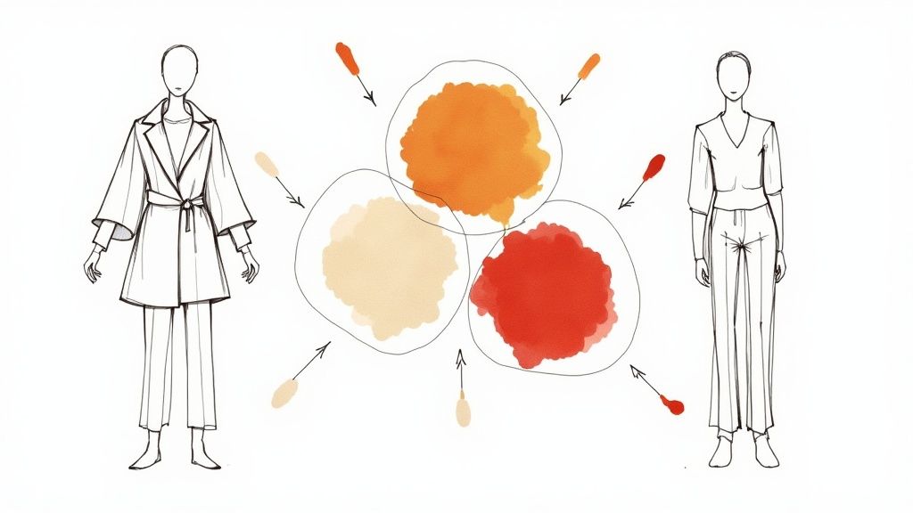
Picture walking through a forest on a crisp autumn day - golden sunlight filtering through branches, leaves in muted oranges and warm browns creating a peaceful atmosphere. This scene perfectly captures the essence of the soft autumn color palette. Finding your personal color palette is an essential step in developing a style that enhances your natural features and builds confidence. When you understand which colors complement your complexion, you can make thoughtful choices about clothing, makeup, and even home decor that bring out your best features.
Color analysis has come a long way from rigid seasonal categories to a more personalized approach that recognizes individual variations. The goal is to find colors that work in harmony with your natural coloring to enhance your overall appearance. The soft autumn palette offers a sophisticated yet approachable selection of colors that can transform your wardrobe and style. This guide will explore the seven key shades that define this palette, help you identify them, and provide practical ways to incorporate these colors into your daily life - whether you're passionate about fashion or simply want to look and feel your best.
1. Warm Terracotta
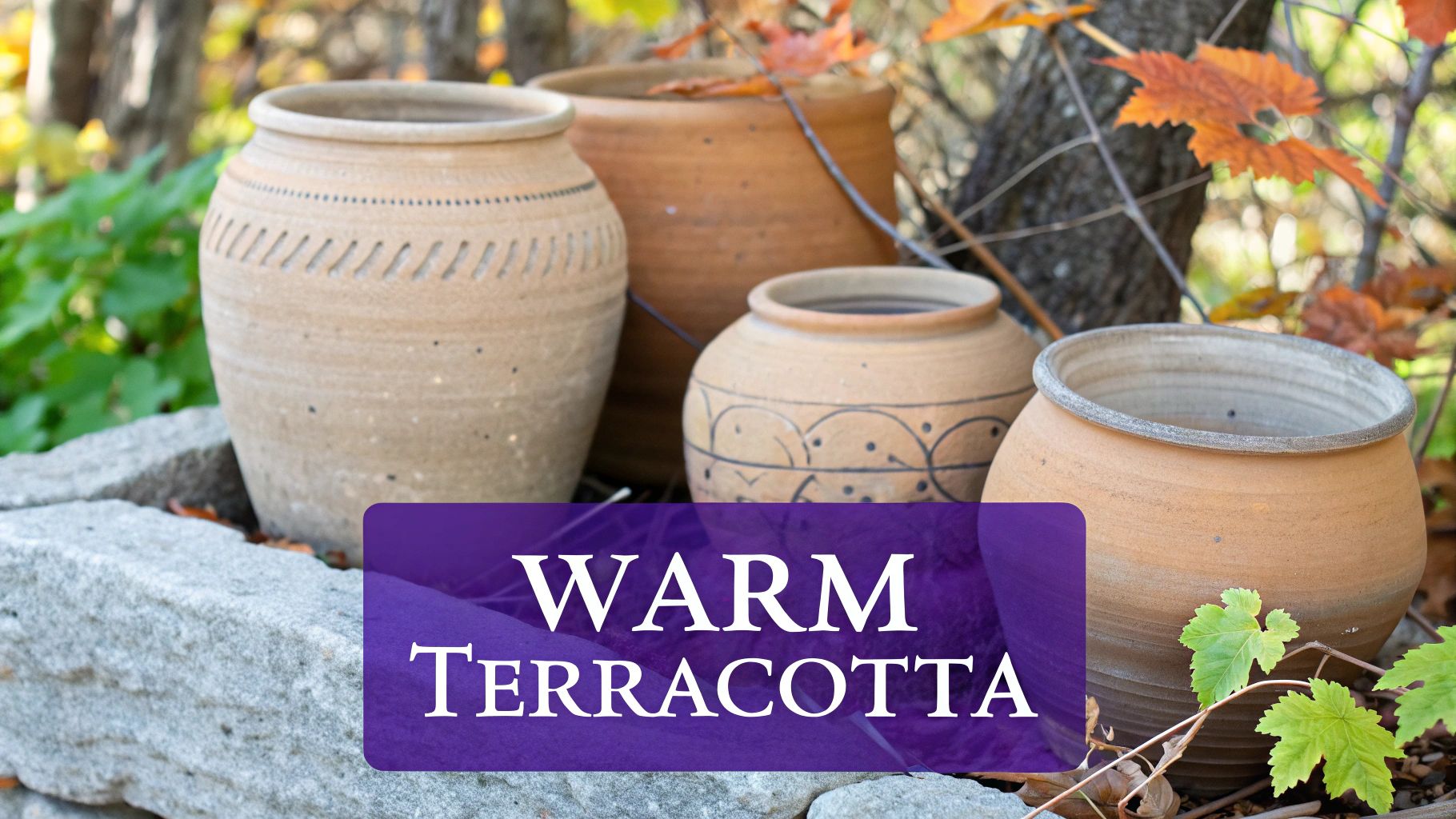
Warm terracotta is a muted, earthy reddish-brown that forms a key part of the soft autumn color palette. This rich hue captures the essence of fall, bringing to mind images of dried leaves, handmade pottery, and the natural world. Its balanced intensity makes it both cozy and polished, perfect for those who appreciate understated elegance.
What makes this shade special is its unique character: it has muted, earthy undertones that set it apart from brighter terracotta variations, and its medium intensity prevents it from overwhelming an outfit. You can see similar tones in classic Hermès orange boxes and traditional Tuscan buildings, showing how this color has stood the test of time.
The fashion world has embraced warm terracotta, moving it beyond home decor into clothing and accessories. This shift reflects a growing appreciation for colors that feel natural and timeless. You might be interested in: [The Rise of Earthy Tones in Fashion]. Fashion designers regularly feature warm terracotta in their fall and winter collections, from cozy sweaters to leather accessories.
Adding warm terracotta to your wardrobe offers several benefits. It's remarkably adaptable, working equally well in clothing and accessories. It brings out the best in warm skin tones and creates an inviting feel during cold weather. Plus, it pairs beautifully with other fall colors like cream, olive, and burgundy. However, be aware that it can look muddy if not styled carefully, and it may not suit those with cool undertones.
Here are practical ways to style warm terracotta:
- Match it with cream or camel tones for a refined, coordinated look
- Use it in accessories like scarves or bags to add warmth to any outfit
- Choose textured materials like knits and suede to enhance the color's natural qualities
For more guidance on finding your ideal color palette and using warm terracotta effectively, check out: Color Analysis: Your Perfect Palette Guide. This resource offers key insights into color theory and personal style, helping you make confident choices that enhance your look.
2. Camel
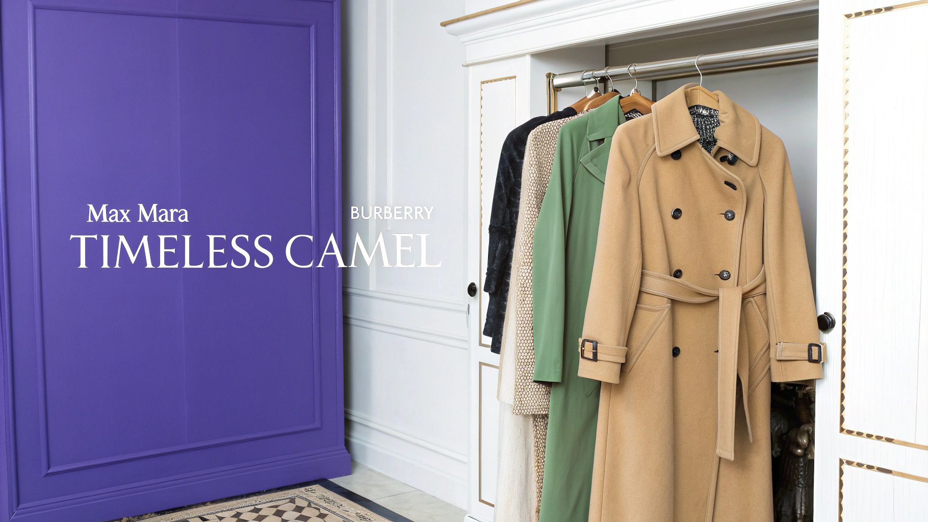
Camel is a key color in the soft autumn palette, offering warmth and understated style. This neutral beige-brown shade has a subtle yellow undertone that makes it incredibly adaptable. Its medium-light value provides an excellent foundation for building outfits with richer autumn colors.
The true beauty of camel lies in how easily it works across different styles. From casual weekend wear to polished office attire, this color adapts beautifully. Classic pieces like the Max Mara coat and Burberry trench demonstrate camel's enduring appeal. Even small touches of camel in accessories can bring refined elegance to any outfit.
Fashion history shows camel's lasting influence through designers like Coco Chanel, Max Mara, and Ralph Lauren. Their consistent use of this shade has cemented its place as a mark of refined taste and timeless style.
While camel offers many advantages, it does have some limitations. People with very fair skin may find it makes them look washed out. If this applies to you, try wearing camel pieces away from your face or pair them with more vibrant colors near your complexion. The light color can also highlight wear and stains more than darker shades, so proper care is essential.
Features: Warm neutral tone, Medium-light value, Subtle yellow undertone
Pros: Highly adaptable, Strong foundation color, Classic appeal, Professional look
Cons: Can be unflattering on fair skin, Shows wear easily
Tips for Implementation:
- Base Pieces: Start with camel staples like a coat, blazer, or pants
- Color Mixing: Pair with deeper autumn colors like burnt orange, forest green, or burgundy
- Quality Focus: Choose well-made camel pieces that will last for years
For more guidance, check out our Comprehensive Guide to Understanding Skin Undertone to see how camel works with your complexion. Understanding your skin tone helps determine which camel shades suit you best. Whether you're building a professional wardrobe or updating your casual style, camel offers endless possibilities for creating polished, timeless looks.
3. Olive Green
The appeal of olive green lies in its understated natural charm - a color that captures fall's essence through its subtle yellow-green tints and earthy undertones. This mid-depth shade bridges the gap between summer's brightness and winter's cool tones, making it a key player in soft autumn color palettes.
The story of olive green is fascinating. What started as a purely practical color for military uniforms has evolved into a sought-after shade in fashion and design. From battlefield to runway, olive green has found its place in mainstream style. Its natural associations resonate strongly with modern preferences for eco-friendly and sustainable design, especially in home décor where olive green walls and furniture create calming spaces.
Features and Benefits:
- Yellow-green foundation: Creates a softer, more adaptable tone compared to bright greens
- Natural undertones: Adds an organic quality that works with many color combinations
- Balanced depth: Provides stability without being overly dark or light
- Earth-inspired character: Brings outdoor elements into fashion and interiors
Pros:
- Fresh take on neutrals: Offers an alternative to standard beige and gray
- Creates calm spaces: The natural qualities help create peaceful environments
- Day-to-night versatility: Works equally well in casual and formal settings
- Flattering on many skin tones: Complements both warm and cool complexions
Cons:
- Light sensitivity: May appear flat under certain lighting conditions
- Color matching care needed: Requires thoughtful pairing to maintain its appeal
Real World Applications:
- Military-inspired fashion: Structured jackets and cargo details showcase its practical roots
- Natural home design: Creates serene spaces through walls and furnishings
- Country style clothing: Perfect for waxed jackets and traditional tweeds
Usage Tips:
- Mix with warm browns and gold: Creates balanced, rich color combinations
- Choose natural fabrics: Cotton, wool, and linen enhance its organic qualities
- Perfect for outer layers: Makes excellent coats, jackets, and blazers
These insights will help you confidently use olive green in your wardrobe and home, creating grounded and polished looks that stand the test of time.
4. Warm Burgundy
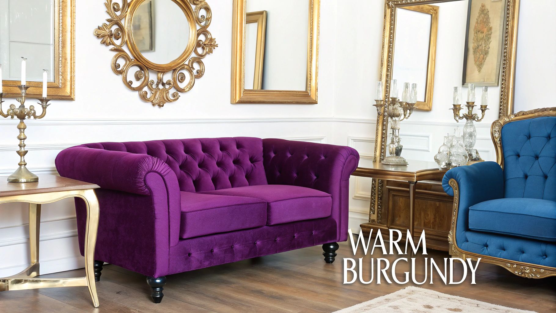
Within the soft autumn color family, warm burgundy stands out for its rich wine-red hue and brown undertones. This color brings depth while maintaining the muted, cozy qualities that define autumn palettes. The brown notes in this deep red create a grounding effect that enhances other soft colors in the collection.
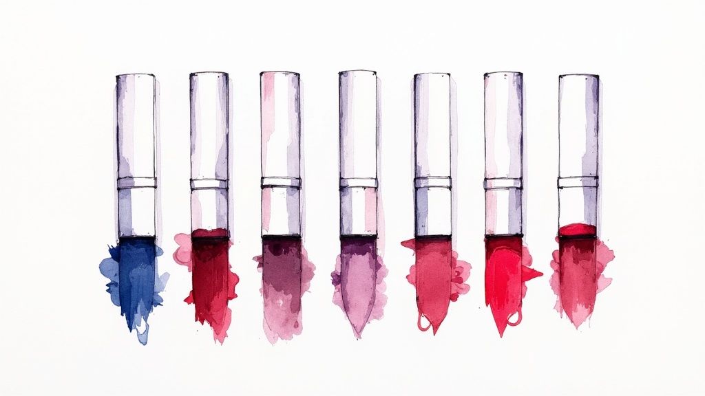
Warm burgundy has gained prominence as people embrace deeper, more nuanced colors in both clothing and home design. Unlike bright reds that can appear harsh, warm burgundy offers a more subdued and polished option. This shift mirrors the move from vivid cherry-red lipsticks to deeper wine shades - showing how color preferences have evolved toward more subtle choices.
Key Characteristics:
- Deep red with brown undertones
- Muted warmth
- Rich depth
- Refined character
Key Advantages:
- Adds visual interest and depth to autumn color combinations
- Complements warm skin tones naturally
- Creates subtle but impactful accent moments
- Works well across seasons and occasions
Main Benefits:
- Enriches autumn color palettes
- Enhances warm complexions
- Creates striking accents
- Versatile for year-round use
Potential Drawbacks:
- Can dominate softer colors if overused
- May feel too rich for those who prefer lighter tones
Real Applications:
- Fashion: A classic warm burgundy trench coat paired with cream pants and a light brown sweater showcases how this color grounds lighter neutrals while adding polish. High-end burgundy leather bags and silk scarves demonstrate its luxurious appeal.
- Beauty: Burgundy lip colors have become classics, offering flattering options for many skin tones. From sheer berry stains to rich wine shades, these colors create timeless elegance.
- Home Decor: A burgundy velvet armchair can transform a living space, creating an anchor point against neutral walls and warm wood floors. The color adds richness without overwhelming.
Usage Guidelines:
- Strategic Placement: Use warm burgundy thoughtfully as an accent rather than the main color.
- Balance with Neutrals: Pair with cream, beige, soft brown or light grey to create pleasing contrasts.
- Start Small: Begin with burgundy accessories like scarves, bags, or throw pillows to test the color's impact.
These practical tips will help you confidently incorporate warm burgundy into your personal style and surroundings while maintaining visual harmony.
5. Warm Gold
Warm gold stands out in the soft autumn palette as a gentle metallic shade that brings light and warmth while maintaining a balanced look. This muted golden hue mixes the beauty of yellow-gold with subtle metallic qualities to create an understated yet graceful accent.
The beauty of warm gold comes from its perfect middle ground - not too bright to overwhelm, not too muted to fade away. Like sunlight filtering through autumn leaves, it provides a gentle radiance rather than a harsh glare.
Recent years have seen warm gold making a comeback, especially in vintage and bohemian styles. This resurgence reflects growing interest in artisanal items and cozy, inviting spaces. From antique gold jewelry to brass home accents and gold embroidery details in fashion, brands like Chloe and Isabel showcase how this timeless shade continues to inspire.
Pros:
- Adds Warmth and Light: Brightens deeper fall colors like burgundy, forest green, and burnt orange
- Creates Subtle Luxury: Adds elegance without being flashy
- Versatile Accent Color: Works well in jewelry, accessories, makeup and decor
- Flattering on Warm Skin Tones: Natural complement to warm complexions
Cons:
- Can Appear Dated if Not Used Carefully: May look old-fashioned if overdone
- May Compete with Other Statement Pieces: Can clash with bold accessories
Examples:
- Vintage Jewelry: Antique lockets, etched rings, ornate earrings
- Luxury Fashion Details: Gold stitching, subtle buttons, metallic thread accents
- Home Decor Accents: Brass candlesticks, picture frames, lamp bases
Tips for Implementation:
- Use in Accessories and Jewelry: Simple gold pieces can enhance basic outfits
- Combine with Deeper Autumn Tones: Mix with rich jewel tones and earth colors
- Keep Metallic Elements Subtle: Focus on a few key pieces rather than overdoing it
By applying these guidelines thoughtfully, warm gold can add refined touches of radiance to your autumn style and decor while maintaining an elegant, balanced look.
6. Soft Navy
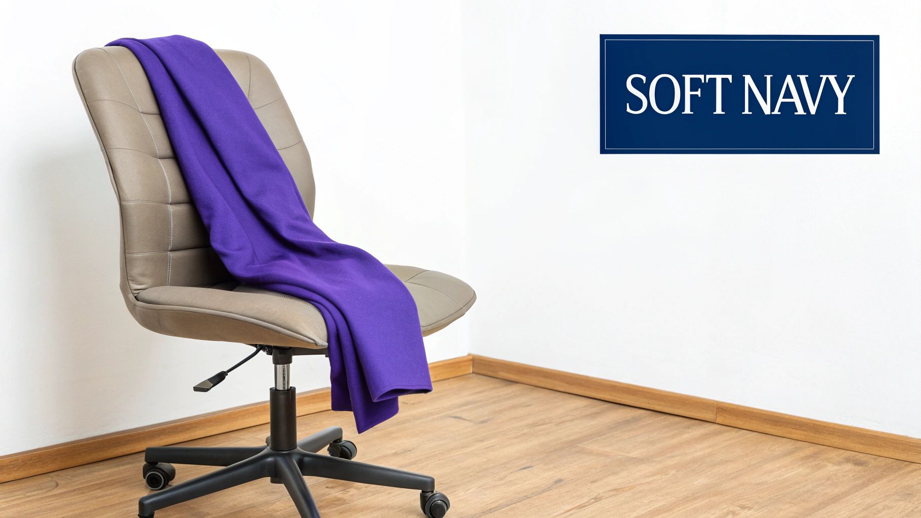
Soft navy brings a gentle yet polished touch to the soft autumn color palette. This muted variation of classic navy blue carries subtle warm undertones that make it an excellent choice for those who find traditional navy or black too harsh.
As more people discover the benefits of personalized color analysis, soft navy has emerged as a welcome alternative to stark blacks and deep blues. This thoughtful color choice creates harmony with natural features rather than competing with them. For more insights on how colors interact with personal features, see Eye and Hair Color Importance in Personal Color Analysis.
The muted quality of soft navy allows it to blend beautifully with other autumn shades. Picture a soft navy blazer paired with burnt orange or olive green - the result is refined yet approachable, perfect for both work and casual settings.
Pros:
- Natural black alternative: Offers a gentler option that flatters soft color palettes
- Business-ready: Adapts well to professional and casual environments
- Creates subtle depth: Adds dimension without harsh contrasts
- Season-spanning: Works equally well year-round
Cons:
- Color matching challenges: Finding the exact soft navy shade can take effort
- Style limitations: May feel too understated for those seeking bold looks
Examples:
- Professional pieces: A soft navy blazer with cream trousers and rust blouse
- Business attire: Soft navy suits as a fresh take on traditional dark suits
- Key accessories: Scarves, bags and watch straps in soft navy add polish
Tips for Implementation:
- Use as your base: Build outfits around soft navy as a grounding neutral
- Mix with autumn colors: Combine with rust, olive, burnt orange or mustard
- Office-ready: Choose soft navy suits and separates for a polished work look
By focusing on these practical applications, you can make soft navy a valuable addition to your wardrobe while maintaining the sophisticated, harmonious look of the soft autumn palette.
Warm taupe is a balanced neutral that blends gray and brown, making it a key color in the soft autumn palette. This shade adds a natural depth that pure grays or browns often lack, making it highly adaptable for both fashion and interior design.
As a neutral, warm taupe pairs beautifully with the richer shades in the soft autumn family. It acts as a subtle foundation that lets statement colors - like burnt orange, deep teal, or mustard yellow - stand out. This makes it easy to create coordinated looks with minimal effort.
The name "taupe" has debated origins, from the French word for mole to descriptions of natural wool. The color gained popularity in design for its ability to convey understated elegance. You'll find it in premium fashion collections, minimalist interiors, and upscale accessories, offering a softer alternative to stark black or white while maintaining sophistication.
Features:
- Warm gray-brown blend
- Subtle depth
- Neutral character
- Sophisticated undertone
Pros:
- Extremely versatile neutral
- Easy to coordinate
- Professional and sophisticated
- Works in any season
Cons:
- Can appear bland if not styled well – consider adding texture and richer accent colors
- May need accents for interest – use it as a backdrop to let brighter colors pop
Examples & Case Studies:
- Fashion: A warm taupe cashmere sweater paired with dark denim and rust boots creates a grounded yet refined look. For men, a taupe blazer over a white shirt offers easy sophistication.
- Interior Design: Warm taupe walls provide a calming backdrop that works with seasonal accent colors in furniture and decor.
- Professional Accessories: A taupe leather briefcase or handbag adds polish to work attire with understated confidence.
Tips for Implementation:
- Use as a foundation color: Build outfits and rooms around warm taupe, adding layers of color and texture.
- Mix with autumn tones: Combine with burnt sienna, olive green, or deep teal for a balanced palette.
- Perfect for work basics: Invest in warm taupe staples like trousers, blouses, or jackets for a professional wardrobe.
Understanding warm taupe's strengths and potential limitations allows you to use this versatile neutral effectively in any season.
7-Color Soft Autumn Palette Comparison
| Method | Difficulty | Time Required | Results | Best For | Key Benefit |
|---|---|---|---|---|---|
| Warm Terracotta | Moderate 🔄 | Moderate ⚡ | Cozy and natural 📊 | Autumn accents ⭐ | Versatile warmth |
| Camel | Easy 🔄 | Quick ⚡ | Classic and refined 📊 | Wardrobe foundation ⭐ | Timeless versatility |
| Olive Green | Moderate 🔄 | Moderate ⚡ | Natural and organic 📊 | Casual & formal wear ⭐ | Neutral alternative |
| Warm Burgundy | Moderately high 🔄 | Intermediate ⚡ | Rich, dramatic impact 📊 | Statement accents ⭐ | Depth and sophistication |
| Warm Gold | Moderate 🔄 | Moderate ⚡ | Subtle luxury 📊 | Accessories accent ⭐ | Adds luminosity |
| Soft Navy | Easy to moderate 🔄 | Moderate ⚡ | Professional depth 📊 | Business wear ⭐ | Versatile alternative to black |
| Warm Taupe | Easy 🔄 | Quick ⚡ | Sophisticated neutral 📊 | Professional bases ⭐ | Easy coordination |
Styling with the Soft Autumn Palette
The soft autumn palette features cozy, muted earth tones that work beautifully together. From the rich warmth of Terracotta and Camel to natural Olive Green and Warm Taupe, plus Warm Burgundy and Soft Navy accents, these colors create an inviting and cohesive look. Understanding how to combine these shades lets you make the most of this versatile palette.
Think of Camel and Warm Taupe as your foundation colors for building outfits and spaces. Add depth with richer Warm Burgundy or Olive Green. Use Warm Gold sparingly as an elegant accent. Soft Navy provides structure and works well for outerwear or tailored pieces. Warm Terracotta brings in that perfect touch of earthy warmth.
Try different color combinations to find what speaks to you. Consider pairing a Camel sweater with Olive Green pants and a Warm Burgundy scarf. Or style a Soft Navy blazer over a Warm Taupe dress with Warm Gold jewelry. The options are endless.
As you work with the soft autumn palette, focus on what enhances your natural coloring rather than following strict rules. Natural earth tones are having a major moment in fashion, making this palette both classic and current. Color analysis continues to evolve, giving you more tools to develop a style that truly suits you.
Key Takeaways:
- The soft autumn palette offers warm, earthy, and sophisticated colors that work together
- Use Camel and Warm Taupe as your base colors
- Add Warm Burgundy and Olive Green for depth and visual interest
- Mix and match to discover your favorite combinations
Want to find out if the Soft Autumn palette is your best match? Get a personalized color analysis with AI Color Analysis. Our service analyzes your unique features to create a custom color palette just for you. You'll receive a detailed PDF report with your ideal colors plus recommendations for clothing, makeup and more - all from home. Discover your most flattering colors and refresh your style with confidence. Get your personalized color analysis now!