The Psychology Behind Winning Color Palettes

Colors shape how we feel and think, creating deep emotional connections and influencing our decisions. When choosing colors for your brand, website, or artwork, understanding this psychological impact is key. For instance, blue creates feelings of reliability and peace, making it effective for business settings. Red stirs up energy and passion, which is why it features prominently in marketing. These effects show how colors subtly guide our emotional responses.
The meaning of colors varies significantly across cultures. Take white as an example - Western societies see it as representing purity, while some Eastern cultures associate it with mourning and loss. These differences highlight why it's essential to consider your audience when selecting colors. Understanding their cultural background helps ensure your color choices send the right message.
Historical Trends and Societal Influences
Looking at color trends through history offers valuable insights for modern palette selection. The 1950s embraced soft pastels - gentle pinks, blues, and greens that reflected post-war optimism and domestic comfort. By contrast, the 1980s burst with intense hues like bright cyan, red, and yellow, mirroring the decade's bold fashion and tech advancement. Learn more about color's evolution in design here.
By studying these historical patterns, we can better understand what makes certain colors resonate at different times. This knowledge helps create color combinations that connect meaningfully with specific audiences while avoiding dated or inappropriate choices.
Applying Color Psychology to Your Projects
Creating effective color palettes requires a clear plan. Start by identifying the mood and message you want to convey. Research how different colors affect people and choose ones that match your goals. For a health food brand's website, greens and browns might work best to suggest nature and wellness. A tech startup might prefer blues and purples to communicate forward-thinking ideas.
Always test your color choices with your target audience. Get their feedback and adjust based on their responses. This testing process helps ensure your colors achieve their intended effect. By combining scientific understanding with practical feedback, you can develop color schemes that truly speak to your audience and effectively deliver your message.
Mastering Color Analysis in Visual Media
Professional creators across graphic design, film, and data visualization use color analysis techniques to connect with their audiences. By carefully selecting color combinations, they can guide viewer emotions and perceptions in powerful ways.
Deconstructing Successful Color Schemes
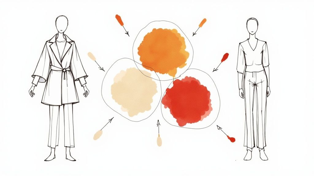
Looking at successful color schemes provides excellent insights for developing your own palette. Nature documentaries often use calming blues and greens to create a tranquil atmosphere that matches their subject matter. Action movies, on the other hand, frequently incorporate energetic reds and oranges to heighten excitement and drama.
These choices aren't random - they come from understanding how colors shape the viewer's experience. By studying these patterns, you can identify effective color relationships to use in your work. Learn more about finding your perfect palette in this color analysis guide.
The Science of Color in Film and Data
Color research extends beyond design into film and data visualization. For example, researcher Gillian Maurer at the University of Missouri is conducting a fascinating study analyzing color palettes in award-winning films. Her project examines RGB values across 50 movies - approximately 13.4 trillion pixels total. The goal is to determine whether people prefer artistically chosen or mathematically generated color schemes. Read more about this research in this University of Missouri article.
Practical Techniques for Color Analysis
Here are key methods you can use to analyze color in visual media:
- Isolate Key Colors: Find the main colors used in an image or design. Notice whether they are warm or cool tones and how they work together
- Consider Context: Think about the content's purpose - is it meant to calm, excite or inform? How do the colors support that goal?
- Analyze Contrast: Look at how color contrasts create emphasis or harmony in the piece
- Explore Color Harmony: Test classic color harmony principles like complementary, analogous and triadic combinations
By practicing these techniques, you'll better understand what makes color palettes successful and be able to create more effective color strategies in your own work. This analytical approach will give you more confidence in selecting colors that achieve your visual goals.
Creating Data-Driven Color Strategies

Smart color selection is becoming increasingly data-driven. By studying how colors perform in real-world scenarios, we can build color palettes that deliver better results. Major companies now carefully track and analyze their color choices to boost brand recognition and improve user engagement.
Let's look at how different color combinations work best for various design purposes:
| Application Type | Recommended Colors | Key Considerations |
|---|---|---|
| Data Visualization | 5-7 colors | Clarity, differentiation, cognitive load |
| Brand Identity | 3-4 primary colors | Recognition, consistency, versatility |
| Website Design | 2-3 core colors + accents | Accessibility, usability, contrast |
| Print Materials | 2-4 colors | Print reproduction, cost, legibility |
Leveraging Performance Data for Color Optimization
Companies are getting smarter about testing color performance. A/B testing different color schemes helps identify which combinations drive better results like higher click-through and conversion rates. Eye-tracking studies provide insights into how viewers interact with colors, helping create more engaging designs.
This approach moves color selection beyond pure aesthetics into a strategic choice backed by real data. When color decisions align with business goals and user needs, the results speak for themselves through improved metrics and better user engagement.
Building Palettes for Comprehension and Appeal
Color plays a vital role in making complex information easier to grasp. The right palette highlights key data points while avoiding visual overload. For data visualization specifically, experts recommend using 5-7 distinct colors to balance clarity with cognitive load. Popular tools like Excel and Google Sheets follow this principle with their default chart colors.
Good color palettes must serve both form and function. While visual appeal matters, the main goal is helping viewers understand the information quickly and clearly. This requires careful attention to how different audiences perceive and process color combinations.
Creating Balanced Color Schemes Across Platforms
A strong color system maintains consistency across all touchpoints - from websites to print materials to social media. This requires a flexible palette with primary colors, secondary colors, and accent shades that work together while adapting to different mediums.
Accessibility should be a top priority when designing color schemes. Since color blindness affects many users, palettes need to work for everyone. Testing tools can identify potential issues early in the design process. The result is color schemes that look great and work well for all users, reinforcing brand identity across every platform.
Designing Inclusive Color Experiences
Creating effective color palettes requires considering accessibility and usability for all users. Good design ensures colors work well together while remaining accessible to people with different visual abilities.
Understanding Color Vision Deficiency
Color vision deficiency (CVD) affects a significant portion of the population. When designing with color, we must account for these vision differences to avoid creating barriers. For example, using red and green coding alone can be problematic since red-green CVD is the most common type.
Techniques for Inclusive Color Palettes
Building inclusive color palettes involves multiple strategies. First, pay attention to contrast - ensuring sufficient difference between foreground and background colors improves readability for everyone, including those with low vision or using different screen settings.
Consider using patterns and textures alongside color to convey information. Adding visual elements like stripes or dots helps distinguish between data points even when color perception is limited.
Include a wider range of hues in your palette to maintain clear contrast between colors, even if some hues appear similar to users with CVD.
Testing and Validation
Testing color choices for accessibility is essential. Online tools help preview how designs appear to people with different types of CVD, allowing adjustments before finalizing. For scientific figures and data visualization, accessibility is particularly important since 1 in 12 men and 1 in 200 women have some form of color vision deficiency. Using complementary colors like blue and orange improves clarity while maintaining visual appeal. Adjusting hue, saturation, and lightness creates effective palettes that highlight key information clearly. Learn more about scientific color palettes here.
Tools and Workflows for Accessibility
Many resources can help create accessible color schemes. Read our guide on understanding skin undertone for insights on personalized color selection. Many design tools include accessibility checkers, while specialized online tools analyze color contrast. For more details, see How to Master Understanding Skin Undertone. By making accessibility central to color selection, you can create designs that work well for everyone and build truly inclusive experiences.
Essential Tools for Perfect Color Selection

Choosing the right colors for your designs doesn't have to be overwhelming. Today, several practical tools make color selection straightforward and precise. Let's explore the main tools available to help you build beautiful, cohesive color palettes.
Color Palette Generators
Color palette generators make it easy to build color schemes from a single starting color or image. These tools produce color combinations based on classic principles like complementary, analogous, and triadic relationships. You can adjust and fine-tune the generated palettes to match your vision perfectly. Both new designers and experienced pros rely on these tools for quick inspiration and solid starting points.
Color Wheel Websites and Apps
The color wheel remains essential for understanding how colors work together. Modern digital color wheels take this classic tool into the interactive age. You can explore color relationships hands-on while learning important concepts like hue, saturation, and value. Many tools let you save your favorite palettes and share them with others.
Image Color Pickers
When you find inspiration in a photo or artwork, image color pickers (or color extractors) help you capture those exact colors. Simply upload your inspiration image, and these tools identify the key colors present. This makes it simple to translate real-world color inspiration into usable design palettes.
Advanced Design Software
Professional tools like Adobe Photoshop, Illustrator, and InDesign offer detailed color controls for expert users. These programs include features like color libraries, swatches, and gradient tools that help you build and manage complex color schemes. While these tools require more learning time, they provide the precision needed for professional work.
Choosing the Right Tool for Your Needs
Pick your color tools based on your skill level and project requirements:
- For beginners: Start with color palette generators and color wheel websites
- For inspiration: Use image color pickers to capture colors from photos
- For professionals: Invest in advanced design software for maximum control
Below is a comparison of popular color selection tools and their key features:
| Tool Type | Best For | Features | Price |
|---|---|---|---|
| Palette Generators | Quick inspiration | Auto-generation, harmony options | Free - $10/mo |
| Color Wheels | Learning color theory | Interactive tools, educational resources | Usually free |
| Image Color Pickers | Finding colors in images | Color extraction, palette creation | Free - $5/mo |
| Design Software | Professional work | Complete color management | $20-50/mo |
The key to mastering color selection is experimenting with different tools until you find what works best for you. Learn more about color in our guide to the importance of eye and hair color in personal color analysis. With practice and the right tools, you'll develop an eye for creating stunning color combinations.
Bringing Your Color Vision to Life

Selecting colors is just the first step. The real challenge lies in applying your chosen palette effectively across different mediums while maintaining visual consistency. Success requires careful planning, clear documentation, and openness to refining your approach based on real-world results.
From Concept to Consistent Application
Think of your color palette like building blocks - you need a solid foundation that supports every element working together smoothly. Your colors should seamlessly connect across all platforms, from websites to marketing materials to physical spaces, creating a unified brand identity that people instantly recognize.
Consider how companies effectively use color combinations - like using deep blue for headlines and calls-to-action, light blue for backgrounds, and bright orange for emphasis. When applied consistently, these color choices help strengthen brand recognition.
Documenting and Sharing Your Color Scheme
To maintain consistency, especially when working with teams, clear documentation is essential. Create a style guide that specifies exact color codes in HEX, RGB, and CMYK formats. This acts as a reference guide ensuring everyone uses the correct colors across projects.
Digital color management tools make it easy to store and share palettes with collaborators. Many tools can also generate accessible versions of your colors to support users with color vision differences.
Managing Feedback and Iterative Refinement
Even well-planned color schemes often need adjustment after implementation. Getting input from stakeholders and target audiences through A/B testing and surveys helps validate color choices.
Remember that while feedback is important, it's subjective. Balance individual opinions with your overall design goals and brand identity. Sometimes you'll need to weigh different perspectives against established design principles.
Real-World Case Studies and Problem-Solving
Designers often face practical challenges implementing color palettes. For example, colors that look perfect on desktop screens may appear washed out on mobile devices. Print materials may not match digital versions due to differences in color reproduction.
Learning from these real examples helps you prepare for common issues. Solutions include thorough testing across devices and working closely with print vendors to ensure color accuracy.
Ready to find your perfect color palette? Discover Your Colors Now!