Dive into the Perfect Summer Hues
When we think of summer, vibrant scenes fill our minds - golden beaches, leafy palms, and spectacular sunsets. These natural wonders offer incredible inspiration for bringing summer energy into our personal style and creative projects. The right mix of colors can completely change how something looks and feels, from soft beachy pastels to rich tropical tones. But what makes certain color combinations work so well together?
The science and art of color has a fascinating history, from Isaac Newton's groundbreaking experiments to Johann Wolfgang von Goethe's artistic studies of how colors interact and affect our emotions. Our responses to different hues have shifted over time, shaped by cultural changes, fashion, and advances in technology. While trendy summer colors may come and go, successful summer palettes tap into fundamental color psychology - using shades that make us feel energized, joyful, and relaxed.
In this guide, we'll explore 10 inspiring summer color combinations that can enhance your personal style and fuel your creativity. These palettes offer fresh ideas whether you're updating your wardrobe, planning your next makeup look, developing your signature style, or seeking ways to visually express yourself. Let's discover how these vibrant summer hues can bring new life to your creative vision and personal aesthetic. The transformative power of thoughtfully chosen colors awaits.
1. Tropical Paradise
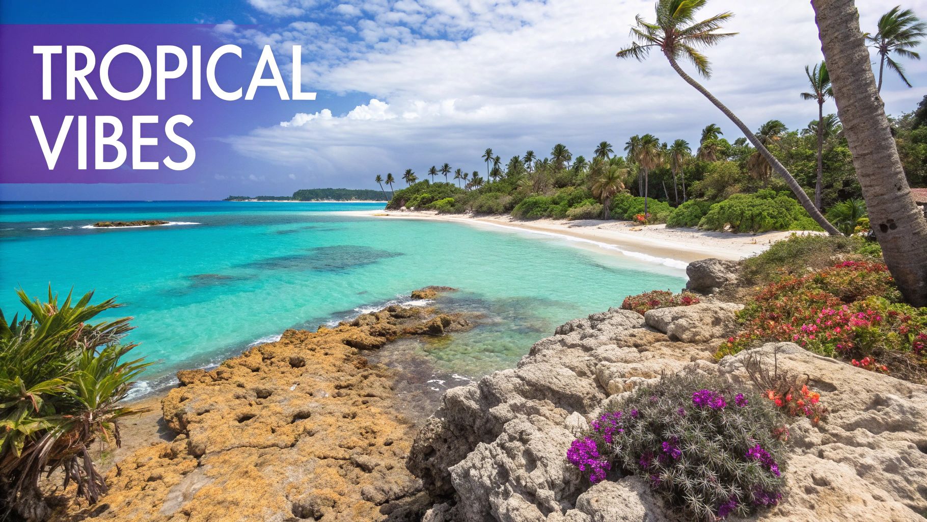
A vibrant mix of colors that brings to mind relaxing beach vacations and sunny getaways. This energetic palette combines bright turquoise (#00C3D9), coral pink (#FF6B6B), sunny yellow (#FFD93D), and fresh lime green (#95E06C) - colors found in tropical flowers and crystal-clear ocean waters.
The palette has gained attention through its use by beach resorts, travel companies, and summer fashion brands. You'll spot these colors in Tommy Bahama's island-inspired designs and Hawaiian Airlines' cheerful branding. Resort websites often use this combination to give visitors a taste of paradise before they arrive.
Key Benefits:
- Creates an upbeat, positive atmosphere perfect for summer themes
- Works well across digital and print designs, from websites to brochures
- Takes inspiration from nature's most beautiful tropical elements
Advantages:
- Brings energy and life to designs
- Ideal for summer-focused marketing
- Flexible for various applications
Challenges:
- Can feel too bold for minimal designs
- Needs careful balancing to avoid visual overload
Usage Tips:
- Add white space: Include plenty of neutral areas to let the vibrant colors breathe and prevent them from overwhelming the design
- Mix with neutrals: Pair these bright shades with sand tones or white for sophisticated contrast
- Use as highlights: Try these colors as accent pieces against neutral backgrounds - like a coral detail on a light-colored shirt
Whether you're designing a brand identity or putting together a summer outfit, Tropical Paradise offers ready-to-use color combinations that work. For more insights, check out Color Analysis: The Perfect Palette Guide to better understand color palettes and their effects. These colors work together to create visually appealing designs that connect with viewers emotionally.
"The Coastal Breeze" section:
2. Coastal Breeze

This fresh color palette captures the peaceful feeling of a day at the beach. It blends soft blue (#A5D8DD), sandy beige (#E8D2A0), and pale yellow (#F8F4D7) with crisp white (#FFFFFF) accents to create an airy, light atmosphere that brings a sense of calm to any space.
The rise of this palette reflects our increasing desire for natural, soothing elements in design. You'll find it featured prominently in beach house interiors, luxury spas, and high-end resorts. The classic Hamptons style perfectly demonstrates this look - bright spaces with white walls, natural wood elements, and gentle touches of blue and beige throughout.
While this palette excels at creating peaceful environments perfect for spas and wellness spaces, it does have some limitations. The subtle nature of these colors may not provide enough visual impact for projects that need bold statements.
Tips for Implementation:
- Add Depth: Include darker blue accents like navy throw pillows or a deep teal feature wall to prevent the palette from feeling too light
- Play with Texture: Mix in natural materials like wood, linen, and rattan to add visual interest and dimension
- Use Color Blocking: Apply these shades in large sections - try a pale yellow wall as a backdrop for white furniture with blue accents
Fashion Applications: The Coastal Breeze palette works beautifully in clothing. Consider linen shirts in pale yellow, white pants, and soft blue accessories. This combination offers a polished yet relaxed summer look that works well for both casual and business settings.
Beauty Applications: These colors inspire makeup looks centered on glowing skin, subtle blue eye makeup, and neutral lips - perfect for enhancing natural features without overwhelming them.
By following these practical tips and understanding how to best use the Coastal Breeze palette, you can create beautiful, calming spaces and looks that feel both sophisticated and serene.
3. Summer Garden
The "Summer Garden" palette brings together the charming hues of a flourishing garden - rose pink (#FF9EAA), lavender (#A5B3FF), sage green (#9DC183), and warm yellow (#FFE17B). The colors work in harmony to create a fresh and naturally beautiful scheme that's both elegant and feminine.
The magic of this palette lies in its thoughtful color combinations. Rose and lavender create a delicate romantic feeling, while sage green provides an earthy foundation. The warm yellow adds cheerful brightness that ties everything together. These colors reflect the natural beauty of a garden in full bloom.
Garden-inspired design has seen growing popularity in recent years, driven by brands embracing natural elements and botanical themes. You'll find these colors used beautifully in wedding stationery with soft watercolor florals, garden lifestyle products, and beauty packaging that aims to convey natural freshness.
Pros:
- Creates a peaceful, nature-inspired feeling
- Perfect for romantic and feminine design concepts
- Works well across multiple seasons from spring through early fall
Cons:
- May not suit brands seeking gender-neutral or masculine aesthetics
- Floral associations could limit use in some contexts
Tips for Implementation:
- Balance with Neutrals: Add earth tones or neutral greens to broaden appeal
- Watercolor Effects: Use watercolor techniques to showcase the soft color blends
- Floral Patterns: Incorporate subtle floral motifs to enhance the garden theme
The versatility of this palette shines in real-world applications. Picture a summer dress in rose pink paired with sage accessories, or home decor featuring these colors in cushions and wall art. Even menswear can incorporate these hues through subtle floral-print ties or pocket squares.
For more insights, check out our Comprehensive Guide Understanding Skin Undertone to see how these colors might complement your complexion.
This palette offers busy professionals an easy way to add natural elegance to their wardrobe. The soft yet impactful colors help build confidence while expressing personal style. Men can incorporate touches through sage shirts or subtle floral accessories, while makeup enthusiasts can explore romantic looks with rose and lavender tones. The Summer Garden palette proves that natural beauty and sophisticated style can beautifully coexist.
4. Citrus Splash
Bring summer energy to your style with the Citrus Splash color palette. This eye-catching mix of bright citrus tones creates a lively look that works beautifully across fashion, branding and beyond. The palette features coral (#FF7F50), lemon (#FFF176), lime (#CDDC39), and grapefruit pink (#FF5252) - creating an energetic contrast that feels fresh and alive.
The magic of this palette lies in its immediate visual impact. These fruit-inspired hues create an appetizing, refreshing feel that's especially effective for food and drink brands, summer events, and fresh product packaging. Just think of your favorite smoothie shop's branding or an artisanal lemonade label - they tap into these exact colors to create that perfect summer vibe.
Why it stands out: The Citrus Splash palette adds instant energy and personality to any summer design. It works equally well as a bold statement or subtle accent, capturing the essence of the season. The colors are flexible enough for both playful and polished applications, making them widely appealing.
Real-world Applications: Picture a lemon-hued linen shirt paired with crisp white chinos for an easy summer outfit. Or add a grapefruit pink tie to a navy suit for an unexpected pop of color. For makeup, try pairing coral lips with lime green eyeliner for a bold, on-trend look.
Tips for Using These Colors:
- Balance with white: Add plenty of white or neutral space between the bright citrus tones to create a clean, modern effect
- Add fruit elements: Include fruit patterns or motifs in clothing, accessories or brand materials to enhance the theme
- Use neutral backgrounds: Pair the vibrant citrus colors with white, beige or light gray backgrounds to keep them from overwhelming
Benefits:
- Grabs attention instantly
- Perfect for food/drink brands and summer events
- Creates an energetic, fresh feeling
Challenges:
- Can feel too bold if overused
- May not suit formal settings
By thoughtfully incorporating the Citrus Splash palette, you can create visually striking summer looks for any occasion. Whether you're styling an outfit or designing brand materials, these vibrant hues offer a fresh take on warm-weather colors that will make your work stand out.
5. Mediterranean Dream

Drawing inspiration from coastal Mediterranean towns, this color palette combines deep blue (#1A237E), terracotta (#E64A19), white (#FFFFFF), and golden yellow (#FFD700). The colors work together to create a balanced mix of warm and cool tones that captures the essence of this scenic region.
The appeal of this palette comes from its connection to Mediterranean culture and lifestyle. From the iconic blue and white buildings of Santorini to warm terracotta roofs against bright blue skies, these colors tell a story of relaxation, natural beauty, and rich heritage. The popularity of these colors grew alongside tourism in the Mediterranean, as visitors fell in love with the region's distinct visual character.
Key Features:
- Cultural Color Story: These colors work together to showcase history and natural beauty
- Temperature Balance: Deep blue provides cooling effects while terracotta and gold add warmth, with white creating clean contrast
- Long-lasting Appeal: A classic combination that maintains its relevance across different seasons and years
Advantages:
- Enduring Style: These colors maintain their appeal over time
- High-end Feel: Perfect for creating sophisticated, premium branding
- Cultural Impact: Connects to Mediterranean heritage and lifestyle
Challenges:
- Color Balance: Finding the right proportions between colors requires careful consideration
- Style Perception: May feel too classic for projects needing a very modern look
Tips for Using This Palette:
- Lead with Blue: Use it as your main color for backgrounds and large areas
- Balance with White: Add white elements to brighten and lighten the overall feel
- Add Pattern Elements: Include Mediterranean-inspired patterns like Greek keys or mosaics
- Fashion Applications: Try a blue linen suit with white shirt and terracotta accessories
- Makeup Ideas: Combine blue eyeliner with terracotta lip colors
Real-World Uses:
- Restaurant Design: Greek and Mediterranean restaurants use these colors for authenticity
- Travel Marketing: Cruise lines incorporate the palette in their branding
- Property Showcase: Luxury Mediterranean properties highlight these colors
By applying these colors thoughtfully, you can create designs that capture the warmth and beauty of Mediterranean style while maintaining visual harmony and professional polish.
6. Summer Sunset
The "Summer Sunset" palette combines stunning colors that reflect the magical moment when day transitions to night. The blend features warm coral (#FF7E5F), soft peach (#FEB47B), dreamy lavender (#D4A5FF), and deep purple (#4A0063). This gorgeous mix creates eye-catching gradients and smooth color flows that work beautifully in digital design.
These colors have gained major traction on social media platforms and digital art. From event posters and social media backgrounds to wedding photos with an ethereal glow, creative professionals are using this palette to tell compelling visual stories. The colors naturally evoke feelings of warmth and serenity while maintaining visual interest.
Features and Benefits:
- Perfect for Gradients: The colors flow seamlessly from coral to purple, creating beautiful depth and dimension
- Eye-Catching Contrast: The interplay between warm and cool tones captures attention naturally
- Emotional Connection: The palette taps into feelings of romance, nostalgia and tranquility
Pros:
- Creates Instant Impact: Helps forge emotional connections with viewers
- Versatile Backgrounds: Works beautifully as a backdrop across different media
- Digital-First Design: Colors display vibrantly on screens and devices
Cons:
- Print Limitations: Achieving the same vibrancy in print can be technically challenging
- Not Always Business-Appropriate: May be too artistic for formal corporate contexts
Tips for Implementation:
- Play with Gradients: Test different linear and radial gradient combinations
- Add Depth with Transparency: Layer colors at varying opacity levels
- Keep Typography Simple: Let the colors shine by using clean, minimal fonts
These colors translate beautifully to personal style and fashion. Picture coral dresses with lavender accessories or peachy eyeshadow blending into purple. Men can incorporate the palette through accessories like pocket squares and ties. Even professionals can add subtle touches to presentations and profiles while maintaining polish. With thoughtful application, this palette helps express creativity and personality across many areas of life.
7. Ocean Deep
The Ocean Deep palette brings a fresh take on summer colors through marine-inspired tones. It features strategically layered blues: deep navy (#003B6F), classic ocean blue (#0096C7), and vibrant aqua (#48CAE4), complemented by crisp white (#FFFFFF). This combination creates a polished yet soothing aesthetic perfect for diverse design applications.
The power of this palette lies in how it balances professionalism with serenity. The graduated blue shades provide visual depth while the white offers clean contrast - ideal for brands wanting to project reliability with a summery feel. You'll often see these colors used effectively by luxury yacht clubs, marine research organizations, and premium swimwear brands.
The growing focus on ocean conservation and natural aesthetics has driven this palette's popularity. Marine lifestyle brands and environmental organizations were early adopters, using these colors to highlight their connection to the sea. The sports and outdoor industry soon followed, recognizing how well these tones resonated with their audience.
While highly effective, Ocean Deep does have specific considerations. Without warmer elements, it can feel distant. The focused color range may also limit some creative directions. However, these challenges are easily addressed with thoughtful application.
Tips for Implementing the Ocean Deep Palette:
- Add Warmth: Incorporate coral or sandy beige touches to create balance and approachability
- Play with Transparency: Use varying opacity levels in the blues to create rich visual layers
- Incorporate Patterns: Add subtle wave motifs or nautical elements to enhance the marine theme
The Ocean Deep palette extends beyond design into personal style, where these colors can convey composed confidence. For more insights on how colors enhance personal presentation, see: Eye & Hair Color Importance in Personal Color Analysis. This knowledge serves fashion enthusiasts, style-conscious professionals, and anyone looking to make a polished impression.
Pros:
- Professional appearance
- Calming effect
- Corporate-friendly
Cons:
- Can feel cold without warm accents
- Restricted color range
Ocean Deep stands out among summer palettes by combining professional polish with refreshing coolness. Understanding its characteristics and following the implementation tips allows you to maximize this sophisticated color scheme for visual design or personal style. For those building confidence through appearance, Ocean Deep offers an accessible yet impactful option. Read also: [How color affects mood and confidence]. (This is a placeholder link. Replace with an actual link if available.)
8. Summer Ice Cream
As bright and cheery as a sunny day at the beach, the "Summer Ice Cream" palette captures the joy of warm-weather treats in color. This delightful mix includes pastel pink (#FFB5C5), mint green (#98FF98), soft vanilla (#FFFFF0), and gentle purple (#9370DB). The combination brings to mind dripping ice cream cones and candy-colored beach umbrellas.
These colors work magic in creating positive emotional connections. When people see these shades, they often think back to childhood summers and carefree days. That's why this palette works exceptionally well for brands targeting younger audiences or those wanting to convey a sense of playfulness. Look around any ice cream shop, toy store, or candy display and you'll spot these colors at work. Many successful dessert and children's brands have embraced these tones to build memorable brand identities that customers love.
Pros:
- Child-friendly: These bright, fun colors naturally draw in younger audiences
- Perfect for food branding: Works wonderfully for desserts, sweets, and treats
- Positive associations: Brings up memories of summer fun and happy times
Cons:
- Can seem immature: May not fit well with more serious or professional brands
- Limited business use: Better suited for creative rather than corporate settings
Tips for Implementation:
- Use patterns carefully: While patterns add playfulness, too many can overwhelm. Find the right balance.
- Add neutral colors: Mix in white, beige, or light gray to create a more refined look that appeals to broader audiences
- Include relevant imagery: Add pictures of ice cream, sprinkles, or fruit to strengthen the summer theme
Real-World Examples:
You can see this palette's success in action at places like the Museum of Ice Cream, where these pastel shades create an engaging, playful atmosphere. Many candy companies also use similar color combinations to make their products more appealing.
Why it Deserves its Place on the List:
The "Summer Ice Cream" palette stands out by perfectly capturing summer's carefree spirit. These colors excel at creating positive emotional connections, making them valuable for brands wanting to add a dash of fun to their look. While it might not work in every professional setting, its ability to spark joy and create lasting impressions makes it a worthy addition to this list. Fashion and beauty brands targeting younger customers find these colors especially useful for summer collections. Even business professionals can use these shades in casual wear to add some seasonal cheer to their wardrobe.
9. Urban Summer

The Urban Summer palette infuses classic summer style with a modern city twist. It pairs vibrant warm tones like neon pink (#FF1E56) and bright orange (#FFAC41) with urban-inspired charcoal (#323232) and light gray (#E8E8E8). This mix creates a bold statement that speaks to those drawn to an edgy, contemporary look.
The combination feels fresh and energetic while maintaining sophistication through its neutral base tones. This makes it especially appealing for brands targeting style-conscious audiences who appreciate an urban-influenced aesthetic.
This color story emerged from street culture - picture bright graffiti art against concrete walls, glowing city signage, and bold skateboarding graphics. Starting in streetwear and music festivals, the palette gained broader appeal as artists embraced these contrasts in their work. Soon it influenced mainstream fashion, design, and home decor.
Pros:
- Stands out with a contemporary feel
- Connects well with younger audiences
- Creates memorable visual impact
Cons:
- May not align with traditional brand styles
- High contrast can be visually intense if not balanced well
Examples:
- Fashion brands using bold graphics with neon accents
- Food truck festivals with vibrant signage
- Concert posters and event merchandise
Tips for Implementation:
- Use neon colors sparingly as accent elements
- Let neutral grays provide a grounding base
- Add urban-inspired textures like concrete and metal finishes
This palette offers an exciting way to embrace summer energy through a modern lens. It works especially well for brands and projects aiming to stand out with a bold, city-influenced style while maintaining visual sophistication through thoughtful color balance.
10. Summer Vintage
Summer Vintage offers a refreshing take on summer colors inspired by old postcards, vintage ads, and hazy summer memories. The palette creates a feeling of timeless beauty through faded, weathered tones that bring warmth and history to any design.
The core colors include:
- #E9967A (Faded Coral): A soft, muted coral that adds subtle warmth
- #F0E68C (Khaki Yellow): A sandy yellow reminiscent of sun-bleached fabrics
- #87CEEB (Sky Blue): A classic blue that balances the warmer tones
- #DEB887 (Beige): A neutral that grounds the palette and enhances the vintage feel
This palette shines in its ability to evoke nostalgia through weathered effects - think worn denim, antique furniture, and faded photographs.
What Makes It Special: In contrast to bold modern palettes, Summer Vintage provides understated sophistication. It connects with our desire for nostalgia while maintaining timeless style that works across many applications.
Pros:
- Enduring Appeal: The classic look stays stylish regardless of trends
- Emotional Connection: Muted tones create feelings of nostalgia and romance
- Wide Applications: Works well in fashion, interiors, branding and beyond
Cons:
- Limited Vibrancy: May not suit projects needing bright, energetic colors
- Risk of Looking Old: Requires careful execution to avoid seeming outdated
Real-World Uses:
- Summer Events: Festival signage and materials using these colors create an immersive vintage atmosphere
- Beach Products: Towels and swimwear featuring the palette tap into classic beach style
- Tourism Materials: Marketing for historical sites benefits from the palette's period feel
Implementation Tips:
- Add Natural Textures: Incorporate linen, burlap or distressed wood elements
- Choose Classic Fonts: Pair with serif or script typography
- Use Aged Effects: Apply subtle wear and distressing to match the vintage mood
Notable Adopters:
This palette has gained popularity among vintage collectors, retro-inspired brands, and heritage tourism. The growing interest in vintage style has made these colors increasingly relevant for modern designers seeking an authentic, meaningful aesthetic. Following the tips above helps create designs that feel genuinely vintage rather than artificially aged.
10 Summer Color Schemes: Side-by-Side Comparison
| Title | Implementation Complexity 🔄 | Resource Requirements ⚡ | Expected Outcomes 📊 | Ideal Use Cases 💡 | Key Advantages ⭐ |
|---|---|---|---|---|---|
| Tropical Paradise | Moderate; requires careful color balance | Standard for digital/print | Energetic, uplifting mood | Summer marketing, travel, resort branding | Versatile and vibrant |
| Coastal Breeze | Easy; subtle nuances demand attention | Minimal; works best with textured design elements | Calm and relaxing atmosphere | Spa, interior design, luxury resorts | Serene and airy appeal |
| Summer Garden | Moderate; balancing soft, feminine tones | Standard design resources | Natural beauty with soft vibrancy | Botanical brands, weddings, beauty packaging | Versatile natural appeal |
| Citrus Splash | Moderate; high-contrast colors need careful application | Standard; quality imagery beneficial | Eye-catching and fresh | Food & beverage, events, summer festivals | Instantly attractive |
| Mediterranean Dream | High; balancing warm and cool tones is challenging | Higher resource input for precision design | Timeless and sophisticated vibe | Luxury brands, travel, dining | Rich cultural associations |
| Summer Sunset | Moderate; gradient effects can be tricky to reproduce | Moderate; digital-focused applications | Emotional and dramatic impact | Digital media, event backdrops, backgrounds | Visually striking gradients |
| Ocean Deep | Easy to moderate; structured approach works well | Standard; fits corporate design settings | Professional and calming | Corporate identities, marine, luxury yacht brands | Professional and refreshing look |
| Summer Ice Cream | Easy; playful pastels require minimal adjustments | Minimal; suited for low-scale, playful designs | Happy, nostalgic associations | Food industry, children’s products, dessert branding | Approachable and fun |
| Urban Summer | Moderate; balancing neon accents with urban neutrals requires care | Standard; modern digital and print resources | Modern with strong visual impact | Urban fashion, street events, youth-oriented brands | Contemporary edge |
| Summer Vintage | Easy; retro, weathered effects are less demanding | Minimal; vintage styles often use lower budgets | Nostalgic and timeless mood | Retro festivals, historical tourism, vintage branding | Nostalgic and versatile |
Embrace the Vibrancy of Summer with the Perfect Palette
Color choices can transform how you look and feel this summer season. From bright, tropical hues to soft, cool pastels, there are endless possibilities to refresh your style. Understanding how colors work together, complement your natural features, and fit the season will help you create looks that feel authentic and confident.
Making color choices is about finding what works for your lifestyle. A vibrant citrus palette might be perfect for casual weekend outfits, while ocean-inspired blues and greens could elevate your eveningwear. Don't be afraid to mix and match colors in unexpected ways. Notice which shades make you feel most confident and which ones consistently earn compliments.
The world of color is becoming more personalized and mindful. New tools help identify individual undertones and ideal color combinations. Nature-inspired palettes reflecting environmental awareness are also gaining popularity. This shift towards personalization allows for more authentic self-expression through color.
Key Tips for Working with Color:
- Know your natural features: Choose colors that complement your skin tone, hair, and eyes
- Consider the setting: Adapt color choices for different occasions and environments
- Try new combinations: Mix colors creatively to discover unique pairings
- Stay current: Learn about emerging color trends while staying true to your style
Want to find your most flattering colors? AI Color Analysis offers an easy way to discover your ideal palette. Simply upload a photo to receive a detailed report about your skin undertone, seasonal color profile, and recommended shades for clothing and makeup. Save time and money compared to traditional color consultations while gaining confidence in your color choices.