Unlocking the Power of Seasonal Colors
Understanding how colors work together with the changing seasons is a fascinating part of personal style. Just as nature shifts its palette throughout the year, we intuitively connect with different colors during spring, summer, fall and winter. This natural color cycle has shaped fashion, design, and personal styling for generations.
The science behind seasonal color theory emerged in the early 1900s, when experts began systematically analyzing how skin tones and personal coloring relate to nature's palette. The key lies in understanding three main aspects of color: temperature (warm or cool undertones), value (light to dark), and intensity (bright to muted). These elements work together to create the distinct palettes we associate with each season.
This guide will help you discover which seasonal color palette brings out your best features and enhances your personal style. We'll explore the unique characteristics of spring, summer, autumn and winter colors, providing practical tips for incorporating them into your wardrobe and daily life. Whether you're looking to build a more cohesive closet, enhance your makeup choices, or simply express yourself more authentically through color, understanding seasonal palettes gives you powerful tools to create harmony between your natural coloring and the hues you choose to wear.
1. Spring Color Palette
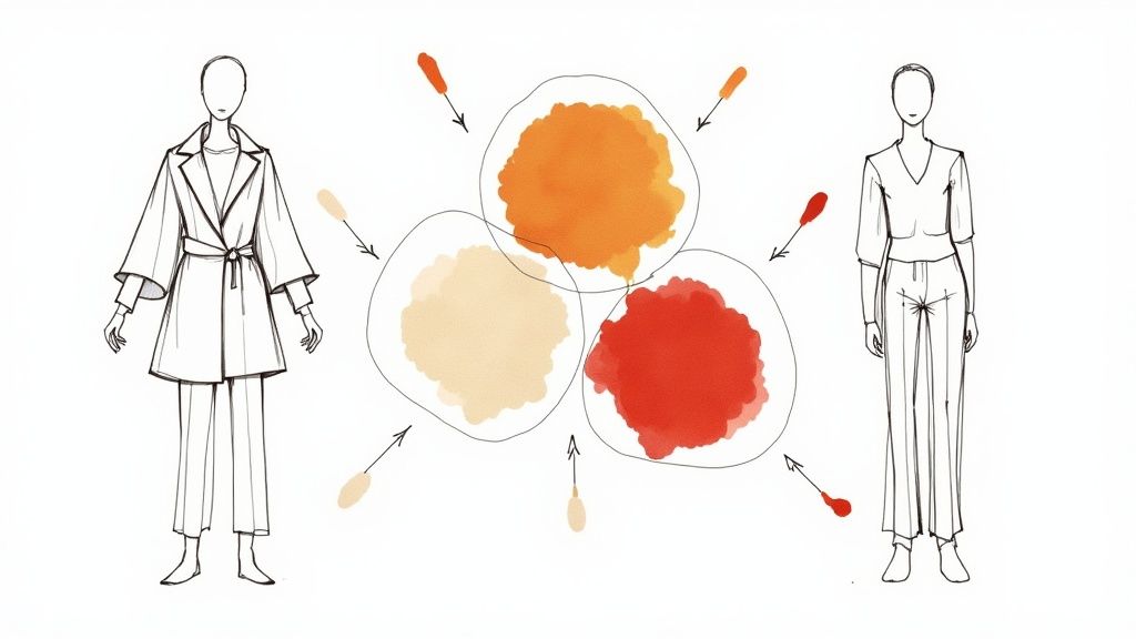
Spring brings fresh life and energy, reflected in its characteristic color scheme. The palette features warm, clear, and bright colors that echo nature's awakening - from delicate flower petals to tender green leaves and crystal blue skies. It's perfect for adding vitality and warmth to design projects and living spaces.
The Spring palette combines light pastel tones with pops of more saturated color. Its warm undertones create an inviting, cheerful mood. The colors maintain a crisp, clean quality that feels fresh and pure, with moderate contrast levels that create visual interest without becoming overwhelming.
This palette works exceptionally well in retail and hospitality environments where a welcoming atmosphere is essential. Its adaptability makes it a go-to choice for graphic design, branding, and interior design projects. The naturally complementary color combinations make it accessible even for those just learning about color theory.
The growing appeal of Spring colors connects deeply to fashion cycles and our natural response to seasonal changes. As winter ends, people naturally gravitate toward lighter, brighter hues that signal new beginnings. Leading brands like Kate Spade often showcase these vibrant seasonal tones in their collections. Major cultural events like cherry blossom festivals also embrace Spring's signature colors to create joyful experiences. Pantone's seasonal color forecasts help guide these trends.
Pros:
- Creates energetic, uplifting spaces
- Works well in retail and hospitality settings
- Versatile for both interior and graphic design
- Naturally harmonious combinations
Cons:
- Can appear too casual for formal settings
- May feel out of place during autumn/winter
- Colors need careful balancing to avoid overwhelming spaces
Tips for Implementation:
- Balance: Add neutral tones like beige, cream, or light gray to create sophistication and visual rest
- Tints: Use lighter versions for large areas and save saturated hues for accents
- Texture: Include natural materials like linen, cotton, or wood to complement the organic palette
- Light: Consider natural lighting - brighter spaces can handle more intense colors while darker rooms need softer tints
The Spring color palette stands out for its ability to create positive, engaging environments. When thoughtfully applied using these guidelines, it can enhance any design project with its fresh, timeless appeal.
2. Summer Color Palette

The summer color palette features gentle, cool-toned hues that draw inspiration from peaceful coastal scenes and muted summer landscapes. Unlike spring's bright colors, summer shades have a subtle quality that creates a sense of calm. This makes them a lasting favorite for interior design, fashion, and brand identity.
Key characteristics include cool undertones and soft, romantic qualities with maritime influences. Picture weathered beach house blues and greens, sun-faded sand beiges, and driftwood grays working together to create an enduring visual experience.
The growing preference for simple design and peaceful spaces has made the summer palette increasingly popular. Its adaptability lets it work equally well in casual or formal settings, making it perfect for those wanting effortless style.
Benefits of Using the Summer Color Palette:
- Creates peaceful environments: These colors naturally promote relaxation in both fashion and interior spaces
- Perfect for coastal design: The nautical influences make it ideal for beach homes and vacation properties
- Stands the test of time: These classic colors maintain their appeal over many years
- Suitable for work settings: The refined tones project professionalism across various environments
Key Challenges to Consider:
- May appear faint in dim lighting: The gentle nature of these colors needs proper illumination
- Not suited for high-energy designs: The understated palette may feel too subtle for bold concepts
- Reduced contrast options: Working with similar muted tones can make creating visual interest harder
Tips for Using the Summer Palette:
- Build depth with similar shades: Combine various blues and grays to create rich visual texture
- Add white accents: Clean white provides clear contrast and brightens the overall look
- Choose natural materials: Elements like linen, cotton, and wood enhance the organic feel
- Test colors in different light: Check how paint and fabric colors look throughout the day
Real Examples:
- Classic Hamptons homes: These beach houses showcase the elegance of summer colors
- Ralph Lauren seasonal lines: Their summer collections display refined casual style with light fabrics and soft tones
- Seaside resort design: Many coastal properties use these calming colors to create relaxing guest experiences
The summer color palette offers a reliable choice whether you're updating your clothes, redesigning your home, or developing your brand identity. By following these guidelines and understanding its characteristics, you can use these colors to create stylish and peaceful designs.
3. Autumn Color Palette
The Autumn color palette brings together the rich hues found in fall foliage and harvest scenes.  This collection features deep earth tones like burnt orange, rust red, deep gold, and olive green, often highlighted by golden undertones. These colors create a sense of warmth and sophistication that works well across fashion, interior design, and marketing.
People connect with this palette because it reflects the natural world and seasonal changes. The warm, inviting qualities of these colors provide comfort and familiarity. While rooted in classic design, the Autumn palette fits perfectly into modern contexts, especially with the rise of cozy design trends focused on creating welcoming spaces.
Features and Benefits:
- Rich depth: These saturated colors add visual interest and dimension
- Natural foundation: Earth-based hues provide stability and ground designs
- Bold impact: Strong, vibrant tones make memorable statements
- Built-in harmony: Colors work together naturally for cohesive looks
Pros:
- Creates welcoming environments: Perfect for cozy, inviting spaces
- Long-lasting style: Maintains appeal beyond passing trends
- Natural material complement: Enhances wood, leather and textiles
- Design versatility: Works in both traditional and modern applications
Cons:
- Can overwhelm small spaces: Deep colors may make rooms feel smaller
- Needs thoughtful balance: Risk of dated look without proper execution
- Lighting dependent: Requires good illumination to show true richness
Real-World Examples and Implementation Tips:
- Fashion: Mix rust sweaters with olive pants and burnt orange accessories. Balance deep colors using cream or beige. For menswear, incorporate autumn tones in jackets and knitwear.
- Interior Design: Take inspiration from Pottery Barn's seasonal collections - warm orange throws, deep green pillows, and dark wood furniture create inviting spaces.
- Marketing: Seasonal campaigns often use this palette to communicate warmth and abundance.
Tips for Success:
- Add light neutrals: Balance deep colors with cream, beige or light gray
- Include metallic touches: Gold, copper and bronze add refined accents
- Mix textures: Combine knits, velvet and suede for visual depth
- Consider lighting: Adjust color intensity based on natural light levels
The Autumn palette stands out for its ability to create beautiful, inviting designs across different applications. With careful implementation, these colors can craft spaces and styles that feel both timeless and fresh.
4. Winter Color Palette
The Winter color palette captures the essence of the season with its rich depth and dramatic contrasts. Drawing inspiration from snowy landscapes and festive traditions, it combines deep jewel tones like emerald, sapphire, ruby, and amethyst with crisp whites, icy silvers, and charcoal grays to create striking visual effects.
Key Characteristics:
The Winter palette stands out through its distinctive features:
- Bold Contrasts: The mix of deep and light tones creates eye-catching visual interest
- Rich Jewel Tones: Deep, saturated colors form the foundation of this palette
- Cool Undertones: An overall cool temperature unifies the color scheme
Advantages:
- Makes a bold visual statement
- Creates an elegant atmosphere
- Works well for formal settings
Limitations:
- May feel heavy in compact spaces
- Needs careful color distribution
- Less suited for casual environments
Real Applications:
The Winter palette shines in both commercial and residential spaces. High-end hotels often showcase this palette during holiday seasons with deep reds and greens accented by metallic touches. Fashion designers embrace these rich tones in their winter collections through luxurious fabrics. Nordic interiors masterfully blend deep blues and grays with bright whites for a modern yet cozy feel.
Implementation Tips:
- Strategic Color Placement: Use deep tones as focal points rather than dominant colors
- Add Metallic Elements: Incorporate gold, silver, or pewter accents to enhance sophistication
- Balance with White: Include crisp white to lighten the overall effect
- Mix Textures: Combine materials like velvet, wool, and silk to add visual depth
The Winter color palette offers timeless appeal for those seeking to create sophisticated spaces or elevated looks. By following these guidelines and carefully balancing colors, you can create stunning designs that capture winter's dramatic beauty.
5. Transitional Color Palettes
A transitional color palette is an elegant solution that smoothly connects different seasons through thoughtful color combinations. These versatile palettes blend hues from both the outgoing and incoming seasons to create designs that stay fresh and relevant for longer periods. This approach is ideal for those who want to maximize their color choices while being mindful of costs.
The foundation of a successful transitional palette combines balanced undertones with moderate contrast levels. This setup allows you to easily incorporate different accessories and accents to shift the overall mood between seasons. For example, when moving from spring to summer, you might pair warm neutral bases like beige with soft spring greens and blues, plus touches of vibrant summer corals and yellows.
Many retail spaces and modern offices effectively use transitional palettes in their designs. Department stores are masters at this technique, smoothly moving from autumn's rich jewel tones to winter's metallic accents through carefully chosen neutral bridges. The fashion industry, particularly resort wear collections, also excels at creating pieces that work beautifully from late spring through early fall.
Leading home and lifestyle brands like Martha Stewart Living, West Elm, and HGTV have helped popularize this approach by showing how simple updates to accessories, fabrics, and accent colors can refresh a space without requiring major changes.
Pros:
- Extended seasonal relevance: Your wardrobe and décor stay current longer
- Practical for commercial spaces: Makes sense for business environments
- Cost-effective: Fewer updates needed
- Adaptable to different contexts: Works across various settings
Cons:
- May lack strong seasonal identity: Can feel less season-specific
- Can appear indecisive: Needs careful planning to avoid confusion
- Requires careful color selection: Balancing seasonal elements takes skill
Tips for Implementing Transitional Palettes:
- Focus on neutral base colors: Use neutrals as your foundation
- Use accessories for seasonal shifts: Update with pillows, throws, scarves
- Incorporate versatile patterns: Choose patterns that bridge color families
- Consider lighting changes: Account for seasonal light variations
You might be interested in: Color Analysis: The Perfect Palette Guide to learn more about finding flattering transitional palettes for your style. This guide is particularly helpful for fashion enthusiasts, men exploring personal style, and professionals seeking efficient styling solutions. Understanding your best colors builds confidence in your appearance, which beauty and makeup enthusiasts will find valuable.
Transitional color palettes earn their place on this list by offering a practical and attractive solution for lasting style. By mastering color blending and seasonal transitions, you can create versatile looks that stand the test of time. Read also: [How to build confidence with your image] (insert link if available, otherwise remove this line).
6. Natural Color Harmony
Nature offers some of the most beautiful and balanced color combinations. By studying and adapting colors directly from our environment, we can create seasonally-inspired palettes that connect deeply with viewers. This design method focuses on capturing authentic color relationships found in nature's landscapes and settings.
When you look closely at nature's seasonal displays, you'll find perfect color pairings - from the rich oranges and browns of fall foliage to the fresh greens and yellows of spring meadows to the crisp blues and whites of winter scenes. These combinations work so well because they've evolved naturally over time. For both fashion enthusiasts and busy professionals, these timeless nature-inspired palettes offer reliable styling options that won't quickly go out of style.
Organizations like National Geographic and The Nature Conservancy have helped showcase these natural color harmonies through their stunning photography and artwork. Their work highlighting nature's incredible diversity has inspired designers across industries - from interior design to branding - to embrace organic color palettes.
You can see natural color harmony at work in many settings. For example, botanical gardens often use earthy greens and browns to blend buildings with their surroundings. Eco-resorts frequently incorporate the blues and greens of ocean and forest into their branding. In men's fashion, earth tones create a sophisticated yet rugged look, while flower-inspired colors add refined touches to outfits.
Practical Tips for Implementing Natural Color Harmony:
- Study local landscapes: Observe the colors in your immediate environment as seasons change
- Document seasonal changes: Photograph or sketch the evolving colors around you
- Use photography for reference: Photos help identify specific colors for your palette
- Consider regional variations: Color palettes differ based on location and climate
Pros:
- Natural color combinations that work well together
- Classic appeal that lasts
- Easy seasonal updates
- Strong environmental connection
Cons:
- Requires seasonal palette updates
- Can be hard to match colors exactly
- Weather affects inspiration
While natural palettes are effective, capturing nature's subtle color nuances takes practice. Understanding your personal coloring helps you choose flattering natural palettes. Read more: Comprehensive Guide to Understanding Skin Undertone. This knowledge builds confidence in your style choices.
Natural Color Harmony earns its place here by offering a tested approach to creating visually appealing palettes grounded in the natural world. It provides a path to enduring style for anyone wanting to feel more confident in their appearance. You might be interested in: [How to Use Color Psychology in Your Wardrobe].
7. Cultural Color Seasons
Color in design goes far beyond simply matching spring greens or fall oranges. Cultural Color Seasons explores how different societies and traditions influence seasonal color choices. This fascinating approach looks at how history and regional customs shape our color preferences and cultural identity through generations.
When we incorporate culturally significant colors, we create deeper connections with specific audiences. For instance, Chinese New Year features bright reds and golds that represent wealth and good fortune. Indian weddings showcase deep jewel tones reflecting tradition and auspiciousness. Japanese festivals display distinct seasonal palettes - from soft cherry blossom pinks in spring to rich forest greens in summer.
Key aspects of Cultural Color Seasons include:
- Cultural Symbolism: Each color carries specific cultural meanings and significance
- Traditional Meanings: Understanding historical color associations within cultures
- Regional Differences: Color interpretations can vary across different areas
- Historical Context: Studying traditional art and artifacts reveals color meanings
Benefits of using Cultural Color Seasons:
- Meaningful Design: Colors gain extra depth through cultural context
- Fresh Perspectives: New ways to approach seasonal color schemes
- Personal Connection: Colors resonate with those sharing cultural backgrounds
- Cultural Celebration: Respectfully honors traditions and heritage
Important considerations:
- Cultural Variations: Colors may have different meanings across cultures
- Global Design: International audiences need careful color consideration
- Deep Understanding: Proper research prevents cultural misrepresentation
Tips for Using Cultural Color Seasons:
- Study Color Meanings: Research the cultural significance behind colors
- Follow Traditions: Use established color combinations correctly
- Learn Local Customs: Pay attention to regional color preferences
- Include Patterns: Add traditional patterns to enhance cultural themes
Cultural Color Seasons gained recognition through traditional artists, cultural organizations, and heritage-focused brands working to preserve cultural practices. This approach deserves attention because it adds meaning beyond pure aesthetics, helping fashion enthusiasts and professionals create more thoughtful color choices. It gives anyone interested in personal style a deeper appreciation for color's cultural importance. You might be interested in: Eye and Hair Color Importance in Personal Color Analysis. Read also: [How to Choose Colors That Complement Your Skin Tone]. This mindful approach to color helps us better understand and appreciate different cultural perspectives through design.
8. Commercial Seasonal Color Trends
Color trends play an important role in defining modern style choices. Understanding seasonal color trends helps you make informed wardrobe decisions that align with current fashion directions. Leading color forecasting organizations carefully research and predict which shades will shape upcoming seasons across fashion, home decor, and consumer products.
Major industry players like Pantone, Color Marketing Group, and WGSN invest extensive resources into identifying color trends months before each season. Their forecasts guide everything from clothing design to visual merchandising. For example, Pantone's Fashion Color Trend Report, released before major fashion weeks, influences colors used in apparel, accessories, beauty products, and home goods. You can see these predicted palettes come to life in retail displays from mass market to luxury brands.
Color forecasting emerged in the mid-20th century alongside the rise of mass production and consumer culture. The introduction of the Pantone Matching System in the 1960s brought standardization to color communication across industries. Today, trend forecasts are readily available through online publications, industry reports, and social media platforms.
Key Benefits:
- Current color combinations that reflect contemporary aesthetics
- Research-backed selections based on market analysis and consumer preferences
- Regular seasonal updates to keep your wardrobe fresh
- Expert forecasting from color industry professionals
- Wide product availability in trending shades
Advantages and Limitations:
Advantages:
- Reflects current style directions
- Market-validated color choices
- Professional trend analysis
- Easy to find products
Limitations:
- Colors can feel outdated quickly
- May seem mainstream
- Less individual expression
Implementation Tips:
- Follow key forecasts from leading color organizations
- Plan ahead for upcoming seasonal palettes
- Consider your preferences alongside trends
- Mix trendy and classic colors for balance
Understanding commercial color trends helps you build a wardrobe that feels current while staying true to your personal style. While trends provide useful guidance, the key is finding the right balance between embracing new directions and maintaining your authentic look. Thoughtfully incorporating trending colors can refresh your style while keeping it grounded in what works best for you.
8-Point Seasonal Palette Comparison
| Palette | 🔄 Implementation Complexity | ⚡ Resource Requirements | 📊 Expected Outcomes | Ideal Use Cases | ⭐ Key Advantages |
|---|---|---|---|---|---|
| Spring Color Palette | Medium – requires careful balancing of bright accents | Medium – balanced materials and lighting essential | Energetic & uplifting ambience | Retail, hospitality, graphic & interior design | Naturally harmonious and versatile |
| Summer Color Palette | Low – softer tone blending simplifies application | Low to Medium – minimal adjustments needed | Calming & sophisticated atmosphere | Coastal resorts, professional spaces, residential | Serene and timeless appeal |
| Autumn Color Palette | Medium – careful blending of deeper, earthy hues | Medium – moderate investment in complementary elements needed | Warm, inviting, and timeless spaces | Traditional interiors, seasonal marketing, home decor | Rich, naturally cohesive color harmony |
| Winter Color Palette | High – precision needed for high-contrast, dramatic combinations | High – premium materials and lighting required | Sophisticated with bold, dramatic impact | Formal events, luxury settings, evening gatherings | Striking visual impact and drama |
| Transitional Color Palettes | Medium – flexibility required to bridge seasonal differences | Low – cost-effective with adaptable neutral bases | Balanced and versatile design outcomes | Commercial spaces, offices, adaptable interiors | Extended seasonal relevance and adaptability |
| Natural Color Harmony | Medium – moderate effort to replicate organic, environment-inspired tones | Medium – periodic updates may be needed to capture natural variations | Authentic, timeless, and harmonious ambiance | Eco-friendly designs, nature-inspired interiors, public spaces | Inherent organic harmony and authenticity |
| Cultural Color Seasons | High – demands cultural research and sensitive color selection | Medium – balanced integration of traditional elements | Emotionally resonant and culturally rich designs | Cultural events, heritage branding, thematic design projects | Rich cultural significance and unique symbolism |
| Commercial Seasonal Color Trends | Low to Medium – trend adoption with relatively straightforward updates | High – relies on up-to-date market research and materials | Current and market-aligned visual impact | Retail, fashion, visual merchandising, corporate branding | Market-tested relevance and professional insight |
Designing with Seasonal Color Palettes: A Final Word
Every season brings a unique set of colors that can inspire design choices and personal style. Throughout our exploration of seasonal color theory, we've covered the distinct palettes of spring, summer, autumn, and winter, along with the subtle shifts that happen between seasons. These color combinations work together with our natural features while reflecting cultural meaning and natural beauty. As you develop your color intuition, remember that observation and experimentation are key to finding what works best for you. Recent developments show more people moving beyond strict seasonal rules to embrace personalized approaches to color.
Key Takeaways:
- Learn the seasonal basics: Each season has signature colors and characteristics that can guide your choices
- Use transitional colors wisely: Colors that bridge seasons add flexibility to your palette
- Make it personal: While seasonal guidelines help, your individual coloring should drive color choices
- Keep learning: Color trends and applications continue to evolve - stay open to new ideas
Want to better understand which colors highlight your best features? AI Color Analysis can help you discover your perfect palette. By analyzing a photo of you, the system creates a detailed report covering your skin undertone, seasonal color type, and specific recommendations for clothes, makeup and more. Take the guesswork out of color choices and feel confident that you're showcasing your natural beauty. Find your ideal colors today with AI Color Analysis!