Ever put on a shirt in a color you adore, only to feel like it makes you look... off? Maybe a little tired or washed out? It's a common frustration, and the reason usually has nothing to do with the color itself. It’s all about how that color plays with your skin's unique undertone.
This is the secret weapon of stylists and the foundation of personal color analysis. Getting this right is the first, most crucial step in building a wardrobe that makes you look and feel fantastic every single day.
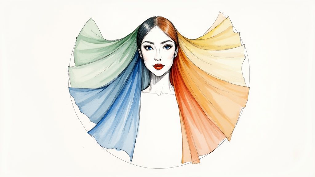
Your Guide To Finding Your Most Flattering Colors
So, what exactly is an undertone? Think of it as the subtle, permanent hint of color just beneath your skin's surface. It’s completely different from your surface skin tone (like fair, medium, or deep), which can change with a tan. Your undertone, however, is constant.
It’s a bit like painting a room. The color of the primer (your undertone) will affect how the final coat of paint (your clothing) looks. When those two are in sync, you create a beautiful, harmonious effect. When they clash, it just feels wrong. This guide will walk you through finding your undertone and building a color palette that truly makes you shine.
And if you're looking to enhance your natural vitality from the inside out, which in turn makes your best colors pop even more, you might explore something like a full face rejuvenation package for a comprehensive boost.
Understanding The Three Undertones
Most people fall into one of three main undertone categories. Once you know yours, you've unlocked the entire system.
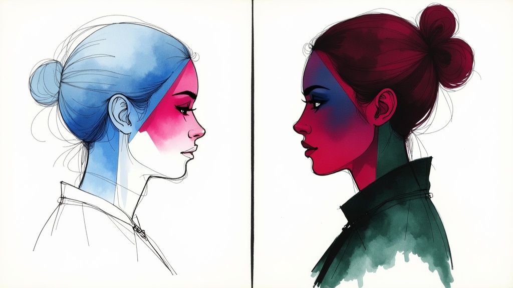
- Cool Undertones: Your skin has subtle hints of blue, pink, or red. People with cool undertones generally find that silver jewelry looks much more flattering on them than gold.
- Warm Undertones: Your skin has underlying notes of yellow, peachy, or golden hues. If you're warm-toned, you'll probably notice that gold jewelry makes your skin glow.
- Neutral Undertones: You have a balanced mix of both cool and warm hues. This is the most versatile undertone, as you can often pull off colors from either side of the spectrum without much trouble.
Think of your undertone as your personal color filter. When you wear colors that align with it, you look vibrant and healthy. When you wear colors that fight against it, they can cast unflattering shadows, making you look drained. This is precisely why a bright fuchsia might be a showstopper on your friend but a disaster on you.
To make this even easier to grasp, here's a quick reference table.
Quick Guide To Skin Undertones And Colors
This table breaks down the core characteristics of each undertone and the color families that typically bring out the best in them. Use it as a starting point on your color discovery journey.
| Undertone Type | Key Characteristics | Best Color Families |
|---|---|---|
| Cool | Skin has hints of pink, red, or blue. Veins appear blue. Silver jewelry is best. | Blues, purples, emerald greens, deep reds, and cool pinks. |
| Warm | Skin has hints of yellow, gold, or peach. Veins appear green. Gold jewelry is best. | Oranges, yellows, earthy greens, olive, and warm reds. |
| Neutral | A balanced mix of cool and warm. Veins may look blue-green. Both metals work. | Most colors work, but muted or softer shades are often safest. |
With this foundation in place, we can now move on to some practical, real-world tests you can do right now to pinpoint your own undertone and start exploring the color palettes that were made for you.
The Secret to Color Harmony: Uncovering Your Undertone
Alright, you get the idea of undertones, but now for the fun part: figuring out your own. Think of this as your personal color detective work. Instead of just guessing, there are a few simple, time-tested methods you can use to reveal the subtle hue hiding just beneath your skin’s surface. This is the real secret to finally answering the question, "what colors look best on me?"
These little at-home tests don't require any fancy equipment—just a few minutes of your time and some good natural light. By trying them out, you’ll gather all the clues you need to figure out if your undertone is cool, warm, or neutral.
This quick infographic breaks down the three easiest tests you can do right now to discover your skin's undertone.
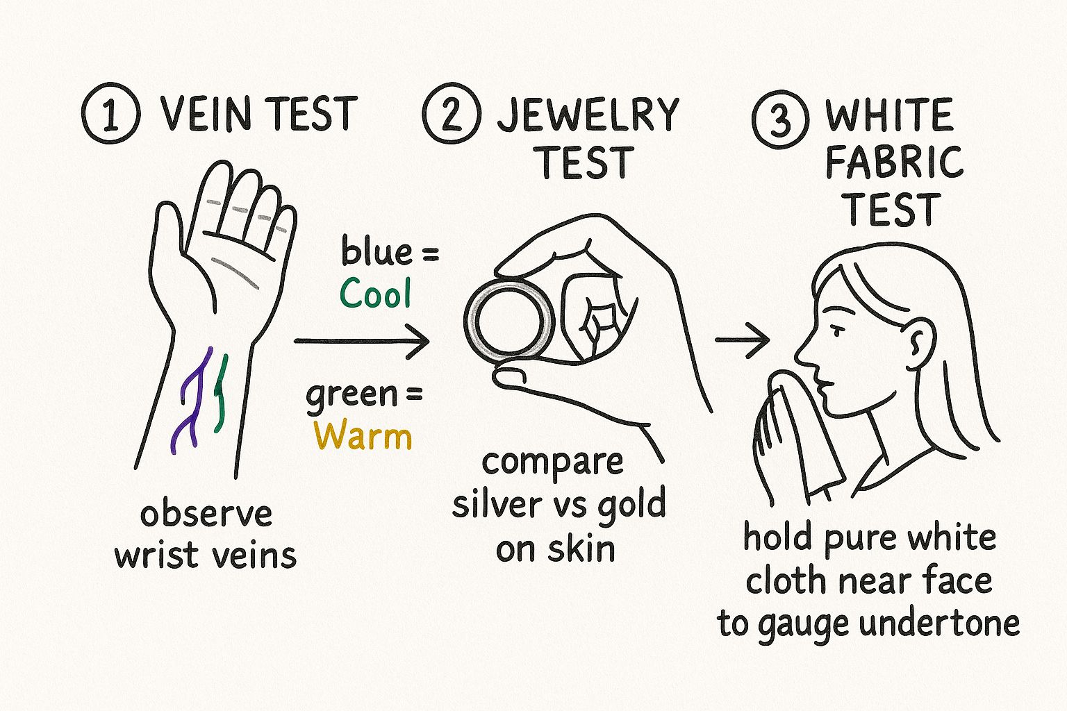
As you can see, each test is just about observing how your skin reacts to different colors. It’s a simple, clear path to finding your natural color harmony.
The Vein Test: Quick and Easy
This is probably the most famous and fastest way to get a read on your undertone. All you have to do is find some natural daylight and take a close look at the veins on the inside of your wrist. The color you see there is a surprisingly strong clue.
- Blue or Purple Veins: If your veins have a clear blue or purplish tint, you almost certainly have a cool undertone.
- Green or Olive Veins: Seeing more of a greenish hue? That points to a warm undertone. It’s a bit of an illusion—you're seeing blue veins through yellowish skin, which makes them appear green.
- Indistinct or Blue-Green Veins: If you're having a hard time telling if they're blue or green, you likely have a neutral undertone.
If you want to dive deeper into these visual cues, our guide on the warm vs. cool undertone test has even more details and examples to help you out.
The Jewelry Test: Silver or Gold?
Here's another incredibly effective method. Grab a piece of silver jewelry and a piece of gold jewelry—earrings, a necklace, whatever you have. In good, natural light, hold each one up against your skin, maybe near your wrist or neck.
Pay close attention to which metal makes your skin look more radiant and healthy. One should make your complexion light up, while the other might make it seem a bit dull or washed out.
If silver or platinum makes your skin pop, you’re on the cool side. On the other hand, if gold brings out a healthy, vibrant glow, you have a warm undertone. And if you genuinely feel like you can pull off both without a noticeable difference? You've hit the neutral jackpot.
The White Fabric Test: Your Final Clue
For this last test, you’ll need two pieces of white fabric. One should be a pure, stark white, and the other should be a slightly off-white, cream, or ivory color. It's important to do this with a clean, makeup-free face.
Find that natural light again and hold each piece of fabric up to your face, one at a time. The stark white fabric tends to flatter cool undertones, bringing out their rosy or blueish hints. If it makes you look washed out, you're likely warm. The off-white or creamy fabric does the opposite—it complements warm undertones beautifully but can make cool-toned skin look a bit tired.
Welcome to Seasonal Color Analysis
So, you’ve figured out your undertone. That's a huge first step—the foundation of understanding your personal color harmony. Now, we're ready to build on that knowledge and explore a much richer, more detailed system.
Let's dive into the world of Seasonal Color Analysis. This is a brilliant framework that takes the simple "cool vs. warm" concept and expands it into four distinct "seasons," each with its own beautiful palette of colors.
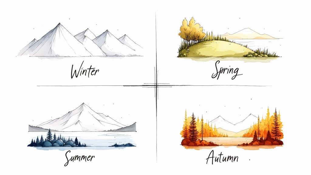
This method looks at the whole picture—the unique interplay between your skin, hair, and eye color. It then groups your coloring into one of four categories: Winter, Spring, Summer, or Autumn.
Think of it this way: a vibrant spring landscape feels completely different from a cozy, rustic autumn scene. Each season has a distinct mood and color story, and this system matches you with the one that brings your natural features to life.
The Four Seasons Explained
How does this actually work? The system is pretty ingenious. It groups the seasons based on their undertone (temperature) and the overall intensity of their colors. This gives us a much more nuanced way to find the shades that make you glow.
Here's the basic breakdown:
- Winter & Summer: These are the cool-toned seasons. They look incredible in colors that have blue, pink, or red bases—think stunning jewel tones, deep berries, and soft pastels.
- Spring & Autumn: These are the warm-toned seasons. They absolutely shine in colors with a golden, yellow, or peachy glow, like rich earthy tones and bright, sun-drenched hues.
This is where your undertone test comes into play. If you discovered you have cool undertones, you're almost certainly a Winter or a Summer. And if you have warm undertones, you’ll find your perfect match in the Spring or Autumn palettes.
By finding your season, you get a personalized roadmap to the colors that will make you look healthy, vibrant, and effortlessly put-together. It’s a classic, time-tested approach to building a wardrobe where everything just works.
Why Finding Your Season Matters
This whole system is designed to take the guesswork out of getting dressed. No more standing in a store, staring at a rainbow of options and feeling totally lost. Once you know your season, you can confidently walk in and focus on a specific family of colors you know will flatter you.
It makes shopping easier and getting dressed in the morning a more creative, enjoyable process. It’s all about working with your natural beauty, not against it.
Understanding your season is the real secret to unlocking a personalized color strategy. To dig deeper into this, check out our guide on how to figure out, "what is my color season?". Next, we’ll explore the unique characteristics and palettes for each of the four seasons.
Exploring The Four Seasonal Palettes
Alright, you’ve figured out your undertone, which is the foundational step. Now for the fun part: let's dive into the four seasonal palettes. This is where the abstract idea of "cool" or "warm" blossoms into a tangible, specific set of colors that will make your features pop.
Think of your season as a custom-curated wardrobe of colors, each one selected to harmonize perfectly with your natural coloring. It’s the difference between guessing which colors might work and knowing which ones will make you look vibrant and alive. Each season has its own personality—from the crisp intensity of Winter to the soft, hazy grace of Summer.
Let’s get to know them.
Winter: Cool Tones And High Contrast
If you're a Winter, your look is all about cool undertones and high contrast. The visual is dramatic and sharp, like a snow-covered landscape against a dark forest. There’s a striking clarity between your skin, hair, and eye color.
Your best colors are just as bold and crisp as you are. You look incredible in true, saturated primary colors and icy shades that echo your natural intensity.
- Your Go-To Colors: True black, pure optic white, deep navy, and a classic ruby red are your absolute power players.
- Best Jewel Tones: Think emerald green, sapphire blue, rich amethyst, and vibrant fuchsia.
- Celebrity Examples: Anne Hathaway and Lucy Liu are fantastic examples of the stunning Winter palette.
Spring: Warm Tones And Bright Clarity
The Spring palette is defined by warm undertones and bright, clear colors. Everything about your coloring feels fresh, light, and full of energy—like a garden bursting into bloom. There’s a certain golden, sunny quality to your look.
You come alive in colors that are just as warm and lively. Forget muted or dusky; you need shades that are cheerful and vibrant.
- Your Go-To Colors: Warm ivory, bright coral, light peach, and clear blues like turquoise will look amazing on you.
- Best Lively Hues: You can pull off zesty lime green, sunny yellow, and warm, poppy pinks with ease.
- Celebrity Examples: Emma Stone and Taylor Swift both have that fresh, energetic vibe of a classic Spring.
It's a common myth that every piece in your outfit needs to match perfectly. In fact, research points to a 'Goldilocks principle' in fashion. The most aesthetically pleasing outfits tend to have moderately matched colors—they avoid being too clashing or too perfectly coordinated. You can read the full research on color coordination in fashion to learn more.
Summer: Cool Tones And Muted Softness
If you're a Summer, you have cool undertones paired with a soft, muted quality. Your coloring is more blended and has a lower contrast, creating a gentle and elegant feel. Think of a hazy, romantic beach scene or a delicate watercolor painting.
Your best colors are just as soft and refined. Steer clear of harsh, bright colors and embrace the dusty, cool end of the spectrum.
- Your Go-To Colors: Soft navy, dusty rose, powder blue, and lavender are incredibly flattering.
- Best Muted Shades: You’ll also look fantastic in shades like plum, soft off-white, and muted greens like sage.
- Celebrity Examples: Emily Blunt and Kate Middleton perfectly embody the graceful, elegant energy of the Summer palette.
Autumn: Warm Tones And Rich Earthiness
Last but not least, the Autumn palette is all about warm undertones and deep, earthy colors. Your natural coloring is rich, golden, and often muted—reminiscent of a cozy, rustic autumn landscape. There’s an inherent warmth and depth to your look.
The colors that flatter you most are warm, rich, and spicy. Think of all the gorgeous shades of harvest season and fall foliage.
- Your Go-To Colors: Creamy whites, mustard yellow, terracotta, and deep olive green are your wardrobe staples.
- Best Earthy Hues: You’ll also shine in colors like rust, warm chocolate brown, burnt orange, and rich teal.
- Celebrity Examples: Julia Roberts and Jennifer Lopez are quintessential Autumns, glowing in their warm, rich palettes.
How to Personalize Your Color Palette
Think of your seasonal color analysis result as a great starting point, not the final destination. It’s fantastic to know you're an "Autumn" or a "Winter," but we all know people are far more nuanced than four simple categories.
You might find that most colors in your assigned season look incredible, but a few just don't feel right. That’s perfectly normal. In fact, that feeling is the first step toward true personalization. Your seasonal palette is like a well-drawn map—it shows you the main highways, but the real magic is in finding the scenic backroads that are uniquely yours.
Going Beyond the Four Seasons: Subtypes and Flows
To capture that beautiful complexity, color experts expanded the original system into 12 seasons. It's not as complicated as it sounds. Each of the four core seasons simply branches out into three more specific "sub-seasons" or "flows."
This more detailed system helps you zero in on what's most prominent about your natural coloring. When someone looks at you, what do they notice first? Is it how deep your coloring is, how bright your eyes are, or how soft your features are?
- Deep/Dark: Your overall coloring is rich and intense (think Deep Winter or Deep Autumn).
- Light: You have a fair, delicate look (like a Light Spring or Light Summer).
- Bright/Clear: There's a striking, high-contrast clarity to your features (the territory of Bright Spring and Bright Winter).
- Soft/Muted: Your features blend gently with low contrast (characteristic of Soft Summer and Soft Autumn).
- Warm/True: Your golden, honeyed warmth is your defining trait (hello, Warm Spring and Warm Autumn).
- Cool/True: An unmistakable icy or rosy coolness is your dominant feature (that's Cool Summer and Cool Winter).
This refined approach is what moves you from a general collection of colors to a palette that feels like it was made just for you.
Trust Your Gut and Start Experimenting
As helpful as these systems are, your best tool is your own intuition. At the end of the day, your seasonal palette is a guide, not a set of unbreakable laws. No one knows what makes you feel confident and vibrant better than you do.
Your personal color palette is a tool for self-expression, not a box to confine you. Use it to make confident choices, but never let it overrule your personal style or what makes you feel amazing.
The fashion world is a behemoth, with the global apparel market valued at over $1.7 trillion. Trends come and go, pushing certain colors to the forefront each season. But just because a color is "in," doesn't mean it's right for you. You can discover more insights about color's role in fashion on fashionunited.com to see how it all works. Knowing your palette helps you cut through the noise and choose trends that actually work for you.
Ultimately, the only way to perfect your palette is to play with it.
- Start with Your Neutrals: First, lock down the core neutrals that form the foundation of your wardrobe. These are your go-to shades for investment pieces. If you're not sure where to begin, you can learn about finding the best neutral colors for your skin tone in our detailed guide.
- Find Your "Wow" Colors: These are the 3-5 accent colors that always make you feel incredible and get you compliments. They’re your secret weapons.
- Borrow from a Neighbor: Feel like you're on the edge of your season? You probably are! A Soft Autumn, for example, can often borrow some of the cooler, muted shades from the neighboring Soft Summer palette. Don't be afraid to test the waters with colors just outside your official list.
Bringing Your Color Palette To Life When Shopping
Okay, you've figured out your personal color palette—now for the fun part. It’s time to take that knowledge out into the world and see how it completely changes the way you shop.
This is where the theory turns into real, tangible results. Knowing your season transforms shopping from a frustrating guessing game into a focused, empowering hunt for pieces you’ll actually love and wear. Instead of getting lost in a sea of endless racks, you can confidently scan for the colors that you know will make you look and feel fantastic.
A great tip? Create a small swatch of your best colors to carry with you. This could be a few fabric scraps, some paint chips from the hardware store, or even a digital palette saved to your phone. It’s a simple reference that makes all the difference.
Smart Shopping With Your Colors
Putting your palette into practice is surprisingly simple. The trick is to be intentional, especially with clothing you'll wear close to your face—think tops, jackets, scarves, and jewelry.
Trust Natural Light: Store lighting is notoriously deceptive. Those harsh fluorescent lights can make a perfect color look all wrong, and vice-versa. Whenever possible, take the item over to a window to see how the color really looks against your skin in natural daylight.
Start with Neutrals: Every great wardrobe is built on a foundation of solid neutrals. Use your palette to identify your best ones, whether that's a warm camel, a crisp navy, a cool slate gray, or a soft cream. These core pieces will become the versatile backbone of your closet.
Accessorize Wisely: Even small details can make a big impact. Your palette can guide everything from your handbag to your choice of cozy pink fluffy socks, ensuring every piece works in harmony.
But what about those favorite clothes you already own that aren't in your palette? Don't toss them! You can create a "buffer" by pairing them with a scarf, a statement necklace, or even a collared shirt in one of your best colors right next to your face. This little trick lets you keep wearing what you love while still getting all the benefits of your new palette.
It’s also fascinating to realize how much industrial muscle goes into creating the colors we see in stores. The global textile colorant market was valued at a staggering $10.21 billion in 2023 and is projected to reach $16.12 billion by 2032.
This massive industry, supported by a separate $2 billion market for color-matching instruments, is dedicated to producing the exact shades that eventually land on the rack. It’s a powerful reminder that the colors we choose are part of a huge global process.
Common Questions About Color Analysis
Diving into the world of color analysis often sparks a few questions. Getting clear on the details is what helps you take your palette from a neat idea to a practical tool you can use every day. Let’s tackle some of the most common things people ask.
Can My Seasonal Color Palette Change Over Time?
This is a great question, and the answer is a little nuanced. Your fundamental skin undertone—the cool or warm base—is set for life. That part won't change.
However, the things that sit on top of that base can shift. Think about major hair color changes (going from brunette to blonde, for instance), getting a deep tan, or even the natural way our hair and skin soften as we age. These factors can alter your overall contrast level.
So, while a Winter will always be a Winter, they might find their best shades evolve. For example, someone who was a vibrant Bright Winter in their youth might find the slightly softer Cool Winter palette feels more harmonious later in life. It’s a good idea to revisit your colors every few years or after any big change to your look.
What If I Have A Neutral Undertone?
If you've discovered you have a neutral undertone, you've hit the jackpot! It means you have incredible versatility and can pull colors from both the warm and cool sides of the color wheel. You have a much wider playground of shades to explore.
That said, most people with neutral undertones still find they have a slight preference. You might notice that while you can wear a huge range of colors, you truly shine in the more muted, less saturated shades from both warm and cool families, rather than the most intense, electric hues.
Do I Have To Throw Out All My Clothes That Aren't In My Palette?
Not at all! Please don’t. Think of color analysis as a guide for the future, not a judgment on your past choices. The goal is to make smarter purchases moving forward, not to purge your entire closet overnight.
There are clever ways to keep wearing pieces you love, even if they aren't your "best" colors. The trick is to keep those colors away from your face. A pair of pants, a skirt, or shoes in an off-palette color? No problem.
For a top you just can't part with, create a buffer. A scarf, a statement necklace, or even the collar of a blouse in one of your power colors can create a flattering frame right next to your skin, neutralizing the less-than-ideal shade.