Transforming Winter Spaces with Color
Color can breathe new life into winter environments, going far beyond the typical grays and whites we often associate with the season. The right color choices can completely change the feel of your spaces, clothing choices, and general perspective during the colder months.
The winter color spectrum offers remarkable variety - from crisp arctic blues and shimmering silvers that mirror frosty landscapes to deep jewel tones that create cozy, intimate atmospheres. Our understanding of winter palettes has expanded significantly, shaped by art history and modern design trends. We now better grasp how colors affect our emotions and perceptions, particularly during winter.
What makes winter colors work well together? The key is finding the right mix between cool seasonal shades and warmer accent colors to create visual interest and balance. This combination helps spaces feel both energizing and welcoming, capturing the dual nature of winter. When done thoughtfully, winter color schemes can:
- Enhance natural light reflection
- Create a sense of warmth
- Add visual depth to spaces
- Complement winter's unique qualities
In this guide, you'll discover essential techniques for developing effective winter color palettes and find inspiring combinations to apply throughout your home and wardrobe. These practical tips will help you craft winter environments that express your personal style while making the most of the season's distinctive characteristics.
1. Ice Queen Winter
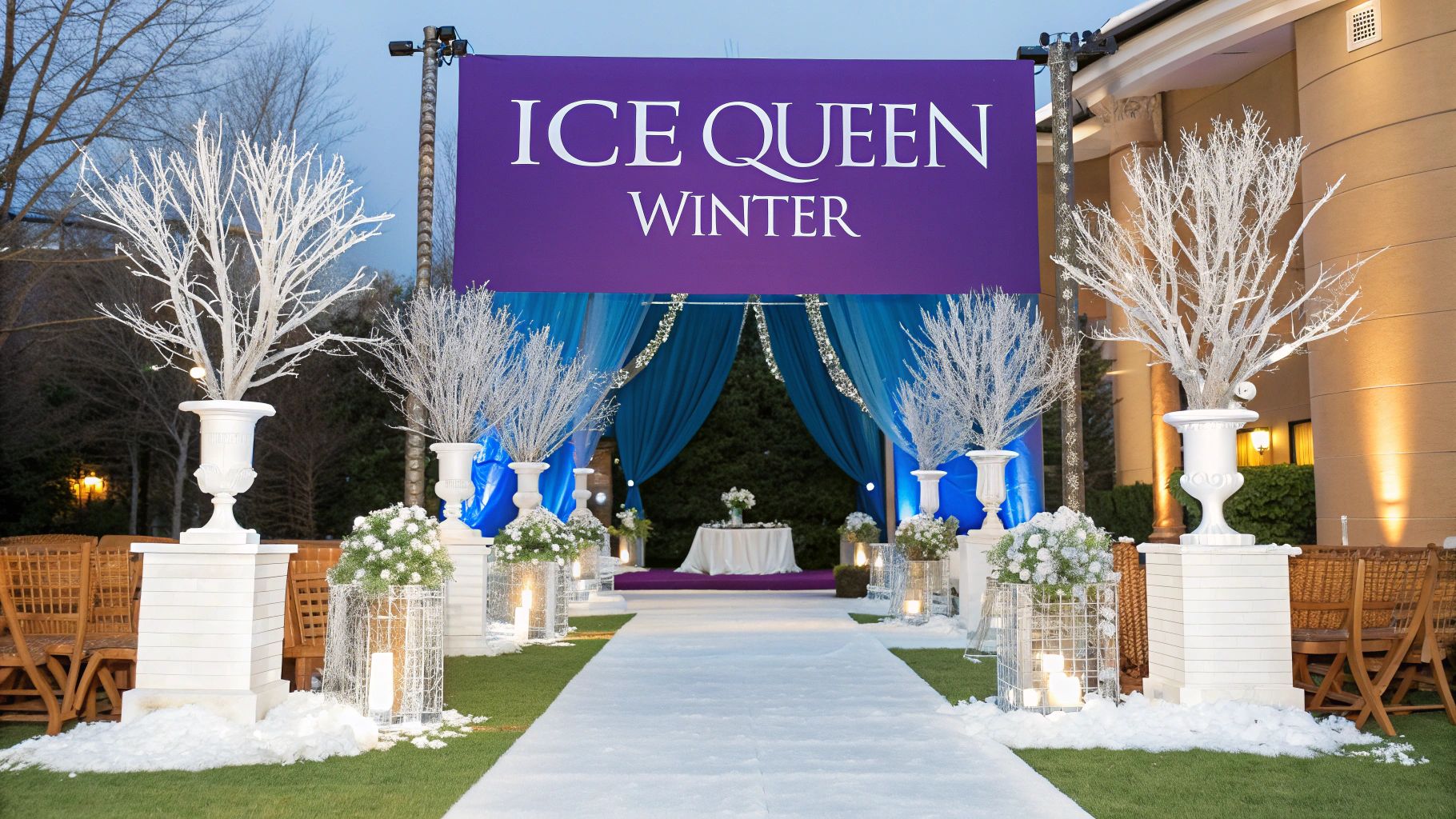
The Ice Queen Winter color palette captures the pristine beauty of winter landscapes through cool whites, silvers, and pale blues. This combination creates an atmosphere of elegance and refinement that works beautifully in both fashion and design applications.
Applications and Examples
This palette shines in high-end settings. Ralph Lauren regularly features these icy tones in their winter collections to create timeless looks. The immense success of Disney's Frozen brought this aesthetic into popular culture, showcasing how these colors can create magical visual environments.
Leading hotels and luxury retailers have mastered using these winter-inspired elements in their seasonal displays. By combining icy blues, bright silvers, and pure whites, they transform spaces into enchanting winter wonderlands that draw visitors in.
Growing Influence
The Ice Queen Winter palette has gained momentum alongside the rise of refined minimalism in design. Its subtle sophistication allows it to create dramatic impact without overwhelming spaces. Swarovski has helped popularize this look by demonstrating how light interacts with cool tones to create stunning visual effects.
Implementation Guide
Add Rich Textures: Mix in furs, velvets, and silks to create visual depth and prevent the palette from feeling flat
Include Crystal Elements: Use crystal or glass accents to enhance the icy theme and add sparkle
Balance with Warm Light: Add soft, warm lighting to keep spaces feeling welcoming
Mix in Accent Colors: Incorporate subtle warm metallic tones or color accents to maintain visual interest
Value in Design
This palette earns its place through its ability to create sophisticated, luxurious environments. Its versatility makes it effective across fashion, interiors, and event design while maintaining timeless appeal.
Key Benefits and Limitations
Benefits:
- Creates an upscale, refined ambiance
- Works well for formal winter events
- Adapts easily to different design needs
- Creates stunning photographic results
Limitations:
- Can feel stark without proper balance
- May need additional colors for depth
- White elements require careful maintenance
The Ice Queen Winter palette offers a compelling option for creating elegant winter-inspired designs. For more color guidance, visit the Perfect Palette Guide.
This palette particularly appeals to those interested in personal style, fashion, and creating polished environments. Whether styling an event or updating a wardrobe, these icy tones deliver refined sophistication.
2. Nordic Winter
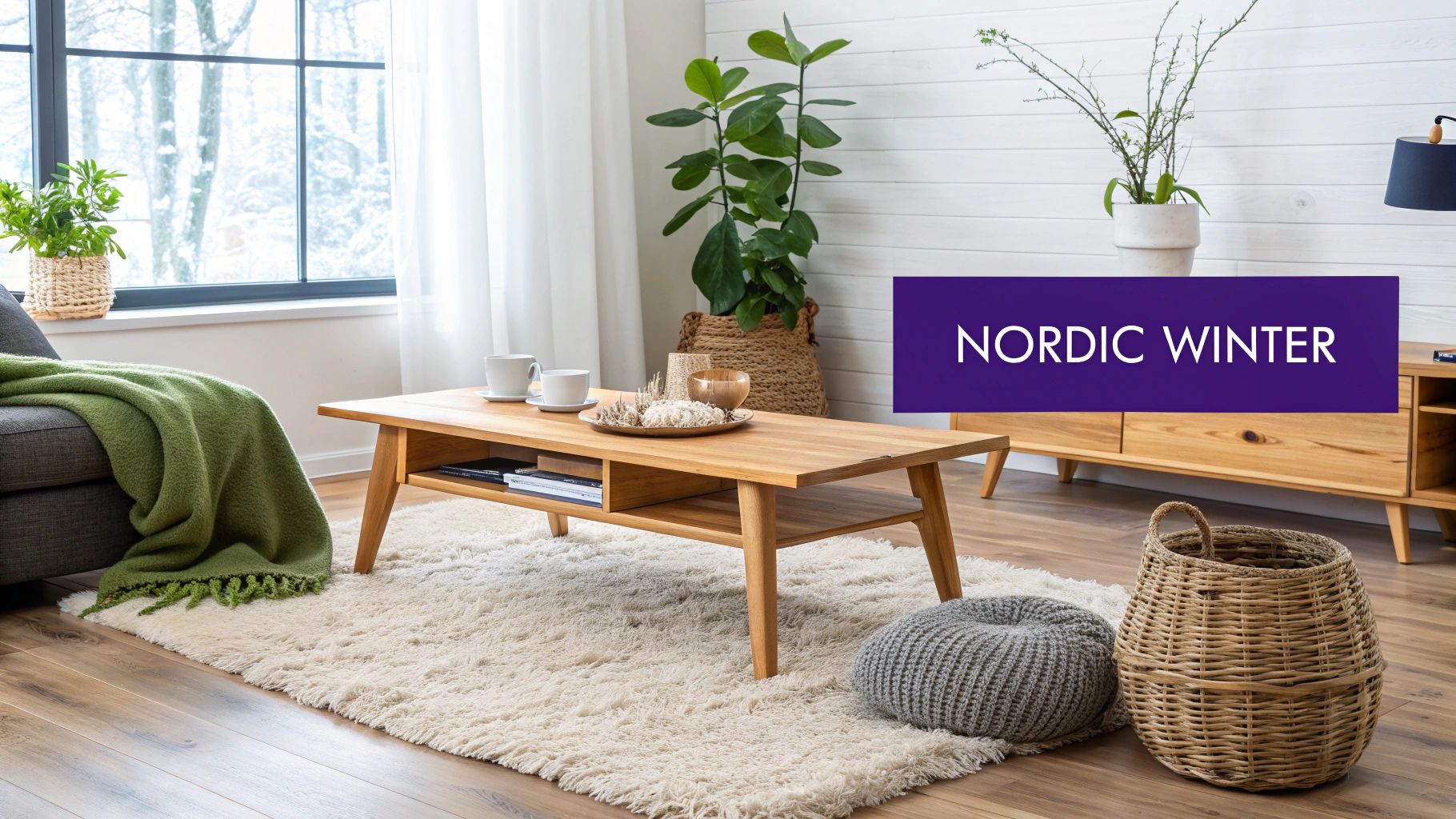
The Nordic Winter color palette captures the pure beauty of Scandinavian winter design. It blends warm neutral tones with deep forest greens and charcoal grays to create an inviting atmosphere that feels like a cozy winter retreat. This combination brings warmth and sophistication to both modern and classic spaces.
Core Elements The beauty of Nordic Winter lies in its simple elegance. Earth tones mix with rich greens and dark charcoal to reflect nature's subtle beauty. Natural wood adds essential warmth, while black accents provide crisp contrast that keeps spaces feeling fresh and balanced.
Real-World Applications You'll find this palette throughout Scandinavian interiors, where it enhances clean lines and functional spaces. Modern winter cabins often feature these colors to connect with their natural surroundings. The palette also appears in minimalist holiday displays that mirror snowy landscapes.
IKEA has played a key role in bringing these colors to homes worldwide through their winter collections. The rising popularity of hygge (Danish concept of coziness) has also shown how these colors create welcoming spaces.
Tips for Using Nordic Winter
To bring this palette into your space:
- Use natural materials like wood and wool
- Add texture through soft blankets and living plants
- Balance dark and light shades carefully
- Keep the overall look clean and uncluttered
For personal style, try pairing neutral sweaters with deep green accessories or charcoal outerwear. This creates an effortless look that works well for any occasion.
What Makes It Special Nordic Winter stands out for its ability to create calm, welcoming spaces that feel both current and timeless. It works equally well in contemporary or traditional settings, offering remarkable flexibility.
Key Benefits and Limitations
Advantages:
- Creates warm, welcoming spaces
- Never goes out of style
- Works in many design styles
- Easy to add natural elements
Challenges:
- May feel too sparse for some
- Restricted color range
- Needs careful tone balancing
The Nordic Winter palette celebrates both beauty and function while creating spaces that feel peaceful and comfortable. For design inspiration, explore IKEA's winter collection.
3. Winter Berry
The Winter Berry color palette pairs deep reds and burgundies with pure winter whites and rich forest greens. This classic combination delivers a warm, inviting seasonal feel perfect for both personal style and interiors.
Understanding and Application
Winter Berry brings comfort and elegance through its rich cranberry and burgundy hues. When balanced with forest green and winter white, it creates an inviting yet sophisticated look. Adding gold elements provides a touch of glamour that works especially well during the holidays or in upscale settings.
Real-World Examples and Case Studies
You'll find Winter Berry colors featured prominently in traditional holiday decor like wreaths, table settings and garlands. The fashion world embraces these shades during winter months through rich cranberry coats, burgundy accessories, and berry-toned clothing that pops against winter whites. Many fine dining establishments use this palette seasonally, incorporating deep cherry linens and evergreen centerpieces.
Evolution and Popularity
This palette rose to prominence through Martha Stewart's influential holiday collections that gave traditional winter colors a fresh, timeless presentation. It's also deeply rooted in classic English manor house style. Pottery Barn has helped popularize Winter Berry through their seasonal styling and product collections.
Practical Tips for Implementation
- Use deeper shades like burgundy and forest green as anchoring colors in larger spaces
- Add metallic accents through gold candleholders and frames for festive sparkle
- Balance bold colors with neutral areas and light wood tones to prevent overwhelming the eye
Why Winter Berry Deserves Its Place
Winter Berry earns its spot through enduring appeal and ability to create warmth. The interplay of rich tones and cool accents perfectly captures winter's essence while remaining versatile for both fashion and decor.
Pros and Cons
Pros:
- Creates inviting seasonal ambiance
- Natural visual impact
- Perfect for holiday decorating
- Brings warmth and comfort
Cons:
- Can feel too holiday-specific
- Bold colors need careful balancing
- May overwhelm smaller spaces
Conclusion
Winter Berry offers a rich, traditional palette ideal for creating welcoming spaces and sophisticated style. The balanced mix of deep hues and light accents works beautifully not just for holiday decor but year-round design seeking warmth and refinement.
Learn more about seasonal color palettes on our website.
4. Winter Night Sky
The Winter Night Sky palette captures the essence of a clear winter evening's celestial display. It blends deep midnight blues, rich royal purples, shimmering silver metallics, and classic black undertones to create an elegant atmosphere. This combination works beautifully for special events that call for drama and sophistication.
Understanding the Concept
This palette has gained prominence in fashion, interior design, and personal styling by creating a refined visual story. Top fashion houses and luxury event planners frequently choose these colors to add instant elegance to spaces and outfits. The combination excels at setting a mood that balances dramatic flair with sophisticated charm.
Real-World Examples and Case Studies
Winter Gala Decorations: Picture an event space transformed with deep blue drapes, twinkling silver accents, and tables dressed in rich purple linens. These elements work together to create an atmosphere of exclusivity and romance.
Evening Wedding Themes: For weddings, the palette creates an intimate ambiance. Bridesmaid dresses in royal purple, midnight blue décor elements, and silver-white flower arrangements combine to produce a timeless celebration setting.
Luxury Retail Displays: High-end retailers often implement these colors in winter window displays. The deep, rich tones paired with metallic accents naturally draw attention and boost store traffic.
Practical Tips for Implementation
Use Lighting Thoughtfully: Strategic lighting helps reveal the subtle variations in these deep tones while preventing the space from feeling too dark.
Add Reflective Elements: Including mirrors, metallic surfaces, or crystal accents helps bounce light throughout the space and keeps darker colors from overwhelming.
Balance Dark and Light: Mix in silver or metallic elements to offset deeper tones and maintain visual interest.
Pros and Cons
Pros:
- Creates sophisticated spaces with natural drama
- Ideal for evening events and formal occasions
- Works with many design approaches
- Responds beautifully to lighting effects
Cons:
- May appear too dark without proper light elements
- Needs careful lighting planning
- Not suited for spaces that need bright, airy feelings
The Winter Night Sky palette stands out for its ability to blend drama with refinement. It offers designers and planners many options to create memorable spaces and fashion statements that leave lasting impressions.
5. Winter Forest

The Winter Forest color palette captures the serene beauty of a snow-covered woodland. It blends rich shades of green, brown, and white to reflect the peaceful atmosphere of a forest in winter. The mix of crisp white snow against deep evergreens and earthy bark creates a perfect balance that works beautifully in fashion, interior design, and product styling.
Key Colors and Applications
The palette features several distinctive hues found in winter woodlands. Deep evergreen and pine tones provide richness and life, while pure snow white adds brightness and contrast. Warm bark browns and subtle sage undertones bring natural warmth. This combination creates spaces that feel both peaceful and grounded.
Success Stories
- Mountain Retreats: Many luxury lodges use this palette to create seamless indoor-outdoor connections that highlight their natural surroundings.
- Sustainable Design: The palette pairs perfectly with eco-friendly materials like reclaimed wood and natural stone.
- Retail Spaces: Stores often feature these colors in displays to create an inviting atmosphere that speaks to sustainability and timeless design.
Historical Context and Growth
The palette gained early recognition through iconic national park lodges that used natural colors to blend with their settings. As interest in sustainable living has grown, Winter Forest has become increasingly popular among designers and brands focused on eco-conscious luxury.
Implementation Guide
Try these tips to effectively use the Winter Forest palette:
Add Natural Materials: Include wood, stone, and wool textures to enhance the natural feel
Mix Green Tones: Combine different greens to create visual depth and interest
Balance with White: Use white strategically to highlight other colors while maintaining harmony
Key Benefits
This palette excels at creating spaces that feel natural and timeless. It works especially well with organic materials and brings a sense of calm that appeals to busy professionals and design enthusiasts.
Strengths and Limitations
Advantages:
- Classic appeal that works across seasons
- Natural harmony with organic materials
- Creates peaceful environments
Challenges:
- May not suit ultra-modern tastes
- Somewhat restricted color range
- Needs occasional refreshing to stay current
For more insights on working with colors in personal style, see: A Comprehensive Guide to Understanding Skin Undertone.
This palette earns its place by embodying winter's natural beauty. Its versatility makes it valuable for both fashion and interior design, especially for those seeking an eco-conscious aesthetic that stands the test of time.
6. Winter Metallics
The Winter Metallics color scheme brings together shimmering precious metals with crisp winter tones to create an elegant look. The mix of gold, silver, and copper with winter whites and deep charcoal grays produces striking visual effects that work beautifully in both fashion and interior design.
What makes this palette special is how adaptable it is. The warm glow of gold adds richness, while silver elements create a sleek, modern feel. Copper brings in natural warmth, while pearl white and charcoal gray act as neutral foundations that keep the metallic elements from becoming too intense. This careful balance of warm and cool creates highly usable combinations.
Key Elements:
- Gold metallics: Provides warmth and elegance
- Silver tones: Delivers modern, crisp appeal
- Copper accents: Adds natural, grounding warmth
- Pearl white: Creates a luminous base
- Charcoal gray: Offers sophisticated balance
Benefits:
- Creates elegance: The inherent shine of metallics instantly elevates any design
- Highly adaptable: Works for both formal and casual applications
- Enhances lighting: Reflective qualities beautifully catch and amplify light
- Perfect for events: Adds sparkle and glamour to special occasions
Challenges:
- Balance is key: Too much metallic can appear overdone
- May feel dressy: The elegant nature might not suit all casual spaces
- Requires care: Metallic finishes need proper maintenance
Real-World Examples:
Think of shimmering New Year's Eve celebrations, elegant hotel lobbies with metallic details, or high-end retail displays featuring fine jewelry. Interior design expert Kelly Wearstler has shown how metallics can create sophisticated modern spaces. Leading jewelry brands regularly use this palette to showcase their pieces.
Implementation Tips:
- Mix metallic finishes: Combine gold, silver and copper for visual depth
- Add matte elements: Balance shine with matte textures in fabrics and surfaces
- Include rich textures: Velvet, silk and faux fur complement metallic elements
The Winter Metallics palette offers a perfect blend of sophistication and flexibility. With thoughtful application of these elements and tips, you can create stunning looks in both personal style and interior design.
7. Arctic Frost
The Arctic Frost palette brings the pure beauty of winter landscapes into interior design through clean, minimal tones. The core colors feature crisp whites, pale blues, and soft grays that create an airy, open feel. This understated combination works well across many applications, from home design to fashion.
The palette includes several shades of white to add visual depth - from bright snow white to warmer ivory tones. A gentle glacier blue provides cool serenity, while soft gray grounds the palette and prevents starkness. Delicate touches of silver and ice blue can be incorporated for subtle shimmer and dimension.
What Makes Arctic Frost Special: This palette creates expansive, serene spaces perfect for minimalist design. The colors work together to produce a sense of order and tranquility.
Pros:
- Fresh, open atmosphere: Light colors make spaces feel bright and welcoming
- Perfect for minimal design: Simple palette lets architectural details shine
- Ideal for wellness spaces: Creates a calming, peaceful environment
- Makes rooms feel bigger: Light colors reflect more light and open up spaces
Cons:
- Can feel cold without textures: Needs warm elements to avoid feeling sterile
- Shows wear easily: Light colors tend to reveal marks and dirt
- May lack warmth: Cool tones need balancing with warmer accents
Examples and Case Studies:
- Modern bathrooms: White walls with glacier blue tiles and soft gray accents create a spa-like retreat
- Wellness spaces: Many high-end spas use this palette to establish serenity
- Art galleries: Clean white walls with gray floors let artwork stand out
Tips for Implementation:
- Add texture: Include natural materials like wood, stone and textiles for warmth
- Layer lighting: Use a mix of ambient, task and accent lights for depth
- Bring in nature: Plants and natural light help soften cool tones
Made Popular By:
- Scandinavian designers: Used in their signature minimal interiors
- Luxury spas: Featured in high-end wellness spaces
- Minimalist architects: Chosen to highlight clean lines and details
By thoughtfully using Arctic Frost's colors and following these guidelines, you can create visually balanced spaces that feel both refined and welcoming. The key is combining the cool palette with warm textures and natural elements.
8. Winter Sunset
The Winter Sunset palette brings the stunning colors of a winter dusk to life. Blending rich purples, deep oranges, and cool blues, this striking combination creates an unforgettable visual impact. Its mix of contrasting colors offers an eye-catching look that breaks away from typical winter palettes.
The power of this palette comes from its core colors: deep purple, sunset orange, cool blue, rose gold, and dusky pink. Deep purple sets a rich foundation, while sunset orange adds warmth and energy. Cool blue provides essential balance, rose gold brings subtle elegance, and dusky pink softens the overall effect. This thoughtful mix of warm and cool shades produces an engaging visual dynamic.
This palette shines in creative applications like art projects, fashion design, and event spaces. Picture flowing purple evening gowns with orange silk accents, or art installations using cool blue lighting on purple and orange sculptures. Many contemporary artists and designers have successfully used these colors across different media, showing just how adaptable they can be.
While Winter Sunset offers striking possibilities, it requires careful handling. The key is finding the right balance - too much orange can overwhelm the cooler tones, while excess purple can feel heavy. Lighting plays a crucial role too. The right lighting enhances these rich colors beautifully, but poor lighting can make them appear flat. Some may find this palette too bold for everyday use or certain interior spaces.
Pros:
- Creates an eye-catching visual impact
- Offers a distinct and memorable look
- Works well in artistic and fashion applications
- Successfully combines warm and cool tones
Cons:
- Requires skill to balance effectively
- May be too intense for some uses
- Needs proper lighting for best results
Tips for Using the Winter Sunset Palette:
- Use dark colors sparingly: Let deep purple or cool blue anchor the brighter shades
- Balance temperature: Mix warm oranges and pinks with cool blues and purples evenly
- Pay attention to lighting: Test different lighting to bring out the best in these colors
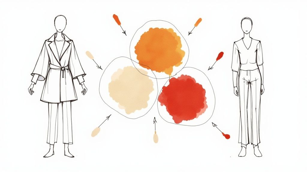
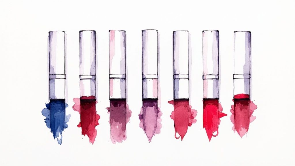
You might be interested in: Understanding the interplay of color in personal style. Understanding your natural coloring helps guide how you can best use palettes like Winter Sunset. Read also: The importance of eye and hair color in personal color analysis. For professionals, these color principles help create polished looks that boost confidence. This palette's bold contrasts work especially well for makeup artists and beauty enthusiasts exploring expressive looks. Winter Sunset deserves recognition for offering a fresh take on winter colors while encouraging creative expression through color.
8-Point Winter Palette Comparison
| Palette Name | 🔄 Implementation Complexity | ⚡ Resource Requirements | 📊 Expected Outcomes | ⭐ Ideal Use Cases | 💡 Key Advantages |
|---|---|---|---|---|---|
| Ice Queen Winter | Moderate – Requires balanced accents and lighting | Moderate – Extra accent colors and careful lighting needed | Luxurious, versatile, and elegant ambiance | Formal events, luxury displays, high-end design | Sophisticated; photograph-friendly design |
| Nordic Winter | Low – Minimalist design with basic natural balance | Low – Utilizes standard natural materials | Warm, inviting, and timeless feel | Scandinavian homes, modern cabins, minimalist décor | Easy integration with natural charm |
| Winter Berry | Moderate – Bold hues need careful balance | Moderate – Rich, intense colors requiring accent support | Festive, eye-catching holiday vibe | Traditional Christmas decor, upscale restaurant styling | Evokes warmth with seasonal richness |
| Winter Night Sky | High – Demands precise lighting and balance | High – Specialized lighting and reflective surfaces required | Dramatic, sophisticated, and versatile look | Evening galas, luxury retail displays, formal events | Striking visual impact and refined elegance |
| Winter Forest | Low – Simple layering of natural shades | Low – Leverages basic natural elements and textures | Natural, calming, and organic atmosphere | Mountain lodges, eco-friendly designs, rustic interiors | Timeless, grounding aesthetic |
| Winter Metallics | Moderate – Requires precise mix of metallic finishes | Moderate – Maintenance of gold, silver, and copper textures | Luxurious, glamorous, modern appearance | New Year’s Eve events, upscale hotel lobbies, chic retail | Versatile blend of modern glamour |
| Arctic Frost | Low – Minimalist approach with easy execution | Low – Basic palette of whites and blues | Clean, fresh, and spacious ambiance | Spa environments, modern galleries, contemporary bathrooms | Enhances space with a fresh, expansive feel |
| Winter Sunset | High – Challenging balance of warm and cool tones | High – Precise color standards and lighting essential | Dramatic, artistic, and memorable atmosphere | Art installations, creative events, fashion collections | Unique and balanced visual statement |
Embrace the Beauty of Winter with Color
The winter season showcases an incredible spectrum of color palettes - from crisp blues and whites in Ice Queen Winter to lush reds and greens in Winter Berry, to stark contrasts in Winter Night Sky. Other stunning themes include Nordic Winter, Winter Forest, Winter Metallics, Arctic Frost, and Winter Sunset. Each palette has its own unique character and potential. By understanding how these palettes work together - the interplay of cool and warm tones, light and shadow, and metallic accents - you can create a style that's fresh and impactful.
The key is to experiment and find what works for you. Look at your current wardrobe and living space, then consider how to bring in winter-inspired colors. Mix elements from different palettes to develop your personal look. The icy tones of Arctic Frost might complement your natural coloring, while Winter Sunset's warm hues could energize your space. Simple additions like a Winter Berry scarf or Winter Metallic accessories can make a noticeable difference.
Pay close attention to how different colors affect your mood and appearance. Notice which combinations enhance your features and express your personality best. While staying aware of current trends, remember that authentic personal style goes beyond passing fads. Natural elements and sustainable design are increasingly popular, as seen in Winter Forest and Nordic Winter palettes. Looking ahead, personalized color analysis will likely become more sophisticated, helping people find their most flattering color combinations.
Key Takeaways:
- Winter provides diverse color inspiration, from icy blues and whites to rich reds, greens, and metallics
- Understanding color relationships, light, and shadow helps create effective combinations
- Testing different palettes helps develop an authentic personal style
- Individual color analysis is growing more important for finding flattering looks
Ready to discover your perfect winter colors? AI Color Analysis offers a modern solution using advanced technology to analyze your unique features. Simply upload a photo to receive a detailed PDF report with personalized color recommendations for clothing, makeup, and hair. Get expert guidance to enhance your style confidently and affordably. Let AI Color Analysis help you embrace winter's beauty with colors chosen specifically for you.