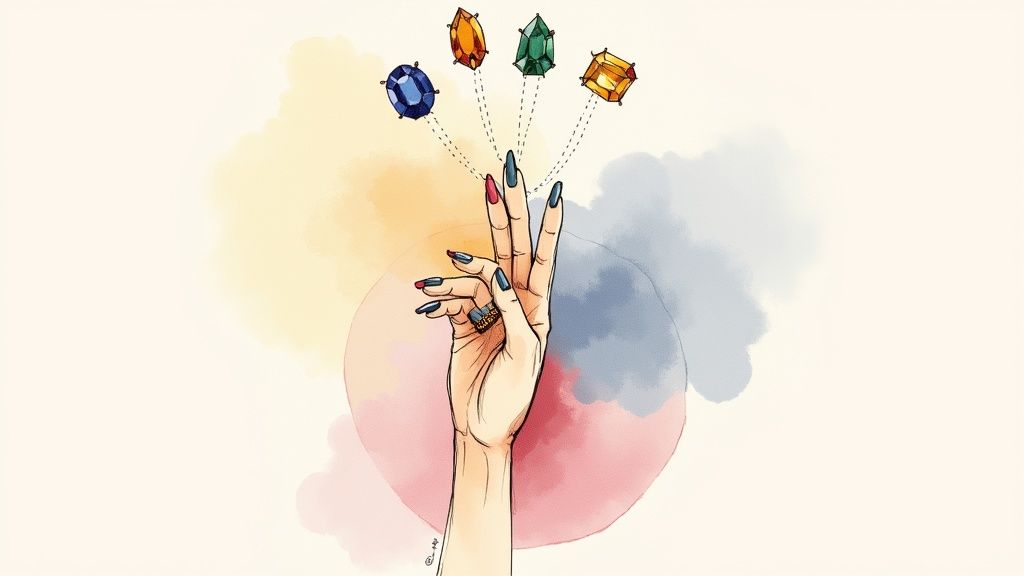
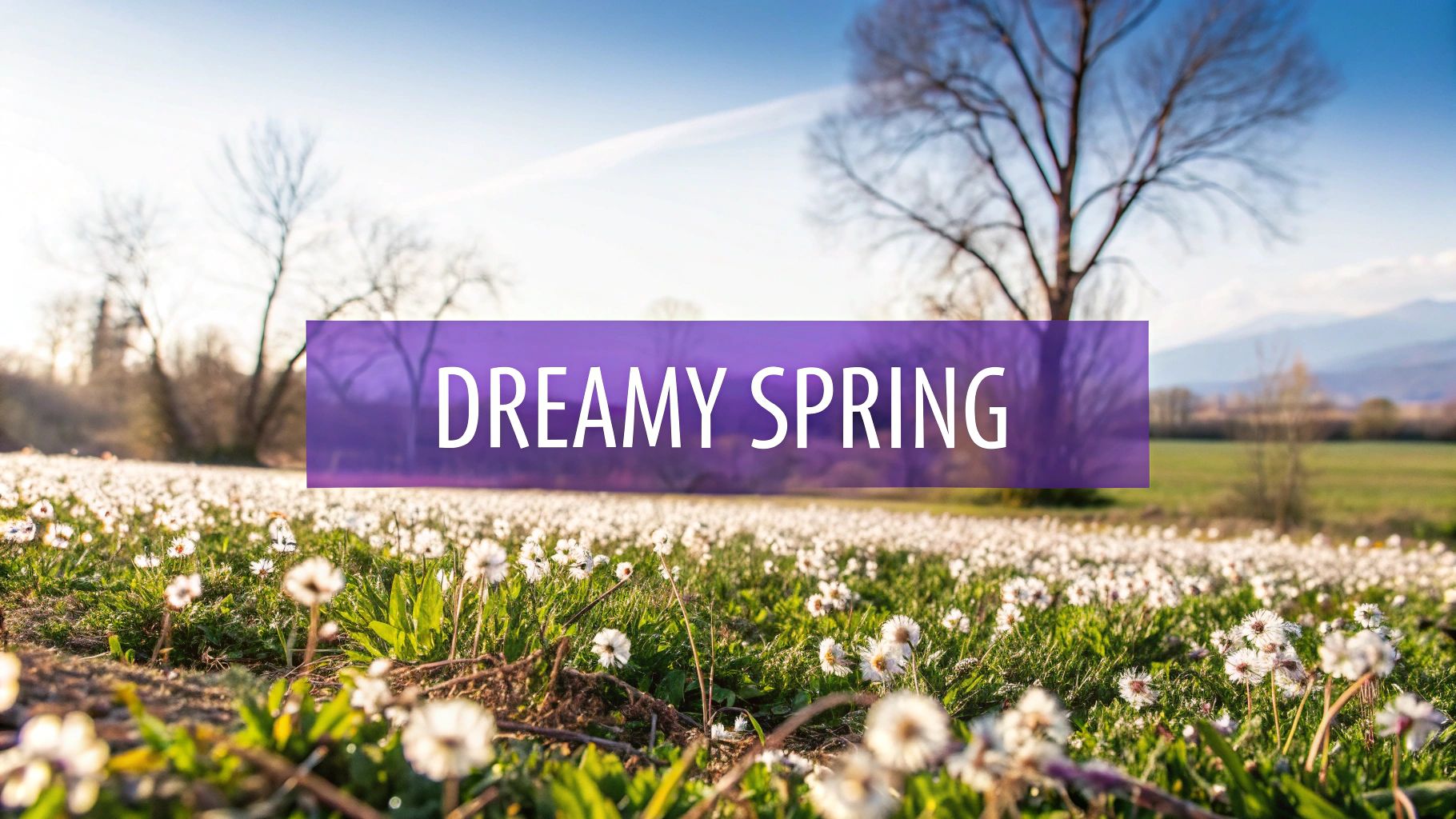
Embrace the Vibrancy of Spring with These Stunning Colors
The arrival of spring brings exciting new energy as nature awakens with blooming flowers and brighter days. This magical season has traditionally inspired color choices across fashion, design, art and more. Research has shown that specific colors can influence our mood and emotions in powerful ways. As we transition from winter's subdued palette, spring colors embrace both soft pastels and energizing brights that capture the spirit of renewal.
The most effective spring color combinations achieve perfect harmony between gentle and bold tones. These balanced palettes feel inherently "spring-like" because they echo the season's qualities of freshness, growth and renewed vitality. The key is selecting hues that work together to create a light, uplifting feeling while still maintaining visual interest through thoughtful contrast.
Whether you're refreshing your wardrobe, updating your living space, trying new makeup looks, or simply wanting to add some seasonal sparkle to your life, understanding spring's signature colors can make a real difference. This guide will walk you through eight essential spring colors and provide practical tips for incorporating them beautifully into your personal style. Get ready to embrace spring's cheerful spirit through the thoughtful use of color.
1. Cherry Blossom Pink

Cherry Blossom Pink is one of the most beloved spring colors, inspired by the fleeting beauty of cherry blossom flowers. This soft pink shade features subtle purple undertones that create a unique, ethereal quality. The gentle warmth balanced with cool tones makes it remarkably adaptable for different uses.
This romantic hue shines in spring weddings, from flower arrangements to bridesmaid attire. Its association with fresh starts and optimism makes it appealing across many groups - both fashion enthusiasts and professionals appreciate its fresh energy. Fashion designers regularly showcase this versatile shade in everything from flowy dresses to structured pieces. The color also features prominently in Japanese-inspired products, reflecting its deep cultural roots.
Several key factors explain this color's enduring popularity. Color authority Pantone frequently highlights variations of this pink in their seasonal forecasts. Japanese art and cultural influences have helped spread appreciation for this shade worldwide. Major fashion houses like Dior have also established it as a symbol of refined style.
While beautiful, Cherry Blossom Pink comes with some practical considerations. The color can read as traditionally feminine, which may limit its use in certain contexts. Its delicate nature means it may lose vibrancy when exposed to sunlight. The soft quality requires thoughtful application to avoid overwhelming a design.
Pros:
- Creates a fresh, romantic mood
- Works well in both fashion and interiors
- Represents new beginnings
- Has broad appeal
Cons:
- Can appear overly feminine
- Prone to fading in sunlight
- Needs careful balancing
Tips for Using Cherry Blossom Pink:
- Mix with sage green: This natural pairing creates visual harmony
- Use as an accent: Add pops of pink to neutral spaces for interest
- Combine with white: Creates a fresh, clean look perfect for warmer seasons
For men interested in this shade, try subtle touches like accessories. Professionals can refresh their work attire with a pink scarf or blouse. Makeup enthusiasts might explore this shade in blush, lip colors or eye makeup.
To learn more about building color palettes, visit AI Color Analysis for in-depth guidance on creating effective color combinations.
2. Fresh Mint Green
As a classic spring shade, mint green captures the essence of new beginnings and natural vitality. This bright, cool-toned pastel green brings a sense of clarity and freshness to any space or design. Its natural appeal makes it a timeless choice that resonates across different styles and applications.
The magic of mint green lies in its perfect balance of blue and green undertones. This combination creates a refreshing quality that works beautifully in both contemporary and classic settings. From modern offices to traditional kitchens, mint green has a natural ability to make spaces feel more open and peaceful. The color has a remarkable impact on room perception, often making areas appear larger and more airy.
Mint green gained prominence during the mid-century modern era, where designers embraced its optimistic qualities. Today, minimalist designers and wellness brands frequently choose this shade to convey natural freshness. You'll often spot mint green in modern kitchen designs, where it appears in cabinetry and backsplashes, creating clean and current looks.
Pros:
- Adds freshness and clarity
- Adapts well to modern and traditional designs
- Provides a calming atmosphere
- Makes spaces feel more open
Cons:
- Can feel sterile without proper balance
- Shows dirt and wear more easily
- Not suited for creating warm atmospheres
Tips for Implementation:
- Pair with white: Create clean, modern looks by combining mint green with crisp white in minimalist spaces and kitchens
- Use as an accent: Add mint green through decorative pieces like pillows, vases or artwork in neutral rooms
- Create depth with greens: Mix mint with deeper green shades like emerald or forest green to build visual interest and natural connections
Whether you're updating your wardrobe, seeking quick style solutions, or wanting to refresh your home, mint green offers reliable versatility. Its natural ability to bring calmness and vitality makes it an excellent choice for spring color schemes.
3. Periwinkle Blue
Periwinkle blue brings a fresh perspective to the spring color palette by blending blue and violet tones. This ethereal shade captures the essence of spring skies and early blooming flowers, adding both refinement and playfulness to designs. Its balanced mix of cool and warm undertones makes it remarkably adaptable.
The color's gentle nature creates spaces that feel both peaceful and polished. Its subtle intensity works equally well in feminine and masculine designs, proving its wide appeal across different styles and applications. From clothing to room decor, periwinkle blue shows its true range.
Features and Benefits:
- Unique Color Mix: The blue-violet combination creates depth and visual interest
- Soft Pastel Quality: Perfect for creating peaceful, refined spaces
- Multi-Purpose: Effective in everything from fashion to interior design
- Visual Impact: Adds subtle complexity without dominating the design
Pros:
- Creates calm, relaxing environments
- Complements many colors from bright to neutral tones
- Appeals across different style preferences
- Excellent for adding visual layers to designs
Cons:
- Needs modern styling to avoid looking outdated
- May be too understated for bold design needs
- Print reproduction can be inconsistent
Real-World Applications:
The color shines in spring fashion collections as a fresh, airy choice. Wedding planners often select it to set a romantic, peaceful mood. Modern nursery designs embrace periwinkle as a more mature option compared to classic pastels.
Growing Popularity:
When Pantone named periwinkle their Color of the Year in 2022, it gained significant attention. This recognition influenced design trends across industries. Fashion brands showcased it on runways while interior designers used it to create serene spaces.
Practical Design Tips:
- Bold Pairings: Mix with yellow for lively spring combinations
- Soft Effects: Use in color blends for dreamy, ethereal results
- Professional Look: Combine with grays, beiges, or whites for clean, timeless designs
For quick style updates, adding periwinkle accessories like scarves or pocket squares can refresh basic outfits. Men can try periwinkle shirts or sweaters for a current look. Beauty fans might explore the shade in eye makeup or nail colors for subtle impact. Understanding how to use periwinkle blue effectively helps create thoughtful, appealing designs in any context.
4. Daffodil Yellow

A bright and cheerful shade reminiscent of early spring blooms, daffodil yellow captures the essence of renewal and optimism. This color's connection to nature's first flowers after winter makes it a perfect choice for spring fashion and design palettes.
The warm, clear tone of daffodil yellow demands attention in the best possible way. Like seeing the first daffodils emerge from the earth, this color instantly lifts spirits and creates an upbeat mood. Its emotional impact is immediate and lasting.
For those interested in fashion, daffodil yellow offers exciting styling possibilities. It works beautifully as an accent color - picture a yellow scarf brightening up a classic beige trench coat or a pocket square adding punch to a navy suit. Men can easily incorporate this shade through accessories to add personality to their outfits.
When working with daffodil yellow, moderation is key. The color's intensity means it performs best in smaller doses. Too much can overwhelm the eye and make coordination challenging.
Pros:
- Naturally uplifting and energizing
- Makes a strong visual statement
- Perfect for seasonal transitions
- Works well as an accent
Cons:
- Can be visually intense in large amounts
- Requires careful color coordination
- May strain eyes if overused
Examples:
- Spring event decorations
- Kids' room designs
- Garden-inspired fashion
Tips for Implementation:
- Use sparingly as an accent color
- Balance with neutral tones
- Pair with blues and greens for a fresh look
The appeal of daffodil yellow continues to grow, particularly in spring fashion collections and nature-inspired design. Its ability to instantly communicate joy and fresh beginnings makes it a perennial favorite.
Want to know how this shade works with your complexion? Check out our Comprehensive Guide to Understanding Skin Undertone. You'll learn whether daffodil yellow should be a main element in your wardrobe or just an accent. Looking for more seasonal style guidance? Read also: [How to Incorporate Trending Colors Into Your Wardrobe] (This is a placeholder - replace with your actual link) for practical tips on working with bold spring shades like daffodil yellow.
5. Lavender Purple
Lavender purple draws its charm from the gentle spring flowers it's named after. This elegant shade blends light purple with subtle gray undertones, creating a versatile color that works beautifully across many design applications. Its balanced nature makes it perfect for spring palettes as it bridges winter's coolness with summer's warmth.
The color's connection to actual lavender flowers adds depth to its appeal. Picture walking through a blooming lavender field - this same sense of peace and refinement carries through when using this color in design.
Key Characteristics:
- Light purple with gray undertones: Creates a sophisticated shade that avoids being overly sweet
- Natural flower inspiration: Connects to organic elements and natural beauty
- Peaceful yet refined quality: Achieves perfect balance between calm and elegance
- Balanced temperature: Adapts well to different color combinations
Advantages:
- Creates welcoming, peaceful spaces
- Fits both contemporary and classic designs
- Works across fashion, decor and branding
- Appeals to all genders
Limitations:
- May be too subtle for high-impact design needs
- Can lose vibrancy with sun exposure
- Needs proper lighting to avoid looking washed out
Real Applications:
Lavender purple has gained momentum across industries. Premium beauty brands use it in packaging to convey calmness and luxury. Fashion houses feature it as a fresh spring option. The wedding industry has embraced it from flowers to bridesmaid dresses, showing its versatility.
Design Tips:
- Mix with deep purples: Pairing with rich purples adds depth and prevents a washed-out look
- Combine with white: Creates an airy, fresh spring feeling - try white clothing with lavender accessories
- Add sage green: Creates a natural, soothing combination that works in fashion and interiors
Growing Popularity:
Several factors drive lavender purple's increased use. The focus on wellness has boosted demand for calming colors. Its gender-neutral appeal aligns with shifting style preferences. The color's association with premium brands has made it desirable for upscale marketing.
For style-conscious individuals, lavender purple offers polish and adaptability. Whether you're a professional seeking easy outfit combinations, someone building style confidence, or a beauty enthusiast exploring trends, this color brings a fresh, calming element to spring looks. Its ability to work with many colors makes it simple to incorporate into various styles from casual to dressy.
6. Coral Pink
Coral pink brings a warm, energetic presence to the spring color palette by blending the best qualities of pink and orange. This beautiful hue creates a welcoming yet dynamic effect that makes it a standout choice for both fashion and design.
The color's signature characteristic is its vibrant pink-orange fusion that draws inspiration from ocean coral reefs. This natural connection gives it an organic, fresh quality that has made it highly successful across fashion, interior design, and other creative fields.
Why Coral Pink Deserves Its Spot:
This shade strikes an ideal balance - warm enough to feel inviting but vibrant enough to make a statement. It plays well with both cool colors (blues/greens) and warm tones (yellows/browns), making it highly adaptable. The color maintains its appeal year-round, from bright spring/summer looks to cozy fall/winter designs. Even small touches of coral pink can make a big visual impact.
Pros:
- Creates a warm, welcoming mood
- Mixes well with cool and warm colors
- Makes a strong design statement
- Works across all seasons
Cons:
- Can feel too intense when overused
- May not flatter all skin tones (test before buying large garments)
- Less suited for formal/conservative settings
Real-World Examples and Case Studies:
Coral pink has gained momentum in multiple industries. Beachwear designers use it to capture a relaxed vacation vibe, while home decorators incorporate it through accent walls, pillows and art pieces. Picture a flowy beach coverup, festive tropical party decor, or a statement coral chair in a modern room.
Evolution and Popularity:
Pantone's selection of "Living Coral" as 2019's Color of the Year helped drive coral pink into mainstream popularity. Resort fashion brands have long featured this cheerful hue in their collections. Interior designers now regularly use it to add fresh, modern flair to spaces.
Practical Tips for Implementation:
- Balance with Neutrals: Pair with white, beige or gray to create sophisticated looks without overwhelming.
- Use as an Accent: Add small pops through accessories like scarves or jewelry. For interiors, try throw pillows or decorative items.
- Pair with Turquoise: This classic combo captures a tropical paradise feel. Try a coral shirt with turquoise shorts or coral couch with turquoise pillows.
By following these guidelines and understanding coral pink's unique qualities, you can confidently incorporate this versatile color into your wardrobe and living spaces.
7. Sky Blue
Sky blue is a light, fresh shade that captures the essence of clear spring skies and calm waters. This bright, clear tone has earned its spot in spring color schemes thanks to its ability to create an open, airy feeling in any space.
When used thoughtfully, sky blue can transform spaces and styles. Picture a bright living room where sky blue walls create an illusion of extra space, or a breezy spring outfit featuring sky blue linen that exudes effortless style. The color has a natural calming effect that makes it appealing across many applications. It works especially well as a foundation color for creating peaceful, refreshing environments.
Several design movements have helped popularize sky blue. Scandinavian design, with its focus on light and simplicity, frequently features this shade to brighten spaces. Coastal brands often use sky blue to evoke seaside serenity. Modern architects appreciate how it enhances spatial perception and natural light.
While sky blue offers many benefits, it requires careful consideration. In spaces with poor lighting, it can appear cold and uninviting. To counter this, pair it with warm elements like cream colors, natural wood, or coral accents for better balance. The color can also feel bland on its own - try layering different blue tones from deep cerulean to soft periwinkle to add visual depth. Good lighting is essential for sky blue to achieve its full airy effect.
Pros:
- Creates a sense of space and openness
- Universally appealing
- Calming psychological effect
- Easy to coordinate with other colors
Cons:
- Can appear cold in certain contexts
- May lack impact in some applications
- Requires careful lighting consideration
Tips for Implementation:
- Use in well-lit spaces for best effect.
- Pair with warm accents for balance.
- Layer with other blues for depth.
You might be interested in: Eye and Hair Color: Why They Matter in Personal Color Analysis. Understanding your personal color palette helps determine how to best use colors like sky blue in your wardrobe and style. This is especially helpful for men interested in personal styling and busy professionals wanting quick style solutions, since having a clear color palette makes getting dressed easier and boosts confidence. For fashion and beauty enthusiasts, knowing how sky blue works with different skin tones and hair colors is key for creating flattering looks. Read also: How to Determine Your Skin Tone and Choose the Right Colors.
8. Sage Green
Sage green has become one of spring's most beloved colors. This gentle mix of gray and green provides a natural, calming presence that reflects springtime's themes of new growth and renewal. Its muted tone makes it a wonderful substitute for brighter greens while keeping a strong connection to nature and organic elements.
Several key trends have fueled sage green's popularity. The modern farmhouse style embraced it for creating peaceful, nature-inspired spaces. Environmental brands adopted it to express their commitment to sustainability. Interior designers also gravitated towards it as a versatile neutral that pairs well with bolder accent colors.
Features and Benefits:
- Muted green-gray tone: Works beautifully as a neutral while offering more character than standard grays and beiges
- Nature-inspired color: Connects to herbs and plants, bringing an organic, tranquil feeling to spaces
- Understated elegance: Adds sophisticated style without overwhelming a room or outfit
- Design flexibility: Easily combines with many color palettes and design styles
Pros:
- Creates peaceful ambiance: Perfect for spaces meant for relaxation and calm
- Fresh neutral option: Provides an interesting alternative to basic neutral colors
- Easy to coordinate: Pairs nicely with spring colors from soft pastels to vivid corals
- Classic staying power: Maintains relevance beyond short-term trends
Cons:
- Can feel flat: Needs texture and bright accents to avoid looking dull
- Dark spaces challenging: May need lightening in rooms with minimal natural light
- Not for bold statements: May not satisfy those wanting dramatic, high-impact color
Real-World Examples:
- Modern farmhouse: Sage walls create calm backdrops for rustic wood and natural textures
- Eco-friendly brands: Many sustainable companies use sage green for packaging and logos
- Kitchen design: Sage cabinets paired with brass hardware and marble create elegant spaces
Practical Tips:
- Start with key pieces: Use sage green on walls, large furniture, or area rugs as foundation elements
- Add bright accents: Mix in coral, yellow, or pink for visual interest and energy
- Balance with white: Combine sage with crisp white for a fresh, airy spring feeling
Understanding how to use sage green effectively lets you create balanced, serene spaces that perfectly capture the essence of spring.
8-Color Spring Palette Comparison
| Color Combination | 🔄 Implementation Complexity | ⚡ Resource Requirements | 📊 Expected Outcomes | Ideal Use Cases | 💡 Key Advantages |
|---|---|---|---|---|---|
| Cherry Blossom Pink | Moderate; requires careful balance | Low; easily integrated | Fresh, romantic ambiance | Spring weddings, fashion, interior design | Versatile; evokes new beginnings |
| Fresh Mint Green | Moderate; precise pairing recommended | Low to moderate; flexible design | Invigorating and calming effect | Modern kitchens, wellness brands, offices | Crisp and refreshing with spatial depth |
| Periwinkle Blue | Moderate; subtle reproduction needed | Moderate; consistent application | Serene, balanced aesthetic | Fashion collections, weddings, nursery designs | Gender-neutral; dreamy versatility |
| Daffodil Yellow | High; risk of overwhelming if overused | High; careful coordination necessary | Cheerful, energetic impact | Festival decor, children's rooms, floral designs | Attention-grabbing and optimistic |
| Lavender Purple | Low; easy to use though may fade in sunlight | Low; minimal styling adjustments | Calming and peaceful atmosphere | Spa branding, weddings, luxury packaging | Soft and sophisticated elegance |
| Coral Pink | High; potential for overpowering | Moderate; balance is required | Warm, dynamic design impact | Beach designs, tropical collections, contemporary decor | Vibrant and inviting energy |
| Sky Blue | Low; broadly adaptable with proper lighting | Low; simple integration | Airy, spacious, and calming visual effect | Coastal schemes, spring fashion, modern interiors | Universally appealing and expansive |
| Sage Green | Low; versatile as a neutral base | Low; minimal demands | Natural, soothing background | Farmhouse designs, eco-branding, contemporary kitchens | Timeless with subtle sophistication |
Styling Your Spring Color Palette
Spring invites fresh style opportunities with eight essential colors - Cherry Blossom Pink, Fresh Mint Green, Periwinkle Blue, Daffodil Yellow, Lavender Purple, Coral Pink, Sky Blue, and Sage Green. This palette combines gentle pastels with brighter hues to create versatile style options. For best results, mix these colors with basics like white, beige, or gray to create balanced outfits and decor. Play with combinations - try pairing cool Periwinkle Blue with sunny Daffodil Yellow, or soft Lavender Purple with vibrant Coral Pink. These colors work beautifully in clothing, home design, and makeup applications.
Success with spring colors comes from understanding your unique coloring. While seasonal trends offer inspiration, identifying shades that complement your natural features helps create an enduring personal style. Take time to test different colors against your skin tone - notice which ones make you look radiant versus those that may wash you out. This exploration process helps develop your color intuition.
Color preferences have become increasingly individualized, moving beyond generic recommendations to personalized approaches. New technologies in color analysis continue advancing, making it easier to find your most flattering shades.
Key Guidelines:
- Balance: Mix vibrant spring colors with neutral basics
- Experimentation: Test various color pairings to find what works
- Personal Analysis: Know your natural coloring to choose flattering shades
- Flexibility: Adjust color choices based on what suits you best
Want scientifically-backed color recommendations tailored just for you? AI Color Analysis provides an innovative solution to discover your ideal palette. Simply upload a photo to receive a detailed PDF report analyzing your skin undertone, seasonal color type, and personalized style advice for clothing, makeup and more. Take the guesswork out of color selection and enhance your spring style with confidence. Find your perfect colors at AI Color Analysis today.