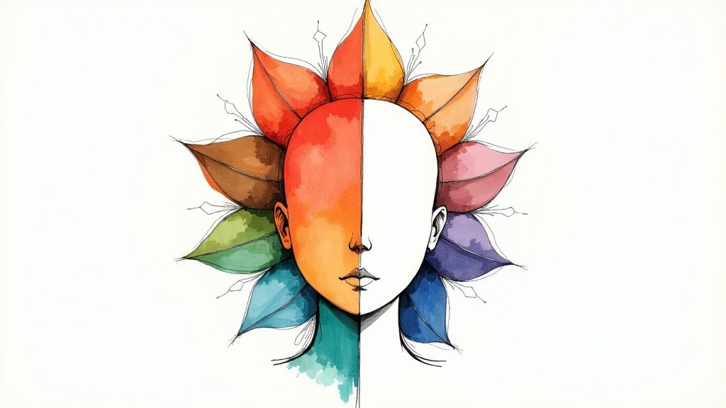
Finding your personal color palette isn't just a fun aesthetic exercise—it’s one of the smartest things you can do for your personal style or brand. When you nail down a set of colors that work for you, you're building a powerful, recognizable identity that feels both authentic and intentional. It’s the secret to turning a random assortment of clothes into a polished, memorable look.
Why a Cohesive Color Palette Is a Game Changer
Let's be real for a moment. Color isn't just decoration; it's a silent communicator. It shapes how people see you before you even say a word. When you consistently use a specific group of colors, you create a visual language that speaks volumes about your personality or brand. Just think about the most iconic brands—their colors are so burned into our brains that we recognize them instantly.
That very same principle works wonders for your personal style. A well-chosen palette makes getting dressed in the morning so much easier, ensures your outfits always look pulled-together, and helps you shop with purpose. No more buying that one-off piece that doesn't go with anything else in your closet.
Build Instant Recognition and Trust
Consistency is everything when it comes to creating a memorable visual identity. When your colors show up again and again—in your wardrobe, on your website, or across your social media—people start to connect those hues with you. This repetition creates familiarity, which is the foundation of trust and recognition. It’s not just about looking good; it's about creating a visual presence people can count on.
A cohesive color palette acts as your visual signature. It’s the thread that ties everything together, making your personal or professional brand instantly identifiable and so much more impactful.
The Power of Perception
The colors you wear send subtle psychological messages all day long. A palette of soft blues and grays can read as calm and professional, while a mix of vibrant yellows and pinks might scream energy and creativity. This is exactly why it's so critical to find a color palette that actually reflects the message you want to send.
- For Professionals: A refined palette can project competence and authority.
- For Creatives: Bold or unexpected color combinations can showcase your innovative spirit.
- For Personal Style: Your colors can mirror your personality, whether you're warm and approachable, bold and dramatic, or clean and minimalist.
This isn't just fluff; there's data to back it up. Using color consistently can boost brand recognition by a staggering 80%. That stat shows just how powerful a strong, consistent color scheme can be. You can dive deeper into the impact of brand color consistency with these statistics.
Using AI to Find Your Color Palette
Trying to figure out your best colors on your own can feel like a total shot in the dark. Instead of just guessing, you can use modern tools to get a data-driven starting point and find your true color palette. It's a fantastic way to cut through the confusion and get some real clarity.
To get started, AI-powered color analysis platforms like getdressed.ai are a great first step. These tools analyze a photo of you to pinpoint things like your skin's undertones and your natural contrast level, giving you an objective foundation to build on.
Getting a Good Photo for an Accurate AI Analysis
The results you get are only as good as the photo you upload. Seriously, this is the most important part. Think of it as giving the AI the best, clearest information to work with. A blurry, poorly lit, or edited picture will almost certainly give you the wrong season, so taking a few minutes to get this right is worth it.
For the most accurate analysis, just follow these simple steps:
- Find Natural Daylight: Face a window to let soft, indirect sunlight hit your face. Steer clear of harsh shadows or direct sun, as both can completely change how your skin tone looks on camera.
- Wipe Off Your Makeup: Foundation and concealer are designed to cover up your skin's natural undertones. To get a true reading, you need a clean, bare face.
- Tie Your Hair Back: Your hair color can throw off the analysis. Just pull it back so your skin, especially around your jawline, is completely visible.
Key Takeaway: A great AI color analysis starts with a high-quality, unedited photo taken in natural light. The goal is to let the AI see your real skin tone, free from any interference from makeup or bad lighting.
Making Sense of Your AI Results
After you submit your photo, the AI will generate a report. This isn't just a random list of colors; it’s a detailed breakdown of what makes you, you. You’ll usually get a verdict on your skin's undertone (cool, warm, or neutral) and your contrast level, which is the degree of difference between your skin, hair, and eye color.
This information is the core of your personal color palette. For instance, if you have cool undertones and high contrast, you'll absolutely pop in bold, crisp colors like pure white and true red. On the flip side, someone with warm undertones and low contrast will look amazing in softer, more muted shades like olive green and terracotta.
Many of these tools are getting pretty sophisticated. You can learn more about how a color analysis filter uses this data to recommend specific shades. This AI-powered insight gives you the "why" behind your best colors, making it so much easier to understand.
Making Sense of Your Seasonal Color Profile
Alright, so your AI analysis gave you the technical details—your undertones, your contrast level. What now? It's time to translate that data into something you can actually use: your seasonal color profile. This is where we connect the dots using the classic seasonal color theory, a system that groups colors into four "seasons" that make finding your best shades intuitive.
Think of it this way: the AI gave you the raw ingredients. Understanding your season is the recipe that shows you how to put them all together. It’s the key to moving beyond a simple list of "good" colors and developing a real, instinctual feel for what makes you look and feel your best.
This is all built on the foundation of your skin's undertone, which is the most critical piece of information from your AI report.
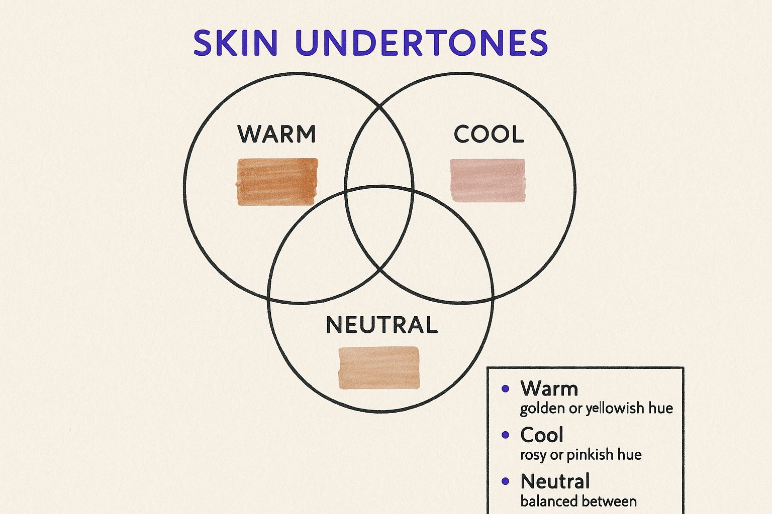
As you can see, figuring out if you're fundamentally warm, cool, or neutral is the first and most important step. It’s the fork in the road that leads you to your color family.
The Four Core Color Seasons
Each of the four seasons has a totally different vibe, and it all comes down to two things: the undertone (warm vs. cool) and the color intensity (bright and clear vs. soft and muted). Your job now is to match your AI results to one of these profiles.
- Spring: If you have warm undertones and your best colors are bright and clear, you're likely a Spring. Think of the vibrant, lively colors of a garden coming to life—daffodil yellow, apple green, and bright coral.
- Summer: This season is defined by cool undertones paired with soft, blended colors. Imagine a hazy summer afternoon by the ocean. The colors are gentle and serene, like dusty rose, soft lavender, and sky blue.
- Autumn: Known for its warm undertones and deep, earthy tones. This palette is all about rich, organic warmth. Think of pumpkin spice, olive green, and warm terracotta.
- Winter: If you have cool undertones and shine in bold, high-contrast colors, you're a Winter. The feeling is crisp and dramatic, like a snowy landscape against a bright blue sky. Colors include true black, pure white, ruby red, and cobalt blue.
Finding your home in one of these color families is a game-changer. It’s like being handed a key that unlocks a wardrobe where everything looks incredible on you. Shopping becomes simpler, and getting dressed is suddenly so much more fun.
To help you visualize this, here’s a quick-reference table that breaks down the main characteristics of each season. It’s a great way to see how your AI results line up with the classic profiles.
Seasonal Color Profile Characteristics
| Season | Undertone | Key Characteristics | Best Colors (Examples) |
|---|---|---|---|
| Spring | Warm | Bright, Clear, Light | Peach, Lime Green, Aqua |
| Summer | Cool | Muted, Soft, Smoky | Dusty Rose, Lavender, Powder Blue |
| Autumn | Warm | Rich, Earthy, Muted | Olive Green, Burnt Orange, Mustard |
| Winter | Cool | Bold, Icy, High-Contrast | True Red, Cobalt Blue, Pure White |
Use this table to see which description best fits the feedback you got from your analysis. It really helps to solidify which seasonal direction you should be heading in.
If you want to go even further, our detailed guide on what is my color season is the perfect next step. It's designed to help you turn your AI data into practical, everyday style wisdom.
Fine-Tuning Your AI-Generated Palette
An AI color report is a brilliant launchpad, but it’s not the destination. The real magic happens when you filter those automated suggestions through your own experiences, lifestyle, and gut feelings. This is where you transform a generic recommendation into a color story that feels authentically you.

Think of your palette as a well-balanced team, not just a random collection of pretty shades. You need a strategic mix of colors that can work together to build a versatile wardrobe or a cohesive brand identity.
Here's how I think about building that team:
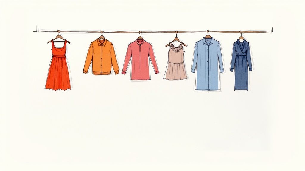
- Your Base Neutrals: These are the MVPs, the foundation of your entire palette. Think of shades like charcoal, navy, cream, or a soft beige that effortlessly anchor your look and pair with everything else.
- Your Core Colors: These are the stars of the show—the 2-3 main colors from your seasonal analysis. They should be the ones that make you feel incredible and will feature most prominently in your signature pieces.
- Your Accent Colors: These are the bold, energetic players you bring in for a pop of personality. Use them for accessories or a single statement piece to inject life and interest into your outfits.
Weaving in Trends Without Losing Your Core Style
It's always fun to play with what's current, but you don't want your whole look to have an expiration date. The trick is to be intentional.
For example, Pinterest's data-backed '2025 Palette' identified Cherry Red and Butter Yellow as major upcoming trends, based on billions of user searches. Instead of overhauling your wardrobe, you could simply bring in a cherry-red scarf or a pair of butter-yellow flats. This lets you nod to the trend while staying true to your timeless, personalized palette.
The best way to know if a color truly works is to see it in the real world. A shade can look fantastic on a screen but feel completely wrong once you’re actually wearing it.
The final, most crucial step is to take your palette for a test drive. Head to a store and hold fabrics in your chosen colors up to your face in good, natural light. Drape a shirt over your shoulders. See how the color interacts with your skin tone and, just as importantly, pay attention to how it makes you feel.
This simple, real-world check is the ultimate confirmation. It’s how you’ll know, without a doubt, that you’ve found the colors that work flawlessly for you.
Putting Your New Color Palette to Work
Alright, this is where the magic happens. You’ve used AI to get your colors, you know your season, and you’ve tweaked the shades until they feel just right. Now, let’s get those colors off the screen and into your actual life. It's about creating a sense of harmony that not only looks great but also makes daily decisions a whole lot easier.
Your wardrobe is usually the first place you'll see a big change. When you stick to your palette, you’re basically building a real-life capsule wardrobe where everything mixes and matches beautifully. Think less morning stress figuring out what to wear and a lot more confidence walking out the door.
Building a Wardrobe That Works For You
I always tell people to start with their neutrals. These are the workhorses of your closet. Think about using them for bigger investment pieces—your classic coat, a great pair of trousers, or those tops you wear over and over. If you're unsure where to begin, our guide on the https://aicoloranalysis.com/blog/best-neutral-colors-for-my-skin-tone is a fantastic starting point.
With your neutral base established, you can begin weaving in your other colors. Here’s a simple way to think about it:
- Core Colors: These are great for pieces like blouses, sweaters, and dresses that carry a bit more visual weight. They’re your go-to "statement" shades.
- Accent Colors: Use these for a pop of personality! They’re perfect for accessories—a bright scarf, a fun handbag, or even a bold swipe of lipstick.
Your palette isn't just about looking good; it's about feeling confident and put-together, especially at work. Understanding how to dress professionally and keep your style is much easier when your colors are already doing half the work for you.
And this thinking goes way beyond your closet. If you’re a small business owner, using your colors across your logo, website, and social media creates a brand that feels instantly recognizable and authentic. The same logic applies to your home. Choosing paint colors and decor from your palette can turn your living space into a sanctuary that genuinely feels like you. It’s all about creating a consistent visual story that’s uniquely yours.
Answering Your Top Color Palette Questions
https://www.youtube.com/embed/7MrvJ7k8B4o
Diving into color analysis is a huge lightbulb moment, but it's totally normal for a few questions to pop up once you get your results. Let's walk through some of the most common ones I hear so you can start using your palette with confidence.
What If I Don't Like My Colors?
This is probably the number one concern I see. You get your results back, maybe you're a Soft Autumn, and you see a shade of mustard yellow that you just can't stand. Don't panic!
Your palette is a guide, not a strict set of rules you have to follow forever. Think of it as a curated menu, not a required meal plan. If a specific shade just isn't you, simply ignore it.
Focus on the colors within your seasonal palette that you genuinely love. You might also find you can "borrow" from a neighboring season. For example, a Soft Summer often looks fantastic in some of the more muted, cooler tones from the Soft Autumn palette. It's all about finding what makes you feel amazing.
How Many Colors Do I Actually Need?
You absolutely do not need to build a wardrobe with 50 different shades. In fact, that's a recipe for decision fatigue. A well-chosen, curated selection is always more powerful.
I always suggest starting with a simple 5-color palette to build your core wardrobe. It’s surprisingly versatile.
- 2 Core Neutrals: These are the foundation of everything (think charcoal, navy, cream, or camel).
- 2 Main Colors: Pick two shades from your season that you absolutely adore and feel great in.
- 1 Accent Color: This is your "pop" color—perfect for accessories, a blouse, or a fun pair of shoes.
Your personal color palette is a living tool, not a one-time diagnosis. It should adapt with you as your style, hair color, or even your environment changes over the years.
And that brings up a final point: your colors can—and should—evolve. If you go from a bright blonde to a deep brunette, your natural contrast level shifts, and that can influence which colors look best on you.
The whole point isn't to get stuck. It's to use color theory as your secret weapon to always look and feel like the best version of yourself, no matter what.